I'm travelling into a new way of working, a new country, a new language, and a new hobby which I'm passionate about. Come with me for some of the journey...

Showing posts with label Archival. Show all posts

Wednesday, 18 August 2021

Three times three times three

Hello all!  I'm delighted to be here today to share a project created for a Guest Designer spot at the Funkie Junkie Boutique Blog.  I was honoured that my journalling page for the wonderful Time challenge was chosen as their winner, and I'm honoured to be guest designing for them today.  The current theme is one that made my heart sing when I heard about it... Triple the Heat - not for the heat, but for the tripling!  I love working in threes and trios and triptyches, so here's what I came up with...

The host, Suzz, is using the number three as the inspiration (you can read all about it over at the Funkie Junkie Boutique Blog), and I've got lots and lots of threes going on here, not just the three ATCs themselves.

There are three different insects, courtesy of the Tim Holtz Collage Paper glued on to the ATC backgrounds (and lightly gessoed over to soften the look).

There are three different mediums involved in making these... texture crackle paste, paint and ink.  Soft washes of PaperArtsy Fresco Finish chalk paints in soft purple (Wisteria, Forget-me-not and Lavender) and vibrant green (Lawn) bring colour.

There are splatters of the paint colours as well as washes.  The Ranger Opaque Crackle Texture Paste obviously brings the texture.

And DecoArt Quinacridone Gold mixed with Payne's Grey to create one of Andy Skinner's "dirty washes" soak down into the crackles, followed by a quick burnishing with Sepia Archival ink for an extra rusty look.

The most obvious of the "three of a kind" elements are the lavender stems, one to each ATC.  I picked them from the garden, but since they were already going over, I used the same Fresco paints to give them a fresher look.

And each lavender stem is accompanied by two inky/painty green stems, cut with one of Tim Holtz's Wildflower Thinlits dies, so that makes a total of three stems per ATC.

There are also three additional decorative elements on each ATC... a strip of Design Tape, a strip of lace, and a postmark label, stamped in Leaf Green Archival (from the TH Field Notes stamp set) and cut out.

Finally, and for me just as important as all the rest, we have the words.

The phrases are each three words long (but of course!), chosen from the Tiny Text stamp set.

They're stamped again in Leaf Green Archival to coordinate with everything else going on.

So, that's about that.  Many, many threesomes all built in to a trio of ATCs.  I like each of them individually, but best of all for me is how they work as a set, with the composition shifting slightly as the eye moves from tiny artwork to tiny artwork.

I hope that gives you some additional inspiration for the Triple the Heat challenge theme.  The design team have, of course, offered up glorious projects for you too, and you can see them all, read the challenge details and join in over at the Funkie Junkie Boutique Challenge Blog.

Thanks so much to the team for inviting me to guest design with them this time around, and thanks to all of you for stopping by today.  I hope you're having a relaxing and enjoyable August.  Stay safe, and happy crafting all!

Three things cannot long be hidden - the sun, the moon, and the truth.
Confucius

Thursday, 1 July 2021

Summer Countryside at Art Journal Journey

Hello all!  I'm so happy to be back with you all, and very excited to share the reason for my return... I'm delighted to be the host this month at Art Journal Journey.  I'll be here throughout July to share some journalling pages on my chosen theme: Summer Countryside.

There are more details over at Art Journal Journey itself, and of course I have an inspiration page today to start you off.  I know I've been away for a long time, with only occasional appearances, but I'm looking forward to reconnecting with lots of you here in Craftyblogland this July, and I can't wait to see what you create in response to the theme.  Here's my first offering...

Tuesday, 2 March 2021

More backgrounds in progress

 Hello all... it's still slow-going here.  As soon as the floors go down and there are some unpacking/organising the craft room pictures, I'll be sharing those, but for now here are some more inky backgrounds in progress.  

They're a combination of springtime colours and an ongoing wintry feel... They were made before Christmas (sorry - see I told you it was slow-going around here!) but this is exactly what the weather is doing here at the moment.

We had a wonderful week of sunshine and warm temperatures, but now we're back to freezing fog this morning and there's snow forecast again later in the week.

Ah well, I did know that spring would be later coming here in Central Europe, but it's still a little sad to experience it for real.

Still, the fog adds a touch of mystery to the landscape, and the birds are extra grateful for the food I'm putting out.

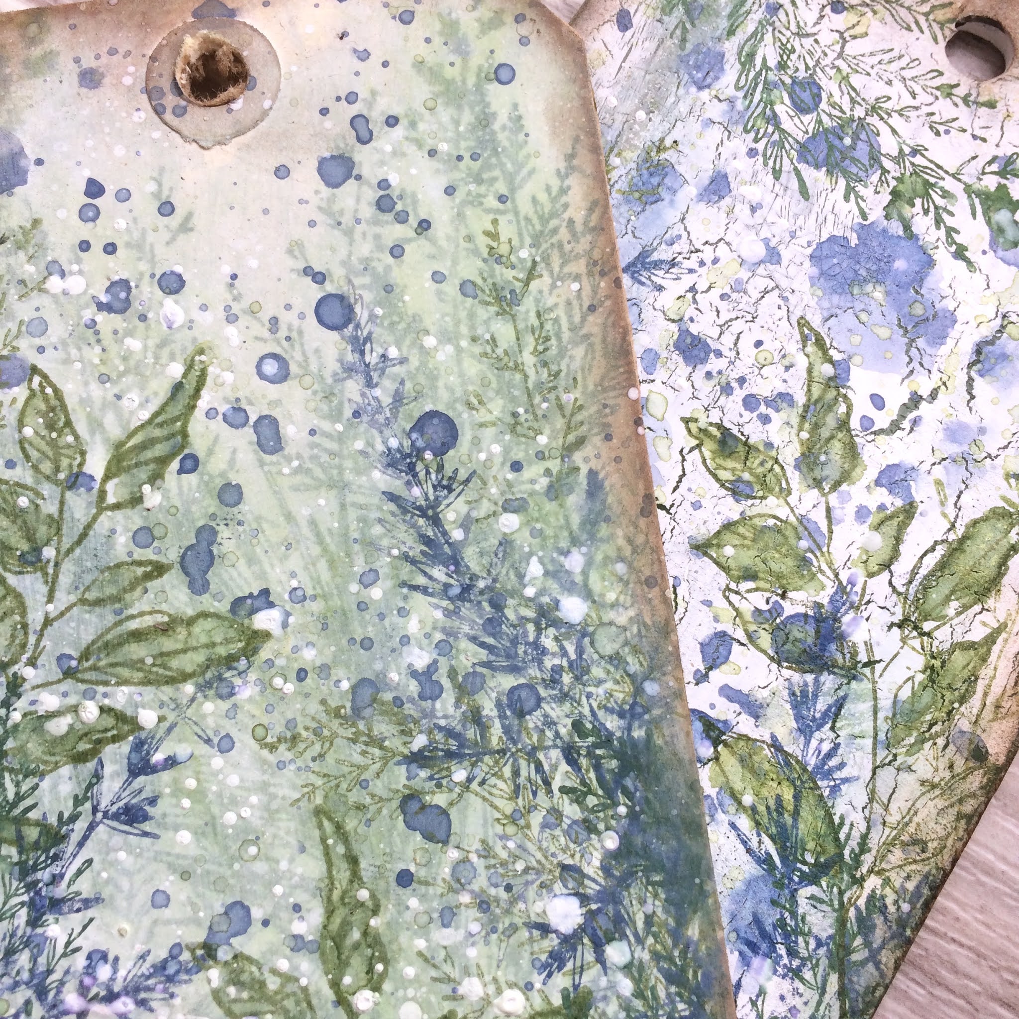
For those who want to know a bit about what I used here... one tag has a PaperArtsy crackle background (Snowflake over Crackle Glaze over something dark... don't know what any longer I'm afraid!) and some inky splodges of Stormy Sky and Chipped Sapphire Distress Oxide (and maybe other Inks and Oxides too).

The other has a soft smooshing of, I think, Speckled Egg and Rustic Wilderness over a white painted background, with Stormy Sky and Faded Jeans splodges over the top (there may be some Faded Jeans in both tags, come to think of it).

Then all the stamping is greenery from Tim Holtz's Sketch Greenery stamp plate - which I was lucky enough to win as part of a wonderful goody package from Tim and Mario.

The greens involved are Olive and Leaf Green Archival, tinted with Rustic Wilderness and Peeled Paint Inks and Oxides, and I think there's some Faded Jeans and Speckled Egg stamping too.

I hope you like them.  One has already made its way onto a card, and I'm sure I took some pictures, but at the moment I can't find a photograph of it.  The other is still waiting for some finishing inspiration to strike (and has joined the pile of backgrounds waiting for the same thing!).

I hope you're all doing okay, and I'm looking forward to spending a bit of time catching up with you again soon.

If we had no winter, the spring would not be so pleasant: if we did not sometimes taste of adversity, prosperity would not be so welcome.
Anne Bradstreet

To be interested in the changing seasons is a happier state of mind than to be hopelessly in love with spring.
George Santayana

Thursday, 10 December 2020

Happy Smiles

Hello all!  A couple of those Rustic Wilderness backgrounds I shared last week have made their way to completion with the help of a pair of Paper Dolls, and a touch of ephemera collaging.  Take a look...


The background stamping is courtesy of the Forest Floor stamp set.  The large fir branch in the background has a softer look as I spritzed the inks on it (Rustic Wilderness Oxide and Peeled Paint) with a bit of water before stamping.


The pinecones are stamped in Archival Coffee as far as I remember and it's all over a background of Antique Linen and Vintage Photo with maybe some Pumice Stone in the mix (only because there usually is some Pumice Stone in the mix round here!).


The darker, shorter-needled branches are stamped in pure Rustic Wilderness Distress Ink... such a rich deeply pigmented green.  It makes for perfect layering with the ability to put something really dark and impactful over the rest of the stamping.


The two girls are wrapped up warm against the winter cold, and have happy smiles...


... if not quite the twinkling eyes suggested by the Clippings word stickers!  This one clearly has more important things to do with her time than have her photo taken.


I hope you like all the winter foliage around here at the moment... it's been a long time obsession of mine from way before I was crafting.


The large tree and jugs and vases full of ivy and holly are the most important part of the Christmas festivities for me... along with plenty of candlelight and music.


So having these new foliage stamps to play with along with the fabulous rich green of Rustic Wilderness has certainly put a happy smile on my face.  Even with my limited craft time/energy, I'm loving the moments I do manage to grab at the craft table.

Thanks so much for stopping by, and I hope to see you again soon.  Don't forget to come and join in with our very last ever challenge at A Vintage Journey - we'd love to go out with a bang.  But most importantly stay safe and well until we meet again.

Between every two pines is a doorway to a new world.
John Muir

I'd like to play along at Country View Challenges where the theme is Anything Christmas
I'm hoping the twinkling eyes and the gleaming pearl droplets provide enough Christmas Sparkle to join in at Try It On Tuesday

Tuesday, 1 September 2020

September Leaves


Hello all and a very happy September to you.

I thought I'd drop in to share some more of the backlog of tags I've been creating with a newly active mojo here in the Czech Republic (overseeing the final stages of building work before coming back to the UK to pack up my life and ship it over here - all before 31st December... stressed, not much!).

But partly because of my limited travelling stash (fewer decisions to make - just got to go with what I've got), and partly thanks to Speckled Egg (a colour which fired my enthusiasm no end) I've found myself getting really inky at the craft table.

This is one of three backgrounds which all came into being together, but each took a slightly different journey as I worked out what to put onto them.  So here's the first of the three and the other two will tip up soon.


The background is a combination of inks and oxides, smooshed until they made my heart sing.


I stamped the Tim Holtz leaves onto another smooshed background and cut them out, clear-embossing the outlines before adding little sprinkles of Frantage Aged Silver.


I think that gives them a look of sparkling dew or sunlight catching glossy leaf edges.


In between the stamped leaves, I wedged some metal filigree leaves which have also had a coating of the Aged Silver powder.  The gleam is gorgeous without being too in your face.


The stars are also done with the Aged Silver over some stencilled texture paste.


The paste I used was a bit sloppy, so we haven't go the cleanest of finishes on the edges of the stars, but that really doesn't bother me.  I just love the gnarly knobbly texture.


The Quote Chip seemed like the right way to add the words.


I dyed the crinkle ribbons to match for the topping and tied them with some simple twine.  The fine silvery ribbon is cut out of the shoulder of a blouse (one of those ones they put in to keep them on the hanger, but I never use them for that... much better to add them to the craft stash!).


The sparkle is really rather lovely on this.  I don't get blingy very often but just occasionally it's fun!  I shared a little video clip of them on Instagram, but I seem to have deleted it before uploading it here.


I have still got the one of all three tags together though, so I'll make sure to hang on to that until I've posted all three, so you'll get to see the video in the third of the posts (if New Blogger lets me upload it).


Have just had to revert to Legacy yet again in order to get my photos where I want them.  If they don't sort it out before taking Legacy away, it is going to be the end of my blogging I think.  I am so sad, angry, frustrated, depressed about it.

Sorry, didn't mean to end on a down note.  I really hope you all have a wonderful September.  Happy crafting all.

I believe a leaf of grass is no less than the journey-work of the stars.
Walt Whitman


Sunday, 9 August 2020

Corrugated Quotes

Hello everyone!  I hope you're doing well, and not suffering too much in the heat (if that's what's happening where you are!).  I wanted to pop in to share probably my favourite samples from my latest round of stamp releases, launched by PaperArtsy in June.  It's a lo-o-ong one, so grab a cup of whatever keeps you going!


There's one sample for each of the stamp sets, so one quote comes from EAB18 Gardens & Growth, one from EAB19 Life & Living, and one from EAB20 Night & Day.  The colours for each were specific to each stamp set, but intended to co-ordinate overall with one another, so these work beautifully as a trio.


I was going to try to write this post in New Blogger, but then I decided I didn't want to waste my time getting frustrated.


For as long as Legacy is here, I'm sticking with it.  I can write a complex post very quickly.  With N.B. even the simplest post is a trial.


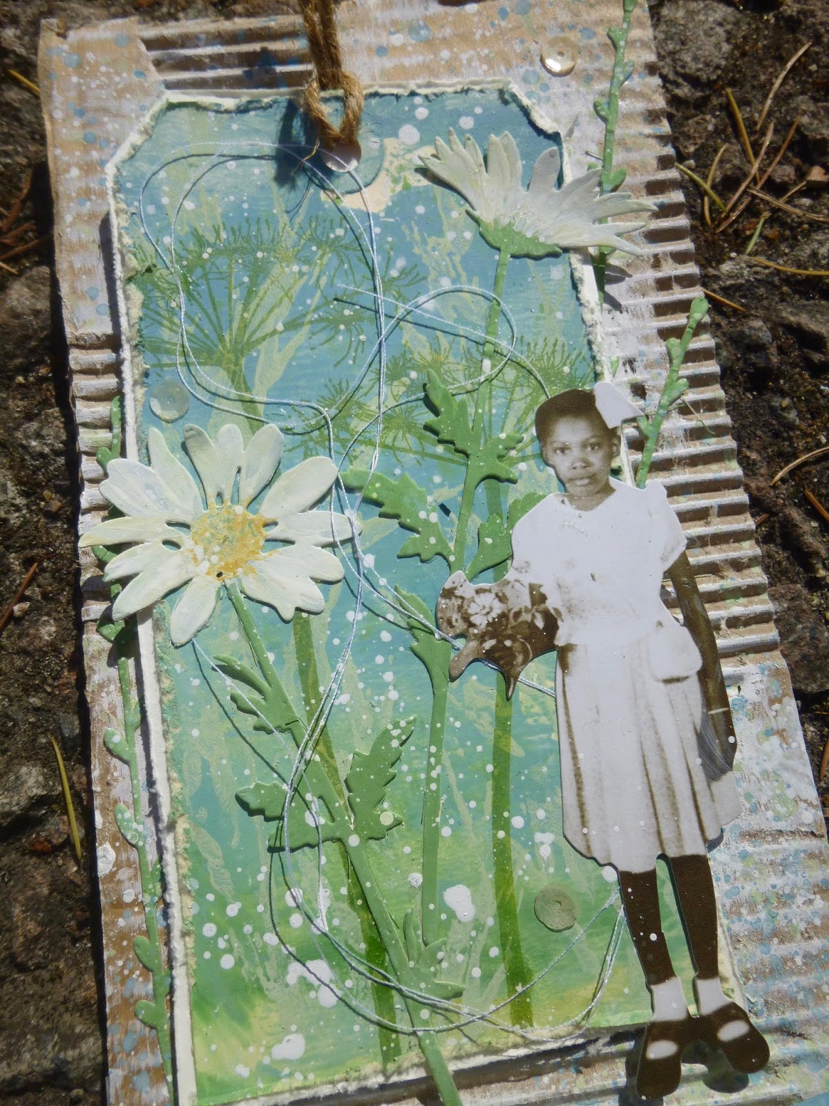
But on to happier things... this trio of tags.  You can see what they have in common... the Paper Dolls, the regular-sized colourful tag mounted over corrugated cardboard...


... the Tim Holtz Wildflower thinlits and Lin Brown's fabulous grasses from PaperArtsy ELB30.  These grasses always seem to play a part in my quote stamp samples, and here they are in triplicate!


I was also enjoying playing with 3D quotes with these arched banners.  Some of them were done on acetate (check out Double Sided Acetate if you missed those ones) but on two of these I went with a more conventional substrate for my arched words.


What's great about this technique is that you can use a quote that might be just a bit too wide to fit on the card or tag and still get it all on!


Let me take you through a few process pictures so you can see how they all came together, but mostly I'm going to share pretty close-ups, so feel free to scroll on and enjoy those!


Let's start with EAB18 Gardens & Growth (might as well go in number order so that I don't get completely confused!!).

I stamped the grasses in paint over a brayered background - there's a lovely softness to the paint stamping, as though the grasses are blowing in the wind.


I decided to have another layer of stamping, so this Hot Picks wildflower stem appears in Leaf Green Archival.  I stamped the stem again upside down to make it long enough, and you get one of those lovely knotty bits in the stem into the bargain - very true to life.


I cut the Thinlits stems from another piece of painted card, and used more Fresco paints to add the petal details. 


Some are tucked behind the tag, and some are layered on top.  It all adds depth and dimension.


The twisting cotton thread adds movement and intricate detail.


The quote is stamped in Leaf Green Archival and clear-embossed so you get that little touch of gloss to catch the light.


And I blended on a little bit of co-ordinating paint around the edges to draw the eye in towards the words, before fixing it in place with a couple of Idea-ology fasteners.


I love this little girl, so I'll forgive her for picking flowers in my garden!


Onwards to EAB19 Life & Living...  a quick look at the early stages first.  For this, I used one of a pair of sponged tags (you've seen the other in action already on the Life & Living acetate tag linked to above).


This time the grasses are stamped in Archival so you get that lovely sharp look.  I combined Leaf Green and Olive Archival inks directly on the stamp for a slightly variegated look.


The tag I cut some of the Wildflower thinlits from was a bit dark, so I sponged on some gesso and got this really lovely mottled look.


And you'll see that others have a little bit of script stamping to add extra detail.

Again the cotton thread swirls around to help give a sense of movement and life.  (Ignore the little seedpod near the bottom star - it's not a permanent fixture.  I was photographing outside.)


Speaking of the stars - they're moulded in paperclay in one of the Finnabair silicone moulds.


Since it's clearly twilight, I thought the stars might just be starting to appear.

I gave them a rough coating of white embossing powder so that they would be the same colour as the text stamping, rather than just having the plain paperclay matte finish.


And there's another segue to the white-embossed words themselves.  Since the colour palette for the Life & Living samples included the lovely Lavender and Wisteria Fresco paints, I decided to echo the twilit sky at the top of the tag for the quote down at the bottom.


It brings those soft purple tones to the fore on the panel as a whole.  It's fastened in the same way as the one on the Gardens & Growth panel, even though this quote would have fitted lying flat.


The boy is one of my all-time favourite Paper Dolls, so it's only fitting that he takes his place on this, with one of my favourite quotes (by Oscar Wilde).


And it may also be my favourite of all the samples.

(Sshhh, don't tell the others - and in any case the Gardens & Growth girl and tag is such a close second as to make no odds!). 


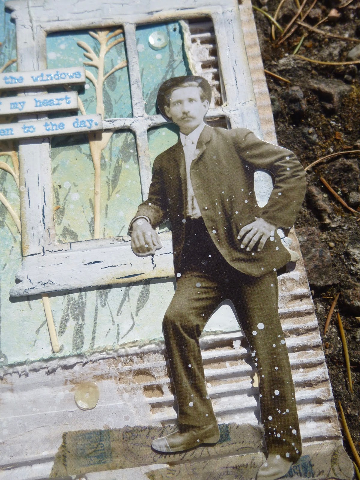
And so to Night & Day... (This post has probably taken you all day and all night so that seems appropriate!).  I don't seem to have anything in the way of process photos for this one, but you get the idea by now.


The ombre tag in the background is another sponged affair - I love the subtle blending capability a natural sponge gives you.  (Again, you can see its partner in the acetate tags linked before - you get a better look at the effect there.)


And I think here we're probably at the start of the day...  throwing open the windows to the day.  The window might be very weathered (with PaperArtsy Crackle Glaze), but it still lets in the golden dawn light.


The Thinlits stems here play the role of the ripening corn...


... as do the grasses, stamped in Pumice Stone against the sky.


The quote is stamped in some Stampendous powder which happily echoes the Sky Fresco paint of the background, as well as catching the light to make me happy!


I decided I really wanted to include the author of the words this time.  Quite apart from anything else it adds an important balancing element to the composition of the whole piece down there at the foot of the panel.


Our Paper Doll looks more than ready to throw his heart into his day's work, whatever that may be, but however high his heart is leaping... 


... his feet are firmly grounded on some Idea-ology Design Tape.


Phew, I think we made it!  I hope you like them as much as I do.  I really enjoyed creating this triptych... even though it was an unconscious one.  I didn't plan it like this from the start.

They weren't made together... each was created along with the samples for the rest of that quote set, but as the days progressed I obviously gave in to letting them echo one another, and by this third panel, it was a conscious process.


I wanted the Lin Brown grasses again, so I used them again.  I wanted some more corrugated card,  so I grabbed some more.  I wanted the Wildflower Thinlits to add another layer, so I let myself have them.  I wanted another arched quote, so I made one.

And by the end I was a happy woman.  As a triptych, they're one of my favourite makes of all time, all the better for being slightly accidental.  Serendipity is a wonderful thing.


Thank you so much for stopping by today.  As you know, this blog is as much my own personal scrapbook for my creations as anything else.

It's an endlessly happy bonus to have your company as I keep my records of what I did and how.  For that, and for your lovely comments and for the inspiration I find as I hop around Craftyblogland, you have my thanks now and always.  Stay safe, stay well everybody.

I am working here (in Amsterdam) on my last big triptych, which will be a tremendous story, and which gives me a more intense life and exhilaration. My God, life is worth living!
Max Beckmann