I'm travelling into a new way of working, a new country, a new language, and a new hobby which I'm passionate about. Come with me for some of the journey...
Hello all - hope you're all doing well. I'm here with a quick heads-up to let you know there's a new series starting today on my YouTube channel called A Few Minutes of Fun. Something to add to the monthly Sunday Swatching videos. (Yes, my New Year's resolution to build the channel is still on course and we're nearly at the end of February!)
My aim for this series is to share a few minutes of art and crafting fun once a week, either on a Friday or a Saturday - usually somewhere between five and fifteen minutes, depending on what we're playing with. Look at what I've been up to in the craft room today...
For this first episode, I've been playing with some Gypsophila stems on the gel plate, using some of my favourite colours of PaperArtsy Chalk Acrylic paint. Why not start the weekend by joining me at the craft table for a little bit of printing inspiration? It's great fun seeing these prints come to life.
And while you're there, I hope you'll choose to subscribe to the channel. Likes and comments also help me with the YouTube algorithm, so if you feel the urge... But mostly, I just hope you enjoy the fun, and take away some inspiration.
Have a great weekend, all!
Do anything, but let it produce joy. Walt Whitman
It is a happy talent to know how to play. Ralph Waldo Emerson
I'm so thrilled to show you in detail the results of a very special collaboration between Fodder School, PaperArtsy and Words & Pictures. If you take another look at the Fodder School 3 project I will be teaching, you may be able to guess at some of what's coming up!
I am absolutely delighted to have had the chance to design a brand new, original stamp set especially for my Fodder School 3 project - the Fodder Berry Edition. The plate has beautiful berry variations with complementary quotes and small ephemera for background detailing.
Plus I've curated three sets of their fabulous Fresco Finish Chalk Acrylic paints, combining colours specifically geared around this project, for the backgrounds and for painting botanical imagery, but of course they will be great for that whether you're making this project or not! The sets are: Botanical Basics, Berrylicious Brights, and Background Blues.
Botanical Basics - Three primaries (chosen to create my signature "cool" palette),
a dark (my much-loved French Roast) and a light (Snowflake - well, of course!).
This set is designed to create a palette for botanical painting...
... and you also get a glaze - for extra-shiny berries!
Berrylicious Brights - a fabulous berry bright palette, perfect for mixing berry or floral colours.
It will also take you through the berry seasons from summer into autumn.
A great way to augment the Botanical Basics.
Background Blues - steely cool blues along with a cool grey and a warm grey,
designed to create subtle layered backgrounds to let bright botanicals pop over the top.
It's absolutely not required to buy any of them in order to do my class - Fodder School actively encourages you to use what you have already in your stash. Not all of the berries you see on the houses are stamped... one element of the classes I'll be teaching is about sketching them for yourselves! Obviously, the stamps make life so much easier, so they are there for those who would like to add them to their stamp collection! You can find more details here on the PaperArtsy website and your local independent PaperArtsy stockists (worldwide) should be able to help you out if you'd like to get your hands on them.
And of course you don't have to be signed up to Fodder School to play with these new designs, but you might want to think about coming on what I have no doubt will be an incredible year-long creative journey. If you've seen any of the Fodder Challenge inspiration on offer, you already know what an amazing opportunity this is going to be.
The Early Bird Pricing offer is $207.00 USD plus tax for the year. As a lump sum, it feels a lot, but that’s an entirely new mixed media art course each month for $17.25 USD + tax per month - that's just over €15, or around £13.50 at current exchange rates. (This deal will last for five days only from 21st - 25th July so grab it while you can.)
There are loads more details about all that in my previous post, so I won't repeat it all here. I really just wanted to share my excitement about having these new PaperArtsy toys to play with. You can see more of the houses on the move in my own little personal Fodder School 3 video (the full trailer was in the previous post)... see below or simply click here.
I'm really excited about the whole Fodder School adventure, and about these lovely new PaperArtsy/Fodder products, and so grateful for the collaboration that has brought them to life. I hope you will be too.
Happy Sunday, all!
Better than any argument is to rise at dawn and pick dew-wet red berries in a cup. Wendell Berry (!)
On the motionless branches of some trees, autumn berries hung like clusters of coral beads, as in those fabled orchards where the fruits were jewels... Charles Dickens
Hello all! I'd like to invite you to go hopping over to the PaperArtsy blog where I've been busy playing with the current Stamp Mash Up theme. This fortnight we've all been combining stamps by Lynne Perrella, Ellen Vargo, Gwen Lafleur and me, Alison Bomber! Here's a sneak peek of what I came up with... may I introduce you to the Monarchs of the Ice?
You can see stamps from all the designers in the mash-up except me in this sneak peek... To find the words, you'll just have to hop over to PaperArtsy.
Of course, there are also lots more photos and plenty of information about the making-of process - it wasn't all smooth skating! - as well as some more close-up angles. And it's really worth having a scroll around while you're there to see the different projects this combination of designers' stamps has inspired. There are even a couple more to come after this one.
In any case, I hope you enjoy your visit to the sparkling kingdom of ice shards and snowflakes, and that it inspires you to combine your stamps in new ways too.
Thanks so much for stopping (and for hopping), and I'll see you again soon... or not, given that my laptop may be about to die on me as I write this - which is a week before you're reading it. Please keep your fingers crossed for me!! Either way, happy crafting all!
It is the life of the crystal, the architect of the flake, the fire of the frost, the soul of the sunbeam. This crisp winter air is full of it. John Burroughs
Hello all, I'm over at the PaperArtsy blog this evening with some Shades of White for their current inspiration theme. I decided to see if I could work with contrasting white...
There's not a lot of contrast available between shades of white, so the resulting pair of tags are pretty subtle, but I rather like them. If you have time to hop over and check them out, I'd love to know what you think. Thanks so much for stopping and hopping, and I'll see you again soon.
White. A blank page or canvas. So many possibilities.
Stephen Sondheim
Hello everyone! I hope you're doing well, and not suffering too much in the heat (if that's what's happening where you are!). I wanted to pop in to share probably my favourite samples from my latest round of stamp releases, launched by PaperArtsy in June. It's a lo-o-ong one, so grab a cup of whatever keeps you going!
There's one sample for each of the stamp sets, so one quote comes from EAB18 Gardens & Growth, one from EAB19 Life & Living, and one from EAB20 Night & Day. The colours for each were specific to each stamp set, but intended to co-ordinate overall with one another, so these work beautifully as a trio.
I was going to try to write this post in New Blogger, but then I decided I didn't want to waste my time getting frustrated.
For as long as Legacy is here, I'm sticking with it. I can write a complex post very quickly. With N.B. even the simplest post is a trial.
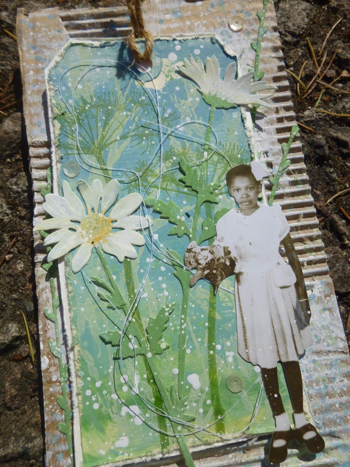
But on to happier things... this trio of tags. You can see what they have in common... the Paper Dolls, the regular-sized colourful tag mounted over corrugated cardboard...
... the Tim Holtz Wildflower thinlits and Lin Brown's fabulous grasses from PaperArtsy ELB30. These grasses always seem to play a part in my quote stamp samples, and here they are in triplicate!
I was also enjoying playing with 3D quotes with these arched banners. Some of them were done on acetate (check out Double Sided Acetate if you missed those ones) but on two of these I went with a more conventional substrate for my arched words.
What's great about this technique is that you can use a quote that might be just a bit too wide to fit on the card or tag and still get it all on!
Let me take you through a few process pictures so you can see how they all came together, but mostly I'm going to share pretty close-ups, so feel free to scroll on and enjoy those!
Let's start with EAB18 Gardens & Growth (might as well go in number order so that I don't get completely confused!!). I stamped the grasses in paint over a brayered background - there's a lovely softness to the paint stamping, as though the grasses are blowing in the wind.
I decided to have another layer of stamping, so this Hot Picks wildflower stem appears in Leaf Green Archival. I stamped the stem again upside down to make it long enough, and you get one of those lovely knotty bits in the stem into the bargain - very true to life.
I cut the Thinlits stems from another piece of painted card, and used more Fresco paints to add the petal details.
Some are tucked behind the tag, and some are layered on top. It all adds depth and dimension.
The twisting cotton thread adds movement and intricate detail.
The quote is stamped in Leaf Green Archival and clear-embossed so you get that little touch of gloss to catch the light.
And I blended on a little bit of co-ordinating paint around the edges to draw the eye in towards the words, before fixing it in place with a couple of Idea-ology fasteners.
I love this little girl, so I'll forgive her for picking flowers in my garden!
Onwards to EAB19 Life & Living... a quick look at the early stages first. For this, I used one of a pair of sponged tags (you've seen the other in action already on the Life & Living acetate tag linked to above).
This time the grasses are stamped in Archival so you get that lovely sharp look. I combined Leaf Green and Olive Archival inks directly on the stamp for a slightly variegated look.
The tag I cut some of the Wildflower thinlits from was a bit dark, so I sponged on some gesso and got this really lovely mottled look.
And you'll see that others have a little bit of script stamping to add extra detail. Again the cotton thread swirls around to help give a sense of movement and life. (Ignore the little seedpod near the bottom star - it's not a permanent fixture. I was photographing outside.)
Speaking of the stars - they're moulded in paperclay in one of the Finnabair silicone moulds.
Since it's clearly twilight, I thought the stars might just be starting to appear. I gave them a rough coating of white embossing powder so that they would be the same colour as the text stamping, rather than just having the plain paperclay matte finish.
And there's another segue to the white-embossed words themselves. Since the colour palette for the Life & Living samples included the lovely Lavender and Wisteria Fresco paints, I decided to echo the twilit sky at the top of the tag for the quote down at the bottom.
It brings those soft purple tones to the fore on the panel as a whole. It's fastened in the same way as the one on the Gardens & Growth panel, even though this quote would have fitted lying flat.
The boy is one of my all-time favourite Paper Dolls, so it's only fitting that he takes his place on this, with one of my favourite quotes (by Oscar Wilde).
And it may also be my favourite of all the samples. (Sshhh, don't tell the others - and in any case the Gardens & Growth girl and tag is such a close second as to make no odds!).
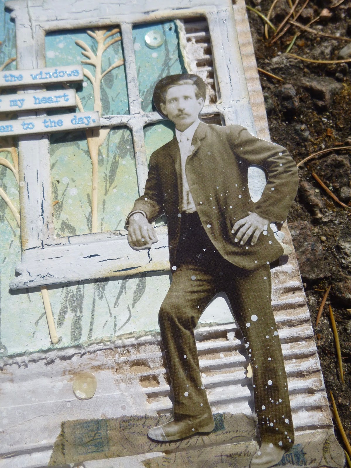
And so to Night & Day... (This post has probably taken you all day and all night so that seems appropriate!). I don't seem to have anything in the way of process photos for this one, but you get the idea by now.
The ombre tag in the background is another sponged affair - I love the subtle blending capability a natural sponge gives you. (Again, you can see its partner in the acetate tags linked before - you get a better look at the effect there.)
And I think here we're probably at the start of the day... throwing open the windows to the day. The window might be very weathered (with PaperArtsy Crackle Glaze), but it still lets in the golden dawn light.
The Thinlits stems here play the role of the ripening corn...
... as do the grasses, stamped in Pumice Stone against the sky.
The quote is stamped in some Stampendous powder which happily echoes the Sky Fresco paint of the background, as well as catching the light to make me happy!
I decided I really wanted to include the author of the words this time. Quite apart from anything else it adds an important balancing element to the composition of the whole piece down there at the foot of the panel.
Our Paper Doll looks more than ready to throw his heart into his day's work, whatever that may be, but however high his heart is leaping...
... his feet are firmly grounded on some Idea-ology Design Tape.
Phew, I think we made it! I hope you like them as much as I do. I really enjoyed creating this triptych... even though it was an unconscious one. I didn't plan it like this from the start. They weren't made together... each was created along with the samples for the rest of that quote set, but as the days progressed I obviously gave in to letting them echo one another, and by this third panel, it was a conscious process.
I wanted the Lin Brown grasses again, so I used them again. I wanted some more corrugated card, so I grabbed some more. I wanted the Wildflower Thinlits to add another layer, so I let myself have them. I wanted another arched quote, so I made one. And by the end I was a happy woman. As a triptych, they're one of my favourite makes of all time, all the better for being slightly accidental. Serendipity is a wonderful thing.
Thank you so much for stopping by today. As you know, this blog is as much my own personal scrapbook for my creations as anything else. It's an endlessly happy bonus to have your company as I keep my records of what I did and how. For that, and for your lovely comments and for the inspiration I find as I hop around Craftyblogland, you have my thanks now and always. Stay safe, stay well everybody.
I am working here (in Amsterdam) on my last big triptych, which will be a tremendous story, and which gives me a more intense life and exhilaration. My God, life is worth living!
Max Beckmann
Hello all! I'm here with a trio of altered money envelopes today. They were made as samples for one of my latest stamp sets, launched last month by PaperArtsy. All the quotes on these come from EAB19 Life & Living. They ended up needing to be a trio because each of them starts with the phrase "Life is..." (or in one case "Life isn't..." but it then goes on to tell you what "Life is..." in the second half!). The cash envelopes are actually just slightly larger than ATC sized, especially when you leave the top flap open, as I have, to receive possible gift vouchers or cash as a gift. I won't keep you long, as these were really pretty simple to make, but just in case you want to know how, keep reading.
I started by smearing gesso onto the envelopes with a palette knife. It's really not important to be neat or precise with this bit.
Next, I added watery washes from the chosen palette - a green-turquoise-blue-purple spectrum.
Once that was all dry, I stamped some of Courtney's fabulous leaves from ECF06, combining Leaf Green and Olive Archival directly on the stamp. Some of the postmarks from the same set are stamped around the place in French Ultramarine Archival.
The French Ultramarine is actually a soft purply pale blue, so fitted perfectly with the paint palette.
I stamped the quotes on separate pieces of card, and embossed them in Wow Earthtone Pepper.
I love this speckled grey, especially when it catches the light... it makes me very happy.
And I did want to have the authors' names somewhere in the mix. Obviously, you can just cut them off and discard them, but sometimes I like to have them around.
Rather than have them conventionally attached somewhere as a footnote, I used them as little balancing accents in opposite upper corners.
Okay, Helen Keller made it to footnote sort of place in the bottom corner, but only because that was the position needed to get a balanced composition.
The cotton thread adds movement and dimension.
I love how the spontaneous coils and swirls bring everything to life. And of course there's plenty of splatter, which I find has a similar effect.
If I'm using the method of stamping on a separate piece of paper and then cutting the quotes up, rather than stamping straight on a project, the positioning of the words is worth some attention.
For instance, with this Einstein quote, you can create the pause needed for the comic timing of the quote by leaving visual space between the words. But maybe that's just me... I know I do have a strange and particular brain as far as words are concerned!
So there you go - another batch of samples from the new stamp sets. I hope you like them. My favourites are still to come. That's going to be a more complicated blogpost to write.
Hopefully now I'm safely settled in the Czech Republic (for a few weeks at least - all a bit up in the air, depending on building work) I'll have more time to play with. I've got most of the unpacking done, and the travelling craft stash organised... there's quite a lot, though the pile is smaller than on some occasions in the past - have a look here, third photo down!).
Three Tim Holtz stamp folders, plus assorted extra stamps; plenty of Distress Ink and Oxide pads in the TH Cargo Case; tools and brushes and powders in the little Wendy Vecchi bag; and a couple of cardboard boxes rammed full - here's a sample of the top layer of the little one. Next time out I'll try to remember to show you a couple of pictures of my current set up. I hope you're all thriving this week, or at least surviving. Stay safe, stay well everyone, and happy crafting! Life is a series of natural and spontaneous changes. Don't resist them - that only creates sorrow. Let reality be reality. Let things flow naturally forward in whatever way they like.
Lao Tzu