I'm travelling into a new way of working, a new country, a new language, and a new hobby which I'm passionate about. Come with me for some of the journey...

Sunday 17 February 2019

Yellow Wallflowers

Hello all.  I'm so happy you're as excited by my new PaperArtsy word stamps as I am - thank you for your lovely comments.  And now, welcome to a New York-based post, though these pages were actually created while I was still at home.  There's no die-cutting machine in the travelling stash, of course, and I really wanted to try out the new Tim Holtz Wildflower Thinlits before I disappeared to the other side of the Atlantic for a couple of months.  So here they are...


I did promise I'd do better with my yellows for the Art Journal Journey theme of The Colour Yellow this month, so this page spread is also fulfilling that pledge.  And for all that I'm a reluctant user of yellow, I found myself really loving it once I'd worked it into the natural world.


These daisies nestled against the brick wall make me very happy.  Get yourself a nice cup of coffee and enjoy the journey along the yellow brick road...


I was playing in the same altered book as for most of my recent pages.  I'm very sad I couldn't squeeze it into the travelling stash, as I was on a bit of a creative roll with it. 


I started by roughly gessoing over the text, before adding some texture sand paste through the Wendy Vecchi brick stencil.

I used Antique Linen Distress Spray to add some warm Cotswold stone colour to my "walls".  (See, I'm getting in there early with some yellow tones... more to come!)


I cut several stems from the new Tim Holtz sets out of watercolour paper and had a little play to see what might go where.


Then it was out with the Distress Stains to watercolour the wallflowers.


There's Antique Linen, Scattered Straw and Wild Honey involved for the yellows...


... but also Weathered Wood and Pumice Stone for the centre of the flower head, as well as for shading.


The stems have Pumice Stone, Old Paper and Peeled Paint in the mix, and some of those colours also wandered up into some of the petals for some more shadows and detail.


I mostly tried to leave my white space on the petals untouched, but there are just a couple of spots where I added tiny touches of white acrylic afterwards.


That includes the centre of the flowers, where I used a white paint pen for the highlighting and my dip pen and some walnut ink for the shading and floret detailing.


And there are some white pen detailing touches on a few of the other petals too.


I decided the tall, slender die-cuts would be twiggy stems in bud, so that gave me another chance to add a touch of yellow - though I'll confess it's back to the most delicate of Antique Linen yellows, rather than the full-on version!


I did make sure there was plenty of yellow spatter across the brickwork and book text... mainly Antique Linen and Wild Honey, if memory serves.


And I chose the primrose-toned word stickers from the Finnabair Art Daily collection.


That's the Daniel Smith walnut ink again, framing and shadowing the words...


... applied with the dip pen and then shaded out with a water brush under each sticker.


I also added some dip pen detailing to the leaves and stems.


There are some deeper shadows at the foot of each cluster of flowers...


... as well as some inking around the edges of the pages, which looks great over the brick texture.


And some Antique Linen script stamping to contrast with the typed text of the book pages.

And that's pretty much that.


Yellow is said to be a lovely cheerful colour (which makes it a little worrying how rarely I'm tempted to use it!)...


... and there's no doubt that these pages made me happy in the making and also make me happy in the looking.  Maybe I need to use yellow more often?

I had such a lovely time "colouring" the flowers.  I'd planned to do some die-cutting so that I could bring lots of unpainted ones with me and have them to play with here.


Sadly, time ran away from me in the packing process, so I'll just have to be patient and wait until I'm home again.


Thanks so much for stopping by today.  I hope you're all enjoying a lovely Sunday.  The weather's not due to be great, so I don't think it's going to be a good day for much New York walking on my one day off.  I hope to get out and about during the morning.


But then in the afternoon I'm looking forward to having a bit of time to come and see what you've been up to lately.  Happy Crafting all!

It takes as much time to build walls sturdy enough for wallflowers like you and me to lean against, as it does for us to bloom.
Ayokunle Falomo

I said I'd be back with something yellower for Rike's theme, The Colour Yellow, over at Art Journal Journey - and here I am!
With the word stickers, as well as the book pages in the background, I'm entering this in the Simon Says Stamp Monday Challenge, where this week they are looking for Typography
At Happy Little Stampers,they are having their usual Anything Goes with Dies challenge, so I'd like to play along there
There's also a Watercolour Challenge over at Happy Little Stampers, so with my Distress Stain watercoloured flowers, I'd like to join in there too

Wednesday 13 February 2019

New PaperArtsy Stamps!

Hello all!  I'm thrilled to be with you on Valentine's Eve (that must be the night before Valentine's Day, right?) to announce the arrival of some brand new Eclectica³ Alison Bomber stamp sets at PaperArtsy.


There are three new sets of quotes celebrating love, friendship and the possibilities of taking flight.  All the details are over at PaperArtsy this evening, with some samples I've created with the new words.


And over the next couple of nights the launch continues.  You can see more projects over at PaperArtsy, made by two of the PaperArtsy design troupe using just some of the quotes from the new stamp plates.  (Now live - see Josefine's gorgeous tag here and Alison (Craftytrog)'s card designs now too.)

I felt we could do with as much positivity as possible going in to 2019, and I've been so inspired by these new word stamps.  Do hop over and check it all out.  I hope they'll make your imaginations soar too.  Happy crafting all!

Just try new things. Don't be afraid. Step out of your comfort zones and soar, all right?
Michelle Obama

Saturday 9 February 2019

Follow Your Path

By the time you read this I'll probably be in the air, bound for New York for another working trip; or perhaps I'll even already arrived (depending on when you arrive here at Words and Pictures).  I'm all for following your path, as this journal page recommends, but my path does seem to involve a lot of travelling, one way or another!


We've been dabbling in green and even yellow (!) for several of the past few posts (mostly obsessed with the new Organic Thinlits die - see it in action in on a tag or a journalling page), and there are some more of those colours to come.  But I'm taking a diversion back into my favourite blues and browns for this page, working in the France Papillon altered book again.


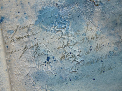
I started by gessoing the pages and then scraping on some old crackle paste just before bedtime.  It was fairly hard and uncooperative, so I wasn't at all sure it would work.

But the next morning there were some really cool crackled parts, which I spritzed with Distress Spray.


I can't remember now whether it was Faded Jeans or Stormy Sky, but so far at this point, it's all only one colour.

I love that where I heated the pages to dry the Distress Spray, the crackle and gesso have all interacted to create these fabulous bubbles of extra texture.


The next step was fiddling with the composition of lots of metal elements to go on the page.  And I also had a pretty clear idea about which word stickers I wanted to use.


I seem to be in a floral frame of mind at the moment, because I was driven to the next step almost without realising it was happening.


I stamped these gorgeous trailing tendrils (from a Rubber Dance set called Weed Love) in Sepia and Coffee Archival here and there - well, almost everywhere, really.


I'd also added some splatters of a slightly more vivid blue by this point - the Cosmos Blue Colorex ink, much beloved in my Winter Journal pages - and some script stamping done in Watering Can Archival.


I realised that the weight of all that metal might be too much for the book pages - even though they were already glued back to back for extra strength.  So I glued on some reinforcing kraft card panels behind where the cogs and clocks were going to go.


Then I got alcohol inky with my metal embellishments.


All of them got a splash of either Ginger, Rust or Espresso...


... or sometimes a combination of more than one of them.


Now to the word stickers, from Finnabair's Art Daily collection.  As a text & voice coach, the first phrase leapt straight out at me.


It's very important not to hurry things, especially with big changes afoot.

This sticker put in an appearance on my What you seek spread too, in one of its other colourways, so it's definitely calling to me at the moment.


And this one's pretty self-explanatory.  Gut instinct has played a big part in my life decisions, and when you follow those instinctive prompts, you have to go head first and full on.


Above all... never give up.  My junior school (elementary school to the Americans) motto was "Persevere!", so this idea has been with me for a long time.


There's lots about this page spread which makes me very happy.  The colours, of course, but also the fairly spare composition, even though the textures and layers are complex and detailed.


There's a simplicity to the circular shapes of cogs and clocks, with the twining tendrils providing a more organic contrast, and the word stickers giving us the only straight lines and corners.


Ah yes, those tendrils - that really was the step that lifted this page into something special for me.


And I honestly don't remember the conscious decision to do it.  I just found myself there with the ink and the stamp ready to go!


I always love my crackle, of course (I've put two different kinds in my travelling stash for NYC, which is probably excessive, but there you go).  And for a last minute touch I highlighted the crackle with some gilding wax.


There are touches of the gilding just brushed onto the metal pieces and even the edges of the word stickers in places.  It's a lovely extra touch of light.


Brown, blue, crackle, book text and words... what more could a woman want?  Well, maybe just a little more time...


I'm going to take my time settling in to the swing of rehearsals in New York, but some time soon I'll share what's in my travelling stash with you, if you're interested.  And there's another journalling page heading your way shortly, done before I left the UK, with some more of Tim's new Thinlits in action (and some more yellow!!).


Before that, though, I'll be back in a few days with a very exciting post - in the evening on the 13th, in fact... unlucky for some, but I don't think it applies in this case - at least, I really hope not!  I do hope you'll be able to join me then for some big news.

In the meantime, thanks so much for stopping by today, and I hope you'll all be following your paths passionately this weekend.  Happy crafting all!

When the whole world is silent, even one voice becomes powerful.
Malala Yousafzai

I'd like to make this my third and final entry for this month at the Creative Artiste Mixed Media Challenge where, as always Anything Mixed Media Goes
Anything Creative Mixed Media Goes also over at the Love 2 Create Mixed Media Challenge so I'm playing along there too