I'm travelling into a new way of working, a new country, a new language, and a new hobby which I'm passionate about. Come with me for some of the journey...

Sunday 31 January 2016

Flutter by...

Hello all.  I'm glad you enjoyed the colourful hop-out-of-kin of my Be Brave tag for Tag Friday!  It's just a quick sneak peek here today at Words and Pictures so, although it's lovely to see you, I'm going to invite you to flutter on by towards the Country View Crafts Projects blog...


... and your trouble will be rewarded by some butterflies!  I hope you have time to flutter by and see what I've been up to, and I hope you're all having a lovely Sunday.  See you again very soon!

Not quite birds, as they were not quite flowers, mysterious and fascinating as are all indeterminate creatures.
Elizabeth Goudge

Friday 29 January 2016

Be Brave

Hello everybody.  It's lovely to see you again in a busy week here at Words and Pictures.  I'm glad you enjoyed my altered vintage bottles.

I'm here today because it's Tag Friday over at A Vintage Journey - that extra Friday in a month which means that the Creative Guides just get out their tags and play.  There are some amazing tags by my fabulous fellow Creative Guides for you to enjoy over at the Tag Friday post at A Vintage Journey - well worth a few minutes of your time during a coffee break some time today.


Tag Friday is always a favourite for me.  Usually I use it as an excuse to just play with my favourite inks and stamps, but this time I've used it to be brave with a different colour palette.

With this layered tag, I've definitely been influenced by some of the fabulous Polish crafters I follow - check out JaMajka, Dorota, or Ewa at Cynkowe Poletko (Zinc Plot) as well as the Russian, Elena Morgun.

If you've never seen their work, you're in for a treat.  I would blame my Eastern European (Czech) heritage for loving all these Polish crafters (and there are more...) but I think it's just that they make very beautiful things!


But really the major influence on this particular tag is another Pole -  Czekoczyna a.k.a. Kasia Krzyminska, whose work I've admired for a long time.

It's unsurprising she should be an influence at the moment, given that she's co-ordinating the Wanderlust 2016 course which I'm very much enjoying when I get the time.  She's also teaching some of the classes.


Of course, it's not unheard of for me to use these kinds of colours (check out this tag in a bag if you don't believe me - and there have been other occasions too), so it's actually the use of the black which feels more iconoclastic to me...

In terms of texture, layers and composition, I guess it's still me though.


I started with some papers from the Tim Holtz Vintage Shabby stack (no longer around, sadly).  One of my resolutions is to use some of my hoarded paper stash, so I'm trying to be good.

I applied Ranger Transparent Matte texture paste through the Burlap Layering Stencil.


Once that was dry, I gesso'd lightly over the whole thing and started adding some inky colour (Spiced Marmalade and Picked Raspberry mainly) by unscrewing the Distress Spray lids and scribbling with the ends of the spray hoses.


Sometimes I spritzed with water for softer colour, and sometimes I dried it so that the scribbles would be nice and bold.  Scribbling was one of the things I found I loved when making my Wanderlust Travel Journal, so you can expect to see more of it round here I think.


The photo is, of course, one of the Idea-ology Photobooth pictures.


The determined gleam in her eye dictated the words chosen from the Small Talk stickers.

And it was when I had those black word stickers that I decided to be braver myself and add some more black detailing.


So I used my favourite alphabet stamp from the Documented set and stamped it in Jet Black Archival.  And I did some spritzing with the Black Soot Distress Marker too.  (I think that's a Prima screw head at the top of the smaller tag, just in case you're interested.)


It's really very rare for me to stamp in black... I'm almost always a brown stamper (Coffee, Sepia or Potting Soil? - that's usually the main question).  Or sometimes I'll push the boat out with Olive, Cobalt or Watering Can.  But black is scary - even in these tiny amounts!


Once that was there, though, I felt brave enough to skim the shabbied edges of the tags too - and I do quite like the bolder grungy look it gives.


There are some Idea-ology flowers with added skeleton leaves tucked in around the place.


And I added some wisps of cheesecloth - some before inking and some after...


... so some of them are inkily colourful, and others wisp delicately away in white.


... and of course there's some dyed crinkle ribbon to top the whole thing off.


So, there you have it... A Vintage Journey's Tag Friday - sometimes an excuse to play in my comfort zone, but today a chance to push the boundaries of that zone a little wider.  I'd love to know what you think.

I'm back once more before we wave goodbye to January but, in the meantime, have a wonderful weekend whatever you're up to.

Courage is what it takes to stand up and speak.  Courage is also what it takes to sit down and listen.
Winston Churchill

Be brave enough to live life creatively.  The creative place where no one else has ever been.
Alan Alda


Wednesday 27 January 2016

Bottling It Up

Hello all.  Thank you so much for your lovely response to my Wanderlust Travel Journal.  I hope I'll be able to return some visits over the next few days - I've been a bit distracted lately (all with good things, don't worry - just time-consuming).  I'm back today with my second inspiration offering for Brenda's wonderful "Inspired by Bottles" theme at Country View Challenges.


You've only got a few days before the end of the month, but I hope this might nudge you in to action.  Although there are already lots of great projects, it's always the more, the merrier!


I got a job lot of vintage bottles on Ebay for a very good price, and some have already put in an appearance.

I suppose serious collectors might get antsy about altering old glass bottles, but there seem to be a lot of this type around - and I do have others in my collection which I wouldn't dream of altering!


These were actually pretty simple to do... 

First, a couple of coats of gesso to seal and give some tooth.


Then I stamped the gorgeous Graphic 45 vintage label stamp on to tissue paper with Archival ink.  

(The two in this photo are in fact some others I was also playing with, painted with white crackle paint rather than gesso, and both stamped on natural kraft-coloured tissue paper, but in different coloured inks.)


Of the two I've ended up with here, one is stamped on white tissue paper and one onto kraft tissue paper, but both stamped in black ink.  For some reason I can't find the early stages photos of these ones.  


I couldn't decide which I preferred out of the two tissue papers, so decided to go with one of each.


After all, if they've been standing around for decades in different places with differing amounts of sunlight falling on each of them, they'd have faded differently in any case.


I stamped my favourite PaperArtsy "birds in the grass" along the foot of the bottles.  It just makes me happy!


After that, I applied DecoArt Crackle Glaze in places, just using my fingers mostly.


And once that had crackled nicely, I used various Distress Inks and DecoArt paints to highlight the crackles.


A couple of Idea-ology Muse Tokens are attached with rusty wire...


... wound around the necks of the bottles.


I thought about putting a coat of Ultra Matte Varnish over the top, but the crackle is showing no signs of going anywhere, and I decided I rather liked the gleam of the glaze in the sunlight.


And I really love that embossed lettering along the sides of the bottles too - so glad it has plenty of exposure despite all the ageing. 


And that's pretty much your lot for today.


I hope you like my "antique" bottles, and I hope you'll be "Inspired by Bottles" and come and play along with us at Country View Challenges.


As always, there's a prize voucher on offer from Country View Crafts, and the honour of being one of our Top Three or our Special Mention for the month.  Hope to see you there!

He who pours water hastily into a bottle spills more than goes in.
Spanish Proverb

Thursday 21 January 2016

Wanderlust Travel Journal

How appropriate to create a travel journal for a course called Wanderlust!  And how appropriate for me in a year when it now seems I'm going to be away more than I'm home... (exciting, but bad news for my crafting time).


Today I'm sharing some pictures of the accordion album I created in response to Kate Crane's tutorials in the second week of the course.  (Well, there are quite a lot of photos, in fact - so I think for once I'm going to stick to the simplest course and put them straight down the middle of the post!)


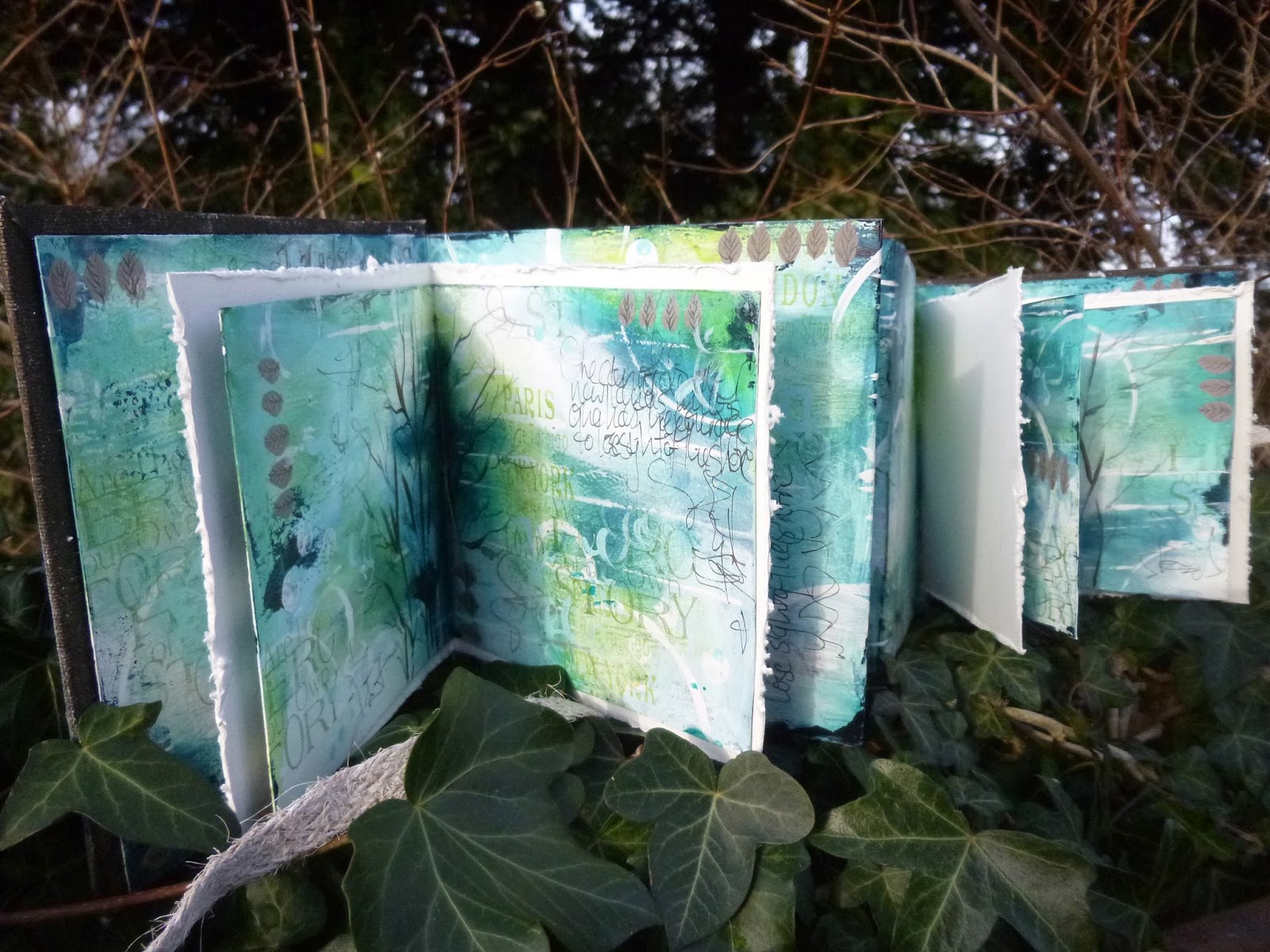
I loved the construction of the journal, and I think I rose to the challenge of doing at least some of my own mark-making...


... but the finished piece is really quite a long way from the original in style.


But I think that's one of the joys of courses and tutorials... to be inspired and to let that inspiration interweave with your own creative instincts and pleasures.


Obviously, I don't want to give away Kate's secrets, so in this post I'm just making my way through the pages of the album, sharing some close-ups as we go.


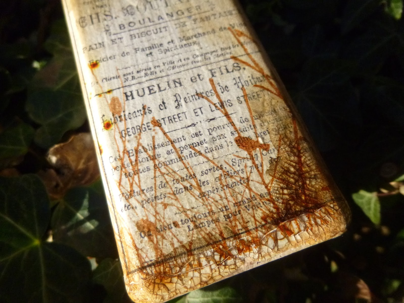
As you can see, my colour palette stayed close to home (but then I've got to be inspired to journal in this, so it's no use having lots of colours which don't feel like me)...


... and it was also very natural to me to create lots of texture when I applied my gesso originally.


I love what that gesso texture adds to the whole feel of the piece.


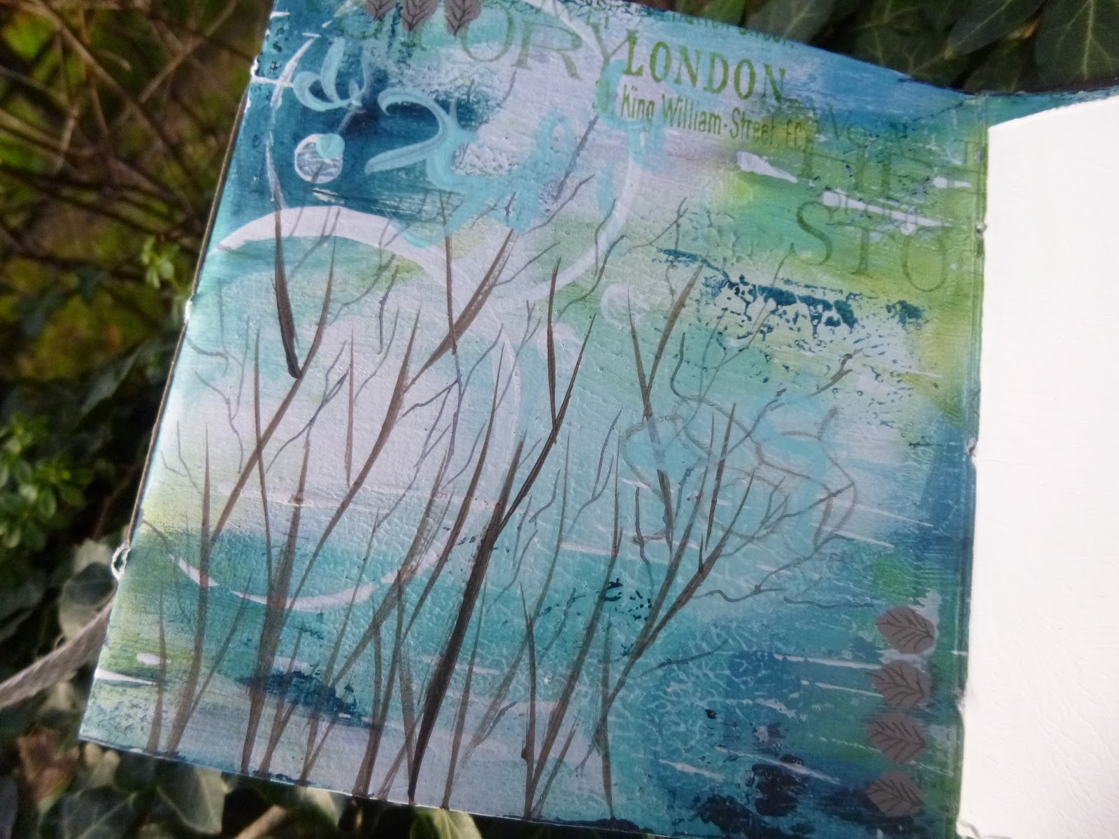
I didn't go for as much colour variation as in the original, but I think different pages still have different atmospheres.


Some are quite moonlit and bluesy with plenty of Prussian Blue Hue.  Others are much bolder and fresher with the bright Green Gold taking centre stage.


And there are some where cloudy whites soften the whole look...


Lots of lids and other implements (both ends, sometimes) were pressed into action to create the circles and bubbles and dots.


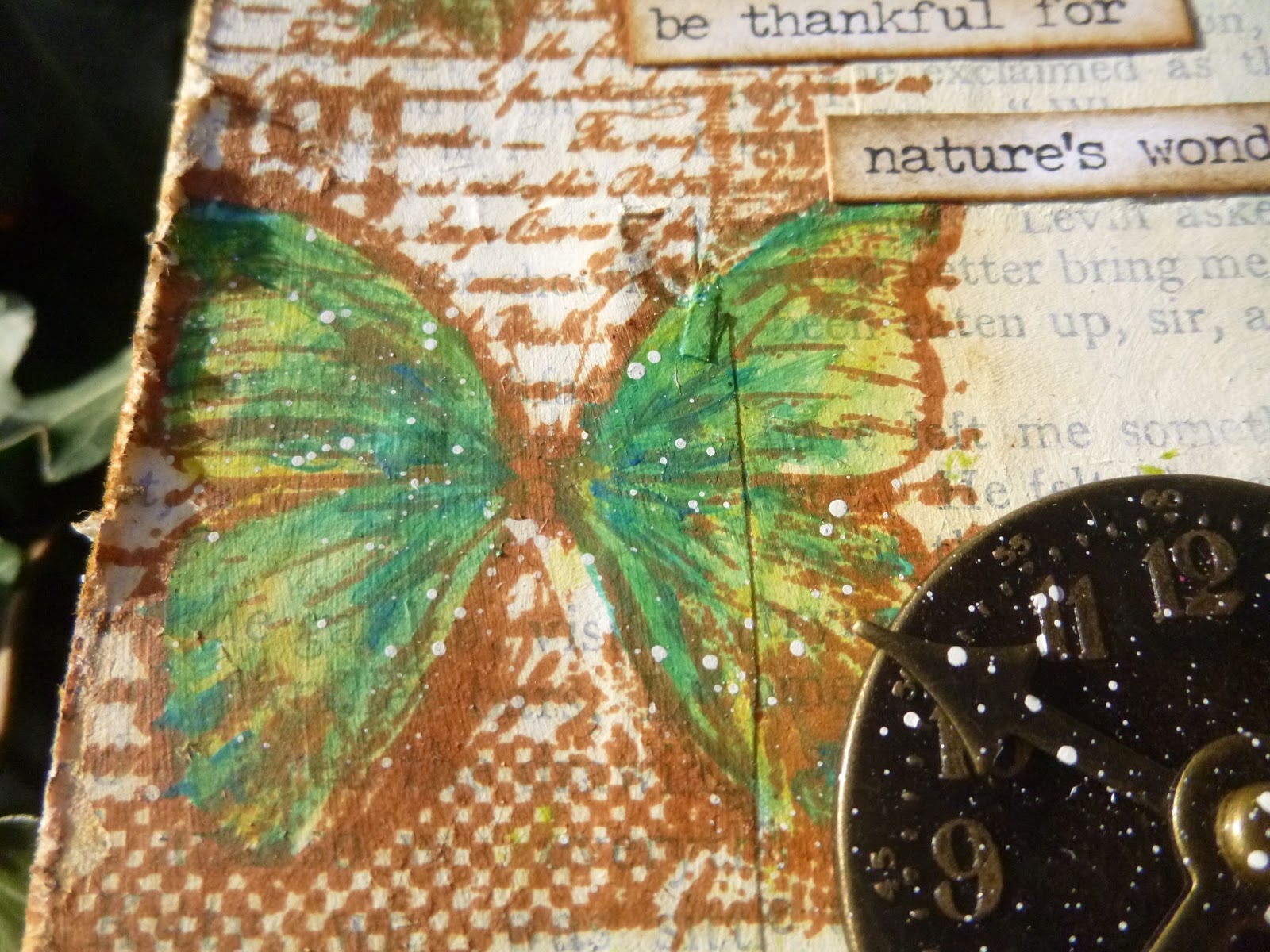
For my own mark-making, rather than the geometrical doodling Kate does so well, I wanted to build a palette of more organic, natural doodles.


The stamps and images I return to again and again are the nature ones, so I thought it would be good if I experimented with creating some nature imagery of my own.


I love a good wild grass stamp, or bare tree branches... I think my doodles are somewhere between the two!


They're done with paint/paintbrush for the thicker lines and ink/dip pen for the finer lines.


And I came up with a leaf shape which was no more than a single placing of the paintbrush tip.  I added some pen work to create the veins of a basic leaf skeleton.


Obviously, I couldn't resist including some of my much-loved word stamps... in various shades of green Archival.


One thing I had an absolute ball with was the scribbling.


As I said when I shared my first Wanderlust pages, putting my own handwriting there felt really scary.  But the scribbly version is so freeing...


... whether scribbling words or just plain scribbling scribbling!


In fact, I enjoyed it so much that I scribbled in pen, in coloured pencil and in paint in different places.


I started to feel that I wouldn't want to journal over the top of all my lovely layers, so I layered blank pages in every section.


Obviously, I distressed the white page edges to give a more textured look.


I do like how you get hints of all the different colours, doodles and mark-making in the layering of the pages.


I also think the white framing effect of these inserted pages sets off the busy doodled pages rather nicely.


There's a pocket built in to the whole thing too, so there are some more gesso'd pages tucked in there, ready to be journalled on.


I have a troubled history with sewing machines (though I'm about to have one final try), so I did my bookbinding by hand with a simple pamphlet stitch.  I left the knots perfectly visible because I think the bookbinding thread is beautiful in itself!


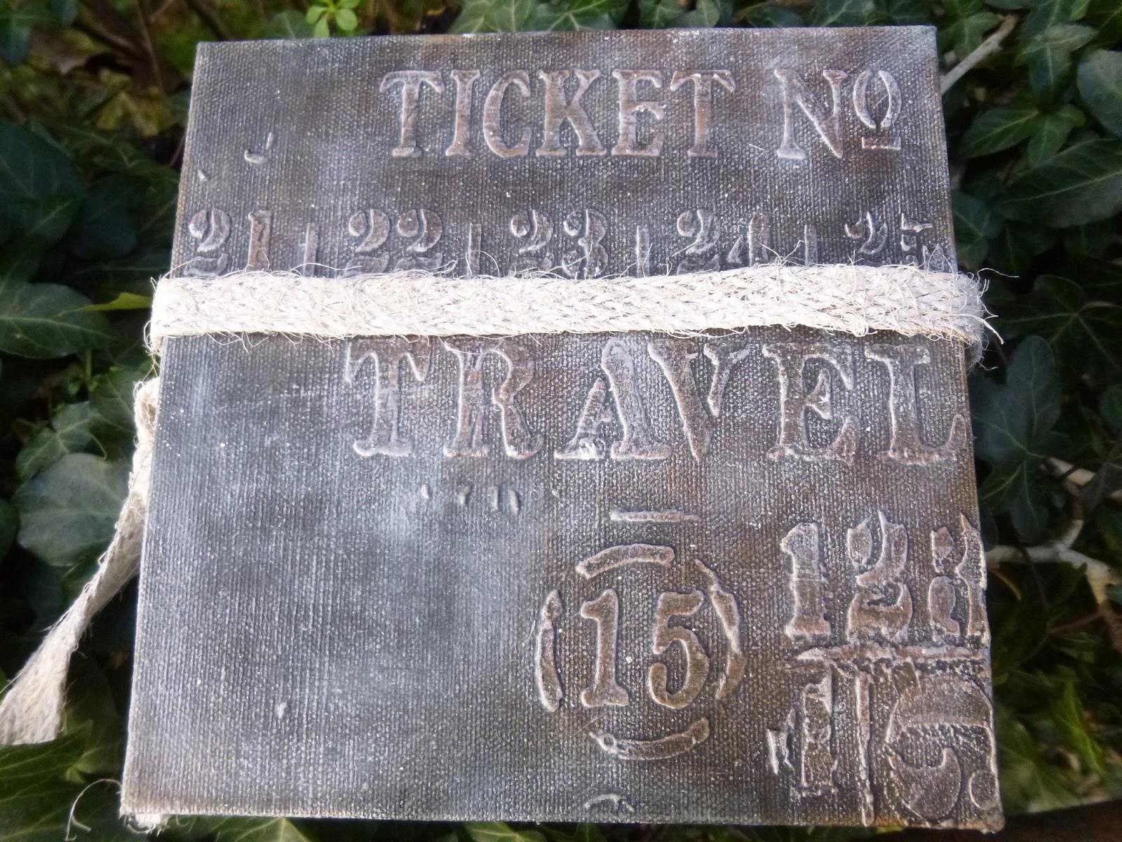
For my looped fastening, I gesso'd some burlap ribbon (this is the back cover - texture paste and drybrushing = happy place).


I love the look of the gesso'd burlap, and it makes it pleasurably stiff and chunky.


So, having been a little wary to start with, I ended up having an absolutely wonderful time creating this.


And the end result really makes me happy.  I call that a result!


Of course, if you're tempted to come and join the Wanderlust journey, it's never too late.  All the videos are always available for viewing and download.  So far, we've only scraped the surface of what's on offer throughout the year. If you want to know more about the many amazing teachers involved as well as all the other benefits, take a look at this post, and as an affiliate I can also invite you simply to...


Thank you for bearing with me through all those photos.  As you know, I like to get everything recorded here in my virtual scrapbook, and when a project has this many pages and details, there just have to be a lot of pictures!  I hope you enjoyed travelling through my travel journal, and I'll hope to be travelling around to visit you in the next few days.

These are my scribbled words (which may have altered slightly in the scribbling!)...

Man cannot discover new oceans unless he has the courage to lose sight of the shore.
André Gide

Two roads diverged in a wood, and I - 
I took the one less travelled by...
From The Road Not Taken by Robert Frost