I'm travelling into a new way of working, a new country, a new language, and a new hobby which I'm passionate about. Come with me for some of the journey...

Monday 17 February 2020

Encore - Glass Foliage Lanterns

Hello all!  I'll be in technical rehearsals for Women Beware Women this week at the Sam Wanamaker Playhouse which is part of Shakespeare's Globe on the South Bank.  It's a tiny indoor theatre, made of wood - a reconstruction of a theatre interior of the early 1600s.  The shows in the Wanamaker are played entirely by candlelight, which is pretty magical.

Given that, this seemed like the perfect Encore post to share while I'm working by flickering candlelight all week in the theatre.  It's some altered jars made into candle lanterns for a Destination Inspiration post at A Vintage Journey back in August 2017.  Here's what I wrote back then...
_______________________________

Hello all, Alison here from Words and Pictures, arriving at Terminal 2 of Destination Inspiration.
As a reminder, here's what's in the travel bag this month:
Product - texture paste
Technique - layers
Colour - neutrals
Substrate - glass

I have to confess I really enjoyed this one, so this is one of my long posts.
Cups of coffee at the ready?  Then off we go... here are my foliage lanterns.


And here they are when they are candlelit from within.


Since the technique element this month is all about layers, I have to share at least some of them with you.
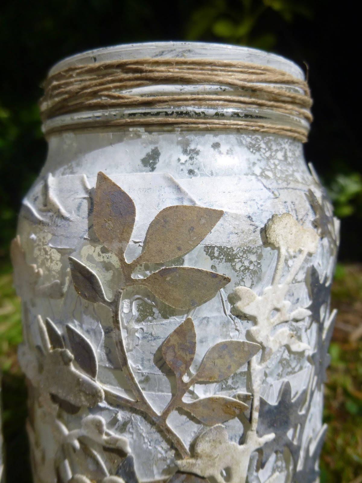
I started with my plain glass jars (always happy to recycle a glass jar).


First layer for jar one was some Transparent Gloss Texture Paste applied through a harlequin stencil.
Of course the paste goes on opaque, and then dries to transparency.


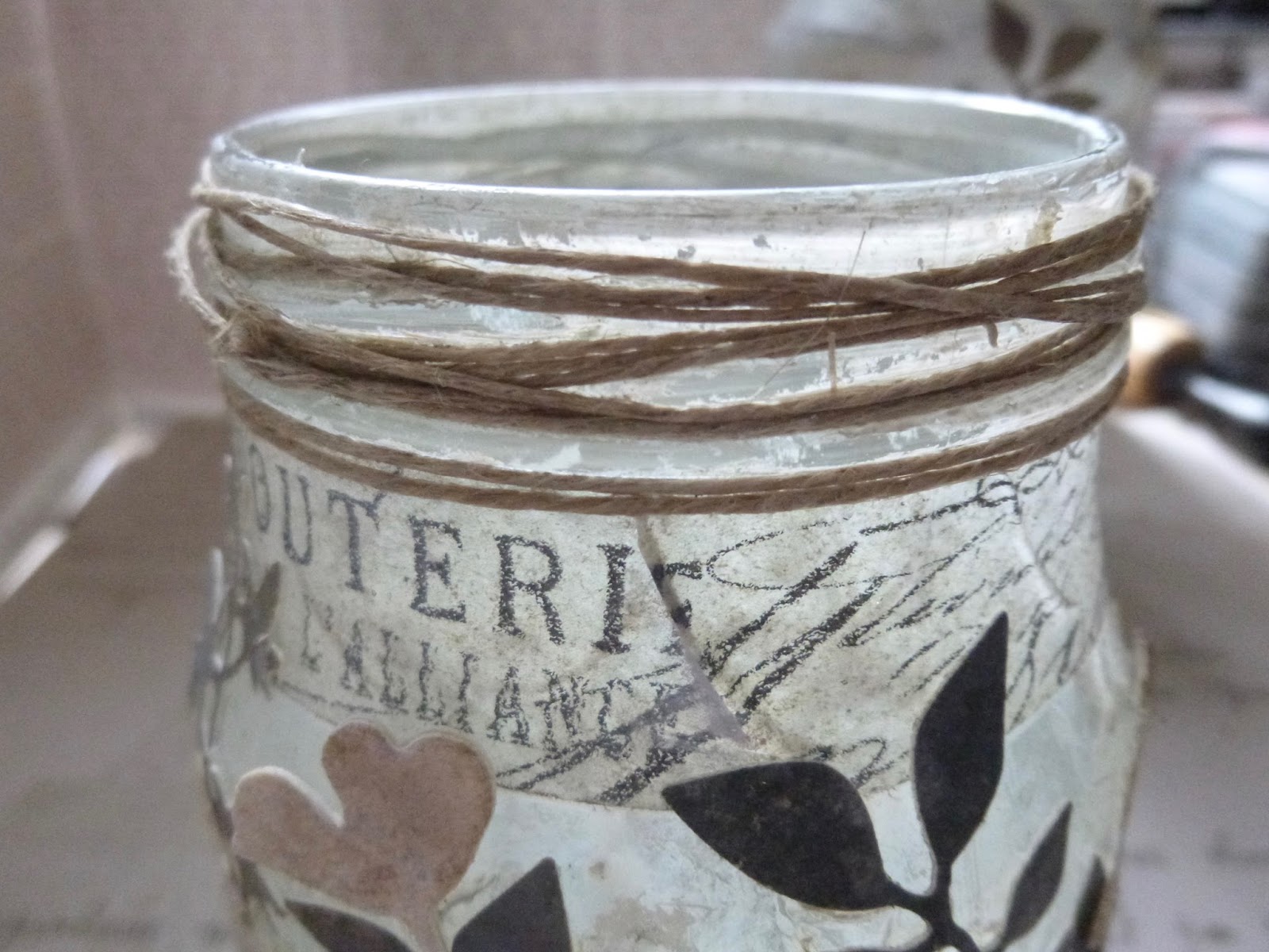
I was hoping that I'd be left with some clear "windows" for the candle to shine through.  It didn't go quite according to plan in the end, but I like what I ended up with maybe even more so not to worry.  Jar two had a layer even before the texture paste - some strips of tissue tape, which I thought would show through nicely.


And then the texture paste went over the top of the strips.


Jar one has its tissue tape around the neck instead.  I quite like both looks!


At this point, I was enjoying the transparent texture over the transparent glass,
especially with the tissue tape strips showing through.


Next layer was some spritzing with the DecoArt Media Mister in White.


It's a shimmer mist, so you get a lovely soft mother-of-pearl effect.  It didn't leave entirely clear windows (well, the gloss paste is no more of a resist than the glass underneath, of course) but I do like that the texture still shows.


And when the light hits it... wow!


I mopped up the excess shimmering white liquid onto some spare card - and that's going to come in handy very soon.  The grid pattern you can see is from the internal structure of the cardboard I was using as my spray area - the texture printed as I was mopping up the spray.


Next I did a couple of spritzes with Pumice Stone and Old Paper Distress Sprays.  It adds just a little extra depth to the texture, but it looked a bit grubby in places, so I finished off with another spritz of the Shimmer White.


While that was all drying thoroughly, I started inking up my mop-up card with subtle neutral tones of both Distress Ink and Distress Oxide.  There's Pumice Stone and Iced Spruce and Vintage Photo.


Later on I blended on some Walnut Stain and Gathered Twigs, I think, with maybe some Black Soot thrown in for good measure in places.  From that I started cutting lots of foliage using the Tim Holtz thinlits.
I loved these, even before I'd done anything with them!


And I preserved the paler card for cutting some wildflowers.


I started layering the foliage onto the jars from dark to light.  Darker fronds and branches in the background...


... to the pale off-white wildflowers for the top layer.


(I always like to keep an eye on how things are going from the inside.)


At least, I thought it was the top layer, until I decided that I needed some words.


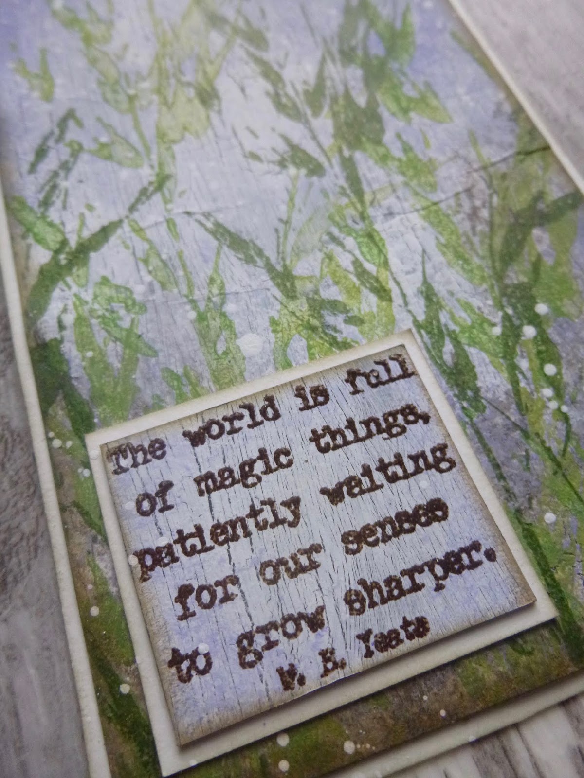
So the actual top layer is formed by some of my quote stamps from EAB02 Darkness and Light.


They're stamped in Ground Espresso (Archival version) on some more of the inky card which gives a lovely soft effect.


And I mounted them on padded tape, so that they stand a little way proud of the foliage,
giving that top layer a touch more dimension.


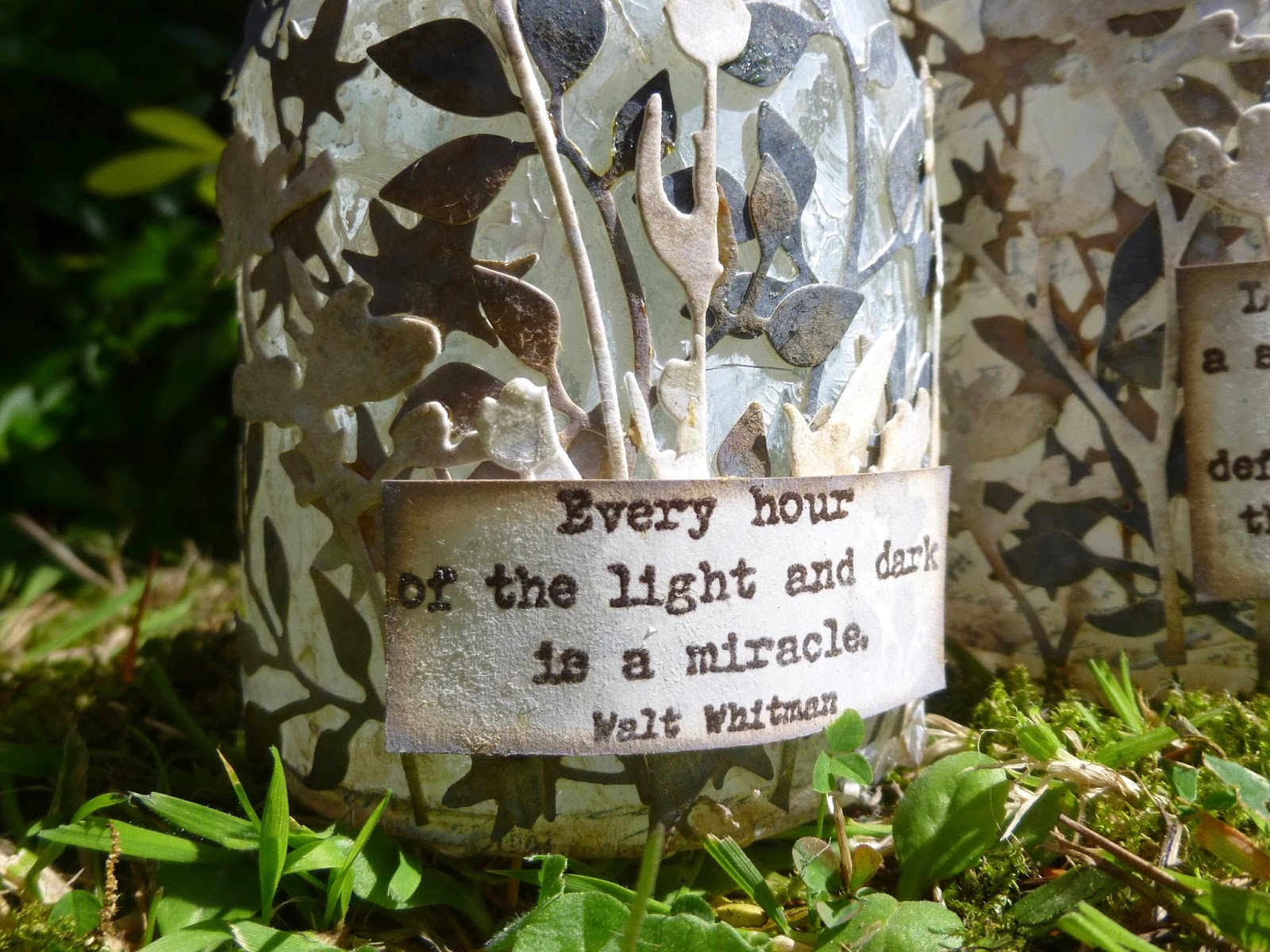
Some simple twine around the grooves at the tops of the jars finishes them off.


It's another tricky photography challenge... these change so much in different lights.


In full daylight, with the light falling on them, they look almost like stone.


When they were on my desk, with the daylight falling inside, they were already glowing beautifully.


And when you put the candles in and light them in the dark, the foliage turns into glorious silhouettes.


If you want an altogether simpler look, you can turn them around
and just have the mottled harlequin texture and subtle tissue tape text.


Also pretty by candlelight...


And when they're lit both within and without, then you get pretty much the best of both worlds...


... as seen in the candlelit photo near the start of the post.


__________________________________

Thanks so much for stopping by today.  I hope you enjoyed revisiting these glowing jars.  I've already done one variation on this technique to create some Haunted Jars, and now I'm thinking I need to create some new ones with my new Magic & Wonder set - there are quotes there which will be just lovely by candlelight!

I don't know how much time I'll have for visiting over the next few days, so for now I'll just wish you a wonderful week and hope to see you again soon, either here or elsewhere in Craftyblogland.  Happy crafting all!

Thousands of candles can be lighted from a single candle, and the life of the candle will not be shortened.
Buddha

Encore Posts
Projects which made their first appearances elsewhere for Design Team duties or Guest Designer opportunities, but which only had a sneak peek here, are being gathered together in the pages of my virtual scrapbook while I'm busy.
As always, the Encore Posts are formatted differently from the regular ones, so that you can easily spot them.  Please don't feel that you have to comment all over again!

Wednesday 12 February 2020

Magic things


Hello all!  After a couple of very lengthy posts, full of ticking clocks (The Golden Hours and the Curio Clock), I'm here with something very much quicker today.

Whereas those projects used quotes from my new Time Edition stamp set, this tag is one of the sample pieces using another new collection - EAB16 Magic & Wonder.

Stamp launch details are here at PaperArtsy if you missed the party!

(I'm working on something new with the House & Home set at the moment - but we're about to head in to the busiest part of the theatre production I'm working on, so I may have to stick to revisiting samples for now, and finish that project afterwards.)


Lin Brown's wonderful grasses have always been a magical stamp, as far as I'm concerned.

I've layered the stamping of them here.  Some are done with Fresco paints in Granny Smith and Lawn for the lighter, softer look of the grasses further off...


And in the foreground some sharper, clearer, darker stems in Olive Archival.

Right in the very background is some PaperArtsy Crackle Glaze creating that weathered painted wood look, with shades of soft purple - mainly Lavender and Wisteria Fresco paints sponged on with a natural sponge.


The words, as you can see, are by W.B. Yeats, and they're embossed onto a piece of card which had the same background treatment as this tag, but ended up being cut up for use rather than becoming a project on its own.


I'm going to leave it at that for today - see, I told you, a nice quick post.  I bet you didn't think I could do that!

Thanks so much for stopping by, and I'll see you again soon.

It's still magic even if you know how it's done.
Terry Pratchett

With these springtime colours, I'd like to share this at Tag Tuesday where the new theme is Spring is in the Air

Friday 7 February 2020

Curio Clock


Double trouble today - it's a while since there have been two posts in a day here at Words and Pictures!!

I'm honoured and delighted to be here with a Guest Designer project for the Creative Artiste Challenge Blog.  I was invited to guest design after my fungi ATB, There's not mushroom inside... was selected as one of their top picks last October.

Overnight I shared some Golden Hours with you for the new Vintage Journey challenge, Against the Grain and now, as promised, I've got a second project for you using a quote from one of my brand new sets, the Time Edition.

(If you missed them earlier this week, do check out all three new stamp sets along with the samples I created for them in the launch post here at PaperArtsy.)


Creative Artiste is a fabulous challenge blog, where it's Anything Mixed Media Goes every month.  To fit that mixed media brief, I've been playing with all sorts of mediums as well as a an upcycled old watch of mine to create this little Curio Box.


Once again, I've not exactly made my life easy on the photography front.


Curio Boxes cast all sorts of their own internal shadows, which makes things tricky...


... and with textural and floral details tucked into every little corner, it's pretty hard to let you see all the angles.


The focal point is an old pendant watch of mine (no way to replace the battery once it's died, sadly).  In fact, you saw the back of the watch in action earlier today in The Golden Hours... well, it would have been a waste to glue it down so that it was invisible!


And as I mentioned, it's paired with these wise words from Benjamin Franklin, from my brand new Time Edition quote collection.


The box itself is cut using Tim Holtz's new Curio Box Bigz XL die, though I did add some extra waste cardboard to the foot of the box for additional sturdiness, knowing the contents might end up being fairly weighty.


Here's the watch before any altering was done to it.  I still have the chain to use another way another day.  I was planning to surround it with cogs and gears for quite a steampunk/vintage industrial look - but that's not what happened in the end.


I added various crackle mediums over the top of the design papers...


... and layered on antiquing medium and washes of acrylic paint to highlight the crackles and deepen the colour tones.


Over the top of that I added some shimmer using Treasure Gold waxes.  Somehow, despite the metallic finish, I think this still somehow resembles gnarled tree bark in places...


... and I think that's probably what triggered my imagination to turn in the direction of plants and flowers.  Not that I need much encouragement to head nature-wards!


So I added some mossy colour to the gnarly tree trunk texture in places on the outside - I really like this effect!


And then I started gathering together some moss and some of my favourite dried flowers and arranging to grow out of the "ground" below the clock.


The watch itself also got a touch of the waxes to lighten the old gold into more of a White Fire silver-gold, but once I started with the mossy look, I added some green-toned PaperArtsy Fresco paints in places, to give it a really weather-worn look.


I hope you can also catch a glimpse in the background of some of my favourite tangled tendrils, courtesy of the Rubber Dance Weed Love stamps.

Because I only decided on the plant-based theme after gluing the box together, I had to do some pretty deedy stamping to get these trailing everywhere I wanted them.  And in the end,  you only really see them properly when you take the lid off!


I felt I needed another floral motif to bring it all to life, so I selected a Scrapiniec chipboard flower stem from my hoarded collection.


I used Frescos to paint it, trying to keep the paint nice and dimensional for an enamelled look.


After it had dried, I decided I wanted a bit more of a vintage look, so on went the crackle glaze.


I'm really happy with the finished look of the flowers, subtly textured with a look of old glass or cracked enamel.


And I think they are the perfect adornment for the outer frame.

That's about it, I think, apart from lots of spatter of course.


Oh, and I'm delighted to say that you can still press the button on top of the pendant and open the front of the watch.


It's set to my usual time... and yes, there is honey still for tea.


I love all the texture on the lid or frame or whatever you want to call it, and the matte mossy paints contrasting with the gleam of the Treasure Gold.


I hope you like this little Curio Clock.  I'm really happy to have found a way to display a watch I loved a lot when it was working.

And with all those wildflower buds and stems, I like the idea of time being swallowed up by nature.

Thanks to the Creative Artiste Challenge Blog for the opportunity to guest with them.  I hope you'll have lots of fun playing with mixed media this month too.  Happy crafting all!

Stands the Church clock at ten to three?
And is there honey still for tea?
From The Old Vicarage, Grantchester by Rupert Brooke

Even a broken clock is right twice a day.
Proverb

I'd like to share this in the Floral Frenzy over at the Simon Says Stamp Monday Challenge


Don't forget to check out how I used the back of the watch in The Golden Hours if you missed it earlier today.

Scheduling meant it only got about five minutes to itself, so I'm giving it another shout out here!