I'm travelling into a new way of working, a new country, a new language, and a new hobby which I'm passionate about. Come with me for some of the journey...

Showing posts with label tissue tape. Show all posts

Wednesday, 18 August 2021

Three times three times three

Hello all!  I'm delighted to be here today to share a project created for a Guest Designer spot at the Funkie Junkie Boutique Blog.  I was honoured that my journalling page for the wonderful Time challenge was chosen as their winner, and I'm honoured to be guest designing for them today.  The current theme is one that made my heart sing when I heard about it... Triple the Heat - not for the heat, but for the tripling!  I love working in threes and trios and triptyches, so here's what I came up with...

The host, Suzz, is using the number three as the inspiration (you can read all about it over at the Funkie Junkie Boutique Blog), and I've got lots and lots of threes going on here, not just the three ATCs themselves.

There are three different insects, courtesy of the Tim Holtz Collage Paper glued on to the ATC backgrounds (and lightly gessoed over to soften the look).

There are three different mediums involved in making these... texture crackle paste, paint and ink.  Soft washes of PaperArtsy Fresco Finish chalk paints in soft purple (Wisteria, Forget-me-not and Lavender) and vibrant green (Lawn) bring colour.

There are splatters of the paint colours as well as washes.  The Ranger Opaque Crackle Texture Paste obviously brings the texture.

And DecoArt Quinacridone Gold mixed with Payne's Grey to create one of Andy Skinner's "dirty washes" soak down into the crackles, followed by a quick burnishing with Sepia Archival ink for an extra rusty look.

The most obvious of the "three of a kind" elements are the lavender stems, one to each ATC.  I picked them from the garden, but since they were already going over, I used the same Fresco paints to give them a fresher look.

And each lavender stem is accompanied by two inky/painty green stems, cut with one of Tim Holtz's Wildflower Thinlits dies, so that makes a total of three stems per ATC.

There are also three additional decorative elements on each ATC... a strip of Design Tape, a strip of lace, and a postmark label, stamped in Leaf Green Archival (from the TH Field Notes stamp set) and cut out.

Finally, and for me just as important as all the rest, we have the words.

The phrases are each three words long (but of course!), chosen from the Tiny Text stamp set.

They're stamped again in Leaf Green Archival to coordinate with everything else going on.

So, that's about that.  Many, many threesomes all built in to a trio of ATCs.  I like each of them individually, but best of all for me is how they work as a set, with the composition shifting slightly as the eye moves from tiny artwork to tiny artwork.

I hope that gives you some additional inspiration for the Triple the Heat challenge theme.  The design team have, of course, offered up glorious projects for you too, and you can see them all, read the challenge details and join in over at the Funkie Junkie Boutique Challenge Blog.

Thanks so much to the team for inviting me to guest design with them this time around, and thanks to all of you for stopping by today.  I hope you're having a relaxing and enjoyable August.  Stay safe, and happy crafting all!

Three things cannot long be hidden - the sun, the moon, and the truth.
Confucius

Monday, 12 October 2020

An Aura of Menace at Simon Says Stamp

Hello all!  It's Monday, and I'm delighted to be back for my second week in the Designer Spotlight at the Simon Says Stamp Monday Challenge.  As always, it's a pleasure and an honour to be invited along for the month.

The brand new theme this week is Spooky, so you can imagine there's a wealth of inspiration from the uber-fabulous full-time team members.

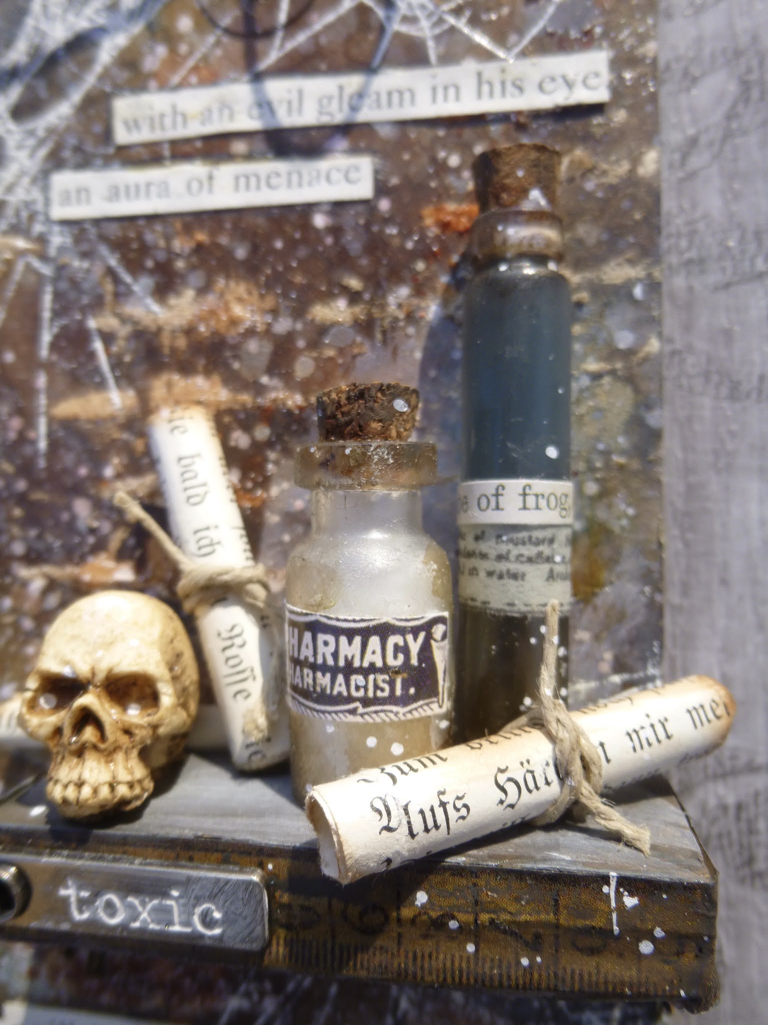
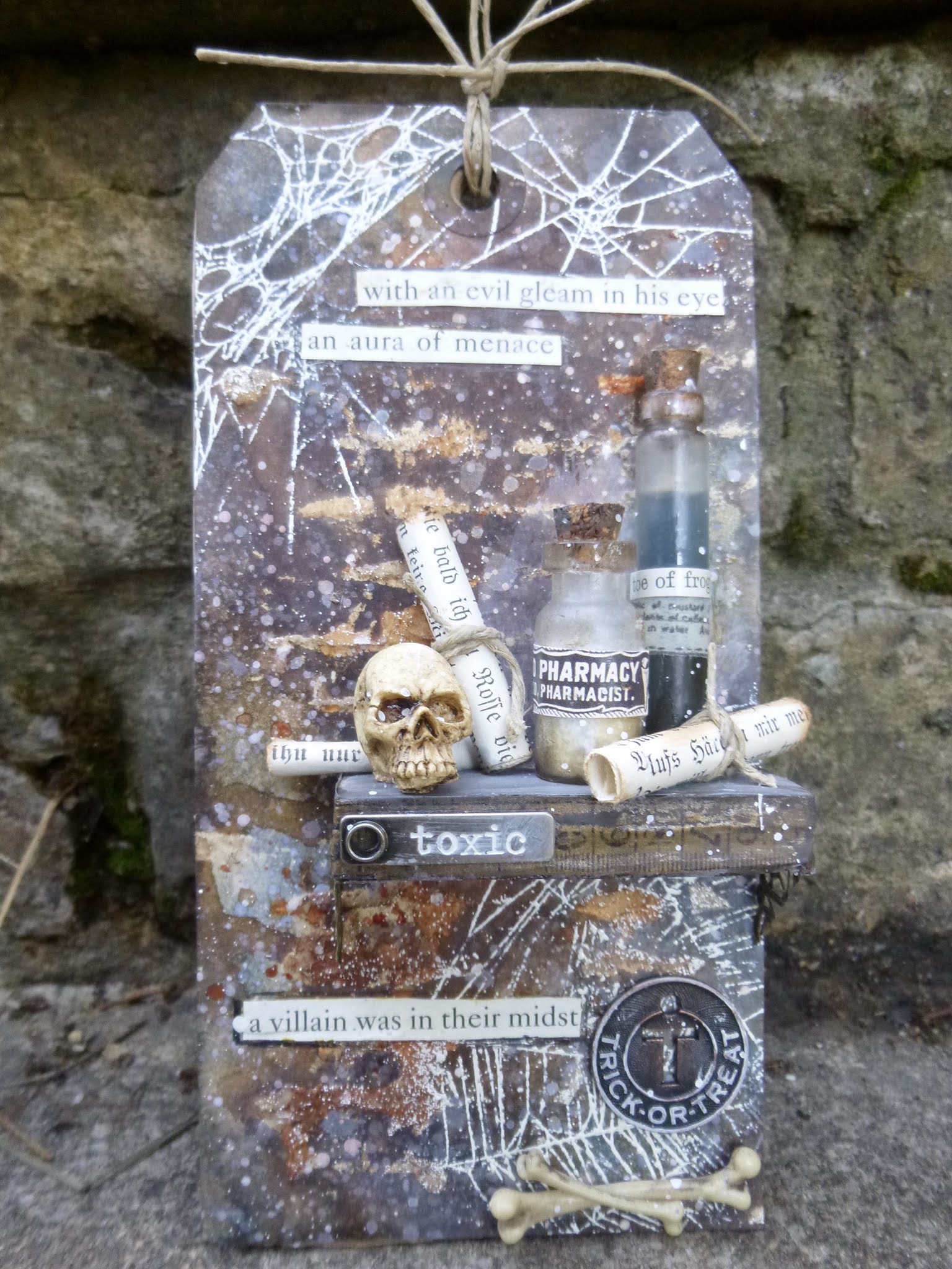
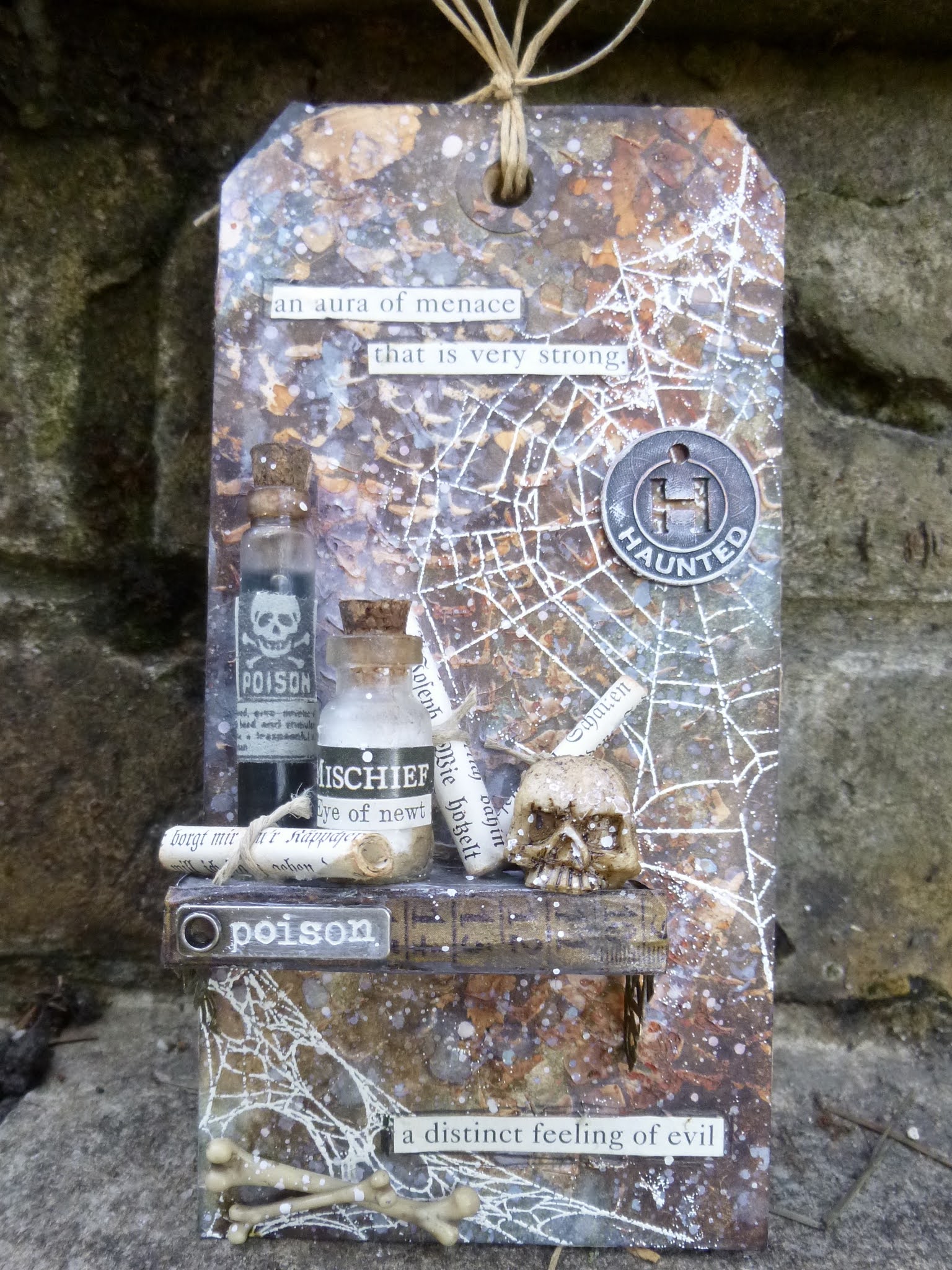
But before you hop over there to check it all out, here's my offering for you - a pair of tags offering double trouble.  You might need a sustaining drink of something hot and reassuring to see you through this - we're about to enter the creepiest of apothecary's laboratories...

Anyone who has been following me on Instagram will have seen this pair of backgrounds before.  They were mop-ups from a very extensive project I worked on while I was in the Czech Republic recnetly, involving lots of brick and stone texture.  (You'll get to see that project here just as soon as I've got time to write what's going to be a stupidly long blogpost... I may have to break that one down into chapters!)

I scraped the leftover texture paste from the Bricked and Mosaic stencils I was using onto a couple of tags nearby, and then had a nice time adding Distress Inks and Oxides and paint to create this rusty grungy look which really got my creative tastebuds tingling.

There's Vintage Photo and Walnut Stain Distress Ink involved, DecoArt Quinacridone Gold fluid media paint (this was before Crackled Campfire turned up, but that would do the rusty job now too!), and some Stormy Sky Distress Oxide, but beyond that I don't really remember the details.

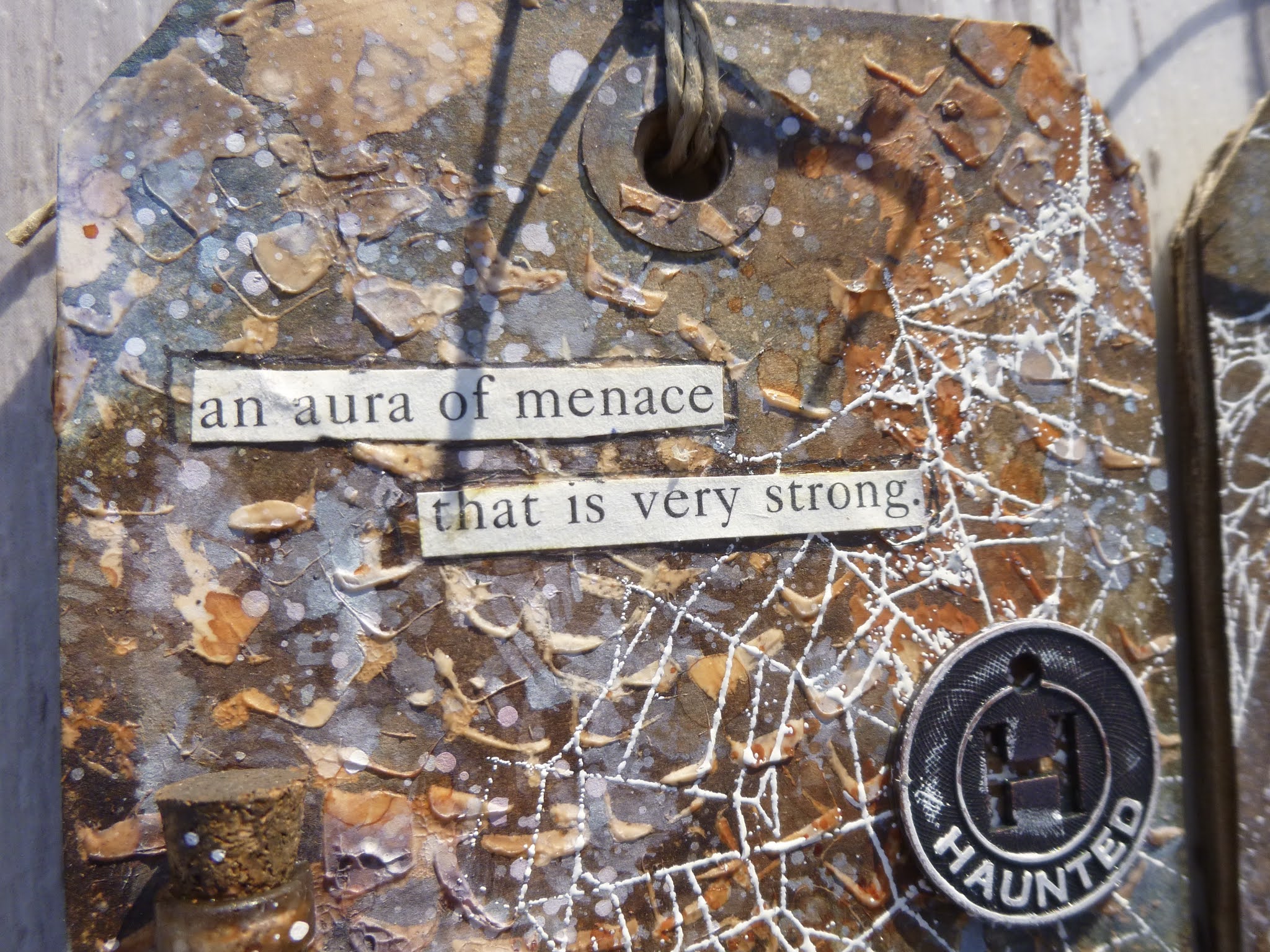
The fabulous Tangled Webs by Tim Holtz are embossed over the top in Wow Vanilla White - ready to catch in your hair if you dare to enter here...

But then I couldn't work out what should happen to them next, and I thought I'd probably be wanting to use some stuff from my full stash at home.  So the backgrounds flew back to the UK with me (they're well-travelled tags now), and as soon as I saw the Spooky theme I knew where they needed to go.

I built my shelves from some snippets of cardboard, and you can see I was already planning what was going on top, so they needed to be pretty sturdy.  The Corked Vials are real glass, so they're not light, and the Skulls are pretty heavy too.


The tall vials are filled with watery Stormy Sky Distress Stain in the role of an evil potion (to tone in with the backgrounds of course!), and the shorter ones have got some white sand playing the part of poisonous powders the apothecary adds to the prescriptions of those he really doesn't like very much.  (The sand is for using in vases, I think, from a certain Swedish furniture store.)  And I created some simple scrolls with book page fragments rolled and glued.


I needed to grubby things up a bit - so some PaperArtsy French Roast paint gives the glass a nice dirty look (I'd already made it translucent rather than glossily transparent by applying a bit of matte medium with my fingertips.)  And the scrolls have had a touch of inking to give them that aged look we all love.


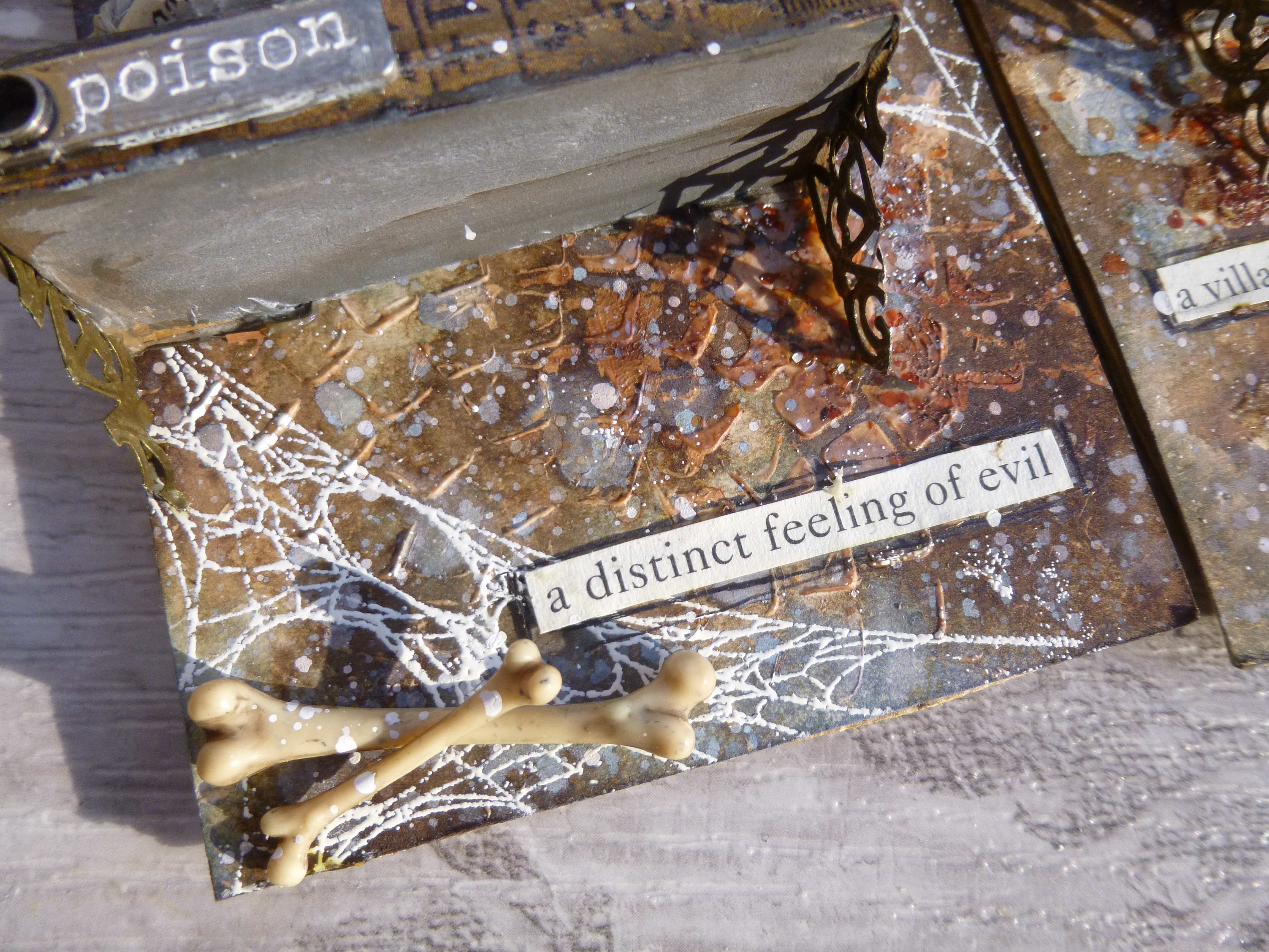
Clearly the apothecary needed some bones to go with his skulls.  The French Roast is perfect again for making these Boneyard bones look as though they've been underground for a century or so.  I don't know whether he does his grave-robbing himself, or whether he has accomplices or apprentices who busy themselves with the dirty work.


The shelves themselves I painted top and bottom, and then added some TH Design Tape which happened to be pretty much exactly the right width to go around the edges. The little Story Sticks are the perfect extra detail - these were from a Halloween edition.  I always like to add a bit of metal.


With that in mind, I dug out a couple of older Halloween Muse Tokens too and zhuzhed them up with some white paint to make them pop at the centre of the cobwebs.


Time to load the shelves... and to give them some extra support I created brackets by snipping up one of those metal filigree flower medallion things which hang around in most people's stashes.


Not sure how effective they really are at supporting the weight (the shelves themselves are rock solid), but I think they look really cool!

And once I looked at everything in position on the shelves, I realised I needed to go the extra mile with my glass jars and vials and create some labels.


The labels are made of a combination of things.  There are some pieces cut from one of Tim's old tissue tapes (I've got a stock of it, but if there's one product I'd love to have back...) - on the tall vial there, the skull and crossbones warning and the instructions beneath (some of those on the other tall vial too).


There are some words from the Clippings section of the Curiosities sticker book - the Mischief and, to my delight, some Shakespeare - one jar has powdered "eye of newt" as an ingredient...

... and one vial contains liquidised "toe of frog".  And then there's also an apothecary's name and address cut from a larger label in the same sticker book.  I think they all work rather well together.

The scrolls are now wrapped with twine (glue holding them down? what glue? no, it's the twine which keeps them scrolled), and rest higgledy-piggledy amongst the jars and skulls.  


The bones seem to have tumbled onto the floor, where they're coated in all that gossamer cobweb now, I expect.  He's not the tidiest of men, our apothecary.


I was very pleased with my found text.  It was the page I'd originally torn out to make my scrolls from, but the font was really a bit too large for that.


As I was deciding that, I focussed on the words themselves and discovered they were completely ideal for use on the tags in another way!  Anybody know where they're from?

If you've ever read Lemony Snicket's Series of Unfortunate Events books, you might recognise the style.  In any case, they add a suitable aura of menace to the tags, don't you think?

That's pretty much the lot, I think.  Some simple twine to finish things off - no point over-egging the poisonous pudding, eh?!


So I hope that's got you in a suitable Spooky mood.  Even if you're already burning to start making something, I still recommend you to go and check out the amazing work from the full-time team at the Simon Says Stamp Monday Challenge... they always knock it out of the park.

They'll be picking some of their favourites to spotlight at the end of the week as usual, and of course there's the Simon Says Stamp gift voucher on offer for one lucky randomly chosen entrant.

I hope you're ready to get your spook on, and I hope you enjoyed the aura of menace around here.  Thanks so much for stopping by, and I look forward to seeing you again soon.  Take care out there, and happy spooky crafting all.


APOTHECARY, n. The physician's accomplice, undertaker's benefactor and grave worm's provider
From The Devil's Dictionary by Ambrose Bierce

Oh true apothecary, thy drugs are quick.
From Romeo and Juliet by William Shakespeare

I'd like to share this at Creative Artiste where, as always, it's Anything Mixed Media Goes
I'd say these are definitely Autumn Colours which is what they're looking for at Try It On Tuesday - it may not have leaves, but it's definitely seasonal!

Yup, I've given in - the photos are all the way down the middle.  There's no longer any way to distinguish my Encore posts other than by labelling them.  I don't like having my hand forced, particularly in design and layout decisions, so I still hate you, New Blogger, but I haven't the time or the energy any longer at the moment to struggle to make my blogposts the way I want them.  

#newbloggersucks

Thursday, 7 May 2020

Happy Hour

Hello all... and welcome to the results of a very happy hour of Skype crafting last weekend.  I didn't have time for a full session, so I suggested that Nikki, Brenda and I could do a "time-limited" quickie.  Last time we embraced the Tim Holtz quote Out of limitations comes creativity, and worked only with limited ingredients, declared in advance, so no chance to change your mind part way through.  This time we would just have an hour to work with but we could play in any way we chose.  I chose ATCs.


I love working with the ATC (Artist Trading Card) format - just 2.5 x 3.5 inches in size - and often work in pairs or sets when I play with them.  I thought a trio should be do-able in an hour and, in fact, apart from time taken to choose exactly the right word stickers, I was done much more quickly than that.


I started with some old playing cards.  I really liked the design on the back, especially after I'd sanded it back to remove some of the glossy finish, and got a softer weathered look as a result.

I mounted them on some waste cardboard to give them a sturdier presence.


There aren't many process photos - no time to stop and click constantly! - so you see them now after 1) a quick brayering of a watery wash of white paint; 2) torn strips of tissue and design tape applied in places; then...


... 3) texture paste applied through a Crafter's Workshop stencil of quavery Latin lettering; and 4) washes of DecoArt Media Fluid Acrylic in Payne's Grey, Raw Umber and Quinacridone Gold, spritzed with extra water to let it run down between and around the letters.

And of course the leftover paint on the craft mat got splattered over the top.


The blue design of the card background pretty much dictated the choice of the rusty browns... 


Give me blue when I'm under pressure and I'm likely to head for my favourite blue and brown combination.


With that scrumptious dribbly rusty Quin Gold paint concoction...


... it was a pretty short step to the addition of some rusty wire, wound round at various heights to create variation across the set.


A quick flip through the Idea-ology Paper Dolls brought these three characters to the fore, and thankfully I had each of them in the appropriate size to fit on the ATCs.


Then it was just a question of positioning them so that they wouldn't cover up too much of the background, but it still needed something else.  


These Scrapiniec stems have been hanging out on the craft table lately.  They almost made it on to my tag, The flowers appear on the earth, but in the end the lavender didn't need any extra support.


They almost put in an appearance on the Catching up journal page, but simplicity won out that time.   But finally, here, their patience was rewarded.


They're made in very pale wood in any case, but they've had a wash of snowflake just to make them even lighter in contrast to the rusty shadows in the background.


As I said, it took me a while to get exactly the right word stickers in place.

But these ones not only seemed to suit the respective Paper Dolls, but as a trio of phrases they also reflect the crafting friendship which was the reason these ATCs came into existence at all.


If we hadn't had the Skype session set up, it's unlikely I'd have got myself to the craft table that day.  So the "lasting friendship", sharing a creative hobby which is "nearest to my heart" (or at least one of two areas of creativity nearest to my heart), definitely makes me happy.


It was a very happy hour spent chatting as we each pursued our own crafty paths, and I hope you'll hop over and take a look at how Nikki and Brenda filled their sixty minutes of time.


These two sneak peeks ought to tempt you, I would think.  You'll find Nikki's project here at Addicted to Art, and Brenda's here at Bumblebees and Butterflies.


The Skype session also nudged me into spending at least a bit of time at the craft table on subsequent days, so the inspiration was ongoing, and you've already seen one result of that with my Daisy, daisy (daisy) painting, and there's more to come soon.

In the meantime, I wish you all well.  Stay safe, stay healthy, and I hope you have some happy creative hours of your own in the next few days.

A man who dares to waste one hour of time has not discovered the value of life.
Charles Darwin

With my spritzed and dripping painty background, I'd like to share this trio at the Simon Says Stamp Monday Challenge where they are playing with Spritz and Splatter this week
The More Mixed Media Challenge are on Anything Goes + Optional Pink - can't quite take up the option this time, sorry - rust is as close as I can get for now!
Creative Artiste Challenge Blog are, as always, playing Anything Mixed Media Goes