I'm travelling into a new way of working, a new country, a new language, and a new hobby which I'm passionate about. Come with me for some of the journey...

Tuesday 30 January 2018

New Words, Words, Words at PaperArtsy

Hello all!  I'm thrilled to be starting the year with some new word stamps at PaperArtsy - and the themes of the new stamp sets are designed with new starts and fresh momentum in mind.  As well as a Spring Edition - perfectly timed to blow away those winter blues - I've got a couple of really motivational sets to share with you, full of positive thinking and philosophical wisdom.

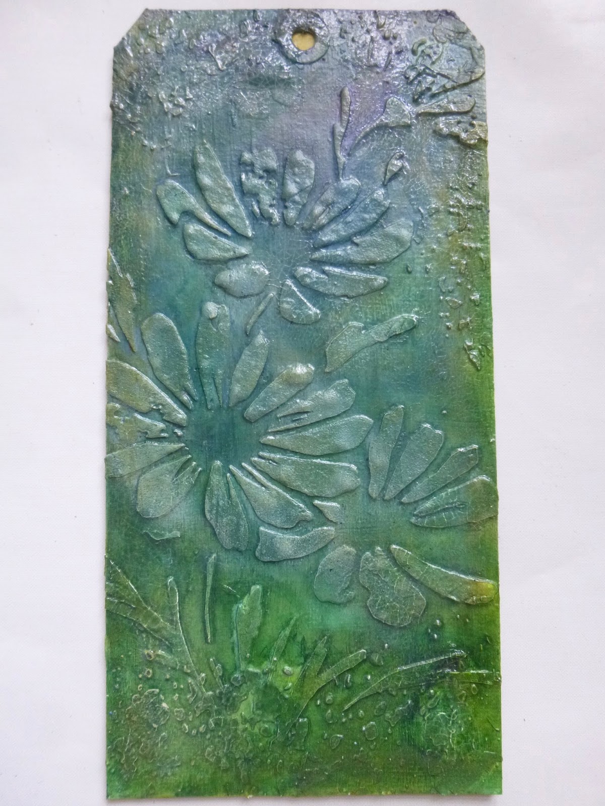
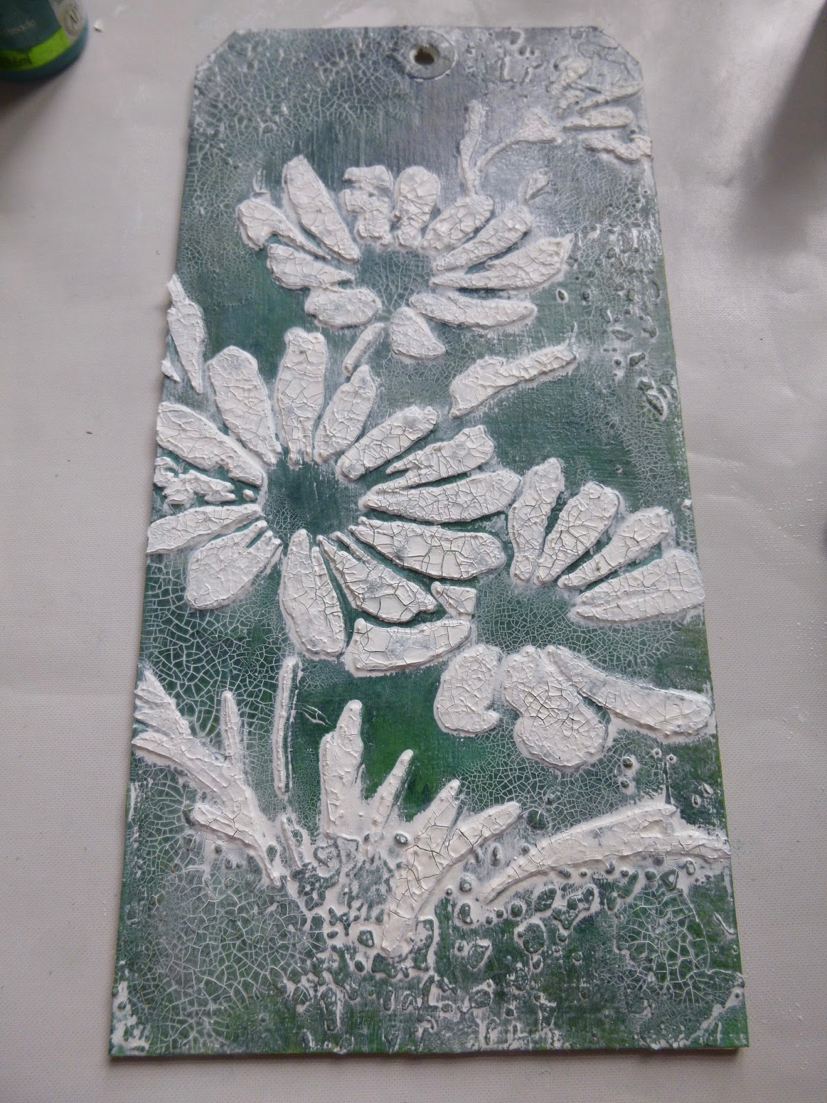
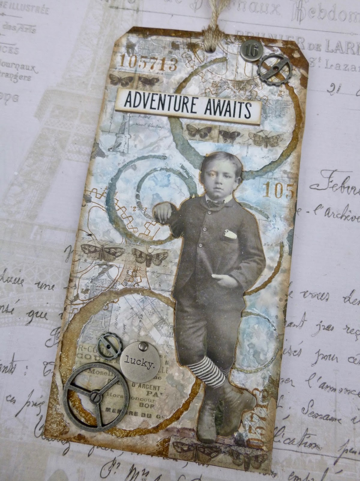
So do hop over to PaperArtsy to check out my first samples with the three new quotes sets, all in a pretty springtime palette using some of Seth Apter's new paints, and also using some of the other brand new PaperArtsy stamps.

EAB06 The Spring Edition - full of seasonal quotes: 


EAB07 Dreaming & Doing - about dreaming big and putting those dreams into action:


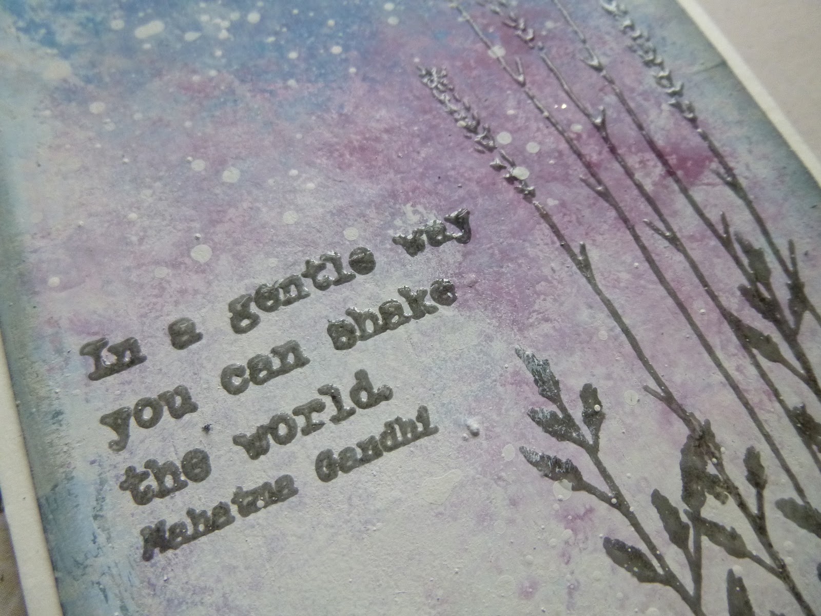
EAB08 Strength & Courage - about digging deep to find the power to change the world, or at least your world:


As well as my samples, you'll also be able to check out an alternative take from my wingman - a PaperArtsy debut for the brilliant Amanda of Moments of Inspiration, who will be up on the PaperArtsy blog just half an hour after me.  And you already caught a sneak peek of how these new quotes work in the shabby chic world of the wonderful Jennie of Live the Dream earlier this month.

I hope you enjoy seeing the new quotes put through their paces, and I hope you'll be as inspired by them as I am.  I'll be sharing some more how-to details on these samples over the next days and weeks, so do keep your eyes peeled...

The beginning is always today.
Mary Wollstonecraft Shelley

Tuesday 23 January 2018

Hopeful Flowers


Hello all, and welcome to an unusually quiet Words and Pictures.

As January vanishes away, I'm dashing hither and yon - sometimes feels like ever-increasing circles - just about managing to be in the right place at the right time, but without much time left over for anything else.

And there's exciting craft news coming along in a week's time, so I'm saving some of my energy for that!  But I'm squeezing in a blogpost before setting off to Bath in about an hour's time.

As a result of all the busyness of life, the jumbo tag I'm sharing today is not a current make.  It was actually made some time back in the autumn and is finally making an appearance prompted by the Simon Says Stamp Monday Challenge who are playing Tag It this week, and the chance to add a touch of colour to these grey days for Stamps and Stencils' On the Bright Side theme.


This was one of those tags which unfolded over a number of weeks on the craft table.  I would get a couple of steps done, and then get stuck, leave it for a while to get on with something else, and eventually return to take a few more steps. 


It's not in quite my usual vein - though it does have many of my favourite things - so maybe that's why it was such a stop/start process.

I took plenty of photos along the way - just as well, or I'd have no idea any more how I made it! - so this post is all about the creative struggle to get it done.


So way back in September I started by putting texture paste through a fabulous Donna Downey stencil onto a jumbo tag which, as you can see, had already been through some aborted stages before being painted over with gesso to start again.


I added some additional texture mainly around the edges with the Tim Holtz Speckle stencil...


... and then set to with some colour.  I think I was using mainly DecoArt Media Fluid Acrylics, but four months on I'm not entirely sure any longer.

As I dried the paint with the heat tool, I found the texture paste was bubbling underneath.  I really liked the effect, so I did it some more.


Next stage, a couple of weeks later, if I remember rightly, was to add some dollops of DecoArt One Step Crackle in and around the stencilled texture.


You may be able to see that I've glued the tag to some thick cardboard by this point - the sturdy support means the crackle can do its job without distorting the tag.  It also gives the whole thing a satisfying solidity.


Once that had dried and crackled (nice!) it sat around again for a while...


... until I took the heart-in-mouth decision to smother it in white Antiquing Cream.  You've seen this method in action in a couple of places since (the Mini Marvels and the Trailing Ivy) this was one of the most dramatic cover ups!


You apply it, let it dry, and then wipe it back with a damp cloth for a whole new effect.  It's a little scary to do...


... but totally worth it when you see the white crackle against the darker colours...


Then there was some more procrastinating when, having decided the flowers now needed a bit more presence, I was unable to decide how to achieve that.


I re-placed the stencil and applied DecoArt Crackle Paint through it.  I lost my nice bubbled texture, but I think it was the right decision.


Once it was dried and crackled I started adding some more colour with the Fluid Acrylics. 


Yellow is an almost-never colour for me, but I had been dabbling in daisies with my watercolour explorations at the time, so I guess that influenced this decision.

I couldn't quite decide how to handle the centres of the flowers.  On the one hand, I really didn't want to cover up some of the delicious crackle which was there.


On the other hand, they looked a bit weird with just empty space in the middles.  It was another waiting period while I debated what to do.


In the end I went with some Prima Art Stones...


... topped with a brushing of raw umber paint to give them a seedy look.


It was touch and go with the addition of the words too... the tag sat there for days as I added and removed the Quote Chips, trying to decide whether they belonged or not.


Finally, with some tangled thread in the mix, I glued them down.

Still not sure whether I should have left them out after all... but I guess they fit quite well with this whole drawn out indecisive creative process!


And I found myself using black - black! - to edge the tag.  It felt like it needed some strong definition, but it doesn't feel very "me".


After all that stressful decision-making, the topper is as simple as can be - just some garden twine to tie up the daisies.


You can probably tell I'm not entirely sure about this one.  I really don't know whether I like it or not.

I love the crackled daisies and the crackle in the background, but the finished look is a bit off to my eye.

Ah well!  One day this year I hope to finish the journal page I've also used this flower stencil in - that one is shaping up to be far more my kind of thing.  But it won't be until the end of April at the earliest now...

Yes, it's packing time again.  Words and Pictures is on the move again for the next few months.  Getting the balance of winter clothes and craft stash in the suitcase is going to be as tricky as ever!

I hope you're all in fine fettle, and I really hope to manage some blog visiting soon to find out what you've all been up to...  In the meantime, happy crafting all!

Where flowers bloom, so does hope.
Lady Bird Johnson


I'd like to share this in the Tag It theme over at the Simon Says Stamp Monday Challenge
With the unaccustomed pop of yellow, and some bright colours underneath all those layers too, I'd like to share this at Stamps and Stencils where they are looking for spring-themed projects On the Bright Side

Sunday 14 January 2018

Believe in Adventure

Hello all!  I'm sorry I'm so quiet at the moment.  As I mentioned, there's a lot going on behind the scenes - not only craft-wise but with real world admin and planning.  January always seems to be a bit of a crazy month!  But I managed to grab some crafting time at the table, and finally used up a piece of scrap card which has been floating around for months... in fact, almost exactly a year it turns out.

I've created a pair of jumbo tags, 8.5 x 4.25 inches, all in my favourite colour combination and using some of the largest Paper Dolls.  Plenty of pictures today, but I've tried to keep the words to a minimum!


I had a piece of white card from which I'd cut the circles and coffee rings for the journal spread A Harlequin Infusion a year ago.  Yes, the not-being-able-to-throw-stuff-away maybe needs dealing with, but occasionally it pays off.  I forgot to take a picture of just the card, sadly.


I thought I'd stick the card down over a tag to make a cool background.  But then I realised that if I first used it as a stencil, I'd get two cool backgrounds!


I spread some thick gesso through the rings onto one large tag, and then glued the gesso'd card onto a second tag.

Once the gesso was dry, I spritzed and smooshed both tags with Distress Sprays - Stormy Sky, Hickory Smoke, Pumice Stone and Walnut Stain.


So you have one tag where the coffee rings are raised from the surface...


... and one where they are sunk down into the surface.


Then I added lots of lovely background stamping.

There's some architectural detailing in Watering Can Archival.


And some numbers and gears done in Potting Soil.


The two large boys - the largest of the Paper Dolls - demanded to be included.


They're each five-and-a-half inches from top to bottom.

I like working with oppositions and pairings, as regulars know...


... so the one in the darker suit is over the lighter background...


... and the one in the lighter suit goes over the darker background.


Then it was a question of selecting a Quote Chip to go with each boy.


They both have such confident expressions and body language... so they definitely needed some positive phrases to go with them.


I also added some pieces of Design Tape to each tag.  There's some nice vintage print...


... and I found a need for butterflies too.  This narrow strip tape is amazing with the finely detailed butterfly images.


I grabbed some gears and Typed Tokens to add metal accents.


Again, picking the right words didn't take long.


They're strong and positive.


I do love these number brads too.


They have such a lovely vintage font for the numbers.


A scrap of linen ribbon tops them both off in a nice simple way.


I hope you like them.  Of course, each tag can stand alone...


But I really like the contrasts and oppositions when you see them together... especially in those backgrounds.  I can't quite decide whether I like them with the two boys close together as in the photo here, or at opposite sides, as in the photo at the start of the post.


Thanks so much for stopping by today.  I'm away for a few days, but now that the tax (yuck!) is done, I should have a bit more time on my hands for some visiting once I return.   Happy crafting all!

The purpose of life is to live it, to taste experience to the utmost, to reach out eagerly and without fear for newer and richer experience.
Eleanor Roosevelt

I'd love to share this in the Winter Blues theme at the Simon Says Stamp Monday Challenge
And I'm also playing along at That's Crafty Challenges where they are Feeling Blue this month