I'm travelling into a new way of working, a new country, a new language, and a new hobby which I'm passionate about. Come with me for some of the journey...

Monday 29 July 2019

Going for a walk

Hello all!  I'm just making it in under the wire with my entry for this month's Art Journal Journey theme.  I promised myself I'd play along at least once a month this year but the lovely Chris of PearShapedCrafting slightly stumped me with her "We're All Going..." theme.  It's a lovely idea, and opened up lots of possibilities for everyone, but I found myself paralysed between two phrases which really didn't inspire me at all.

Firstly, there was "We're all going on a summer holiday... " - thanks for that earworm, Cliff Richard! - but that just isn't true for me this year.  And then there was "We're all going to hell in a handcart," which seems a lot more apt for the current state of world affairs, but was far too depressing for me to want to start journalling about.  I know that you can use art journalling for all kinds of emotions and expressivity - but, just at the moment, I prefer to escape from nightmarish reality when I head into the craft-room, rather than take it in there with me.


In the end, with July rapidly running out of days, I decided my best bet was to run for my happiest possible artsy place, so on my art journalling page we're all going for a walk in the meadow.  When the world is looking dark, some sunlight and a gentle breeze are sometimes all that's needed to feel a little more cheerful.


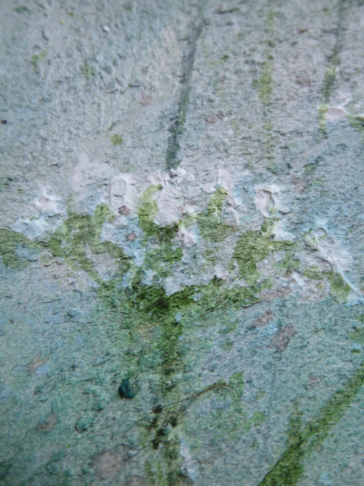
This is a heavily textured page, since I started with a thick coat of watercolour ground to prepare the page for using watercolour paints.  It gives you a deliciously grainy, sandy texture which also allows the pigment to flow as though you had watercolour paper.

It means you can get lovely soft background effects before applying more detail in later layers.


The paper in this large 10x10 inch album from Paperchase is already sturdy (it's the same book as has the Inspiring Herbs and Wild and Organic pages), but the ground gives you even more weight and texture. 


Watercolours are the main medium here.  At this stage, that's all that's on the page, apart from the watercolour ground itself... but then I moved on to a more mixed media approach.


There are some nice thick applications of heavy body acrylic to create texture in the flower heads.


I love the dimension and movement this gives you.


I used some large PITT artist pens to add some variation in line to some of the stems...


... as well as adding some soft blue flower heads to the distant stems in the background.  


And it wanted warming up a bit so I added some of my favourite Broken China Distress Stain, creating turquoise shading beneath the flower heads as well as deepening the colour of the sky.


There's some script stamping in Olive Archival adding texture to the undergrowth.


I used my dipping pen and some Turtle Dove Grey ink by Colorex to write the words, which are layered over some torn strips of tissue tape.


I've no nearby meadows to head into in real life, so the craft table version will just have to do for now when I need to escape.

I hope you've enjoyed coming for a walk with me, and I'll be back soon with some exciting posts in the next couple of weeks.  Stay tuned and happy crafting in the meantime!


In a meadow full of flowers, you cannot walk through and breathe those smells and see all those colors and remain angry. We have to support the beauty, the poetry, of life.
Jonas Mekas

I'd like to share this over at Art Journal Journey for this month's theme of "We're All Going..."
At the Simon Says Stamp Monday Challenge, they're looking for projects which are Bright and Cheerful - my sunshine meadow has made me feel a little more cheerful about the world, so I'd like to play along there too
I'd also like to share this at Paint Party Friday - continuing to work on expanding my experience with watercolours, and also exploring how they fit in with my mixed media work

Friday 26 July 2019

Perfection is Overrated

Hello all!  I'm here with the last of my samples created with the new PaperArtsy Minis designed by Seth Apter and launched earlier this month.  This pair of tags may be my favourite of the lot, I think.  


I had one more Mini left to ink up by this point, so that one is in action here.  And this time I've layered a couple of the minis together to create my grungy backgrounds.


The first layers were created with several Fresco paint colours brayered onto the tags (as done with the ATCs), and then some Distress Inks and Oxides smooshed on the top (as used on the first tag trio) - so this pair brings the whole collection together by using both techniques.


The last Mini which needed to see some action was Eclectica³ Mini 48 EM48.  I love these grungy circles (they remind me of the rusty bubbles on my Bubble, Bubble, Boil and Bubble tag last year).

I'm a bit confused about how they turned out, mind you.


I stamped them in Acorn Archival ink - which is earthy brown at first stamping.  But when I then applied clear embossing powder to the stamping, they turned this rather nice green colour (like unripe acorns, I suppose!).


I don't know whether it's just my inkpad, or whether it's the case with all Acorn pads (let me know if you've got one and have tried clear-embossing it!).

I'm not objecting... I rather like the effect.  In fact, I decided to have both acorn colours together, so I used the same Acorn ink to stamp EM 44 around the tags.


This time I left it un-embossed, so the angular lines in acorn-brown contrast with the squiggly circles in acorn-green.


I thought these two chaps from the Idea-ology Paper Dolls suited the look of the backgrounds.


They each have a casual strength in their confident stance which works well with the energy of the background layers.


Strips of torn book page help them to stand out from the busy layers behind them, and some dark tissue tape provides the "ground" for them to stand on...


... and a couple of metal cogs add extra interest.


The words are again chosen from Finnabair's Art Daily Words You Need pad of words and phrases.


I think the bold font and the capitalisation suits the self-assured mood of the men and the excitement of the grungy layered backgrounds.


I used some simple twine to top the tags off, before mounting them on inked white card as a frame.


I thought I'd finish off by sharing a quick shot of the whole "collection".  They were all done in one morning, following an urgent request from Leandra for samples to go on the show display boards.


Look at what you can get done when you don't have time to think!   The truth is I really got into the "zone" or my "flow" or however you want to put it.  I had an absolute ball playing with these stamps and getting my grunge on.  I hope you've enjoyed them as much as I did.  

Hope you all have a great weekend - perhaps a little cooler, with luck!

Have no fear of perfection - you'll never reach it.
Salvador Dali

It is reasonable to have perfection in our eye that we may always advance toward it, though we know it can never be reached.
Samuel Johnson

I'd like to share this pair of tags at the Simon Says Stamp Monday Challenge where they'd like to see anything which is Not a Card
At Tag Tuesday the challenge theme chosen by Wendy is Circles
And how about some more Splatters and Splodges for the challenge at Try It On Tuesday

Tuesday 23 July 2019

Mini ATCs

Yes, I know... all ATCs are pretty small, but these aren't so much "mini ATCs" as ATCs using the new Minis designed by Seth Apter for PaperArtsy and launched earlier this month.  It's a quick little post too (for me), covering two pairs of ATCs which were very quick to make.  They had to be... I was on a deadline!


I used embossing powders over brayered backgrounds, so there's a lovely shimmer when they catch the light.  (Check out All about the background... and Memories of the Future to see some of the other Minis in action.)


The first pair uses Eclectica³ Mini 43 EM43...


... and Eclectica³ Mini 45 EM45.


They're both very "Seth style" images, with that bold graphics/industrial grunge look.  They're embossed in Ranger's Liquid Platinum, one of my all-time favourite metallic powders.


I did a little bit of doodled outlining with a black pen, just to help them pop a little more against the busy backgrounds.


The words are from the Finnabair Art Daily word pad, given a little smoosh of Antique Linen Distress Stain.


And the black pen was in action again to outline the words and provide a little frame around the edges of the ATCs before mounting them on white card.


The second pair uses Eclectica³ Mini 42 EM 42...


... and Eclectica³ Mini 46 EM 46 - these great little texture stamps with bits of text tucked away inside them.


This time I've done my embossing in white over the brayered paint.  I wanted to lift away from the darker shadows of the layers in the background.


I'm not entirely sure any longer exactly which paints are in action in these ATCs.  I think there's Double Denim, Midnight, Venice Blue and Glacier Ice (all Seth Apter colours), and then there's definitely some Snowflake and Slimed spattered over the top.


A little additional shimmer is provided by the sequins dotted around.


And no need to add words to these, they're already there in the stamps.


So that's my little pair of ATC pairs, ready to go on the PaperArtsy show display boards, dotted amongst all the tags.


We're almost at the end of my sample-making blitz, just one more pair of tags to go... and I think they may be my favourites of the whole batch.  I hope you'll be able to join me again to enjoy those soon.  In the meantime, thank you so much for dropping by and happy crafting all!

It has long been an axiom of mine that the little things are infinitely the most important.
From The Memoirs of Sherlock Holmes by Sir Arthur Conan Doyle

I'd like to join in at the Simon Says Stamp Monday Challenge where they are looking for anything which is Not A Card
At Try It On Tuesday they are looking for Splatters and Splodges... I generally have plenty of those!

Sunday 14 July 2019

Memories of the Future

Hello all, and happy Sunday!  I'm back with the details of the second and third of my tag trio of samples using Seth Apter's brand new Mini stamps for PaperArtsy.  The fabulous little stamps are perfect for adding detail and texture to your backgrounds.


This pair, very much a pair, are made in a very similar way to the first one (a slight odd one out in the trio, though very harmonious), but these have an extra gleam of glamour amidst the grunginess.


Again there are Distress Inks and Oxides smooshed onto the tags to start with, and then for the tag with "future boy" I stamped EM41 randomly in Acorn Archival ink.

I was just rolling the tag on in partial stampings rather than a full-on flat-out print.


I stamped again quite randomly, but this time with embossing ink and added some of my much loved Liquid Platinum embossing powder from Ranger.

I love this stuff, as well as this stamp... 


You can see the fabulously grungy, distressed look of those tiny textural cubes, even in the embossed version.


The topping is pretty minimal so as not to cover up too much of the background.  As with the first tag, I went for one of the Idea-ology Photobooth photos...


... and layered it up over some rusty mesh and torn book text, with a little metal cog added for fun.


The one-word sticker is again from Finnabair's Art Daily book of phrases and words.  I hope he's got a bright future.


For "memory woman", it's pretty much the same again, except this time using EM 47.  

I just love these cool brick-like wedge shapes.  They provide an almost architectural feature against the random inky splotches underneath.


Again, some are stamped in Acorn, and some in embossing ink with Liquid Platinum powder applied.


Just look at that soft golden glimmer when the light catches it!


The Photobooth photo is layered up over the same simple ingredients, held together with an Idea-ology mini paper-clip.


I do love this rusty mesh, especially when you tweak the edges for a nice ragged look!


And again the word sticker has had a little smoosh of Antique Linen Distress Stain to warm up the colour tone.


I hope you've enjoyed seeing these tags even half as much as I enjoyed making them.


It's really nice for me to have a record of them here, as they've now gone off to grace the PaperArtsy show display boards.


There are some more samples coming your way soon, but for now I'll love you and leave you with wishes for a wonderful Sunday and a great week to come.  Happy crafting all!

Nothing is ever really lost to us as long as we remember it.
L. M. Montgomery

The future belongs to those who believe in the beauty of their dreams.
Eleanor Roosevelt