I'm travelling into a new way of working, a new country, a new language, and a new hobby which I'm passionate about. Come with me for some of the journey...

Monday 28 May 2018

I Say "Why Not?"

Hello all!  I'm delighted to be basking for one final time in the Designer Spotlight at the Simon Says Stamp Monday Challenge.


It's been such a delight and an honour to create alongside the fantastic Design Team for the month of May, and they've got some cracking inspiration for you this week again.


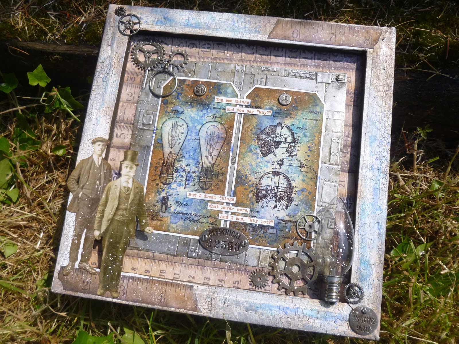
The new theme we've been playing with is Masculine, and I've been having a wonderful time with plenty of Tim Holtz goodies, my favourite colours, blue + brown, plus lots of different textures and materials.  So without more ado, take a look at the 12 x 12 inverted canvas full of inventions that I'd like to share with you.


I'll confess I get a bit cross when these ingredients are regarded as "masculine".  I love them all, and I'm not a man.  Why am I supposed to be stuck with pink and princesses and unicorns when there's all this beautiful stuff out there?!


It's only about a hundred years since gentle blue was regarded as the colour for little girls, and martial pink and red were for boys.


And let me do woodwork and metalwork over sewing any day.  I'm so bad at sewing that I've been known to put hems up with double-sided sticky tape!

Rant over... let's take a closer look at some of the details.


At the heart of this inverted canvas are the inky tags with Tim's Inventor stamp images on them.


The wrinkle-free distress backgrounds are a combination of Distress Inks and Distress Oxides.


And the stamping is done in Jet Black with clear embossing.  I "lifted" some of the ink inside the bulbs with a water brush, so that they would have a pale glow to them.

(If you look closely, you'll see there's even a silvery touch of Pewter Treasure Gold on the filaments.)


I did the same lifting of colour for the extraordinary goggles on the other tag, but it's less obvious.

I'm really not sure what this extraordinary contraption is good for!


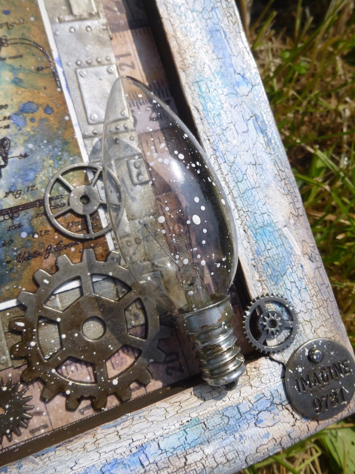
This recycled light bulb pretty much kicked off the whole piece.  I knew I had to pair it with the fabulous vintage bulb stamp.

The light bulb is the realisation of the blueprint on the first tag...


... but I didn't have any antique goggles to go with the second tag.

It seems they haven't quite completed the goggle prototype... they've only got as far as experimenting with the lenses.


Here are our two inventors and engineers, father and son...

The frame supports the son, but the father needed a little extra help, so there's a used sponge dauber glued behind him to keep him in the foreground.


He founded the company exploring the possibilities and innovations of the new industrial age, and his son has now joined him in the enterprise.


In the far background is some paper from the Idea-ology Dapper Paper Stash, and over that are some panels made with the brilliant new Foundry 3D Texture Fade.


I had a wonderful time creating my faux metal, and the timeworn distressed look of it.


I started with plain white card, and gave it a couple of coats of Brushed Pewter Distress Paint before spritzing it with water and running it through the BigShot the recommended three times for the depth of embossing.


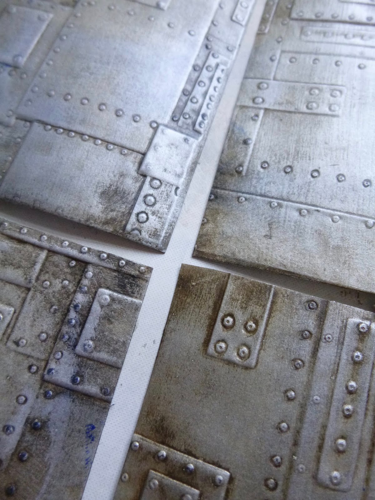
The brush strokes of the paint just add to the texture already in the folder - the amazing pits and dents amidst the layered riveted panels.

To highlight all that amazing texture I painted and knocked back a couple of layers - Ground Espresso Distress Paint first, then Little Black Dress Fresco Acrylic.


And I wanted a blue sheen to echo the blue of the tags, so I also swept on some Blueprint Sketch Distress Ink in places and wiped it back with paper towel, so you end up with just a hint of blue steel.


The final touch, once the panels were stuck in position, was to add tiny touches of Pewter Treasure Gold in a few places.  This gives a wonderful burnished look to those areas, as though they've been rubbed a lot, so that the dirt of ages is worn away to reveal the gleaming metal underneath.


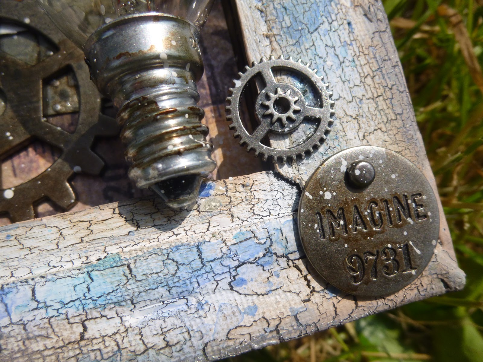
I'm pretty happy with the overall result.   Of course, you have to screw the metal panels down once they're in place, so that was pretty hard work.  (I'm kidding - it's a brad... an Idea-ology Hex Fastener, to be precise!)


Around the edges of the frame, there's some of my much-loved crackle effect.  I used the PaperArtsy Crackle Glaze between layers of Fresco Finish Chalk Acrylic paint.

Over that I used my acetate stamping plate to add inky blotches and spots in blue tones to match the central tags.


And of course there's plenty of brown inking around the edges, and more accents of the Pewter Treasure Gold to create a metallic echo.


There are plenty of Idea-ology metal goodies.  Countdown Brads to number the invention patents...


... cogs and gears, both actual and metaphorical, reflecting the whirring cogs and gears in the brains of the inventors.


All the metalwork has had a touch of Mushroom Alcohol Ink for a slightly more vintage look.


What will they come up with next?  Imaginations at the ready!


And with all the creativity, imagination and invention going on, I couldn't resist adding one of my own quote stamps from PaperArtsy.


This is a George Bernard Shaw quote from my PaperArtsy Eclectica EAB07 plate, Dreaming & Doing.  I love how it captures the eternal cry of the creative mind!


Do hop over to see the amazing Masculine works created by the regular Simon Says Stamp Monday team.  As always, there's a $50 gift voucher on offer, and the chance to have your work highlighted by the team.


At the foot of this post, you'll find links to the products I've used here, so if you're tempted to go shopping, I'm making it very easy for you!


Huge thanks to Lols and the team, and to Simon Says Stamp, for inviting me to create alongside them this month and for the warm welcome.  I've had a wonderful time with the themes, and it's been an honour to be along for the ride.


Thanks so much for stopping by today, and I'll see you again soon, either here or elsewhere in Craftyblogland.

To invent, you need a good imagination and a pile of junk.

I find out what the world needs, then I go ahead and invent it.

Our greatest weakness lies in giving up.  The most certain way to succeed is always to try just one more time.
All quotes from Thomas Alva Edison

I'd like to share my faux metal panels at Stamps and Stencils where the challenge this month is Let's Fake It!
And at Emerald Creek Dares they are looking for Guy Style, so that works out well in terms of timing.

Find these products at Simon Says Stamp:

Tim Holtz Inventor 2 by Stampers Anonymous
Foundry 3D Texture Fade
Idea-ology metal - Gadget Gears, Foundry Adornments, Countdown Brads, Monocle, Philosophy Tags, Hex Fasteners
Idea-ology Paperie - Paper DollsDapper Paper Stash
PaperArtsy Crackle Glaze
PaperArtsy Fresco Finish Acrylic Chalk Paints - French Roast, Chalk, Snowflake, Little Black Dress
Distress Inks - Blueprint Sketch, Salty Ocean, Vintage Photo, Gathered Twigs
Distress Oxides - Vintage Photo, Blueprint Sketch
Distress Paint - Brushed Pewter, Ground Espresso
Archival Ink - Coffee, Jet Black
Alcohol Ink - Mushroom
Ranger Clear Embossing Powder
Inkssentials #8 Manila Tags

Monday 21 May 2018

Inspired by a Song

Hello all!  I'm delighted to be in the Spotlight for my third guest designer spot this month at the Simon Says Stamp Monday Challenge.


And how about this as a coincidence?  The new theme this week is Inspired by a Song.  I could hardly believe my luck.


As you probably already know, we're hosting a Words and Music theme at A Vintage Journey this month, looking for you to get inspired by some song lyrics.  So why not do the double and join in with both challenges?!


As always, the regular team at Simon Says have created wonders to inspire you, and here's my jumbo layered tag to get you singing along.


My inspiration is the bitter-sweet ballad, I Won't Send Roses, from the musical, Mack and Mabel.  It's not the first time this song has inspired me in creating tags.

I've known and loved it for years, ever since it formed part of Torvill and Dean's gold medal-winning ice dance routine in 1982.

They used the whole Mack & Mabel overture for the competition, but did a beautiful, sad, sweet exhibition dance to this song once the competition was over.

Last time around I ended up with two tags to tell the story.  This time it's also produced two tags but they're combined into one jumbo panel.

Grab yourself some coffee ready for a trademark long post here at Words and Pictures!


The standard #8 tag was made all the way back in NYC when I was playing with the new Oxide colours, but failing to get very much further than a background ever, though this one did get as far as some stamping, mainly because I wanted to try the new Archival ink colour, Peat Moss.


I stamped the beautiful PaperArtsy Lin Brown grasses with the Peat Moss - a beautiful dusky grey-green, perfect with the soft, muted colours of the inky background.

I'd never have thought that Shaded Violet would please me this much, but its gentle softness when combined with Hickory Smoke and Weathered Wood makes me very happy.


There's some tiny script stamping also done in Shaded Violet Oxide - I think this is the script from Tim's new Entomology set.


The second tag is one of the Dylusions giant #12 journalling tags, backed onto packing cardboard (waste not, want not) to create a sturdy panel of weathered crackle.


The crackle is done with the PaperArtsy Crackle Glaze, layered in between French Roast and Chalk Fresco Finish Paints.

I stamped the new Tim Holtz Botanical Background, using the Peat Moss again... it's so deliciously distressed, like old wallpaper - I love it.


I inked the edges of my crackled tag with various browns and added some clear embossing powder for a touch of dewy shine.


The Idea-ology Metal Mini Fasteners give the impression of screws in a wooden panel.  I burnished them with a sweep of Sepia Archival ink.


There are more touches of metal in amongst the flower clusters.

Alongside the paper flowers (various sources - it's possible some of them are Prima?) are nestled some Idea-ology Foliage leaves, also burnished with Sepia Archival ink.


And also a little typed token down in one cluster, again altered with Sepia Archival ink and a touch of splatter.

The words of the song may be bitter-sweet and hard to hear, but at least he's telling her the truth.


The leafy die-cuts are done with Tim Holtz's Garden Greens Thinlits.


They were cut from some card which I'd wrinkle-free-distress-inked with Bundled Sage...


... and once they were cut I added touches of Peeled Paint and a little of the Peat Moss around the edges to make sure they echoed the other leafy elements in the tags.


I couldn't resist adding some of my much loved tiny dried flower buds to the mix too.


There's fine twine in the top of the smaller tag, twirling into the flowers there.


And some more of the same twine as the topping for the whole piece.


Now on to those song lyrics...  I typed them and printed them out.


I had to try a couple of font sizes before I found the one that worked.


There's a slight cut to the lyrics, but I think it works.  (The full lyrics are down below if you haven't already listened to the Youtube clip.)


And who's the target of the warning?  Well, this Paper Doll with the slightly sad expression in her eyes seemed ideal for the role of Mabel - and her dress is the right sort of period for Mabel Normand too.


There's a slightly forced casual calmness about her body language, and a haunted look in her eyes as she braces herself to listen to the uncomfortable truth.  Those lips are firmly held to prevent them quivering.


She needed something to stand on, so I broke off a bit of coffee stirrer and dyed it with some brown ink before positioning it under her feet.


Final touches include some lid-stamping over that crackled background.


The white circles are little bubbles of hoping against hope that Mack Sennett might change his ways.


And once I had those I decided to go even further and get myself some dew drops to go with those bubbles.


Clearly, she's up at dawn, pacing restlessly in the garden.  If he won't send her roses, she'll go and find her own...

These dew drops are done with the DecoArt Liquid Glass, but you can get a similar effect with Glossy Accents.


I love how they catch the sunlight as you move the tag.


I added some extra green shading to the edges of the crackled tag, so that the garden in which she's standing became a little more verdant. 


And there's a tiny bit of padded tape to support the words extended from the layered tag, just to keep them from flapping around!


I hope you like the wild rose garden I've created around these song lyrics, and I hope you'll be inspired to come and play along at the Simon Says Stamp Monday Challenge this week (and A Vintage Journey too while you're at it!).


If you need more inspiration, do check out what the Simon Design Team have created.  As always there's a $50 prize voucher on offer.


Who wouldn't want to win a shopping spree at Simon Says Stamp?  That should be enough to get anyone singing along!  Thanks so much for stopping by today, and I hope you all have a lovely week.


I won't send roses or hold the door
I won't remember which dress you wore
My heart is too much in control
The lack of romance in my soul
Will turn you gray, kid, so stay away, kid

Forget my shoulder when you're in need
Forgetting birthdays is guaranteed
And should I love you, you would be the last to know
I won't send roses and roses suit you so

My pace is frantic, my temper's cross
With words romantic, I'm at a loss
I'd be the first one to agree
That I'm preoccupied with me
And it's inbred, kid, so keep your head, kid

In me you'll find things like guts and nerve
But not the kind of things that you deserve
And so while there's a fighting chance, just turn and go
I won't send roses and roses suit you so
From Mack and Mabel, music and lyrics by Jerry Herman


Find these products at Simon Says Stamp

Tim Holtz Garden Greens Thinlits
Tim Holtz Botanical & Batik
Tim Holtz Entomology
Idea-ology Paper Dolls
PaperArtsy Crackle Glaze
PaperArtsy Fresco Finish Acrylic Chalk Paints - French Roast, Chalk, Hey Pesto, Zucchini
Distress Inks and Oxides - Hickory Smoke, Shaded Violet, Weathered Wood
Archival Ink - Peat Moss, Sepia, Coffee
Idea-ology Mini Metal Fasteners
Idea-ology Foliage
Ranger Clear Embossing Powder
Ranger Manila Tags #8
Ranger Journalling Tags #12