Hello all! I'm delighted to be back with another inspiration offering for the Simon Says Stamp Monday Challenge, and I think it's up there with my favourite things I've ever made. (And in return to Words and Pictures tradition, this is a l-o-o-o-n-g post... cups of tea or coffee, or a glass of wine recommeneded!)
It's an honour to play alongside the amazing Simon Says Stamp Monday team for the month of June and, as always, they've got a wealth of inspiration to share with you.
The new theme for this week is Frame It.
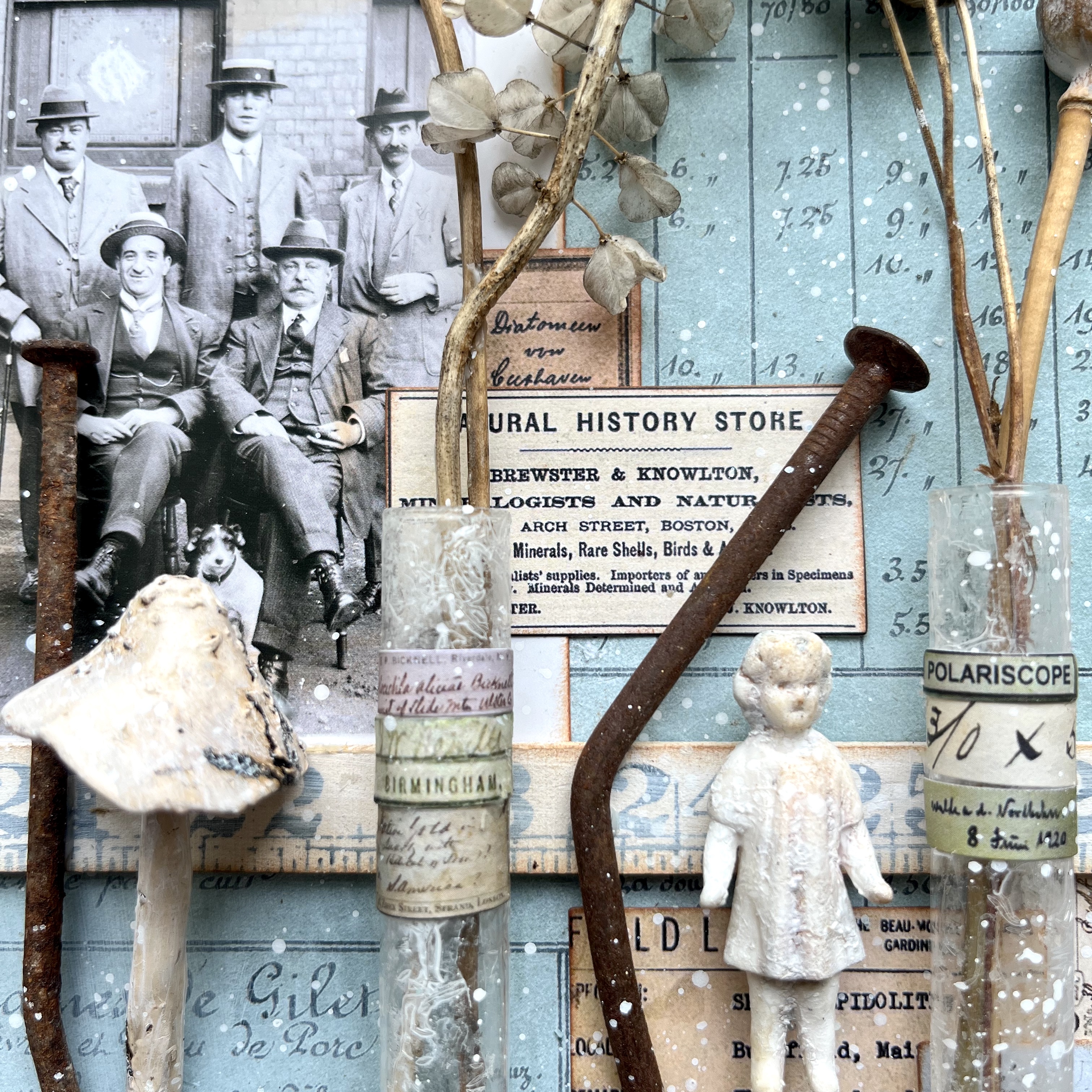
I've framed a whole collection of gathered items, presented by members of the botanical research team from Cambridge University (or Harvard, if your imagination prefers it), and surrounded by their academic notes and observations.
It's an upcycling of a home decor frame which was about as uninspiring in its original form as it could possibly be. But it's a lovely deep frame, which set my creative mojo whirring.
I started by gathering some things I thought I might want to use in the frame and playing a little with the composition. Some little glass test tubes, rusty nails retrieved from old pieces of wood removed in the house reconstruction and now doing service in the garden in various ways, my trusty poppy seedheads and other dried flower heads from the garden, and so on...
I was enjoying the neutral colour palette, but as I was flicking through the Backdrops Volume 3 paper collection, this gorgeous vintage aqua/turquoise panel caught my eye, and once I'd seen it I couldn't let it go.
So I selected some more Tim Holt paper from one of the older 12-inch stashes to go behind, mounted them both on scrap cardboard to make them more sturdy, and set about adding all the details which make me happy.
I started with making the panels look a little rusted and worn. Some Hardware Heads and other metal toppings "screw" the panels together...
... while Grit Paste smeared onto the metal as well as in places around the edges of the panels gives me some rusty texture to work with.
Then I had a little play with various Distress Crayons (Vintage Photo, Ground Espresso mostly), Archival Inks (mainly Sepia) and a little Quinacridone Gold Fluid Acrylic to get the aged rusty tones I wanted.
The new Snapshots have lots of great new characters to fire the imagination. These Cambridge (Harvard) chaps are looking very pleased with themselves and their academic pursuits.
I hadn't originally planned on including any photos, but things were changing direction from that original minimalist look, and I let them have their way.
Oh, back to texture for a moment... I wanted to age my glass test tubes a bit, so I started by dabbing on some of the seasonal Icicle crackle medium which Tim Holtz and Ranger brought out last Christmas.
It's perfect for making glass look a little bobbled and aged. I spritzed them with Picket Fence Distress Spray Stain, wiping a good deal of it off again afterwards, so that it subtly highlights the texture.
Regular followers over at Instagram will be well aware of how obsessed I am with the tiny labels from the Halloween Snippets collection. I find them completely enchanting, and they get added to almost everything I'm making at the moment! So here, as well as a starring role on the test tubes along with some Snippets Number Strips...

(Someone's clearly been on a fungus foray too, and got lucky with this Idea-ology Toadstool!) ... the tiny labels also form little collage clusters around the panel - above the snapshot and to one side...
(having the labels on two sides breaks up the straight edges of the snapshot, which I love)...
... and also tucked down behind the test tube rack. Don't ask me how the Frozen Charlotte got in there... these Salvaged Dolls have a way of just appearing from somewhere without you really noticing. Haunting.
The rack itself is one of the wooden Ruler Pieces, slightly softened with a wash of gesso, and inked with Ground Espresso Archival to help it tone in with everything else going on.
The seedheads the team have been collecting don't really seem like anything out of the ordinary to me (poppy, aquilegia, grape hyacinth), but who am I to throw doubt on this important academic study?
But the challenge is to Frame It, so "where's that frame?", I hear you cry! I'm afraid I failed on the process photos for the frame - sorry. All I can give you are some close-ups and some details about what I did to get there.
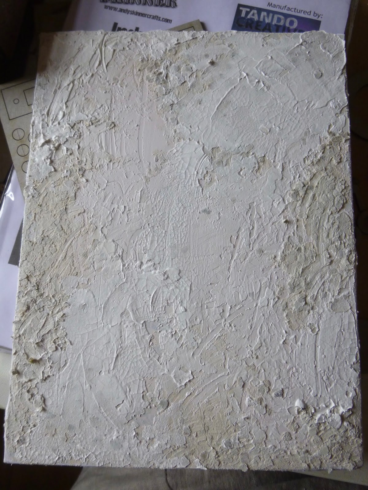
There's Grit Paste and Crackle Paste applied over a first wash of gesso, and then I layered various PaperArtsy Fresco paints (Seaglass, Waterfall, and Azure) along with Speckled Egg Distress Paint to find a blend that echoed the panel in the centre. And at the end, I used a blending tool to apply some Pebble Beach and Ground Espresso Archival inks to create a more distressed look.
And I may not be done yet. I think the turquoise colour may be too full-on, so I might change it to something more neutral to let the turquoise panel shine out.
Almost there - just a few odd angles to try to give you an idea of the depth and dimension...
... and we're done! I hope you'll find something and Frame It this week to join in with the challenge theme. If you're in need of further inspiration, the brilliant Simon Says Stamp Monday Challenge Design Team will definitely provide it.
... so there will be one lucky random winner of a $25 gift voucher, as well as spotlight projects selected by the team members.
Thanks so much for stopping by to take a look, and I hope I haven't exhausted you!
Have a great week and happy crafting all!
Is this not the collector's exquisite pleasure, that his desire should know no bounds, should reach out into the infinite, should never know full possession which disappoints by its very completeness. O what joy to be able to postpone the fulfillment of desire to infinity!
From The Bells of Bruges by George Rodenbach