I'm travelling into a new way of working, a new country, a new language, and a new hobby which I'm passionate about. Come with me for some of the journey...

Sunday 29 September 2019

Rusted Texture Galore


Hello all!  Hope you've all been having a great week.  I'm here to share a project I created at a recent Andy Skinner workshop at Country View Crafts.

I think Andy's work and paint techniques are brilliant, and I've been lucky enough to go to a couple of his workshops over the years, though this was the first one for a while that has fitted into my schedule.

Although I was on the Design Team at Country View Crafts for a couple of years, this was the first time I've been to their lovely workshop venue.

I had a great time, and I'm sure it won't be my last visit now that I've worked out the trains aren't completely impossible.

We had a fantastic time trying out Andy's new Lava Paste by Cosmic Shimmer... it's astonishing how many different kinds of effects you can get, simply by applying it in different ways and in different thicknesses.


We were also exploring the new paint line Andy has with Cosmic Shimmer, and you'll see from the close-ups here that they achieve superb rusty effects over the wild and wonderful Lava Paste textures.


It's hard to believe that all this started with just two blank MDF panels.  They're quite heavyweight panels, really very pleasingly sturdy, and well able to cope with all the mixed media goodness about to come their way.

It's a large panel - the big base one is about 8 x 11.5 inches, so about the same as a piece of A4 paper.


We had an extra ATC-sized piece of MDF to practise on - here's the lava paste applied quite thickly with a palette knife...


... and here's what happens when you heat it with a heat gun!  (Sorry for the blur in the foreground, I didn't notice I had smeared my camera lens in all the excitement.)


And then we played with adding some of the new paints Andy has produced with Cosmic Shimmer.  I stuck to my trusted palette of Payne's Gray/Prussian Blue/Transparent Yellow Iron Oxide/Quinacridone Gold for my rusted look.


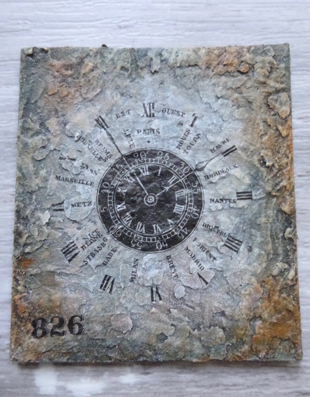
On the large piece, we had a choice of about ten different printed images to work with.

I went with this rather wonderful vintage song sheet cover.  

As you can see, it's for a song called Amanda, which is - as it says in the subtitle - a response to an earlier song by the same lyricist and composer called L'Amant d'Amanda.  (Yes, I had to come home and look it up - that's just the way I am!)


It's had various dirty washes of paint to make it look even more vintage and distressed, and of course there's some splatter too.


But the real point of this creation was the lava paste.  Just look at it bubbling up around the edges.


And right on the edge of the smaller panel, it's still the lava paste, but here applied much more thinly, and gently patted into place.  (Do click on these smaller photos for a closer look.)


I love the gritty look this gives you, just perfect for rusted textures.  


The nuts and bolts are just greyboard, believe it or not...


... with Andy's genius paint combinations added to give you the perfect rusted metal look.


You can probably tell that there's some corrugated cardboard offering up additional texture and dimension in the corners.


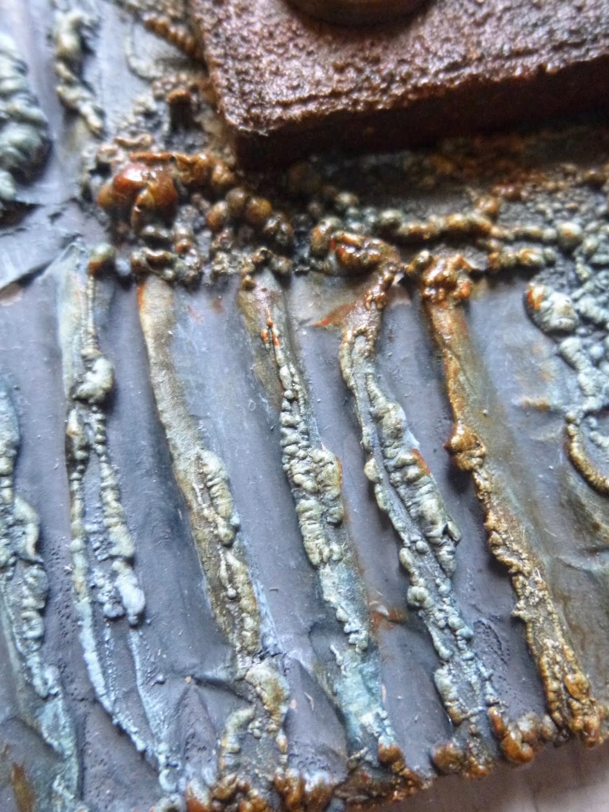
But it gets an extra distressed look from some more lava paste applied in places. 


I concentrated my Quinacridone Gold/Transparent Yellow Iron Oxide colours near these bolts so that they "drip" down to give an impression of realistic rusting patterns where water might drip and carry the rusty contagion.


Part of the joy of the lava paste is the randomness of the results.

You know approximately what you'll get from how you're applying it, but you're not in control of the specifics!


We had a bit of time to spare at the end of the workshop, so we also had a play with the new Strata Paste on a little greyboard square.

This is about the size of an ATC, but not quite.


The Strata Paste has a wonderful stony texture like shale.


Quite apart from any regular crafting uses, I think it could be really useful for dollshouse work.

It was such fun to have a playful day following Andy's instructions without having to think too much.  I hope you enjoy the results as much as I do!


Thanks so much for stopping by today and I hope you all have a lovely peaceful Sunday.

It is the lava of the imagination whose eruption prevents an earthquake.
Lord Byron

Thursday 26 September 2019

Just a little journey...

Hello all!  Here's the first of series of closer looks at some of the samples created for my latest Eclectica³ Alison Bomber quote stamps.  We're starting with EAB12 Travel & Journeys, and this quartet of ATCs.


The soft blue/violet tones of my Stripes of Strength journal pages appear here too, but rather than inks and watercolours, they're now provided by some of the lovely new PaperArtsy Fresco Finish Chalk Paint colours.


For the background of the purple pair, I used a brayer to create this gentle ombre effect.


The shades move from the palest Periwinkle via Wisteria to Forget-me-not.


Before running the brayer through the paint on the craft mat, I spritzed it with plenty of water, so that you get a really soft look to the finish.


The postmarks from another PaperArtsy designer, Courtney Franich, are great to go with a travel theme, and they're stamped in Watering Can Archival.


The quotes themselves are also stamped in Watering Can, but then I used Wow Embossing Powder in Vanilla White to give them glossy texture.


The squidginess at the end of the word "miles" was entirely my own fault... I picked the ATC up before the embossing had cooled and managed to put my thumb straight on the end of that line.

Ah well... let's embrace imperfection, shall we?  I still think it's worth it for the dimension and light-catching properties of the embossing.


I used an old credit card to add textural stripes of Aquamarine and Captain Peacock to the edges of the ATCs.


For the second pair, those turquoise colours are the main feature of the background, along with some Caribbean Sea and the soft blue of the new Summer Sky.


This time, rather than brayering, I applied the paint by smooshing the ATC into puddles of watery paint on the craft mat.  Finally, I added splatters of the Wisteria and Periwinkle paints so that the turquoise/blue/purple colour combination would match across all the samples.


The Seth Apter minis I've chosen are reminiscent of globes and compasses, so there's an abstract reflection of the Travel & Journey's theme.


They're stamped in Watering Can Archival again, and I added partial stampings around the edges to add more detailing.


Again, the quotes are in Wow Vanilla White and, again, I have to hold my hand up to the minor imperfections in evidence.


This time the problem was that I hadn't dried the grey stamping fully, so some of my Vanilla White powder stuck to it.  In brushing those unwanted grains away, Antoine slightly lost his Exupéry!


There will be making-of details about some more of the samples on their way to you soon.  There really wasn't time in the original launch post to cover all of it in one go.  But before the next set of samples, there are some new projects to enjoy over the next couple of weeks too.

Thanks so much for stopping by today, and I'll see you again soon.

For the person for whom small things do not exist, the great is not great.
Jose Ortega y Gasset

Sunday 22 September 2019

Stripes of Strength

Hello all!  I'm so happy you're as excited about the latest collections of Eclectica³ Alison Bomber word stamps as I am.  Thank you for your lovely comments.  I'll be sharing some more details about my samples here soon, but for today I'm working with some words from an earlier set, EAB08 Strength & Courage.


I'm still on course to manage at least one entry each month to the Art Journal Journey challenge.  Erika's theme for September is Polka Dots, Stripes, Plaids or Patterns, so I've been getting stripy with this page.


I've also stuck to hues of blue-violet with my neutrals, so this page is just in time to fit in nicely to this week's Monochromatic theme at the Simon Says Stamp Monday Challenge.


The background started with stripes of washi and tissue tape.


Over that, I added a soft wash of gesso and then applied stripes of DecoArt Crackle Paint with a palette knife.


The palette knife means the top line of the crackle paint is completely straight, but then I've smeared it downwards in each case to create more random, loosely shaped stripes.


The next step was to add some stripes of colour using my Daniel Smith Moonglow watercolour stick.  It goes on like hard crayon...


... but once you apply water with a brush, it blooms into the most glorious free-flowing pigment.

Funnily enough, this was the colour which informed last month's AJJ entry too, But while there's moonlight...


This page is considerably smaller than that one, though - it's in a journal which is 8.5 x 6 inches in size.

And the moon is involved this time around too - on this lovely Japanese washi tape.


Finally for the background... lots of spatter, both of the leftover Moonglow pigment that was on the craft mat, and of the new soft white from PaperArtsy, Cloud 9.


The stripes of tape provide somewhere for the two paper dolls to stand and sit.   Happily, there's a nice thick "bench" for the seated girl to perch on, and some sturdy crackled paving to support the one standing up.


I added some Pumice Stone shading around the two girls to bed them into the page.  And some wild thread adds movement and energy behind them.


Their bold expressions seem to me to work beautifully with the words.


The quote forms a whole new set of stripes, stripes of text, this time.


I used Stormy Sky and a wash of the Moonglow over the top to create the background, before stamping and embossing the words with Wow Vanilla White powder.


I always find it deeply moving that these powerful words come from a girl barely older than these two Paper Dolls, who never made it to her sixteenth birthday, yet somehow found the strength to endure hardships and horror almost beyond imagining.


The sequins capture glimmers of light and reflect them back at the viewer...


... those shafts of brilliance echoing the power of one's inner strength and courage.


I hope you like this strong, stripy page.  The words mattered a great deal to me on the day I was making it, and I came out of the craft room feeling a lot better than when I went in.  I hope you've found some time for restorative art this weekend.


For those who follow the dollshouse side of things, there's a fantastic new post to enjoy over at Cestina's Dollshouses today.

Stripes will always add that certain something.
Anthony T. Hincks

Once you can accept the universe as matter expanding into nothing that is something, wearing stripes with plaid comes easy.
Albert Einstein

I'd like to share this at Art Journal Journey where the theme is Polka Dots, Stripes, Plaid or Patterns
At the Simon Says Stamp Monday Challenge they would like us to work in Monochrome