I'm travelling into a new way of working, a new country, a new language, and a new hobby which I'm passionate about. Come with me for some of the journey...

Friday 29 March 2019

Good things are beginning

Hello all!  It's been a little quiet round here, I know (only on the blog - real life is anything but quiet!), but I couldn't miss a Tag Friday at A Vintage Journey.  It's that extra Friday in the month where the Creative Guides get to play just for fun... as long as it's on a tag (or two).


I'll be packing and flying (Friday and overnight), and then hopefully unpacking (Saturday) by the time many of you read this, and once I'm home I hope to get back in the swing of things again here at Words and Pictures, at least for a while.  For now though, I'll quickly share some details of this pair of tags and then get back to the packing.


I don't really remember very much about what went on in the backgrounds.  I know there's some Distress Ink-ing and some inky stencilling with a brick pattern by the look of things.


The leafy stems are embossed in (probably) Wow Vanilla White.


And I've used one of my quote stamps to create some text detail hovering in the distance.


The Paper Dolls are always a delight to play with - they tell me stories as I go.  I love the contrasting attitudes of these two...


The boy is all open smiles, ready for anything that life wants to throw at him.


The girl knows that, as a female, she may have to fight that little bit harder to get her share of the good things - but just look at that determined expression.


I layered up gessoed book page scraps, messy cotton thread, and some Idea-ology ephemera behind them...


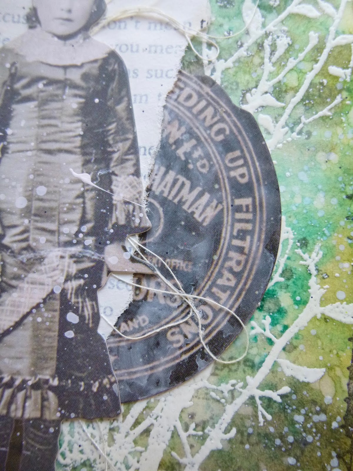
... this large label being cut in two so that each child could have half of it.  Fair's fair...


Some dark washi tape provides firm ground for them to stand on.


And you'll see that eventually I layered the tags onto some white card to give them a contrasting frame.


The stitched borders are stamped rather than real - still waiting for space/time to work with the tiny sewing machine I have stashed away - but I think they look pretty cool.


The Idea-ology word stickers seemed appropriate when I was just at the start of this latest production process here in New York... all about things beginning and adventures in store.


Now that I'm about to get on a plane home, they can refer instead to the upcoming set of adventures of shifting that home across a continent!


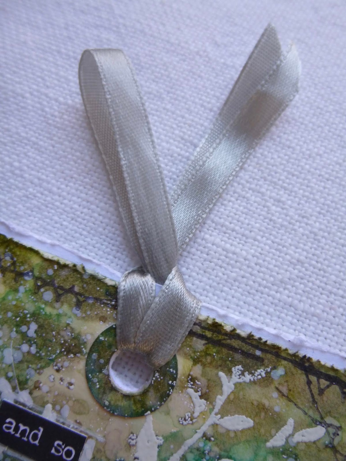
The ribbons at the top were cut out of the neckline of a cardigan - who hangs cardigans on a hanger anyway?  Waste not, want not... here they are topping off the tags.

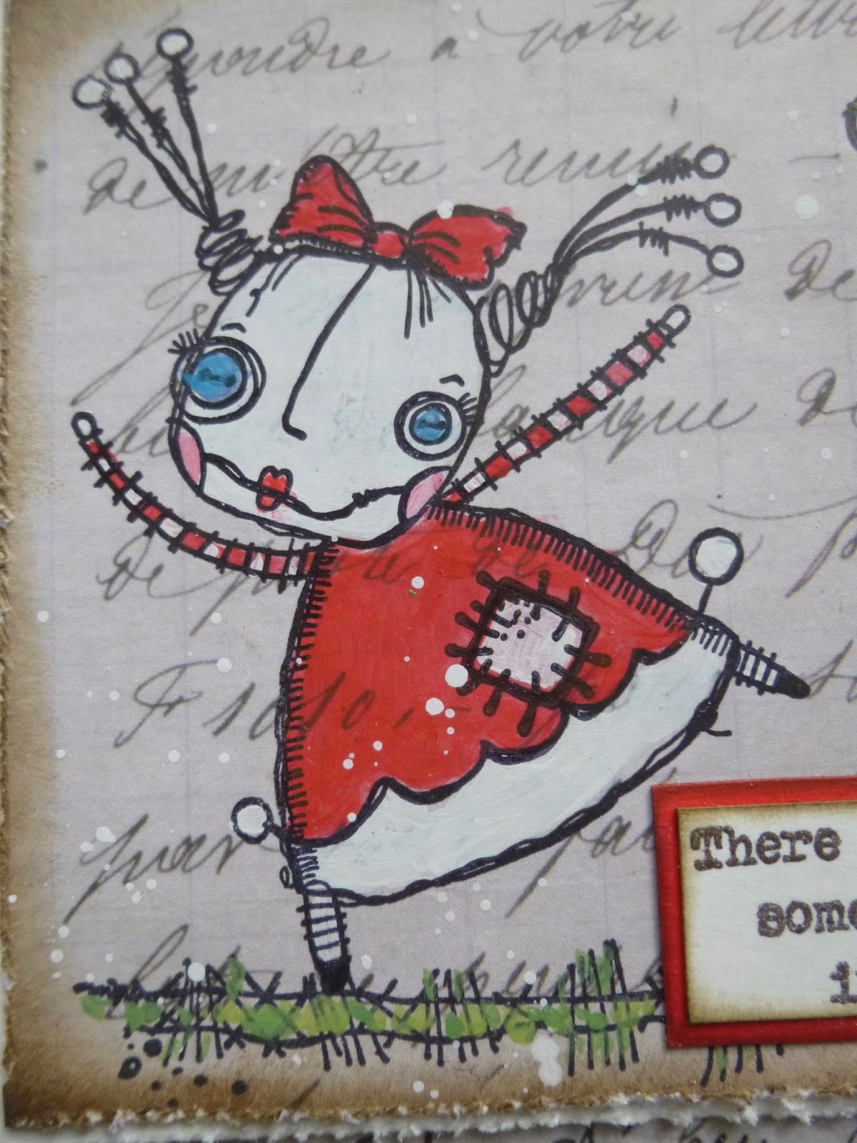
These tags look a little un-me to me... it's all that black, not a colour I work with much, preferring my vintage browns.  But maybe the slightly grungier look is fun for a change.


Thanks so much for stopping by.  I hope you'll hop over to A Vintage Journey and see the fun and games my fellow Creative Guides have been having for Tag Friday, and you're very welcome to share any tags you've been making this month in our Linky collection.  See you there!

Security is mostly a superstition. It does not exist in nature, nor do the children of men as a whole experience it. Avoiding danger is no safer in the long run than outright exposure. Life is either a daring adventure, or nothing.
Helen Keller

Sunday 17 March 2019

Encore Post - Live Gently

Encore Post - see the foot of the post if you don't know what I'm talking about!

Hello all and happy Sunday!  I had hoped to share some more of my new stamp samples with you, but there just hasn't been time to write the blogpost.  I'm still busy with Julius Caesar here in New York - full days in the theatre, with the first audience preview this evening (yes, Sunday - theatres here play on Sundays, with Monday as the day off, unlike in the UK).  But I didn't want to neglect the blog completely, so here's an Encore tag with a little touch of springtime for you in the meantime.  It's something of a favourite of mine, I must confess, so I'm happy to be sharing the full post here at Words and Pictures at last.

It was made back in August 2016 for one of the Vintage Journey Destination Inspiration posts, so there were certain elements which had to be included.  But, as you'll see, this list really wasn't a stretch for me!  Here's what I wrote back then...
_____________________________

Hello all, it's Alison here arriving at Terminal 3 of Destination Inspiration.  We've already seen wonderful projects from Anne and Deb, and now it's my turn to create with the contents of the travel bag this month.  Just as a reminder, this is what's in the suitcase:

Product - Paint
Substrate - Tag
Colour - Smoky Grey Blue (think Stormy Sky and Weathered Wood)
Technique - Resist (paint, embossing or mediums)

And here's the tag I came up with...


I started by putting a coat of PaperArtsy Chalk Fresco Paint onto a plain manila tag, and then stamping Tim Holtz's Cracks background in Versamark and clear-embossing it.


So that was my paint and my resist - now for something for it to resist!  I used Distress Stains in Stormy Sky, Weathered Wood and Hickory Smoke to create the almost stained glass look.


Having the coat of paint underneath means the Stains don't soak into the tag in the same way - they sit on the surface a little and create lovely effects as you dry them.  And you can see the grain of the paint brush strokes too, which I really like.


By now I'd covered all the travel bag contents requirements, so I was free to go in any direction with what to put over my background.  Whatever I did next, I would still have my lovely light-catching resist mosaic.


The gorgeous Bird Silhouette is a favourite die of mine so I cut him from some Tim Holtz paper and inked the edges with Ground Espresso DI.


Some more paper scraps provide the "ground" for him to stand on.  He's mounted on padded tape, by the way, to get a touch more dimension.


I was in a gentle frame of mind, so I cut some soft neutral Wildflower die-cuts to go behind him (also inked with Ground Espresso)...


... and I added some actual dried Wildflower stems to the mix.  I love the fragile dimensionality - not one for sending through the post, this!


Adding the lower parts of the stems was an afterthought.  They're just tucked in, but I think they're positioned about right to create the illusion that they're all attached somewhere behind his back.


Obviously I needed some words - Small Talk stickers to the rescue, as so often.  I can't think what I did before these little phrases were released.


So that's my Destination Inspiration tag for you.  I hope you like it.


Thanks so much for stopping at Destination Inspiration with me today.  See you again soon.
____________________________

I'm happy to say that there is finally a touch of spring in the air here, so this seemed like the right time for this tag.  I hope you're all enjoying a gentle weekend full of things which give you joy, and I'll hope to be back soon with something a little newer to share.  Many thanks for stopping by and happy crafting all!

Nothing is so strong as gentleness, nothing so gentle as real strength.
Saint Francis de Sales

Encore Posts
Projects which made their first appearances elsewhere for Design Team duties or Guest Designer opportunities, but which only had a sneak peek here, are being gathered together in the pages of my virtual scrapbook while I'm away.
As always, the Encore Posts are formatted differently from the regular ones, so that you can easily spot them.  Please don't feel that you have to comment all over again!

Sunday 10 March 2019

Spring Melancholy

Hello all and happy Sunday!  I've managed some intermittent blog-visiting this week - apologies if I haven't made it round to you yet, I'm doing my best.  And I've been squeezing in some art and craft playtime too (we had our one and only two-day-weekend last week - albeit Sunday/Monday - so it felt like a luxuriously long time!).   So in between sharing the new stamp samples, I'm here with something new for you today... a journalling spread to say hello to Spring.


Not that there's much sign of Spring here in New York at the moment... we keep getting snow overnight, though it mostly vanishes through the next day - though we are enjoying fairly frequent blue skies and sunshine, but c-o-o-o-l-d!


The tag which forms the main focal point here has been sitting on my NYC craft table since almost the first day I arrived.

To crack open my travelling stash, I did some Distress Ink blending and then dipping and spritzing with some of my favourite springtime colours.


I then added the meadow flower stamp in Olive Archival, and then got stuck.  I really wanted to add some of the new TH die-cut flowers, but I have neither dies nor a die-cutting machine with me, so that was really a non-starter.


On another day, I'd stuck a couple of torn pieces of book page into the kraft journal I have with me, and gesso'd them, and happened to add the same meadow flower stamp (not with any idea then of connecting the two... it's just I have only limited stamp selections with me).  I didn't take a picture of that stage, but you can imagine it I'm sure.


Cut forward a few weeks, and the new theme of "Hello Spring" popped up at Art Journal Journey, and suddenly inspiration struck... to combine the tag and the pages together, and off we went.


Though I don't have the dies with me, I do have Tim's Wildflower stamp set, so that became the next layer of stamping, both on the pages as wild background stamping...


... and on the tag in a more "finished" version.  I've used white paint pen to add flower head detailing.


I wanted to echo the intense DI colours of the tag over on the facing page, so Dina Wakley's acrylic paints came into play for the vivid wash of the sky.  It's a combination of Turquoise and Peacock, applied with plenty of water.


I love that, being opaque and highly pigmented, it works over the kraft as well as over the whitewashed book page.


I liked it so much that I did some spattering with it too, as well as adding some around the foot of the page to bring even more colour to the grassy hedgerows.  There's some olive green watercolour paint going on at the feet of the flower stems too, to add more depth.


All the lid-stamping, in various sizes, is also done with Dina's paint, the trusty White.

I love the bubbles of light dancing around the page, almost a Bokeh effect.


The Idea-ology Paper Dolls always bring an air of nostalgia to any project, and I think that's particularly true of this grouping.

I'm sure they partly prompted the words I later added, scribbled in white pen across both pages.


For all the joys that spring brings, I find that there's also a touch of melancholy about it... maybe something about knowing how short the spring will be, or memories of springtimes past, or lost youth or whatever. 

The Germans have a word for the feeling of weariness and sadness which can overcome you at this time of year - Frühjahrsmüdigkeit (literally early year weariness or spring fatigue).


So there's something about the combination of the childhood smiles in the photo with the bright springtime feel which actually makes me a little melancholy.  It seems topsy turvy, but there it is.


If you'd rather just say hello to spring in a nice cheerful way, then look away now, but if you're curious, here's what is scrawled across the page spread in white pen:

When I look back, it seems to me that it was always spring or summer, and that there was always laughter.  But that can't be true, can it?  So when the spring sunshine arrives, along with the joy I find I am filled with an aching melancholy, for the lost springs which have gone and for the winters to come.


It's usually a sort of pleasurable melancholy - a wistfulness - full of memories and hopefulness along with the sadness, so don't worry about me too much!


The butterflies, unbelievably, have made several trips back and forth across the Atlantic - strong wings! - in my travelling stash envelope of ephemera.  They were here last year and the year before without being used.


They're made with the Tim Holtz punch and were left over from some project years ago (just found it - it was these money envelopes back in May 2017!), so I tucked them into the travelling stash, thinking that one day they might come in handy.


Now, finally, they get to take their place on a project!  It's a sign of how often I return to the same colour zones that they match perfectly in their new setting. 


Some simple twine through the top of the tag finishes everything off.


I hope you enjoyed taking a walk in my springtime meadow, and I hope you'll be filled with the joys of spring in due course (the proper kind, not the sad kind!).


Thanks so much for stopping by today, and I hope to see you again soon.  We're about to head in to the technical rehearsals for Julius Caesar , and then Dress Rehearsal and Previews, so the days get even longer and more intense... so when I say "soon", that may turn out to be a somewhat elastic term!  But happy crafting in the meantime, and I'll see you on the other side.

The word "happy" would lose its meaning if it were not balanced by sadness.
Carl Jung

I'd like to share this at Art Journal Journey where Jo's theme this month is Hello Spring
And I hope they enjoy the spring sunshine over at the Simon Says Stamp Monday Challenge where the challenge is Whatever the Weather
At Moo Mania this fortnight, they are inviting us to get Close to Nature, so this should fit right in

Wednesday 6 March 2019

Love, Friends and Flying with the Zinskis

Hello all!  Thank you so much for your lovely response to my latest stamp launch with PaperArtsy.  The new collections are full of positive thoughts and ideas, which I hope you'll enjoy using on all sorts of projects.  When I was creating my samples for the new collections, I thought I would "colour code" them.  They all started from a neutral base, but then each set was assigned an accent colour.  Then across the sets there were "matching" styles, hopefully showing how the quotes will work in all sorts of crafting genres.

When it came to sharing more details here, I couldn't decide whether to divide up the posts by colour/collection or by shape/style, so I'm doing a bit of both in each post!  To start with, here's the full collection of samples for EAB09 The Love Collection, with its accent colour of red (well, of course, if you're dealing with love and hearts - though red is a pretty rare sighting around here!)...


And now I'm going to pull out one of those samples, and look at the matching ones from the other new collections, EAB10 Friends & Friendship and EAB11 Wings & Flight.

Let's start with those whimsical Zinski characters...  They're a hop out of kin from my usual crafting style, but it's fun to stretch one's wings in new directions occasionally (see, wings... even in my thinking I'm mixing and matching my quote collections!).


I started with some neutral Tim Holtz design paper, and used the stamping platform to stamp the Zinski girl. 


I'll confess this particular rag doll does make me very happy for some reason - it's that carefree, childlike exuberance, I think.

She's painted with Fresco paints - Cherry Red and London Bus to create the vibrant red tones, and some Chalk, Snowflake, China, Magic Moss and Granny Smith for accents.


The quote is stamped and embossed with Wow Earthtone Pepper embossing powder, and mounted on some card painted with the same bold red Fresco paints. 


That's Friedrich Nietzsche hitting the nail on the head with the words, as he so often does.

I did all the painting while the stamp and the card were still in their stamping platform positions, so that I could then stamp over the top to get all the details nice and sharp again.


The techniques are exactly the same for the "matching" Zinski cards using the other word stamps - keeping things very simple.  Now we move into EAB10 Friends & Friendship, and the colour accent is green.

There's some more of that large script paper in the background.  (I think it may be from the French Industrial paper stash, if memory serves.)


Pairing these two made me smile... look at the tolerant affection in the expression on this chap's face.


I hope he knows how good a friend he has in his tall pal.  The greens are a combination of Magic Moss and Granny Smith Fresco paints.

And the red, blue and white accents use the same paints as mentioned above.


The words are by Baltasar Gracián, a seventeenth century Spanish writer and philosopher... again, all too true.


Again, the Earthtone Pepper is in action on the quote.  I love the subtle shimmer and peppery texture of it.


And finally for this "mini collection", we're off into the wild blue yonder with EAB11 Wings & Flight.  Blue really was the obvious choice for this selection of quotes, and this is one of those magical pairings of words and pictures where it all just fits!


This Zinski girl is paired with what may be my favourite words out of this whole new release.  (I say that, but then I see another quote and think, "no, that one's my favourite... no, or this one...)


I love the mischief and daring in her eyes as she considers the possibility for flight.  And with those little wings made real by sheer force of her imagination and desire, she's already ready to take to the skies.

The blues are China and Smurf, with accent colours as already listed.


Some slightly different background paper this time, but still Tim Holtz, and still in those gentle neutral tones.  And again the stamping platform came in to its own to allow the painting and re-stamping to keep all the details fresh and sharp.


So there they are... the mini Zinski collection celebrating Love, Friends and Flying.  I'll be back soon with some close ups of some of the other samples, just so that I have them all collected together here at Words and Pictures.


The samples themselves have gone off to grace the PaperArtsy boards for shows, so this is the only place I'll have a record of what I created.  I hope you'll enjoy seeing them all gathered together.  I've even got pictures of the WHOLE group together - but you'll just have to wait for the final post for that!

Thanks so much for stopping by today, and I'll see you again soon.  Happy Crafting all!

You must not ever stop being whimsical. And you must not, ever, give anyone else the responsibility for your life.
From Wild Geese by Mary Oliver