I'm travelling into a new way of working, a new country, a new language, and a new hobby which I'm passionate about. Come with me for some of the journey...

Friday 31 August 2012

Back to school...

Hello everyone, I'm delighted to have your company here at Words and Pictures today.

I'm sharing a Guest Design project with you today for Fussy and Fancy and their Back to School challenge.  I'm afraid I'm one of those odd types who actually didn't mind going back to school (yes, I know - boo, hiss!)... I've always enjoyed learning new things, and being set new challenges.  And I know for sure many of you share that - look at us all here in Craftyblogland trying out new techniques and styles and equipment all the time.

So, perhaps my take on this challenge comes from a slightly offbeat position - made as a wall hanging to go by the front door, so that each day as you set off for school you're reminded that it really is completely worth your while.  And, being me, it's vintage and distressing all the way (and lots of photos, as there's lots going on!)...


The minute Fussy & Fancy let me know that the challenge was Back to School, my head went to these glorious images from Nicecrane Designs.  

This set is called A Child's Garden of Verses (taken from a version of Robert Louis Stevenson's collection of poetry for children illustrated by Jessie Willcox Smith).  Usually, I would take an actual stamp over a digi any day of the week, but for these I was prepared to make an exception!

I think they're completely adorable.  It's really worth a visit to the Nicecrane store and blog if you've never been, because there are so many amazing images to play with, and lots of inspiration.


I experimented with colouring them with Distress Markers, and I'll certainly hang on to the results for future projects, but it wasn't quite what I was after this time.  Then I thought I'd try printing them onto Kraft paper, and suddenly things started to fall into place.

I adore this one with the boy so completely absorbed in his reading - just as captivated and engrossed by that as an activity as he is by the adventure games, or the idling in conversation over the five-bar gate...


I used the Picket Fence Distress Marker to highlight certain parts of each image - trying to give the impression of the same boy moving from picture to picture, and then gave each of them a buffing with a blending tool full of Vintage Photo Distress Ink.  I'm really happy with the results.  I really like the golden brown of long lost summers...

As my first background layer, I used a sheet from the Graphic 45 ABC Primer collection in the 8x8 size.  I gave it a whitewash layer with Picket Fence Distress Stain to get that slightly shabby look, but I'm quite pleased that it also looks like a partially wiped blackboard behind the pictures, with plenty of chalkdust left on it.  It's got a bluish tinge in the photos, but I promise you it's not!


The quote is by George Washington Carver - not someone I really knew anything about (seems he's an American scientist 1864-1943), but I love the sentiment - and wholeheartedly agree with it.


The two really significant words get extra attention drawn to them by being backed onto some cream mesh ribbon.


The key seemed a perfect addition, not only in support of the words, but also with the whole golden vintage glow I was - by now - trying to create.  


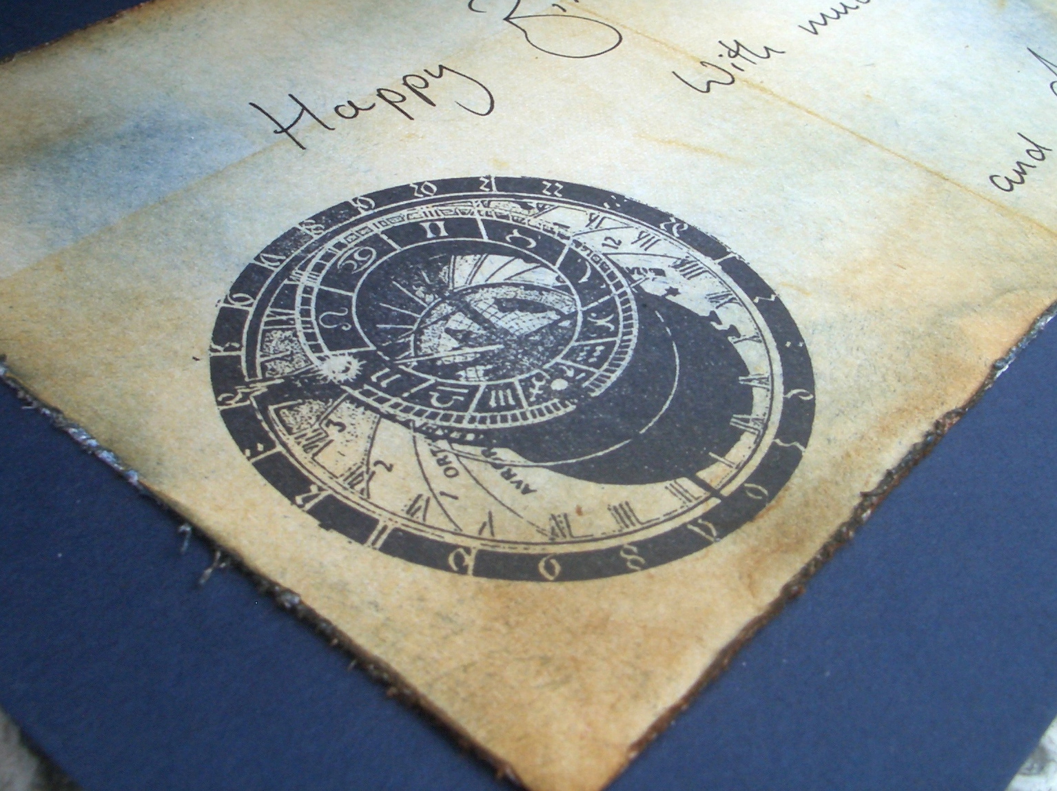
The compass is there to help you decide your direction in life.  It's the Tim Holtz stamp on Kraft card, given a good coating of UTEE for the super glossy finish, and with a dull gold game spinner through the centre.


I then started building extra framing layers.  There's one on white paper, stamped with the Prima Almanac Script stamp, and inked with Vintage Photo.  

And over two corners of that, in the opposite corners from where the words are, I've added the lovely Memory Box corner die cut out of Paperartsy's wax paper (same thing as Kraft Glassine, as far as I can make out).

And then, for the base frame, I started ripping up one of my ex-stash-delivery-boxes (nothing useful ever thrown away round here) to try to get at the corrugated card inside.  

You have to peel away the top layer of paper/card over it - easier said than done! But in the end I quite liked the textured effect where some of the paper wouldn't quite come off.

I played around with gesso, white acrylic, Vintage Photo and Walnut Stain DIs, some Mushroom Color Wash spray and Perfect Pearls Mist in Heirloom Gold, ripping, distressing and rolling the edges as I went, until I had a weatherbeaten look which pleased me.


The banners are hand-cut from one of the other ABC Primer papers and inked... learn your letters as well as your numbers for an all-round education!


Thank you so much for stopping by today here at Words and Pictures - your support and comments mean so much to me.  Do pop over to Fussy and Fancy and see all the amazing projects from the Design Team there - there's lots of inspiration, and still plenty of time to join in with the challenge.

What we want is to see the child in pursuit of knowledge, and not knowledge in pursuit of the child.
George Bernard Shaw

The larger the island of knowledge, the longer the shoreline of wonder. 
Ralph W. Sockman

I'm entering this in the following:
Kraft Outlet's Make it Monday who are also playing Back to School this week
It's All About the Vintage have a lovely challenge called Summer Memories, for which this seems perfect
Simon Says Stamp are having an Anything Goes week
The Addicted to Stamps Challenge would like us to Recycle Something - I've used my packing boxes
Papertake Weekly who are having a Sketchie Free For All... I'm using Sketch #35


Thursday 30 August 2012

It's not easy being green...

Well... it's not that hard either - it's just a song I love (Kermit used to sing it on The Muppets, you can listen here), and I fancied it for my title - you'll soon see why!

Welcome (back) everyone - so happy you decided to drop in... it's always great to have company on the journey.  Since I'm 'fashionably late' for both the challenges today's piece was inspired by (though thankfully I haven't missed the party altogether), I'm going to dive right in.


I can't tell you much about the making of this tag ('phew', I hear you all cry), as it's for the Studio L3 challenge, hosted by Linda Ledbetter, to carry out the techniques in Tim Holtz's Compendium of Curiosities II.  So if you'd like to know more, you'll need to check out page 41 of the book or - as a special treat this week - you can watch the man him self in action (LOVE the opening credits - the music has become a really happy tune for me as I know I'm going to enjoy what follows!):


So now the cat's out of the bag about how it's done, here are a couple of shots of the early stages of the tag.  I knew I wanted butterflies, so once I'd started I just layered butterflies and butterflies and butterflies!  


I love resist... so I love this technique!


The other challenge I really wanted to make time for this week was Our Creative Corner's lovely Recycle with a Pop of Green affair.  Well, as you can see, I've got the green covered already, so now the recycling...

If you visited me on WOYWW this week, you'll have seen the bread wrapper on my workdesk, awaiting a new life in a crafty project - well, the reincarnation has taken place!  Thank you Morrisons supermarket for selling your bread in wax paper...  and it gets splendidly rumpled and creased as you make your way through the loaf, wrapping and unwrapping it!


I had various plans for it, and just had to find the time to make the piece they would be right for.  And here it is as my lovely dimensional butterflies. 

I haven't got a butterfly punch or individual die, so I used the Tim Holtz On the Edge Butterflight die, which meant doing some topping and tailing to get whole butterflies.


They're stamped with the little Prima Almanac wallpaper stamp in Staz-On black ink, and heat set. Then the two layers are stuck together with Glossy Accents, which is also what I used to attach them to the tag.


I'm so pleased with the effect, as the wax paper is so light, it has a really delicate translucence and flutters in the slightest draught so that my flight of butterflies really dances with dimensionality.


Once I started assembling the whole thing (it's mounted on thick chipboard, so that it's nice and sturdy), I found it all a bit too polished, so before sticking anything down I wellied in with a coarse-grain sandpaper emery board at the edges. 

I loved the worn wallpaper look that I got, so took it onto the main surface of the tag in places too.


(The quote is one I've always loved... so was easy enough to decide on!)


The rough hewn, shabby look was just right for what I had planned at the top of the tag, and for the ribbons and twine I was starting to gather around the tag on my workdesk, seeing which wanted to really be there.

I had a leftover kraft tag that I'd tried a new woodgrain stamp on (new three months ago, when I experimented).  It was far too large, so I cut it down, and then ripped the bottom edge, and gave it a going over with the Paper Distresser on the other edges.  

To this I added a butterfly I cut from the trimmings of the Kraft Resist paper.  He also got a little sanded at the edges.  And lastly I stuck on a mini botanical label from the 7 Gypsies Conservatory set.  

Again, this was something I'd made ages ago, when I got hold of some Glossy Accents for the first time (in, I think, late March-ish?) and was just seeing what it would do!  It's been sitting in a little box since then - time to come out and play!


The delicious ribbon at the top is from the Funkie Junkie Boutique, as is the twiny mesh ribbon from which I made the fringe at the bottom of the tag.  

Overall, I'm pretty happy with the finished tag - especially as I didn't think I was going to make the deadlines for these challenges!  I really had fun creating it - greens and blues are so soothing to work with... I hope you've enjoyed it too.  It's always great to hear what you think, and I always try to pay a return visit if I know you've stopped by.


I'm entering this in:
Studio L3's Compendium of Curiosities Challenge 19, Kraft Resist
Our Creative Corner's lovely challenge, Recycle it with a Pop of Green - recycled bread wrapper
Addicted to Stamps challenge called Etwas Recyclen - in other words, Recycle Something
Hels Sheridan's lovely Sunday Stampers challenge, which is to use Green at Ink on My Fingers
Paper and Such are playing a challenge this week called Wings N Things
Simon Says Stamp are on an Anything Goes challenge
Out of a Hat Creations would like us to use our Favourite Technique or Product... well it's probably no secret that I would be lost without Distress Inks, and at the moment, I'm fairly obsessed with resists of one sort or another - but my absolutely favourite thing is Distressing or ageing things for that lived in look... and there's plenty of that going on here!
Oh, and I almost forgot - I wanted to enter it for Frilly and Funkie's gorgeous Resist challenge too!

Butterflies are self-propelled flowers.
Robert Heinlein

I only ask to be free.  The butterflies are free.
Charles Dickens

If nothing ever changed, there'd be no butterflies.
Anonymous

Wednesday 29 August 2012

WOYWW 169

Oh boy, Wednesday it is then... so soon already?!  What's On Your Workdesk this Wednesday?  Well, here's what's on mine, and if you want to peek at what's on hundreds of other crafty workdesks this Wednesday, hop over to the Stamping Ground where you'll find Julia Dunnit's huge and brilliant linky list - and you can join in too!


Bits and pieces really... practice cards part way through some of the amazing Timeworn Techniques I'm learning on the Andy Skinner online course; gorgeous wax paper from a loaf of bread which I have an idea about for the Recycling challenge over at Our Creative Corner... not sure if there's going to be time though.

Whole pile of leftover paper scraps shoved to the right, and discarded acetate that I failed to create with successfully to the left, in case inspiration should re-strike.  In the back right corner is my Life is Good tag, trying to provide that inspiration...


On the left are the Darkroom Door metal boxes of the Prague stamps used for my Postcard from Prague.  They haven't really got a home yet, so still sitting there - but also partly because I think the boxes are sooo beautiful, so I like having them there at the moment!

Just got the tiny skull and bats as extras in a package from the Funkie Junkie Boutique, and they're hovering to see if I want to rust'em up or use one of the other Timeworn techniques on them...

And then there's what lies beneath...

Hmm... gathering crumpled tissue paper just above the radiator - fine for the moment, but need to sort it out before the radiator needs switching on!

Thanks for stopping by, and if you're in today's fabulous nosy-parkers' bloghop, I'll hope to catch up with you before next WOYWW!!

Creative minds are rarely tidy.
John William Gardner


Tuesday 28 August 2012

Postcard from Prague

Hello again!  I'm back to share another of the pieces I prepared for my uncle's 60th birthday - this one is the giftcard I made for him.  It's on 4mm board, so that it can be framed and hung as a picture.

Longtime followers will know that I started blogging while in the Czech Republic, where I hope to spend more time from now on - and that's because it's where my forebears are from.  So I was delighted, shortly before my uncle's birthday, to win an Ebay auction for some Darkroom Door stamps of Prague.  They are fantastic stamps, and they're what I used to make this birthday giftcard.


Evening Street, 1906
Jakub Schikaneder
There's a Czech painter called Jakub Schikaneder (1855 - 1924) who, amongst other things, painted many dusk and night-time scenes, with streetlamps and glowing lights in windows.  

It wasn't until my mother looked at this card and said - 'Oh, it's like a Schikaneder!', that I realised that I probably had been influenced by his colourways, unconsciously.  

But then, Prague has always seemed to me a city of mystery and learning - a centre of alchemical, musical, and intellectual studies for centuries, so there's also something of that in it for me.

Anyway, I had tremendous fun just allowing the stamps to merge onto the card, and blending blues, browns and golds into the mix.

I was working on a very thick A5 cream board, so it has a real solidity to it.  I later mounted it onto folded dark blue A4 card so it could be displayed like a conventional card.


The images are stamped in Archival Black, as I knew I'd be inking and spritzing and didn't want any of them to end up blurring in this particular piece.  

I started with the image of Charles Bridge, stamped onto one of the Prima Printery sheets of 8x8, and backed onto another paper from the same collection.  Both were attacked with the Tim Holtz Paper Distresser and a number of Distress Inks - Vintage Photo and Stormy Sky prime amongst them. 


The sentiment I stamped in Versamark Watermark and embossed with Detail Black powder to give it some gloss and dimensionality.  


Around the edge of the board, I used the Tim Holtz cracked glass stamp from the Ultimate Grunge set, stamped in Cobalt Archival.  It has a lovely quality somewhere between cracked ice and spiders' webs.   

In the centre I added my much-loved TH Postcard stamp, and the little Prague description from the DD set.  Just off camera is the Prague postage stamp done in Cobalt Archival.


I love this stamp with the street of houses and cobblestones.  There is more to the picture but I wanted it curving round behind the main image, to give it a half-hidden intriguing look... like all the little streets and alleyways you get tempted to walk up as you walk around Prague.  


I needed more cobble stones to fill the space, so I repeated that little bit of the stamp to go further down the card.  


I also adore this stamp of the astronomical clock you can find on the City Hall on the Old Town Square.  

The clock dates back to 1410, making it the oldest astronomical clock still working.  It was made by two men: clockmaker Mikuláš of Kadaň and Jan Šindel, a professor of mathematics and astronomy. It's an absolute must on the sightseeing itinerary if you're visiting Prague!


I used it again on some more of the Prima paper, inked up and distressed at the edges, to make a panel for the interior of the card so that we could write inside.


In the top left corner, I added one of the splendid wrought iron curlicue stamps from the set, and the ghostly PRAHA (Prague in Czech) letters are embossed in Weathered White.  

I love this spooky, cobwebby corner, drifting into twilight!

The whole thing got a spritz of Heirloom Gold Perfect Pearls Mist for the lustrous gleam it gives.

Last of all, here's a shot of it lying on top of the large white envelope I distressed with Vintage Photo Distress Ink.  

It also makes quite a nice frame to the whole thing as it turns out!

Thank you so much for dropping in to Words and Pictures today (especially if this is your second visit... certainly the first time I've posted twice in a day!).  It means so much to have your company and your comments along the way.

Prague isn't just a city, but an entity of some kind.
Sezin Koehler

The ancient splendor and beauty of Prague, a city beyond compare, left an impression on my imagination that will never fade. 
Richard Wagner

I'd like to enter this for:
The Try It On Tuesday challenge this fortnight, which is Travel
Top Tip Tuesday are celebrating their second birthday with a Birthday Gift challenge
My Time to Craft are, by lucky chance, having a Milestone Birthdays challenge this week
Papercrafting Journey are having an Anything Goes challenge - lasting SIX weeks!!


Timeworn Ivory

Hello all, great to have your company for a while... I won't keep you long today, I promise!

I'm very excited to have just started doing the Andy Skinner Timeworn Techniques course online, and while we're encouraged to play with the techniques for a while to get comfortable, I had to put one of them straight into action as part of a gift.  

My mother and I put together a configurations box to celebrate my uncle (her brother) and aunt each turning 60 this year, as well as celebrating their 35 year wedding anniversary, and the prospect of shortly becoming grandparents for the first time!  I'll give you a look at the whole box in a post soon, but just wanted to share this little element first.

One thing my uncle has done is to collect netsukes (tiny Japanese ivory figurines - pronounced netsky), so we wanted to put something into the box to commemorate that.  All we could lay hands on was a bright green plastic figurine - but very helpfully the Timeworn workshop had just kicked in, and one of the techniques is for aged ivory... so here's the transformation:


He's quite small... he's with a roll of tissue tape for comparison here, and with a 20p piece below, so that you can see the scale.


The instructions provided by Andy are extremely clear, and easy to follow, but I'll be doing plenty of practice with washes and dry-brushing, all new techniques to me, but it's such fun to be learning.  


I had to go easy with the buffing as the paint was showing a tendency to flake a bit - didn't do my prep fully on the plastic surface, I guess - but I was working to a deadline!


And overall  I'm quite pleased with the results for a first go.


Just a little sneak peek of some bits of the configuration box where he has taken his place... watch this space for more on that, and I'm sure there'll be some more Timeworn experiments to share with you soon too! 

Thanks for dropping in to Words and Pictures today.  I hope you've seen something to tickle or inspire you, and I hope you get to spend at least some time today doing something that brings you joy!

If you believe everything you read, better not read.
Japanese proverb

Fall down seven times, stand up eight.
Japanese proverb

Knowledge is not skill.  Knowledge plus ten thousand times is skill.
Shinichi Suzuki

Best get back to practising then!!

Sunday 26 August 2012

First Journal Page

Hello everyone, and a happy Sunday to you.  Welcome to Words and Pictures, and an especially big welcome to the new followers; I'm so delighted you decided to join up!

I'd like to share my first journalling attempt with you today.  I've been admiring art journalling posts around Craftyblogland for some time, and can see that an art journal is a wonderful place to play freely, and explore ideas, feelings, products and techniques.  But I was really scared about doing it!  I decided you've just got to start...

Regulars will see that this first page grew out of my recent Autumn tag, sharing techniques, colours and even some recycled leftovers!  I was so enjoying making the tag, and the autumn sunshine (definitely got that tang in the air now round here) and some of that feeling needed to overflow into another outlet, so here it is.


In fact, the first elements arrived out of playing with an earlier challenge - the Tim Holtz Whitewash stamping technique.  I was frustrated because I loved the effect of simply stamping in Picket Fence Distress Stain, and only reluctantly completed the rest of the stages!


I'd got myself a couple of journal books to play with, to try to tempt me into starting.  I got one with Kraft pages, as I do love working on Kraft, so it seemed a good idea.

I had to do something to break the barrier of all those blank sheets of paper, so I stamped down the TH Papillon text stamp in Picket Fence as my opening salvo.


From there, it just gathered pace... there's TH tissue tape (LOVE it!); the Artistic Outpost leaf came into play;


the Kaisercraft music stamp, using my newly discovered tissue paper stamping game;   a TH texture stamp from the Ultimate Grunge set;


and collaged pieces of the paper (Kaisercraft Timeless, with additional inking) left over from the previous project.


I tried using a left over Life is good quote too, but it wasn't quite right somehow, so I stamped myself a new one on less inky paper.  I also spritzed the whole thing with some Ranger Mushroom Color Wash, which gives it all some additional texture and a nice depth, I think.


I love that through it all, that Picket Fence stamping holds its own...

It's only a one-sided page, as it's the first in the book. I don't know yet what the cover is going to do, and I'm probably going to have to do something clever with sandwiching pages, as the paper is really quite thin so will need some buffering in the long run, but overall I'm happy to have got the thing started... I hope it will roll more easily now.
So, there you have it... you can see my mood is autumnal, but also pretty buoyant, I hope.  Just about to start a new theatre project, and I've heard there's going to be lots of singing so that always makes me happy!  I hope that whatever you're up to this weekend makes you happy too...  thank you so much for spending some of it here with me.  It's always a real delight to hear your thoughts, and I do always try to return the visit if I know you've been...

I'm entering this in the following:
The Art Journal Cafe who, by happy chance, are looking at Monochromatic pages this week
A final throw of the dice in the Simon Says Stamp and Show challenge, No Rules


If you think you can do a thing or think you can't do a thing, you are right.
Henry Ford

A journey of a thousand miles must begin with a single step.
Lao-Tzu

The secret to a rich life is to have more beginnings than endings.
David Weinbaum


Friday 24 August 2012

Life is Good!

Hello and welcome!  I'm relieved to be back with a piece I'm wholeheartedly behind today, a tag which was a sheer joy to create from beginning to end...


It was inspired by the gorgeous Artistic Outpost stamps... these are from two sets: Old Grist Mill and Typography.  I was really looking forward to creating something using resist technique for the Frilly and Funkie challenge... it's a technique I love, and use a lot, so it was such fun to play. 

I took a piece of Kaisercraft's Timeless collection with handwriting on - I love any kind of text on papers and stamps.  Initially I used two different resists with the leaf stamp from Old Grist Mill. 

I stamped some with white acrylic paint, and some with Matt Studio Multi Medium.  Then I inked with Frayed Burlap Distress Ink on a blending tool, and wiped over the leaf prints with some dampened paper towel. 


It's funny, but when I first got the Old Grist Mill stamps, many weeks ago, my itch with the watermill was that it wanted to be stamped on glassine or tissue paper.  I've experimented with both, but never quite found the place I wanted to use it... until now!

I stamped it in Coffee Archival onto some tissue paper and then, using the Multi Medium, pasted it quite wetly onto the tag, creating some wrinkly texture as I went.  Thankfully, as hoped, the text still shows through in places - very happy!


So, having added some Vintage Photo round the edges, I already really liked the tag.  In a minimalist mood, I might even have kept it like this perhaps!


No... by now I was too enthusiastic about the tissue-stamping game, so I had a play with the leaf again, stamping it onto tissue paper in Archival Sepia and in Coffee, and gluing it wetly and wrinklily (?!) onto the tag.  


I loved how the layers were starting to build up, with all the different versions of the leaf.  And it was getting progressively more autumnal which, though I'm resisting it in real life, is a beautiful place to play crafting-wise.  The colours of Autumn are just gorgeous!


And I was quite simply happy and contented while I was making this tag, so when it came to choosing a sentiment, it wasn't very hard!  I used some of the leftover script paper, partly inked and partly not, and stamped in Coffee Archival.  It's mounted on some of the delicious metal mesh from the Funkie Junkie's Boutique.  


At the foot of the tag I added some natural twine (like this a lot at the moment), and one of the gorgeous rusty hearts also from the FJB.  I stuck to a simple knot rather than a bow, as it feels like such a simple, rustic tag.

It's casually (if carefully) placed so that there's the dark brown of the mill, a light resist leaf, and a sepia tissue leaf all in contact with it... call me a pedant or perfectionist if you like - I'm used to it!

For the top of the tag I used the ribbon which recently made an altered appearance in Sherlock Holtz, but this time I left it unaltered and added some natural raffia.


The heart is made out of some corrugated card which was wrapped around the metal mesh when it arrived from the FJB (thank you, Linda!).  I drew round the rusty one, so as to have the same shape, then gave it a dab of white acrylic and a sweep of Vintage Photo DI.  


And finally I added an extra leaf resist leftover from earlier, but gave it a more intense Vintage Photo background to set it in sharper relief.  

If you look closely, you'll also see a faint echo of the 'good' from the sentiment, which I'd also played with as a resist before deciding I wanted the earthier ink version. They're both attached to the raffia/ribbon with bronze jump rings (TH Idea-ology).  


Thank you so much for taking some time to visit here today.  I feel a real lift of the heart with this tag (perhaps in contrast to the walk on the dark side, which I was not very happy with as a piece, but there you go... it's all about the exploration), so I hope you've enjoyed it too.  Have a great day doing whatever makes you happiest, and I hope to see you again soon - here or elsewhere in Craftyblogland!

I'm entering this in the following:
Frilly and Funkie's challenge this fortnight which is How Can You Resist?
Artistic Outpost's August challenge which is Anything Goes (using AO stamps)
Because it makes me happy, I'd like to put this in as another No Rules entry for Simon Says Stamp and Show
I'd like to make this another entry for the Allsorts challenge this week, Heavy Metal
Another entry for the Anything Goes challenge this week, to Make Your Own Background
And I'm joining the Sunday Share at Frilly and Funkie too, having used heart and mesh (and corrugated card!) from the FJB

Autumn is a second spring when every leaf is a flower.
Albert Camus

If you want to be happy, be.
Leo Tolstoy

"Well," said Pooh, "what I like best," and then he had to stop and think.  Because although Eating Honey was a very good thing to do, there was a moment just before you began to eat it which was better than when you were, but he didn't know what it was called.
A.A.Milne