I'm travelling into a new way of working, a new country, a new language, and a new hobby which I'm passionate about. Come with me for some of the journey...

Showing posts with label Distress Markers. Show all posts

Friday, 10 August 2018

Encore Post - Irresistible Fossils

Encore Posts
Projects which made their first appearances elsewhere for Design Team duties or Guest Designer opportunities, but which only had a sneak peek here, are being gathered together in the pages of my virtual scrapbook while I'm away.
As always, the Encore Posts are formatted differently from the regular ones, so that you can easily spot them.
Please don't feel that you have to comment all over again!

This is a post which appeared over on the PaperArtsy blog back in April 2016.  I'm reviving it now as it's a perfect fit for this month's How Can You Resist? challenge at A Vintage Journey, so I thought this could offer an extra bit of inspiration.  Inspiration from the past for a current challenge - not bad, eh?!   You can check out my actual inspiration for this month's challenge if you missed it... this time they were Irresistible Insects rather than fossils.  Here's what I wrote back then....
__________________________________

Hello all, it's Alison here from Words and Pictures.  I've not been around much lately but I couldn't resist joining in with the Resists theme, and it gave me the excuse to get two of the PaperArtsy Minis I've coveted for ages - finally giving in to temptation (like Oscar Wilde, I can resist everything but temptation!).  Regular followers of mine will know that clear embossing is a favourite thing of mine - I love its glossy dimensionality - and it works brilliantly as a resist for the inkiness to follow.

I ended up creating a quartet of ATCs with these fabulously detailed stamps... one pair with the fossils lying in state in a fusty wooden drawer in some zoologist's collection...


... and one pair where they are in a kind of dream of the world they used to inhabit...


I started by cutting ATCs from some off-white card and stamping the fish fossils - PaperArtsy Ink & The Dog Minis 100 and 101 - in Versamark before embossing with clear embossing powder.

  (You'll see I created a spare pair in case of problems or other ideas!)


For the zoologist's pair, I applied Distress Inks to the ATCs with a blending tool - Antique Linen followed by Vintage Photo - keeping some damp paper towel nearby so that I could buff away any excess ink from the bones as I went.


Then I did some spritzing and flicking, and also sprayed some Distress Marker splatter to add to the aged look.


I added some vintage script - the zoologist's notes, taken from the Ink and the Dog Words Plate 4 - stamped in Distress Ink so that it could also easily be wiped away from the bones.


And finally I added the rub-ons to label the collected specimens, as well as the word stickers which I shaded around with more ink.


For the underwater pair, I applied my ink differently - pressing the chosen colours onto the craft mat, spritzing with some water...


... and then dipping and smooshing my ATCs until I liked the look of them.


I used the branches from Hot Picks 1008 as seaweed, again stamped in Distress Ink so that the paper towel could spring into action to remove any excess from the embossed fossil.


And I painted some Snowflake Fresco paint on to my craft mat and then used the top of a paintbrush cover and the other end of the paintbrush...


... to "stamp" my columns of bubbles.


I always enjoy the gleam of the clear embossing in sunlight, and it gave me great pleasure to fit in just a little bit of Resistance in my brief few days at home recently.


I hope you'll be inspired to play with some Resists too.


__________________________

And that hope is still true today in 2018, only this time the invitation is to share your resists at A Vintage Journey rather than at PaperArtsy!  

If we were fossils of two snails 
caught in a rock for millions of years.
Would we know we were together?
Natasha Tsakos

Friday, 4 March 2016

Encore - Simple cards...

Encore Posts
While I'm away, there are some scheduled posts with new creations coming your way, but I'm also taking the chance to do some catching up here at Words and Pictures.   Projects which made their first appearances elsewhere for Design Team duties or Guest Designer opportunities, but which only had a sneak peek here, are being gathered together in the pages of my virtual scrapbook.  I'm calling them "Encore" posts and they're formatted differently (all the way down the centre), so you can spot them easily.
Please don't feel that you have to comment all over again!

So glad you enjoyed the Doll Exhibition over at Calico - thank you for stopping by even in my absence!  I've made it to Hong Kong, and had a lovely couple of days seeing a bit of the place, but now it's back into the theatre pretty much full time, with the odd break.  Internet is still unpredictable (think it's the hotel's fault here), but I hope to get round for some visiting once the shows are up and running.  But for now, I've another flashback post for you.  These cards were created as part of my Design Team work for The Artistic Stamper, and here's what I said back in June 2014...
________________________________

Simple???  Cards???  Yes, you did read that right...  Not only is today's project very simple, it also consists of a pair of cards.  Regulars at Words and Pictures will know that's a very strange double whammy indeed!  Still, it should mean a shorter post than usual!!


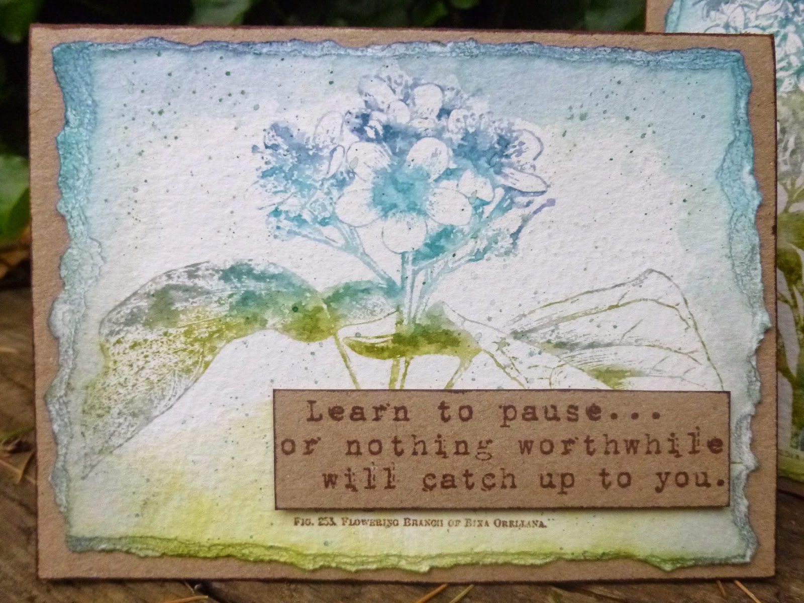
I wanted to play with the magnificent giant flower stamps, new from Katy Leitch.  I started by applying Distress Inks to the stamps, graduating the colours roughly from top to bottom.  I used Peeled Paint, Iced Spruce, Broken China and Faded Jeans.


Once it was inked, I gave the stamp a light spritzing of water and stamped onto watercolour cardstock.


I tapped Archival ink onto the little words at the bottom, just to keep those sharp and fresh whatever came next...


With that done, I then borrowed some techniques from one of last year's Tim Holtz tags - the June 2013 tag... I inked around the edges with a blending tool and then used a water brush to draw the ink in towards the image.


And I also put some ink onto the craft mat from Distress Markers in those same colours (except the Iced Spruce - don't have that as a DM as yet), and then let them soak into the nib of the brush.  Then you splatter delicate little ink droplets over your image.


I grabbed a couple of sheets of thick kraft card in A4 and, using the paler side, cut them to size to fit the watercolour panels I'd created.  I used the leftover cardstock to stamp my two sentiments - selected from various Tim Holtz sentiment sets - in Coffee Archival.


Obviously they were chosen partly because the font is similar on each, but also specifically for the shape of the words - a long tall one, and a wide flat one!


I inked both the sentiment panels and the borders of the card with the Coffee Archival ink pad, just brushing the pad against the card edges.


And inside each card, there's just a little echo of the image on the front.


This time they're stamped in Coffee Archival.


It's nice to get both versions of the stamping - the sharp clarity of the Archival, and the delicate softness of the "watercolour" Distress Ink.


Two cards, and they really hardly took any time at all...


I could get into this simple thing!!  Though it seems the post isn't that much shorter than usual.  I just like having lots of pictures, that's the trouble.


________________________________

Thanks so much for stopping by today for this Encore post.  There'll be another along soon, as well as some new projects scheduled in between.  I hope you're all well and thriving, and I'll see you again soon.  Happy Crafting all!

Flowers seem intended for the solace of ordinary humanity.
John Ruskin

Friday, 29 January 2016

Be Brave

Hello everybody.  It's lovely to see you again in a busy week here at Words and Pictures.  I'm glad you enjoyed my altered vintage bottles.

I'm here today because it's Tag Friday over at A Vintage Journey - that extra Friday in a month which means that the Creative Guides just get out their tags and play.  There are some amazing tags by my fabulous fellow Creative Guides for you to enjoy over at the Tag Friday post at A Vintage Journey - well worth a few minutes of your time during a coffee break some time today.


Tag Friday is always a favourite for me.  Usually I use it as an excuse to just play with my favourite inks and stamps, but this time I've used it to be brave with a different colour palette.

With this layered tag, I've definitely been influenced by some of the fabulous Polish crafters I follow - check out JaMajka, Dorota, or Ewa at Cynkowe Poletko (Zinc Plot) as well as the Russian, Elena Morgun.

If you've never seen their work, you're in for a treat.  I would blame my Eastern European (Czech) heritage for loving all these Polish crafters (and there are more...) but I think it's just that they make very beautiful things!


But really the major influence on this particular tag is another Pole -  Czekoczyna a.k.a. Kasia Krzyminska, whose work I've admired for a long time.

It's unsurprising she should be an influence at the moment, given that she's co-ordinating the Wanderlust 2016 course which I'm very much enjoying when I get the time.  She's also teaching some of the classes.


Of course, it's not unheard of for me to use these kinds of colours (check out this tag in a bag if you don't believe me - and there have been other occasions too), so it's actually the use of the black which feels more iconoclastic to me...

In terms of texture, layers and composition, I guess it's still me though.


I started with some papers from the Tim Holtz Vintage Shabby stack (no longer around, sadly).  One of my resolutions is to use some of my hoarded paper stash, so I'm trying to be good.

I applied Ranger Transparent Matte texture paste through the Burlap Layering Stencil.


Once that was dry, I gesso'd lightly over the whole thing and started adding some inky colour (Spiced Marmalade and Picked Raspberry mainly) by unscrewing the Distress Spray lids and scribbling with the ends of the spray hoses.


Sometimes I spritzed with water for softer colour, and sometimes I dried it so that the scribbles would be nice and bold.  Scribbling was one of the things I found I loved when making my Wanderlust Travel Journal, so you can expect to see more of it round here I think.


The photo is, of course, one of the Idea-ology Photobooth pictures.


The determined gleam in her eye dictated the words chosen from the Small Talk stickers.

And it was when I had those black word stickers that I decided to be braver myself and add some more black detailing.


So I used my favourite alphabet stamp from the Documented set and stamped it in Jet Black Archival.  And I did some spritzing with the Black Soot Distress Marker too.  (I think that's a Prima screw head at the top of the smaller tag, just in case you're interested.)


It's really very rare for me to stamp in black... I'm almost always a brown stamper (Coffee, Sepia or Potting Soil? - that's usually the main question).  Or sometimes I'll push the boat out with Olive, Cobalt or Watering Can.  But black is scary - even in these tiny amounts!


Once that was there, though, I felt brave enough to skim the shabbied edges of the tags too - and I do quite like the bolder grungy look it gives.


There are some Idea-ology flowers with added skeleton leaves tucked in around the place.


And I added some wisps of cheesecloth - some before inking and some after...


... so some of them are inkily colourful, and others wisp delicately away in white.


... and of course there's some dyed crinkle ribbon to top the whole thing off.


So, there you have it... A Vintage Journey's Tag Friday - sometimes an excuse to play in my comfort zone, but today a chance to push the boundaries of that zone a little wider.  I'd love to know what you think.

I'm back once more before we wave goodbye to January but, in the meantime, have a wonderful weekend whatever you're up to.

Courage is what it takes to stand up and speak.  Courage is also what it takes to sit down and listen.
Winston Churchill

Be brave enough to live life creatively.  The creative place where no one else has ever been.
Alan Alda


Friday, 2 October 2015

A Beautiful Adventure

Hello all!  It's my turn to host our challenge at A Vintage Journey, and I'm setting out to go Art Journalling with Tim.  As you'll know, Tim doesn't really do art journalling (or if he does, he keeps it to himself), so what we're really looking for is to see how you use Tim's techniques, products or vintage/grunge style in your own art journalling.

Do check out what my amazing team-mates have come up with to inspire you - what a joy to be on this journey with them - and here's my offering for you.


If you saw my first Wilted Violet playtime tags, you'll recognise the genesis of this journalling page.  And if you saw yesterday's Time to Fly tag for Country View Challenges, you'll know I'm in slightly melancholy autumnal mode.


But there's also tremendous beauty to this season, as well as the promise of journeying with all those migrating birds.  All this has come together, I think, in today's pages.


I started by putting some tissue tape on to create some textured earth.  Then I started smearing layers of colour onto my craft mat, direct from the ink pad.

From the top down it's Chipped Sapphire, Wilted Violet, Ground Espresso and Rusty Hinge.  I spritzed on plenty of water and then pressed my journal down onto the ink.


It's a medium sized book (this spread is 13 inches wide and 9 tall), and the pages seem to be slightly coated - they're certainly very smooth.  (I've no idea where it came from - I think it bobbed up in the house move a couple of years ago!)

This was the first "print", and you can see that the ink is pooling and spotting in really interesting ways.


I pressed down on to the ink a few more times, drying in between - basically it's wrinkle-free distressing on a large scale - and I love the end result.


I stamped the large Tim Holtz bare tree branches repeatedly in either Potting Soil or Jet Black, and sometimes in both, to create a canopy of trees at either side of the pages.


To give the "earth" some texture I blended on Ground Espresso and then stamped Tim's scratchy grunge stamp in Potting Soil (of course!) along under the tissue tape.


And from the soil, there are grasses and wildflowers growing, all Tim Holtz stamps, stamped mainly in Coffee and Sepia.


Well, it's me... of course there are grasses and wildflowers!  What did you expect?  (Click on the photos for a larger version.)


The birds, "at break of day arising from sullen earth", are setting off on their long journey southward.


The large Scratched Raven has been startled by the sudden flurry of sound and movement, but he's not going with them - just shaking his wings and settling down again to pass the long cold winter right where he is.


The words are cut out of cream card, and then I embossed them with Vanilla White.


This gives them more dimension, but also meant that they wouldn't soak up the ink as I shaded around them to bed them in to the page.


I've used the same colour shades, dipping a water brush into Distress Stains to add the shadows.


I toyed with adding other elements, trying out various bits of ephemera and embellishments, but in the end I just went with some subtle script stamping for a touch of extra detail.


I used my all-time favourite script from the Apothecary stamp set, and I stamped it in Rusty Hinge, Wilted Violet or Chipped Sapphire, according to where it was in the sky.


I'm really pleased with the tissue tape, given that I only really put it there initially to balance the necessary taping of the central spine to strengthen the pages. 


Whether travelling far to new horizons, or staying at home amongst friends and family...


... either way you can enjoy life's beautiful adventure.


I hope you like my journalling pages.  As you can see I've used Tim Holtz techniques and products, but I've also been inspired by the things I fell in love with when I first encountered Tim and his work - stamping and the Distress Inks - so I kept it fairly simple to let those elements shine.  And although I've been Art Journalling with Tim, I think I've also made it in my style.


I really hope you'll be inspired to come Art Journalling with Tim this month at A Vintage Journey.  Do remember to check out the journal pages from the rest of the team too.  As always, there's a prize voucher (drawn randomly) sponsored by Country View Crafts, and we'll be selecting our three Pinworthies to be displayed on our Vintage Journey Pinterest board.

I'm working away from home quite a lot over the next couple of weeks so it's likely to be quieter round here again, but I'll see you somewhere along the road!

The violets were past their prime,
Yet their departing breath
Was sweeter, in the blast of death,
Than all the lavish fragrance of the time.
From The Adventure of a Star by James Montgomery

I'd like to join in with the Ombre theme at Simon Says Stamp Monday Challenge.  I'm not completely sure whether Ombre has to be tones of one colour or whether you can move from colour to colour - I'm hoping it's the latter!
I'd like to offer up my migrating birds and autumnal colours in the Autumn challenge at Try It On Tuesday
And I'd like to share these pages with the Love to Create challenge in their regular Anything Mixed Media/Creative Goes theme
And I'd like to join in yet again at Anything Goes with Autumn Colours at Mixed Media World - can you tell I've got my Autumn Hat on?!


Just a quick reminder... we are seeking two new Creative Guides.
If you would like more information and details please email Brenda at
brenda_brown25@hotmail.com by Monday 5th October.