I'm travelling into a new way of working, a new country, a new language, and a new hobby which I'm passionate about. Come with me for some of the journey...

Thursday 30 June 2022

New PaperArtsy stamps with Words and PICTURES!

I'm absolutely thrilled tonight to be launching three brand new Eclectica Alison Bomber stamp sets with PaperArtsy, and with a brand new look for me.  Yes, it's been a long time coming, but my PaperArtsy stamps have finally expanded from collections of words to collections of words AND pictures.  

These stamps are very personal - they are botanical, theatrical, poetical and historical, with family history in the mix too... they're me on a stamp plate!  But I hope all of you will find beauty and delight in them too.

You can see all the sets - and of course lots of samples - and hear the stories behind the stamps, the personal connections I have with each of the new designs, over at the PaperArtsy blog.  You can also catch me talking in person about them in the launch video.

I've been procrastinating over the move to images for a couple of years, but the time was finally right, and I'm so excited to share these new stamps with you.  I can't wait to hear what you think.  Do hop over and take a proper look.

Or watch the launch video directly from here... 

For the pattern is new in every moment
And every moment is a new and shocking
Valuation of all we have been...

... And so each venture is a new beginning...

From East Coker by T.S. Eliot

Monday 27 June 2022

Inspired by a Movie

Hello all!  It's time for my final week in the Designer Spotlight over at the Simon Says Stamp Monday Challenge, and this week we are "Inspired by a Movie".  It's not often that I spook myself at the craft table (and there are often skulls and skeletons around) but, inspired by Alfred Hitchcock's The Birds, I definitely got the chills as I transformed Tim Holtz's adorable Silhouette Birds into something deeply ominous!

It's been a delight and an honour to work alongside the amazing Simon Says Stamp Design Team for the month of June.

And this new theme, "Inspired by a Movie", has produced another round of their amazing creativity so, when you're done here, do hop over and check out what they've all been up to in order to inspire you to play along.

These tags were really quite simple to make, but I'm very happy with how effective they are.  I would never have believed that the Silhouette Birds - with which I'm completely in love - could become so scary!  Check it out while listening to the title sequence!

The backgrounds were made using my favourite dip-and-dab technique with Distress Inks and Oxides.  I smoosh the chosen ink pads onto the craft mat, spritz the ink with a little water (but not the tags usually), and then swipe, dip and dab the tags into the inky droplets.

I usually start with one or two colours, drying between layers, and then add more colours as the mood takes me, often being quite specific about where I'm dabbing to add the new colours.

In the mix here are Walnut Stain DI, Pumice Stone DI and DOx, Hickory Smoke DI, Vintage Photo DI and DOx, Ground Espresso DI, Crackling Campfire DI, Shaded Violet DI, Villainous Potion DI, Wilted Violet DI, Stormy Sky DI and DOx, with a little white paint spatter at the end.

And I added some subtle stamping using the Faded Type set in Walnut Stain and Vintage Photo.

Next up, selecting the right twigs and branches from my little stockpile on the windowsill.


If I go through them too quickly in the year, I sometimes have to head out into the garden to find some more...


I found the right shapes to create a balanced composition across the two tags.

And I love how much dimension they gave me to play with.

You probably spotted that I had already cut the birds out of Kraft Stock Stack Black Paper - some cut black-side up, some kraft-side-up, so that I could have them facing in both directions - and began to arrange them in my newly-created trees.  They were surprisingly cooperative about perching in position while I was working it out (or perhaps that shouldn't be reassuring).  I was tossing up between five birds per tree...

... and six birds per tree, and decided that six was definitely creepier.  

And it's especially creepy moving between these two photos, because that gradual gathering of more and more birds is exactly what Tippi Hedren's character experiences in the film.  I just love how these two in the middle are hovering three and nearly four centimetres above the surface of the tag (yes, I measured!).

With the branches so crowded, I thought it was probably best to keep everything else nice and simple.  Also, I wanted the birds to have centre stage for full impact.

So it was just a question of seeking out the right phrases from the Idea-ology Clippings Stickers.  These are actually from a seasonal Halloween set, hence their suitability for reflecting the psychological fractures and breakdown the film captures so brilliantly.

It also makes a huge difference sanding back the black paper to reveal some of the kraft colour underneath.  It seems to create more life and movement in the birds somehow.

They're definitely watching you...

Imagine yourself standing at the foot of the tags, just in the middle there... yup, you're surrounded!


So I hope you'll be "Inspired by a Movie" this week, and join in at the Simon Says Stamp Monday Challenge.  There's absolutely no need to scare yourself in the process... you can pick a nice safe romcom if you like!  The Design Team have created lots more fabulous inspiration for you over at the challenge blog.
As always, the team will be selecting some favourite projects to go in the spotlight, and of course the challenge is generously sponsored by the Simon Says Stamp store...


... so one lucky random winner will receive a $25 voucher to go shopping there and choose some new stash to play with.


Thanks so much to Lorraine and the team for inviting me to guest design with them this month, and thank you to all of you for stopping today.  I hope I haven't started your week off too ominously.  Happy crafting all!

Always make the audience suffer as much as possible.

Suspense is like a woman. The more left to the imagination, the more the excitement. ... 

The length of a film should be directly related to the endurance of the human bladder.

Alfred Hitchcock

Friday 24 June 2022

Selling, Branding, Advertising

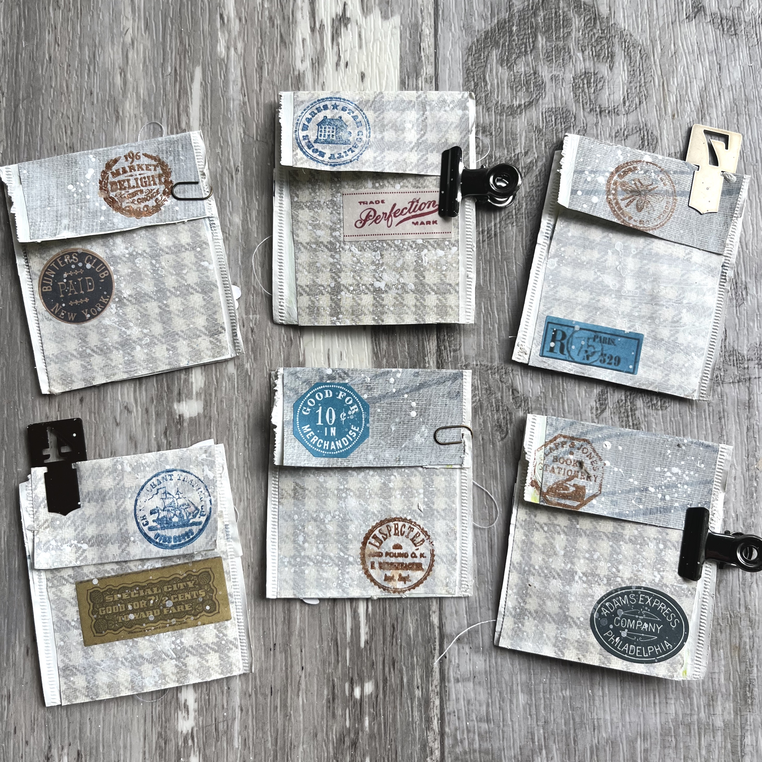
Hello, all!  In between a LOT of exciting things going on behind the scenes (watch this space on 30th June!) I found a bit more playtime with the fabulous new vintage advertising Flea Market Finds collection by Cathe Holden.  Spellbinders kindly invited me to create with some of the new ephemera, stickers, stamps and papers, and I've been having a lovely time making another batch of teabag sachets with them.

These travelling salesmen are some of the legion of men and boys who made their way around the country hawking, peddling, selling any goods, provisions, inventions and ideas they could to make a living. 

With so many of them all trying to make a buck, it all came down to how you could compete in the market - how could you convince someone to buy your product rather than someone else's?  

Patents, branding and advertising became the lifeblood of the travelling salesman, and this collection captures that feverish excitement and those endeavours so well with all the labels, stamps, seals, posters, cigarette cards and other gimmickry used to catch the eye and promote whatever was on sale.

In the recent catch-up post, you saw a number of these little series... the tiny collage space is such fun to work with.  Mind you, when my mother has mostly been drinking fennel tea, they do smell quite a lot!

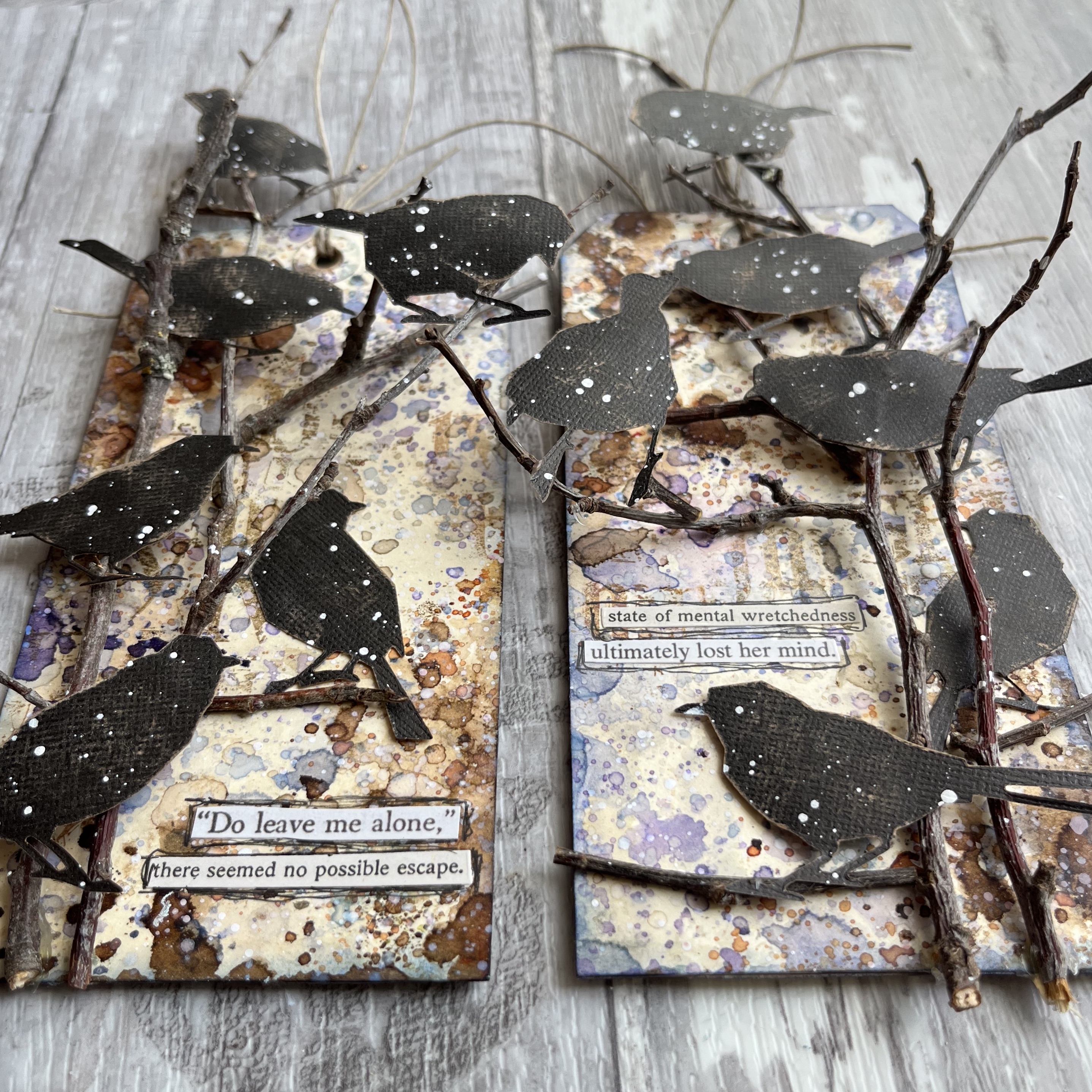
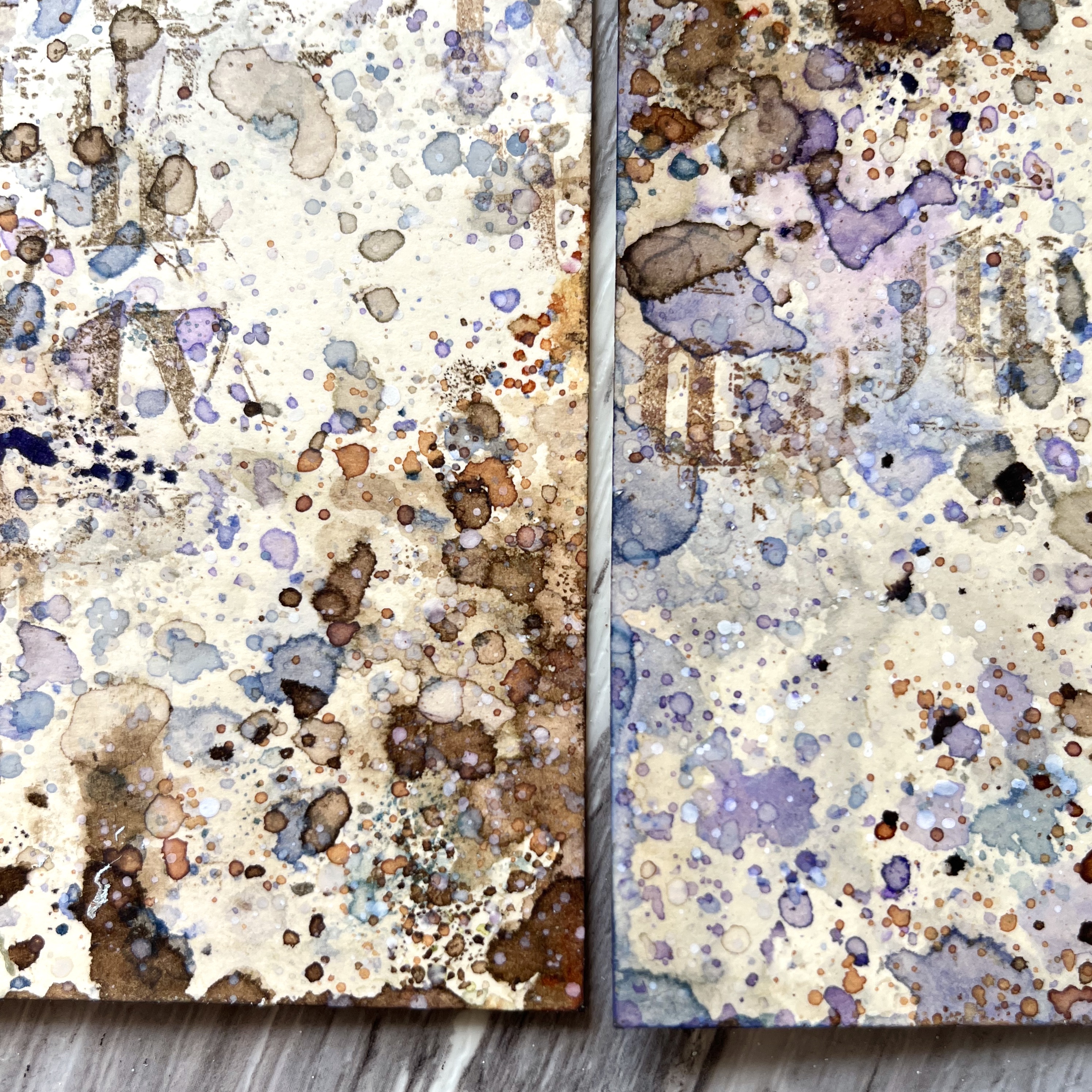
I started out by gessoing the sachets and then covering them (I've always just painted them before) with some of the papers from the Neutrals Palette Sampler

That also got a wash of gesso to give it a more weathered look, and a little splatter of what was left on the craft mat.  

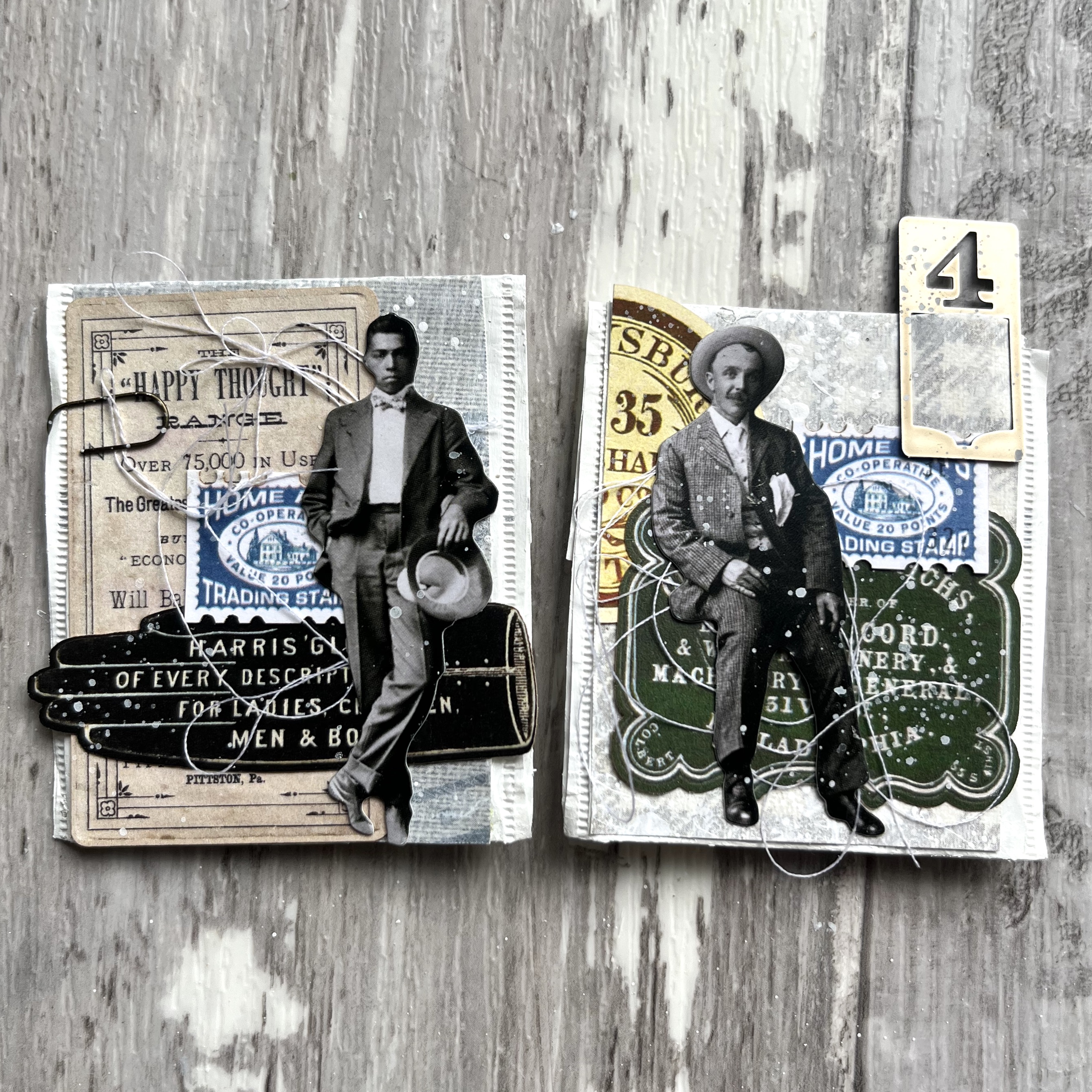
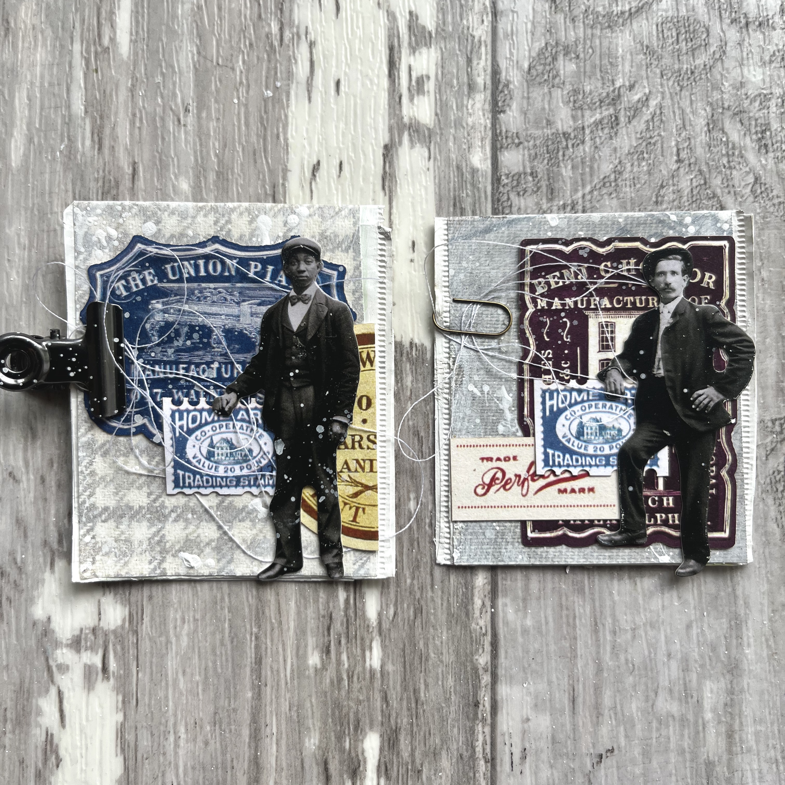
Then I got to work picking out some labels and other ephemera from the Home Arts Miscellany and Happy Thought Miscellany packs.   

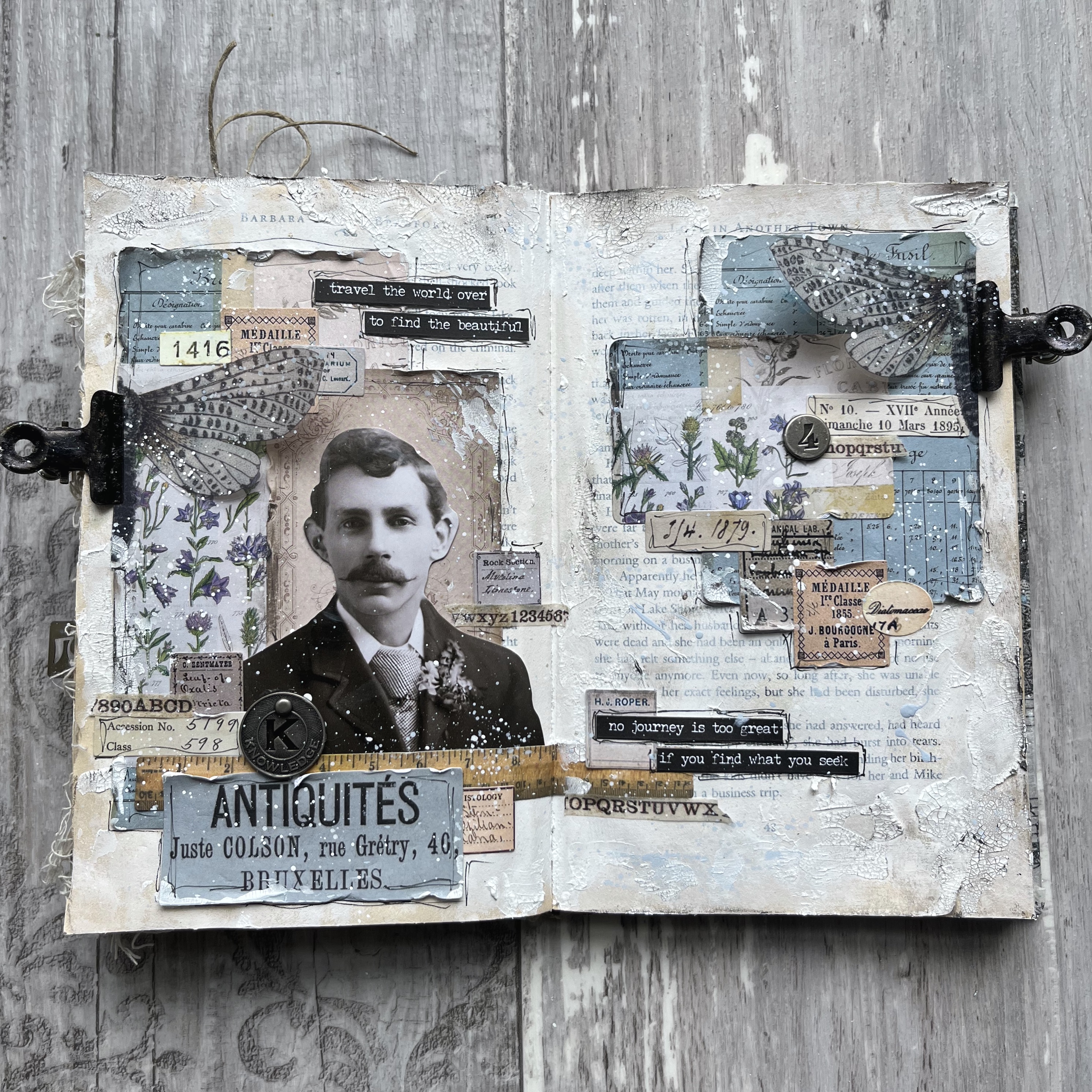
I particularly love the elegant glove-shaped advertisement...

... the wonderful photo someone is carrying with them on their travels (maybe that's Pa who stayed at home on the farmstead?)...

... and the house as the logo for the manufacturer and dealer in turpentine (amongst other things).


Over on the reverse, there are some of the Etiquettes Stickers and some stamps and seals from the Circle Labels Icons Stamps.


I then realised that it was all very well having all these leaflets and logos and advertising cards... what the collages needed now was the travelling salesmen to do the hawking and promoting.


Time to get out the Paper Dolls Minis - just the right size for a tiny collage space like these teabag sachets.


It didn't take long to track down my peddlers, hawkers, hucksters and vendors, each of them ready to wear out his shoe leather in search of more customers.


Some of them are clearly right at the start of their endeavours.


Others are considerably more experienced and/or more prosperous.   (Don't judge me - I'm a little bit smitten with this guy and his smouldering gaze.  Whatever he's selling, I'm buying!)


Maybe they've even settled down with an emporium of their own now, with no need to go on the road any longer.


But the commercial travellers are as vital a part of the American story as any rancher or railway builder.  In a way, their values are the ones that have prevailed most strongly in today's society.


Certainly the advertising industry that grew out of these humble beginnings has become a huge part of the way we live now.  Buying and selling, promoting and branding, they're central to how the economy ticks over.


And these guys were there at the start of it all...  That's the journey these great little pieces of historical ephemera took me on today, anyway!  


I hope you like this little collection of teabag sachet collages.  If you click on any of the links in this post, you can take a closer look at the products I've used.  And if you make any purchases while you're there, I'll get a small commission, without you having to pay anything extra.  See, I'm at it now too!

Happy weekend all!  I'll see you on Monday for the last of my weeks in the Simon Says Stamp Designer Spotlight... watch out - it's a scary one!!

He could sell snow to an Eskimo.
Overheard in a real estate office.

Monday 20 June 2022

Something beginning with S

Hello all, and welcome to the start of a new week and another new theme over at the Simon Says Stamp Monday Challenge.  This week they are looking for "Something beginning with S", so I have a journal page Spread for you.

I'm thrilled to be guest-designing alongside the amazing Simon Says team for the month of June.

They always offer up such incredible inspiration, with such a variety of styles, techniques and ideas.  Once you're done here, do hop over and see what the others have been creating beginning with the letter S.

When my Idea-ology Portraits arrived - that's the large scale head-and-shoulders chap in the centre - I started by putting a few of them with some Pocket Cards as a first step in gathering ideas.  

This is the third of the portraits to get its expanded version.  So far they've all made their way onto journal spreads - one in this same altered book...

... and one in a square format journal.  But this is the first of the men to see any action.

The large scale of these Portraits busts makes them a really great focal point for a spread or a large tag, and then it's just a question of building the collage around them and, in my case, the story that tells itself as I'm making.

The Pocket Cards come in several different sizes and shapes, with the designs recurring in different scales, so they are great for coordinated collaging.

The ephemera here also includes elements from the new Memoir Ephemera pack (the Antiquités label for one), and the photographers advertisement panel behind his head is cut from some older 12x12 TH paper. 

There are Number Strips Snippets, and lots of my much-loved tiny Halloween Snippets labels.  Clearly, as a respected antiques dealer, he is meticulous in recording the provenance of every piece he buys, as well as keeping details of the journeys he personally makes to follow up each lead.

There's also one of the new Transparent Things butterflies, which I cruelly cut in half so that I could have half a wing on each side of the spread.  (It's always seemed to me one of the cruellest forms of collecting - those trays and trays of beautiful butterflies impaled on pins for the collector's pleasure.)

I didn't really mean the hinge clips to look like replacement bionic wings, but when I was taking the photos, I realised that that's what had happened.

These cheap clips were a dirty gold colour which really wasn't very appealing, so I used some Mushroom Alcohol Ink and Jet Black Archival Reinker to give them a more industrial look.

The Small Talk stickers add some words - you know I always like to have some words somewhere.  As always, the right phrases just seemed to appear... 

I don't remember noticing either of these before, but suddenly there they were.  And for a buyer and seller of antiques, the words could hardly be more appropriate.... don't you agree?

You can also see the crackle paste I applied fairly randomly over my gesso'd book pages.  I used various inks and paints to give the whole thing a grungier, vintaged look, as well as the Design Tape Trim which just adds another delicious layer of tiny detail to the spread.

Muse Token and a Number Token give another little metallic lift to the whole thing.  I certainly think he has the knowledge necessary for the career he's chosen, and he looks a trustworthy chap to me.  

If you're looking to invest in some antiques, you could definitely do worse than to avail yourself of his services!


So I hope you like this journal SPREAD, and I hope your brains are now teeming with things beginning with S!  But if they're not, you can always hop over to the Simon Says Stamp Monday Challenge where the team will give you another nudge.  (Or check out the quote at the end of this post!!!)


As always the challenge is generously sponsored by the Simon Says Stamp store...


... and there's a $25 gift voucher available for one lucky, randomly-picked winner, as well as spotlight mentions if your project is chosen by the Design Team members.


I hope you have fun with your Ss, and I'll see you again soon.  Happy crafting, all!

The shelves of this store are stacked with stock. You will find a steamship, a sailing ship, and even a spaceship. There are several sorts of shoe and scores of signs and symbols. There is a sketch of a squinch, a selection of shells (not all from the sea), a siamang settled on a seat, a sponge to be studied, and sundry stuff suspended from strings. In all I included 1,234 Ss for you to see.
From The Ultimate Alphabet by Mike Wilks