Hello all, and welcome to the start of a new week and another new theme over at the Simon Says Stamp Monday Challenge. This week they are looking for "Something beginning with S", so I have a journal page Spread for you.
I'm thrilled to be guest-designing alongside the amazing Simon Says team for the month of June.

They always offer up such incredible inspiration, with such a variety of styles, techniques and ideas. Once you're done here, do hop over and see what the others have been creating beginning with the letter S.

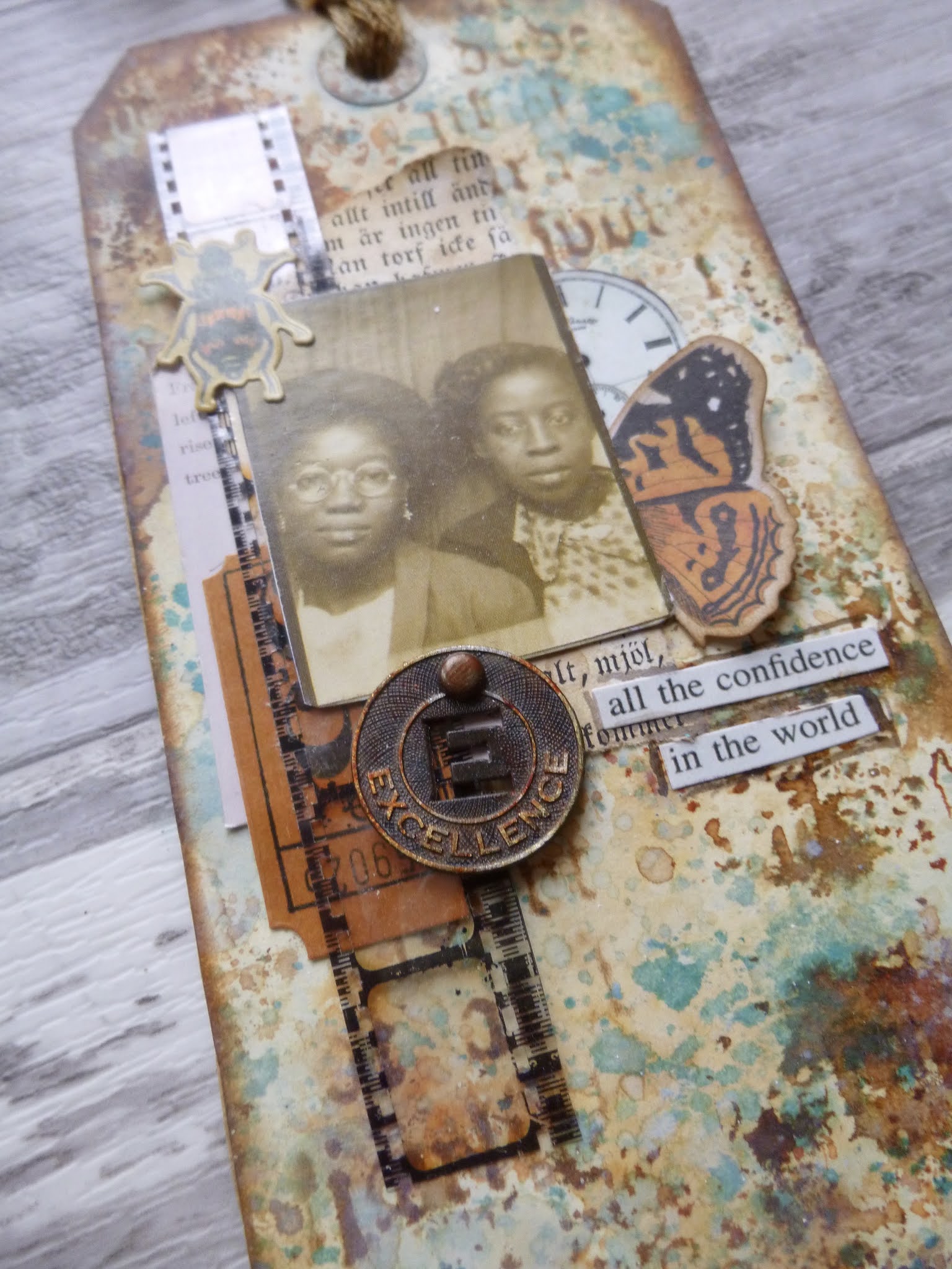
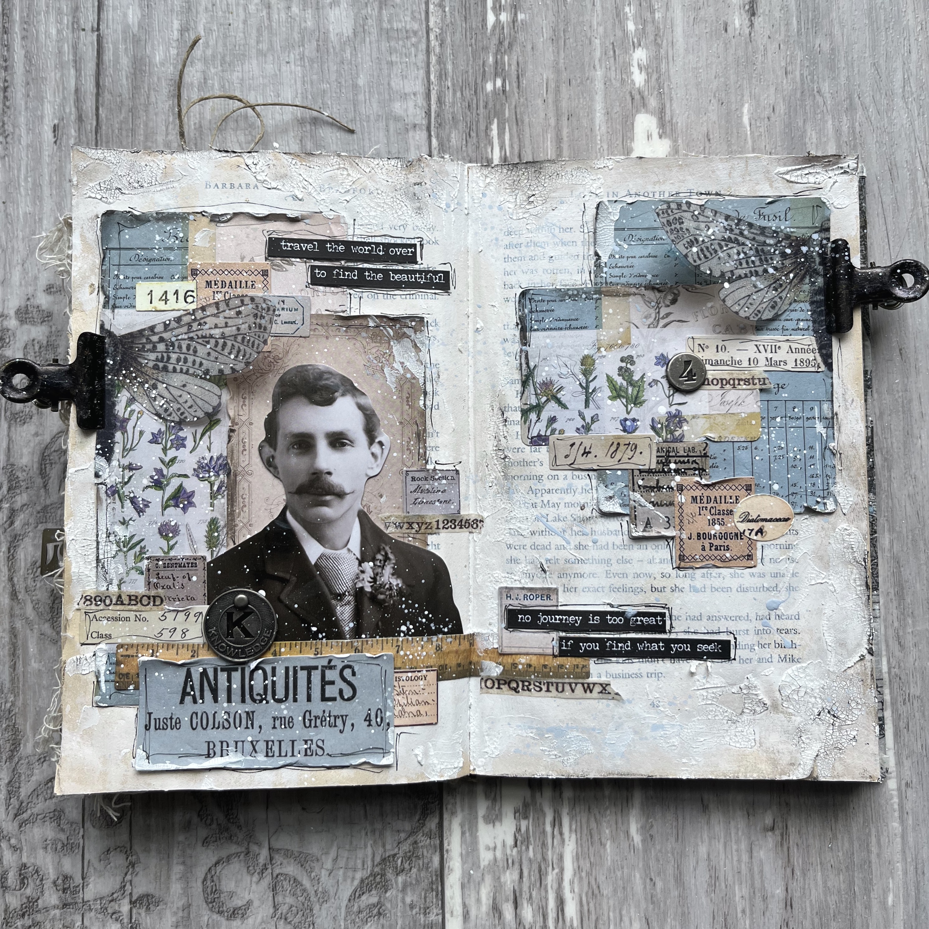
When my Idea-ology Portraits arrived - that's the large scale head-and-shoulders chap in the centre - I started by putting a few of them with some Pocket Cards as a first step in gathering ideas.

This is the third of the portraits to get its expanded version. So far they've all made their way onto journal spreads - one in this same altered book...

... and one in a square format journal. But this is the first of the men to see any action.

The large scale of these Portraits busts makes them a really great focal point for a spread or a large tag, and then it's just a question of building the collage around them and, in my case, the story that tells itself as I'm making.

The Pocket Cards come in several different sizes and shapes, with the designs recurring in different scales, so they are great for coordinated collaging.

The ephemera here also includes elements from the new Memoir Ephemera pack (the Antiquités label for one), and the photographers advertisement panel behind his head is cut from some older 12x12 TH paper.

There are Number Strips Snippets, and lots of my much-loved tiny Halloween Snippets labels. Clearly, as a respected antiques dealer, he is meticulous in recording the provenance of every piece he buys, as well as keeping details of the journeys he personally makes to follow up each lead.

There's also one of the new Transparent Things butterflies, which I cruelly cut in half so that I could have half a wing on each side of the spread. (It's always seemed to me one of the cruellest forms of collecting - those trays and trays of beautiful butterflies impaled on pins for the collector's pleasure.)

I didn't really mean the hinge clips to look like replacement bionic wings, but when I was taking the photos, I realised that that's what had happened.

These cheap clips were a dirty gold colour which really wasn't very appealing, so I used some Mushroom Alcohol Ink and Jet Black Archival Reinker to give them a more industrial look.

The Small Talk stickers add some words - you know I always like to have some words somewhere. As always, the right phrases just seemed to appear...

I don't remember noticing either of these before, but suddenly there they were. And for a buyer and seller of antiques, the words could hardly be more appropriate.... don't you agree?

You can also see the crackle paste I applied fairly randomly over my gesso'd book pages. I used various inks and paints to give the whole thing a grungier, vintaged look, as well as the Design Tape Trim which just adds another delicious layer of tiny detail to the spread.

A Muse Token and a Number Token give another little metallic lift to the whole thing. I certainly think he has the knowledge necessary for the career he's chosen, and he looks a trustworthy chap to me.

If you're looking to invest in some antiques, you could definitely do worse than to avail yourself of his services!