I'm travelling into a new way of working, a new country, a new language, and a new hobby which I'm passionate about. Come with me for some of the journey...
Friday 31 January 2020
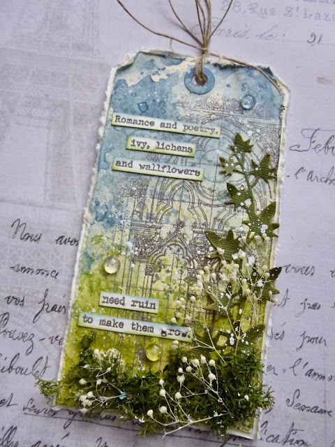
Romance in the Ruins
Hello all! It's Tag Friday over at A Vintage Journey, so the Creative Guides have been taking their tags out for a spin with no other destination in mind than a bit of creative fun and freedom.
As always, there are delights in store if you hop over to a Vintage Journey, and a link party for you to share any tags you've been making this January - we'd love to see what you've been up to.
You'll probably spot that my tag continues the nature/decay themes that have been running through the last couple of posts. No rust this time, but some stone ruins being overtaken by nature's greenery...
I could also have called this tag "the mystery of the disappearing words"!
I started with some wrinkle-free distressing (Stormy Sky and Faded Jeans for the top part and Peeled Paint and Bundled Sage for lower down), and then stencilled some Gothic lettering on in the same colour tones.
I loved this Tim Holtz monastery stamp from the moment I saw it, and it's done good service so far... often with ivy involved. But you can see that at the point of stamping it, the stencilled text was already starting to go.
It's stamped in Watering Can Archival and then embossed with my Wow Earthtone Pepper powder, which I thought would give a nice stony effect.
I die-cut the ivy from some suitably dark green kraftcore. With a little light sanding, you get a nice weathered look.
I made sure to apply the glue mainly to the stem, so that I could scrunch the leaves upwards for some extra dimension and a more lifelike look.
There's plenty of moss surrounding the ruins too. I'm having a bit of a moss-thing at the moment...
There's an upcoming Guest Design project where it plays a big part, so it's been around on the desk rather than tucked away in the stash.
And of course there are my much loved dried flower stems winding their way through the greenery...
... adding a touch of 3D white spatter effect - I guess that's probably why I like them so much!
I added a couple of small glass pebbles to catch the light, glued on with Glossy Accents.
Actually there are three of them... the rule of odd numbers in composition is a good one.
I love how they magnify the inky patterns behind them.
I'm really happy with the dimension on this tag, and the shabby edges, distressed with the blade of my scissors.
It's a very pleasing tag to hold and move around to see from different angles, letting those pebbles catch the light.
And the words... I almost forgot the words! They're Nathaniel Hawthorne's (just the best name for a writer ever, don't you think?), and they're also embossed in Pepper.
You can find the quote on the very first of my PaperArtsy stamp sets, EAB01 Trees & Flowers.
Some fine twine finishes things off at the top of the tag, and it's mounted on some off-white card for a nice framing effect.
So we have some wonderful words at the heart of the tag, but as you can see, the Gothic stencilled words have pretty much entirely vanished from the background - yet the wrinkle-free distressing hasn't faded or changed at all. I'm very puzzled!
Despite the mystery, this tag brings me a sense of calm and serenity, just like the last time I combined the monastery with ivy in Silent Strength. I think that was a Tag Friday tag too - and it used the flower stems and one of my quotes... I'm playing variations on a theme!
Speaking of quote stamps - keep your eyes peeled in the next few days for exciting news.
I hope you'll hop over to A Vintage Journey and see how much fun my fellow creative guides have been having with their tag playtime. And do share any tags of any kind that you've been making this month in our Tag Friday link party.
We'll be picking a Pinworthy from those tags, as well as a trio of Pinworthies from our main challenge, We're All Getting Older. You've got one more week to try out those ageing, distressing and weathering techniques to make something new look old. Hope to see you there... and happy crafting all!
The stones here speak to me, and I know their mute language. Also, they seem deeply to feel what I think. So a broken column of the old Roman times, an old tower of Lombardy, a weather-beaten Gothic piece of a pillar understands me well. But I am a ruin myself, wandering among ruins.
Heinrich Heine
Even though the words are about romance flourishing amongst the ruins, it's still romance, so I'd like to join in at the Simon Says Stamp Monday Challenge where this week they are All Loved Up
And at the Bleeding Art Challenge it's Anything Mixed Media Goes
Saturday 25 January 2020
Hopes of Spring
Hello all! I'm still in slightly rusty mode after my Rusted Hope tag the other day. And I couldn't resist having another play with the chicken wire die - this time rusted slightly differently.
I made this tag to celebrate having completed my tax return. It really was just a chance to play after sorting through invoices and receipts all day.
(Yes, I know, if I were more organised through the year, it would all be much simpler at this point... but that's just not how I work I'm afraid. I'd rather restrict the financial admin to a couple of days each year than think about it all year long!)
Like Rusted Hope, this tag plays with the contrast between the rusted "manmade" elements and the forces of nature.
And it's well worth encouraging your hopes not your fears here, because nature definitely seems to be winning out this time round!
The background on this tag is really rather full on. It started with some wrinkle-free-distressing with Broken China, Stormy Sky, Peeled Paint and Mowed Lawn Distress Inks.
Over that I stamped the teeny tiny text from Tim Holtz's Entomology stamp set and embossed it in bright white.
I then did some multiple stamping of two of the insects from the same set in Pumice Stone Distress Ink and embossed those in clear.
As always, I love how the glossy embossing captures light.
The chicken wire (or honeycomb, whichever way you want to think of it), cut from card, has had a coat of Finnabair's Art Extravagance Brown Rust Paste (grabbed in the sales).
Such a simple way to get a rusty texture... and I added some variation in colour with other paints and mediums.
The two delicate grass stems are cut from the mop-up tag created in the wrinkle-free-distressing earlier. I brayered white paint over the top of my blues and greens, so the stems are lighter in tone than the vivid inks in the background.
This Paper Doll has been hovering on the desk for a while.
I'm worried about how serious he looks... as though he's wary about what life is going to throw at him next.
So I've grounded him on some tape to give him a safer standing in the world.
And I thought he could do with the reassurance provided by this particular Word Band.
If you read my previous post, you'll know that I'm feeling the need of the same advice.
I've been feeling very gloomy about the state of the world, but I have to stay hopeful that the power of nature will triumph in the end over all our attempts to destroy her.
The butterflies are carrying my hopes on their fragile wings...
... as they hover over the lush greenery, and point us in the direction we need to go if we're to save this miraculous planet of ours.
Some simple rustic garden twine tops the whole thing off...
... and I mounted the tag on some thick waste cardboard before inking the edges with Vintage Photo. It gives it a really pleasing sturdiness.
That'll do for today. I hope you're all enjoying a lovely weekend, and I look forward to doing some hopping to catch up with you all now that the tax return is done and dusted... yay!! Happy crafting all!
One of the first conditions of happiness is that the link between man and nature shall not be broken.
Leo Tolstoy
Saturday 18 January 2020
Rusted Hope
Hello all and welcome. I've been sorting papers for my taxes as well as starting a new theatre job, so time has been a little on the short side. But when you're procrastinating over actually filling out the tax return, the craft table is a pretty good place to hide!
I'm still in an ageing/weathering/distressing/decaying sort of a mood, prompted I'm sure by this month's We're All Getting Older! challenge which I'm hosting at A Vintage Journey. I'm looking for projects using techniques and products to make something new look old.
Yesterday, I shared some of the how-to details for my aged parchment tags over at the Vintage Journey blog, and today I'm here at Words and Pictures with a project full of crackled, rusted decay - so there's a whole different batch of ageing techniques and products on show.
In other words, stick around for lots more inspiration for the challenge - you still have nearly three weeks to play (it's a long challenge month this time around), so there's plenty of time to do some ageing, weathering, distressing or decaying of your own.
I was also inspired by the Rust It Up theme at the Simon Says Stamp Monday Challenge, and a new die which had just arrived. And this jumbo MDF tag also plays another line of Tic Tac Toe at the Funkie Junkie Boutique Blog - this time on the diagonal with Die Cuts, Sentiment, Heat Embossing.
This is one of those creations which looks quite different when the sunlight hits it and when it's in less direct light, so forgive me for having two main photos!
It's a tag which carries ideas from deep inside. I wasn't really conscious of them as I was making it, but I can "read" them pretty clearly now it's here!
There's a lot of rusted decay going on...
... as well as worn and weathered crackle. It all linked in my imagination with the damage we are doing to the planet and each other.
There seems to be something badly broken in mankind's relationship with the natural world around him. We seem to have reached a point where disaster and decay is almost inevitable.
But somewhere underneath it all, there has to be the hope of regrowth, of beauty and harmony somehow finding a way to survive and flourish again.
Otherwise, without hope, we might as well just give up now.
I started with a large MDF tag (8 x 4 inches) and gave it a rough coat of white chalk paint. It really was very rough - I wanted as worn a look as possible (reflecting my general exhaustion with all the bad news around at the moment).
Over that I scraped some DecoArt Media Crackle Paint. I'm at the bottom of a pot, so it's dried out a bit - it's more the texture of the Crackle Paste these days, but you still get a great crackle effect from it.
I used Distress Crayons in Pumice Stone and Walnut Stain to add some shadows and grime. It also highlights the cracks nicely!
Some of the flakes flaked right off which gives it an even more weathered look.
I painted on washes of DecoArt Media Fluid Acrylics - Payne's Grey, Raw Umber and Quinacridone Gold - to add some rusted decay in various places around the edges, or where the crackle was thickest in the middle.
While I was happy with a few flaked flakes, I didn't want too many to go, so I gave the whole thing a coat of Ultra Matte Varnish to keep it all in place.
My other main rusted element is some chicken wire, courtesy of a fabulous new die by Tim Holtz and lots of powder and paint.
There's some of Seth Apter's Chunky Rust Baked Texture powder as a first layer. That gives lots of rusty texture as well as colour.
Then I used some more of the Media Fluid Acrylics to get the exact shades of rusted decay that I wanted (a little darker and more ominous than the cheery orange red tones of the powder).
I broke the die-cut apart so that my chicken wire could trail a little further across the tag.
And with the addition of the Idea-ology word plaque, I was able to separate the chicken wire pieces even further, and started layering up some cogs and gears - the technology and machinery we continue to use without fully considering its impact on the Earth.
It was all looking a bit bleak at this point, and I felt an urgent need for some greenery to lighten the mood. Rubber Dance's Weed Love to the rescue...
... but the tendrils and vines are so delicate that they were barely noticeable until you got close up, so I decided to give them a bit more presence by painting on some flower heads.
I began by using Stormy Sky Oxide - knowing I could wipe it away with water if I hated the look. But I didn't hate it at all... quite the opposite!
So I decided to be bolder and added in some Fresco paints to the floral action - Lavender and Wisteria, but both mixed with the Stormy Sky which was still on the craft mat.
And of course I added some spatter with the leftover paints once I was done.
I really like the delicate flowers contrasting with the decayed metal.
They share a similar spidery fragility, but a web of decaying wire which will eventually rust away to nothing is very different from a web of tangled stems and tendrils getting stronger by the day.
Despite the decay everywhere, the plants are finding a way around it, fighting for survival.
The lettering of the Quote Band has been filled with Picket Fence Distress Crayon and I burnished the top with Sepia Archival, applied direct from the ink pad.
The ink gives a warm rusty tone to match everything else that's going on. The original silvery pewter wouldn't have worked.
Some actual rusty wire holds the plaque in place. (There's some padded tape and glue helping out too.)
(Just a quick warning courtesy of the lovely Bleubeard and Elizabeth... when working with real rust it's advisable to wear gloves. You don't want it getting into the bloodstream.)
I thought about rusting up the gears too, but in the end I decided that might upstage the chicken wire. They are already a good coppery colour, so I left them alone.
Some more rusty wire is tangled around the top of the tag, and that's about that.
Things have been a bit sluggish at the craft table lately. Even when I have found time, there have been a lot of unsatisfactory tag backgrounds ending up in the bin - so I'm very happy that this creation made its way to the end without mishap.
I really love the decaying weathered crackle...
... the tendrils twining behind the rusted chicken wire trellis...
... the textural details of the rusty elements...
... the tiny flower heads emerging from the decay...
... the grime and the grunge...
... and those hidden stories and ideas which emerge from the subconscious and arrive on the craft table in front of you - unbidden, unplanned, but perhaps all the more powerful because of that.
I really hope you like the tag, and I hope there are some more ideas there which might send you off to your craft table to create something aged, weathered and distressed for the We're All Getting Older! challenge at A Vintage Journey this month.
Thank you so much for stopping by, and I'll see you again soon. Have a great weekend, everyone.
In a decaying society, art, if it is truthful, must also reflect decay. And unless it wants to break faith with its social function, art must show the world as changeable. And help to change it.
Ernst Fischer
I'm playing the diagonal Tic Tac Toe line of Die Cuts, Sentiment, Heat Embossing for the Funkie Junkie Boutique Blog
I'd like to play along at the Simon Says Stamp Monday Challenge where they want us to Rust It Up
I'd also like to share this at the Bleeding Art Challenge where it's Anything Mixed Media Goes, as always
Labels:
Archival,
crackle effect,
DecoArt,
die-cutting,
Distress Crayons,
embossing powder,
Fresco,
Idea-ology,
MDF,
metal,
painting,
Rubber Dance,
rust technique,
rusty wire,
Seth Apter
Subscribe to:
Posts (Atom)