I'm travelling into a new way of working, a new country, a new language, and a new hobby which I'm passionate about. Come with me for some of the journey...

Saturday 27 June 2020

Starry, starry night

Hello all, and welcome!  Another quick sample post for you today, catching up with some of the ATC gift envelopes I created to show off my latest quote stamp releases with PaperArtsy.  In between, there have been some lightly dancing art journalling pages using one of the quotes from EAB19 Life & Living, but today I'm here with a couple of quotes from EAB20 Night & Day.


This pair of not-quite-ATCs are created on some very cheap cash envelopes.  You can usually pick up packs of 200 or so in a pound shop.  That means that, as long as you keep the top flap open and operational, you can use them for gift vouchers or cash gifts with a little bit of artwork attached.


There's lots of embossing powder involved here - both for the quotes themselves, but also on the background stamping, which is clear-embossed for that fabulous light-catching quality.


They started very simply with some gesso scraped onto the envelopes pretty randomly.  Rather than the 3.5 x 2.5 inch ATC standard, they're actually 4 x 2 and three quarter inches, if you don't count the flap.


Then I added Fresco paints in shades of night blue... Blueberry, Midnight, Twilight and Sky.  There may have been a bit of Purple Rain involved too.


I added the paint in watery washes and spritzed with more water to let it move on the surface, and finished by splattering with whatever was leftover on the craft mat.


Seth Apter's fabulous minis make wonderful "orbits" or rings like the rings around Saturn... the perfect framing for the dimensional white stars. 


The minis are stamped in Cobalt Archival and then clear-embossed, as I said.  This means they have that now-you-see-it, now-you-don't quality which always makes me happy.


The stars are moulded using one of the Finnabair/Prima silicone moulds and some paper clay.  Then, so that they would match the quotes in gleaming whiteness, I pressed them down into the squidgy embossing ink pad, and embossed them with Wow Bright White.


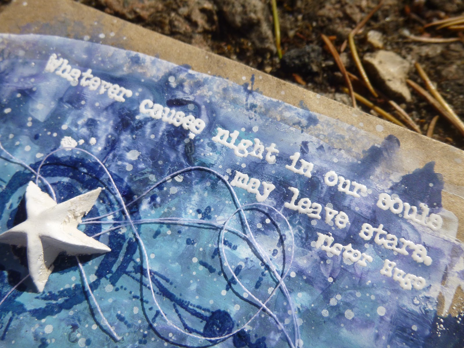
And yes, that's what I used for the words too.  As always, I stamped in Archival ink, so that you get a sharper stamping edge than with (squidgy) embossing pads.


This is really important when you're embossing fine-detail stamps like these words, if you want to be able to read them clearly in the end.  Given one of the quotes is by Vincent van Gogh, I really had to call the pair, "Starry, starry night"!


The white thread adds movement and interest, almost making the stars into shooting stars leaving trails across the sky.

And I really like the kraft framing you get from the cash envelopes as the substrate.


So there you go... a couple of mixed media ATC envelopes celebrating the stars and how we endure even the darkest nights.  Thanks so much for stopping by today.  I hope your weekend will be wonderful, and I'll see you again soon.

When it is dark enough, you can see the stars.
Ralph Waldo Emerson

I'd like to enter this at the Simon Says Stamp Monday Challenge where the theme this week is Shoot for the Stars

Tuesday 23 June 2020

Let your life lightly dance

Hello all!  It's been just over a week since the launch of my three newest word collections over at PaperArtsy, but I'm back on the PaperArtsy blog tonight using another of the new quotes along with some of the gorgeous France Papillon stamps which are now part of the PaperArtsy collections.


The theme for the fortnight is Calm Colours - and oh, how we've needed those over the last few weeks and months.  You'll notice it's not far from my usual colour palette... clearly I'm always in need of a bit of soothing!  I hope you'll be able to hop over and check out the art journal spread I've created.

Thanks for stopping and hopping.  I hope you are staying safe and well, and I'll see you again soon.

Let your life lightly dance on the edges of time like dew upon a leaf.
Rabindranath Tagore

Sunday 21 June 2020

Words and Zinskis

Hello all, and happy summer solstice to you!  (Or happy winter solstice, obviously, if you're in the southern hemisphere.)  And happy Sunday too.  I hope the day is being kind to you.

I'm just here with a quick post today to start sharing some of the samples from my latest stamp release at PaperArtsy.  Thank you so much for your amazing feedback both here and at PaperArtsy and, of course, over at the dreaded (ssshhhh, whisper it) Facebook.  If you missed the launch post, you may also have missed my first ever Facebook Live - so do take a look if you fancy it.


For now, I'm just going to offer up a couple of close-ups of the two tags I created for the launch using the Zinski characters, and some of Kay Carley's lovely meadow flowers.  One has a quote from EAB18 Gardens & Growth, and one has words from EAB19 Life & Living.


Let's start with Gardens & Growth and the little boy.  I began with some brayered tags, applying the paint with plenty of water spritzed on for a soft effect.


For both backgrounds I used Kay Carley's lovely meadow grasses from EKC17.  I stamped some in Olive Archival, and then decided I'd like some yellow grassy stems, like hay.  So I painted some Cheesecake and Haystack onto the craft mat...


... and used that to stamp into and layer the stems with thicker heads over the others for a grain/cereal look.  There's a little white spatter (of course) and the Zinski "ground" stamp to go underneath the boy's feet.


Here he is, stamped on a separate piece of card using the stamping platform so that I could stamp, paint him and then re-stamp to retrieve all the details.

He's mounted on some padded tape which is what gives him that lovely shadow, making him pop from the background.  I added slightly darker shadows beneath him with some walnut ink.


Here are some of those Olive-stamped grasses in close-up...


... and the yellow stalks layered over the top.


And here are those words by Frances Hodgson Burnett, author of The Secret Garden.  You can read the words two ways, I realised.  There's the primary one, which I think was probably in FHB's head: if you look at the world the right way, you can see good things everywhere.


But there's another possibility, if you choose to hear it: if you have the right appearance, the world will be a garden to you.  If you don't look the right way - not so much.


Onwards to Life & Living and the girl dancing her way through life.  Her tag started out with a sponged background.  It's one of my favourite ways to blend Fresco paints onto a tag.

I flatter myself that you can get quite a "Monet-esque" effect!


Some more of Kay Carley's pretty grasses - this time all stamped in paint for a lovely soft focus look.


Some are in the light Spring green, and some have a little of the darker Lawn mixed in.


And again, I stamped some Zinski "ground" beneath her feet and added some walnut ink shadows.


The girl herself I stamped on separate card again, using the stamping platform - same process as before... stamp, paint, re-stamp for detail.  But when it comes to cutting this sweetheart out, there are a lot of fiddly bits to deal with around the edges.


So I took the easy route and also stamped her direct to the tag, embossing her hair with Wow's Primary Bark embossing powder to give it a dark, glossy sheen.  Then you can just cut the easy way and have the details ready and waiting on the tag when you stick her down!


And finally those words, stamped in Archival and then embossed with Earthtone Pepper embossing powder by Wow.  I find it's best to stamp in Archival rather than an embossing ink.  You get a sharper image for the powder to cling to - important when you're working with fine detail stamps like these words.


I know I'll find lots of other uses for this fabulously positive quote, but somewhere in the back of my brain it will always be linked with this exuberant little girl!


So there you have it... the first of the samples done and dusted.  I'll be back with more over the coming days and weeks.


But before all that there's some new journalling coming your way, also using a quote from one of these new sets.  Watch this space...  Thanks so much for stopping by today.  Stay safe, stay well and I'll see you all again soon.

If you've never experienced the joy of accomplishing more than you can imagine, plant a garden.
Robert Brault

Monday 15 June 2020

Brand New PaperArtsy Words

Hello all!  It's one of those heart-in-mouth, pulse-pounding nights...  I've got some new word stamps launching at PaperArtsy.  There are three new collections:  Gardens & Growth, Life & Living and Night & Day.  If you're quick, you can catch me talking about them in my first ever Facebook Live over on the PaperArtsy People group at 7.30pm UK time, Monday (though I hope the recording will stay there for late arrivals too!).


I'm so excited about these three collections - there are some really beautiful quotes on all three sets.  It's going to be tough to pick a favourite from these, I think.  I hope you'll have time to hop over to PaperArtsy to see some of the samples I've created to get the inspiration flowing, and I'd love to know which set would be at the top of your list!

Thanks so much for stopping by and for hopping onwards.  All of this wouldn't be half as much fun without your company along the way.  You'll see why I haven't been a very good visitor lately when you see what I've been up to over at PaperArtsy, but I'll be back to visit regularly again now it's all done!  Stay safe, stay well, and see you soon.

Colours fade, temples crumble, empires fall, but wise words endure.
Edward Thorndike

Friday 12 June 2020

Encore - Salty Watercolour Words

Hello all!  I'm so glad you enjoyed my altered Rustic Plant Pots.  We had very heavy rain (and some hail) a couple of days after I'd put them out in the garden, and you'll be happy to hear that so far they're doing just fine.  I even wiped away the earth which had splattered them pretty much all over, and the paint stayed put perfectly happily.  Time will tell, but so far it's all good!

I'm busy with some stuff behind the scenes at the moment, so I thought I'd fill in with a quick Encore post (see the very end for a definition of that).  And the project I've chosen might give you a clue as to what it is I'm busy with.  Watch this space early next week!  And in fact, maybe watch out for me on camera too... I'll keep you posted!

And if you want something brand new today, rather than just an Encore, there's a (rare) new post over at Cestina's Dollshouses to enjoy.

These wordy watercolour bookmarks were created for the PaperArtsy blog back in March 2018, and here's what I wrote back then...
________________________________


Hi everyone, it's Alison from Words and Pictures with you today, and I'd like to share with you some salty, watery bookmarks.


I fell in love with watercolours a year or two ago, and have been exploring their possibilities since then. I thought I'd combine them with my quote stamps to make some bookmarks. The salt was an afterthought, but one I'm so happy I added!


I love how the pigment of a good watercolour moves in water, and how some colours granulate (the pigment powder floats in the water to create a mottled look) and some are more stable. I was using Daniel Smith watercolours to create my masterboard, and they have lots of fabulous granulation in some of the colours.


I think it was that granulation which suddenly made me think of adding salt - something I've done in the past with Distress Inks, but hadn't done with my watercolours before. I think the effects are spectacular, both while the paint is still wet...


... and once you've brushed the salt away once it has all dried.


I cut a section of the masterboard into strips of equal length and width and then sought out some words to fit onto them.


I used two quotes each from EAB03 Music & Silence, EAB07 Dreaming & Doing and EAB08 Strength & Courage.


On the paler bookmarks, I stamped in Cobalt and clear-embossed the words with Ranger Clear embossing powder.


And where the paint background was darker, I stamped in Versamark and embossed in Detail Fine White powder by Wow.


Some distressing of the edges, and some fine white twine through the punched holes, and now I can keep my place in the several books I usually have on the go at one time...


... and receive a little more food for thought from reading the bookmark too!


I hope you'll have a go at salting your watercolours or water-soluble inks. It really is fascinating watching the crystals at work, soaking up pigment and water and creating the incredible organic patterning. It certainly won't be the last time I craft with added salt!


_________________________________

I gave half the bookmarks to Cestina and kept the other half myself, and mine are in every day use.  I still have several books on the go at once, as well as bobbing back and forth to my Kindle, so bookmarks are just as useful as ever.

I'm heading back to the craft table now... I expect most of you can make a good guess at what I'm busy with there.  For now, I'll wish you a peaceful weekend with plenty of whatever makes you happy, and I'll see you on Monday!

When a bookmark tumbles out of an old book pristine and unwrinkled, it is like a gasp of breath from another century.
Don Borchert

Encore Posts
Projects which made their first appearances elsewhere for Design Team duties or Guest Designer opportunities, but which only had a sneak peek here, are being gathered together in the pages of my virtual scrapbook while I'm busy.
As always, the Encore Posts are formatted differently from the regular ones, so that you can easily spot them.  Please don't feel that you have to comment all over again!

Friday 5 June 2020

Rustic Plant Pots


Hello all!  I hope you are all doing okay, and staying safe and well.

It's time for a new challenge over at A Vintage Journey, and our wonderful host Astrid is looking for Rustic Charm.

You'll find all the challenge details over at A Vintage Journey, along with a wealth of rustic inspiration from some of the Creative Guides.  But before you go, let me show you my rustic plant pots.

Sometimes simplicity is all I want.  Despite my usual layers of mixed media complexity, the things I like to have around me tend towards the minimal, the simple, the rustic.

These altered pots make me so happy -particularly now they each have a plant of their own in (which you'll see at the end of the post).


I'll quickly show you some process photos and then share some pictures of the the finished pots in place.  Here they are in their original state.  As I said over at A Vintage Journey... cheap, shiny plastic.


First step was an undercoat of DecoArt Chalky Finish paint in Primitive (a nice stony colour).  I applied it with a natural sponge so you're already getting some nice texture to replace that plasticky sheen.


Next I used the same sponge to add the DecoArt Crackle Medium (formulated for the Chalky Finish paints) in various thicknesses and left that to dry overnight. 


Over that went a layer of mostly Everlasting (White) Chalky Finish, with a little of the Primitive mixed in at times, and once that had done its crackle magic I had this delicious aged, weathered finish.


The label stamps are from a giant set by Iron Orchid Designs.  They're not cheap, but I'm thinking that these stamps can be used to alter all sorts of things from pots to jars to boxes and more to make some really saleable items, so I'm definitely thinking of them as an investment.


I considered stamping direct, but in the end took the safe option of stamping onto tissue paper and glueing it down with some matte medium.  Already happy!


Time for a bit of garden distressing now... and we're back to the natural sponge to apply three shades of PaperArtsy Fresco Finish green, building from Hey Pesto to Lawn to Winter Green.


Over time, I'm sure they'll gather some more earthy colour quite naturally, so I didn't bother adding that myself!


I already love how they look amongst the terracotta and white (earthy, dirty white!) pots which are housing our flourishing herb and vegetable plants.


Each of the labels is different, of course, and with my undying love of different vintage fonts and historical detailing, I'm so pleased I splashed out on these stamps.


I already have plans for some of the endless glass jars I've been hoarding!


The two larger pots are about 5 inches tall and across, and the smaller ones are about 3.5 inches.


Even where I managed to glue the tissue paper on completely crookedly, I still like the imperfection... This one would go in the "Seconds" section in the pottery shop (where I would happily buy it at a reduced price!).


I love the weathered crackle, which I think gives them a really good stony look.


And those mossy greens work beautifully against the real greens of the surrounding plants.


Now they have plants in, they make me even happier!  Some of these are only temporary... the tomato seedlings will have to move into bigger pots quite soon.  I'll just have to get some more seeds going, won't I?!


I'm really happy with the rustic simplicity of these.  I have a feeling some more plastic pots might be meeting a similar fate pretty soon.  It's very satisfying to do.

Do hop over to A Vintage Journey to see the Rustic Charm created by my fellow Creative Guides.  We hope you'll be inspired to join us somewhere down the road this month with some charming rustic creations of your own.  In the meantime, thank you so much for stopping by today.  Stay safe, stay well, and I'll see you again soon.

Simplicity is the ultimate sophistication.
Leonardo da Vinci

Everything should be as simple as possible, but not simpler.
Albert Einstein

I would like to share these at the Bleeding Art Challenge where the theme is Anything Mixed Media Goes all the time
The Simon Says Stamp Monday Challenge would like you to Make Your Own Background - the weathered crackle is a simple background, but it's the right one to showcase these stamps I think
At the More Mixed Media Challenge the theme is Anything Goes + Optional Purple - I'm not taking up the option yet, but I will try to later in the month
There's another Anything Mixed Media Goes opportunity at the Creative Artiste Challenge Blog