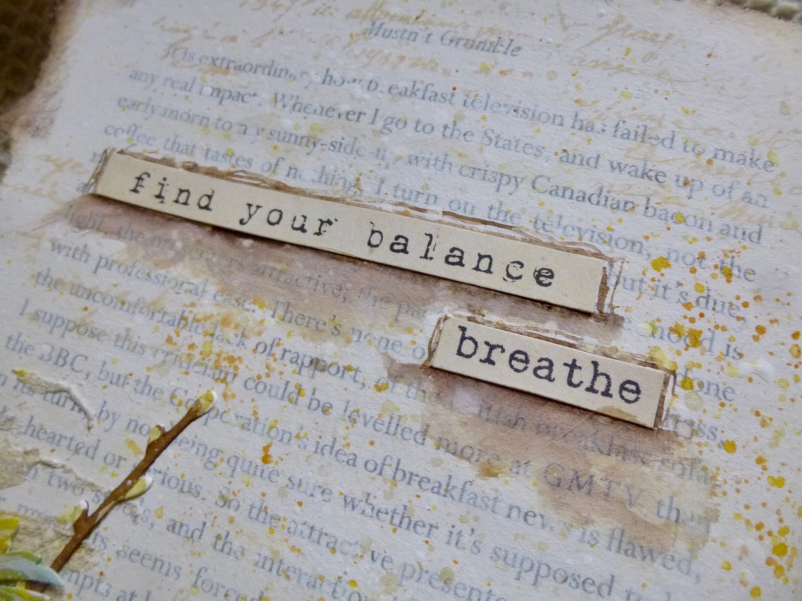
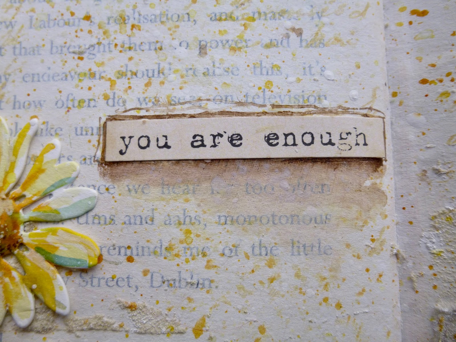
Hello all! It's been just over a week since the launch of my three newest word collections over at PaperArtsy, but I'm back on the PaperArtsy blog tonight using another of the new quotes along with some of the gorgeous France Papillon stamps which are now part of the PaperArtsy collections.
The theme for the fortnight is Calm Colours - and oh, how we've needed those over the last few weeks and months. You'll notice it's not far from my usual colour palette... clearly I'm always in need of a bit of soothing! I hope you'll be able to hop over and check out the art journal spread I've created.
Thanks for stopping and hopping. I hope you are staying safe and well, and I'll see you again soon.
Let your life lightly dance on the edges of time like dew upon a leaf.
Rabindranath Tagore
I'm travelling into a new way of working, a new country, a new language, and a new hobby which I'm passionate about. Come with me for some of the journey...
Showing posts with label France Papillon book. Show all posts
Tuesday, 23 June 2020
Saturday, 26 October 2019
A dream within a dream
Hello all! One of these days I'll get my Art Journal Journey page done near the beginning of the month... not this month though. I've been procrastinating, but I'm finally there with something for Eileen's Dreams or Wishes theme. And dreaminess seemed to link up in my head with the Bokeh effect - the out of focus bubbles of light you can create in photography. That's the theme over at Country View Challenges for October, so this page spread was inspired by linking the two challenge themes.
Bubbles or circles became something of a motif, and that circularity is reflected in the words I've used to... the way dreams have of taking you round in circles to where you began, or of seeming to take you round in circles, yet you find yourself somewhere completely new when you get there.

Or even daydreaming, where you suddenly see those other versions of yourself - other lives, other possibilites... the road not travelled.

And since my daydreams usually take me to a place of monastic peace, an overgrown garden full of ivy clambering on stone walls, that's the location for this dreaming page.
Its real-life location is within the pages of my France Papillon altered book.

I started with some gesso, and then texture paste and a 13Arts garland stencil, embossed with Duck Egg powder. It seemed a good starting point for whirling dreams.

Later on, it got a bit of extra inking to try to dull down the glossy shine a bit, but the texture and dimension really work nicely.

The double Paper Doll idea arrived next... the dreamer and her dream-self, echoing across the page with dreamlike words attached. And I added some of the gorgeous PaperArtsy grasses, stamped in Bundled Sage Distress Oxide.
Looking back, I really like this fairly spare white stage... it has an emptiness and room for meditation. But it didn't feel "finished", so I knew there had to be more to come.

First of all, those Bokeh bubbles. I used a Simon Says Stamp stencil and Distress Inks in Tumbled Glass and Broken China.

The Tim Holtz architecture stamps are embossed in Earthtone Pepper powder.

I really like how the dreamer is framed by the Gothic archway.

I added the extra ruined pillar as an afterthought (as you'll see if you look closely at the ivy leaves... I managed to wipe the powder away but not all of the Watering Can ink underneath).

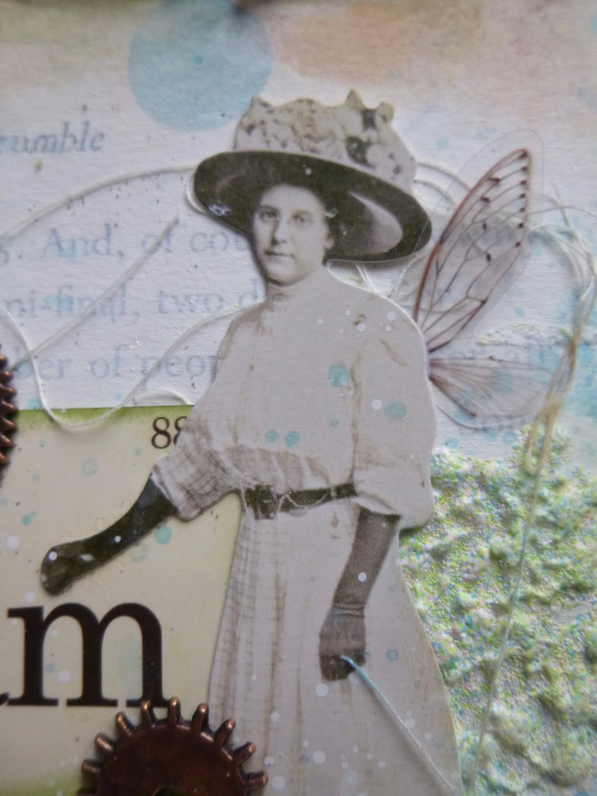
The distant dream-self has wings... who hasn't dreamed of being able to fly?

And the cogs and gears provide additional circular shaping, keeping the eye moving around the page...

... as well as reflecting the cogs and gears of the mind processing the day's events through dreaming.

Edgar Allan Poe's words seemed the right choice for a page about the circularity of dreams within dreams. They're from PaperArtsy EAB07 Dreaming & Doing.
I hope these pages have given your imagination something to dream about. I'll be back in a few days with a special Guest appearance and some more autumn crafting, but for now I'll wish you all a wonderful weekend, and I'll see you again soon.
People think dreams aren't real just because they aren't made of matter, of particles. Dreams are real. But they are made of viewpoints, of images, of memories and puns and lost hopes.
Neil Gaiman
I'd like to share this in the Dreams or Wishes theme at Art Journal Journey
And at Country View Challenges the October theme is Bokeh
Or even daydreaming, where you suddenly see those other versions of yourself - other lives, other possibilites... the road not travelled.

And since my daydreams usually take me to a place of monastic peace, an overgrown garden full of ivy clambering on stone walls, that's the location for this dreaming page.
Its real-life location is within the pages of my France Papillon altered book.
I started with some gesso, and then texture paste and a 13Arts garland stencil, embossed with Duck Egg powder. It seemed a good starting point for whirling dreams.

Later on, it got a bit of extra inking to try to dull down the glossy shine a bit, but the texture and dimension really work nicely.
The double Paper Doll idea arrived next... the dreamer and her dream-self, echoing across the page with dreamlike words attached. And I added some of the gorgeous PaperArtsy grasses, stamped in Bundled Sage Distress Oxide.
Looking back, I really like this fairly spare white stage... it has an emptiness and room for meditation. But it didn't feel "finished", so I knew there had to be more to come.
First of all, those Bokeh bubbles. I used a Simon Says Stamp stencil and Distress Inks in Tumbled Glass and Broken China.
The Tim Holtz architecture stamps are embossed in Earthtone Pepper powder.

I really like how the dreamer is framed by the Gothic archway.
I added the extra ruined pillar as an afterthought (as you'll see if you look closely at the ivy leaves... I managed to wipe the powder away but not all of the Watering Can ink underneath).

The distant dream-self has wings... who hasn't dreamed of being able to fly?

And the cogs and gears provide additional circular shaping, keeping the eye moving around the page...
... as well as reflecting the cogs and gears of the mind processing the day's events through dreaming.

Edgar Allan Poe's words seemed the right choice for a page about the circularity of dreams within dreams. They're from PaperArtsy EAB07 Dreaming & Doing.
I hope these pages have given your imagination something to dream about. I'll be back in a few days with a special Guest appearance and some more autumn crafting, but for now I'll wish you all a wonderful weekend, and I'll see you again soon.
People think dreams aren't real just because they aren't made of matter, of particles. Dreams are real. But they are made of viewpoints, of images, of memories and puns and lost hopes.
Neil Gaiman
I'd like to share this in the Dreams or Wishes theme at Art Journal Journey
And at Country View Challenges the October theme is Bokeh
Tuesday, 30 April 2019
Having fun flying
Oops... almost didn't make it! I promised myself I would try to join in at Art Journal Journey at least once a month this year. One set of journal pages once a month... how hard could that be, right? Well, I got the pages done a couple of weeks ago, but the blogpost almost didn't get written. I just remembered in time, so here I am "Having Fun", as commanded by Wendy for this month's theme.
I simply had fun with some of my favourite things... crackle and book pages and leafy stems, some texture, some tissue tape and, of course, some words.
It's another spread in the hardback book I altered as part of a France Papillon workshop. (You can check out all the spreads so far, as well as the book alteration itself, here.)
I spread some watercolour ground over the pages - gorgeous sandy texture - and then set to with some spritzing and spraying. Your guess is as good as mine at this distance of exactly which colours are on the page.

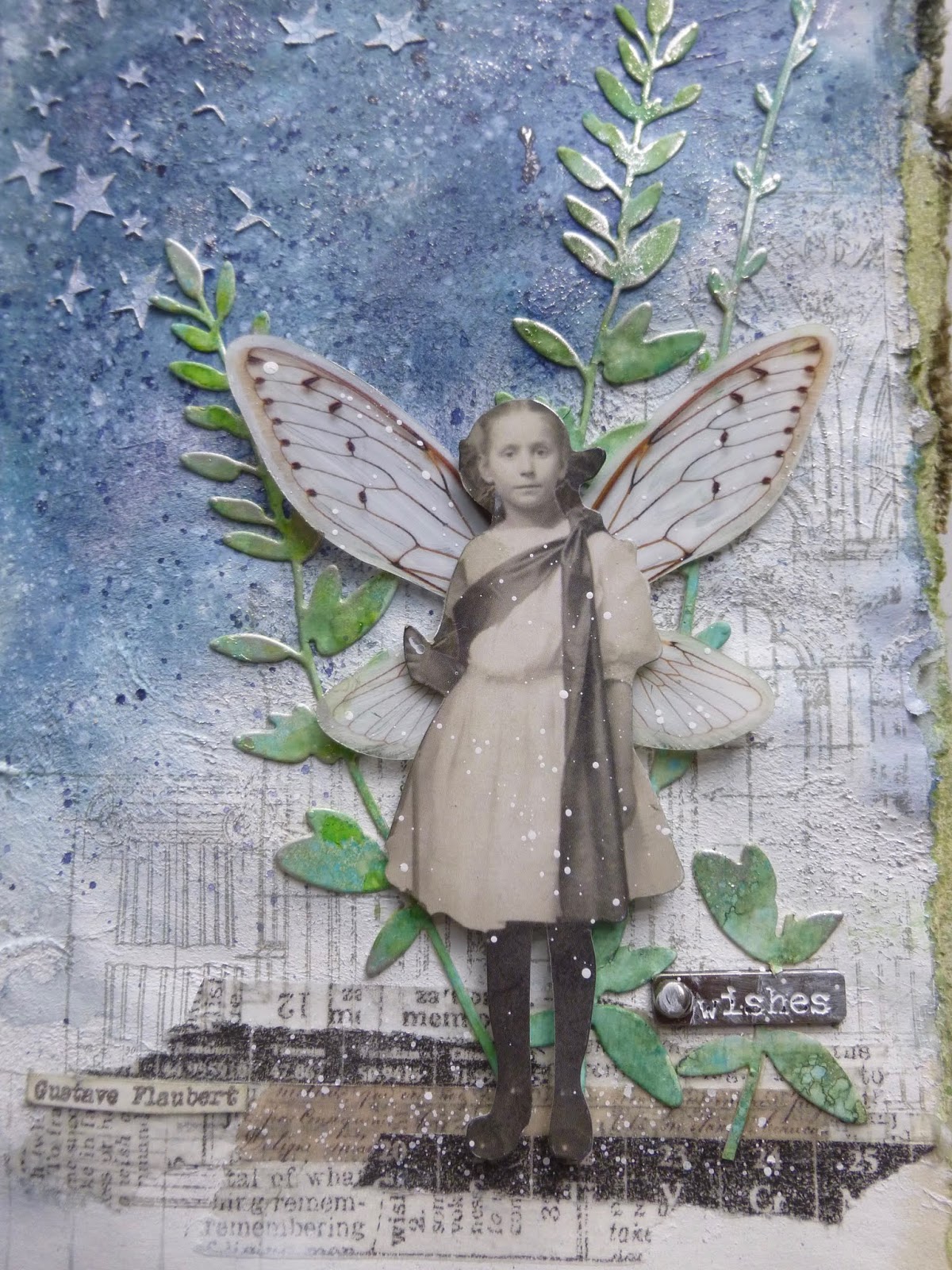
I added the gorgeous new Gothic architecture stamp by Tim in Watering Can Archival, and added some strips of tissue and design tape for the Paper Doll to stand on while she tests her new wings.

She's the Paper Doll who usually holds a furled flag, but I've removed that with a quick snip of the scissors.

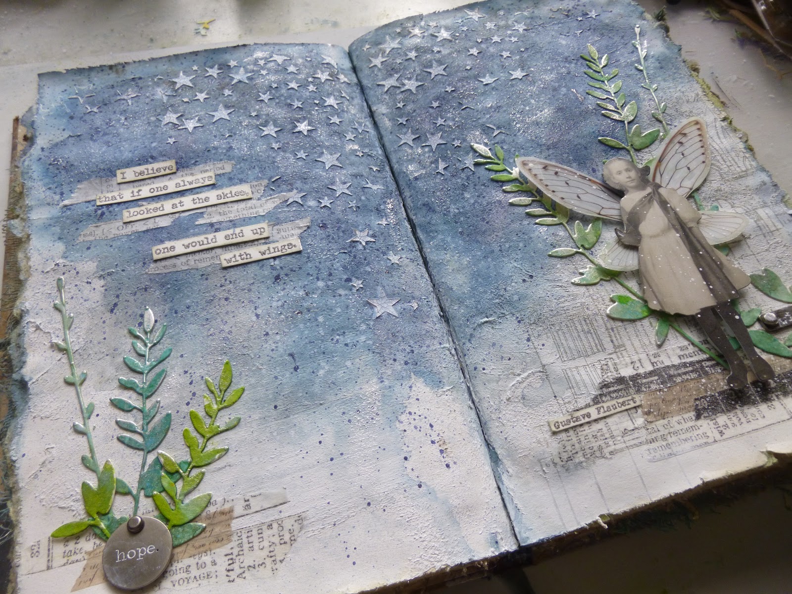
The quote is from my recent new EAB11 collection at PaperArtsy, Wings & Flight. Definitely one for the dreamers. I do think it would be fun to fly.

And you can see who the dreaming author of those words was, tucked down in the tissue tape strips near the Paper Doll's feet.

The wings themselves (from the new Idea-ology range) weren't showing up too well (they're clear acetate in their natural form), so I gave them a sweep of gesso on the back to make them a little more solid.

But they still have a magical sheen if you get the angle right!

Tim's star stencil is plastered across the sky, giving her a wonderful place to take flight into. The crackle paint I used gives an extra touch of texture...

... particularly once I highlighted it with some Pewter Treasure Gold for a delicious gleam.

With the addition of a little metal tag, I was almost ready to stop there...

But coming back the next morning, it didn't seem quite done yet, so I reached for the leafy die-cuts.

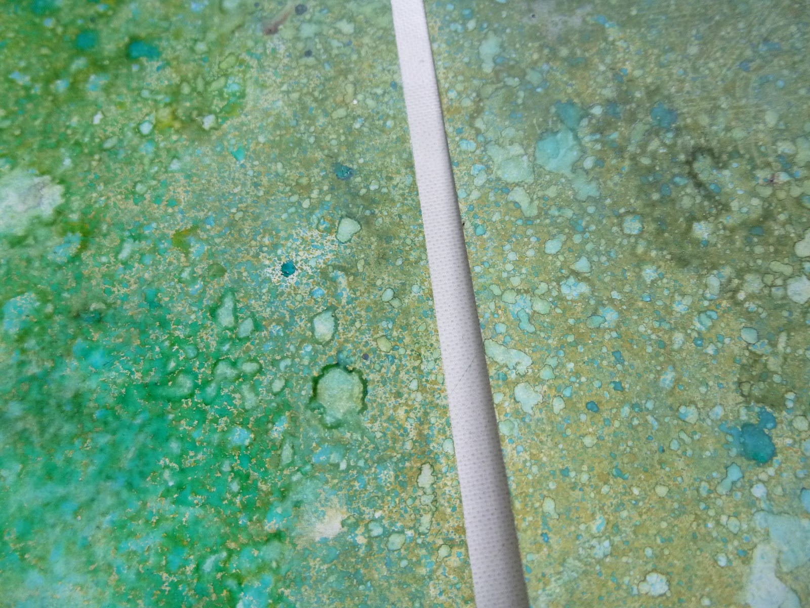
I'd also been having some fun experimenting with a couple of the new Oxide sprays, just on a pair of tags.

They were sitting there patiently, so that's what I grabbed to go a-cutting with.

It took me a while to "grow" the stems and branches where I wanted them.

And it took the addition of another piece of Idea-ology metal and some more tape strips before I worked out what was going on on the left-hand page below the quote.

But once it was all tucked in for viewing, I liked the whole look of it much more, so I glued it all down in place.
And that's my fun for the month... I'm also having fun with real life at the moment, which is how come I'm not much of a presence in Craftyblogland just now. Normal service should be resumed some day soon... fingers crossed.
For now, I thank you for stopping by today - oh, and thank you so much for your birthday wishes and kind words about my watercolour dabblings too - and I'll hope to see you in May. Happy crafting, all!
Flying might not be all plain sailing, but the fun of it is worth the price.
Amelia Earhart
I'd like to share this at Art Journal Journey where, this month, it's been all about Having Fun
At Try It On Tuesday they are looking for Things With Wings - it seems a little unfair to call her a "thing", but there you go!
I simply had fun with some of my favourite things... crackle and book pages and leafy stems, some texture, some tissue tape and, of course, some words.
It's another spread in the hardback book I altered as part of a France Papillon workshop. (You can check out all the spreads so far, as well as the book alteration itself, here.)
I spread some watercolour ground over the pages - gorgeous sandy texture - and then set to with some spritzing and spraying. Your guess is as good as mine at this distance of exactly which colours are on the page.

I added the gorgeous new Gothic architecture stamp by Tim in Watering Can Archival, and added some strips of tissue and design tape for the Paper Doll to stand on while she tests her new wings.

She's the Paper Doll who usually holds a furled flag, but I've removed that with a quick snip of the scissors.
The quote is from my recent new EAB11 collection at PaperArtsy, Wings & Flight. Definitely one for the dreamers. I do think it would be fun to fly.
And you can see who the dreaming author of those words was, tucked down in the tissue tape strips near the Paper Doll's feet.
The wings themselves (from the new Idea-ology range) weren't showing up too well (they're clear acetate in their natural form), so I gave them a sweep of gesso on the back to make them a little more solid.
But they still have a magical sheen if you get the angle right!

Tim's star stencil is plastered across the sky, giving her a wonderful place to take flight into. The crackle paint I used gives an extra touch of texture...

... particularly once I highlighted it with some Pewter Treasure Gold for a delicious gleam.
With the addition of a little metal tag, I was almost ready to stop there...

But coming back the next morning, it didn't seem quite done yet, so I reached for the leafy die-cuts.

I'd also been having some fun experimenting with a couple of the new Oxide sprays, just on a pair of tags.
They were sitting there patiently, so that's what I grabbed to go a-cutting with.

It took me a while to "grow" the stems and branches where I wanted them.

And it took the addition of another piece of Idea-ology metal and some more tape strips before I worked out what was going on on the left-hand page below the quote.
But once it was all tucked in for viewing, I liked the whole look of it much more, so I glued it all down in place.
And that's my fun for the month... I'm also having fun with real life at the moment, which is how come I'm not much of a presence in Craftyblogland just now. Normal service should be resumed some day soon... fingers crossed.
For now, I thank you for stopping by today - oh, and thank you so much for your birthday wishes and kind words about my watercolour dabblings too - and I'll hope to see you in May. Happy crafting, all!
Flying might not be all plain sailing, but the fun of it is worth the price.
Amelia Earhart
I'd like to share this at Art Journal Journey where, this month, it's been all about Having Fun
At Try It On Tuesday they are looking for Things With Wings - it seems a little unfair to call her a "thing", but there you go!
Sunday, 17 February 2019
Yellow Wallflowers
Hello all. I'm so happy you're as excited by my new PaperArtsy word stamps as I am - thank you for your lovely comments. And now, welcome to a New York-based post, though these pages were actually created while I was still at home. There's no die-cutting machine in the travelling stash, of course, and I really wanted to try out the new Tim Holtz Wildflower Thinlits before I disappeared to the other side of the Atlantic for a couple of months. So here they are...
I did promise I'd do better with my yellows for the Art Journal Journey theme of The Colour Yellow this month, so this page spread is also fulfilling that pledge. And for all that I'm a reluctant user of yellow, I found myself really loving it once I'd worked it into the natural world.
These daisies nestled against the brick wall make me very happy. Get yourself a nice cup of coffee and enjoy the journey along the yellow brick road...

I was playing in the same altered book as for most of my recent pages. I'm very sad I couldn't squeeze it into the travelling stash, as I was on a bit of a creative roll with it.

I started by roughly gessoing over the text, before adding some texture sand paste through the Wendy Vecchi brick stencil.
I used Antique Linen Distress Spray to add some warm Cotswold stone colour to my "walls". (See, I'm getting in there early with some yellow tones... more to come!)

I cut several stems from the new Tim Holtz sets out of watercolour paper and had a little play to see what might go where.

Then it was out with the Distress Stains to watercolour the wallflowers.

There's Antique Linen, Scattered Straw and Wild Honey involved for the yellows...

... but also Weathered Wood and Pumice Stone for the centre of the flower head, as well as for shading.

The stems have Pumice Stone, Old Paper and Peeled Paint in the mix, and some of those colours also wandered up into some of the petals for some more shadows and detail.

I mostly tried to leave my white space on the petals untouched, but there are just a couple of spots where I added tiny touches of white acrylic afterwards.

That includes the centre of the flowers, where I used a white paint pen for the highlighting and my dip pen and some walnut ink for the shading and floret detailing.

And there are some white pen detailing touches on a few of the other petals too.

I decided the tall, slender die-cuts would be twiggy stems in bud, so that gave me another chance to add a touch of yellow - though I'll confess it's back to the most delicate of Antique Linen yellows, rather than the full-on version!

I did make sure there was plenty of yellow spatter across the brickwork and book text... mainly Antique Linen and Wild Honey, if memory serves.

And I chose the primrose-toned word stickers from the Finnabair Art Daily collection.

That's the Daniel Smith walnut ink again, framing and shadowing the words...

... applied with the dip pen and then shaded out with a water brush under each sticker.

I also added some dip pen detailing to the leaves and stems.

There are some deeper shadows at the foot of each cluster of flowers...

... as well as some inking around the edges of the pages, which looks great over the brick texture.

And some Antique Linen script stamping to contrast with the typed text of the book pages.
And that's pretty much that.

Yellow is said to be a lovely cheerful colour (which makes it a little worrying how rarely I'm tempted to use it!)...

... and there's no doubt that these pages made me happy in the making and also make me happy in the looking. Maybe I need to use yellow more often?
I had such a lovely time "colouring" the flowers. I'd planned to do some die-cutting so that I could bring lots of unpainted ones with me and have them to play with here.

Sadly, time ran away from me in the packing process, so I'll just have to be patient and wait until I'm home again.
Thanks so much for stopping by today. I hope you're all enjoying a lovely Sunday. The weather's not due to be great, so I don't think it's going to be a good day for much New York walking on my one day off. I hope to get out and about during the morning.
But then in the afternoon I'm looking forward to having a bit of time to come and see what you've been up to lately. Happy Crafting all!
It takes as much time to build walls sturdy enough for wallflowers like you and me to lean against, as it does for us to bloom.
Ayokunle Falomo
I said I'd be back with something yellower for Rike's theme, The Colour Yellow, over at Art Journal Journey - and here I am!
With the word stickers, as well as the book pages in the background, I'm entering this in the Simon Says Stamp Monday Challenge, where this week they are looking for Typography
At Happy Little Stampers,they are having their usual Anything Goes with Dies challenge, so I'd like to play along there
There's also a Watercolour Challenge over at Happy Little Stampers, so with my Distress Stain watercoloured flowers, I'd like to join in there too
I did promise I'd do better with my yellows for the Art Journal Journey theme of The Colour Yellow this month, so this page spread is also fulfilling that pledge. And for all that I'm a reluctant user of yellow, I found myself really loving it once I'd worked it into the natural world.
These daisies nestled against the brick wall make me very happy. Get yourself a nice cup of coffee and enjoy the journey along the yellow brick road...
I was playing in the same altered book as for most of my recent pages. I'm very sad I couldn't squeeze it into the travelling stash, as I was on a bit of a creative roll with it.

I started by roughly gessoing over the text, before adding some texture sand paste through the Wendy Vecchi brick stencil.
I used Antique Linen Distress Spray to add some warm Cotswold stone colour to my "walls". (See, I'm getting in there early with some yellow tones... more to come!)

I cut several stems from the new Tim Holtz sets out of watercolour paper and had a little play to see what might go where.
Then it was out with the Distress Stains to watercolour the wallflowers.
There's Antique Linen, Scattered Straw and Wild Honey involved for the yellows...

... but also Weathered Wood and Pumice Stone for the centre of the flower head, as well as for shading.

The stems have Pumice Stone, Old Paper and Peeled Paint in the mix, and some of those colours also wandered up into some of the petals for some more shadows and detail.
I mostly tried to leave my white space on the petals untouched, but there are just a couple of spots where I added tiny touches of white acrylic afterwards.

That includes the centre of the flowers, where I used a white paint pen for the highlighting and my dip pen and some walnut ink for the shading and floret detailing.
And there are some white pen detailing touches on a few of the other petals too.

I decided the tall, slender die-cuts would be twiggy stems in bud, so that gave me another chance to add a touch of yellow - though I'll confess it's back to the most delicate of Antique Linen yellows, rather than the full-on version!

I did make sure there was plenty of yellow spatter across the brickwork and book text... mainly Antique Linen and Wild Honey, if memory serves.

And I chose the primrose-toned word stickers from the Finnabair Art Daily collection.

That's the Daniel Smith walnut ink again, framing and shadowing the words...

... applied with the dip pen and then shaded out with a water brush under each sticker.

I also added some dip pen detailing to the leaves and stems.

There are some deeper shadows at the foot of each cluster of flowers...

... as well as some inking around the edges of the pages, which looks great over the brick texture.

And some Antique Linen script stamping to contrast with the typed text of the book pages.
And that's pretty much that.
Yellow is said to be a lovely cheerful colour (which makes it a little worrying how rarely I'm tempted to use it!)...

... and there's no doubt that these pages made me happy in the making and also make me happy in the looking. Maybe I need to use yellow more often?
I had such a lovely time "colouring" the flowers. I'd planned to do some die-cutting so that I could bring lots of unpainted ones with me and have them to play with here.
Sadly, time ran away from me in the packing process, so I'll just have to be patient and wait until I'm home again.
Thanks so much for stopping by today. I hope you're all enjoying a lovely Sunday. The weather's not due to be great, so I don't think it's going to be a good day for much New York walking on my one day off. I hope to get out and about during the morning.
It takes as much time to build walls sturdy enough for wallflowers like you and me to lean against, as it does for us to bloom.
Ayokunle Falomo
I said I'd be back with something yellower for Rike's theme, The Colour Yellow, over at Art Journal Journey - and here I am!
With the word stickers, as well as the book pages in the background, I'm entering this in the Simon Says Stamp Monday Challenge, where this week they are looking for Typography
At Happy Little Stampers,they are having their usual Anything Goes with Dies challenge, so I'd like to play along there
There's also a Watercolour Challenge over at Happy Little Stampers, so with my Distress Stain watercoloured flowers, I'd like to join in there too
Labels:
Acrylics,
art journal,
DecoArt,
die-cutting,
Distress Inks,
Distress Sprays,
Distress Stains,
Finnabair,
France Papillon book,
Prima,
stencilling,
texture paste,
tim holtz,
watercolour
Subscribe to:
Posts (Atom)