I'm travelling into a new way of working, a new country, a new language, and a new hobby which I'm passionate about. Come with me for some of the journey...

Friday 31 May 2019

Silent Strength


Hello all!  It's an exciting day over at A Vintage Journey.  Not only is it Tag Friday - always one of my favourite stops on the journey - but we are also welcoming three new Creative Guides on board.


Do hop over there to see the new arrivals as well as all the fantastic tags everyone has created.  You can join in too by sharing any tags you've made this month in our Tag Friday Link-up. 


And remember Tag Friday means you've still got a week to come and join us on our current Book It! challenge too.


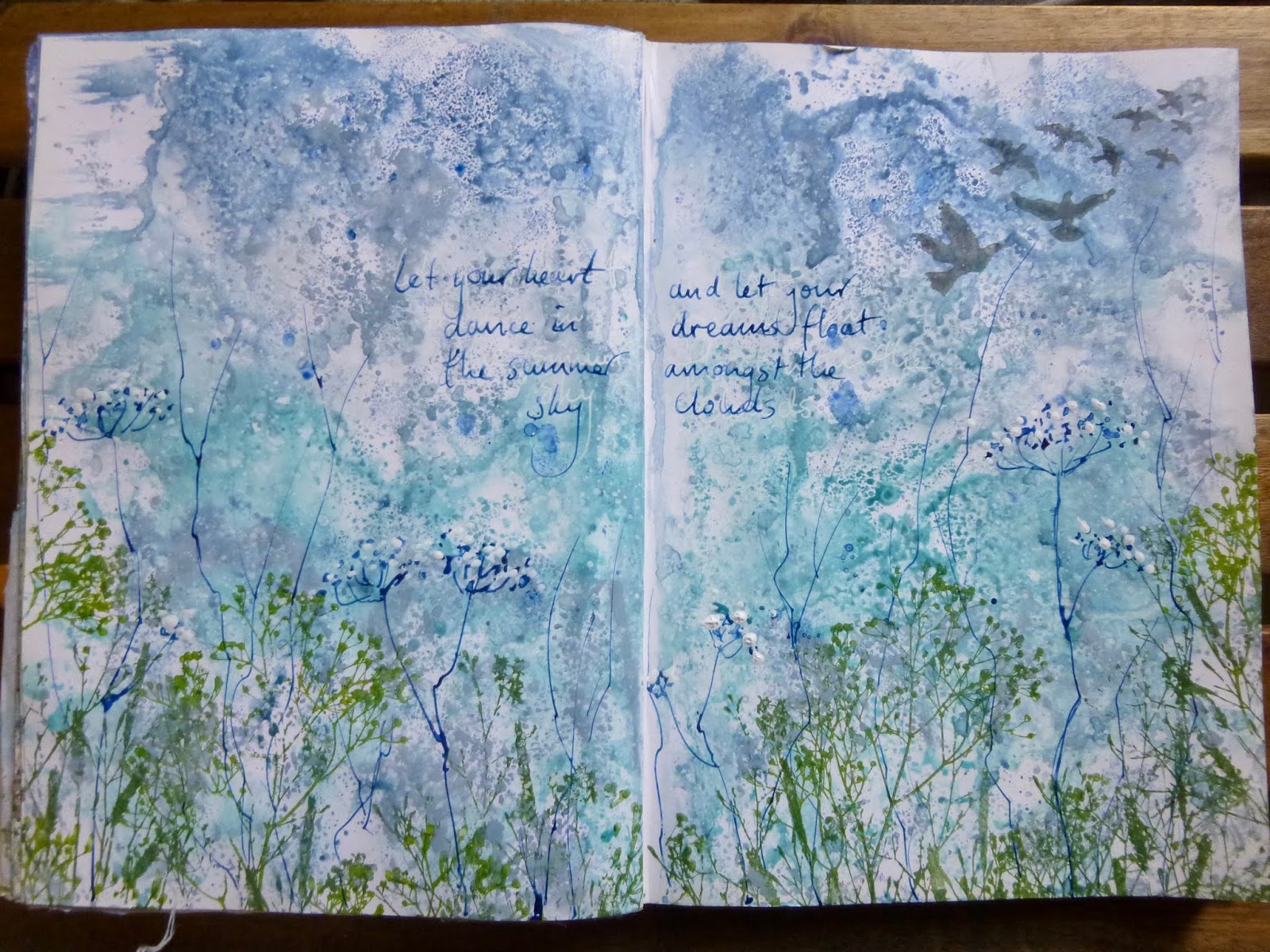
As you'll know from my absences, it's been a busy time behind the scenes here lately, so perhaps it's no wonder that I was drawn to a message of peace and silence for my tag.


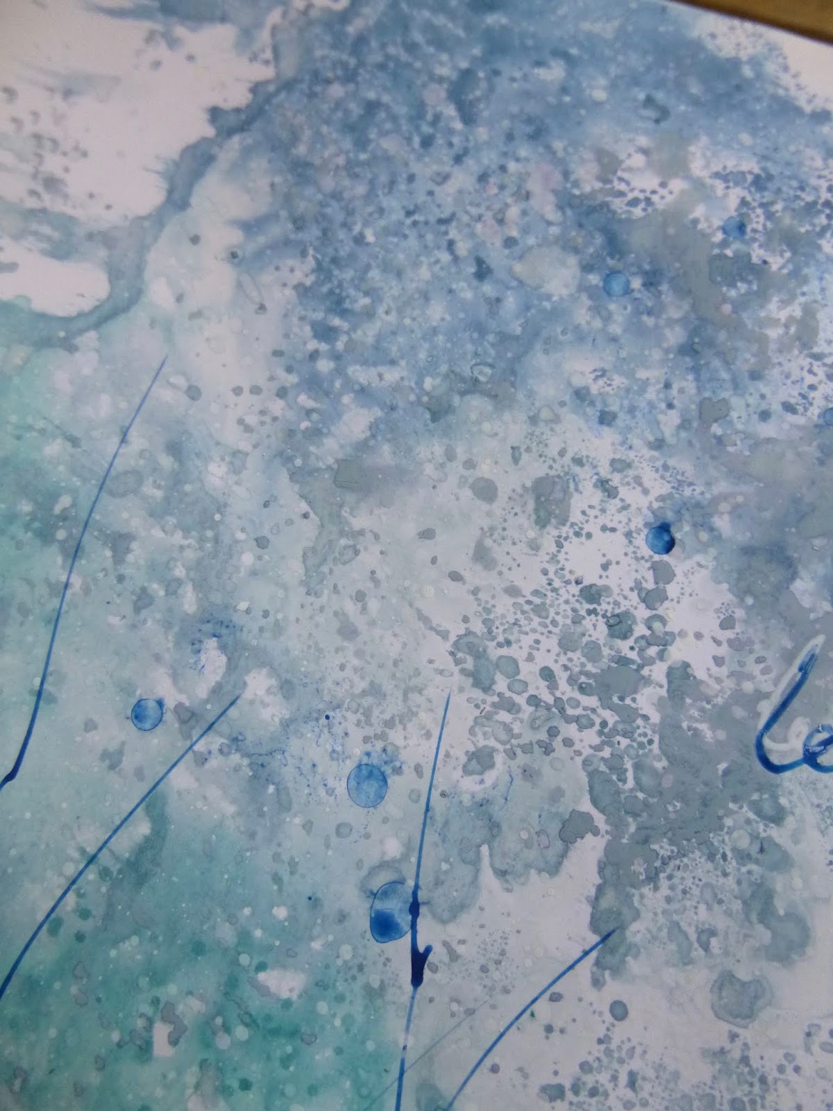
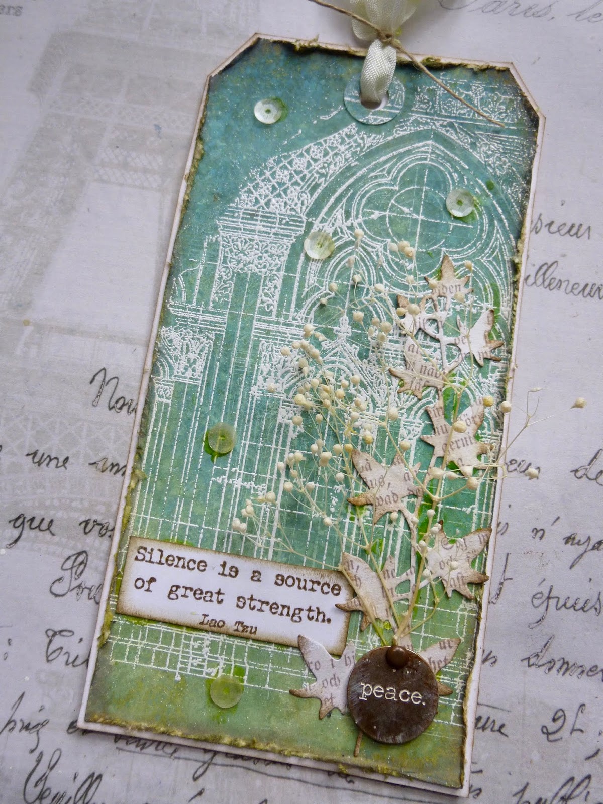
The background has been sitting around for a while... another of my playtime Oxide/DI tags, just messing around with layers of colour and spritzes of water droplets.

Over that I stamped the glorious Tim Holtz architecture stamp in one of the many white ink pads I've tried over the years.  It was deliciously subtle, but a little too much so.  (You can still see faint echoes of it in places.)


So I restamped (in Hickory Smoke) and used Bright White Ultra Fine Wow embossing powder to create a bolder white structure amidst the greenery.


I love the texture and the light-catching shine you get with an embossed stamping.


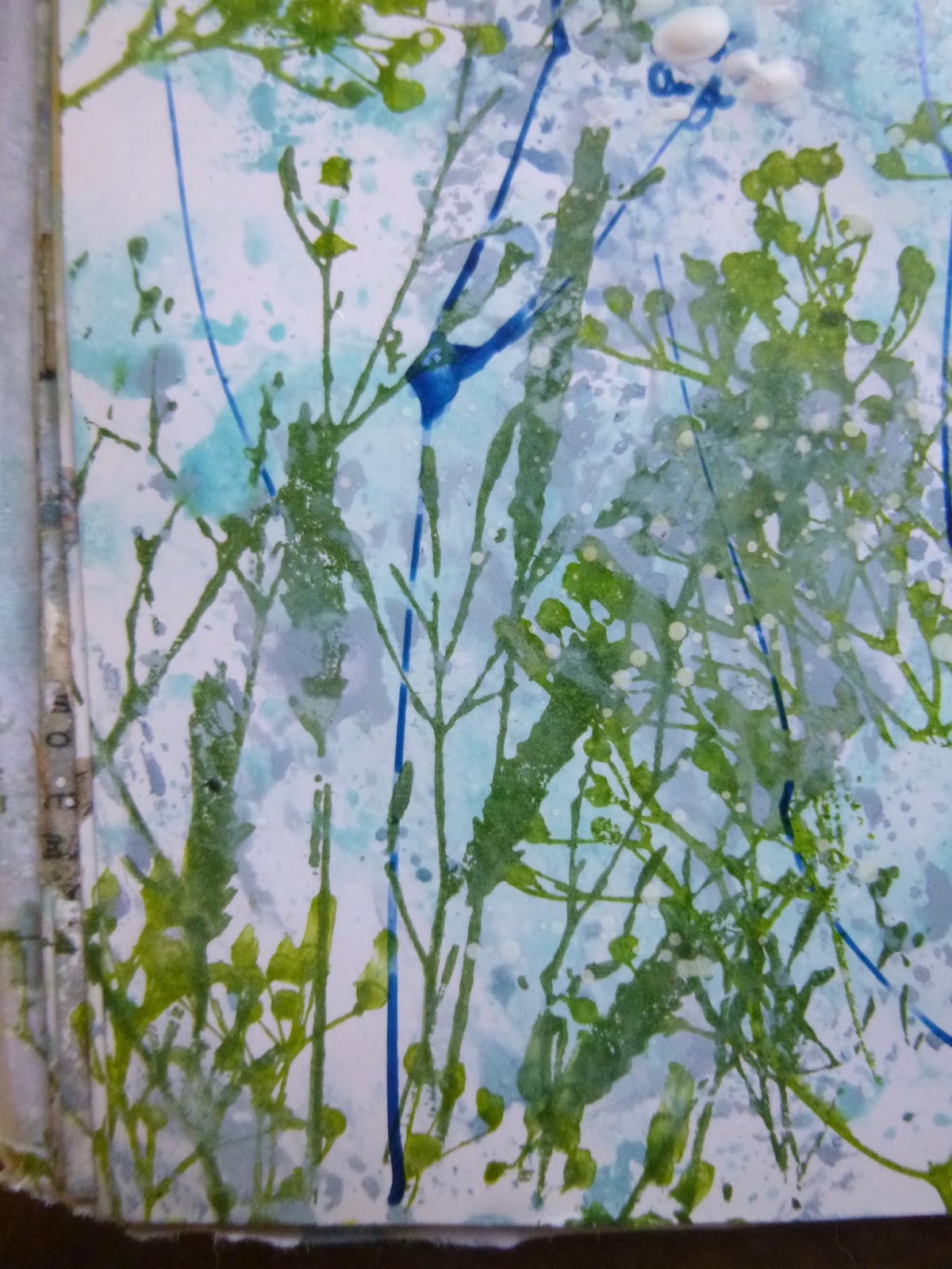
From there, it's really very simple.  Some ivy cut with a Thinlits die out of some Pion design paper (or Maja Designs, maybe)...


... some of my favourite dried flower stems...


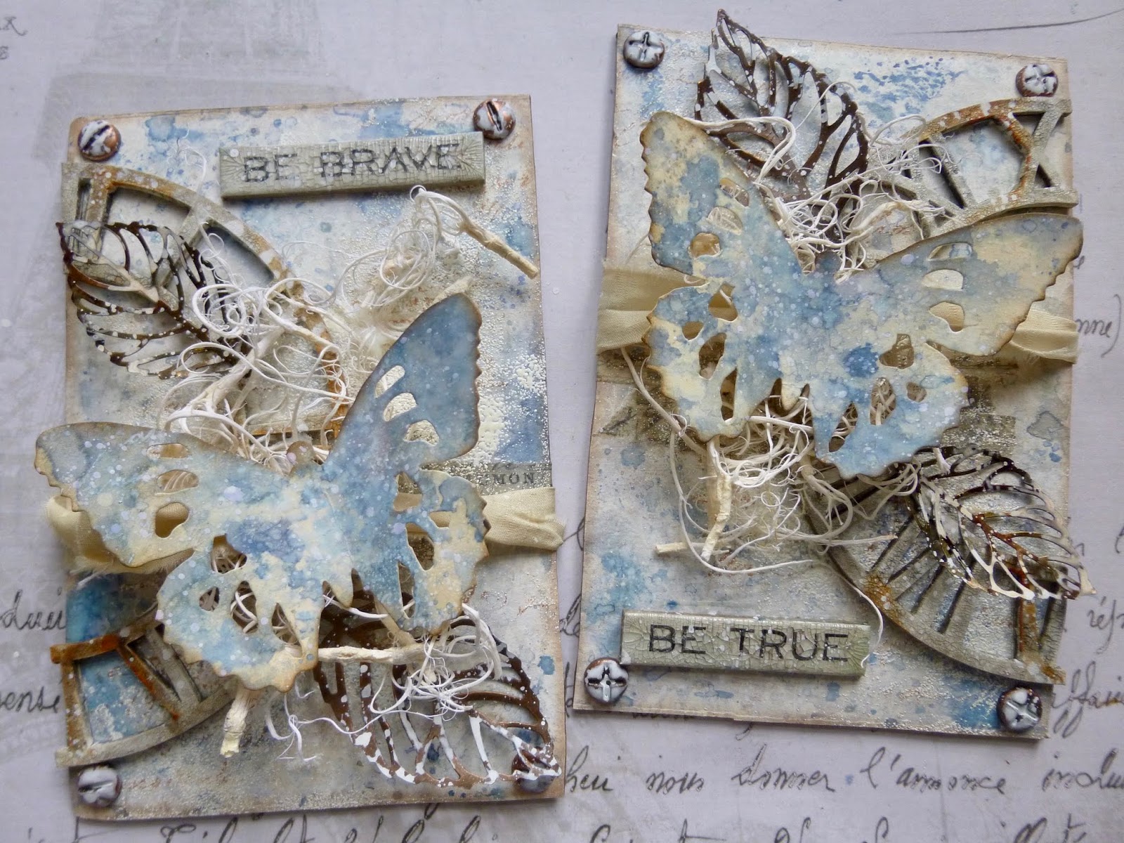
... a Typed Token altered with alcohol inks and a smear of white paint to highlight the lettering.


And then, of course, there are the words.   They're from one of my earliest PaperArtsy quote collections, EAB03 Music & Silence.


A few ivory sequins dotted around help to catch the light.

And the whole tag is mounted on white card, trimmed to size as a frame to draw the eye inwards.


And some crinkle ribbon tied with fine twine tops everything off up at the head of the tag.


I love the delicate dimension provided by the flower stems, and the intricate lines of the arches behind them.


I didn't really intend the flowers to be sprouting out of the token, but that seems to be the effect.  I supposed they have to grow out of somewhere!


Given the tag was already inky, this really didn't take long to put together.


It was definitely following a deep impulse for peace, gentleness and serenity.


And I think it fulfils that need very well.  It may be simple, but it makes me deeply happy.  I hope you like it too.


I hope you enjoy Tag Friday at A Vintage Journey as much as I do, and I hope you find some peace and silence amidst the hurly burly this weekend. 


Oh, since you're here... if you missed my Puddles of Paint over at PaperArtsy I'd love it if you had a moment to check them out.  I was rather pleased with how I managed to turn a crazy idea of continuously-pouring-paint into reality!

Thanks so much for stopping by today.  I'll see you again in June.  June... seriously?!  Yup, June!  Happy Crafting all!

Go placidly amid the noise and the haste, and remember what peace there may be in silence.
From the Desiderata by Max Ehrmann


I'd like to play along at Emerald Creek Dares where the theme is Flowers on the Wall
At the Simon Says Stamp Monday Challenge, they would like us to Frame It.  My framing is a very simple matting and layering, but it's still a frame!

Wednesday 29 May 2019

Puddles of PaperArtsy Paint

Hello all!  It's been a while since I've managed to put in an appearance over at the PaperArtsy blog, but I'm delighted to be there today with some puddles of paint.


It's a slight hop out of kin project for me... but it was one of those ideas which just sprang into my mind and then wouldn't leave me alone until I'd managed to turn it into reality.  I hope you'll have time to hop over and check it out.  As far as I'm concerned, there's almost nothing better than watching paint dry!

Thanks for stopping by today, and for hopping, and I'll see you again soon.

I could watch you watching paint dry, and I still wouldn’t be bored.
From The Deal by Elle Kennedy

If you're willing to hop over to PaperArtsy to see the full project, I'd love to share this at the Simon Says Stamp Monday Challenge.  Given it's created in a reverse canvas frame, I think it should fit in perfectly with this week's Frame It theme.

Monday 27 May 2019

Sky Dreaming

Hello all!  I know I've been very quiet here on the blog and vanishingly absent around Craftyblogland, but I'm finishing out the month with a bit of a surge by comparison.  I've just done some Creative Card Making for A Vintage Journey, and there are at least two more posts to be squeezed into May after this one.  And then I suddenly remembered my resolution to join in at Art Journal Journey at least once a month this year...


The lovely Erika a.k.a. BioArtGal is the host there for May and her theme is In the Sky/In the Air.  Coincidentally my page Having Fun Flying for last month's Having Fun theme would have fitted in perfectly for this, if I'd only known!  But I'm back with a summer sky for dreaming in.


It's a very simple page, so for once it's a pretty short blogpost, you'll be happy to hear!  It's done in the journal with some sort of sizing on the pages which makes the inks do really cool things.

In fact, it's not really an art journal at all.  It was an old notebook left over from Cestina's work days, which I helped myself to.  You can check out other spreads making use of the special ink+paper effects in this book here.


For this one, I did my usual wrinkle free distressing, using Faded Jeans, Stormy Sky, Broken China and Tumbled Glass Distress Inks, and then added some Stormy Sky Distress Oxide smooshes over the top of that.


The wildflower and grass stamps are both by Tim Holtz, one stamped mainly in Olive Green Archival...


... the other stamped mainly in Leaf Green Archival.


I used a dip pen and some Prussian Blue drawing ink to add the wording.


If you look closely, you'll see I tried it in white pen first.  It didn't show up well enough, but I rather like it as a ghostly shadow of the phrases.


The words needed an echo somehow, so as well as doing some ink splatters with the same Prussian Blue ink, I then added some hand-sketched meadow flowers of my own.


The dip pen gives them a lovely quirky line, thicker and thinner according to the ink flow.

And I added some white acrylic flower heads by dipping a wooden skewer in some white paint and dotting it around.


The flock of birds flying away are stamped in Watering Can Archival, and now I'm free to let my dreams float away into the summer sky.


Thanks so much for stopping by today.  I'll be back very soon with another new offering for you.  It's going to be a busy end-of-month!

Rest is not idleness, and to lie sometimes on the grass under trees on a summer's day, listening to the murmur of the water, or watching the clouds float across the sky, is by no means a waste of time.
John Lubbock

I'd like to join in at Art Journal Journey where the theme this month is In the Sky/In the Air

Friday 24 May 2019

Not so hard to make a card

Hello all, and welcome... though I'm about to send you away again immediately!  I'm so happy you enjoyed the Brave and True Butterflies, and today I'm over at A Vintage Journey with a Creative Card Making post.  Regulars will know I almost never make cards.  For some reason I find them very difficult.


But for this one I've adapted techniques from the tag I was inspired to make by Jennie at Live the Dream.  Borrowing all that inspiration meant that making the card wasn't all that hard after all.  I hope you'll be able to hop over to A Vintage Journey to see my Creative Card Making there.

Thanks for stopping by and happy crafting all!

Each player must accept the cards life deals him or her: but once they are in hand, he or she alone must decide how to play the cards in order to win the game.
Voltaire

Wednesday 15 May 2019

Brave and True

Hello all!  I'm absolutely delighted to be a guest over at the Bleeding Art challenge today, thanks to them liking my Need for Neutrals tag enough to make it their winner last month.  (I really wanted to call this post Bleeding Butterflies in their honour, but my better angel intervened!)  They are starting a new theme today and it's everybody's favourite: Anything Goes.  So here's what I created... a pair of butterfly panels.


I've been struggling a bit to get back into the mixed media swing of things at my craft desk since getting back from New York a month and a half ago, so for this I thought I would just grab some things that make me happy and put them all together!


In fact, the backgrounds of my panels come from a failed project which had landed in the rubbish bin.  I mentioned when I shared my Book It notebooks that it had taken me a couple of goes to get there.


One of the book failures was an attempt with the Wrapped Journal die.  I hated the exterior I ended up with, but I did like the inner covers.  So I fished it back out of the bin and cut out the two wide panels to use for this project.

I added some Design Tape and some stamping...


... but then decided I didn't much like the stamping so I covered most of it up with some sponged gesso and some embossing powder.


I was blowed if I was going to throw the panels away again!  And I do really like the resulting additional texture from the Weathered White powder.


I took a pre-cut greyboard clock face and cut it in half, and then played with some crackle.  It was DecoArt crackle paint, with some Antiquing Cream rubbed in to the resulting cracks...


... and later I rubbed on some Quin Gold Fluid Media Acrylic paint for a rusty look in places.


Some screwhead brads, altered with alcohol ink and watery white paint, add a nice metallic touch to the corners, and they make the panels look a bit more substantial too.


I got this lovely tangled "moss" in a sale ages ago...


... so I thought it was about time it came out to play.


And the silk sari ribbon makes me very happy when I catch sight of it in my stash, so I thought I should start putting that onto a creation or two too. 


I think I've only used it once before now, or perhaps twice.

I love how it looks wrapped around the moss, keeping it in place (along with some glue).


There's some more metal in the form of the skeleton leaves.  I love that you can mould them for a more dimensional look.


And again the alcohol inks and watery white paint bring a great distressed look to the metal.


Perched on top of it all are a pair of the Tim Holtz Tattered Butterfly diecuts (in the smaller size).


They're smooshed in similar colour Oxides and DIs as the original panel backgrounds.


But since the panels were done on gesso'd design paper and the butterflies are on a standard Manila tag, they do have a slightly different look...


... which hopefully makes them pop against all that busy-ness in the background.


I took a couple of the Idea-ology Quote Chips and gave them a coat of DecoArt One-Step Crackle Glaze.


I love the aged look it gives them - adding a slightly different mixed media twist to a generic product can sometimes make all the difference to a project.


I really enjoy the dimensional collaging of these.


There may not be much left to see of the original backgrounds I was moved to remove from the rubbish bin...


... but they're very pleasing to hold in your hands and twist and turn to catch sight of different angles.


And you can position them so that the clock face is broken apart so that you almost don't register it  (as in the first photo in the post), or you can position them the other way round so that it becomes whole again, and therefore much more present.


I hope you've enjoyed my bleeding butterflies for the Bleeding Art Challenge, and I hope you'll be inspired to play along in their Anything Goes challenge this month.

Happiness is a butterfly, which when pursued, is always just beyond your grasp, but which, if you will sit down quietly, may alight upon you.
Nathaniel Hawthorne


I'd like to join in with the Happy Hour at the Simon Says Stamp Monday Challenge... with the crackled clock measuring the time, this reminded me of how many happy hours it's possible to spend at the craft table, at a time when I really needed reminding!


I'd also like to play along at Frilly and Funkie, where we are allowed to follow our heart's desire in a theme called I love it because...  I love this because it's full of my favourite things, but mostly because it gave me a much-needed nudge back towards the mixed media playfulness I've been missing
And I'm joining in with the Anything Mixed Media Goes theme at the Creative Artiste Challenge Blog too
At the Mix It Up Challenge Blog they are also playing Anything Goes with a Mixed Media twist to use more than two different media - I've got inks, Oxides, paint, crackle, alcohol ink and embossing powder, so I'm in!