I'm travelling into a new way of working, a new country, a new language, and a new hobby which I'm passionate about. Come with me for some of the journey...

Friday 27 February 2015

Lynne Perrella Stained Glass

Hello all!  I'm aware that I promised some follow-up posts from the PaperArtsy releases at the beginning of the month and, as usual, time seems to have slipped away from me.  But here's the first of a few chances to take a closer look at some of the samples I created for the fabulous Lynne Perrella stamp release.


This large hanging panel, based on a corrugated cardboard background was one of the hardest to part with when I had to send the samples off to Leandra!


I stamped this magnificent image in Black Archival onto Smoothy Stamping Card, and clear-embossed it with some detail embossing powder.  This makes it much easier to "stay within the lines" when painting, but also gives a slight sense of dimension for the look of leaded windows.  I think you can see the embossing at the top of this photo.

I had a really wonderful time using translucent Fresco paints to colour the image, amongst them the fabulous new blues - Glass Blue, Blueberry and Southern Skies.


The red tones were built up with layers of Claret, Blood Orange and London Bus.  As I painted, I kept everything very soft and watery, to allow the colours to blend and to keep their full translucence, capturing the light.

I just love this image of the saint, with the circle of the halo echoing the headpiece of the main woman.


My greens were my usual go-tos, Hey Pesto and Limelight.  They've been given a whole new lease of life in terms of the shades you can create by mixing them with the new blues.  And the Blueberry was brilliant to create the mysterious stone arches.


I used Blush (again with plenty of water as it's an opaque) for the basic skintone, and added shadings of the reds as well as some Autumn Fire if memory serves.


I added a layer of Glossy Accents to the whole image to create a slightly dimensional surface, similar to real glass, I hope.  The gloss coat also refracts light in a different way, helping the colours to stay really intense and bold.


For the metallic embellishments, I used the new blue Frescos again, just to add a hint of colour.


And I dug out the shimmery shiny gems hiding deep in the stash - not something I use very often! - and added them to the mix.  I used Red Pepper alcohol ink to add colour to some of them.


The dragonfly used to be a sort of pinky purple colour!


The little tiny gems, removed painstakingly one by one from a more ornate embellishment, wanted to stay clear. 


I love how they catch the sunlight in their new homes, decorating the stamens on this large metal flower.


The background is really pretty simple.  I used the leftover blues on my craft mat to create a blended wash on another sheet of Smoothy Stamping Card, and then layered a panel of that with book pages leftover from my candle book.

Some of the pages have been soaked in tea/coffee and some are naked, which I think provides a nice variation in colour.


The ChitChat stickers provide the words - a minimal element on this particular project, but still important.


So there's the first of the PaperArtsy samples given a bit more room to breathe.

Since I no longer have the actual pieces, it's nice to have a proper record of them here at Words and Pictures, so there will be some more of these posts along soon!  

Thanks so much for taking the time to drop in, and I'll see you soon, either here or elsewhere in Craftyblogland.

Without leaps of imagination or dreaming, we lose the excitement of possibilities.  Dreaming, after all, is a form of planning.
Gloria Steinem

A thought, even a possibility, can shatter and transform us.
Friedrich Nietzsche

I dwell in possibility...
Emily Dickinson


Tuesday 24 February 2015

Golden Journalling


Hello all - just a quick sneak peek today to entice you over to The Artistic Stamper Creative Team Blog...

I've been playing in one of my art journals again, but with a different colour palette (for me) - just for fun.

Mostly I wanted to play with the glorious new Flourish Background, one of the latest releases from The Artistic Stamper... and somehow that set me  off on a new colour journey.

If you've time to hop over and take a look, I'd love to know what you make of it!

You have been warned against letting the golden hours slip by.  Yes, but some of them are golden only because we let them slip by.
J.M. Barrie

Every moment is a golden one for him who has the vision to recognise it as such.
Henry Miller

Friday 20 February 2015

Lucky Numbers


Hello all and welcome, with an especially big welcome to the newest followers - it's so lovely to have you along for the ride.

It's time for the new challenge at A Vintage Journey, and the brilliant Brenda is looking for Special Numbers - projects incorporating significant numbers, whether that's birthdays, anniversaries or lucky numbers.

As usual, we'd like to see Tim Holtz-style creations and/or products but the project can be anything at all.  And here's my starter for ten.

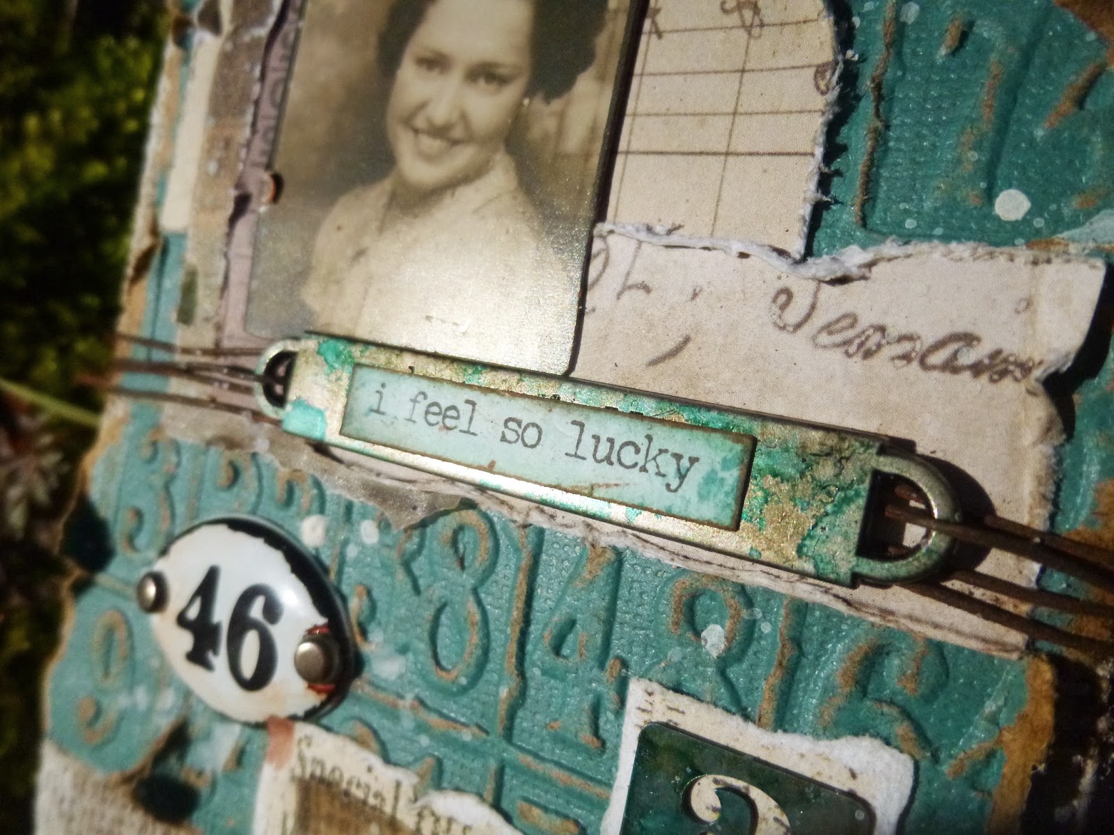
I came up with a burlap panel full of numbers, but there are three particular ones significant to me... and they all add up to the fact that I feel incredibly lucky in how my life works.


I got to play with one of the new Photobooth photos - and she takes the role of being "me".  And yes, that's the kind of happy smile I get to enjoy moment to moment in my work very often; certainly at the craft table or on visits around Craftyblogland enjoying your creations; and whenever I stop to count my blessings.


I also managed to get my hands on the new Small Talk stickers - yay for Country View Crafts! - and this one leapt straight out at me the moment I flicked through them.


I mounted it on a WordBand (one of the festive ones that I'm unlikely to use - 'holly jolly Christmas' or some such wording - just not me!) that I altered with alcohol inks - Mermaid, Mushroom and Pebble I think.


So, to my numbers...

The 24th, the number brad up in the top corner, also alcohol inked to within an inch of its life, is the date of my birthday in April.


And 46 is the number of years I'll hit when it comes around the next time, in a couple of months.  I had to double-check that was the right number when I found the Plaquette - I'm starting to lose count.  Not that it troubles me in the slightest... so far each decade has been better than the one before, so what's to worry?!


Down in the bottom corner, the Idea-ology Stencil Mark holding together some more ephemera fragments is my lucky number three.


Each of the ephemera pieces layered up behind the photo has numbers on it...


... and it's all mounted over the Bingo Texture Fade embossed onto Kraft Core in a lovely deep turquoise shade - sanded and torn to create a dimensional weathered look.


I gave the burlap panel a couple of rough coats of gesso, and then of course there's the rusty wire.


I wrapped some around the edges of the panel, as well as using it to fasten my WordBand to the centre of things.  Big thanks to Nina at It's Crafting Time for taking the trouble to source and stock the rusty wire on request - I'd be lost without it!


So that's my happy-go-lucky burlap panel for you - counting my blessings and sharing my significant numbers.

Hop over to A Vintage Journey to see the fantastic creations my team-mates have come up with to inspire you, and check out all the challenge details and travelling instructions while you're there.  We hope you'll come and share your Special Numbers with us this fortnight, and be in with a chance at the prize voucher generously sponsored by Country View Crafts.  See you there!

I'm a great believer in luck.  I find the harder I work, the more I have of it.
Variously attributed to Coleman Cox, Samuel Goldwyn and even Thomas Jefferson

A man is rich in the proportion of the number of things he can afford to let alone.
Henry David Thoreau

Tuesday 17 February 2015

Dripping and dropping again!

It's time for my second piece of Drips and Drops inspiration for Country View Challenges this month.  No big surprise - I'm back in the art journalling mode.  I'm not quite managing to "journal everyday" as the words suggest, what with work and trips to Budapest (wonderful, thank you!) and songwriting workshops (also wonderful, thank you!) - but I'm certainly doing it a lot more frequently, and enjoying myself a lot.


As well as Sue's fabulous theme, I've also been inspired by the marvellous Marta at Maremi Small Art, and how she constructs her beautiful art journalling pages.  If you've not visited her blog, I highly recommend it!


I started by layering lace, book pages, watercolour paper and washi tape across the double page spread.  I wanted various materials that would all soak up ink in different ways.  


Lots of Marta's pages start with these kinds of structures, and then things carry on from there.


I applied some gloss medium through the Finnabair checked stencil so that there would also be some resist once I started dripping and dropping my colour mediums.


I played with the Distress Sprays... sorry, I'm not completely sure any longer exactly which colours, as it's a while since I made this.  


I'm pretty sure it's just Shabby Shutters and either Salty Ocean or Broken China.  It certainly wasn't more than two in total.

All the other shades were created just by the two colours blending and dripping in to one another.


I did use some Scattered Straw on my crackled book page hearts I remember.

I needed to help them echo the colour of the washi tape, which had also resisted the inks fairly firmly.


I love how the lace and the watercolour paper really soaked up lots of ink, giving great depth of colour...

... compared to the washi tape and around the stencilled texture, where the colours are completely different.


I added some ChitChat stickers so that there would also be some words in the mix.


And there are also some words in the stamping - adding detail and interest softly around the white space (still no good at leaving white space to speak for itself!).


I had lots of fun spritzing and dripping and dropping and allowing the colours to blend and merge...


And I love the effect of the glossy resist in between the inky effects...


... as well as the crackle catching the light too of course.


There's still lots of time to come and play along with your Drips and Drops this month, and be in with a chance at the prize voucher generously sponsored by Country View Crafts.


And don't forget there's always fresh inspiration to be found on the Country View Challenges site.  Hope to see you there soon... and I hope to be round for some sight-seeing in Craftyblogland soon too.

I'm always thinking about creating.  My future starts when I wake up every morning... Every day I find something creative to do with my life.
Miles Davis

Thursday 12 February 2015

Long Rusted Love


Hello all!  I'm away for a week or so at the moment - hot springs in Budapest, (a flying stopover tonight at home) and then some music-making this weekend, so apologies if I don't make it round to see you for a few days.

But I made my Tim tag last weekend and it seemed appropriate to post it in time for Valentine's Day, even though I'm barely here (and usually do my best to ignore V-Day).

The whole hearts and flowers business of Valentines doesn't get much of a look in here at Words and Pictures, so this a very rusty take on love.

My tag has a couple from long in the past - the shiny smiles in the photo may have worn a little thin over the years...

Or perhaps they've weathered well together, sharing years of experience and adventures and trials, and growing ever closer.  Maybe they're wearing those smiles to this very day.


For all my inertia around V-Day, I had a lovely time playing with Tim's February Tag inspiration - it was one of those occasions where I just woke up knowing where I wanted to go with it, and had to sit straight down and act upon it.  If you want the how-to details, you can't do better than go and see how Tim himself does the job.  I'm just going to share some of my adaptations here...


The idea I woke up with was my variation on the portrait frame.  I don't have the stickers, but regulars will know I love my rusty wire.  I guess my wire-doodle-frame might have been subconsciously influenced by those new doodly Thinlits released at CHA... wherever it came from, I love the result!

(Oh, pish tush - as I was writing this, I've just caught up with the fabulous France Papillon's Journal on Monday from a couple of weeks back - I promise I hadn't seen it when I was making this - I'd like to claim the thinking alike of great minds!)


And I don't have red felt, so I decided to use some of Tim's Eclectic Elements fabric instead.

I stuck it onto some card and then onto some thick cardboard before running it through the BigShot and fraying the edges a little.

Sewing machines and I have a long and troubled history, so my stitching is completely fake sadly.


My bright young things were a happy accident.  I gathered up a handful of ephemera bits and pieces and, as I was sorting through them, it suddenly became clear to me that they were obvious candidates for inclusion.

If you're making a Love tag, then you need a loving couple in the story, don't you?

Looking at them in close-up here, I find myself really hoping that they have a "happy ever after" ahead of them... that these are long treasured memorabilia, merely a little timeworn rather than unloved and forgotten.


I stuck to neutrals with my ephemera, but because I knew I was heading towards a rusty look, I added some Quin Gold to my ephemera patchwork to warm up the images and papers.


I used various alcohol inks to create a rusted look on my WordBand, and then added the paint as in Tim's tutorial.  Of course the ink soaked into the pale paint, but I rather like the resulting weathered look.


I thought it would be quite nice to have a tiny echo of the photo of the couple in my heart charm... glancing across the tag you get to see both.


The heart charm also got a touch of the alcohol inks to tone in with the rest of the tag, and I even used Distress Markers to alter the colour of the 14 badge. Why have red when you can have rust?!


And it's all attached with some more rusty wire.


Improvising again... no arrows, so my other main embellishment is this key, DREAMS, echoing the phrase on the WordBand, and likewise altered with the alcohol inks and Antique Linen Distress Paint.


I used some of the leftover fabric as my topping, cut into strips and frayed for added texture.  I added twine to the frayed fabric and bound it together with a final touch of rusty wire.


I made sure the tiny attachers got a hit of rusty alcohol ink while I was at it, and the whole thing is mounted on some rustic corrugated cardboard.


I had such a lovely time with this one so thank you, Tim, for another brilliant piece of inspiration, and my thanks to all of you for your amazing comments and feedback on my recent PaperArtsy work.  I hope you like this one too.  Happy Crafting, and I'll be round to visit soon.

A sword, a spade, and a thought should never be allowed to rust.
James Stephens

Being deeply loved by someone gives you strength, while loving someone deeply gives you courage.
Lao Tzu

I'd like to enter this as my February Tag in Tim Holtz's 12 Tags of 2015
And at the Inspiration Journal where Love Is In The Air