It's doubtful whether I'll ever actually complete a whole journal, since I have so many of different sizes, shapes and papers on the go at once, but this Dina Wakley Media Journal is starting to look pleasurably bulky, even though there's still a way to go before it's even half full.

This page was definitely triggered by the Green theme over at Art Journal Journey this month. And there are a couple of other green-tinged challenges around at the moment, so it will fit in nicely with those too.

But mostly I was inspired by that breath of spring in the air that has been doing its best to break in despite the winds and rain. Every now and then, one of those fresh spring mornings dawns clear and bright and blue-skied, and the air feels softer on the skin as you step outside.

The birds are full of song, and the trees have those vivid light green leaves and buds so particular to this time of year. Spring flowers brighten garden beds, hedgerows and roundabouts, their delicate heads bobbing in the (still pretty stiff) breezes.
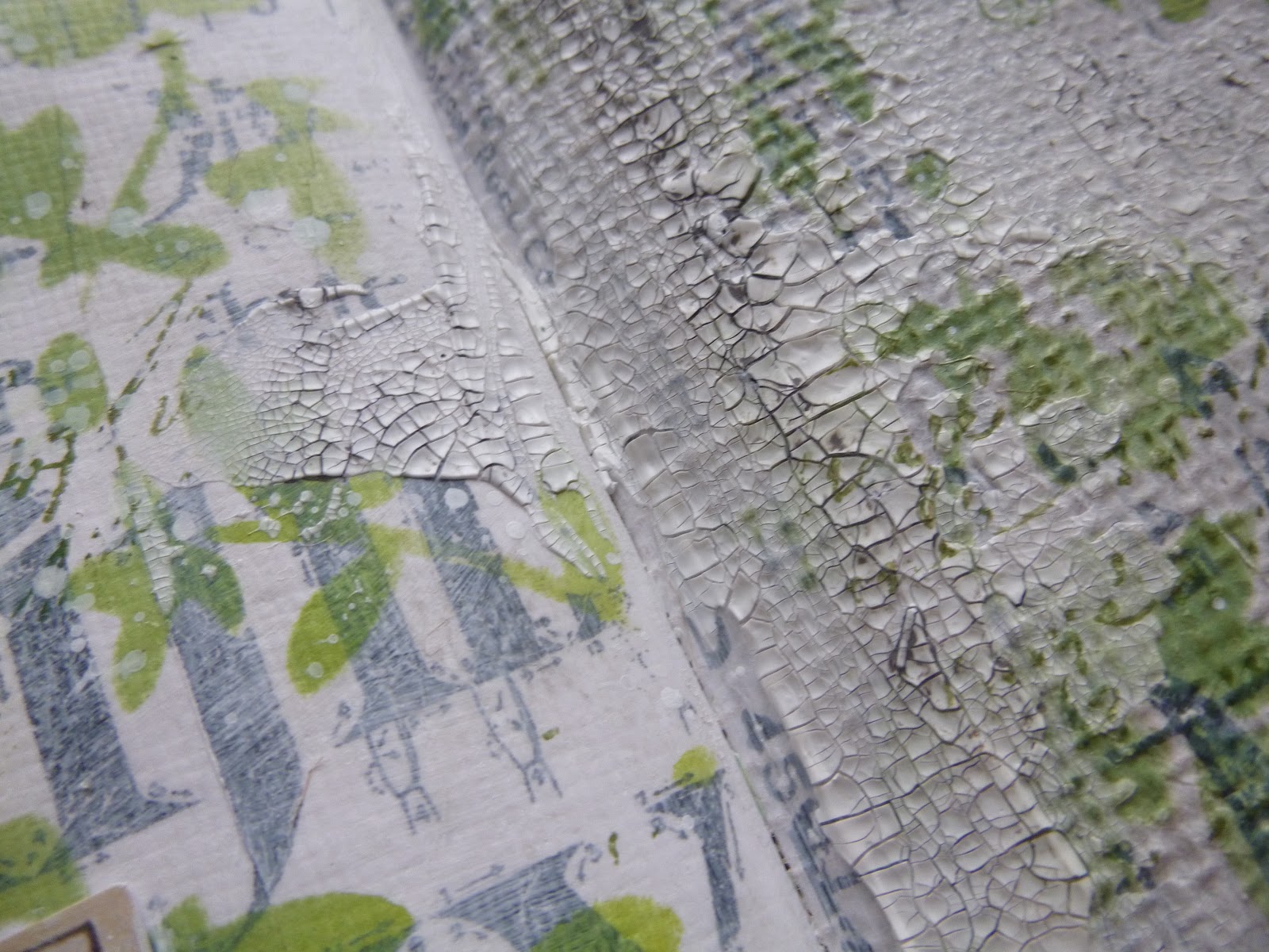
It's a magical time of year, and I hope some of that feeling has rubbed off on my art journalling spread.

I started with some Idea-ology tissue paper, torn and glued in place on the side I planned to use.

I then gesso'd over it all to soften the look. As I was adding the white, some of it got on the facing page of burlap so I deliberately added more gesso to that scrumptious texture, thinking that it would be a good start for whatever eventually happened on that page.

Almost before I knew what I was doing, I'd torn some more of the tissue, glued it down and gesso'd that too. Seems like we're doing a double-page spread after all!

Next step, stencilling... And since this was happening quite early on, I wanted to make sure it would stay put as much as possible, so I used Archival inks in Olive and in Leaf.

I blended them on, alternating them to get the shifting tones of green, as though sunlight is dappling the leaves.
They make me very happy, just as dappled sunlit leaves do in real life!


It took a while to work out what I wanted to add next. But after discarding a couple of half-made tags which I'd thought might work (they just didn't make me happy)...
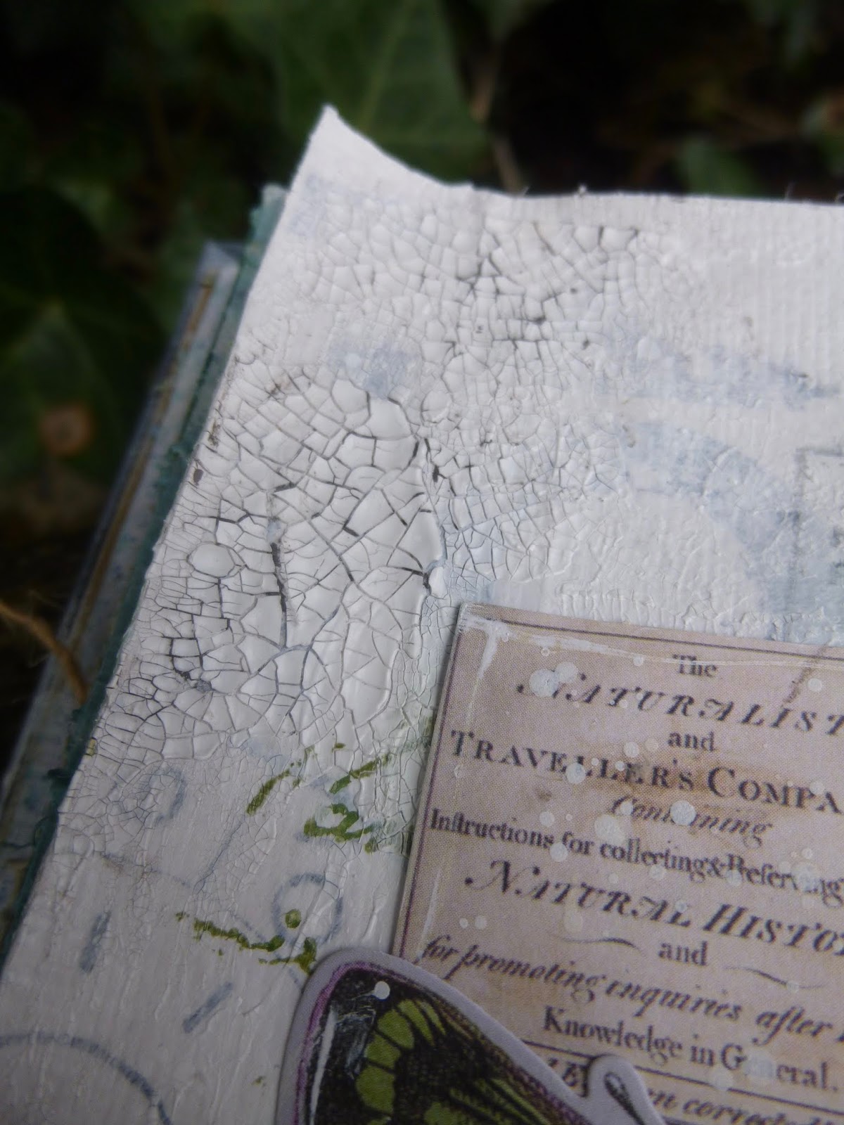

... I decided I couldn't go wrong with adding some crackle texture while I was debating. You can see the before and after on either side here.

It was a happy accident which led me to this glorious photo of the tiny spring seedlings sprouting up through some moss. It was tucked in a pile of scraps and tags on my craft table.

I think it may have come from a Neal's Yard Remedies catalogue, or possibly a Woodland Trust magazine. Either way, it was love at first sight. I don't work with photos much (other than people - Photobooth pictures or Paper Dolls), but this one I snipped out and put aside for future use.
It came to the surface at just the right moment... springtime serendipity.

I was still faffing over the idea of using my springtime tags as background layers. Pure chance, but the colours worked brilliantly with the photo... but in the end I followed my gut instinct which wanted an altogether lighter, less blocky look.
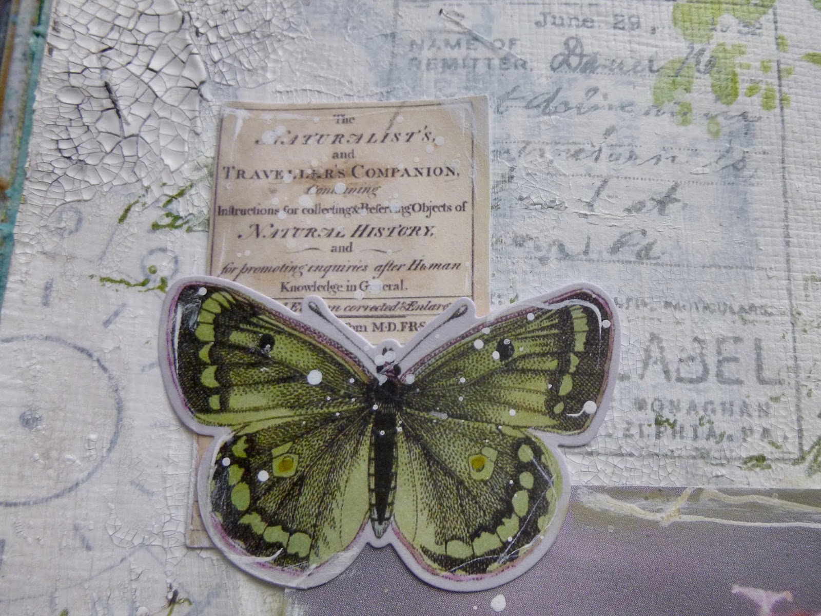
Tim Holtz's lovely new ephemera, all nature expedition-based, arrived just in time to play a part in this page spread.

Anyone who's a regular here won't be surprised that I yielded to temptation on these designs.

They complement my crafting obsessions too well for me to resist. Tucked in and around the photograph, they add a touch of the Victorian naturalist, collecting and labelling every specimen.

Over on the burlap side, they adorn a couple of simple die-cuts. I really love the handwriting added to the specimen labels.

I did some inky outlining of the photo and the ephemera using my dip pen with some white ink, which feels like adding some of my very own "handwriting" or at least mark-making to the mix.

This little chap is amazing... not that I'd like to catch him feasting on any of my plants, of course.
Oh look, that's also given away the author of the quote over on the facing page...

It's one of the quotes from my PaperArtsy EAB06 Spring Edition collection, and it's one that definitely makes my heart quiver in response...

It's one of those times when somebody has managed to sum up in a few poetic words a sensation I recognise completely.

You probably caught sight of some stamping layered under the quote strips there... Yes, I also yielded to the complementary stamp set, Field Notes.

It's full of little labels and botanical illustrations and I can see it being in almost constant use.

(If you check back on those spring tags which didn't make the final cut, you'll see I'd already inked some of them up for those too.)

I used the Pumice Stone Distress Crayon to heighten the crackle detail across the pages.

I really wanted the page to stay fairly light and bright - that vivid spring air, you know - so I gave it a good spritz of water so that I could wipe away all the crayon from the surface, leaving it just in the cracks.

I love how natural it looks, maybe like silver birch bark, and it's great over the tissue paper designs in the background, as well as over the burlap texture on the right-hand-page.

I love the stencilled Archival inks over the burlap too.

I did try some burlap twine which I thought might create a nice echo tangled across the white page, but again I decided to prioritise my white space and that lighter-than-air springtime feeling.
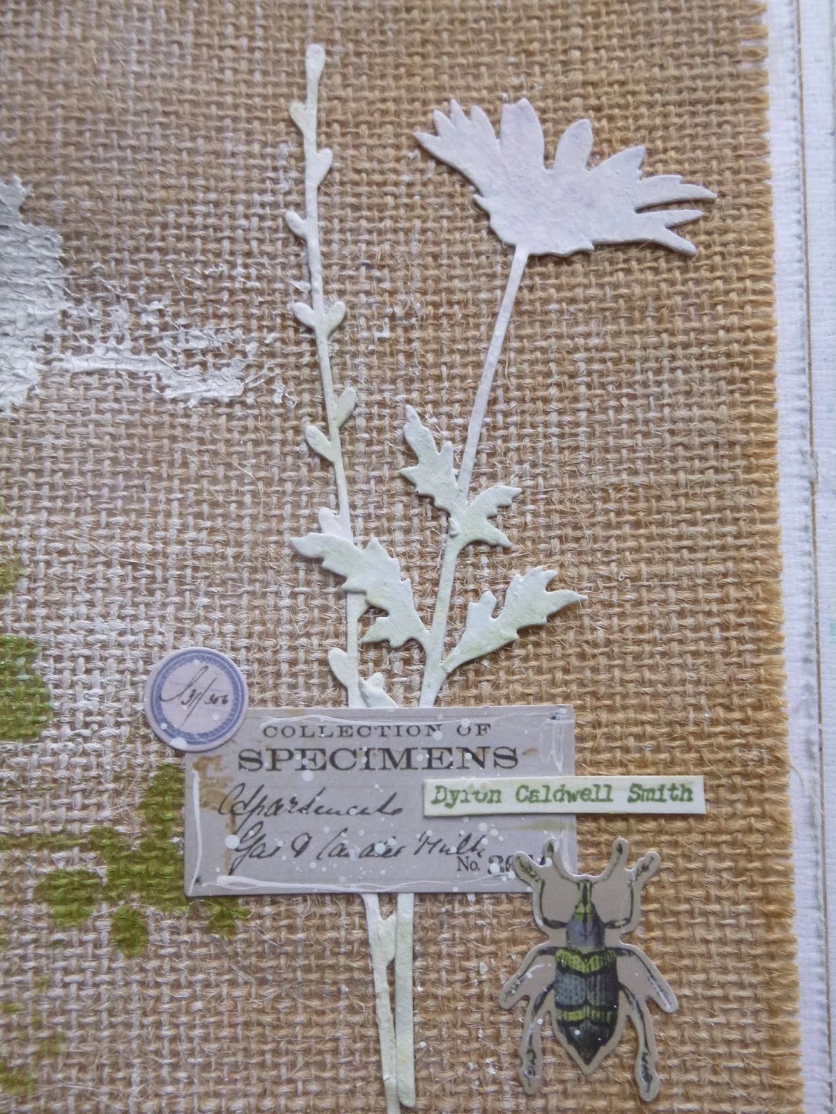
You'll spot that the die-cuts got whiter and brighter in the end too, rather than pink and green.
I think it was the right choice - a better echo of the light white brightness over on the left. And they also show up better against the burlap.

(By the by, I'm well aware of the pun in the post title... I've been eating lots of spring greens this week, so it was an obvious choice.)
This page spread really makes me very happy, just like the signs of springtime do in real life. It's just as well given the difficult times we are clearly all going to be facing in the days, weeks and probably months to come. We're going to need to remember to take delight in the spring breezes, in tree blossom and sprouting bulbs, in the trill of birdsong, and the ever bluer skies.

Of course, since there's no risk of infection in this online community, we can also take delight in the shared creativity here in Craftyblogland. However isolated we may have to get physically, there's still warmth and communication and friendship galore right here. Aren't we lucky?!
Thanks so much for stopping by today, and bearing with me through this mammoth post - virtual hugs all round! I'll be by to catch up (again) on some visiting soon. Wishing you all a creative weekend - stay safe, and I'll see you soon.
When you paint Spring, do not paint willows, plums, peaches, or apricots, but just paint Spring. To paint willows, plums, peaches, or apricots is to paint willows, plums, peaches, or apricots - it is not yet painting Spring.
Eihei Dogen
I'd like to share this at Art Journal Journey where the lovely Eileen would like us to play with Green
At the Simon Says Stamp Monday Challenge they are also looking for A Bit O' Green (there's a bit more on this than on my previous entry!)
The More Mixed Media Challenge are playing Anything Goes with an Optional Twist of Green
Oh, and I've just spotted Use Some Green is the theme at the Simon Says Stamp Wednesday Challenge too... done!