

Most of this page spread was done before I got ill, and it's been sitting on the craft table for two weeks waiting for me to have the energy to stick it all down.

The trees themselves were actually painted months ago - done with some of my Daniel Smith watercolours in an A4 watercolour sketch pad.

For these pages, I tore around them and inked the torn edges with Vintage Photo and Gathered Twigs to give a nice framing effect.

I think they look pretty good against the simple kraft pages of this 8x6 inch Paperchase journal. (As a double spread it measures 12x8 inches.)
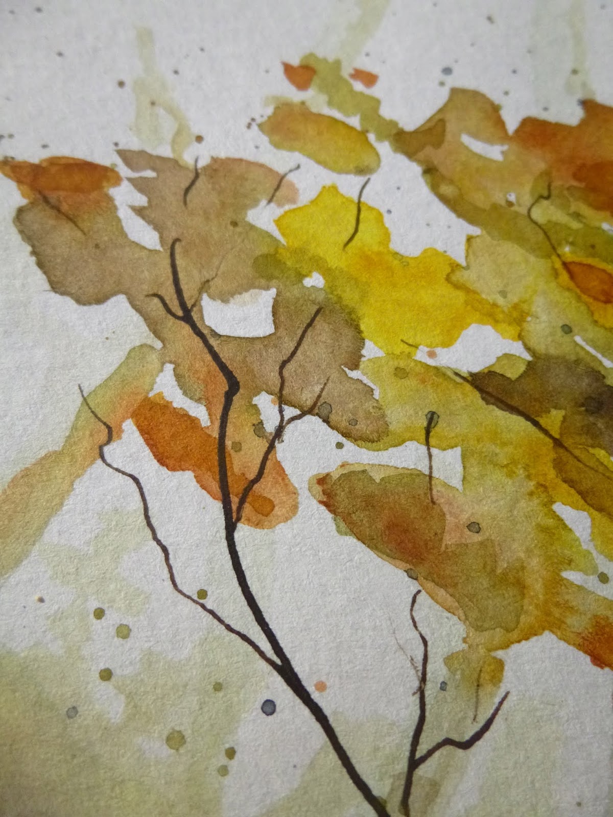
I love the soft patches of colour creating the foliage...

... layered and overlapping...

... and the intricate twining of the trunk, branches and twigs...

... done with dip pen and ink.
I'm also pretty pleased with the soft shadowy trees in the background, giving the scene a touch of depth.

The Art Journal Journey theme meant I needed some fruit to be hanging from the branches of my trees, so I used Fresco acrylic paints to add some green apples.

I applied the paint quite thickly to give them a bit of dimension. But then I decided the green wasn't really doing it for me...

... so I gave all the apples a touch of Cherry Red/London Bus over the top.

And then on top of that each one got a blob of Glossy Accents to give them even more dimension and that glossy look of delicious ready-to-eat apples.

It also helps them stand out from the watercolour effects in the background...

... as well as fulfilling my favourite light-catching function.

The words are from my PaperArtsy EAB04 Autumn Edition.
They're stamped in Sepia Archival on one of the leftover scraps from the torn up watercolour page.

You'll have noticed in the green-apples-photo that I'd done some colourful splattering on the kraft background. When I changed apple-colour I also decided I wasn't enjoying that, so I turned over a new leaf and tried again.

Now there's some watery brayering of Cloud 9 (a lovely soft white by PaperArtsy) as well as splatters and credit-card streaks of the same paint.

There are twisted tangles of thread and some of my much-loved ivory sequins. Again, it's about catching the light I think - but in a nice subtle way.
And a trio of punched leaves cut with a Tim Holtz punch from some Distress Ink spattered cardstock add the final touch of autumnal colour.

I hope you like my watercolour trees and their glossy fruit, hanging low and ready to be picked.

I was a bit nervous about adding the apples, worried that I might just spoil my autumnal trees on the turn.
But I've ended up rather liking the effect. And I do think it's quite a good way to give these trees something more to do, rather than having them tucked away in a sketch pad somewhere, never to see the light of day again!

Thanks so much for stopping by today. I'm glad to have a bit more colour to share with you than for my previous watercolours Got the Grey-Blues! I hope you're all having a lovely weekend, and I also hope to catch up with what you've been up to very soon. Happy crafting, all!
...and so many orchards circled the village that on some crisp October afternoons the whole world smelled like pie.
Alice Hoffman
I'd like to share this at Art Journal Journey where Rike is looking for Fruits & Vegetables
At the Funkie Junkie Boutique Blog they are gathering up Lovely Leaves - since these trees are really all about the colours of the autumn foliage, I hope they will fit right in
I'd also like to join in with Week 38, Year 9 of the marvellous Paint Party Friday


