I'm travelling into a new way of working, a new country, a new language, and a new hobby which I'm passionate about. Come with me for some of the journey...

Showing posts with label Finnabair. Show all posts

Saturday, 3 October 2020

Gothic Text

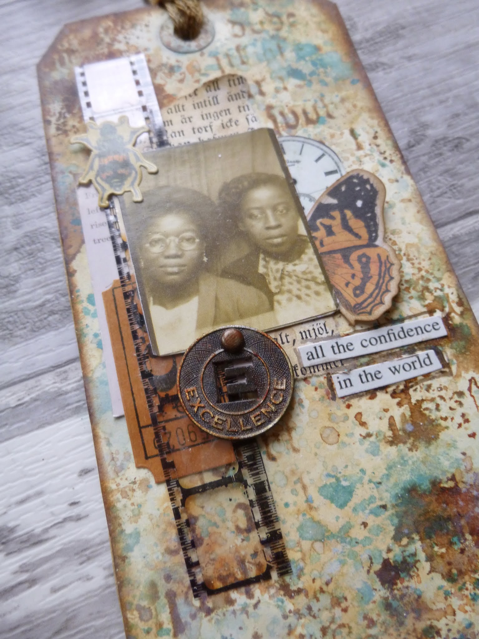
Hello all, and a happy weekend to you, or as one would say in Czech, "Hezký víkend!"  I'm here with a quick post (I hope... #newbloggersucks) to share another pair of the tags I made while I was over in the Czech Republic trying to make sure all the building work would be done so that all the packing I'm now doing over here will have somewhere to go.  Confused?  Not as much as me, I guarantee!  Anyway, here are the tags...

I've called the post "Gothic Text" because not only is there gorgeous crackled Gothic text texture in the background, but there's also a Gothic font on the book page scraps which form part of the collaging.  That's what made me decide to share these now, so that I can play along with Sandie's Book Print theme at Tag Tuesday.


I had a lovely time wrinkle-free distressing, smooshing and dripping and splashing inks to create the backgrounds.


Again, Speckled Egg is the catalyst here, and it pairs so beautifully with some of my favourite rusty browns, Vintage Photo and Rusty Hinge.  


I think there might be some Broken China too, and it's all in a combination of Distress Inks and Oxides.

This isn't Tim's new stencil, but a recent one of Finnabair's in similar style, which I'd already snapped up a few months ago.  Irresistible when you love text as much as I do.


There's some collaging with Idea-ology film strip, ephemera and a Muse Token, rusted with paint (no alcohol inks in the travelling stash).


And a couple of brilliant Photobooth snapshots provide the real focal point that all the collaging is building up to.


I'm very happy with my crackled Gothic script on the one tag...


... and the printed stencil marks which you can find if you look closely on the other.


You also have to look quite closely to spot the book page fragments, but I promise they're there... in fact they were the first part of the collaging to take their place.


And I'm very taken with the clock sticker from the Tim Holtz Halloween Sticker Book (only I think it may be from last Halloween's edition, not the new one.


In any case, I like it so much I didn't want to waste any, so I cut it in half to use a bit on each tag!


I hope you like these.  I know it's pretty rare for me to use orange unless it's for autumn leaves, but if I think of it as rust, that helps me get over it!  Thanks so much for stopping by and I'll see you again on Monday with a very special post.  Hezký víkend and happy crafting all!

Typography is the craft of endowing human language with a durable visual form.
Robert Bringhurst

Every page should explode, either because of its staggering absurdity, the enthusiasm of its principles, or its typography.
Tristan Tzara

I'd like to share this pair of tags at Tag Tuesday for the Book Print theme there

#newbloggersucks  
Okay - does anybody else get the thing where you're adjusting the position of a photo and it randomly hops to the top of the post with a broken bit of text attached to it and now all messed up in alignment so that you have no choice but to remove the photo, delete and re-paste the text where it ought to be and start all over again uploading the photo?

Also, I apologise again for the appearance of my posts these days.  They're not as I would like them but #newbloggersucks.  And of course it takes nearly twice as long to get a result which I hate.  It's a bit soul-destroying when I used to enjoy this so much.

My thanks to all those trying to offer work-arounds and solutions.  I will try to explore everything in time, but I'm a little preoccupied with trying to move country at present, so #newbloggersucks hit at just the wrong time.

Saturday, 29 August 2020

Encore - Calico Flourishing Butterflies

Here's a blast from the past - a project for Calico Craft Parts from all the way back in June 2015.  There's a wealth of different crackle products in the background, and I had a lovely time adding colour with sprays - something I don't do very often.  It's a slightly different vibe from some of my creations, but you'll recognise the colours and of course my passion for crackle!  Here's what I wrote back then...  (Oh, and if you're not sure what an Encore post is about, you'll find the explanation at the end of the post.)
_____________________________

Hello everyone, Alison here from Words and Pictures, and I've brought along some Flourishing Butterflies to share with you today.


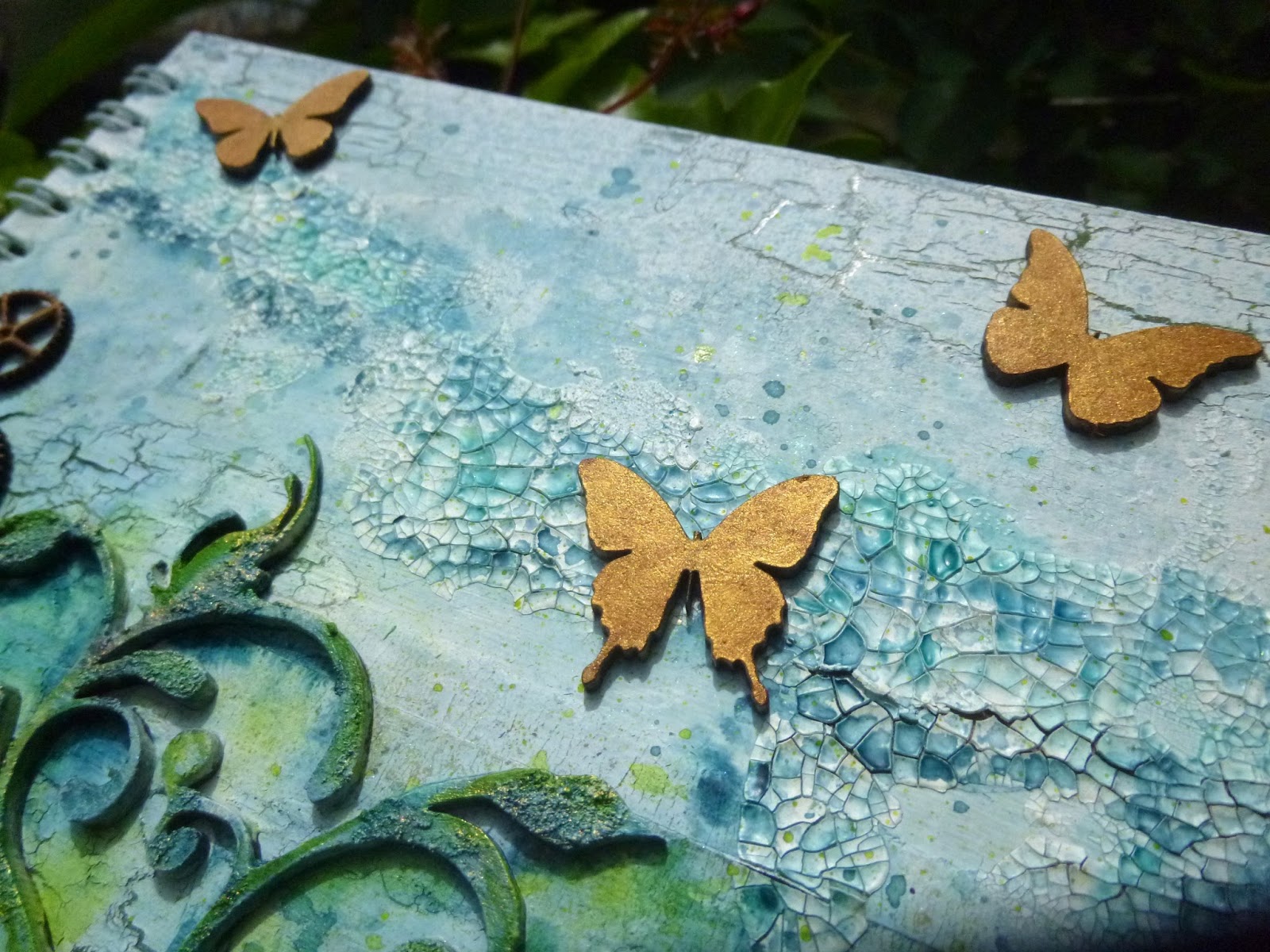
What I mean by that is that I've been playing with the fabulous Mini Butterflies again, as well as some of the scrumptious Mini Cogs, and they're all nestled around one of the glorious ornate Flourishes now available to create an altered notebook cover which, I will confess, I'm rather in love with!


I played with the layout first of all - you'll notice I ended up with fewer butterflies in the end.


I had a lovely time creating the background - book pages, masking tape and various layers of gesso and crackle mediums are at the heart of it.


I also applied texture paste and gesso to the large flourish before gluing it in place.  I added the metal flowers and filigree pieces, and gesso'd all of it.


I decided I needed a bit of extra crackle texture, so I applied that and let it dry before going on to the next stage.


Ah yes, the next stage - lots of spritzing inky colour over and around it all - such fun.


As well as spraying on inky colour, I also used a paintbrush to apply paint (shockingly conventional, I know) to intensify the colour in places.


That also gave me a bit more control in deciding where and how much colour I was applying to the flourish, the flowers and the crackled "sky".


Both the butterflies and the cogs have been given a touch of golden shimmer using some iridescent gold paint - Interference Gold, which changes as it catches the light.


I've used some of the same stuff to add highlights and gilding on the flourish texture and the metal elements too.


The butterflies gleam as they catch the light...


... and the cogs add a little hint of Steampunk glamour...


(... or should that be Glampunk? - something I explored with one of my first ever posts for Calico way back when - my Glampunk Birdhouse!!)


I love how they glow amongst the other elements.


There are spots and splatters of ink to add extra detail, all in colours to complement the main colours on the flourish.


I quite often leave my Calico Craft Parts "naked" as I find them so beautiful, but as you've seen in my last couple of projects, they're also fabulous when altered, and so much fun to play with!


So there's my notebook cover for you - I hope you like it.  See you again soon.

________________________________

There you have it.  I hope you've enjoyed this little wander down memory lane.  I still have lots of these fabulous flourishes in my stash.  I must dig them out when I get home (or make sure they're near the top of my packing when I pack up to move house!).  I hope you all have a wonderful weekend, and I'll see you again soon.  Stay safe, stay well and happy crafting all.

Nothing is ever really lost to us as long as we remember it.
L. M. Montgomery

Encore Posts
Projects which made their first appearances elsewhere for Design Team duties or Guest Designer opportunities, but which only had a sneak peek here, are being gathered together in the pages of my virtual scrapbook while I'm busy.
As always, the Encore Posts are formatted differently from the regular ones, so that you can easily spot them.  For some of you they will be new, but if you've seen them before, please don't feel that you have to comment all over again!

Saturday, 27 June 2020

Starry, starry night

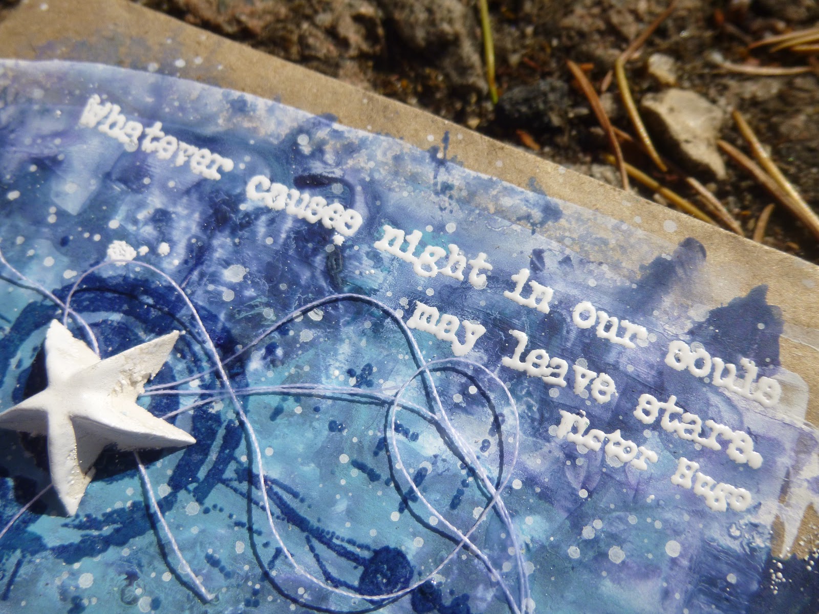
Hello all, and welcome!  Another quick sample post for you today, catching up with some of the ATC gift envelopes I created to show off my latest quote stamp releases with PaperArtsy.  In between, there have been some lightly dancing art journalling pages using one of the quotes from EAB19 Life & Living, but today I'm here with a couple of quotes from EAB20 Night & Day.


This pair of not-quite-ATCs are created on some very cheap cash envelopes.  You can usually pick up packs of 200 or so in a pound shop.  That means that, as long as you keep the top flap open and operational, you can use them for gift vouchers or cash gifts with a little bit of artwork attached.


There's lots of embossing powder involved here - both for the quotes themselves, but also on the background stamping, which is clear-embossed for that fabulous light-catching quality.


They started very simply with some gesso scraped onto the envelopes pretty randomly.  Rather than the 3.5 x 2.5 inch ATC standard, they're actually 4 x 2 and three quarter inches, if you don't count the flap.


Then I added Fresco paints in shades of night blue... Blueberry, Midnight, Twilight and Sky.  There may have been a bit of Purple Rain involved too.


I added the paint in watery washes and spritzed with more water to let it move on the surface, and finished by splattering with whatever was leftover on the craft mat.


Seth Apter's fabulous minis make wonderful "orbits" or rings like the rings around Saturn... the perfect framing for the dimensional white stars. 


The minis are stamped in Cobalt Archival and then clear-embossed, as I said.  This means they have that now-you-see-it, now-you-don't quality which always makes me happy.


The stars are moulded using one of the Finnabair/Prima silicone moulds and some paper clay.  Then, so that they would match the quotes in gleaming whiteness, I pressed them down into the squidgy embossing ink pad, and embossed them with Wow Bright White.


And yes, that's what I used for the words too.  As always, I stamped in Archival ink, so that you get a sharper stamping edge than with (squidgy) embossing pads.


This is really important when you're embossing fine-detail stamps like these words, if you want to be able to read them clearly in the end.  Given one of the quotes is by Vincent van Gogh, I really had to call the pair, "Starry, starry night"!


The white thread adds movement and interest, almost making the stars into shooting stars leaving trails across the sky.

And I really like the kraft framing you get from the cash envelopes as the substrate.


So there you go... a couple of mixed media ATC envelopes celebrating the stars and how we endure even the darkest nights.  Thanks so much for stopping by today.  I hope your weekend will be wonderful, and I'll see you again soon.

When it is dark enough, you can see the stars.
Ralph Waldo Emerson

I'd like to enter this at the Simon Says Stamp Monday Challenge where the theme this week is Shoot for the Stars

Thursday, 19 March 2020

It's Patina Time!


Hello all!  I hope you are staying safe and well wherever you are. 

I'm so glad you enjoyed some spring sunlight on my Spring Greens pages with me.  There will be some more springtime creating along soon, I've no doubt. 

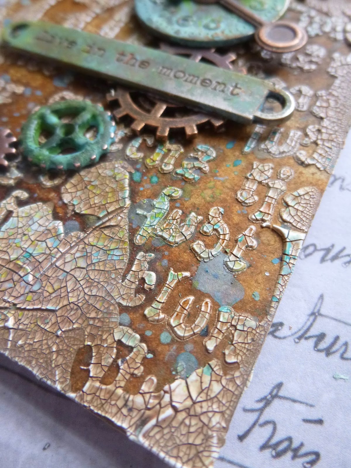
But I'm in a different mode today with this textural tag full of crackle and weathered patina effects.

I'll try to keep the words to a minimum, though there will as usual be plenty of pictures.

I was originally thinking of creating more of a partner piece to the Full of Bright Hopes tag, with maybe a Paper Doll or two involved.


I hadn't intended to go down this metal-heavy, patina'd look... but some already patina'd metal embellishments hanging around on the craft desk had other ideas!


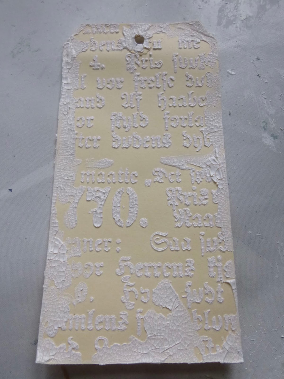
The Simon Says Stamp Monday Challenge is inviting us to indulge in some Stencil Fun, which gave me an excellent excuse to try out this glorious new Prima Gothic font stencil.


I thought it would be fun to apply some crackle paste through it - this is the Ranger Opaque version - because I always have fun with crackle!


I added some random smears around the edges with the palette knife.


Once it was all nice and dry and cracked, I gave it some spritzes of Distress Spray - Vintage Photo and Rusty Hinge mainly, with a touch of Pumice Stone somewhere under there.


For contrast, I flicked and smooshed some Distress Oxides - Broken China, Peacock Feathers and Cracked Pistachio at this point.

Then, of course, I needed to figure out what to put over the top of it all.


This clock was one I used to experiment with the wonderful VerDay patina paints when I first got them about five years ago. 

I'm not sure whether it ever made its way on to a project which later got dismantled or whether it's never made an appearance at all... 


... but it's been sitting in my bits and bobs bowl on my craft table forever.

When I reached for it and put it against the crackled font, I knew I was on to something.


The large cog was in the bits and bobs bowl, patina-ready - I think done with Fresco paints way back when.  Again, I'm not sure whether it came off a dismantled early project or whether it just never got used.


I did do some present-day patina altering of a couple of other cogs, and added splotches of the same new colours to the already-done ones to make sure everything toned in nicely. 

 Mostly I used Distress Paints.


Broken China, Evergreen Bough, Peacock Feathers and Twisted Citron all played a part.

Some stayed unaltered to match the background.


I also created some extra spatter with those colours onto the background to keep everything nice and harmonious.


The Word Band got the same Distress Paint treatment, and the final touch with all the embellishments was to sand back a bit in places to reveal the gleam of metal again.


I found a great way to use up the leftover smooshes of paint on the craft mat... I rolled this bit of chain in them so that it would end up with a nice weathered patina too, ready to take its place at the top of the tag.


The whole thing is mounted on some thick scrap cardboard for extra sturdiness to bear the weight of all that distressed metal...


... as well as all that chunky crackle!

So that's your lot.  I hope you like it.  I certainly had lots of fun making it.


There's endless delight for me in creating weathered, crackled, distressed, aged and antiqued effects.  The quote at the foot of the post today is probably a decent crack at trying to understand why they appeal to me so much.


And it's nice to have some bolder colour in action for a change too.  Thanks so much for stopping by today.  I'll be round for some (non-infectious) visiting soon, and I'm looking forward to seeing what you've been up to.  Take care, stay safe, and virtual hugs to all.

Monuments are anchors in time. Epochs pass, weather erodes, people lose interest. This cannot be helped. But patina itself is worth appreciating. Patina is the value that age puts on an object. It’s what makes an antique antique. It is experience, maturity, the soft sheen of time. Patina wasn’t present at the spanking-new creation. It comes from a life lived.
John Yemma

I'd like to play along with the Stencil Fun over at the Simon Says Stamp Monday Challenge
At the More Mixed Media Challenge it's still Anything Goes with an Optional Twist of Green