I'm travelling into a new way of working, a new country, a new language, and a new hobby which I'm passionate about. Come with me for some of the journey...

Showing posts with label Seth Apter. Show all posts

Friday, 26 January 2024

January Joy in Fodder School

January in Fodder School has been glorious... and that's not an adjective I often apply to January!  The wonderful Megan Quinlan shared some classes which were definitely up my street, and I had a fabulous time shopping my stash for stencils and stamps which had been neglected for far too long, as well as current favourites.  Here's the inspirational deck that emerged on my craft table...

Amongst other things, Megan encouraged us to create a deck whose theme would have personal meaning for us.  

You won't be surprised to learn that I dived straight into nature.

These cards will be a reminder to me of how important it is to keep sacred the moments of stillness, solitude, and heart-opening beauty which nature offers. 

Time spent in nature is what allows my creativity to breathe and flow, despite the troubled times we are living through.

These were the backgrounds, created in the Make Fodder sessions, before adding the Use Fodder detailing which came later.

There are 32 cards in total in my deck, so here they are broken down into groups of eight so that you can see them more clearly...


You'll spot plenty of my own PaperArtsy quotes in action, as well as some of my botanical stamps, mostly from the Fodder Berry and Rosemary Editions.


There are other PaperArtsy stamp sets, as well as some by Seth Apter for Impression Obsession, and lots of Donna Downey stencils, as well as some of her stamp designs for Unity Stamp Co.  


The paints used are almost all PaperArtsy too - mostly from my Background Blues collection - with some added Daniel Smith Moonglow providing those haunting purple tones. 


If you want to see individual close-ups, I'm afraid you are going to have to visit me on Instagram for that.  It would be a massively photo-heavy blogpost!


It really has been an extraordinary month in terms of creativity - with phenomenal inspiration decks appearing from my fellow Fodder School teachers as well as the participants... so much beauty on Instagram and in the Fodder School FB group, which is a really supportive and informative environment (hate to say nice things about FB - but this is down to the people in there!).  I offered up a little bonus session to add to Megan's classes, as did several other teachers.


If all this tempts you to join in the fun (there's still so much more to come, including my own teaching month!!), then just follow this link to find out everything you need to know about joining up for Fodder School.

I hope January has brought you some joy too.  I know it can be a hard month, but I have found real solace in creating my deck, and I know it will continue to bring me a sense of calm and beauty throughout the years.  Thanks so much for stopping by, and I'll see you again soon.

Feeling a little blue in January is normal.
Marilu Henner

January is the month for dreaming.
Jean Hersey

January, the first month of the year. A perfect time to start all over again, changing energies and deserting old moods, new beginnings, new attitudes.
Charmaine J. Ford

Wednesday, 12 August 2020

Encore - Meditation Cube

Hello all... here's an Encore post from me today (I can't be bothered to sweat it out with New Blogger in this heat!).  This was created almost exactly a year ago, and then shared on the PaperArtsy blog in September 2019.  I thought we needed some mindful meditation back then... and things in the world seem to have gone from bad to worse in the twelve months since.  There's an even greater need for this little Meditation Cube now...  so here's what I wrote back then.  (And if you don't know what I'm on about with this Encore business, you'll find the details at the end of the post.)


______________________________

Hi everyone, it's Alison from Words and Pictures here, and I've got a tiny Meditation Cube to share with you today.


I'm going to try to obey the instructions on the cube and keep the talking to a minimum, but there'll be lots of pretty pictures because when you've got a cube there are a lot of different angles and faces to capture!


When I saw the topic I thought, well, inchies and twinchies - best to choose some Mini stamps for that, so I've been playing with Seth Apter's Minis, some of the older ones and some from the latest release.


I had a jumbo tag left over from another project, already wrinkle-free distressed with some of my favourite Distress Inks and Oxides.  I found that with a little bit of coxing and boxing I could just get squeeze six 2 x 2 panels out of the tag, perfect to go on my 2 x 2 x 2 Twinchie box (MDF, from Calico Craft Parts).


There's Ground Espresso, Stormy Sky, Chipped Sapphire and Pumice Stone involved, some of my favourite colours, so I find that very soothing.  Also my eye never tires of tracing the lines of the random splotches and blotches.


Some quick decisions about which Minis would go opposite/next to which, and then it was out with the Wow Vanilla White embossing powder.


The diagonal positioning was dictated by the size of the Twinchie - that was the best way to get as much of Seth's fabulous stamps onto the space as possible.


I really like how, as a result, each image leads the eye round to the one on the next panel, up to down and down to up.  It's quite hypnotic as you turn it.


But then each face gives your brain a different shape to process, so it means you don't fall into autopilot - it's an active trance state!


And it was the soothing effect it was having on me that made me think about adding some words from EAB03 Music & Silence.


In some places I only wanted partial quotes, or even individual words, and that's where some masking tape (or any kind of tape really) comes in handy.  It means you can ink up the area you want, and then quickly apply the tape in case any of the surrounding area has got inky, and then you stamp.


You can, of course, also wipe the ink away from where you don't want it, but I find that sometimes leaves pale traces if you don't do it carefully enough, whereas this way gets me just the word(s) I want and no more.


I stamped the words in Jet Black Archival and then embossed with Wow Primary Bark, a deep dark brown.


The embossing means that as you turn the cube, your fingertips become highly sensitive to the raised textures, which keeps you very focussed and in the moment.


The repetition of the phrases calmly suggests the possibility of silence and stillness, while the mind stays alert to the changing images, ready to listen.


A couple of metal cogs and wheels and bolts offer additional visual and tactile stimulus.


The positioning pretty much took care of itself, dictated by the stamped images.


Given which way up the words are, and that bolt on the top, there is definitely a top and bottom to this cube... this is the bottom!


It really was a meditative creative process, as well as being a very meditative object to turn in your hands.


And the way the blues and browns travel around the corners, and the contrasts between the light and dark embossing all make me very happy.


You may feel it's cheating slightly... an inchie or twinchie constricts the amount of space you have to work with, but by making a cube, I had six times the playing area... but then how could you possibly choose between all those fabulous Minis otherwise?!  And if I'd gone for flat twinchies, I'd almost certainly have made a set of them. This way, my set of Twinchies has become a lovely 3D object.  I hope you like it as much as I do.


_________________________________

Thanks so much for stopping by today.  I'm grateful that so far the Czech Republic hasn't been quite as toasty as many other places, though we could do with some rain.  But if you're due to have the downpours forecast for when the weather breaks, I hope you don't get too much.  Stay safe, stay well and engage in some meditation, or some creativity!  Happy crafting all, and see you soon.

Touch your inner space, which is nothingness, as silent and empty as the sky; it is your inner sky. Once you settle down in your inner sky, you have come home, and a great maturity arises in your actions, in your behavior. Then whatever you do has grace in it. Then whatever you do is a poetry in itself. You live poetry; your walking becomes dancing, your silence becomes music.
Osho

I have lived with several Zen masters – all of them cats.
Eckhart Tolle

Encore Posts
Projects which made their first appearances elsewhere for Design Team duties or Guest Designer opportunities, but which only had a sneak peek here, are being gathered together in the pages of my virtual scrapbook while I'm busy.
As always, the Encore Posts are formatted differently from the regular ones, so that you can easily spot them.  For some of you they will be new, but if you've seen them before, please don't feel that you have to comment all over again!

Saturday, 27 June 2020

Starry, starry night

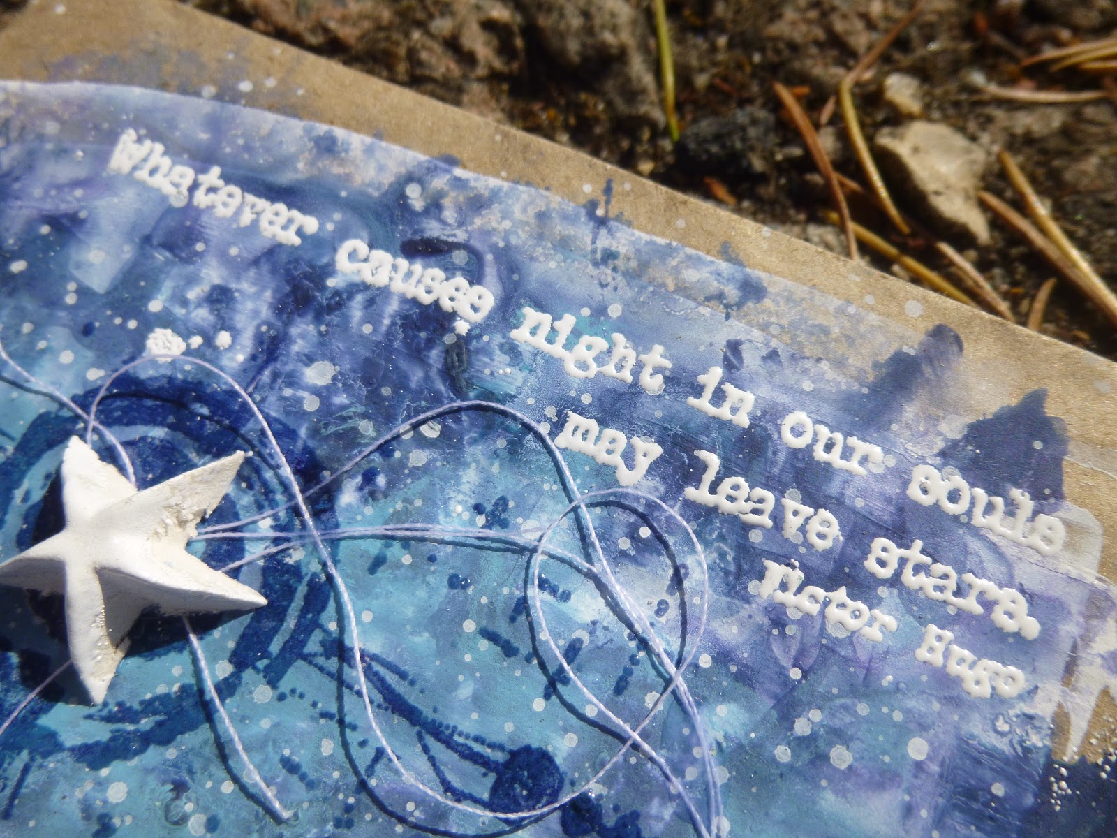
Hello all, and welcome!  Another quick sample post for you today, catching up with some of the ATC gift envelopes I created to show off my latest quote stamp releases with PaperArtsy.  In between, there have been some lightly dancing art journalling pages using one of the quotes from EAB19 Life & Living, but today I'm here with a couple of quotes from EAB20 Night & Day.


This pair of not-quite-ATCs are created on some very cheap cash envelopes.  You can usually pick up packs of 200 or so in a pound shop.  That means that, as long as you keep the top flap open and operational, you can use them for gift vouchers or cash gifts with a little bit of artwork attached.


There's lots of embossing powder involved here - both for the quotes themselves, but also on the background stamping, which is clear-embossed for that fabulous light-catching quality.


They started very simply with some gesso scraped onto the envelopes pretty randomly.  Rather than the 3.5 x 2.5 inch ATC standard, they're actually 4 x 2 and three quarter inches, if you don't count the flap.


Then I added Fresco paints in shades of night blue... Blueberry, Midnight, Twilight and Sky.  There may have been a bit of Purple Rain involved too.


I added the paint in watery washes and spritzed with more water to let it move on the surface, and finished by splattering with whatever was leftover on the craft mat.


Seth Apter's fabulous minis make wonderful "orbits" or rings like the rings around Saturn... the perfect framing for the dimensional white stars. 


The minis are stamped in Cobalt Archival and then clear-embossed, as I said.  This means they have that now-you-see-it, now-you-don't quality which always makes me happy.


The stars are moulded using one of the Finnabair/Prima silicone moulds and some paper clay.  Then, so that they would match the quotes in gleaming whiteness, I pressed them down into the squidgy embossing ink pad, and embossed them with Wow Bright White.


And yes, that's what I used for the words too.  As always, I stamped in Archival ink, so that you get a sharper stamping edge than with (squidgy) embossing pads.


This is really important when you're embossing fine-detail stamps like these words, if you want to be able to read them clearly in the end.  Given one of the quotes is by Vincent van Gogh, I really had to call the pair, "Starry, starry night"!


The white thread adds movement and interest, almost making the stars into shooting stars leaving trails across the sky.

And I really like the kraft framing you get from the cash envelopes as the substrate.


So there you go... a couple of mixed media ATC envelopes celebrating the stars and how we endure even the darkest nights.  Thanks so much for stopping by today.  I hope your weekend will be wonderful, and I'll see you again soon.

When it is dark enough, you can see the stars.
Ralph Waldo Emerson

I'd like to enter this at the Simon Says Stamp Monday Challenge where the theme this week is Shoot for the Stars

Saturday, 18 January 2020

Rusted Hope


Hello all and welcome.  I've been sorting papers for my taxes as well as starting a new theatre job, so time has been a little on the short side.  But when you're procrastinating over actually filling out the tax return, the craft table is a pretty good place to hide!

I'm still in an ageing/weathering/distressing/decaying sort of a mood, prompted I'm sure by this month's We're All Getting Older! challenge which I'm hosting at A Vintage Journey.  I'm looking for projects using techniques and products to make something new look old.

Yesterday, I shared some of the how-to details for my aged parchment tags over at the Vintage Journey blog, and today I'm here at Words and Pictures with a project full of crackled, rusted decay - so there's a whole different batch of ageing techniques and products on show.


In other words, stick around for lots more inspiration for the challenge - you still have nearly three weeks to play (it's a long challenge month this time around), so there's plenty of time to do some ageing, weathering, distressing or decaying of your own.

I was also inspired by the Rust It Up theme at the Simon Says Stamp Monday Challenge, and a new die which had just arrived.  And this jumbo MDF tag also plays another line of Tic Tac Toe at the Funkie Junkie Boutique Blog - this time on the diagonal with Die Cuts, Sentiment, Heat Embossing.

This is one of those creations which looks quite different when the sunlight hits it and when it's in less direct light, so forgive me for having two main photos!


It's a tag which carries ideas from deep inside.  I wasn't really conscious of them as I was making it, but I can "read" them pretty clearly now it's here!

There's a lot of rusted decay going on...


... as well as worn and weathered crackle.  It all linked in my imagination with the damage we are doing to the planet and each other.

There seems to be something badly broken in mankind's relationship with the natural world around him.  We seem to have reached a point where disaster and decay is almost inevitable.


But somewhere underneath it all, there has to be the hope of regrowth, of beauty and harmony somehow finding a way to survive and flourish again.

Otherwise, without hope, we might as well just give up now.


I started with a large MDF tag (8 x 4 inches) and gave it a rough coat of white chalk paint.  It really was very rough - I wanted as worn a look as possible (reflecting my general exhaustion with all the bad news around at the moment).

Over that I scraped some DecoArt Media Crackle Paint.  I'm at the bottom of a pot, so it's dried out a bit - it's more the texture of the Crackle Paste these days, but you still get a great crackle effect from it.


I used Distress Crayons in Pumice Stone and Walnut Stain to add some shadows and grime.  It also highlights the cracks nicely!

Some of the flakes flaked right off which gives it an even more weathered look.


I painted on washes of DecoArt Media Fluid Acrylics - Payne's Grey, Raw Umber and Quinacridone Gold - to add some rusted decay in various places around the edges, or where the crackle was thickest in the middle.


While I was happy with a few flaked flakes, I didn't want too many to go, so I gave the whole thing a coat of Ultra Matte Varnish to keep it all in place.


My other main rusted element is some chicken wire, courtesy of a fabulous new die by Tim Holtz and lots of powder and paint.


There's some of Seth Apter's Chunky Rust Baked Texture powder as a first layer.  That gives lots of rusty texture as well as colour.


Then I used some more of the Media Fluid Acrylics to get the exact shades of rusted decay that I wanted (a little darker and more ominous than the cheery orange red tones of the powder).


I broke the die-cut apart so that my chicken wire could trail a little further across the tag.

And with the addition of the Idea-ology word plaque, I was able to separate the chicken wire pieces even further, and started layering up some cogs and gears - the technology and machinery we continue to use without fully considering its impact on the Earth.


It was all looking a bit bleak at this point, and I felt an urgent need for some greenery to lighten the mood.  Rubber Dance's Weed Love to the rescue...

... but the tendrils and vines are so delicate that they were barely noticeable until you got close up, so I decided to give them a bit more presence by painting on some flower heads.


I began by using Stormy Sky Oxide - knowing I could wipe it away with water if I hated the look.  But I didn't hate it at all... quite the opposite!


So I decided to be bolder and added in some Fresco paints to the floral action - Lavender and Wisteria, but both mixed with the Stormy Sky which was still on the craft mat.


And of course I added some spatter with the leftover paints once I was done.


I really like the delicate flowers contrasting with the decayed metal.


They  share a similar spidery fragility, but a web of decaying wire which will eventually rust away to nothing is very different from a web of tangled stems and tendrils getting stronger by the day.


Despite the decay everywhere, the plants are finding a way around it, fighting for survival. 


The lettering of the Quote Band has been filled with Picket Fence Distress Crayon and I burnished the top with Sepia Archival, applied direct from the ink pad.


The ink gives a warm rusty tone to match everything else that's going on.  The original silvery pewter wouldn't have worked.


Some actual rusty wire holds the plaque in place.  (There's some padded tape and glue helping out too.)


(Just a quick warning courtesy of the lovely Bleubeard and Elizabeth... when working with real rust it's advisable to wear gloves.  You don't want it getting into the bloodstream.)


I thought about rusting up the gears too, but in the end I decided that might upstage the chicken wire.  They are already a good coppery colour, so I left them alone.


Some more rusty wire is tangled around the top of the tag, and that's about that.


Things have been a bit sluggish at the craft table lately.  Even when I have found time, there have been a lot of unsatisfactory tag backgrounds ending up in the bin - so I'm very happy that this creation made its way to the end without mishap.


I really love the decaying weathered crackle...


... the tendrils twining behind the rusted chicken wire trellis...


... the textural details of the rusty elements...


... the tiny flower heads emerging from the decay...


... the grime and the grunge...


... and those hidden stories and ideas which emerge from the subconscious and arrive on the craft table in front of you - unbidden, unplanned, but perhaps all the more powerful because of that.


I really hope you like the tag, and I hope there are some more ideas there which might send you off to your craft table to create something aged, weathered and distressed for the We're All Getting Older! challenge at A Vintage Journey this month.

Thank you so much for stopping by, and I'll see you again soon.  Have a great weekend, everyone.

In a decaying society, art, if it is truthful, must also reflect decay. And unless it wants to break faith with its social function, art must show the world as changeable. And help to change it.
Ernst Fischer


I'm playing the diagonal Tic Tac Toe line of Die Cuts, Sentiment, Heat Embossing for the Funkie Junkie Boutique Blog
I'd like to play along at the Simon Says Stamp Monday Challenge where they want us to Rust It Up
I'd also like to share this at the Bleeding Art Challenge where it's Anything Mixed Media Goes, as always