I'm travelling into a new way of working, a new country, a new language, and a new hobby which I'm passionate about. Come with me for some of the journey...

Showing posts with label Unity. Show all posts

Friday, 26 January 2024

January Joy in Fodder School

January in Fodder School has been glorious... and that's not an adjective I often apply to January!  The wonderful Megan Quinlan shared some classes which were definitely up my street, and I had a fabulous time shopping my stash for stencils and stamps which had been neglected for far too long, as well as current favourites.  Here's the inspirational deck that emerged on my craft table...

Amongst other things, Megan encouraged us to create a deck whose theme would have personal meaning for us.  

You won't be surprised to learn that I dived straight into nature.

These cards will be a reminder to me of how important it is to keep sacred the moments of stillness, solitude, and heart-opening beauty which nature offers. 

Time spent in nature is what allows my creativity to breathe and flow, despite the troubled times we are living through.

These were the backgrounds, created in the Make Fodder sessions, before adding the Use Fodder detailing which came later.

There are 32 cards in total in my deck, so here they are broken down into groups of eight so that you can see them more clearly...


You'll spot plenty of my own PaperArtsy quotes in action, as well as some of my botanical stamps, mostly from the Fodder Berry and Rosemary Editions.


There are other PaperArtsy stamp sets, as well as some by Seth Apter for Impression Obsession, and lots of Donna Downey stencils, as well as some of her stamp designs for Unity Stamp Co.  


The paints used are almost all PaperArtsy too - mostly from my Background Blues collection - with some added Daniel Smith Moonglow providing those haunting purple tones. 


If you want to see individual close-ups, I'm afraid you are going to have to visit me on Instagram for that.  It would be a massively photo-heavy blogpost!


It really has been an extraordinary month in terms of creativity - with phenomenal inspiration decks appearing from my fellow Fodder School teachers as well as the participants... so much beauty on Instagram and in the Fodder School FB group, which is a really supportive and informative environment (hate to say nice things about FB - but this is down to the people in there!).  I offered up a little bonus session to add to Megan's classes, as did several other teachers.


If all this tempts you to join in the fun (there's still so much more to come, including my own teaching month!!), then just follow this link to find out everything you need to know about joining up for Fodder School.

I hope January has brought you some joy too.  I know it can be a hard month, but I have found real solace in creating my deck, and I know it will continue to bring me a sense of calm and beauty throughout the years.  Thanks so much for stopping by, and I'll see you again soon.

Feeling a little blue in January is normal.
Marilu Henner

January is the month for dreaming.
Jean Hersey

January, the first month of the year. A perfect time to start all over again, changing energies and deserting old moods, new beginnings, new attitudes.
Charmaine J. Ford

Friday, 9 August 2019

Encore Post - Flourishing Florals

Since you all enjoyed the rare sighting of some cards round these parts this week with my Birthday Bubbles cards for Simon Says Stamp, I decided to go back in time for another card with this Encore post.  This was created for Calico Craft Parts in February 2016 when I was on the Design Team there, and here's what I wrote back then...  (Check the very end of the post for an explanation if you've not met my Encore Posts before.)
_______________________________________

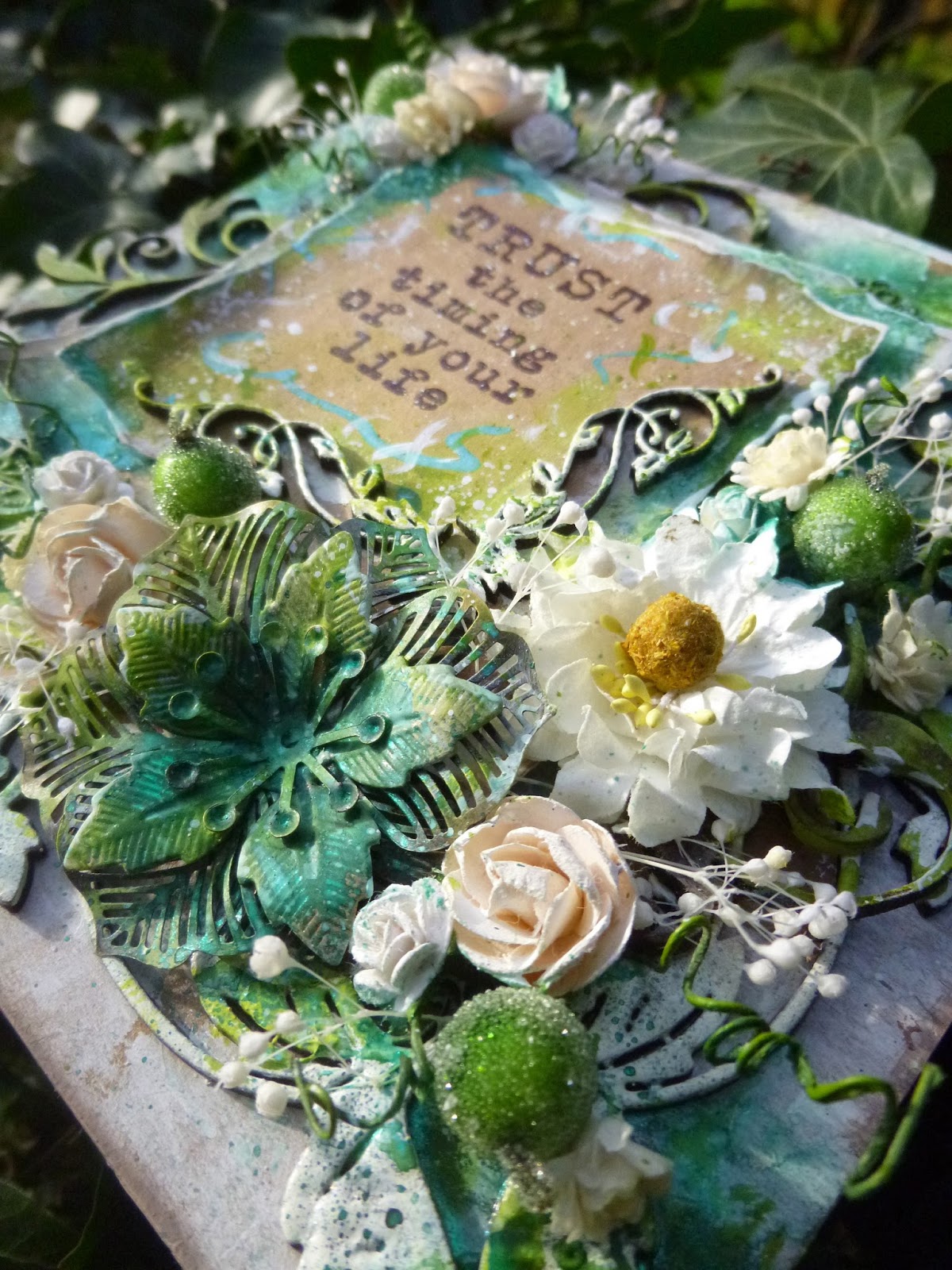
Hello all, Alison here from Words and Pictures with a very extravagant card for you today.  There are so many decorative elements to choose from in the Calico Craft Parts Corners, Flourishes & Ornaments section that you are really spoilt for choice when it comes to ornamentation.  Plenty of influences at work here (a glance at my "cards I love" Pinterest board will give you some of the main ones), but also a determination to use some of my long-hoarded "pretty things" in my craft stash.  I've got plenty of photos for you, so grab a coffee, sit back and enjoy the ride!


It started with some very basic layered panels and one of the wonderful new Corner Wood Shapes in two different sizes.  I definitely took some photos at this earliest stage but, again, my camera seems to have been playing up and they haven't materialised.


Basically, it's a square kraft card, with a couple of layers of patterned paper shabbily die-cut, and finally another kraft panel on the top for the sentiment.  The large Leafy Vine Wood Corner was the perfect size for the main card background, and the smaller one was just right for the sentiment panel.


I applied rough coats of gesso to all the layers, and applied some embossing powders to the Leafy Vine Wood Corners.  It's mainly white embossing powder, but I added some sprinkles of blue and green too.  This is the earliest process photo I've got, and here I've already started adding extra goodies and a touch of paint for colour.


Once I started adding more stuff, I couldn't stop!


A couple more Flourish pieces made their way on - these are all fragments from larger pieces - perfect for tucking in between layers...


... or for adding just a little more ornamental detail in places.


The main corner flourishes have benefitted from some of the spritzing and spraying that I did over the basic gesso and paint layers.


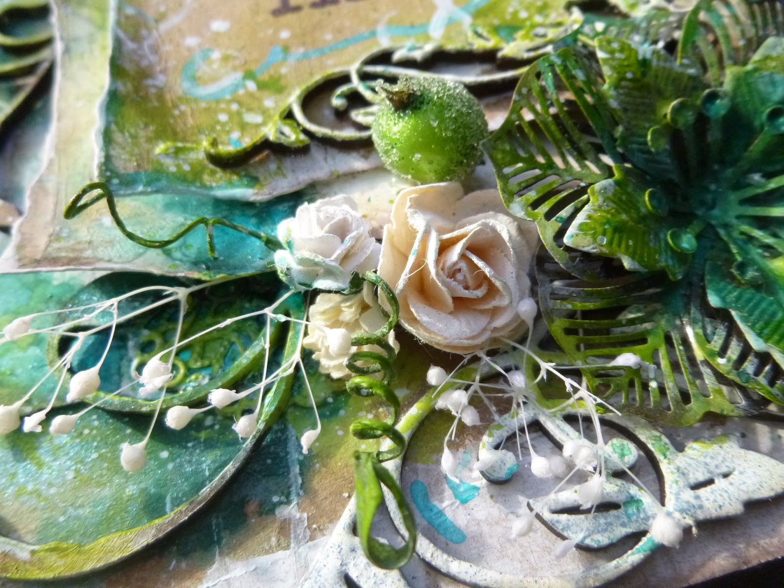
I love how the inks have pooled on the embossed curlicues and ornamentation...


... and the contrast of the slightly glossy dimension with the rougher painted layers on the other flourishes.


The metal flower has also had a coating of gesso and then paint and ink-spritzed added over the top.


Mostly, I managed to keep my paper flowers nice and white to provide some contrast.


I love the extra fun of the curly wires from the flowers coming out in all directions.


The berries had their stems cut off because they were a bit too thick and unwieldy...


... but I love the touch of glittery sparkle which they bring to the card.  When I go full on, I go full on!


You may well recognise the delicate flower sprays which are dotted here and there.


They were on my recent Imagine Simplicity tag - I said it was ironic that that tag grew from such an extravagant creation as this!


There are also some filigree metal pieces layered between the panels.  I think they provide a good contrast to the organic flow of the flowers and flourishes by echoing the more formal decorative style of the corner pieces.


And I love all the inky painty layers and edging to make the panels pop.


A few words in the centre of things, surrounded by inky scribbles, and we're pretty much there.


I hope you like this excursion into flourishing florals.  Alongside my exploration of simplicity, I have a feeling there might be more explosions into full on extravaganzas like this on the side.  When the sun comes out, this just makes me really happy.


_________________________________

I hope you enjoyed this trip down Memory Lane... it just seemed the perfect time to revisit this summery sunshine card full of flourishing florals, much more appropriate than its original February publication date!  Thanks so much for stopping by today.  Have a great weekend, and I'll see you again on Monday with a new Simon Says Stamp spotlight project.

The whole point of extravagance is to act like a fool and feel like a fool, but enjoy it.
Alfred Bester

Encore Posts
Projects which made their first appearances elsewhere for Design Team duties or Guest Designer opportunities, but which only had a sneak peek here, are being gathered together in the pages of my virtual scrapbook while I'm away.
As always, the Encore Posts are formatted differently from the regular ones, so that you can easily spot them.  Please don't feel that you have to comment all over again!

Friday, 30 September 2016

Believe that you can...


Hello all!  It's Tag Friday over at A Vintage Journey - that lovely extra Friday in the month when the Creative Guides get to come out and play.  Anything goes, as long as it's on a tag.

As you've probably worked out by now, my travelling stash has plenty of blues and browns and book pages, but I also decided to bring some as yet un-inked stamps (as well as a few favourites) so that I would be forced to finally bring them into play.

So this tag has my first inking of one of Dina Wakley's faces.  I have them in a mini version which I got on sale when I was in New York earlier this year, so I suppose it's only right that I should play with them back here in the US again.


Apart from the new stamp, it's pretty much business as usual!

There's an inky background, made by smooshing the tag onto some inks on the craft mat.  Then I added one of my new favourite stamps (having inked it up for the first time for my Come What May pages), these lovely branches by Memory Box.


I couldn't resist adding some swirling threads courtesy of my (also previously un-inked before this trip) 49 and Market stamps.  They give extra detail and movement to the background.


The Wakley woman is stamped onto a piece of torn book page which had already been gesso'd and inked.


I used a water brush to remove some of the inky blotches from her face so that she didn't look too diseased!


The words are a Unity stamp, embossed in Bark, a lovely rich dark brown.  As regulars here know, I like giving my words that extra touch of dimension and gloss to catch the eye.


The woman is layered up over some more book page scraps (some tea-stained) and ephemera.


I used an Idea-ology Nailhead for some metal detailing to "fasten" the twine.  I've got limited metal embellishments with me, but I couldn't bear to travel without any at all.


Some inky, distressed Linen Ribbon finishes the whole thing off.


Oh, and there's some painty splatter of course.

While I'm here, I thought I'd share a few more shots of what I'm travelling with stash-wise... just for the curious types, you know.


Stamps, stencils and ephemera (you can probably see the Photobooth packet) line up against the wall.  An art journal lies in front, along with the watercolour paints you saw in action in my Rainbow Wheels.

The Golden tubs I bought when I got here, and I've found an adoptive parent who will take them when I leave (my costume designer on Romeo and Juliet).


The media accessory bag has Archival inks, embossing powders, some tissue tapes and various embellishing odds and sods in it.

I also picked up some paints, crackle and glue at Michaels with a coupon - I've yet to decide whether I try to bring them home in a month or so (the airline website seems to be pretty sniffy about travelling with paint, even in hold luggage) or leave them to a happy home here.


No prizes for guessing which mini Distress Inks made the cut...

There's also a small brown paper bag with some ribbons and metal embellishments in it, but I don't seem to have a photo of that.


It's perfectly possible to make a nice crafty mess with what I have, though I have to make sure I clean up after myself properly (I don't think the hotel staff would be very impressed otherwise).

I know it's not the smallest of travelling stashes, but who needs clothes in the suitcase?!


Thanks so much for stopping by today.  Do hop over to A Vintage Journey to see what my fabulous team-mates have been getting up to with their tag playtime... it's definitely worth the trip!

To accomplish great things we must not only act, but also dream; not only plan, but also believe.
Anatole France

Believe you can and you're halfway there.
Theodore Roosevelt


Wednesday, 13 April 2016

Encore - A little bit of inspiration

Encore Posts
While I'm away, there are some scheduled posts with new creations coming your way, but I'm also taking the chance to do some catching up here at Words and Pictures.   Projects which made their first appearances elsewhere for Design Team duties or Guest Designer opportunities, but which only had a sneak peek here, are being gathered together in the pages of my virtual scrapbook.  I'm calling them "Encore" posts and they're formatted differently (all the way down the centre), so you can spot them easily.
Please don't feel that you have to comment all over again!

This is the last Encore for a little while (there's some new stuff coming your way!), and to be honest I'm not sure whether this really is an Encore...  I don't think that it ever put in an appearance anywhere, even though it was meant for eclectic Paperie (now embraced by The Funkie Junkie Boutique) way back in March 2013.  I think I had this little booklet ready just before I left the team, so I'm not sure it even got an outing at eP.  There again, the post seems to have been ready and written, so maybe it did.  In any case, if it doesn't ring any bells it's probably not your memory going funny on you!  But here's what I wrote back then...
___________________________

Hello all, and I'm very happy to be here at eclectic Paperie to share another project with you.


This one is a very simple little ATC book (I seem to have a thing about handmade books), with lots of little pockets - brilliant for using up paper scraps when you really want to make the most of every last little bit of your favourite papers!


It's a tiny book of uplifting and thought-provoking words and phrases, so that you can turn to it for a little bit of inspiration when in need.  And of course you can add more phrases, or other memorabilia, pictures and ephemera as time goes on... plenty of room in those pockets.


I started with six of the Inkssentials natural canvas ATCs.  One of the great things about these is that they are sticky-backed, so you get all the great canvas texture and you can apply it really easily to cardstock or chipboard to create a really sturdy, dimensional ATC.


I adhered my six ATCs to some kraft cardstock, and then started juggling with my papers.  These are from the Basic Grey Serenade set.  I worked out I had enough to do a couple of ATC-sized pages and a couple of "pockets" out of each of my selected papers.


I wanted to leave plenty of the canvas on display, and also to keep things pretty minimalist, so I kept my pockets nice and simple: a plain rectangle, alternating (mostly) between vertical and horizontal positioning.


And I gave the canvas a good going over with the Vintage Photo Distress Ink to really highlight all that lovely texture.


I thought about doing some stamping on the canvas, which I always love the look of, but I was quite enjoying the clean lines of the whole thing (couldn't bear to leave out the distressing though!)... it's probably the nearest I'll ever get to a CAS project!


All the sentiments - from the fabulous Donna Downey sets, Empowered Words and Art and Possibility - are also stamped onto paper scraps, so they look pretty cute either way up, and they've also had a touch of the Vintage Photo DI of course.


On each facing page, the design paper side, I've added one of the larger sentiments, stamped on plain white cardstock and inked to tone in with the rest of the look.


I particularly love this Picasso quote... and I've tried to match the quotes in the pockets with my "main" quotes each time - I've tried to create satisfying groupings that "speak" to each other.


Another sentiment stamp serves as the title on the front cover (in the picture at the top of the post), and I've stamped some of the Hero Arts Music Background to surround the title, and all over the back cover.  This stamp is designed to coordinate with the Serenade music paper that I've used on the inside, so it fits in with the overall look beautifully.


Finally I added the little corner pieces cut with the ATC and Corners die by Tim Holtz onto the front and back covers.  I love the "finished" look it gives.


The binding is incredibly simple too (seriously, you can knock up a whole little album in well under an hour) - just some crinkle ribbon dyed with Vintage Photo Distress Stain, and tied through the punched holes to give a pretty bow at the front.


I had to do a little bit of retying to get the tension right, so that the pages would turn easily without the whole thing flopping about uncontrollably, but that was about the hardest thing in the whole project - and, really, what's so hard about tying a bow a couple of times!?


Thanks so much for stopping by today.  I do hope my ATC inspiration album has given you a little bit of inspiration to go off and create something yourself.  See you again soon...
______________________________

So, that's about your lot for today.  There's a brand new project up next here at Words and Pictures in just a few days... in fact, quite a few new projects in a row, plus a first little travel update for you, so I'll hope to see you again soon.  Happy Crafting all!

It has long been an axiom of mine that the little things are infinitely the most important.
From The Memoirs of Sherlock Holmes by Arthur Conan Doyle