I'm travelling into a new way of working, a new country, a new language, and a new hobby which I'm passionate about. Come with me for some of the journey...

Showing posts with label Encore. Show all posts

Tuesday, 21 July 2020

Encore - Trailing Ivy

I'm squeezing in a quick Encore post (see the end of the post if you've not encountered these before) between all the leafy watercolouring.  Apart from those leaf studies, there's not a great deal going on at the craft table, and even less now that I'm getting ready to travel across Europe to the Czech Republic to check (czech?!) on the building work).  Yes, it's time to pack the travelling stash again.

In the meantime, here's an ATC I absolutely love, made back in January 2018 for A Vintage Journey.  (It seemed appropriate to post a Destination Inspiration travel bag given what I'm about to do!)  Here's what I wrote back then...
_________________________________________

Hello all, Alison here, arriving at Destination Inspiration with a travel bag of goodies to play with.  Let's take a look inside and see what we have:

Product: Sprays
Technique: Stamping
Colour: Blue & Brown
Substrate: Wood or Chipboard

It's a bag I might have packed all by myself!  And here's what I've created with some of my favourite things...


It was a lucky travel bag for me!


I hope I'll be allowed my slight variation on the substrate - it's actually an MDF ATC from Calico Craft Parts - so it's somewhere between Wood and Chipboard, I suppose.


I stuck down some book pages scraps and an ivy die-cut, added some DecoArt One-Step Crackle and lightly gesso'd over it all once the crackle was dry.  I then added a few spritzes of Distress Stain Sprays in blues and browns and sprayed with water to soften them.  Next, I took the spray nozzle out of the bottle and added some inky spray directly to the edges, softening again with water; and then flicked a few droplets of Ground Espresso from the end of the tube onto the ATC.


So that all that would stay in place as I added more layers, I covered it with a layer of DecoArt Ultra Matte Varnish before going any further.  The next step was a layer of Antiquing Cream in White, knocked back to give this lovely misty effect.


Of course it stays in the cracks though, which I love.


For my stamping, I used some tiny brambly branches - I think they may be by Penny Black - stamped in either Coffee or Potting Soil Archival.


(It's a long time since I made this, I'm afraid, so I'm not quite sure any longer.)


I wanted to make the ivy leaves stand out a little more so I gave them a coat of DecoArt Triple Thick Gloss Glaze.  I love the subtle gleam when it catches the light.


Some Clippings stickers provide the words...


... a good New Year thought to take me through the year ahead.
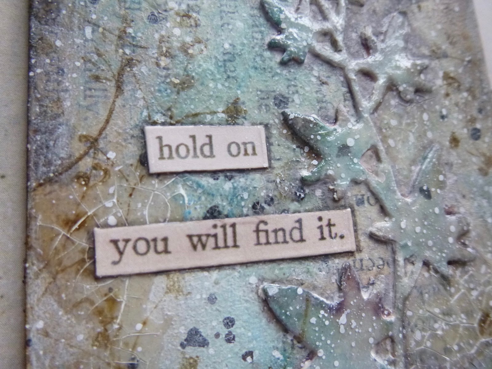

And of course there's plenty of white spatter...


It may be a tiny ATC, but I think it packs a punch.  I love all the layers, and the soft, smoky blues and browns.


_______________________________________

So here we are back in the present day.  This ATC really was a tiny experimental laboratory.  Lots of the techniques I used here have appeared in all sorts of projects since.  When it's an ATC, there's really no pressure.  You can try things out because, well, if things go wrong, it's a tiny thing to give up on.  I hope you enjoyed seeing this again.  And I'll be back again soon (probably with some more of this month's watercolouring).  Stay safe, stay well and happy crafting all.

Like ivy, we grow where there is room for us.
Miranda July

Encore Posts
Projects which made their first appearances elsewhere for Design Team duties or Guest Designer opportunities, but which only had a sneak peek here, are being gathered together in the pages of my virtual scrapbook while I'm busy.
As always, the Encore Posts are formatted differently from the regular ones, so that you can easily spot them.  Please don't feel that you have to comment all over again!

Friday, 12 June 2020

Encore - Salty Watercolour Words

Hello all!  I'm so glad you enjoyed my altered Rustic Plant Pots.  We had very heavy rain (and some hail) a couple of days after I'd put them out in the garden, and you'll be happy to hear that so far they're doing just fine.  I even wiped away the earth which had splattered them pretty much all over, and the paint stayed put perfectly happily.  Time will tell, but so far it's all good!

I'm busy with some stuff behind the scenes at the moment, so I thought I'd fill in with a quick Encore post (see the very end for a definition of that).  And the project I've chosen might give you a clue as to what it is I'm busy with.  Watch this space early next week!  And in fact, maybe watch out for me on camera too... I'll keep you posted!

And if you want something brand new today, rather than just an Encore, there's a (rare) new post over at Cestina's Dollshouses to enjoy.

These wordy watercolour bookmarks were created for the PaperArtsy blog back in March 2018, and here's what I wrote back then...
________________________________


Hi everyone, it's Alison from Words and Pictures with you today, and I'd like to share with you some salty, watery bookmarks.


I fell in love with watercolours a year or two ago, and have been exploring their possibilities since then. I thought I'd combine them with my quote stamps to make some bookmarks. The salt was an afterthought, but one I'm so happy I added!


I love how the pigment of a good watercolour moves in water, and how some colours granulate (the pigment powder floats in the water to create a mottled look) and some are more stable. I was using Daniel Smith watercolours to create my masterboard, and they have lots of fabulous granulation in some of the colours.


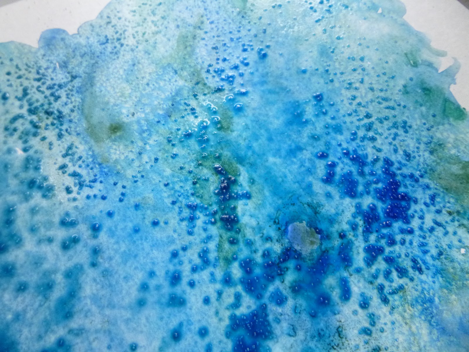
I think it was that granulation which suddenly made me think of adding salt - something I've done in the past with Distress Inks, but hadn't done with my watercolours before. I think the effects are spectacular, both while the paint is still wet...


... and once you've brushed the salt away once it has all dried.


I cut a section of the masterboard into strips of equal length and width and then sought out some words to fit onto them.


I used two quotes each from EAB03 Music & Silence, EAB07 Dreaming & Doing and EAB08 Strength & Courage.


On the paler bookmarks, I stamped in Cobalt and clear-embossed the words with Ranger Clear embossing powder.


And where the paint background was darker, I stamped in Versamark and embossed in Detail Fine White powder by Wow.


Some distressing of the edges, and some fine white twine through the punched holes, and now I can keep my place in the several books I usually have on the go at one time...


... and receive a little more food for thought from reading the bookmark too!


I hope you'll have a go at salting your watercolours or water-soluble inks. It really is fascinating watching the crystals at work, soaking up pigment and water and creating the incredible organic patterning. It certainly won't be the last time I craft with added salt!


_________________________________

I gave half the bookmarks to Cestina and kept the other half myself, and mine are in every day use.  I still have several books on the go at once, as well as bobbing back and forth to my Kindle, so bookmarks are just as useful as ever.

I'm heading back to the craft table now... I expect most of you can make a good guess at what I'm busy with there.  For now, I'll wish you a peaceful weekend with plenty of whatever makes you happy, and I'll see you on Monday!

When a bookmark tumbles out of an old book pristine and unwrinkled, it is like a gasp of breath from another century.
Don Borchert

Encore Posts
Projects which made their first appearances elsewhere for Design Team duties or Guest Designer opportunities, but which only had a sneak peek here, are being gathered together in the pages of my virtual scrapbook while I'm busy.
As always, the Encore Posts are formatted differently from the regular ones, so that you can easily spot them.  Please don't feel that you have to comment all over again!

Monday, 17 February 2020

Encore - Glass Foliage Lanterns

Hello all!  I'll be in technical rehearsals for Women Beware Women this week at the Sam Wanamaker Playhouse which is part of Shakespeare's Globe on the South Bank.  It's a tiny indoor theatre, made of wood - a reconstruction of a theatre interior of the early 1600s.  The shows in the Wanamaker are played entirely by candlelight, which is pretty magical.
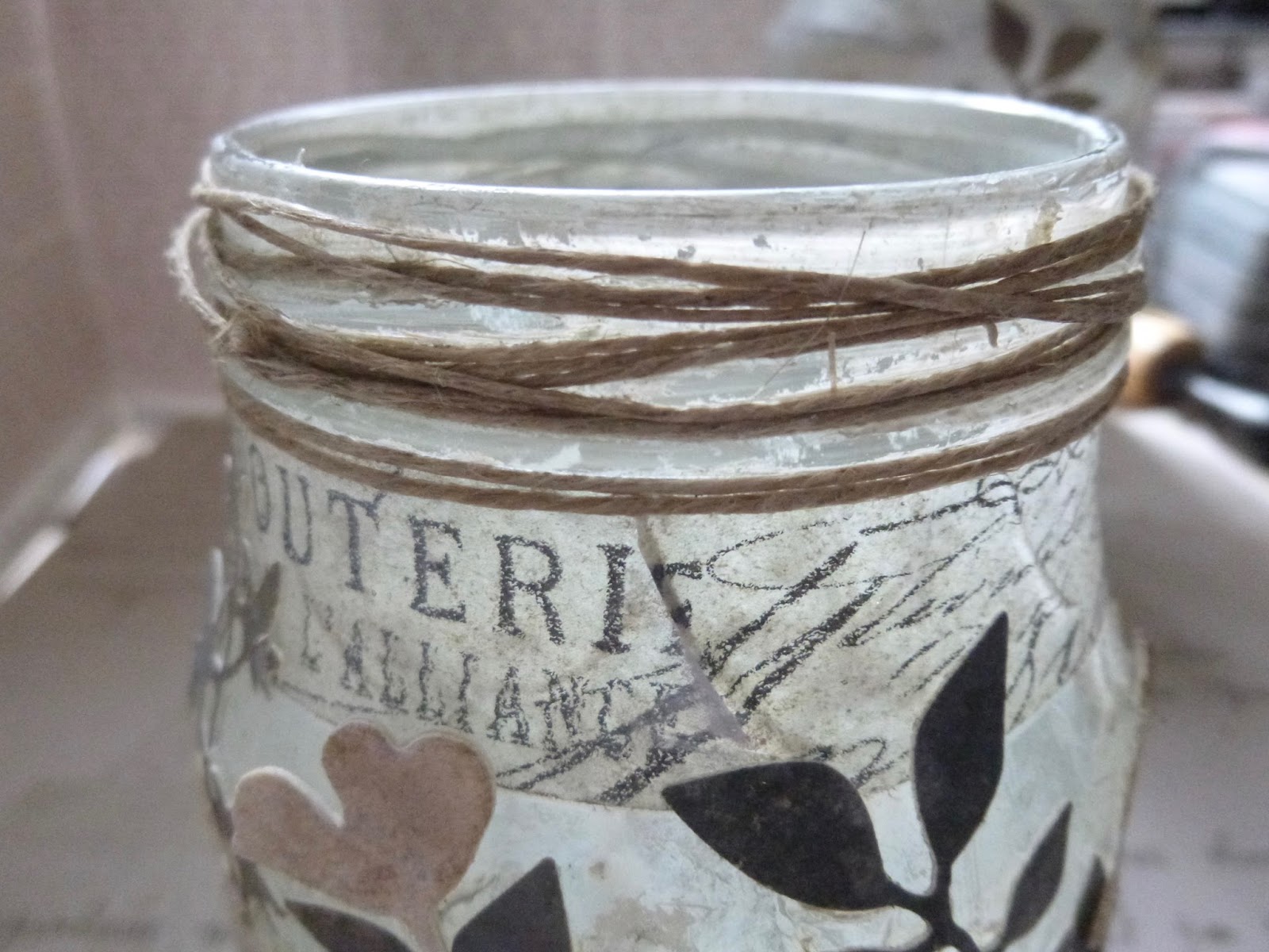
Given that, this seemed like the perfect Encore post to share while I'm working by flickering candlelight all week in the theatre.  It's some altered jars made into candle lanterns for a Destination Inspiration post at A Vintage Journey back in August 2017.  Here's what I wrote back then...
_______________________________

Hello all, Alison here from Words and Pictures, arriving at Terminal 2 of Destination Inspiration.
As a reminder, here's what's in the travel bag this month:
Product - texture paste
Technique - layers
Colour - neutrals
Substrate - glass

I have to confess I really enjoyed this one, so this is one of my long posts.
Cups of coffee at the ready?  Then off we go... here are my foliage lanterns.


And here they are when they are candlelit from within.


Since the technique element this month is all about layers, I have to share at least some of them with you.
I started with my plain glass jars (always happy to recycle a glass jar).


First layer for jar one was some Transparent Gloss Texture Paste applied through a harlequin stencil.
Of course the paste goes on opaque, and then dries to transparency.


I was hoping that I'd be left with some clear "windows" for the candle to shine through.  It didn't go quite according to plan in the end, but I like what I ended up with maybe even more so not to worry.  Jar two had a layer even before the texture paste - some strips of tissue tape, which I thought would show through nicely.


And then the texture paste went over the top of the strips.


Jar one has its tissue tape around the neck instead.  I quite like both looks!


At this point, I was enjoying the transparent texture over the transparent glass,
especially with the tissue tape strips showing through.


Next layer was some spritzing with the DecoArt Media Mister in White.


It's a shimmer mist, so you get a lovely soft mother-of-pearl effect.  It didn't leave entirely clear windows (well, the gloss paste is no more of a resist than the glass underneath, of course) but I do like that the texture still shows.


And when the light hits it... wow!


I mopped up the excess shimmering white liquid onto some spare card - and that's going to come in handy very soon.  The grid pattern you can see is from the internal structure of the cardboard I was using as my spray area - the texture printed as I was mopping up the spray.


Next I did a couple of spritzes with Pumice Stone and Old Paper Distress Sprays.  It adds just a little extra depth to the texture, but it looked a bit grubby in places, so I finished off with another spritz of the Shimmer White.


While that was all drying thoroughly, I started inking up my mop-up card with subtle neutral tones of both Distress Ink and Distress Oxide.  There's Pumice Stone and Iced Spruce and Vintage Photo.


Later on I blended on some Walnut Stain and Gathered Twigs, I think, with maybe some Black Soot thrown in for good measure in places.  From that I started cutting lots of foliage using the Tim Holtz thinlits.
I loved these, even before I'd done anything with them!


And I preserved the paler card for cutting some wildflowers.


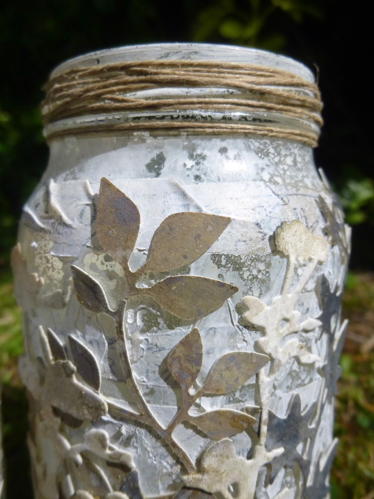
I started layering the foliage onto the jars from dark to light.  Darker fronds and branches in the background...


... to the pale off-white wildflowers for the top layer.


(I always like to keep an eye on how things are going from the inside.)


At least, I thought it was the top layer, until I decided that I needed some words.


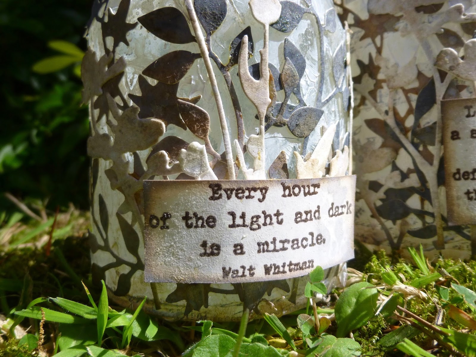
So the actual top layer is formed by some of my quote stamps from EAB02 Darkness and Light.


They're stamped in Ground Espresso (Archival version) on some more of the inky card which gives a lovely soft effect.


And I mounted them on padded tape, so that they stand a little way proud of the foliage,
giving that top layer a touch more dimension.


Some simple twine around the grooves at the tops of the jars finishes them off.


It's another tricky photography challenge... these change so much in different lights.


In full daylight, with the light falling on them, they look almost like stone.


When they were on my desk, with the daylight falling inside, they were already glowing beautifully.


And when you put the candles in and light them in the dark, the foliage turns into glorious silhouettes.


If you want an altogether simpler look, you can turn them around
and just have the mottled harlequin texture and subtle tissue tape text.


Also pretty by candlelight...


And when they're lit both within and without, then you get pretty much the best of both worlds...


... as seen in the candlelit photo near the start of the post.


__________________________________

Thanks so much for stopping by today.  I hope you enjoyed revisiting these glowing jars.  I've already done one variation on this technique to create some Haunted Jars, and now I'm thinking I need to create some new ones with my new Magic & Wonder set - there are quotes there which will be just lovely by candlelight!

I don't know how much time I'll have for visiting over the next few days, so for now I'll just wish you a wonderful week and hope to see you again soon, either here or elsewhere in Craftyblogland.  Happy crafting all!

Thousands of candles can be lighted from a single candle, and the life of the candle will not be shortened.
Buddha

Encore Posts
Projects which made their first appearances elsewhere for Design Team duties or Guest Designer opportunities, but which only had a sneak peek here, are being gathered together in the pages of my virtual scrapbook while I'm busy.
As always, the Encore Posts are formatted differently from the regular ones, so that you can easily spot them.  Please don't feel that you have to comment all over again!