There's one sample for each of the stamp sets, so one quote comes from EAB18 Gardens & Growth, one from EAB19 Life & Living, and one from EAB20 Night & Day. The colours for each were specific to each stamp set, but intended to co-ordinate overall with one another, so these work beautifully as a trio.

I was going to try to write this post in New Blogger, but then I decided I didn't want to waste my time getting frustrated.

For as long as Legacy is here, I'm sticking with it. I can write a complex post very quickly. With N.B. even the simplest post is a trial.

But on to happier things... this trio of tags. You can see what they have in common... the Paper Dolls, the regular-sized colourful tag mounted over corrugated cardboard...

... the Tim Holtz Wildflower thinlits and Lin Brown's fabulous grasses from PaperArtsy ELB30. These grasses always seem to play a part in my quote stamp samples, and here they are in triplicate!


What's great about this technique is that you can use a quote that might be just a bit too wide to fit on the card or tag and still get it all on!

Let me take you through a few process pictures so you can see how they all came together, but mostly I'm going to share pretty close-ups, so feel free to scroll on and enjoy those!

Let's start with EAB18 Gardens & Growth (might as well go in number order so that I don't get completely confused!!).
I stamped the grasses in paint over a brayered background - there's a lovely softness to the paint stamping, as though the grasses are blowing in the wind.

I decided to have another layer of stamping, so this Hot Picks wildflower stem appears in Leaf Green Archival. I stamped the stem again upside down to make it long enough, and you get one of those lovely knotty bits in the stem into the bargain - very true to life.

I cut the Thinlits stems from another piece of painted card, and used more Fresco paints to add the petal details.

Some are tucked behind the tag, and some are layered on top. It all adds depth and dimension.

The twisting cotton thread adds movement and intricate detail.

The quote is stamped in Leaf Green Archival and clear-embossed so you get that little touch of gloss to catch the light.

And I blended on a little bit of co-ordinating paint around the edges to draw the eye in towards the words, before fixing it in place with a couple of Idea-ology fasteners.
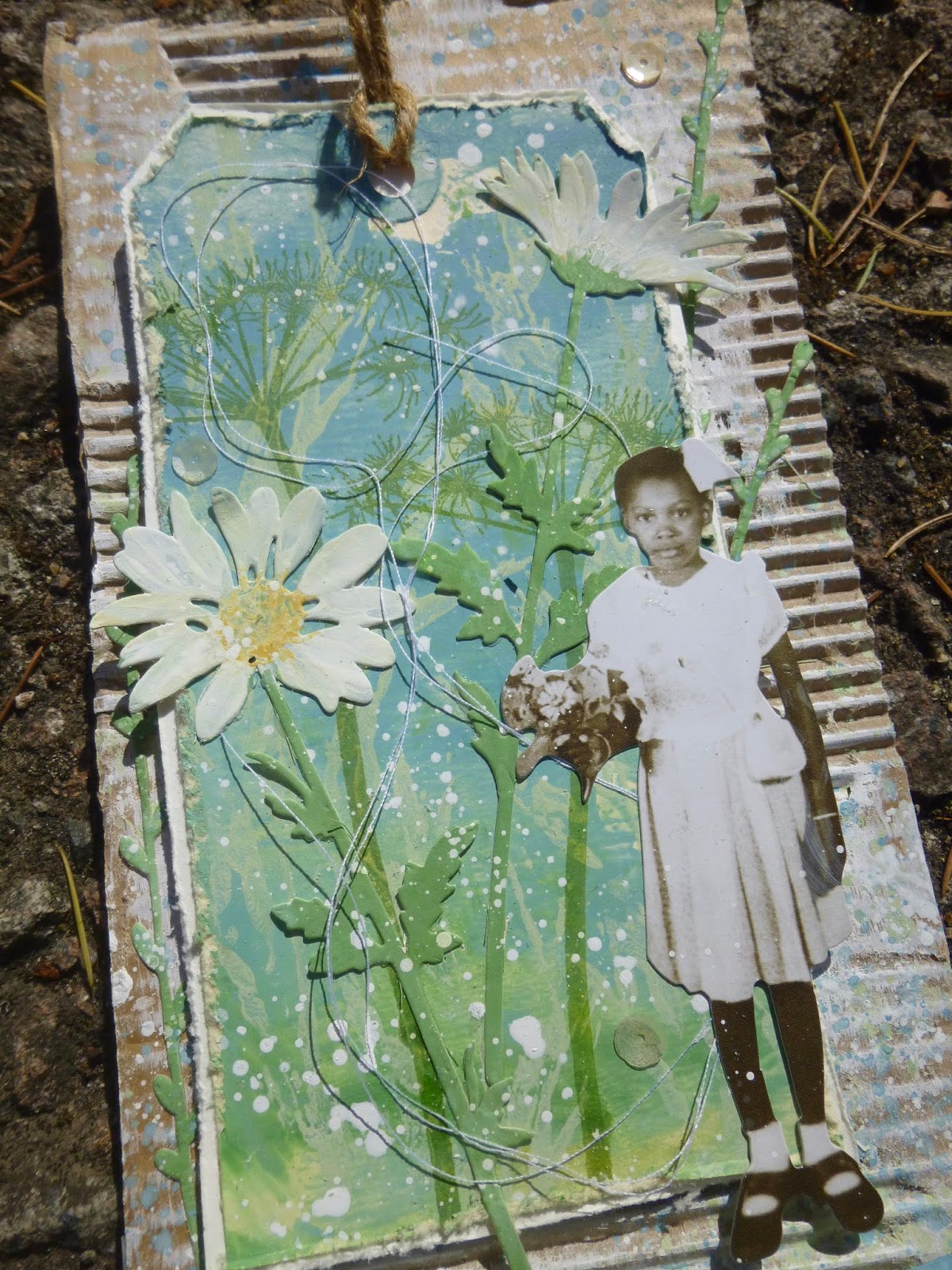
I love this little girl, so I'll forgive her for picking flowers in my garden!

Onwards to EAB19 Life & Living... a quick look at the early stages first. For this, I used one of a pair of sponged tags (you've seen the other in action already on the Life & Living acetate tag linked to above).

This time the grasses are stamped in Archival so you get that lovely sharp look. I combined Leaf Green and Olive Archival inks directly on the stamp for a slightly variegated look.

The tag I cut some of the Wildflower thinlits from was a bit dark, so I sponged on some gesso and got this really lovely mottled look.

And you'll see that others have a little bit of script stamping to add extra detail.
Again the cotton thread swirls around to help give a sense of movement and life. (Ignore the little seedpod near the bottom star - it's not a permanent fixture. I was photographing outside.)

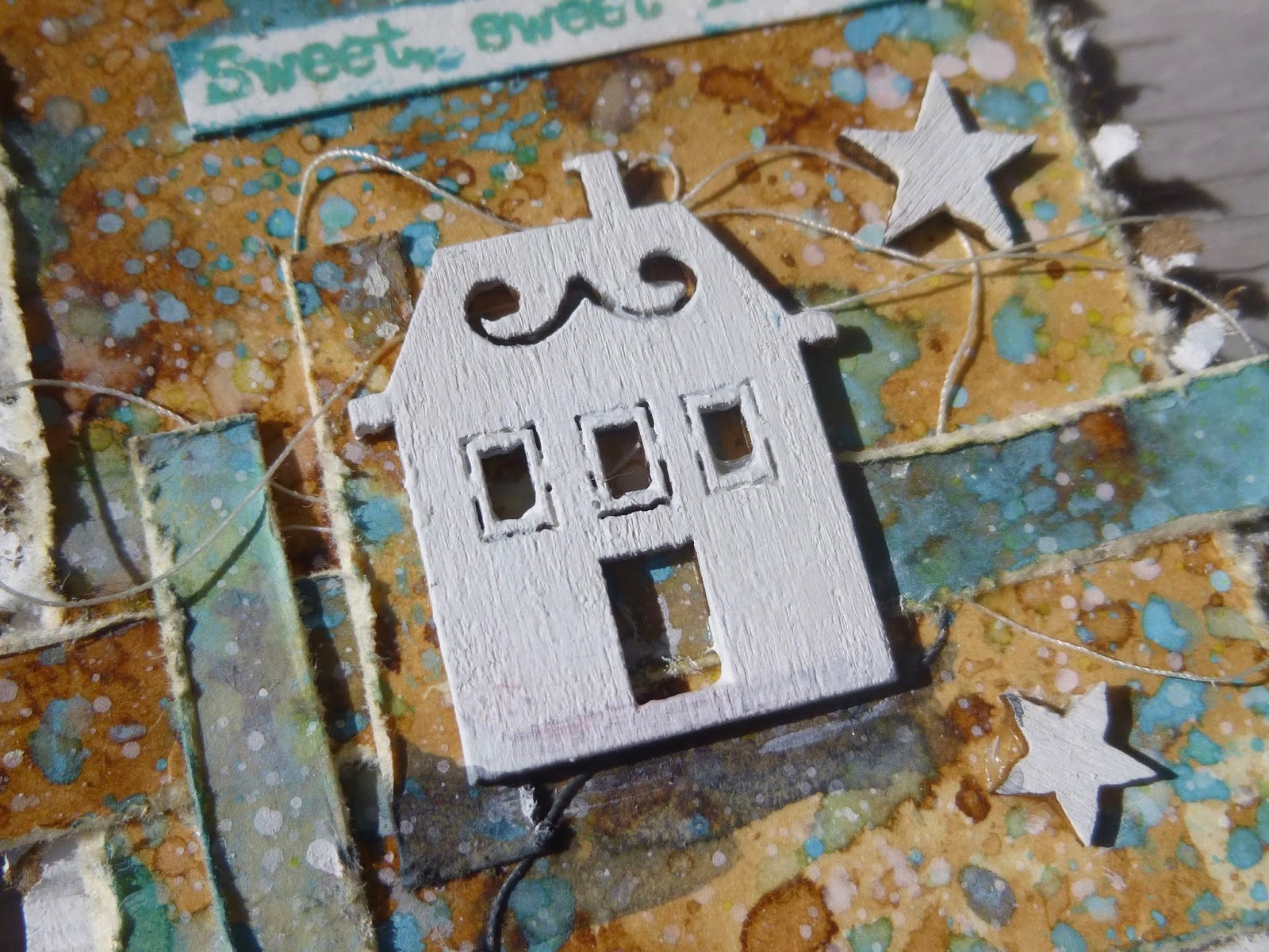
Speaking of the stars - they're moulded in paperclay in one of the Finnabair silicone moulds.

Since it's clearly twilight, I thought the stars might just be starting to appear.
I gave them a rough coating of white embossing powder so that they would be the same colour as the text stamping, rather than just having the plain paperclay matte finish.

And there's another segue to the white-embossed words themselves. Since the colour palette for the Life & Living samples included the lovely Lavender and Wisteria Fresco paints, I decided to echo the twilit sky at the top of the tag for the quote down at the bottom.

It brings those soft purple tones to the fore on the panel as a whole. It's fastened in the same way as the one on the Gardens & Growth panel, even though this quote would have fitted lying flat.

The boy is one of my all-time favourite Paper Dolls, so it's only fitting that he takes his place on this, with one of my favourite quotes (by Oscar Wilde).

And it may also be my favourite of all the samples.
(Sshhh, don't tell the others - and in any case the Gardens & Growth girl and tag is such a close second as to make no odds!).

And so to Night & Day... (This post has probably taken you all day and all night so that seems appropriate!). I don't seem to have anything in the way of process photos for this one, but you get the idea by now.

The ombre tag in the background is another sponged affair - I love the subtle blending capability a natural sponge gives you. (Again, you can see its partner in the acetate tags linked before - you get a better look at the effect there.)

And I think here we're probably at the start of the day... throwing open the windows to the day. The window might be very weathered (with PaperArtsy Crackle Glaze), but it still lets in the golden dawn light.

The Thinlits stems here play the role of the ripening corn...

... as do the grasses, stamped in Pumice Stone against the sky.

 The quote is stamped in some Stampendous powder which happily echoes the Sky Fresco paint of the background, as well as catching the light to make me happy!
I decided I really wanted to include the author of the words this time. Quite apart from anything else it adds an important balancing element to the composition of the whole piece down there at the foot of the panel.
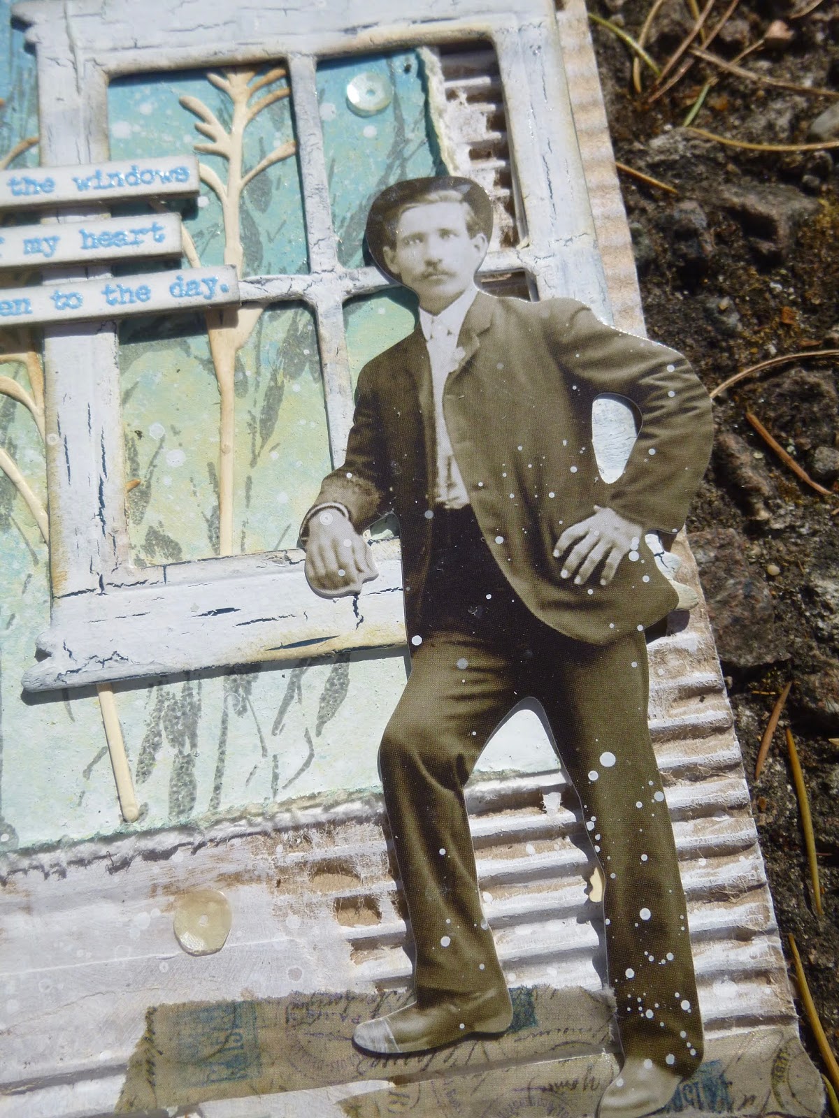
Our Paper Doll looks more than ready to throw his heart into his day's work, whatever that may be, but however high his heart is leaping...

... his feet are firmly grounded on some Idea-ology Design Tape.

Phew, I think we made it! I hope you like them as much as I do. I really enjoyed creating this triptych... even though it was an unconscious one. I didn't plan it like this from the start.
They weren't made together... each was created along with the samples for the rest of that quote set, but as the days progressed I obviously gave in to letting them echo one another, and by this third panel, it was a conscious process.


I wanted the Lin Brown grasses again, so I used them again. I wanted some more corrugated card, so I grabbed some more. I wanted the Wildflower Thinlits to add another layer, so I let myself have them. I wanted another arched quote, so I made one.
And by the end I was a happy woman. As a triptych, they're one of my favourite makes of all time, all the better for being slightly accidental. Serendipity is a wonderful thing.
Thank you so much for stopping by today. As you know, this blog is as much my own personal scrapbook for my creations as anything else.
It's an endlessly happy bonus to have your company as I keep my records of what I did and how. For that, and for your lovely comments and for the inspiration I find as I hop around Craftyblogland, you have my thanks now and always. Stay safe, stay well everybody.
I am working here (in Amsterdam) on my last big triptych, which will be a tremendous story, and which gives me a more intense life and exhilaration. My God, life is worth living!
Max Beckmann