I'm travelling into a new way of working, a new country, a new language, and a new hobby which I'm passionate about. Come with me for some of the journey...

Showing posts with label kraft resist. Show all posts

Friday, 13 June 2014

Wings and Things

Hello and a warm welcome to you all, with an especially big welcome to the newest followers - so lovely to have you here!

After all the colour that's been going on lately, I seem to have hit a neutrals zone!  From yesterday's Men At Work mini-album (if you blinked, you probably missed it, so I'd love it if you had time to check it out), we move to something a little more feminine, and it's all in honour of the new challenge at A Vintage Journey, where our host - the fabulous S@ndy Diller - is looking for Wings and Things - we must see birds, bees, butterflies or dragonflies (or all of them together!) on your Tim-inspired creations.

You'll find all the details of what she's looking for, as well as lots more lovely inspiration from my fabulous team-mates over at A Vintage Journey, and here's my starter for ten.


I had a lovely time playing with one of the 6x4inch burlap canvases.  The background was inspired by a technique I saw over at Layers of Ink, the blog of the amazing Anna-Karin... She was showing how to transfer patterned papers onto the burlap, so that's what I decided to play with first.


I used one of the Wallflower 12x12 sheets (click Anna-Karin's link above to see how it's done), and was really pleased with the textured look once it was done.

It's a subtle bit of damask, but it's there - for now!

I also wanted to play along with the Compendium of Curiosities III challenge, while I was at it.  I haven't managed to play in the last couple for various reasons, so needed to dive back in.  So, as you can see, the next step was stencilling for texture.


But I really, really wanted butterflies - to stick to the Wings and Things theme - and there isn't (yet) a Layered Stencil of butterflies, so I cut the Butterfly Frenzy Decorative Strip Die and used the "leftovers" from that as my stencil instead.  (I don't know if it will count.)


I can't tell you too much more (you'll find the technique on page 49 of Tim's book), but I wanted a bit of extra sparkle around my butterflies, so I also added some Picket Fence Distress Stickles for a touch of vintage shimmer.


I'd had the corrugated cardboard sitting around for weeks, with the butterflies already stamped and framed with the Ornate Plate, knowing this challenge was coming up.  (It travelled all the way to the Czech Republic and back.)  Now finally there was somewhere for it to sit!


The butterflies are stamped in Potting Soil over a thick layer of gesso, and then there's plenty of Walnut Stain inking around the edges.


I started to layer up some other bits and bobs around the corrugated panel:


Some Vintage Lace cut from the same paper as I used for the image transfer...


... and it goes off around the edge too, naturally!


Some ephemera from the Idea-ology Thrift Shop Ephemera Pack... this butterfly has acquired a Game Spinner body.


A couple of skeleton leaves, to tone in with the gold of the Ornate Frame...


One of the little Custom Fasteners, customised with the butterfly sticker, of course...


And the butterflies from the Butterfly Frenzy die - well, they're everywhere!


I'd used the new Motif Resist Paper Stash to cut them, so once inked with Walnut Stain, they've got lovely white script dancing across their bodies.


I decided to layer some of them precisely over the shimmery texture butterflies, to give them double dimension...

Others are just flying free.


And on the top, I added an Idea-ology Clock Key, with a butterfly perched just ready to alight on it.

It sits on some more Vintage Lace heading off around the edge of the burlap frame.


The Courageous Muse Token sits over another label from the Thrift Shop pack.


Oh, and there are the words, of course - stamped in Potting Soil, inked and spritzed and layered up with some more lace and ephemera.


I had such a lovely time playing with this - so thank you, S@ndy, for a great theme.  Do hop over to see what she and the rest of the Vintage Journey team have created to inspire you - you won't be disappointed! - and we hope you'll come and play along with your Wings and Things some time in the next fortnight.


Thanks so much for stopping by... there'll be dollshouses starting on Sunday, and a big celebration next week, so I hope to see you again soon!!

We have to continually be jumping off cliffs, and developing our wings on the way down.
Kurt Vonnegut

If you were born without wings, do nothing to prevent them growing.
Coco Chanel

I'd like to enter this in the Compendium of Curiosities III Challenge 4, hosted by the fabulous Linda Ledbetter
And at the Simon Says Stamp Wednesday Challenge where they are playing Stencil It

Sunday, 2 June 2013

Journey towards yourself

Hello everyone - it's another catch-up post here today... collecting in another of my projects from my February stint as Guest Designer at The Artistic Stamper, so that I have it safely in my virtual scrapbook here at Words and Pictures.  

So, again, please don't feel you have to comment all over again - I'm so grateful for your warm support already over at Artistic Stamper.  This was the second piece I created... a philosophical suitcase!


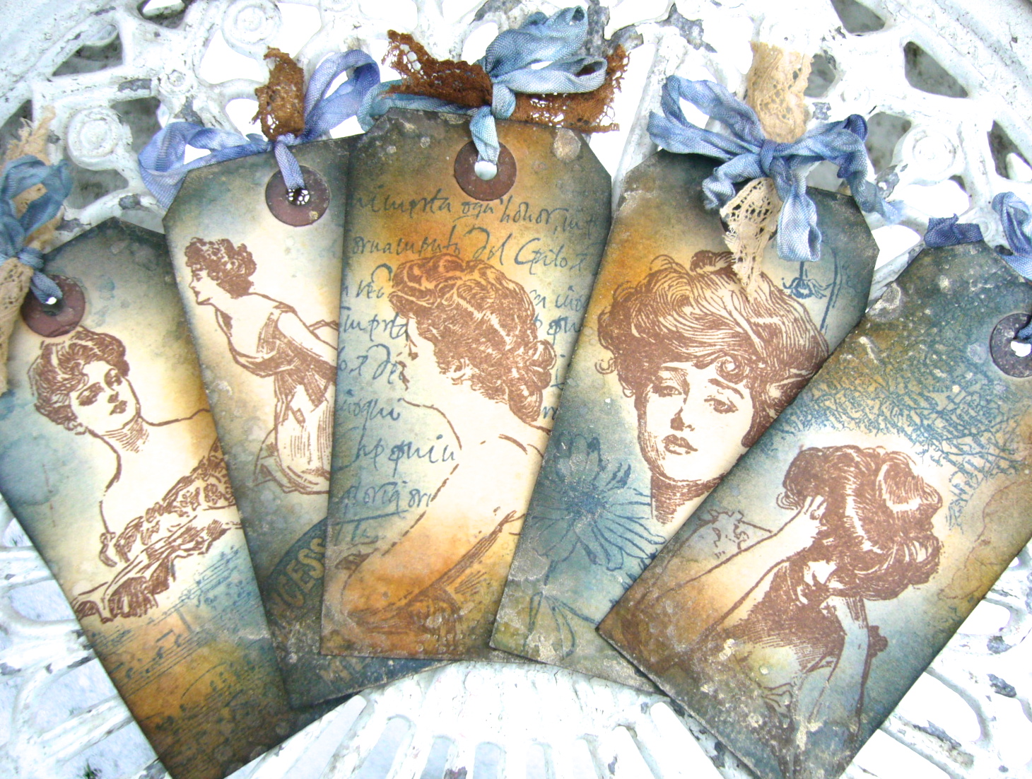
Lots of inky fun in making this one, Distress Inks, Perfect Pearls, Distress Stains galore, and gorgeous stamps from several different Artistic Stamper plates, with the main focus on the glorious Gibson Girls.  (All the ingredients are at the foot of the post, with links to take you straight to them.)


Despite all the fun, the project has ended up having a slightly melancholy, or at least contemplative, "story" to it, which wasn't where I'd planned for it to go at all.  

But these creations sometimes have a mind of their own it seems.


I've always loved Charles Dana Gibson's drawings of turn of the century American girls, it wasn't until I was stamping and looking in detail at these particular images that I realised that, for me, they also have a definite sadness within them.


I started with the fabulous Vintage Valise die from Tim Holtz, cutting the main body of the suitcase from the Kraft Resist sheet of the world map.  

I daubed Distress Stains in various blues along with Picket Fence direct onto my craft map, and swept the kraft resist paper through it until I liked the look of it.


Using the Picket Fence means that the blues keep their colour integrity better than if you use them on kraft by themselves, which can make them look slightly greeny.  

The strappings were cut from Kraft-Core, sanded and inked, and I used tiny brads to attach the strap holders (which I used the other way up to get the plain kraft side, inked).


The luggage label comes from the AS Labels plate, and encourages journeys of all kinds: Seek, Question, Explore the outside world, and the inside one.


I wanted to be able to put things "inside" my suitcase, so - having done two virtually identical cases - I had to work out a way of creating a pocket, preferably one stable enough to allow the suitcase to stand up...


Let's hear it for ice lolly sticks (that's popsicles if you're here from across the water) - one of the most useful things to have in any craft stash! 


I used two (one cut in half) to form a framework inside the suitcase, glued with Glossy Accents, and left overnight to be sure of a good firm hold.


At this point, I was thinking that I would fill the case with tags depicting a young girl travelling the world, exploring, discovering and generally having a fantastic time.  

But, as I said, as I stamped the various images, they started to tell me a very different story.  And the voyage became less an actual journey, but a journey of exploration into the girl's inner self.


So there are two sides to each tag... the front, which just shows you the surface, the exterior, and then - when you turn over - the interior questions bubble to the surface, revealing what's going on behind the eyes.  

I honestly didn't try to think up any of these phrases; they arose as I was inking each tag - they seemed to come from the girl(s) themselves.


I started with luggage labels which had previously been stained with tea and coffee, which gives them a wonderful vintage feel straight away.  

Once the images were stamped, I blended Chipped Sapphire, Stormy Sky, Vintage Photo and Wild Honey Distress Inks onto the tags.  

I've been careful to leave at least the faces un-inked by extra colour, so that they stand out at the centre of each tag.


I spritzed and flicked with water after inking, and then finally added some gilding by spritzing Perfect Pearls Mist in Heirloom Gold onto the mat and splodging the tags onto it - again avoiding the faces, so that you'd be able to "read" what's going on inside.


And each tag has some additional stamping to complement the story of that particular Gibson Girl.


So there's the woman reading her letter...  I stamped her in Coffee Archival both on the tag and on a separate piece of paper so that I could cut a mask.  

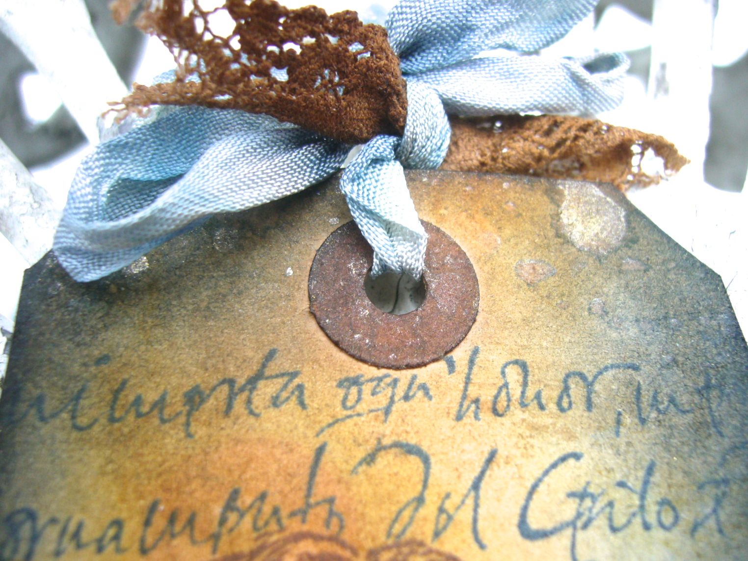
And then I stamped the Calligraphy Mat around her, using Cobalt, to represent the letter she's reading.

I haven't examined the Italian in close detail but in my "story", it's a love letter from an Italian count, approved by the girl's parents as a suitor to her hand.  Everything is tumbling forwards towards the wedding at great speed.


But in the angle of her head and the weight of her shoulders it's clear that for her it's not so clear cut, and so on the opposite side the question reveals itself, lurking in the corner, in the depths of her mind:  Yes, but do I love him?


The woman with the book - to me it seems like a musical score; she's holding it at exactly the angle to read or sing from as a performer - has a look as though she's just heard something, but is not sure what.  

On the reverse, we see that this is not the first time:  Sometimes I wonder... Does no-one hear the same music I hear?


She's masked again, and this time it's music which is floating in her mind.  

The music stamp isn't the AS one, I'm afraid, but they do have a marvellous music manuscript background so I've popped a link to that at the foot of the page.


The girl with the glorious hair piled high has a look which you could mistake for arrogance or disdain, but when you look again, there's a pain and a defensiveness somewhere at the heart of it... the chin just a little too lifted, the eyelids just a little too hooded, hidden.


She shares her secrets with us on the reverse, surrounded by flower images from Botanical Plate #1: My beauty is not all there is to me.


The utter dejection and exhaustion is easy to read in the girl resting her head on her hands.  

She's probably the one who started me off looking more closely at the others.  Again I cut a mask so that I could stamp the Europe Map Background around her.


I positioned it so that you actually get a slightly removed masking effect - the thoughts hover a little way away from the main image of the thinker.  

Her question is clear... in all the travelling, in all the bustle of society events, where does she belong, how does she fit in:  Where is my home?


And finally the wonderful image of the girl seated on the floor, her skirts pooled around her, in a moment's respite from the social whirl of arrival at a new hotel (the beautiful vintage hotel stamp again from the Labels plate, dining, dancing).


There's such a yearning in the angle of her body, leaning forward, listening intently as though to catch the meaning of life, the universe and everything, on the brink of discovery:  Sometimes I can almost understand why.


For the tag trimmings I used Chipped Sapphire and Stormy Sky Distress Stains to tint lots of seam binding, and Vintage Photo and Antique Linen to alter the slightly pinkish tones of some lace from my stash.  

I knew these would all be peeking out of the top of the case, so they needed to tone with the suitcase colours too.


Wow... a longer post than ever - sorry!!  I planned to come up with something very simple for my final project at the end of February... two photos max!  But it didn't quite work out like that - though it wasn't such a marathon as this.  It'll be along soon here at Words and Pictures.

Thank you so much for taking the time if you've made it this far, and I hope you've enjoyed the journey.

Your visions will become clear only when you can look into your own heart.  Who looks outside, dreams; who looks inside, awakes.
C.G. Jung

Click to go shopping:
Ingredients: Gibson Girls Plate #1; Calligraphic Mat #19; Europe Map Background; Music Background; Botanical Plate #1; Labels; Vintage Valise die; Kraft Resist Paper Stash; Kraft-Core;  Distress Inks: Chipped Sapphire, Stormy Sky, Vintage Photo, Wild Honey; Distress Stains: Antique Linen, Chipped Sapphire, Picket Fence, Stormy Sky, Vintage Photo; Archival Inks: Cobalt, Coffee; Perfect Pearls Mist: Heirloom Gold; Seam binding;

Friday, 7 September 2012

The Fabric of our Lives

Hello and welcome!  I'm finally allowed to share some very exciting news with you... a week ago, after my Guest Design slot, the Fussy and Fancy team got in touch and invited me to join their Design Team full time - I was completely over the moon!  Oh, and I said, "yes, please"...

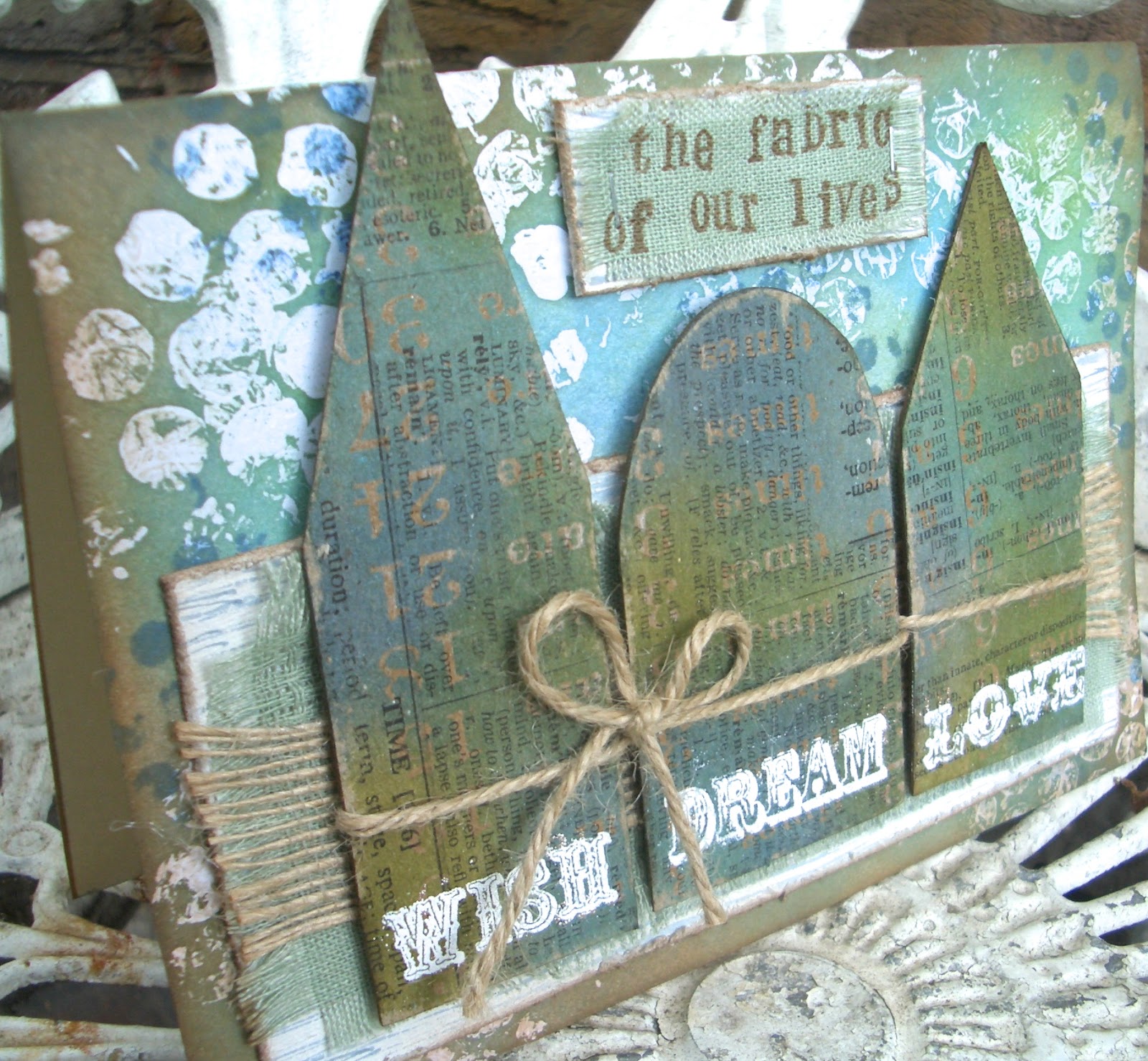
So here, just a week later, I'm offering up my first Design Team piece as part of their new challenge for this fortnight, The Fabric of our Lives.  The challenge is to use fabric as part of your project, but with a title like that, I'm afraid my brain goes into word-world and comes up with all sorts of extra layers of meaning.  So, as well as actual fabric of our lives, I've got some metaphorical 'fabric of our lives' in the mix.  All will become clearer - but first, the card:


So what goes to make up this card?  And the larger question: what does make up the fabric of our lives?  The quote that popped into my head was: A house is made of bricks and beams; a home is made of hopes and dreams.

So there are the concrete materials which make up the places where we live, and the abstract things which make up our internal lives.  And that's how the little houses became part of the game.


First things first, the background: this I used the Multi Medium resist technique on, painting some of the medium onto actual bubble wrap and 'stamping' it onto the white cardstock.  Once dry, I stamped some Tim Holtz Ultimate Grunge dots in Cobalt Archival, and then inked it up with Broken China, Peeled Paint, Faded Jeans and some Vintage Photo round the edges.

A spritz of water on some kitchen roll, a quick wipe, and your bubbles shine through again, having resisted the ink.


The fabric I used really has been part of the fabric of our lives. Sharp-eyed followers may recognise it as having formed both the table runners and sashes for the chair decorations at my brother's recent (handmade) wedding.

We've got a lot of this stuff still hanging around at the moment, more than I could ever use however long I carry on crafting!  But it seemed highly appropriate to use some for this card - so that partly dictated the colour scheme.


It's backed onto some thick chipboard, painted with white acrylic, attacked with the TH Paper Distresser, edged with Vintage Photo, and then stamped with the Kaisercraft woodgrain stamp in Weathered Wood DI, so that there's another 'building' material in there (my favourite one - if I could have a wooden house, I'd be very happy!).

And the top layer of this element is some lovely, wide burlap ribbon from the Funkie Junkie Boutique.  I hope it doesn't say something about the fabric of my life that I found it necessary to distress and fray the edges of all my material(s)... hope I'm not unravelling!

If I am, I've now got the perfect thing to hold everything in place - I spent my recent winnings from a challenge on a Tim Holtz Tiny Attacher ... look, baby staples!  And so easy to use.


The little houses are cut using the TH Artful Dwelling die, and show another version of resist... This one uses the TH Kraft Resist paper, inked with similar colours as the background (but you get different shades since it's on Kraft), and then stamped with some of the abstract things which make up the fabric of our lives - Dreams, Wishes and Love.


The words all come on one TH stamp, but I used masking tape to separate them so that I could have one word at a time.  They're stamped using clear embossing ink, and then a bright white embossing powder.

The Kraft Resist paper has a resist 'built in', so that again you can wipe away the ink to reveal the shiny kraft colour beneath.  I think it's a great effect - I've used it a couple of times recently...


Once it was all stuck and dried, I used some sandpaper to roughen it up a bit.  I'm a big fan of the 'lived-in' look, and I love the texture and weathering you get with something as simple as an emery board.


The houses are stuck down with padded tape to lift them away from the surface of the card even more.  Something else that helps with that is the rustic burlap twine I've 'woven' around them, and tied in a simple bow.

I know it's not usually done to use the title of the challenge as your sentiment, but it just seemed utterly appropriate, given how the piece had grown out of it so directly.  


I stamped directly onto a piece of the fabric using Coffee Archival and my little £1 alphabet set (best buy ever?), and then backed it onto another bit of chipboard, treated the same way as the main backing piece.

And it's held in place by some more tiny staples.  (Sewing machines and I aren't on speaking terms, so sadly I can't manage the stitching I so admire in many of the projects I've visited, but I'm good with the staples.)


So there you have it... If you'd like to join in the challenge, hop over to Fussy and Fancy, and you'll find lots of amazing inspiration provided by my fellow team members (big proud smile!).  For now, thank you so much for visiting Words and Pictures today.  It's so great to hear your comments, and I will always try to return the visit if I know you've been.  Hope to see you again soon, here or elsewhere in Craftyblogland.

I've always loved a challenge.
Lana Turner

Life is challenging, but I'm always up for a challenge.
Venus Williams

I'm also entering this for the following:
Simon Says Stamp's challenge this week is Put A Stamp On It
Tuesday Alchemy are having an Anything Goes challenge
Anything But Square over at Allsorts... I've got a rectangle with lots of other shapes as the focus on it
ABC Challenges have reached W for Wishes - mine are the wishes and dreams that guide your life
Since I don't really expect my Friendship tag to qualify properly for the draw, I'm popping this into the Sunday Share over at Frilly and Funkie, having bought the burlap ribbon from the Funkie Junkie Boutique