I'm travelling into a new way of working, a new country, a new language, and a new hobby which I'm passionate about. Come with me for some of the journey...

Showing posts with label Fussy and Fancy. Show all posts

Friday, 25 January 2013

A Whiter Shade of Pale


Hello all, thank you so much for dropping in today... It's Friday, and time for a new challenge over at Fussy and Fancy.

I'm a little sad, as this will be my last project as part of the Design Team - it's been a fantastic six months (Six months?  Seriously?  Where did that time go?!) but both in real life and in crafting terms there's so much on my plate at the moment that something had to give.

But I'd like to thank everybody at F&F for the fun and friendship and inspiration, and lots of great challenges... I'll definitely be back to play along in future.

But enough of that... time to play!  We're looking for Circles from you this fortnight, and here's my offering for inspiration, using some papier-mâché hanging circles bought very cheaply at The Range.


Any WOYWW-ers out there may remember this trio of frames from my desk a couple of weeks back - I really went through the mill with this one.


The circles have been at least four different colours, and had several different stamped designs over them, then got covered in texture paste and repainted - each time pleasing me less and less.

Eventually I just lost patience and painted them white to give myself a whole fresh start.

At that point, Our Creative Corner offered up their latest challenge - to create something all White with a Decorative Edge... and at last I began to see a journey ahead.


Step number one was the brainwave of trying out some of the gorgeous Memory Box diecut Catalina Wreaths on top of the frames.

I don't actually own this die, but had bought some pre-cut ones from eBay.

To my delight, they were exactly the right size, so I started gathering other flowery bits and pieces.  I don't do flowery that often, so I thought I might as well do it properly while I was at it.


As well as the Catalina honeysuckle wreaths, there are some of the tiny mulberry paper roses, and some of the larger ones also bought for pennies at The Range.


As I looked at all the bits lying on my craft mat, it quickly became clear that "white" is a flexible term...  Even though all the flowers, the die-cuts and now the frames were "white" - they were all completely different shades.  I decided to paint everything to try to get them to match better.


So I tried a coat of gesso - still all completely different. I added a coat of Titanium White acrylic... still all looking pretty different, but now there was at least a sort of continuity of shade.  

I really like the look of the paint on the paper flowers and the rough brushstrokes visible on the delicate diecuts.


I decided to add some of the wooden flourishes from Crafty Emblies into the mix.  I love these, they're so delicate and intricate.  They look beautiful already in their dark wood finish, and of course you can also alter them, as here.


They got the same coat of gesso and paint as everything else, but I kept it only to the top surface so that you get the dimensional definition of the shape of the flourish.


So we were now pretty much all white - and according to the Our Creative Corner rules, the sentiment can be any colour you like.


At first, I stamped individual words on tissue paper so that I could try out the look of them in the circles, but they didn't have enough punch somehow.


So I turned to my favourite Idea-ology Alpha Parts, this time the Newsprint font.


Usually I mess around with them, altering with paints, and/or DIs, and/or alcohol inks to suit whatever project I'm working on (yup, those links all lead to projects I've used them on - and that's just some of them - I use them a lot!).


As I started to get the letters ready, I was thinking about painting their top surfaces white, as with the flourishes.  However, as I tried them out in the circles I decided I really liked the drama of the black.

So for once, I've left the Alpha Parts in their basic state!!

So there you have it, a shabby chic, romantic, all-white, circular extravaganza - probably about as flowery as you're going to see it get round here!


Be sure to pop by and see all the great projects my fellow DT-ers have created over at Fussy and Fancy - they're well worth a visit, and of course, we'd love to have you join in with our Circles challenge this fortnight - can't wait to see what you come up with!  For now, thank you so much for your company, and see you again soon.

Black and white are absolute... expressing the most delicate vibration, the most profound tranquility, and unlimited profundity.
Shiko Munakata

White covers a multitude of sins.  (After four different goes with these frames, I couldn't agree more!)
Jonathan Milne

I'm entering this in the following:
Our Creative Corner are playing White with a Decorative Edge
At Craft-room Challenge they are looking for Monochrome projects
Allsorts are having a Flower Power challenge

Friday, 28 December 2012

Let sleeping cats lie...

Hello all, it's Friday, and time for a new challenge at Fussy and Fancy... and this fortnight the theme is "Our Furry Friends".  I'm not going to lie to you - I had problems with this one!  But I hope you'll hop over to see the great inspiration provided by my fellow Design Team members - and that you'll find some Christmas crafting time to join in with the challenge.

For some reason, I couldn't get my head round the theme this time - and I promise you I'm not an animal-hater - quite the reverse, but I don't really do "cute", as regulars will know, and this seemed like a "cute" theme.  In the end, I just had to try to follow my nose... I'm still unsure about where it got me (and if you were around to see what was on my workdesk on Wednesday, you'll know there were plenty of discarded efforts en route).


Rather than cute I ended up going "Zen"... and I rode on the back of another artist's inspiration.  I've used one of the amazing cat sketches by Steinlen (Théophile Alexandre Steinlen - now there's a name to conjure with) as my central image.  He captures cats to perfection in his drawings.

Round the edges I used Pumice Stone and Frayed Burlap DIs, blended over a torn tag to get a subtle natural framing wave of colour.


The quote comes from Jane Pauley (an American journalist), and seemed to go perfectly with how the image makes me feel... And I'm telling you, I needed some of that Zen-like calm after struggling with this project!

In the background, I used some handmade type paper - the natural fibres provide such pleasing texture.


And on the white card I used my Kaisercraft woodgrain stamp to provide another natural element.  It's stamped in a mixture of Memento London Fog (a lovely grey) and Black Soot DI, so that it echoes the pencil/graphite strokes of the drawing.


On the edges I added texture by stippling gesso and French Roast Fresco paint from PaperArtsy, keeping the brush fairly dry, to get the whiskery/paw-printy look in places.


And since the natural look seemed to have taken hold, I grabbed some more of the twigs leftover from creating my Golden Memories of Home tag.  Once I tried them out, the other elements needed a little more definition, so I used Gathered Twigs DI to edge them.


So that's my attempt to honour Our Furry Friends!  I'm sure you'll find lots from the rest of the DT to tickle your fancy over at Fussy and Fancy... and it would be lovely to have you join in with us this time - I can't wait to see what you all come up with!


I have studied many philosophers and many cats.  The wisdom of cats is infinitely superior.
Hippolyte Taine

Women and cats will do as they please, and men and dogs should relax and get used to the idea.
Robert A Heinlein

Friday, 30 November 2012

A Christmas Postcard

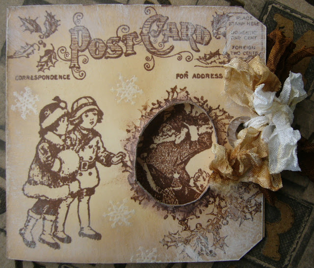
Hello all, and welcome to Words and Pictures.  It's Friday, and it's time for a new challenge over at Fussy and Fancy... and this fortnight it's I Love Christmas.  So, to fulfil my DT duties, I've finally had to abandon my "No Christmas Crafting Before December" policy... but only by a day (though obviously I had to make this a few days ago, in all honesty).

Here's the card I'd like to share with you, made with a Jumbo Size 10 tag as the base.


The stamps are nearly all by Graphic 45, except for the white embossed snowflakes which are from an Artistic Outpost set (which you'll be seeing a lot more of as December progresses...).

I love the vintage feel of the images, and they're lovely to stamp with.


I know Graphic 45 are best known for their papers, but the stamps (made by Hampton Art) are a real delight too.

I folded the tag in half, and used the postcard stamp both on the front and the back.  I did some distressing with Frayed Burlap DI, and also some brushes of gesso.


I stamped the two little girls (and the inside image, actually) and then had to leave the thing sitting there for a couple of days while I tried to work out what to do with the space in front of them!


Finally, light dawned - by a happy coincidence, Father Christmas was just behind that empty space so, by creating an aperture, I could have him as they thing they are looking at so eagerly!

I cut the hole and rolled the the edges, and used the holly stamp to create a border around it.


Inside you have the family dancing - or are they putting up decorations? - hard to tell!  In any case, they certainly look as though they love Christmas!

There are some more embossed snowflakes, the holly stamp again, and the distressing as on the outside of the card, but a little more gently applied.


I think the little girl is adorable!


I love the Glad Tidings greeting... and there's room, I hope, for some fairly neat signatures underneath.


The ribbons are dyed using Distress Inks, and tied so that you only have to undo the little white bow.  Once open, you then have one ribbon still on each side as you are looking at the card, and if you want, you could leave it open and add the white ribbon back on to one side or the other.

So that's my little vintage offering... Do visit Fussy and Fancy and have a look at the amazing work done by my Design Team colleagues - I'm sure you'll find lots of inspiration, and we really hope you'll be able to play along with us this fortnight.  Thanks so much for your visit, and see you again soon!

The best of all gifts around any Christmas tree:  the presence of a happy family all wrapped up in each other.
Burton Hillis

One of the most glorious messes in the world is the mess created in the living room on Christmas day.  Don't clean it up too quickly.
Andy Rooney

I'm entering this in the following:
At Sugar Creek Hollow they are playing a Vintage Christmas challenge
The Shabby Tea Room are looking for Just Neutrals - and my sentiment is on the inside
Hels Sheridan's Sunday Stampers are playing with Vintage this week
Simon Says Stamp are on an Anything Goes week
They would like to see Christmas cards in non-traditional colours over at Elke Kaart Een Feestje! (Every card a party!)

Friday, 2 November 2012

A Faded Beauty?


Hello all, and welcome!  Don't adjust your sets, folks: yes, you are at Words and Pictures, but yes, you are seeing flowers, pearls and pastel pinks.  What can I say?  Sometimes that's the way the cookie crumbles... 

Today's tag is my Design Team offering for the new challenge at Fussy and Fancy, where we'd like you to play with Pearls and Flowers.  Pink is not compulsory, it's just where I ended up!

Do take some time to go and check out my fellow DT's projects; there's lots of different inspiration, and we'd love you to play along.

I started with a sheet of K&Company paper which was just leaping out of the pile at me - my head was probably thinking, "Well, if we're going to go girly, we might as well go the whole hog".

But I wanted to shabby it up a bit.  With the vintage image, and the phrase which was already swirling around in my head - 'the flower of her youth' - this was clearly setting out to be a memento of days long gone, memories of a beauty perhaps fading with the years.


So, to the shabbying...  I used Tim Holtz's Picket Fence Distress Stain to give the paper a whitewashed look, and edged the tag with Tea Dye and Vintage Photo inks.  I also used an emery board to sand away the paper at the edges, and across the centre, to get a really well-worn, shabby chic look to it.


The flowers in the paper still have beauty, but it's been dulled a little by the passing of the years.

You can see the before and after of the effects in this photo.


I used some more of the whitewashed paper in the BigShot with TH's Tattered Flower Garland, and assembled my flowers.


They also got the ink treatment, and a good spritz of Perfect Pearls Mist in - what else? - Pearl, and I added some tiny pearl beads to the centres.

I'm not generally a very flowery crafter - but I do like the end result here...


The little green postcard is from a Prima 6x6 pad - Nature Garden, I think it is - shabbied up with the TH Paper Distresser and some inking... a memento of youthful romantic correspondence, treasured in a lonely old age.


The image is one I found on one of my Google image searches, and printed out.  Apart from the usual distressing, I also used Distress Markers to tint the photo slightly, for the blush of youth.


The ribbons are some of my fruit tea-dyed ones, one with a scrunching of Victorian Velvet DI added for extra blush.


At the bottom, I've again borrowed the idea from Julia's Stuff of the gorgeous UTEE'd lace.  I did also stamp into it this time, which has given it some added texture - but I think I need a bit more practice to make it zing the way Julia does!

All the elements are assembled on a little paper doily, also given the Vintage Photo treatment, its fresh whiteness dimmed by passing time.

So, there you have it - Pearls and Flowers - out of my usual creative zone, but that's the fun of the game!  And it's so strange how these things work out: Fussy and Fancy have had this challenge timetabled for months, and I made most of this a couple of weeks ago - but it fits right in with Simon Says Stamp and Show's challenge to Just Add Pearl this week... coincidence?  Or the Universe moving in mysterious ways?!

Anyway, thank you so much for stopping by, and I hope you've found some inspiration on your visit.  Do head over to Fussy and Fancy to see what the rest of the team have come up with; they would love to have you visit and leave them a little love too!   And if you decide to play along, we'll come and return the favour...  I love how Craftyblogland operates on such a wonderful cycle of positive reinforcement, don't you?!

Faded the flower and all its budded charms,
Faded the sight of beauty from my eyes,
Faded the shape of beauty from my arms,
Faded the voice, warmth, whiteness, paradise!
Vanish'd unseasonably!
John Keats

The flowers anew, returning seasons bring, 
But faded beauty has no second spring.
Ambrose Philips

Beauty is in the eye of the beholder and it may be necessary from time to time to give a stupid or misinformed beholder a black eye.
Miss Piggy

I'm entering this in the following:
Simon Says Stamp and Show who are asking us to Just Add Pearl
There's a Bingo board at Everybody Art Challenge - I'm playing a diagonal line of Flowers, Lace, Ribbon
At Crafty Boots they would simply like us to create a Tag or Invitation
Sugar Creek Hollow are looking for Texting - Vintage Style, with some text on display

Friday, 5 October 2012

Milling around

Hello all - Friday at last, and time for a new challenge over at Fussy and Fancy... the task for this fortnight is to make an Easel Card, but other than that it's entirely up to you.  There's lots of inspiration from my fellow Design Team members, and here's my contribution.


I'm loving autumnal crafting - though I've yet to be tempted down the Halloween path... I'm still obsessed with trees and leaves, and particularly with my new die, the Tim Holtz Decorative Strip Die called Autumn Gatherings.

I used it on this tag in pretty much the formation suggested on the packaging, but for this card I've broken it apart a bit, scattering leaves and twigs across the whole card.

And, as regular followers will spot, I've cut it out of my much loved bread wrappers!


Making the easel card was more straightforward than I'd feared.  I found this very clear tutorial at Crafty Devils Paper Craft just by doing a Google search.

A few simple folds and you're done - and I found it made sense not to stick the main square onto the base until most of the work was done... it just made it easier to get the layout arranged.

You can do all sorts of fancy stuff with the shape of your easel card - as you'll see over at Fussy and Fancy, but I thought I'd stick to the basics on my first one.

I have made this card which I loved, and which worked as an easel card - but only by chance really, not with this properly structured architecture.


I used some textured white cardstock to create the card base and main background.  It's got a nice weave in it which shows through the blended DIs of Tea Dye, Antique Linen, Frayed Burlap and Vintage Photo.


I tried to make sure that all the surfaces were inked which would end up visible, even from the back.


And I used the card leftover from cutting the Autumn Gatherings die last time around as a template to do the stencilling, inking the leaves mainly in Walnut Stain DI.


I love these stamps from Artistic Outpost - the Old Grist Mill set - they're just so full of vintage atmosphere, and seem so perfect to me with the autumn colour palette.

And the water mill, using the power of nature to create energy, is coming right back into fashion of course, with alternative energy - tapping into the power of the natural world.

For the main image I blended Sepia and Coffee Archival inks onto the stamp and stamped onto white cardstock.  For the echo, it was Coffee and Black Archivals stamped onto kraft glassine paper.


You have to heat the kraft glassine after stamping, or the ink will remain smudgeable, and the heating also has the amazing effect of making the image sit somehow 'inside' the paper rather than on the surface.


The two mills are layered in a fan with a paper doily which has some more Walnut Stain on the edges to weather it, and a piece of Core-dinations embossed with the TH woodgrain embossing folder.  And more bread wrapper autumnal bits and pieces are scattered around, adding autumnal leaf mulch texture.


I also added a third stamp from the set - the lovely little olde-time newspaper advert.

I adhered one of the Autumn Gatherings leaves to a tiny tab (cut with the TH Tiny Tabs and Tags die) which I'd used a few weeks back to practise one of the Andy Skinner Timeworn Techniques on - the textured rust.

And you can see one of the Autumn Gatherings acorns here too, as well as the pale mesh ribbon from The Funkie Junkie Boutique which I chose as decoration.


Simple garden twine tied in a bow is the final touch on the main panel.

When you create the base for the easel card, it's really good to give it some dimension so that there's some height.  This will mean there's something to prop the main image against, to hold the easel in place, as it were.


I've built my base embellishment on some corrugated cardboard, also from the FJB, gesso'd and inked very roughly for a rustic look.  

Then there's another strip of the embossed Core-dinations, sanded of course to reveal the contrasting core, and the wonderful sentiment from the same AO set.  


More bread wrapper leaves and twigs scattered around complete the look.

I hope you'll be inspired to join in this fortnight over at Fussy and Fancy - we'd love to see your easel cards - and it's definitely worth hopping by to see what the rest of the DT have come up with.

Nature will bear the closest inspection.  She invites us to lay our eye level with her smallest leaf, and take an insect view of its plain.
Henry David Thoreau

Never say there is nothing beautiful in the world anymore.  There is always something to make you wonder in the shape of a tree, the trembling of a leaf.
Albert Schweitzer

I'm entering this in the following:
Simon Says Stamp and Show are offering us some Leaf-spiration this week
The Artistic Outpost October Referral challenge has begun - Anything Goes using an AO stamp
There's a new Vintage Stamping Challenge blog, sponsored by Flonzcraft, who are starting out with an Anything Goes
Papertake Weekly are celebrating their 5th Birthday with an Anything Goes
The Artistic Stamper challenge for October is the Natural World
Crafty Creations would like to see projects with the Colours of Fall
And with the ribbon and corrugated cardboard bought from the Funkie Junkie Boutique, I'd like to add it to the Sunday Share over at Frilly and Funkie