I'm travelling into a new way of working, a new country, a new language, and a new hobby which I'm passionate about. Come with me for some of the journey...

Showing posts with label kraft core. Show all posts

Friday, 6 November 2015

Remember, remember...

Hello all!  It's time for a new challenge at A Vintage Journey and the fabulous Nikki would like to see the explosive side of things with Baby, You're a Firework!  Grab your glasses of mulled wine - it's a photo-heavy post!  Yesterday, November 5th, was what's known as Bonfire Night in the UK, when we commemorate the near-destruction of Parliament in 1605.

Remember, remember the fifth of November,
Gunpowder, Treason and Plot
I see no reason why Gunpowder Treason
Should ever be forgot.


Given Guy Fawkes and his conspirators failed to ignite their gunpowder beneath the Houses of Parliament, I've always found it a bit strange that we celebrate the failure by setting off fireworks... it seems to me that in that explosive symbolism there's a hidden wish that he'd succeeded!


In any case, with our Bonfire Night and with Thanksgiving in the US coming up at the end of the month and with the darkening evenings, November is the perfect time to play with fireworks (always reading the safety instructions first of course!).  So these are my fireworks, in various lights - because once again I've managed to give myself an almost impossible photographic task!!


I wasn't at all sure what I wanted to do for this challenge until I had the bright idea of getting some tiny lights.  A conveniently timed trip to Ikea meant I was able to grab a little £3 set of battery lights so then I had to set about working out how to do what my head had come up with!


I decided to use a reverse canvas so that I could create a dimensional scene - it's a 12x12, so the internal space is about 10x10.  I remembered I would need to gesso the internal canvas since it's not prepped like the front side.  Then I applied Distress Paints in Chipped Sapphire, Wilted Violet (yup, it's here again!) and Stormy Sky to create my graduated twilit skyscape.


I added some of my favourite Tim Holtz wild meadow grasses (and you can see the early stages of the crackle on the frame in these photos - more on that below - as well as some of the clouds I brought in from the edges to create a darker sky).


I had some wrinkle-free distress tags around which were mainly Ground Espresso and Wilted Violet so I used those to cut some of the Artful Dwellings.  There was also some shimmery inky card left from Underneath the Undertakers so I used that too (for the building on the far right of the scene).


I'm absolutely in love with all the new tree dies - so many gorgeous new arboreal die-cuts to play with.  These delicate outline fir trees made a nice addition to the village I thought.


And along the bottom are the tiny trick-or-treaters but with most of the crazy hairstyles cut off, so that they become simply children at the fireworks display.


So what do I "remember, remember..."?

Some of us haven't always enjoyed such things... At my first firework display it took only the first explosion for me to let go of my mother's hand and hightail it out of there.  I was eventually found some distance away, inside the stately home that was hosting the display, cowering (with my little brother) under one of the tables where they were serving hot drinks!


It's well known that pets can become very distressed on Firework Night, so I'm impressed that this cat has managed to stick around, even though he is halfway off the frame - perhaps he's heading for cover as I did!


Around the frame of the canvas I used DecoArt Chalky Finish paints and crackle medium, as I mentioned earlier...


I used the dark grey Relic underneath, then the crackle, then Lace over the top (you can see those first stages in the earlier photos above).


Finally I layered Distress Paints over the top - Chipped Sapphire and Ground Espresso chiefly, so that it would echo the colours of the interior scene.

I love the results.


So much for the scene-setting... now for the fiddly bit.  There are 12 lights on the garland, so I decided to cluster them in groups of three to create the explosive heart of each rocket.


These days I love fireworks - but my preferred colours by far are the white ones, with a few gold ones thrown in occasionally.  I've not much time to spare for all the bright colours, so I make no apology for going for the all-white look here.


I used a bodger to make the holes for each bulb and then removed them so that I could add spatter to create the showers of sparks around the main explosion.


Some of the spattering was done with Picket Fence Distress Paint and a splatter brush (I don't have Tim's new one... I went off and got a Liquitex one when he used it for a tag some time last year!).  I tried to concentrate the splatter around the light-holes.


Then I thought it would be nice to have something which would pick up the light from the bulbs so I used some Liquid Pearl droplets.

You get glossy light-reflectivity and some extra dimension.  I can't remember now whether they are Platinum or White Opal, but those are the only two colours I have the Liquid Pearl in, so it must be one of them!


Once the pearls had set, there then followed a period of much foul language and fiddling with glue and tape and all sorts to try to get the lights to stay in place!


The problem was that the bulbs sticking through were nice and small, but then the body of the lights sticking out of the back were large and cumbersome by comparison, and trying to get them to stay straight in their clusters was a struggle to say the least.

In the end, I gave up trying not to get glue on the bulbs themselves, and went for some Matte Accents (yup, like Glossy Accents but matte - so it wouldn't make the sky all shiny) to glue them in place and some tape to hold the backs in place while it dried.


I also glued down the battery pack - but don't worry, you can still get at the switch, as well as open it up to change the batteries when necessary.

I used some pieces of strong chipboard and a piece of leftover cardboard packaging to create some "housing" for the electrical parts so that they would a) not look so ugly (yes, I know, but even when you can't see it, I know it's there) and b) be somewhat protected so that the lights wouldn't wobble.


You'll notice for once that there aren't any words, but if you look closely at the houses, you'll see that there are at least some letters, and you'll just have to imagine the sounds this one makes...


... the whistle of the rockets as they head skywards, the crack as they explode, and then of course the ooooohs and aaaaaahs from the spectators... There you see - it's Sounds and Pictures today!!


And although there are no words, I'm really rather pleased with the result.  The colours please me no end - that Wilted Violet/Ground Espresso/Chipped Sapphire combination seems to have hit a nerve somehow.  Even in daylight, you get the idea of the fireworks.


But of course it's with the main lights off and the tiny lights on that it really comes in to its own.

It's another project that it's really hard to capture without taking lots of photographs... so much for the simpler life I'd planned for.  We're back to War and Peace length for this post!

But the effect is really pleasing.  I'm so happy I had the brainwave about the lights, though it was somewhat painful making the dream into a reality!


If you hop over to A Vintage Journey you'll find lots more inspiration from my wonderful team-mates for Baby, You're A Firework! - and there are even some new faces on the journey with us, so be sure to offer them a warm welcome.  We're so happy to have them on board!


Thanks so much for stopping by today.  I'm off enjoying a very crafty weekend in Coventry so I'll do my best to catch up with you all soon.  Happy Crafting all!

Perhaps all romance is like that; not a contract between equal parties but an explosion of dreams and desires that can find no outlet in every day life.  Only a drama will do and while the fireworks last the sky is a different colour.
Jeannette Winterson

Blooming under a cold moon, we are like fireworks... rising, shining and finally scattering and fading.  So until that moment comes when we vanish like fireworks... let us sparkle brightly, always.
Tite Kubo

"We thought the fireworks were marvellous," said Mort.  "And I expect they'll soon be able to rebuild the outer wall."
Terry Pratchett


I'd like to enter this in Let There Be Light, the new challenge theme at Frilly and Funkie
With the Liquid Pearl gleaming in the light, I'd like to enter this in So Glossy over at the Simon Says Stamp Monday Challenge
The story of that first ever firework display is not so much a favourite memory as a much-laughed over one, but even so I'd like to enter this at Stamps and Stencils where their theme is Remember, remember...
And at Mixed Media Monthly they are looking for Texture as you can see from the image - there's plenty of that here!

Friday, 30 May 2014

Queen Bee ATCs

Hello all!  It's time for a new challenge theme over at A Vintage Journey.  Our host this time is the fabulous Jenny, a.k.a. Buttons - and she has a real treat in store for us... she's challenging us to Get Some Texture!  To read the full challenge guidelines and see the amazing inspiration the rest of the team have conjured up for you, pop over to A Vintage Journey.

But, before you go, here's my offering to get your creative engines started...


This pair of ATCs is full of texture, using Tim techniques and products.  There's a Queen Bee/Royal Jelly kind of vibe going on, I think you'll find!


I stuck some of the amazing Wallpaper papers to some really thick card and cut them using the ATC and Corners die.  There's a lovely thickness and heft to this pair.

Over that I blended some Peeled Paint Distress Ink through the Latticework stencil (done on the left, not yet on the right!).


I added clear embossing powder and tapped the back pretty firmly so as to clear quite a lot of the powder before heating.  

That gives you a lovely pobbly effect, rather than smooth glossiness.


After some playtime with some moulds and UTEE, the crown and bee were left sitting around on the table for a couple of weeks awaiting a home...


... suddenly it looked as though they might have found one!


With them in mind, I stamped the large bee and the crown to complement the UTEE shapes.


They're stamped in Coffee and Jet Black Archival, blended onto the stamps as I went.


I added some flourishes in Peeled Paint, and all that stamping got clear-embossed too.


The two hearts are kraft glassine, embossed using the French Script folder, then sanded for even more texture and given a dusting of Picket Fence Distress Paint.


I used the Shattered Kraft Core to cut some strands of ivy from the Spring Greenery Decorative Strip Die, and followed Tim's excellent tip of sanding the die-cut before you remove it from the surround.  

Especially with a delicate die like this, it means you can distress without distress!


Once they were trailing across their respective ATCs, I glued them down by just the stalks, so that I could lift the leaves for a dimensional look.  I love the texture of the Shattered card.


Around the edges I added some Peeled Paint Distress Embossing Powder - this has such a great mossy look, and a rough touch to the fingertips once you've released the textured particles.


Everything got a dusting of Picket Fence, and then a splattering of the same.  The Liquitex Splatter Brush has been one of my favourite Tim recommendations - such fun to play with, and it adds such fabulous splashes of random texture!


A couple of ChitChat stickers and we're done. 


So that's my pair of ATCs for you.  Hop over to A Vintage Journey and see what the rest of the team are packing for this leg of the journey, and I hope you'll be inspired to come and play along with us this month.  


Do make sure you read the challenge guidelines carefully, as well as our Travelling Instructions, in order to qualify for the prize, generously sponsored by Country View Crafts.

Thanks so much for stopping by.  I'll see you again soon, either here or elsewhere in Craftyblogland!


The men of experiment are like the ant; they only collect and use.  But the bee... gathers its materials from the flowers of the garden and of the field, but transforms and digests it by a power of its own.
Leonardo Da Vinci

Sunday, 2 June 2013

Journey towards yourself

Hello everyone - it's another catch-up post here today... collecting in another of my projects from my February stint as Guest Designer at The Artistic Stamper, so that I have it safely in my virtual scrapbook here at Words and Pictures.  

So, again, please don't feel you have to comment all over again - I'm so grateful for your warm support already over at Artistic Stamper.  This was the second piece I created... a philosophical suitcase!


Lots of inky fun in making this one, Distress Inks, Perfect Pearls, Distress Stains galore, and gorgeous stamps from several different Artistic Stamper plates, with the main focus on the glorious Gibson Girls.  (All the ingredients are at the foot of the post, with links to take you straight to them.)


Despite all the fun, the project has ended up having a slightly melancholy, or at least contemplative, "story" to it, which wasn't where I'd planned for it to go at all.  

But these creations sometimes have a mind of their own it seems.


I've always loved Charles Dana Gibson's drawings of turn of the century American girls, it wasn't until I was stamping and looking in detail at these particular images that I realised that, for me, they also have a definite sadness within them.


I started with the fabulous Vintage Valise die from Tim Holtz, cutting the main body of the suitcase from the Kraft Resist sheet of the world map.  

I daubed Distress Stains in various blues along with Picket Fence direct onto my craft map, and swept the kraft resist paper through it until I liked the look of it.


Using the Picket Fence means that the blues keep their colour integrity better than if you use them on kraft by themselves, which can make them look slightly greeny.  

The strappings were cut from Kraft-Core, sanded and inked, and I used tiny brads to attach the strap holders (which I used the other way up to get the plain kraft side, inked).


The luggage label comes from the AS Labels plate, and encourages journeys of all kinds: Seek, Question, Explore the outside world, and the inside one.


I wanted to be able to put things "inside" my suitcase, so - having done two virtually identical cases - I had to work out a way of creating a pocket, preferably one stable enough to allow the suitcase to stand up...


Let's hear it for ice lolly sticks (that's popsicles if you're here from across the water) - one of the most useful things to have in any craft stash! 


I used two (one cut in half) to form a framework inside the suitcase, glued with Glossy Accents, and left overnight to be sure of a good firm hold.


At this point, I was thinking that I would fill the case with tags depicting a young girl travelling the world, exploring, discovering and generally having a fantastic time.  

But, as I said, as I stamped the various images, they started to tell me a very different story.  And the voyage became less an actual journey, but a journey of exploration into the girl's inner self.


So there are two sides to each tag... the front, which just shows you the surface, the exterior, and then - when you turn over - the interior questions bubble to the surface, revealing what's going on behind the eyes.  

I honestly didn't try to think up any of these phrases; they arose as I was inking each tag - they seemed to come from the girl(s) themselves.


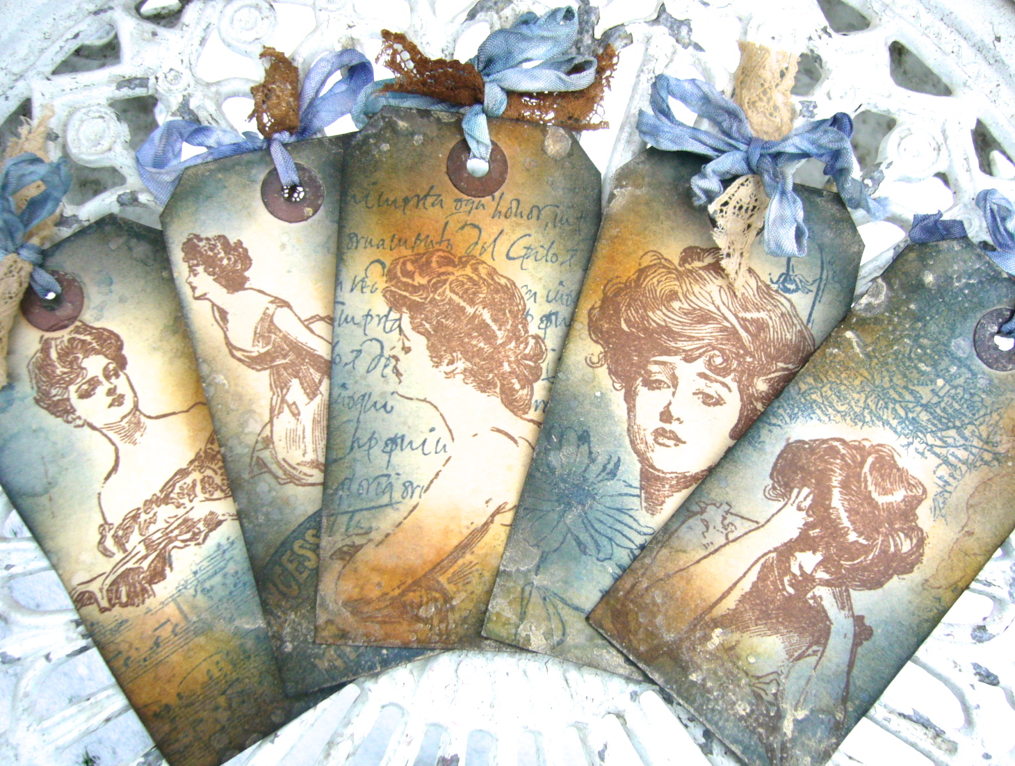
I started with luggage labels which had previously been stained with tea and coffee, which gives them a wonderful vintage feel straight away.  

Once the images were stamped, I blended Chipped Sapphire, Stormy Sky, Vintage Photo and Wild Honey Distress Inks onto the tags.  

I've been careful to leave at least the faces un-inked by extra colour, so that they stand out at the centre of each tag.


I spritzed and flicked with water after inking, and then finally added some gilding by spritzing Perfect Pearls Mist in Heirloom Gold onto the mat and splodging the tags onto it - again avoiding the faces, so that you'd be able to "read" what's going on inside.


And each tag has some additional stamping to complement the story of that particular Gibson Girl.


So there's the woman reading her letter...  I stamped her in Coffee Archival both on the tag and on a separate piece of paper so that I could cut a mask.  

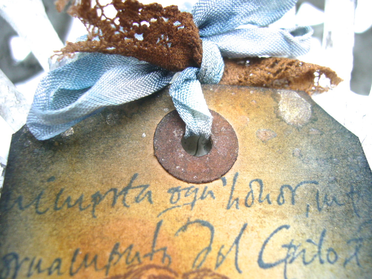
And then I stamped the Calligraphy Mat around her, using Cobalt, to represent the letter she's reading.

I haven't examined the Italian in close detail but in my "story", it's a love letter from an Italian count, approved by the girl's parents as a suitor to her hand.  Everything is tumbling forwards towards the wedding at great speed.


But in the angle of her head and the weight of her shoulders it's clear that for her it's not so clear cut, and so on the opposite side the question reveals itself, lurking in the corner, in the depths of her mind:  Yes, but do I love him?


The woman with the book - to me it seems like a musical score; she's holding it at exactly the angle to read or sing from as a performer - has a look as though she's just heard something, but is not sure what.  

On the reverse, we see that this is not the first time:  Sometimes I wonder... Does no-one hear the same music I hear?


She's masked again, and this time it's music which is floating in her mind.  

The music stamp isn't the AS one, I'm afraid, but they do have a marvellous music manuscript background so I've popped a link to that at the foot of the page.


The girl with the glorious hair piled high has a look which you could mistake for arrogance or disdain, but when you look again, there's a pain and a defensiveness somewhere at the heart of it... the chin just a little too lifted, the eyelids just a little too hooded, hidden.


She shares her secrets with us on the reverse, surrounded by flower images from Botanical Plate #1: My beauty is not all there is to me.


The utter dejection and exhaustion is easy to read in the girl resting her head on her hands.  

She's probably the one who started me off looking more closely at the others.  Again I cut a mask so that I could stamp the Europe Map Background around her.


I positioned it so that you actually get a slightly removed masking effect - the thoughts hover a little way away from the main image of the thinker.  

Her question is clear... in all the travelling, in all the bustle of society events, where does she belong, how does she fit in:  Where is my home?


And finally the wonderful image of the girl seated on the floor, her skirts pooled around her, in a moment's respite from the social whirl of arrival at a new hotel (the beautiful vintage hotel stamp again from the Labels plate, dining, dancing).


There's such a yearning in the angle of her body, leaning forward, listening intently as though to catch the meaning of life, the universe and everything, on the brink of discovery:  Sometimes I can almost understand why.


For the tag trimmings I used Chipped Sapphire and Stormy Sky Distress Stains to tint lots of seam binding, and Vintage Photo and Antique Linen to alter the slightly pinkish tones of some lace from my stash.  

I knew these would all be peeking out of the top of the case, so they needed to tone with the suitcase colours too.


Wow... a longer post than ever - sorry!!  I planned to come up with something very simple for my final project at the end of February... two photos max!  But it didn't quite work out like that - though it wasn't such a marathon as this.  It'll be along soon here at Words and Pictures.

Thank you so much for taking the time if you've made it this far, and I hope you've enjoyed the journey.

Your visions will become clear only when you can look into your own heart.  Who looks outside, dreams; who looks inside, awakes.
C.G. Jung

Click to go shopping:
Ingredients: Gibson Girls Plate #1Calligraphic Mat #19Europe Map BackgroundMusic BackgroundBotanical Plate #1LabelsVintage Valise dieKraft Resist Paper StashKraft-Core;  Distress Inks: Chipped Sapphire, Stormy Sky, Vintage Photo, Wild HoneyDistress Stains: Antique Linen, Chipped Sapphire, Picket Fence, Stormy Sky, Vintage Photo; Archival Inks: Cobalt, Coffee; Perfect Pearls Mist: Heirloom GoldSeam binding;