Hello all! I'm here with a final inspiration journal page for the Summer Countryside theme I'm hosting at Art Journal Journey this month. I was so honoured to be invited to host, and it's been such a joy seeing all the amazing pages you've been sharing. For my final page, I've kept things simple with a soft framing of a watercolour doodle I painted at the start of the month.
I'm travelling into a new way of working, a new country, a new language, and a new hobby which I'm passionate about. Come with me for some of the journey...
Showing posts with label ground. Show all posts
Friday, 30 July 2021
Monday, 4 May 2020
Daisy, daisy (daisy)
Hello all! I do hope you're all doing okay.
I don't think I really registered the start of May - partly because I was caught up in the new Vintage Journey challenge, Beautiful Blooms, which went live on the first.
My lavender tag, The flowers appear on the earth, distracted me from the fact that a whole new month was starting.
That being so, there's a new theme over at Art Journal Journey, and they are also looking for Flowers this month, so I expect I won't be the only one taking advantage of the double floral challenge!
This page is a painting I actually did some time ago, but never shared.
I did a bit of extra shading, some spattering and added the word layers, so let me show you a few close-ups of what's what.
It ought to be a shorter post than some of them have been of late!

The page is done in the large Dylusions journal, so it's 11.5 x 8.25 inches. (The journal is 12 x 9, but that's the cover... the internal pages are a little smaller.)

The paper in the journal is already a lovely heavyweight stock, good for wet media, but I knew I wanted to play with some watercolours, and for those to behave at their best, you really need proper watercolour paper.

The good news is there's something you can use to turn any surface into a happy playground for watercolour paints... watercolour ground. You can get it in various finishes, but it won't come as any surprise to the regulars that I like the rough textured version best.
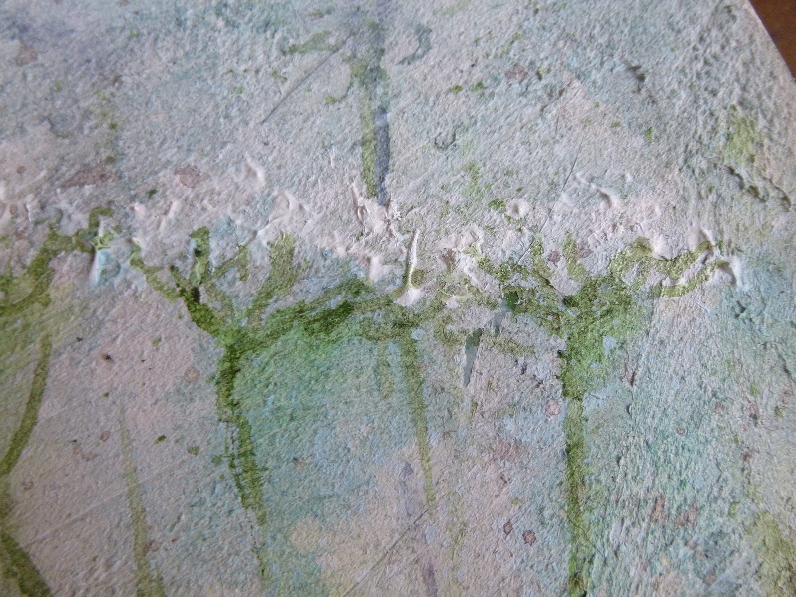
This is Qor's Cold Press Ground, and it is fabulously gritty and rough, mimicking the surface of a sturdy cold press watercolour paper.

I think you can see what I mean in a couple of these photos - that's what I've tried to capture for you, in any case.
It's not a great surface for the PITT pen I used to sketch out my daisies and leaves, but I really only wanted a very sketchy feel to the drawing, and that's what I got.
In fact, the rough surface forced me to let go of my perfectionist tendencies and just go with the flow.
And flow is what it's all about with watercolour.
Having the right surface or ground is what allows the pigment and water to perform its magic (like this bit of "sunlight" leaking out from the flower petals into the sky...).

You can see where the palette knife missed some parts of the paper how the paint sinks in to the paper, rather than flowing across it, and creates much deeper pigmentation.
Talk about embracing imperfection - this might be my favourite part of the painting!
I didn't want to mess with the finished painting much, but I was feeling the urge to add some words. The Calico Craft Parts Word Element band seemed to fit the bill. It did take quite a bit of courage to add anything to a painting I was fairly happy with.
It's layered over a torn strip of teabag paper (still with some cinnamon chai leaves attached in places I think!). I love that you can still see the stems through the translucent paper.

A last little bit of scrumptious texture and soft flowing pigment (and you can see the additional white spatter too), and that should just about do it for today, I think.
I'm sharing this over at Art Journal Journey, and it should also serve as some additional inspiration for the Beautiful Blooms theme at A Vintage Journey.
Lots of journeying going on... ironic, when we're still in lockdown, but there you go. Virtual journeys will have to do for now. I hope you are all staying safe and well. Have a lovely week, and I'll see you soon.
If I had my life to live over, I'd pick more daisies.
Don Herold
I'd like to share this in the Flowers theme over at Art Journal Journey
I'd also like to join in the fun at Paint Party Friday for the Week 9, Year 10 gathering
The Simon Says Stamp Monday Challenge is looking for Spritz and Splatter - there's plenty of my usual white spatter adding dots of light, and plenty of watery spritzing of the watercolour pigment too
Sunday, 15 December 2019
Sparkling Snow
Hello all! I hope all your festive preparations well on the way to completion. We'll be heading out to find a tree in the next couple of days (if it stops raining) ready for decorating probably this time next week, and then sitting back to dream of a white Christmas. The theme at PaperArtsy this fortnight is Sparkle, and for me there was only one choice at this time of year... snow!
My project over at the PaperArtsy blog this evening is full of sparkling snow, so rather than the real thing (which I know can be a nuisance in real life), why not hop over there to enjoy the faux version? If you want to see the candle lit, you'll simply have to hop!
Oh, and if you're a miniatures fan and you'd like a bit more entertainment, there's a new, highly theatrical post to enjoy over at Cestina's Dollshouses too.
Thank you so much for stopping by today and for hopping. I'll be back with another seasonal offering in a few days, so I shall hope to see you again then.
The snow is sparkling like a million little suns.
Lama Willa Miller
My project over at the PaperArtsy blog this evening is full of sparkling snow, so rather than the real thing (which I know can be a nuisance in real life), why not hop over there to enjoy the faux version? If you want to see the candle lit, you'll simply have to hop!
Oh, and if you're a miniatures fan and you'd like a bit more entertainment, there's a new, highly theatrical post to enjoy over at Cestina's Dollshouses too.
Thank you so much for stopping by today and for hopping. I'll be back with another seasonal offering in a few days, so I shall hope to see you again then.
The snow is sparkling like a million little suns.
Lama Willa Miller
Monday, 29 July 2019
Going for a walk
Hello all! I'm just making it in under the wire with my entry for this month's Art Journal Journey theme. I promised myself I'd play along at least once a month this year but the lovely Chris of PearShapedCrafting slightly stumped me with her "We're All Going..." theme. It's a lovely idea, and opened up lots of possibilities for everyone, but I found myself paralysed between two phrases which really didn't inspire me at all.
Firstly, there was "We're all going on a summer holiday... " - thanks for that earworm, Cliff Richard! - but that just isn't true for me this year. And then there was "We're all going to hell in a handcart," which seems a lot more apt for the current state of world affairs, but was far too depressing for me to want to start journalling about. I know that you can use art journalling for all kinds of emotions and expressivity - but, just at the moment, I prefer to escape from nightmarish reality when I head into the craft-room, rather than take it in there with me.
In the end, with July rapidly running out of days, I decided my best bet was to run for my happiest possible artsy place, so on my art journalling page we're all going for a walk in the meadow. When the world is looking dark, some sunlight and a gentle breeze are sometimes all that's needed to feel a little more cheerful.

This is a heavily textured page, since I started with a thick coat of watercolour ground to prepare the page for using watercolour paints. It gives you a deliciously grainy, sandy texture which also allows the pigment to flow as though you had watercolour paper.
It means you can get lovely soft background effects before applying more detail in later layers.

The paper in this large 10x10 inch album from Paperchase is already sturdy (it's the same book as has the Inspiring Herbs and Wild and Organic pages), but the ground gives you even more weight and texture.

Watercolours are the main medium here. At this stage, that's all that's on the page, apart from the watercolour ground itself... but then I moved on to a more mixed media approach.

There are some nice thick applications of heavy body acrylic to create texture in the flower heads.

I love the dimension and movement this gives you.

I used some large PITT artist pens to add some variation in line to some of the stems...

... as well as adding some soft blue flower heads to the distant stems in the background.

And it wanted warming up a bit so I added some of my favourite Broken China Distress Stain, creating turquoise shading beneath the flower heads as well as deepening the colour of the sky.

There's some script stamping in Olive Archival adding texture to the undergrowth.

I used my dipping pen and some Turtle Dove Grey ink by Colorex to write the words, which are layered over some torn strips of tissue tape.

I've no nearby meadows to head into in real life, so the craft table version will just have to do for now when I need to escape.
I hope you've enjoyed coming for a walk with me, and I'll be back soon with some exciting posts in the next couple of weeks. Stay tuned and happy crafting in the meantime!
In a meadow full of flowers, you cannot walk through and breathe those smells and see all those colors and remain angry. We have to support the beauty, the poetry, of life.
Jonas Mekas
I'd like to share this over at Art Journal Journey for this month's theme of "We're All Going..."
At the Simon Says Stamp Monday Challenge, they're looking for projects which are Bright and Cheerful - my sunshine meadow has made me feel a little more cheerful about the world, so I'd like to play along there too
I'd also like to share this at Paint Party Friday - continuing to work on expanding my experience with watercolours, and also exploring how they fit in with my mixed media work
Firstly, there was "We're all going on a summer holiday... " - thanks for that earworm, Cliff Richard! - but that just isn't true for me this year. And then there was "We're all going to hell in a handcart," which seems a lot more apt for the current state of world affairs, but was far too depressing for me to want to start journalling about. I know that you can use art journalling for all kinds of emotions and expressivity - but, just at the moment, I prefer to escape from nightmarish reality when I head into the craft-room, rather than take it in there with me.
In the end, with July rapidly running out of days, I decided my best bet was to run for my happiest possible artsy place, so on my art journalling page we're all going for a walk in the meadow. When the world is looking dark, some sunlight and a gentle breeze are sometimes all that's needed to feel a little more cheerful.

This is a heavily textured page, since I started with a thick coat of watercolour ground to prepare the page for using watercolour paints. It gives you a deliciously grainy, sandy texture which also allows the pigment to flow as though you had watercolour paper.
It means you can get lovely soft background effects before applying more detail in later layers.
The paper in this large 10x10 inch album from Paperchase is already sturdy (it's the same book as has the Inspiring Herbs and Wild and Organic pages), but the ground gives you even more weight and texture.
Watercolours are the main medium here. At this stage, that's all that's on the page, apart from the watercolour ground itself... but then I moved on to a more mixed media approach.
There are some nice thick applications of heavy body acrylic to create texture in the flower heads.
I love the dimension and movement this gives you.

I used some large PITT artist pens to add some variation in line to some of the stems...
... as well as adding some soft blue flower heads to the distant stems in the background.

And it wanted warming up a bit so I added some of my favourite Broken China Distress Stain, creating turquoise shading beneath the flower heads as well as deepening the colour of the sky.

There's some script stamping in Olive Archival adding texture to the undergrowth.

I used my dipping pen and some Turtle Dove Grey ink by Colorex to write the words, which are layered over some torn strips of tissue tape.

I've no nearby meadows to head into in real life, so the craft table version will just have to do for now when I need to escape.
I hope you've enjoyed coming for a walk with me, and I'll be back soon with some exciting posts in the next couple of weeks. Stay tuned and happy crafting in the meantime!
In a meadow full of flowers, you cannot walk through and breathe those smells and see all those colors and remain angry. We have to support the beauty, the poetry, of life.
Jonas Mekas
I'd like to share this over at Art Journal Journey for this month's theme of "We're All Going..."
At the Simon Says Stamp Monday Challenge, they're looking for projects which are Bright and Cheerful - my sunshine meadow has made me feel a little more cheerful about the world, so I'd like to play along there too
I'd also like to share this at Paint Party Friday - continuing to work on expanding my experience with watercolours, and also exploring how they fit in with my mixed media work
Friday, 7 December 2018
Star Light, Star Bright
Hello all! Time for a new challenge over at A Vintage Journey, and the lovely Julia is looking for us all to get starstruck with her theme Star Light, Star Bright. As always, there's lots of beautiful inspiration from my fellow Creative Guides, and here's my offering. Grab a cup of warming grog and come for a starlit stroll with me.
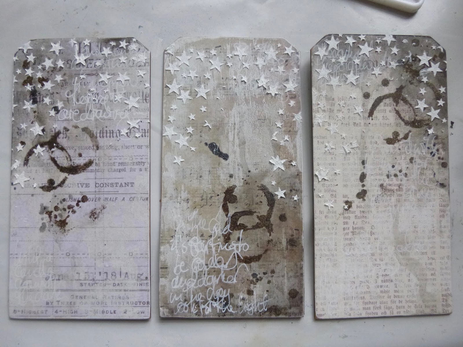
This trio of starry tags came about as a result of another joyful Skype crafting session with Brenda of Bumblebees and Butterflies and Nikki of Addicted to Art. Last time we all worked on a giant tag or MDF surface, but this time we each started with a different substrate. I chose three jumbo MDF tags (though not quite as jumbo as my Curiouser and Curiouser tag from before - these are each 4x8 inches).
Almost by accident, we ended up aiming for something involving stars, so you might recognise some elements when you see their offerings at A Vintage Journey though, again, we each ended up with very different projects.
We took it in turns to deliver instructions, and the first was mine:
Alison (A) - Use paper to start the layers

I have lots of lovely design paper, but I often forget to take advantage of it, so I thought I'd kick off with something off my usual beaten track. I covered each tag with a different paper - one with a glamorous advertisement (TH), one with music (7 Dots Studio), and one with Old German font (Pion).

Brenda was next:
B - Use the monoprint method to add any colour medium of your choice
This is something Seth Apter does a lot. You put the the paint (or other medium) on one piece of card (or other surface) and press it down onto your main surface to get a cool textured look. I stuck in the neutral zone with some Chalk White.

And then Nikki:
N - Add a wash or washes of a colour medium
I worked with watery mixes of DecoArt Media Fluid Acrylic in Payne's Gray and Raw Umber to get a really shadowy aged look that I loved. I applied the washes with a soft brush and then spritzed with water to get even more movement, dripping down from the top of the external two tags and up from the bottom of the middle one.

Shorthand instructions and details from now on... !
A - Use a stencil any way you wish

I used one of Tim Holtz's stencils and sponged some more of the same two paint colours through it.
I was really enjoying the old manuscript look of the tags by this point.

B - Use asemic or dynamic writing to add a layer of visual texture
Essentially this means do some scribbling - so I did, using a white gel pen. It's another effect which I really like - though mine's probably not quite asemic as there are some real words and little bits of meaning hidden in there.

N - Add a bit of physical texture
This is where I grabbed my chance to add my stars.

I applied Watercolour Ground through the new Tim Holtz Falling Stars stencil.
Already in love with this stencil - I love the varied sizes of the stars and the random falling pattern.

A - Choose and prepare the focal point of the design
I needed some thinking time to work out how to progress. I loved my backgrounds and was actually rather unwilling to cover them up, so it took a few goes to work out where I was going next.

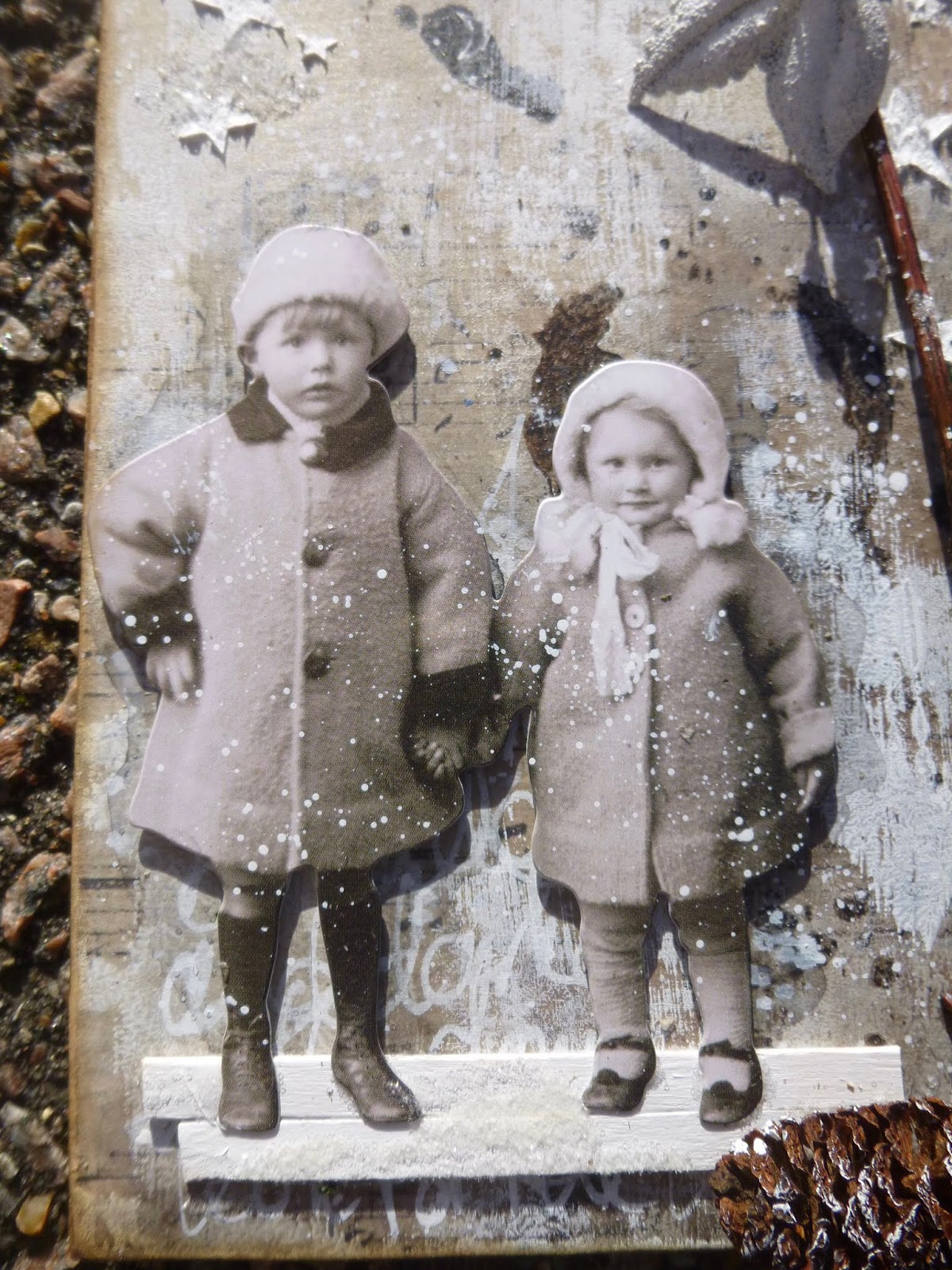
The Paper Dolls were pretty much a given, but the real breakthrough came when I popped outside into the garden to find my bare twiggy tree stems.

B - Find elements to bring the composition together
This was a useful follow on - a chance to gather some more bits and bobs which would serve the stories starting to appear.

I grabbed the pinecones and the little leaves, and found a couple of coffee stirrers to make my "ground" under the dolls' feet.

N - On one or more of the elements use two different mediums of the same colour
Another great next step - a chance to alter and adapt the chosen embellishments. I stayed all white.

I'd already painted my coffee stirrers white with acrylic paint. (Later I added a bit of Rock Candy Dry Glitter to them for a frosted snowy surface.)
I drybrushed some more white paint onto the edges of the pinecones.

And I used Weathered White embossing powder on the Idea-ology metal leaves.

A - Add some words or lettering
Well, obviously... For me it's a given that there have to be words, but I also added "lettering" so that the others could choose something a bit more abstract if they wanted.

My three quotes are drawn from my own PaperArtsy Eclectica quote stamps. One from EAB02 Darkness & Light...
... and the other two adapted from longer quotes on EAB07 Dreaming & Doing...

... chopped about to varying degrees in order to focus on the bits about the stars!

B - Add some sparkle
I sort of knew this was coming... it's a starry theme, it's coming up for Christmas - someone was bound to want to get sparkly!
It's not something I do very often, but the Clear Rock Candy Dry Glitter is usually my saviour when I do need a touch of sparkle.

I applied matte medium with a soft brush over and around the stars, and poured on the Rock Candy glitter. This is when I added it to the coffee stirrers underfoot too.
It's a subtle shimmer, with a chunky icy look, and very lovely when it catches the light - so yes, I'm happy there is some sparkle.

N - Assemble and add whatever you need to finish off your design
A generously flexible final offer from Nikki... allowing each of us to do whatever was necessary.
I needed to re-punch my tag holes through the paper, and then I added some crinkle ribbon, very lightly brushed with Vintage Photo Distress Ink for a slightly more distressed look.

I also did a bit more inking around the edges of the tags, and - as an afterthought - added the little crystal berries to the leaf clusters. (I could have counted that as part of the sparkle-adding instruction, I suppose...)
There was a final shared instruction... Resist. Not to use a resist technique, but to resist adding more or continuing to fiddle! It's always hard knowing when to stop, don't you think?
By sheer chance, when we came to hold up our projects to the cameras so that we could see a bit of what the others had done, we found that Brenda and I had used almost exactly the same Paper Dolls - even though nobody said we had to use Paper Dolls at all! (Click the photos for a larger version.)
I'm very happy with my bare, spare, wintry tag set. You can see how Brenda and Nikki's projects turned out by hopping direct to their blogs from the links at the start of this post, but why not go via A Vintage Journey and catch even more starry inspiration there?
We're looking forward to seeing what you're inspired to create for our Star Light, Star Bright theme this month, and hope to see you somewhere down the snowy December road. Oh, and by all means feel free to borrow our step by step instructions and see what they do for you!
Happy Crafting all!
Look up at the stars and not down at your feet. Try to make sense of what you see, and wonder about what makes the universe exist. Be curious.
Stephen Hawking
I'd like to share these tags at the Simply Neutrals party over at Apple Apricot
And I'm hoping the sparkly frosted look will qualify them for It's Got To Be Christmas over at Stamps and Stencils... it's their final ever challenge and I can't bear not to join in - I'm going to miss their lovely challenge blog a lot
At the Simon Says Stamp Monday Challenge the theme is "B is for..." and my B is for branches, real ones from the garden, and brown berries (not real!)
There's an Anything Goes theme at That's Crafty Challenges for the last month of the year
I've just got time to play along again at Try It On Tuesday where they are walking in a Winter Wonderland
This trio of starry tags came about as a result of another joyful Skype crafting session with Brenda of Bumblebees and Butterflies and Nikki of Addicted to Art. Last time we all worked on a giant tag or MDF surface, but this time we each started with a different substrate. I chose three jumbo MDF tags (though not quite as jumbo as my Curiouser and Curiouser tag from before - these are each 4x8 inches).
Almost by accident, we ended up aiming for something involving stars, so you might recognise some elements when you see their offerings at A Vintage Journey though, again, we each ended up with very different projects.
We took it in turns to deliver instructions, and the first was mine:
Alison (A) - Use paper to start the layers
I have lots of lovely design paper, but I often forget to take advantage of it, so I thought I'd kick off with something off my usual beaten track. I covered each tag with a different paper - one with a glamorous advertisement (TH), one with music (7 Dots Studio), and one with Old German font (Pion).

Brenda was next:
B - Use the monoprint method to add any colour medium of your choice
This is something Seth Apter does a lot. You put the the paint (or other medium) on one piece of card (or other surface) and press it down onto your main surface to get a cool textured look. I stuck in the neutral zone with some Chalk White.
And then Nikki:
N - Add a wash or washes of a colour medium
I worked with watery mixes of DecoArt Media Fluid Acrylic in Payne's Gray and Raw Umber to get a really shadowy aged look that I loved. I applied the washes with a soft brush and then spritzed with water to get even more movement, dripping down from the top of the external two tags and up from the bottom of the middle one.

Shorthand instructions and details from now on... !
A - Use a stencil any way you wish

I used one of Tim Holtz's stencils and sponged some more of the same two paint colours through it.
I was really enjoying the old manuscript look of the tags by this point.

B - Use asemic or dynamic writing to add a layer of visual texture
Essentially this means do some scribbling - so I did, using a white gel pen. It's another effect which I really like - though mine's probably not quite asemic as there are some real words and little bits of meaning hidden in there.

N - Add a bit of physical texture
This is where I grabbed my chance to add my stars.

I applied Watercolour Ground through the new Tim Holtz Falling Stars stencil.
Already in love with this stencil - I love the varied sizes of the stars and the random falling pattern.
A - Choose and prepare the focal point of the design
I needed some thinking time to work out how to progress. I loved my backgrounds and was actually rather unwilling to cover them up, so it took a few goes to work out where I was going next.
The Paper Dolls were pretty much a given, but the real breakthrough came when I popped outside into the garden to find my bare twiggy tree stems.
B - Find elements to bring the composition together
This was a useful follow on - a chance to gather some more bits and bobs which would serve the stories starting to appear.

I grabbed the pinecones and the little leaves, and found a couple of coffee stirrers to make my "ground" under the dolls' feet.
N - On one or more of the elements use two different mediums of the same colour
Another great next step - a chance to alter and adapt the chosen embellishments. I stayed all white.
I'd already painted my coffee stirrers white with acrylic paint. (Later I added a bit of Rock Candy Dry Glitter to them for a frosted snowy surface.)
I drybrushed some more white paint onto the edges of the pinecones.
And I used Weathered White embossing powder on the Idea-ology metal leaves.
A - Add some words or lettering
Well, obviously... For me it's a given that there have to be words, but I also added "lettering" so that the others could choose something a bit more abstract if they wanted.
My three quotes are drawn from my own PaperArtsy Eclectica quote stamps. One from EAB02 Darkness & Light...
... and the other two adapted from longer quotes on EAB07 Dreaming & Doing...
... chopped about to varying degrees in order to focus on the bits about the stars!
B - Add some sparkle
I sort of knew this was coming... it's a starry theme, it's coming up for Christmas - someone was bound to want to get sparkly!
It's not something I do very often, but the Clear Rock Candy Dry Glitter is usually my saviour when I do need a touch of sparkle.
I applied matte medium with a soft brush over and around the stars, and poured on the Rock Candy glitter. This is when I added it to the coffee stirrers underfoot too.
It's a subtle shimmer, with a chunky icy look, and very lovely when it catches the light - so yes, I'm happy there is some sparkle.

N - Assemble and add whatever you need to finish off your design
A generously flexible final offer from Nikki... allowing each of us to do whatever was necessary.
I needed to re-punch my tag holes through the paper, and then I added some crinkle ribbon, very lightly brushed with Vintage Photo Distress Ink for a slightly more distressed look.
I also did a bit more inking around the edges of the tags, and - as an afterthought - added the little crystal berries to the leaf clusters. (I could have counted that as part of the sparkle-adding instruction, I suppose...)
There was a final shared instruction... Resist. Not to use a resist technique, but to resist adding more or continuing to fiddle! It's always hard knowing when to stop, don't you think?
By sheer chance, when we came to hold up our projects to the cameras so that we could see a bit of what the others had done, we found that Brenda and I had used almost exactly the same Paper Dolls - even though nobody said we had to use Paper Dolls at all! (Click the photos for a larger version.)
I'm very happy with my bare, spare, wintry tag set. You can see how Brenda and Nikki's projects turned out by hopping direct to their blogs from the links at the start of this post, but why not go via A Vintage Journey and catch even more starry inspiration there?
We're looking forward to seeing what you're inspired to create for our Star Light, Star Bright theme this month, and hope to see you somewhere down the snowy December road. Oh, and by all means feel free to borrow our step by step instructions and see what they do for you!
Happy Crafting all!
Look up at the stars and not down at your feet. Try to make sense of what you see, and wonder about what makes the universe exist. Be curious.
Stephen Hawking
I'd like to share these tags at the Simply Neutrals party over at Apple Apricot
And I'm hoping the sparkly frosted look will qualify them for It's Got To Be Christmas over at Stamps and Stencils... it's their final ever challenge and I can't bear not to join in - I'm going to miss their lovely challenge blog a lot
At the Simon Says Stamp Monday Challenge the theme is "B is for..." and my B is for branches, real ones from the garden, and brown berries (not real!)
There's an Anything Goes theme at That's Crafty Challenges for the last month of the year
I've just got time to play along again at Try It On Tuesday where they are walking in a Winter Wonderland
Labels:
7 Dots Studio,
AB Word Stamps,
Christmas,
crinkle ribbon,
DecoArt,
Dry Glitter,
ground,
Idea-ology,
PaperArtsy,
Pion,
Skype,
stencilling,
texture paste,
tim holtz,
Vintage Journey,
vintage photo,
white pen
Subscribe to:
Posts (Atom)