I'm travelling into a new way of working, a new country, a new language, and a new hobby which I'm passionate about. Come with me for some of the journey...

Showing posts with label Dry Glitter. Show all posts

Tuesday, 21 December 2021

Christmas Countdown Tags Part II

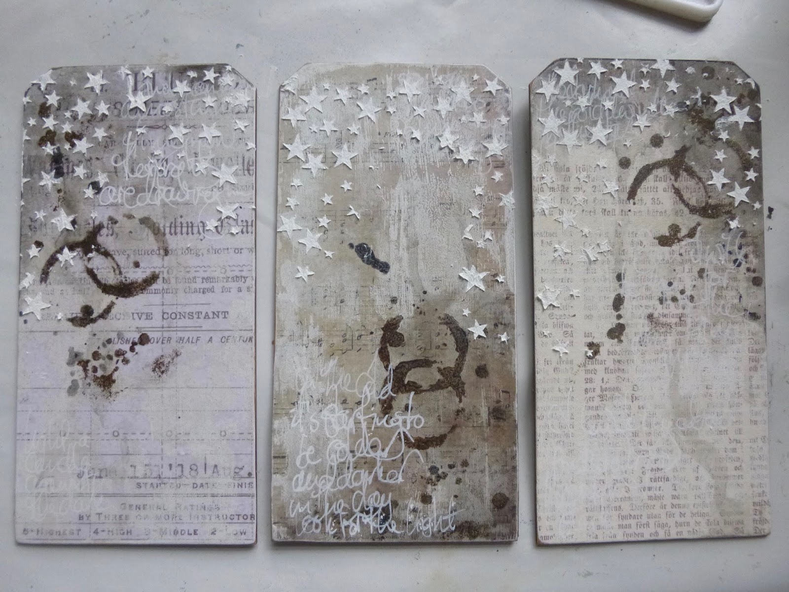
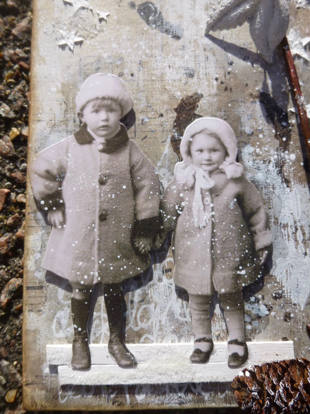
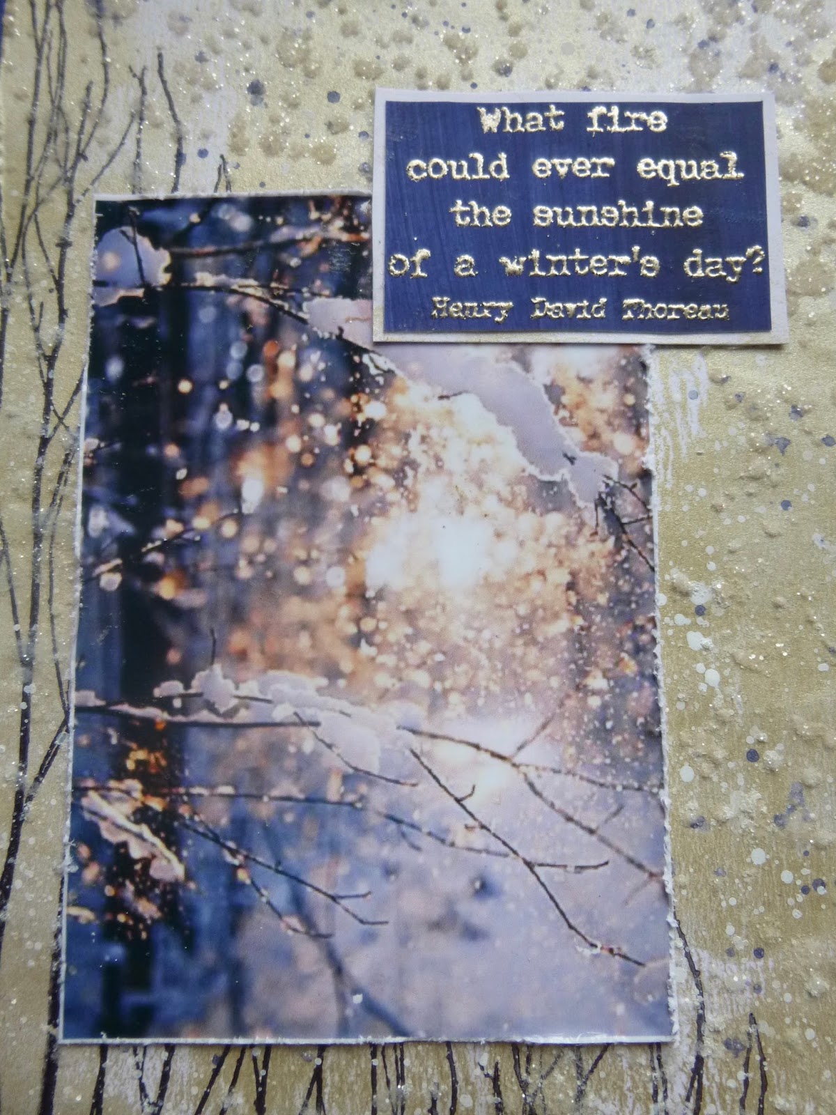
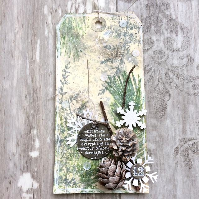
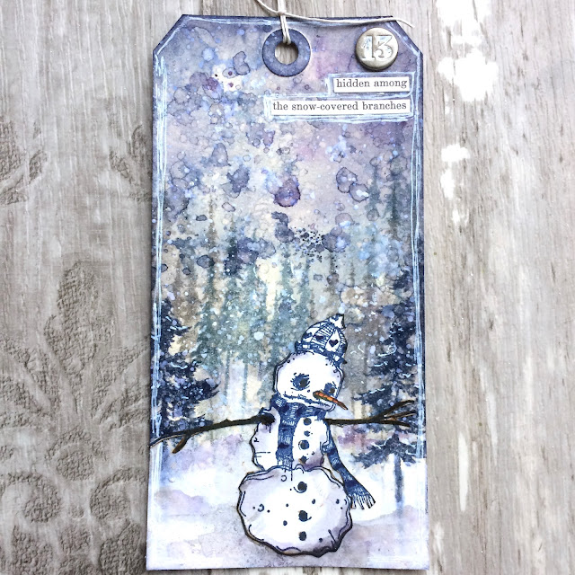
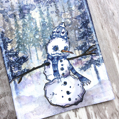
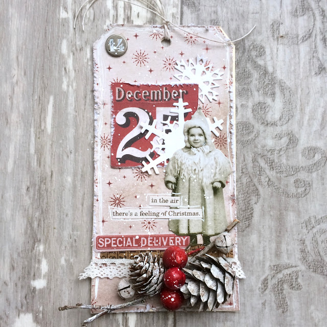
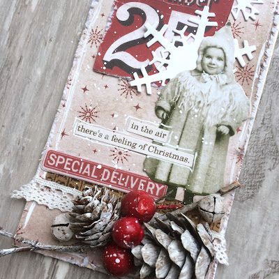
Hello all!  Sorry, I'm behind again... I've got another eight tags for you today (and we're almost at the final eight already too!).  I know how busy everyone is at this time of year (I am too, hence the delay) so I'm not going to hang around here.  Here are days 9 - 16 of my Christmas Countdown tags...


So there you are... eight more tags to get you in a wintry mood, and possibly even a festive one.  I'm just about ready now.  Tree-decorating tomorrow (and vases of ivy etc to do), and we're pretty much there.  I hope you're feeling ready to either rest or play, but above all that you are staying safe and well.  Happy festive crafting all!

Christmas is not a time nor a season, but a state of mind.
Calvin Coolidge

Friday, 7 December 2018

Star Light, Star Bright

Hello all!  Time for a new challenge over at A Vintage Journey, and the lovely Julia is looking for us all to get starstruck with her theme Star Light, Star Bright.  As always, there's lots of beautiful inspiration from my fellow Creative Guides, and here's my offering.  Grab a cup of warming grog and come for a starlit stroll with me.


This trio of starry tags came about as a result of another joyful Skype crafting session with Brenda of Bumblebees and Butterflies and Nikki of Addicted to Art.  Last time we all worked on a giant tag or MDF surface, but this time we each started with a different substrate.  I chose three jumbo MDF tags (though not quite as jumbo as my Curiouser and Curiouser tag from before - these are each 4x8 inches).


Almost by accident, we ended up aiming for something involving stars, so you might recognise some elements when you see their offerings at A Vintage Journey though, again, we each ended up with very different projects.

We took it in turns to deliver instructions, and the first was mine:
Alison (A) - Use paper to start the layers


I have lots of lovely design paper, but I often forget to take advantage of it, so I thought I'd kick off with something off my usual beaten track.  I covered each tag with a different paper - one with a glamorous advertisement (TH), one with music (7 Dots Studio), and one with Old German font (Pion).


Brenda was next:
B - Use the monoprint method to add any colour medium of your choice

This is something Seth Apter does a lot.  You put the the paint (or other medium) on one piece of card (or other surface) and press it down onto your main surface to get a cool textured look.  I stuck in the neutral zone with some Chalk White.


And then Nikki:
N - Add a wash or washes of a colour medium

I worked with watery mixes of DecoArt Media Fluid Acrylic in Payne's Gray and Raw Umber to get a really shadowy aged look that I loved.  I applied the washes with a soft brush and then spritzed with water to get even more movement, dripping down from the top of the external two tags and up from the bottom of the middle one.


Shorthand instructions and details from now on... !

A - Use a stencil any way you wish


I used one of Tim Holtz's stencils and sponged some more of the same two paint colours through it.

I was really enjoying the old manuscript look of the tags by this point.


B - Use asemic or dynamic writing to add a layer of visual texture

Essentially this means do some scribbling - so I did, using a white gel pen.  It's another effect which I really like - though mine's probably not quite asemic as there are some real words and little bits of meaning hidden in there.


N - Add a bit of physical texture

This is where I grabbed my chance to add my stars.


I applied Watercolour Ground through the new Tim Holtz Falling Stars stencil.

Already in love with this stencil - I love the varied sizes of the stars and the random falling pattern.


A - Choose and prepare the focal point of the design

I needed some thinking time to work out how to progress.  I loved my backgrounds and was actually rather unwilling to cover them up, so it took a few goes to work out where I was going next.


The Paper Dolls were pretty much a given, but the real breakthrough came when I popped outside into the garden to find my bare twiggy tree stems.


B - Find elements to bring the composition together

This was a useful follow on - a chance to gather some more bits and bobs which would serve the stories starting to appear.


I grabbed the pinecones and the little leaves, and found a couple of coffee stirrers to make my "ground" under the dolls' feet.


N - On one or more of the elements use two different mediums of the same colour

Another great next step - a chance to alter and adapt the chosen embellishments.  I stayed all white.


I'd already painted my coffee stirrers white with acrylic paint.  (Later I added a bit of Rock Candy Dry Glitter to them for a frosted snowy surface.)

I drybrushed some more white paint onto the edges of the pinecones. 


And I used Weathered White embossing powder on the Idea-ology metal leaves.


A - Add some words or lettering

Well, obviously... For me it's a given that there have to be words, but I also added "lettering" so that the others could choose something a bit more abstract if they wanted.


My three quotes are drawn from my own PaperArtsy Eclectica quote stamps.  One from EAB02 Darkness & Light...

... and the other two adapted from longer quotes on EAB07 Dreaming & Doing...


... chopped about to varying degrees in order to focus on the bits about the stars!


B - Add some sparkle

 I sort of knew this was coming... it's a starry theme, it's coming up for Christmas - someone was bound to want to get sparkly!

It's not something I do very often, but the Clear Rock Candy Dry Glitter is usually my saviour when I do need a touch of sparkle.


I applied matte medium with a soft brush over and around the stars, and poured on the Rock Candy glitter.  This is when I added it to the coffee stirrers underfoot too.

It's a subtle shimmer, with a chunky icy look, and very lovely when it catches the light - so yes, I'm happy there is some sparkle.


N - Assemble and add whatever you need to finish off your design

A generously flexible final offer from Nikki... allowing each of us to do whatever was necessary.

I needed to re-punch my tag holes through the paper, and then I added some crinkle ribbon, very lightly brushed with Vintage Photo Distress Ink for a slightly more distressed look.


I also did a bit more inking around the edges of the tags, and - as an afterthought - added the little crystal berries to the leaf clusters.  (I could have counted that as part of the sparkle-adding instruction, I suppose...)


There was a final shared instruction... Resist.  Not to use a resist technique, but to resist adding more or continuing to fiddle!  It's always hard knowing when to stop, don't you think?

By sheer chance, when we came to hold up our projects to the cameras so that we could see a bit of what the others had done, we found that Brenda and I had used almost exactly the same Paper Dolls - even though nobody said we had to use Paper Dolls at all!  (Click the photos for a larger version.)


I'm very happy with my bare, spare, wintry tag set.  You can see how Brenda and Nikki's projects turned out by hopping direct to their blogs from the links at the start of this post, but why not go via A Vintage Journey and catch even more starry inspiration there?


We're looking forward to seeing what you're inspired to create for our Star Light, Star Bright theme this month, and hope to see you somewhere down the snowy December road.  Oh, and by all means feel free to borrow our step by step instructions and see what they do for you! 

Happy Crafting all!

Look up at the stars and not down at your feet.  Try to make sense of what you see, and wonder about what makes the universe exist.  Be curious.
Stephen Hawking

I'd like to share these tags at the Simply Neutrals party over at Apple Apricot
And I'm hoping the sparkly frosted look will qualify them for It's Got To Be Christmas over at Stamps and Stencils... it's their final ever challenge and I can't bear not to join in - I'm going to miss their lovely challenge blog a lot
At the Simon Says Stamp Monday Challenge the theme is "B is for..." and my B is for branches, real ones from the garden, and brown berries (not real!)
There's an Anything Goes theme at That's Crafty Challenges for the last month of the year
I've just got time to play along again at Try It On Tuesday where they are walking in a Winter Wonderland

Friday, 20 October 2017

Winter Sunlight


Hello all - I'm so glad you enjoyed my frosted falling leaves over at A Vintage Journey.

We're even more wintry here today with another quick catch up for my PaperArtsy word stamps launch samples, as we've made it back round for another sample using EAB05 The Winter Edition.

This one started with a real collision of words and picture. I'd just been finalising the plates, so had the quotes going around in my head, when Pinterest dropped this photo into my email inbox.  It seemed to me to be a match made in heaven for this glorious quote.

Initially, I was thinking of trying to re-create the photo in mixed media form but then I thought, "well, I don't work with photos very often, but plenty of people do... what a useful opportunity to show that the quotes can work for that kind of scrapping too".


So I printed the photo out and set about trying to create a setting for it which wouldn't let it down but, on the other hand, which wouldn't overwhelm it.  (I see now that maybe there's a reason I don't do this very often!)

Influenced partly by the words, I guess, I reached for the White Fire Fresco paint.  PaperArtsy have excellent metallic shades, as well as a Metallic Glaze which you can add to any of their paints, but White Fire is out and out my all time favourite metallic paint.  (It's my favourite colour of Treasure Gold too - no surprises there.)


I brayered the paint onto some Smoothy card and was immediately delighted with the subtle lustre.


Over that, I stamped the fabulous twigs from Hot Picks 1008 multiple times to give me the woodland atmosphere.


And there are lots of fine twiggy branches in the picture too, of course.


One of the things I really love in the photo is the sense of movement from the snow in the air, and I wanted to try to echo that.  I used a palette knife to apply texture paste through a splatter stencil (I think it was glossy transparent paste but it's tough to remember exactly this long after making it.)


While the paste was still wet, I sprinkled Rock Candy Dry Glitter over it, and then let the whole thing dry and set.


Trying to match that extraordinarily lovely blue of the shadows in the photo wasn't as hard as I thought at first.

It turned out that Fresco Blueberry was just in the right tonal range, so I painted a couple of coats (it's translucent so you need that for coverage) onto some more Smoothy paper.


That served as both the frame in the matted layers and as the plaque for Thoreau's words.


I stamped the quote in Versamark and used the Ranger Liquid Platinum embossing powder on it. 


I love that these stamps are so well made - firm rubber, deeply carved - that you can emboss them and still have a sharp finish on what are really very small letters, especially when you get to the author's name.

I also love how you get that fabulous fiery gleam when the words catch the light.


Finally there's some Blueberry splatter amidst the snow to tie things together.

So a bit of a hop out of kin for me... photos AND glitter... who knew?!  Not the kind of thing you see very often round here, but I was aiming to show another side to these word stamps... I want to share the inspiration they give me as widely as possible!

Thanks so much for stopping by today.  We've one final round of samples to get through -one Music and Silence, one Autumn Edition and one Winter Edition left to go - and those posts will make their way to you as and when there's time and space!  For now, happy crafting all, and I'll see you soon.


The colour of springtime is in the flowers, the colour of winter is in the imagination.
Ward Elliot Hour