I'm travelling into a new way of working, a new country, a new language, and a new hobby which I'm passionate about. Come with me for some of the journey...

Showing posts with label Ranger. Show all posts

Monday, 6 October 2025

Think Pink - Simon Says Stamp Guest Designer

Hello all - I'm thrilled to be back in the Designer Spotlight over on the Simon Says Stamp Monday Challenge for October, and we're starting the month with Think Pink.

It's always a huge honour to be invited to be part of the fun over on Simon Says Stamp (though I probably need to look at my calendar more carefully next time before saying yes... it's a busy month ahead!).

As always, you'll find oodles of inspiration from the amazing Design Team over on the Monday Challenge blog, and there's the usual generous prize on offer from Simon Says Stamp

This week's theme of Think Pink is in honour of Breast Cancer Awareness month.


Pink used to be a rare colour here at Words and Pictures, but lately it's been getting more common.  It started with a lot of wintry sunrises and sunsets in my work last winter, but lately it's definitely happening because of some of the floral stamps I've created for PaperArtsy in recent months.  So when I was asked to "Think Pink", my thoughts went immediately to my PaperArtsy EAB49 Coneflowers 

I thought they'd look great with Tim Holtz's lovely daisy from the French Garden set, so I stamped lots of blooms in Olive Archival Ink onto some watercolour paper.

I used a combination of PaperArtsy Mattints and Dylusions sprays to tint my flowers.  Dylusions are the featured product this week.  I don't have many of the sprays - as you'll know, I have tended to prefer my colour palettes muted rather than in the vivid, vibrant Dylusions tones - but I have a few browns and greens and blues in most mediums (to try out), and Dylusions are no exception.

I put dots of Mattint and tiny spritzes of the sprays onto my craft mat to use as a palette, and layered them together to create fabulous variations and depth of colour.  As you can see from the photos, I used Mattints in Glow, Ladybug Squeezed and The Pink, and Dylusions Chopped Pesto, Dirty Martini and Melted Chocolate.  A touch of PaperArtsy Fresco Finish Chalk Acrylic in Snowflake allowed me to create more opaque layers and pastels.  Any white acrylic will do for that.  I'm very happy with how they turned out... the Dylusions might be coming out more often from now on!  

I altered a cheap and simple wooden frame with a coat of white chalk paint and some Distress Opaque Crackle Paste.

And for my background, I used one of the wood effect Tim Holtz 3D Texture Fades.  I think this particular one has been discontinued now, but there are plenty of others to choose from, including the amazing new large size versions.


Once the crackle had done its thing, I grunged it up with some Pumice Stone Distress Crayon and Pumice Stone Distress Spray Stain, brushed on to highlight those fabulous cracks and crevices.

I chose one of the fabulous Idea-ology Photobooth snapshots to go at the heart of my garden of dancing flowers.  I love the energy and joy emanating from this woman.

And then it was simply a question of arranging the flowers around the edge of the frame and gluing them into position.


A few of my much-loved Curator Snippets labels add extra detailing, and it wouldn't be a Words and Pictures project without some words.


These are from the Coneflowers plate - the large word is one of three, especially selected by me to suit the mood of the stamp set, and the phrase is a poetry fragment from a poem by Lope de Vega.


If that isn't enough to inspire you to Think Pink this week, then do head over to the Simon Says Stamp Monday Challenge for lots more glorious pink creativity from the Design Team there.

The team will be selecting projects to spotlight at the end of the week, and one lucky randomly-drawn winner will be going on a shopping spree at Simon Says Stamp.  

So dig out all your pink materials and have a play.  If I can go pink, you definitely can!!

Thanks so much for stopping by, and happy crafting all!

Pink is the colour of strength, a colour of conviction, a colour of decision making.
Angad Bedi

In a world that often lacks compassion, pink stands as a reminder to be kind.
Matthew Green

Thursday, 27 January 2022

Alcohol Ink Abstracts

Hello all... almost the end of January already - how did that happen?!  I hope 2022 is treating you well so far.

I've something a little different for you today - though in some ways it's not different at all!  Regulars will know how much I love creating ink splotches with Distress Inks and Oxides.  I can't imagine why it's taken me so long to have a proper play with doing the same using alcohol inks.


They've been sitting there on the shelf, coming out every once in a while to alter a metal embellishment, or tint a bit of acetate.  But I've never taken them out for a proper ride.  After watching the Tim Holtz demo on YouTube last Saturday, I decided it was about time I did a bit of playful exploration.


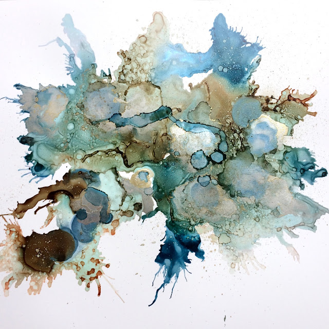
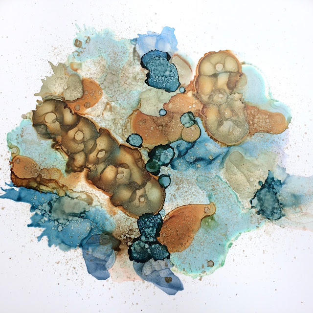
My mojo has been on go-slow, so playing without expectation, judgment or any kind of plan was a lovely thing to do.  And I'm pretty excited about the results.  I'll shut up now and let you have a closer look at some of the splotches and layers in these abstract "maps" of inkiness.

These are from the first one (click to see them a little larger).


And here are some close-ups of the second "map" - lots of organic shapes and seeds growing in this one...


.   
These are a combination of Ranger's Alcohol Inks, Alcohol Pearls and Alcohol Alloys.  The Inks involved are Monsoon, Mushroom, Espresso, Denim, and maybe a touch of Ginger (don't really remember all of it - I was just playing).  The Pearls are Celestial, Smolder and Mineral, and the Alloy is Foundry.

I'm hoping I can stay nice and loose and just keep playing, whilst trying to remember and recreate some of my favourite effects so that I can have at least some idea of what will happen with various combinations and actions!  I do love a learning curve.

I hope 2022 is providing you with new creative adventures, and I'll see you all again soon.  

You can learn new things at any time in your life if you’re willing to be a beginner. If you actually learn to like being a beginner, the whole world opens up to you.
Barbara Shur

The beginning is the most important part of the work.
Plato

Friday, 20 October 2017

Winter Sunlight


Hello all - I'm so glad you enjoyed my frosted falling leaves over at A Vintage Journey.

We're even more wintry here today with another quick catch up for my PaperArtsy word stamps launch samples, as we've made it back round for another sample using EAB05 The Winter Edition.

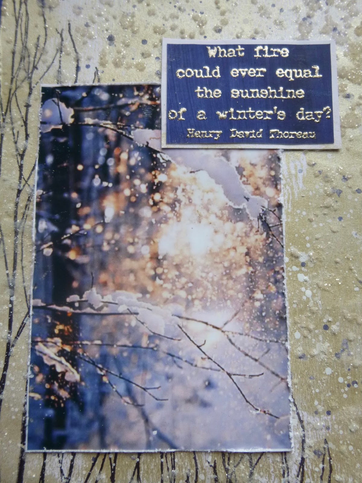
This one started with a real collision of words and picture. I'd just been finalising the plates, so had the quotes going around in my head, when Pinterest dropped this photo into my email inbox.  It seemed to me to be a match made in heaven for this glorious quote.

Initially, I was thinking of trying to re-create the photo in mixed media form but then I thought, "well, I don't work with photos very often, but plenty of people do... what a useful opportunity to show that the quotes can work for that kind of scrapping too".


So I printed the photo out and set about trying to create a setting for it which wouldn't let it down but, on the other hand, which wouldn't overwhelm it.  (I see now that maybe there's a reason I don't do this very often!)

Influenced partly by the words, I guess, I reached for the White Fire Fresco paint.  PaperArtsy have excellent metallic shades, as well as a Metallic Glaze which you can add to any of their paints, but White Fire is out and out my all time favourite metallic paint.  (It's my favourite colour of Treasure Gold too - no surprises there.)


I brayered the paint onto some Smoothy card and was immediately delighted with the subtle lustre.


Over that, I stamped the fabulous twigs from Hot Picks 1008 multiple times to give me the woodland atmosphere.


And there are lots of fine twiggy branches in the picture too, of course.


One of the things I really love in the photo is the sense of movement from the snow in the air, and I wanted to try to echo that.  I used a palette knife to apply texture paste through a splatter stencil (I think it was glossy transparent paste but it's tough to remember exactly this long after making it.)


While the paste was still wet, I sprinkled Rock Candy Dry Glitter over it, and then let the whole thing dry and set.


Trying to match that extraordinarily lovely blue of the shadows in the photo wasn't as hard as I thought at first.

It turned out that Fresco Blueberry was just in the right tonal range, so I painted a couple of coats (it's translucent so you need that for coverage) onto some more Smoothy paper.


That served as both the frame in the matted layers and as the plaque for Thoreau's words.


I stamped the quote in Versamark and used the Ranger Liquid Platinum embossing powder on it. 


I love that these stamps are so well made - firm rubber, deeply carved - that you can emboss them and still have a sharp finish on what are really very small letters, especially when you get to the author's name.

I also love how you get that fabulous fiery gleam when the words catch the light.


Finally there's some Blueberry splatter amidst the snow to tie things together.

So a bit of a hop out of kin for me... photos AND glitter... who knew?!  Not the kind of thing you see very often round here, but I was aiming to show another side to these word stamps... I want to share the inspiration they give me as widely as possible!

Thanks so much for stopping by today.  We've one final round of samples to get through -one Music and Silence, one Autumn Edition and one Winter Edition left to go - and those posts will make their way to you as and when there's time and space!  For now, happy crafting all, and I'll see you soon.


The colour of springtime is in the flowers, the colour of winter is in the imagination.
Ward Elliot Hour