Hello all! I do hope you're all doing okay.
I don't think I really registered the start of May - partly because I was caught up in the new Vintage Journey challenge, Beautiful Blooms, which went live on the first.
My lavender tag, The flowers appear on the earth, distracted me from the fact that a whole new month was starting.
That being so, there's a new theme over at Art Journal Journey, and they are also looking for Flowers this month, so I expect I won't be the only one taking advantage of the double floral challenge!
This page is a painting I actually did some time ago, but never shared.

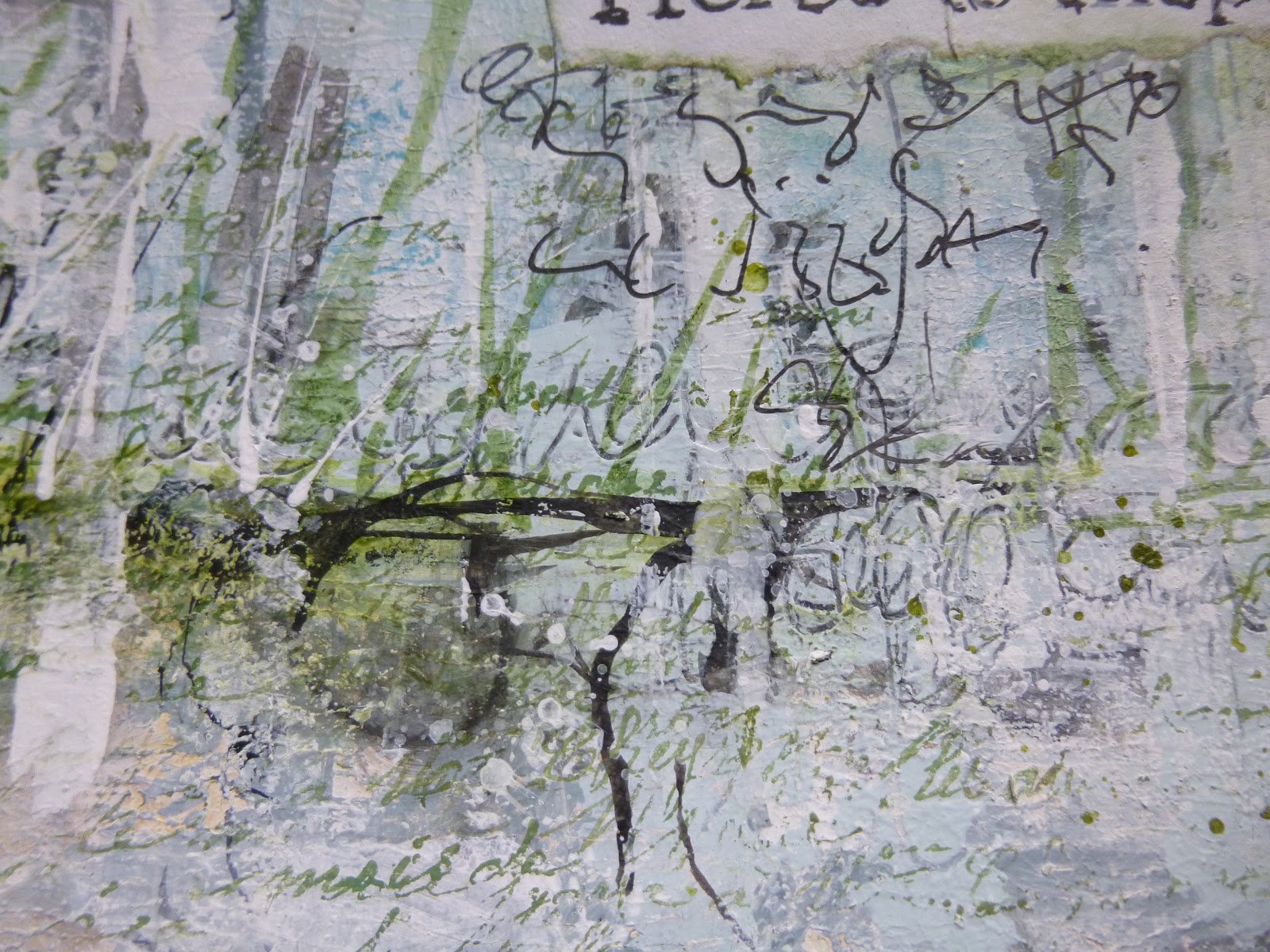
I did a bit of extra shading, some spattering and added the word layers, so let me show you a few close-ups of what's what.
It ought to be a shorter post than some of them have been of late!

The page is done in the large Dylusions journal, so it's 11.5 x 8.25 inches. (The journal is 12 x 9, but that's the cover... the internal pages are a little smaller.)

The paper in the journal is already a lovely heavyweight stock, good for wet media, but I knew I wanted to play with some watercolours, and for those to behave at their best, you really need proper watercolour paper.

The good news is there's something you can use to turn any surface into a happy playground for watercolour paints... watercolour ground. You can get it in various finishes, but it won't come as any surprise to the regulars that I like the rough textured version best.
This is Qor's Cold Press Ground, and it is fabulously gritty and rough, mimicking the surface of a sturdy cold press watercolour paper.

I think you can see what I mean in a couple of these photos - that's what I've tried to capture for you, in any case.

It's not a great surface for the PITT pen I used to sketch out my daisies and leaves, but I really only wanted a very sketchy feel to the drawing, and that's what I got.

In fact, the rough surface forced me to let go of my perfectionist tendencies and just go with the flow.
And flow is what it's all about with watercolour.

Having the right surface or ground is what allows the pigment and water to perform its magic (like this bit of "sunlight" leaking out from the flower petals into the sky...).

You can see where the palette knife missed some parts of the paper how the paint sinks in to the paper, rather than flowing across it, and creates much deeper pigmentation.
Talk about embracing imperfection - this might be my favourite part of the painting!

I didn't want to mess with the finished painting much, but I was feeling the urge to add some words. The Calico Craft Parts Word Element band seemed to fit the bill. It did take quite a bit of courage to add anything to a painting I was fairly happy with.

It's layered over a torn strip of teabag paper (still with some cinnamon chai leaves attached in places I think!). I love that you can still see the stems through the translucent paper.

A last little bit of scrumptious texture and soft flowing pigment (and you can see the additional white spatter too), and that should just about do it for today, I think.
I'm sharing this over at Art Journal Journey, and it should also serve as some additional inspiration for the Beautiful Blooms theme at A Vintage Journey.
Lots of journeying going on... ironic, when we're still in lockdown, but there you go. Virtual journeys will have to do for now. I hope you are all staying safe and well. Have a lovely week, and I'll see you soon.
If I had my life to live over, I'd pick more daisies.
Don Herold
I'd like to share this in the Flowers theme over at Art Journal Journey
I'd also like to join in the fun at Paint Party Friday for the Week 9, Year 10 gathering
The Simon Says Stamp Monday Challenge is looking for Spritz and Splatter - there's plenty of my usual white spatter adding dots of light, and plenty of watery spritzing of the watercolour pigment too