I'm travelling into a new way of working, a new country, a new language, and a new hobby which I'm passionate about. Come with me for some of the journey...

Showing posts with label Frantage. Show all posts

Tuesday, 1 September 2020

September Leaves


Hello all and a very happy September to you.

I thought I'd drop in to share some more of the backlog of tags I've been creating with a newly active mojo here in the Czech Republic (overseeing the final stages of building work before coming back to the UK to pack up my life and ship it over here - all before 31st December... stressed, not much!).

But partly because of my limited travelling stash (fewer decisions to make - just got to go with what I've got), and partly thanks to Speckled Egg (a colour which fired my enthusiasm no end) I've found myself getting really inky at the craft table.

This is one of three backgrounds which all came into being together, but each took a slightly different journey as I worked out what to put onto them.  So here's the first of the three and the other two will tip up soon.


The background is a combination of inks and oxides, smooshed until they made my heart sing.


I stamped the Tim Holtz leaves onto another smooshed background and cut them out, clear-embossing the outlines before adding little sprinkles of Frantage Aged Silver.


I think that gives them a look of sparkling dew or sunlight catching glossy leaf edges.


In between the stamped leaves, I wedged some metal filigree leaves which have also had a coating of the Aged Silver powder.  The gleam is gorgeous without being too in your face.


The stars are also done with the Aged Silver over some stencilled texture paste.


The paste I used was a bit sloppy, so we haven't go the cleanest of finishes on the edges of the stars, but that really doesn't bother me.  I just love the gnarly knobbly texture.


The Quote Chip seemed like the right way to add the words.


I dyed the crinkle ribbons to match for the topping and tied them with some simple twine.  The fine silvery ribbon is cut out of the shoulder of a blouse (one of those ones they put in to keep them on the hanger, but I never use them for that... much better to add them to the craft stash!).


The sparkle is really rather lovely on this.  I don't get blingy very often but just occasionally it's fun!  I shared a little video clip of them on Instagram, but I seem to have deleted it before uploading it here.


I have still got the one of all three tags together though, so I'll make sure to hang on to that until I've posted all three, so you'll get to see the video in the third of the posts (if New Blogger lets me upload it).


Have just had to revert to Legacy yet again in order to get my photos where I want them.  If they don't sort it out before taking Legacy away, it is going to be the end of my blogging I think.  I am so sad, angry, frustrated, depressed about it.

Sorry, didn't mean to end on a down note.  I really hope you all have a wonderful September.  Happy crafting all.

I believe a leaf of grass is no less than the journey-work of the stars.
Walt Whitman


Monday, 18 December 2017

A Guiding Silver Star


Hello all!  The clock is really ticking now... we're almost there - just one week to go.

But happily the deadline for the Funkie Junkie 12 Tags of Christmas is the 29th December, so there's just a bit more wiggle room than there is for decorating, and gifts and food-shopping.

And I'm still merrily making my way through the lovely inspiration tags Linda Coughlin has been serving up.  We're now on to Tag 8, and it's a silvery star of a snowflake.

You may remember me saying on Tag 6 that TH's starry snowflake stamp sometimes confuses me - I can never quite decide whether it's snowflakes or stars.

Well, this tag takes advantage of that slight haziness with a giant starry snowflake all of its own - a wondrous sight!


I love Linda's funky alternative colours on her inspiration Tag 8, but you know me, once I'm in a colour groove I tend to stay there.

I also like having a set of tags at the end of the challenge which work as a collection, with common colour palettes and motifs and echoes from one tag to the next.


So I didn't go with the bold colour combination Linda played with, but followed my heart to this blue and silver and white-gold affair.

Linda's embossed background is a stunner, so I had to stick with it, though I used Stormy Sky and Picket Fence rather than Broken China...


... and then DecoArt Media Fluid Acrylic in Silver and Treasure Gold in Silver to highlight the dry-embossed snowflakes.  Love that icy shimmer.


The large snowflake is layered up with padded tape using the Tim Holtz Layered Snowflake and one of the two smaller snowflakes from the Snowflake Duo.

Both these Bigz dies come with a Texture Fade embossing folder so that you can add all this fabulous texture to your snowflakes.


To highlight that texture, I put on some Silver Treasure Gold (sounds silly, but that's what it's called!) with my fingers, and swept the Versamark ink pad across in places...


... so that I could add some Aged Silver Frantage powder for extra va-va-voom.


I don't have the metallic rub-ons so I had to go another way round to get my metallic words.  I cut mine with a couple of the Handwritten Holiday Words thinlits.


I dabbed them onto the Versamark pad and then went to town with the Aged Silver Frantage again.  I absolutely love the dimensional script you get this way.


They're stuck down across a banner of music paper handcut from the Jingle Christmas pad.  I like to add a touch of music where I can, and I liked the warmer colour tone against the icy snowflake background.


I loved Linda's fabulous antique metal holly leaves so I nabbed that idea too, though mine are again done with the Frantage.


I like it when everything ties together and echoes across the tag.


That's why I also Frantaged the metal snowflake charms.  Once I start, I can't stop!


Having added the statutory white twine, I thought I was done, but I felt something was missing somehow.

Well, all the other tags so far have had some Christmas Clippings on them so, although I already had a Christmas sentiment in place, I decided we needed more words.


And I found the perfect ones - about the guiding silver star, and the wondrous sight, and it wasn't until I was gluing them down (although they're stickers I always add a dab of glue for extra security) that I realised this was a snowflake, not a star...

Ah well, now it's a bit of both!!


Thanks so much for stopping by today, especially at this busy time of year.  I really do appreciate every visit, even when you haven't time to leave a comment.  (Yes, I can see you in my little view-count statistics!)

I hope you all have a wonderful week - though I'll be back well before it's over, so I'll hope to see you again soon, either here or elsewhere in Craftyblogland.

Snow was falling,
so much like stars
filling the dark trees
that one could easily imagine
its reason for being was nothing more
than prettiness.
Mary Oliver


I'd like to share this as my Tag 8 in the Funkie Junkie's 12 Tags of Christmas, sponsored by the Funkie Junkie Boutique

Monday, 13 June 2016

Travelling the World with Simon Says Stamp

Hello all (for the second time today, and after the quietest week on Words and Pictures since I started the whole shebang four years ago)!  If you didn't catch me at Destination Inspiration over at A Vintage Journey, I'd love you to stop by (it's pink, if that's any temptation!), but right now I'm delighted to be back In the Spotlight at the Simon Says Stamp Monday Challenge this month.


It's a thrill to be their Guest Designer for the month of June, playing alongside the fantastic team there.  And the theme for this week is World Traveller, which is pretty apt for me this year!  I've just been able to fit this guest spot in between work trips - it's a bit of a squeeze but I couldn't bear to turn it down!


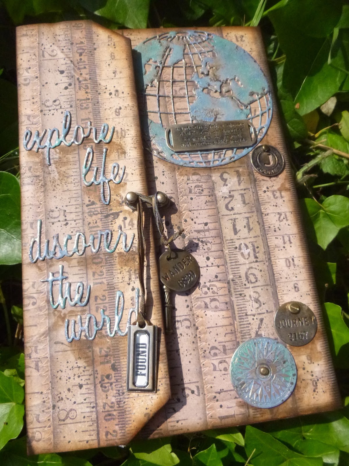
So here's what I came up with for my World Traveller.  It's a document case and journal all in one... securely fastened on the outside...


... but opening up to reveal a sketchbook of journalling pages with a large pocket at the back to keep important documents or collected ephemera in.


I'm afraid this is the second photo-heavy post of the day.  My World Traveller has already been to many places and she has tales to tell, so this is one of my War and Peace-length affairs... or should that be À la Recherche du Temps Perdu?!


So what's lurking underneath this glamorous travel folder?  A simple piece of Amazon packaging...


I covered the outside with these fabulous vintage rulers from the Tim Holtz Dapper Paper Stash, inking the edges with Vintage Photo and then Ground Espresso for a weathered look.


I'd been coveting the gorgeous Globe Thinlits die for some time, so this seemed like the perfect excuse to indulge.

It's cut from plain card which I then embossed with Frantage Aged Silver.  


I added Distress Paint in Stormy Sky and Evergreen Bough, spritzed with water to blend, and heated it to cause a texture reaction with the embossing enamel beneath.

A touch of highlighting with some White Fire Treasure Gold brings that texture to the fore.


I also used the Treasure Gold on my metal embellishments.  (They all started out in the nickel silver finish.)


The Quote Band, Muse Token and Philosophy Tags had a simple touch of the White Fire gilding wax with a little fingertip full of Quinacridone Gold...

... whereas the Compass Coin got Treasure Gold plus the Distress Paints layered in.


The words, cut with the Adventure Words Script Thinlits, have had the same treatment as the globe.


They shimmer nicely in the sunlight (when it deigns to put in an appearance!).


Hitch Fasteners provide the simple closure, with dyed crinkle ribbon wrapped round to keep the wallet closed...


... weighted down with some more Idea-ology bits and bobs (including a Tag Label), plus a key to lock away anything particularly precious.  (Click the photos for a larger view if you would like one.)


Time to open up...

The construction of the inside was slightly more complicated as I wanted to add my journalling pages.  To create those pages I tore some sheets of 9x12 watercolour paper in half and distressed the edges.  (These Canson papers are very similar to what I used.)


I stamped the Tim Holtz Cityscapes in Sepia Archival, front and back.  There are five pages, so one for each city in the set - luck, not judgement!


I used my favourite inky smooshing to add some ageing to them.  I think it was just Pumice Stone DI on the mat.  Then I inked around the shabby edges with Vintage Photo.


You'll see in the finished pages that I also added some shading with Stormy Sky Distress Stain and a water brush, taking the soft blue from the cover through into the inside of the wallet.


You can also see that one side of the paper is much more textured than the other, creating lovely inky variations.


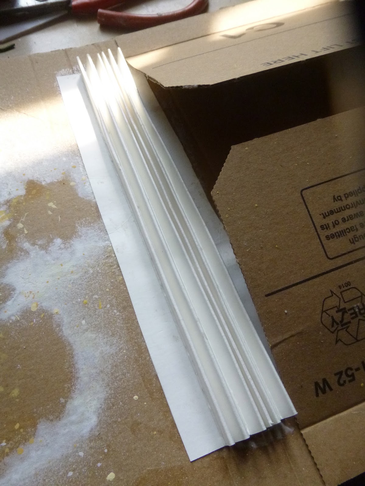
I needed a way to bind the pages into the wallet, so I scored and folded some stiff card to create my binding and glued it firmly into the fold of the packaging.

You can see the great pocket flaps at the back here, and that I'd already been using the packaging to spritz the flowers from last week's Summer Garden.


Then I simply put a thin line of glue down in the depths of each crease and pressed the pages into place, giving them some support as the glue dried!


I covered most of the interior background with the lovely U.S. states map from the Correspondence Paper Stash, all apart from the pocket flaps at the back.


There's not much of the paper left visible as, unlike me, my glamorous world traveller is sorting out her photos and ephemera as she goes (rather than leaving it all until months - or sometimes years - afterwards and trusting that she'll remember what's what and from where).


She's got some of her favourite photos scattered around, in the midst of deciding which ones to stick down onto the journalling pages.


They're from the Found Relatives Occasions pack, as you probably already know.  I've tried to choose ones which have that summer holiday happiness about them.


This one's my own favourite.  There's something so perfect about how it captures the golden age of travel, when it was still an unusual, romantic, glamorous thing to do (hmm, and only for the wealthy of course - so perhaps not that golden).


Around the photos and ephemera I added those colours again - the Stormy Sky and Evergreen Bough - first in watery Distress Paint and then the same colour Distress Stains layered over the top.


I like how it echoes the look of sea/land on a map, and again we're bringing the blue-green tones into the interior of the wallet.


She's started sorting out which bits of ephemera - tickets, leaflets and snapshots - belong to each visit, and is clipping them to each page as reminders for when she comes to write her experiences down later.


I'm imagining she's done the little sketches of each city at the foot of the pages herself, by the way.

The ephemera are mainly from the Expedition Ephemera Packs, either plain or vellum.


The gathered elements are attached with Idea-ology Mini Paper Clips...


... or with Hinge Clips.  Since it's on the New York page, I'm pretending that's the Coney Island Ferris Wheel (I know it's not)...


... and still in the States over the page, I was very pleased that the Minnesota Avenue ticket matches up with an advertisement for trips to Minnesota and Michigan on the leaflet (from my beloved Pocket Cards) underneath - small things please me!


From New York to London, and thence onwards.

You'll notice that her relatives in England, despite having come to see her off on the next leg of her voyage, are very disapproving of this young woman gallivanting off around the world on her own.


Yes, she's headed right around the world.  And the sea voyage to Australia is still a long and arduous one - about six weeks at sea - usually attempted mainly by families looking for a new life in the 1950s post-war migration...


... or by hardy groups of men, keen to make their mark in a continent still relatively unexplored.  A woman alone is unusual to say the least.


But our adventuress is full of courage and curiosity (as well as being wealthy), and she's not going to let society's conventional expectations stand in her way.


(I'm simply ignoring the fact that lots of the city landmarks in the sketches wouldn't have been there for my 1950s world traveller.  I hope you will too!)


Besides, she feels safe and well-prepared.  At the back of her travel wallet is a sturdy security pocket, allowing her to carry documents, travel tickets and visas with safety.


There are some more of those lovely wooden rulers, and some fabulous travel luggage advertisements which she may need to study if she's to have room for all the souvenirs she's been buying en route.


There's a simple clasp to keep it secure, and more Adventure Words to sum up the whole idea of her journey.


And I'm pretty sure she's enjoying it all from beginning to end!


So that's my recycled packaging project for you.  Apologies for the mammoth post, but there's not much else going on this week at Words and Pictures (aside from the small matter of a blogaversary!), so I hope it'll keep you going for a while.

I hope it's inspired you to come and play along with the World Traveller theme this week.


https://simonsaysstamp.com/

There's lots more inspiration from the amazing Simon Design Team over at the blog and, as always, there's that generous $50 voucher to be won, so happy travels all!

The traveller sees what he sees.  The tourist sees what he has come to see.
G.K. Chesterton

I am not the same, having seen the moon shine on the other side of the world.
Mary Anne Radmacher

It's a whole journal rather than one set of journalling pages, but I'd like to link up at Art Journal Journey where they are playing with Maps this month.