I'm travelling into a new way of working, a new country, a new language, and a new hobby which I'm passionate about. Come with me for some of the journey...

Monday, 18 May 2015

Extraordinary Things


Hello all!  Thank you so much for the lovely feedback on the Dollshouse Book - I'm glad you enjoyed it as much as I loved making it.

I'm here today with my take on Tim Holtz's delicious May tag... another wealth of inspiration from the master, and quite a lot of improvising in my version!

I don't have the burlap sheets, but I do have plenty of burlap, and as I was fishing it out of the fabric box I found some cream coloured pieces which I rather fancied playing with.

After I'd glued it to some card and cut the tag, I then gave it a rough coat of gesso to make it even paler, and that led me to this rather delicately toned vintage piece.


I gathered paper offcuts as well as bits of ephemera, including some pieces of vellum, to layer into the design, and then started sorting through the Photobooth characters to see who wanted to come out to play.

It was love at first sight when I saw this woman - and she started to tell me her story almost straight away...


Though she's been overlooked amongst the debutantes of her first season, those glasses hide a first class mind.  She hadn't even considered a university education - not really the thing for girls, don't you know?


But a friend of her uncle's, seated next to her at a dinner party by chance, quickly spotted her potential and invited her to come and take a test down at a place in the country where he was working - a country house, Bletchley Park.


Since passing with flying colours, she's been working night and day on the top secret code-breaking project which will eventually contribute significantly to the defeat of the Nazis in World War II.


Though the decoding work is obviously the main concern (scribbled handwritten notes in a moment of inspiration have to be typed up into reports to be shared), she has suddenly found that it is, after all, easy to speak to men...

... when you have a common interest of importance about which to talk, of course.  Tedious small talk is a thing of the past.


And from being left on the sidelines at dances and at parties, she's now sought out by her male colleagues who admire her mind, her wit and not least her beauty, now that they've taken the time to look at her more than once.

These are only a few of the flowers she's now accustomed to receiving.  (Pre-made, I'm afraid... flower-making is something that only happens occasionally around here.)


So, this former wallflower is blossoming, finding stimulation and fulfilment in her work, and laughter and love with her colleagues.  You could even say she's becoming something of a social butterfly!


No wonder there's a gentle blush in her cheeks, echoing the soft pink tints of her clothes (very delicately done with Tattered Rose and Victorian Velvet).  And is that a hint of lipstick she's taken to wearing?  Or perhaps it's the bruising of a passionate kiss...


I can only hope that she will find somewhere to deploy her considerable talents and intellect once the war is over... or that if she marries one of these intelligent young men, they won't suddenly expect her to become "the little woman" at home.

I'd hate to see her dwindle again, having come into her own with such grace.  The butterfly should never have to turn back into a caterpillar.


In the meantime, let's leave her doing extraordinary things, and finding her way to being anything but ordinary.


Thank you so much, Tim, for the inspiration which tickled this young woman into existence - I'm so glad I got to meet her.  And thanks to all of you for stopping by.  It's always a joy to hear your thoughts... it makes this whole journey come alive.

I'd like to enter this as my May tag in Tim Holtz's 12 Tags of 2015.

Live a life less ordinary.
Benedict Cumberbatch

In the Autumn of 1943, the Government called up all girls aged 17½ ... to work in munitions or hospitals, the Women’s Services being at that time closed for recruitment. It was with some trepidation that I went for my interview at the Labour Exchange ... fortunately I had a Credit in Maths on my School Certificate, and the official thought I should go for an interview at the Foreign Office. Within a month I was on my way to Bletchley Park. My first impression was a lecture on the utmost secrecy the work entailed, and a signing of the Official Secrets Act.
Hilary Pownall (nee Law) Hut 8, Block D

Friday, 15 May 2015

Dollshouse Book


Hello all... No, it's not a miniature book, but rather an altered album which will be the new Visitors' Book in Cestina's dollshouse museum, Small Worlds.

She's just set off back to the Czech Republic to open the museum for the summer season, so I had to make good on my Christmas "voucher" to provide the album before she left.

(If you've no idea what I'm talking about, check out Cestina's Dollshouses for the full story of my mother's dollshouse museum, and/or some of my miniatures posts here, here or here.)

And what else could one possibly have as the Visitors' Book for a dollshouse museum but a house?!

(Just to warn you, you might want a cup of coffee on hand for this one!)


I used some of the techniques learned from Andy Skinner on one of his fantastic workshops to alter a Prima Chipboard Dollshouse Album (I see they think of it as a dollshouse, not just a house... probably what set me off!), creating texture and rust effects galore.

I even added some of my own roof tiles for an extra bit of fun (they're not part of the kit).


Let me show you pictures of some of the stages.

The textures are built up with layers of embossed card, stencilling and DecoArt Mixed Media line paints.


There are lots of great techniques and products involved - drybrushing, paint layers and Texture Sand Paste all play a huge role.


For full details, I can't recommend Andy's workshops highly enough, and there are his online courses (find all the details on Andy's website) as well as videos of Andy demonstrating at CHA where you can get the lowdown from the man himself.


The colour scheme was pretty much dictated by the decor of Small Worlds itself.  If you've seen the photos of the museum (there are some good ones here), you'll know the shelves are all painted in a soft green which sets off the houses really beautifully.


So I went for the greens for this - mixing in a touch of my favourite teals and turquoises as I went.  These are the colours in play, mixed and shaded directly onto the walls and tiles as I went.


For the roof tiles, I followed my own lead.  When I was working on the Tudor Tavern last year, I created terra cotta tiles for my fire places using the Tim Holtz Lattice Frameworks die, some textured sand paste and layers of paint.


I did much the same for these tiles, but instead of conventional terra cotta tiles, I decided to have them tone in with the rest of the greens.  I gave the sand-pasted tiles a touch of black gesso to add extra depth and then set to with my colours.


It took some time to get them positioned to the best effect, but I love the finished look!


The various rust effects are created in different ways...


... some with the DecoArt Mixed Media misters, including the door and the window frames...


... some with layers of the Mixed Media Fluid Acrylics, around the edges of the walls.


In places there's Texture Sand Paste for extra rusty texture...


... including on the door, and the door knob...


... and just look at the damage done by water leaking down from the roof tiles!


The ingredient I can't be without is the Quinacridone Gold Fluid Acrylic, which is absolutely magical!


The windows are lined with tea/coffee stained book pages - we've gone way beyond a "naturalistic" look by now!


On the back of the house, I used Tim Holtz's Bricks stencil with some more of the sand paste to create my brickwork.

Again, I could have gone with standard brick colours (and you can bet there'll be a dollshouse to be done like this at some point in the future - Tim's bricks are exactly the right size for 12th scale work, and the stencil is designed so that you can repeat the pattern and get the right half-brick/whole-brick matching together)...


... but I decided to stick with the Small Worlds colour palette and lots of lovely blue-green shades.


And of course the rusted layers around the edges... eating in to the brickwork a little further where there are holes for the decay to gather around!


As well as the DecoArt colours, there's also a strong showing for Tinned Peas Fresco paint, as that's pretty close to the Small Worlds shelf colour.  I used that as the main colour, with a touch of Phthalo Turquoise mixed in to paint the interior walls of the house.


I stamped the peeled paint stamp from Andy Skinner's Industrial set in French Ultramarine Archival ink, so that you have a distressed look on the inside too.


The Dollshouse Album comes with pre-cut pages, some plain, some kraft and some with faint text on.


I think visitors will be able to write over the text, as long as there's a good enough pen around, or of course you could just snap open the book rings and replace those pages with plain paper.


Rather than let the shiny silver book rings spoil the overall effect, I altered them with some black gesso and alcohol inks so that they would fit the weathered feel.


The main thing is that Cestina (or one of her many willing assistants) will be able to cut fresh pages to refill the album, so that the Visitors Book can be never-ending, which will be just as well if the visitor numbers continue to go up year on year.


I love that it looks like a little faerie house in the woods...

... and I love the gleam of the "rust" in the sunlight, even though the whole thing has had a coat of the DecoArt Ultra Matte varnish to protect it in the busy times ahead.

So there's my (small) contribution to Small Worlds for this year.  Work means I'm not going to be able to get over there to do any substantial dollshouse renovations this time around, though I hope to visit for at least a few days at some point.

I am still hoping I might manage some inhabitants for the Tudor Tavern, including some strolling players - I have all the makings for those here in the UK, but I'm not sure whether time is going to be on my side!

The ornament of a house is the friends who frequent it.
Ralph Waldo Emerson


I would like to enter this in the following:
At Mixed Media World they're playing a Vintage theme, including anything "rusty, crackled and weathered" so I hope this will qualify
Love To Create are playing Anything Creative/Mixed Media/Anything Goes - me too!
The Inspiration Journal is inviting us to Get Pasted - with the embossing paste stencilling on the back as well as used for texture on the tiles and the rust, this should fit the bill.
In the Creative Gym at the Mixed Media Place they are playing with The Power of One - I have one stencil (the bricks), one stamp (the crackle) and one colour (greens).

Thursday, 14 May 2015

Giveaway Winner - at last!

Hello all!  My apologies for the delay in picking a winner for my Ally Pally PaperArtsy Giveaway.  As you'll know from my absence here and elsewhere in Craftyblogland, I've been somewhat distracted lately.  But today I finally got around to putting all the names in a hat (bowl) and picking out a winner, and that winner is...


Rachel, if you drop me a line with your address via the Get In Touch gadget in the sidebar, I'll get the tags off to you as soon as I can.  (Hopefully without the same kind of delay as it took to draw the thing!)


Many thanks to all of you who took part - I'm only sorry you couldn't all win.  But my blogaversary is just around the corner so watch out for another Giveaway in a few weeks.  (That one is likely to include one of my Calico flower cards and some of the bark used on them, so keep your eyes peeled.)

No-one has ever become poor by giving.
Anne Frank


Monday, 11 May 2015

Wildflower Calico Cards


Hello all!  I'm sorry it's been so quiet around here lately (more than a week without posting - unheard of!)... and I know I haven't even drawn my Giveaway Winner yet - soon, soon, I promise!

Life's been a little distracting, but I've got a gentle week coming up so I'm hoping to get back to the craft table as well as to a little bit of visiting around Craftyblogland.

For now though, I'm offering up a sneak peek which I hope will tempt you over to the all new Calico Craft Parts blog.  Yes, as well as the lovely new designs available from Calico Craft Parts, the Design Team are all back together and the inspiration is flowing at the new blog - so do hop over and check out the projects appearing there.

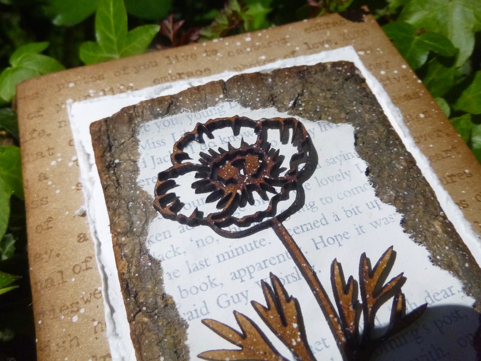
I've got a trio of floral cards for you today.  Yes, I know... cards.  That really doesn't happen very often, so make the most of it!

I hope you'll have time to pop over and take a look, and I'll be around and about again very soon.


May your life be like a wildflower growing freely in the beauty and joy of each day.
Native American Proverb

If they don't mind hopping over to see them, I'd love to enter this in Mixed Media Monthly's challenge May Flowers - how could anybody not be inspired by the flowers of May?!

Friday, 1 May 2015

Spring Tim(e) Colours!


Hello all!  It's time for a new challenge on A Vintage Journey, and the amazing Astrid would like to see as many Spring Colours as possible.

Remember we are a Tim Holtz-inspired challenge so although you don't have to use his products, we would like to hear from you how he has inspired your project - whether that's through ideas, techniques or (of course) products too.

As always, my fantastic team-mates have created some inspirational projects - do hop over and check them out, along with the challenge details and our Travelling Instructions - and here's my offering for you this month.

It's another of those ones that started in one direction and ended up somewhere else, but probably all the better for the discarded layers underneath!


It's a 7x5 canvas, and I started out spritzing it with my favourite spring colours - the vivid green of new leaf growth and the fresh blue of the sky.  Over that, I embossed the Papillon text in Seafoam White and added more powder around the edges for a distressed look...

And then I gesso'd over the whole lot and started again.  I don't know - I just wasn't feeling it!


Instead, I applied texture paste through the wonderful Blossom stencil (my other favourite thing about spring is blossom).  You can see colour is seeping through from underneath... no problem, it's not like I dislike those colours!


I spritzed that with various Distress Sprays - Cracked Pistachio, Broken China, Mermaid Lagoon Squeezed Lemonade (for some sunshine)... others too, I'm sure.


I sprayed the same colours onto some paper and cut that with the Birds in Flight Decorative Strip Die.


They're stamped with Tim's Tiny Words stamps.  Now they can soar and sing amid the treetops.


There's lots of shading around the birds, done using a combination of Distress Markers, pastel pencils, Inktense pencils and even the odd Copic Marker.


And I also added shadings of Fresco paints to the textured blossoms in the background.  There's some Zesty Zing in there, and probably some South Pacific and Southern Skies.

I was really enjoying the blues and greens, but the whole thing needed some paler highlights and some more of the dappled spring sunlight that I love.


On the way in to work I was looking out of the train window and admiring the glorious tree blossoms in all the gardens.  White is my favourite, so the next time I was at the craft table I decided to add some white accents.


The little wooden hearts have had a coat of white paint and then a couple of coats of UTEE.


That gives them not only a glossy reflective surface, throwing light around, but also a touch of domed dimension.


The WordBand has Distress Paint tinting the lettering, and then a coat of Glossy Accents so that it can catch the sunlight too.


It's attached with a large crinkle ribbon bow - a touch of extravagance to mark the excitement of new spring growth.


Obviously there had to be plenty of spatter...


And all of this also "falls" over the sides of the canvas too, of course.

So there you have my Spring Colours canvas.


Do hop over to A Vintage Journey to see what my lovely team-mates have been creating, and we hope you'll be inspired to play along with us this month.


Remember there's a prize voucher from our generous sponsor Country View Crafts, and you might be one of our Pinworthies at the end of the month.  Can't wait to see your Spring Colours!

The month of May was come, when every lusty heart beginneth to blossom, and to bring forth fruit.
Thomas Malory

This is the last day to add your name to the hat on my GIVEAWAY - hurry, hurry, hurry!  I'll include all comments left before 23.59 1st May UK time (my blog is an hour ahead of that, as it runs on European time, so don't panic if your comment seems to be an hour late - I'll take that into account!).