I'm travelling into a new way of working, a new country, a new language, and a new hobby which I'm passionate about. Come with me for some of the journey...

Monday, 23 March 2020

Even tinier houses!


Hello all!  Since we're all pretty much confined to quarters at the moment, I've got a post celebrating our houses and homes.

I shared some tiny houses at the start of the month (officially so - the die used to create my Useful or Beautiful houses is called "Tiny Houses"), but compared to these, those were actually pretty big.  Today's houses are really teeny tiny ones, located on a quartet of ATCs.

There were quite a few prompts behind this creation... first the fact that we're all spending much more time at home just now; then there's the Little Things theme at the Funkie Junkie Boutique Blog coupled with a Home Sweet Home theme at Try It on Tuesday; it was also Mothering Sunday, so this quartet of houses was destined for dollshouse-loving Cestina; and finally, it was another chance to get out my new PaperArtsy House & Home quotes and play.


And in fact they started by themselves, before I'd even thought about them... these were the mop-up/overflow tags for my It's Patina Time tag. 


Every bit of leftover smooshing ink or Oxide made its way onto these tags, either smooshed or splattered.


I thought I'd play along at the FJB by cutting my two tags into four ATCs.


They weren't quite big enough to make the full 3.5 x 2.5 inch sizing, so I cut up a cardboard box to make proper ATC-sized mounts for them.


I didn't want the trimmings to go to waste (they could have been wider than 2.5, but weren't tall enough for 3.5 - that's why there are trimmings for anyone worried about the maths!) so I played about with adding them to the composition.
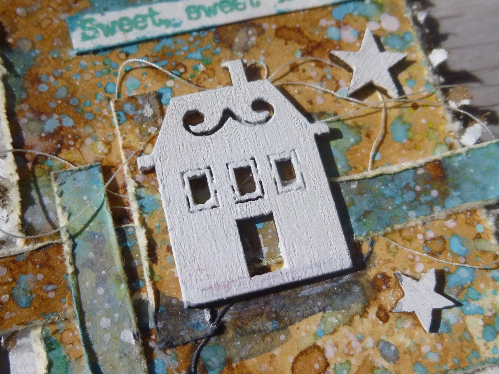


This was the point at which the idea to use the little houses popped into my head.


They're from one of those cheap woodcut sets you can sometimes pick up at places like The Range, and I'd bought them ages ago.


Thankfully, I was able to lay hands on them amidst the chaos of my hoarded craft supplies.


They've had a couple of coats of Snowflake Fresco paint, and they're grounded onto the background with a wash of Payne's Grey.


Each of the quotes comes from PaperArtsy EAB15 House & Home, from the most recent launch of my word stamps.


They're stamped in Garden Patina Archival Ink, which tones in nicely with the verdigris blotches in the background.


In fact, it seems to have colour variation built in to the pad - sometimes it's slightly bluer, sometimes slightly greener as you stamp.


I've not noticed that about it before, so maybe mine's just "gone off".  If so, I'm delighted - I love the slight shifts in shade.


I liked the simple wooden houses, but the ATCs needed a little something extra.  Time for another rummage through the stash...


These wooden stars seemed just right to provide a touch more detail and another white accent.


Well, they were white once they'd also had some Snowflake paint added to them, at least.


I ended up whitewashing the rugged corrugated cardboard in the background too - and roughing it up some more with my scissor blades for a nice distressed look.


I also did some scraping of the edges of all the tag pieces to give them some more texture.


That was fine on the larger background panels, but more than a little tricky when it came to the tiny decorative strips.  My thumbs have lost their top layer of skin from getting scraped!


Worth it though, I think.  You get a light framing colour from the manila tag fibres as well as that extra texture, which draws the eye to them more effectively.


Some twisted tangled thread adds more movement as well as a nice touch of random squiggliness to contrast with all the right angles and straight lines.


And of course there's been some spattering with leftover Snowflake white paint as I went along.  So there you have it.  I hope you like this quartet of ATCs, and I hope you enjoy the added spring sunlight... 


It's lovely to have the sun to cheer us through these tricky times.  I hope you'll have some bright sunshine at some point if you haven't got any yet.  We're all going to need every ounce of things-to-be-happy-about as the virus progresses.  Take care of yourselves and happy crafting all.

It's the little details that are vital.  Little things make big things happen.
John Wooden

It has long been an axiom of mine that the little things are infinitely the most important.
Sir Arthur Conan Doyle

I'd like to add these ATCS to the collection of Little Things at the Funkie Junkie Boutique Blog
At Try It On Tuesday the challenge theme is Home Sweet Home/Where Would You Like To Live

Thursday, 19 March 2020

It's Patina Time!


Hello all!  I hope you are staying safe and well wherever you are. 

I'm so glad you enjoyed some spring sunlight on my Spring Greens pages with me.  There will be some more springtime creating along soon, I've no doubt. 

But I'm in a different mode today with this textural tag full of crackle and weathered patina effects.

I'll try to keep the words to a minimum, though there will as usual be plenty of pictures.

I was originally thinking of creating more of a partner piece to the Full of Bright Hopes tag, with maybe a Paper Doll or two involved.


I hadn't intended to go down this metal-heavy, patina'd look... but some already patina'd metal embellishments hanging around on the craft desk had other ideas!


The Simon Says Stamp Monday Challenge is inviting us to indulge in some Stencil Fun, which gave me an excellent excuse to try out this glorious new Prima Gothic font stencil.


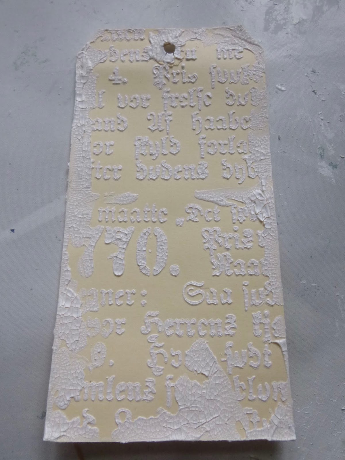
I thought it would be fun to apply some crackle paste through it - this is the Ranger Opaque version - because I always have fun with crackle!


I added some random smears around the edges with the palette knife.


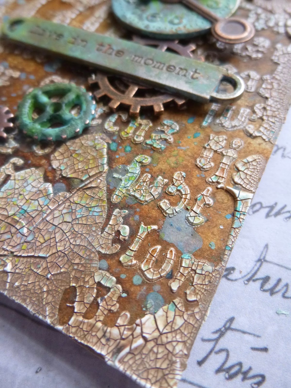
Once it was all nice and dry and cracked, I gave it some spritzes of Distress Spray - Vintage Photo and Rusty Hinge mainly, with a touch of Pumice Stone somewhere under there.


For contrast, I flicked and smooshed some Distress Oxides - Broken China, Peacock Feathers and Cracked Pistachio at this point.

Then, of course, I needed to figure out what to put over the top of it all.


This clock was one I used to experiment with the wonderful VerDay patina paints when I first got them about five years ago. 
I'm not sure whether it ever made its way on to a project which later got dismantled or whether it's never made an appearance at all... 


... but it's been sitting in my bits and bobs bowl on my craft table forever.

When I reached for it and put it against the crackled font, I knew I was on to something.


The large cog was in the bits and bobs bowl, patina-ready - I think done with Fresco paints way back when.  Again, I'm not sure whether it came off a dismantled early project or whether it just never got used.


I did do some present-day patina altering of a couple of other cogs, and added splotches of the same new colours to the already-done ones to make sure everything toned in nicely. 

 Mostly I used Distress Paints.


Broken China, Evergreen Bough, Peacock Feathers and Twisted Citron all played a part.

Some stayed unaltered to match the background.


I also created some extra spatter with those colours onto the background to keep everything nice and harmonious.


The Word Band got the same Distress Paint treatment, and the final touch with all the embellishments was to sand back a bit in places to reveal the gleam of metal again.


I found a great way to use up the leftover smooshes of paint on the craft mat... I rolled this bit of chain in them so that it would end up with a nice weathered patina too, ready to take its place at the top of the tag.


The whole thing is mounted on some thick scrap cardboard for extra sturdiness to bear the weight of all that distressed metal...


... as well as all that chunky crackle!

So that's your lot.  I hope you like it.  I certainly had lots of fun making it.


There's endless delight for me in creating weathered, crackled, distressed, aged and antiqued effects.  The quote at the foot of the post today is probably a decent crack at trying to understand why they appeal to me so much.


And it's nice to have some bolder colour in action for a change too.  Thanks so much for stopping by today.  I'll be round for some (non-infectious) visiting soon, and I'm looking forward to seeing what you've been up to.  Take care, stay safe, and virtual hugs to all.

Monuments are anchors in time. Epochs pass, weather erodes, people lose interest. This cannot be helped. But patina itself is worth appreciating. Patina is the value that age puts on an object. It’s what makes an antique antique. It is experience, maturity, the soft sheen of time. Patina wasn’t present at the spanking-new creation. It comes from a life lived.
John Yemma

I'd like to play along with the Stencil Fun over at the Simon Says Stamp Monday Challenge
At the More Mixed Media Challenge it's still Anything Goes with an Optional Twist of Green

Saturday, 14 March 2020

Spring Greens

Hello all!  I hope you're enjoying some spring time weather (if you're in the northern hemisphere, of course... otherwise perhaps you're enjoying some cooler days after the summer heat).  Even if you haven't got actual spring, I've got some fresh spring greens and vivid light to share with you today in one of my art journals.  (It's one of those long posts about the twists and turns in the creative process, so make sure you have a refreshing beverage to hand.)


It's doubtful whether I'll ever actually complete a whole journal, since I have so many of different sizes, shapes and papers on the go at once, but this Dina Wakley Media Journal is starting to look pleasurably bulky, even though there's still a way to go before it's even half full.


This page was definitely triggered by the Green theme over at Art Journal Journey this month.  And there are a couple of other green-tinged challenges around at the moment, so it will fit in nicely with those too.


But mostly I was inspired by that breath of spring in the air that has been doing its best to break in despite the winds and rain.  Every now and then, one of those fresh spring mornings dawns clear and bright and blue-skied, and the air feels softer on the skin as you step outside.


The birds are full of song, and the trees have those vivid light green leaves and buds so particular to this time of year.  Spring flowers brighten garden beds, hedgerows and roundabouts, their delicate heads bobbing in the (still pretty stiff) breezes.


It's a magical time of year, and I hope some of that feeling has rubbed off on my art journalling spread.


I started with some Idea-ology tissue paper, torn and glued in place on the side I planned to use.


I then gesso'd over it all to soften the look.  As I was adding the white, some of it got on the facing page of burlap so I deliberately added more gesso to that scrumptious texture, thinking that it would be a good start for whatever eventually happened on that page.


Almost before I knew what I was doing, I'd torn some more of the tissue, glued it down and gesso'd that too.  Seems like we're doing a double-page spread after all!


Next step, stencilling...  And since this was happening quite early on, I wanted to make sure it would stay put as much as possible, so I used Archival inks in Olive and in Leaf.


I blended them on, alternating them to get the shifting tones of green, as though sunlight is dappling the leaves.

They make me very happy, just as dappled sunlit leaves do in real life!


It took a while to work out what I wanted to add next.  But after discarding a couple of half-made tags which I'd thought might work (they just didn't make me happy)...


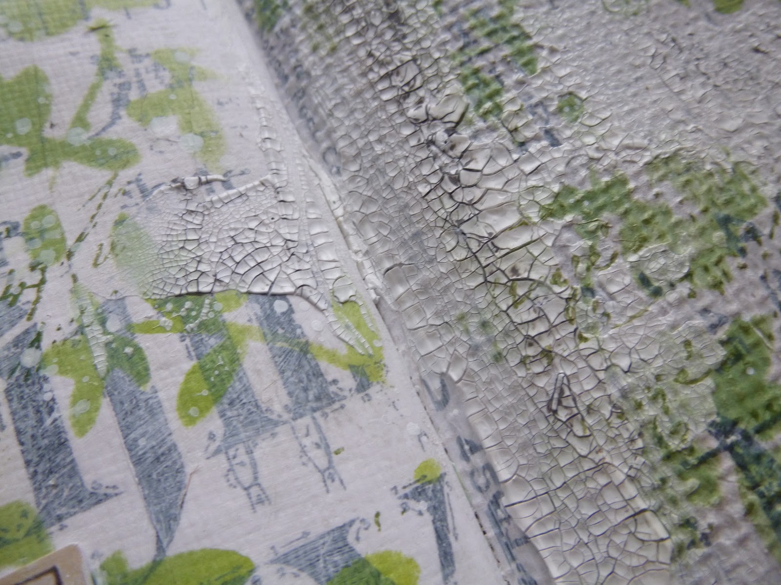
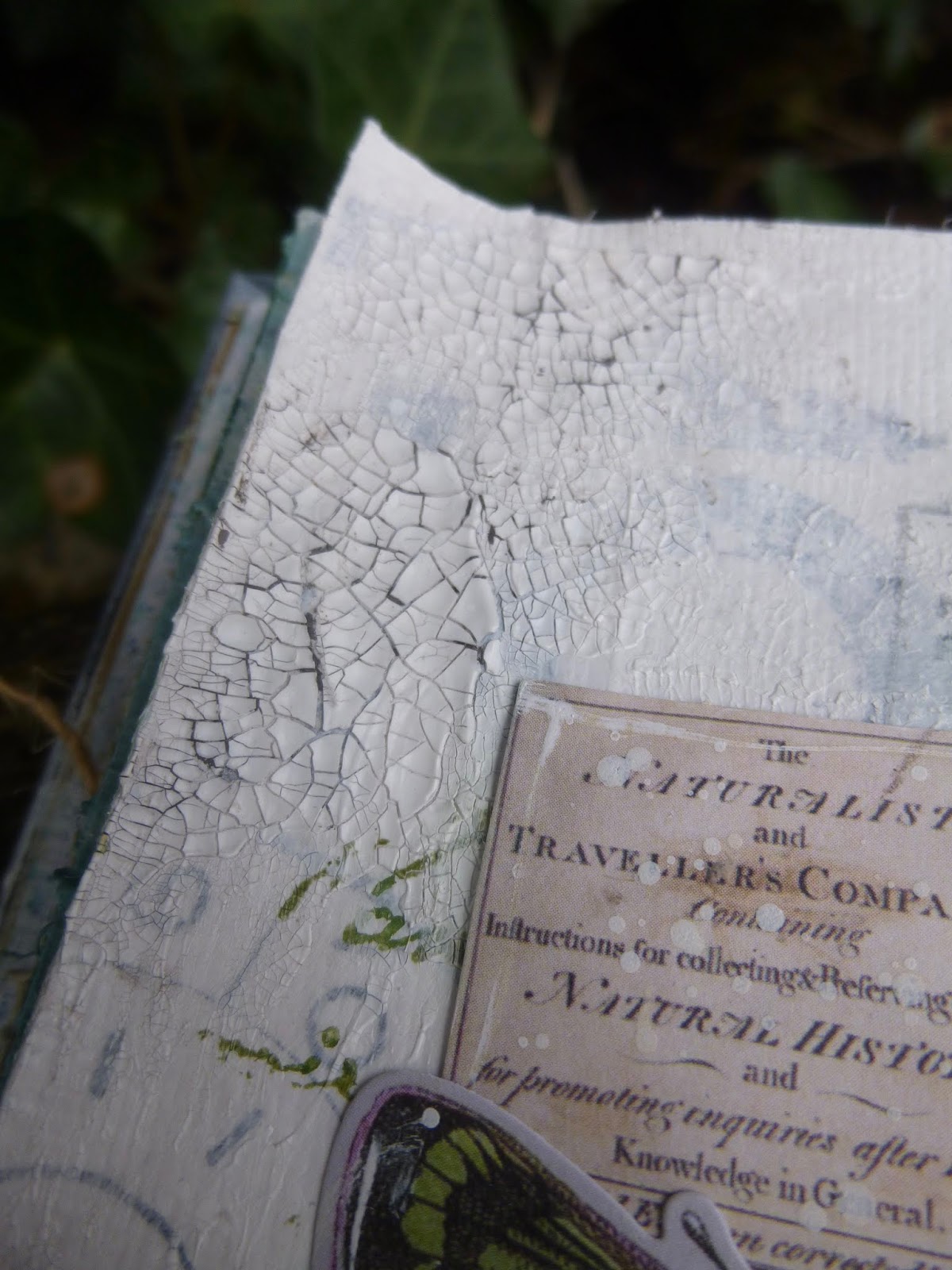
... I decided I couldn't go wrong with adding some crackle texture while I was debating.  You can see the before and after on either side here.


It was a happy accident which led me to this glorious photo of the tiny spring seedlings sprouting up through some moss.  It was tucked in a pile of scraps and tags on my craft table.


I think it may have come from a Neal's Yard Remedies catalogue, or possibly a Woodland Trust magazine.  Either way, it was love at first sight.  I don't work with photos much (other than people - Photobooth pictures or Paper Dolls), but this one I snipped out and put aside for future use. 

It came to the surface at just the right moment... springtime serendipity.


I was still faffing over the idea of using my springtime tags as background layers.  Pure chance, but the colours worked brilliantly with the photo... but in the end I followed my gut instinct which wanted an altogether lighter, less blocky look.


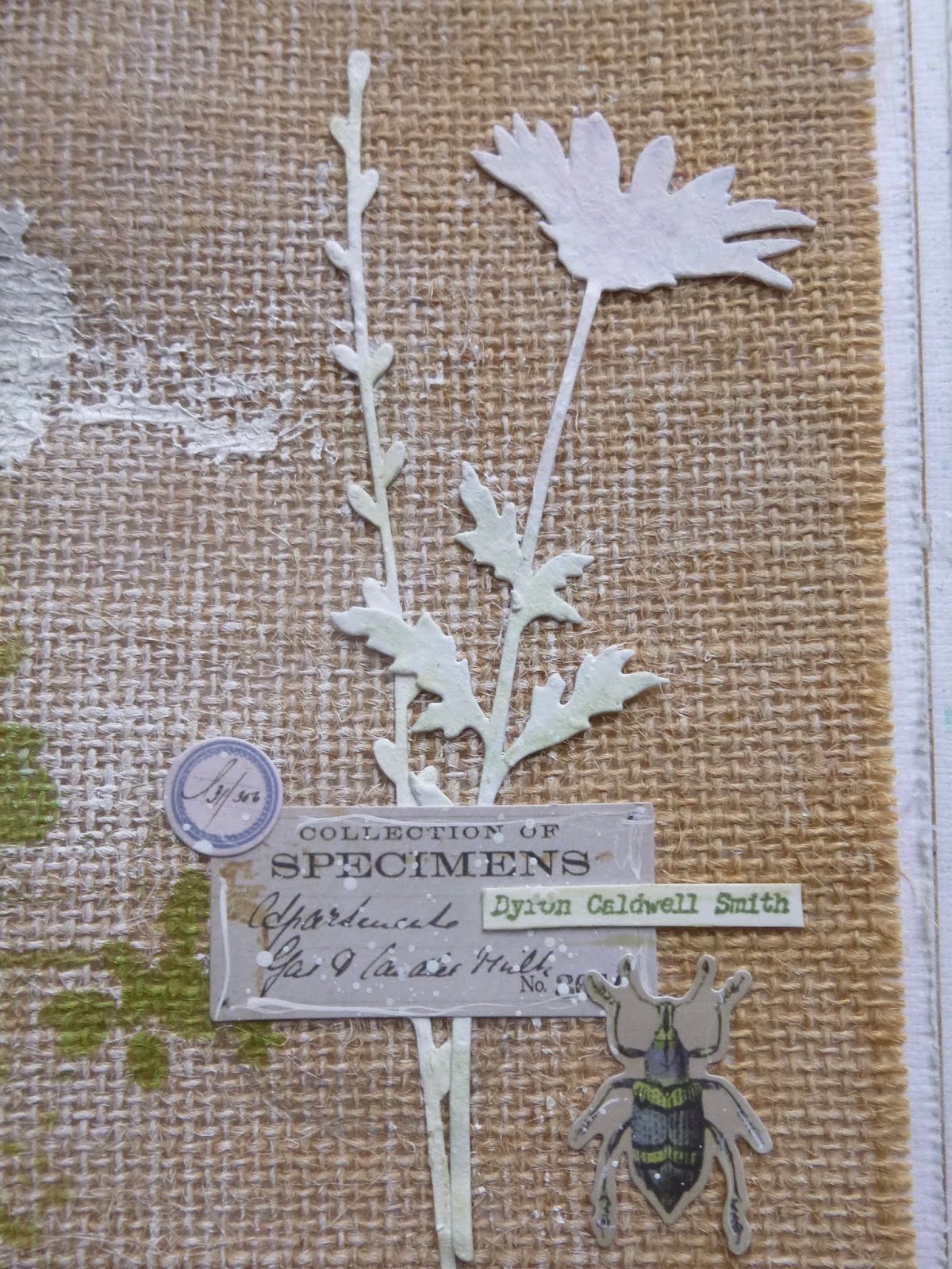
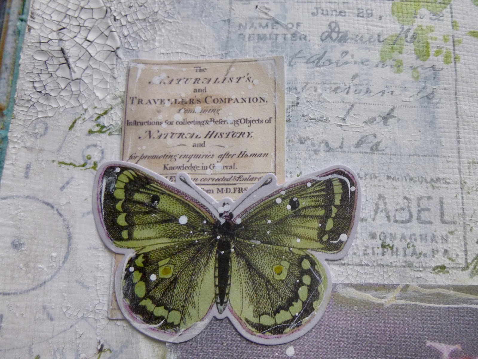
Tim Holtz's lovely new ephemera, all nature expedition-based, arrived just in time to play a part in this page spread.


Anyone who's a regular here won't be surprised that I yielded to temptation on these designs.


They complement my crafting obsessions too well for me to resist.  Tucked in and around the photograph, they add a touch of the Victorian naturalist, collecting and labelling every specimen.


Over on the burlap side, they adorn a couple of simple die-cuts.  I really love the handwriting added to the specimen labels.


I did some inky outlining of the photo and the ephemera using my dip pen with some white ink, which feels like adding some of my very own "handwriting" or at least mark-making to the mix.


This little chap is amazing... not that I'd like to catch him feasting on any of my plants, of course.

Oh look, that's also given away the author of the quote over on the facing page...


It's one of the quotes from my PaperArtsy EAB06 Spring Edition collection, and it's one that definitely makes my heart quiver in response... 


It's one of those times when somebody has managed to sum up in a few poetic words a sensation I recognise completely.


You probably caught sight of some stamping layered under the quote strips there...  Yes, I also yielded to the complementary stamp set, Field Notes.


It's full of little labels and botanical illustrations and I can see it being in almost constant use.


(If you check back on those spring tags which didn't make the final cut, you'll see I'd already inked some of them up for those too.)


I used the Pumice Stone Distress Crayon to heighten the crackle detail across the pages.


I really wanted the page to stay fairly light and bright - that vivid spring air, you know - so I gave it a good spritz of water so that I could wipe away all the crayon from the surface, leaving it just in the cracks.


I love how natural it looks, maybe like silver birch bark, and it's great over the tissue paper designs in the background, as well as over the burlap texture on the right-hand-page.


I love the stencilled Archival inks over the burlap too.


I did try some burlap twine which I thought might create a nice echo tangled across the white page, but again I decided to prioritise my white space and that lighter-than-air springtime feeling.


You'll spot that the die-cuts got whiter and brighter in the end too, rather than pink and green.

I think it was the right choice - a better echo of the light white brightness over on the left.  And they also show up better against the burlap.


(By the by, I'm well aware of the pun in the post title... I've been eating lots of spring greens this week, so it was an obvious choice.)


This page spread really makes me very happy, just like the signs of springtime do in real life.  It's just as well given the difficult times we are clearly all going to be facing in the days, weeks and probably months to come.  We're going to need to remember to take delight in the spring breezes, in tree blossom and sprouting bulbs, in the trill of birdsong, and the ever bluer skies.


Of course, since there's no risk of infection in this online community, we can also take delight in the shared creativity here in Craftyblogland.  However isolated we may have to get physically, there's still warmth and communication and friendship galore right here.  Aren't we lucky?!

Thanks so much for stopping by today, and bearing with me through this mammoth post - virtual hugs all round!  I'll be by to catch up (again) on some visiting soon.  Wishing you all a creative weekend - stay safe, and I'll see you soon.

When you paint Spring, do not paint willows, plums, peaches, or apricots, but just paint Spring. To paint willows, plums, peaches, or apricots is to paint willows, plums, peaches, or apricots - it is not yet painting Spring.
Eihei Dogen

I'd like to share this at Art Journal Journey where the lovely Eileen would like us to play with Green
At the Simon Says Stamp Monday Challenge they are also looking for A Bit O' Green (there's a bit more on this than on my previous entry!)
The More Mixed Media Challenge are playing Anything Goes with an Optional Twist of Green
Oh, and I've just spotted Use Some Green is the theme at the Simon Says Stamp Wednesday Challenge too... done!