I'm travelling into a new way of working, a new country, a new language, and a new hobby which I'm passionate about. Come with me for some of the journey...

Saturday, 16 April 2016

Who Can Resist PaperArtsy?


Who can resist PaperArtsy?  Not me!  Even though I'm away from my craft desk for most of this year, I couldn't resist jumping in for at least one of the PaperArtsy challenges... so yes, it's Resists for me.

And I'm keeping it simple with some fantastically detailed Minis... sometimes all you need is some ink and a great stamp or two.


If you've time, do hop over to the PaperArtsy blog and check out the details of my little quartet of ATCs... hopefully that's an irresistible offer!  Thanks so much for stopping by, and I'll see you again soon.

Nothing is softer or more flexible than water, yet nothing can resist it.
Lao Tzu


Wednesday, 13 April 2016

Encore - A little bit of inspiration

Encore Posts
While I'm away, there are some scheduled posts with new creations coming your way, but I'm also taking the chance to do some catching up here at Words and Pictures.   Projects which made their first appearances elsewhere for Design Team duties or Guest Designer opportunities, but which only had a sneak peek here, are being gathered together in the pages of my virtual scrapbook.  I'm calling them "Encore" posts and they're formatted differently (all the way down the centre), so you can spot them easily.
Please don't feel that you have to comment all over again!

This is the last Encore for a little while (there's some new stuff coming your way!), and to be honest I'm not sure whether this really is an Encore...  I don't think that it ever put in an appearance anywhere, even though it was meant for eclectic Paperie (now embraced by The Funkie Junkie Boutique) way back in March 2013.  I think I had this little booklet ready just before I left the team, so I'm not sure it even got an outing at eP.  There again, the post seems to have been ready and written, so maybe it did.  In any case, if it doesn't ring any bells it's probably not your memory going funny on you!  But here's what I wrote back then...
___________________________

Hello all, and I'm very happy to be here at eclectic Paperie to share another project with you.


This one is a very simple little ATC book (I seem to have a thing about handmade books), with lots of little pockets - brilliant for using up paper scraps when you really want to make the most of every last little bit of your favourite papers!


It's a tiny book of uplifting and thought-provoking words and phrases, so that you can turn to it for a little bit of inspiration when in need.  And of course you can add more phrases, or other memorabilia, pictures and ephemera as time goes on... plenty of room in those pockets.


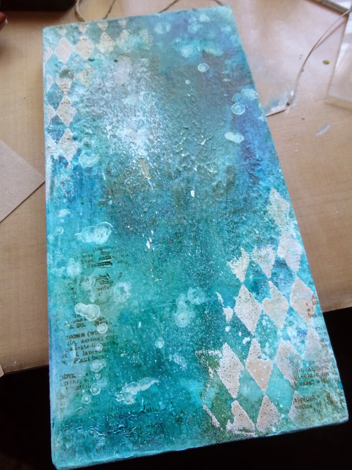
I started with six of the Inkssentials natural canvas ATCs.  One of the great things about these is that they are sticky-backed, so you get all the great canvas texture and you can apply it really easily to cardstock or chipboard to create a really sturdy, dimensional ATC.


I adhered my six ATCs to some kraft cardstock, and then started juggling with my papers.  These are from the Basic Grey Serenade set.  I worked out I had enough to do a couple of ATC-sized pages and a couple of "pockets" out of each of my selected papers.


I wanted to leave plenty of the canvas on display, and also to keep things pretty minimalist, so I kept my pockets nice and simple: a plain rectangle, alternating (mostly) between vertical and horizontal positioning.


And I gave the canvas a good going over with the Vintage Photo Distress Ink to really highlight all that lovely texture.


I thought about doing some stamping on the canvas, which I always love the look of, but I was quite enjoying the clean lines of the whole thing (couldn't bear to leave out the distressing though!)... it's probably the nearest I'll ever get to a CAS project!


All the sentiments - from the fabulous Donna Downey sets, Empowered Words and Art and Possibility - are also stamped onto paper scraps, so they look pretty cute either way up, and they've also had a touch of the Vintage Photo DI of course.


On each facing page, the design paper side, I've added one of the larger sentiments, stamped on plain white cardstock and inked to tone in with the rest of the look.


I particularly love this Picasso quote... and I've tried to match the quotes in the pockets with my "main" quotes each time - I've tried to create satisfying groupings that "speak" to each other.


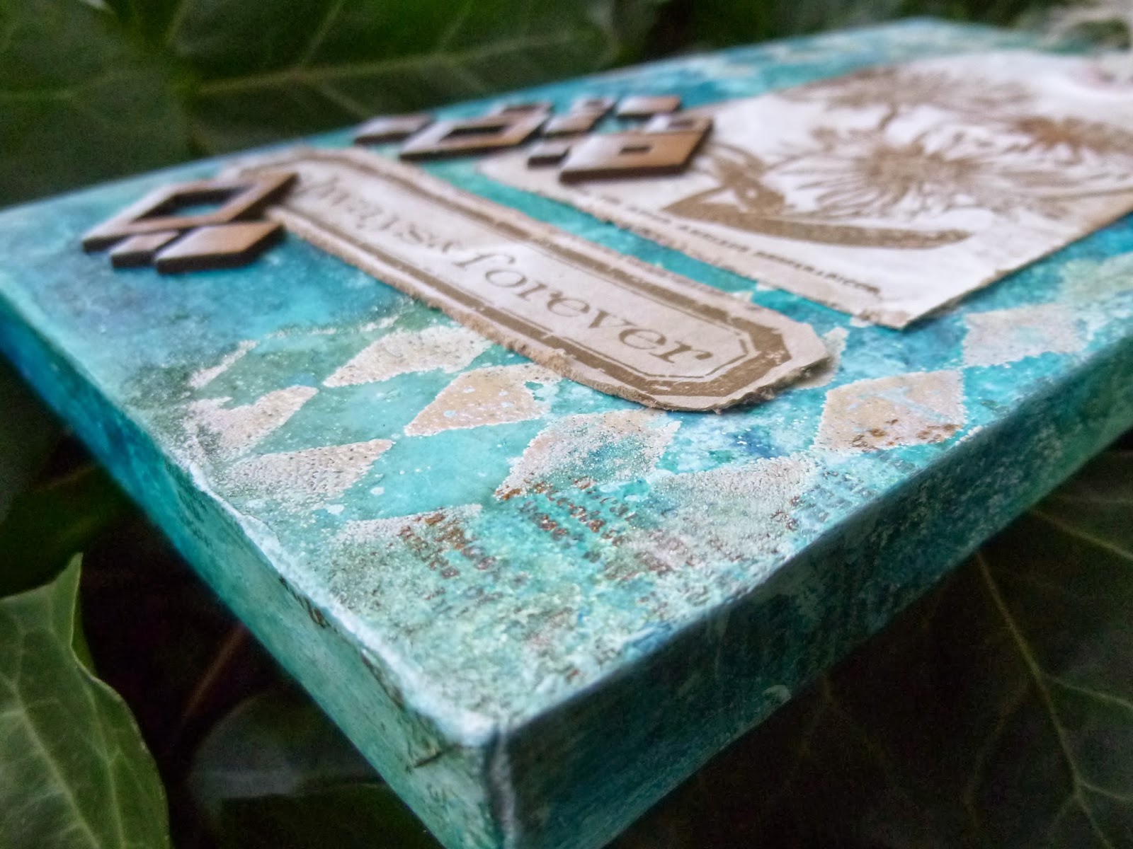
Another sentiment stamp serves as the title on the front cover (in the picture at the top of the post), and I've stamped some of the Hero Arts Music Background to surround the title, and all over the back cover.  This stamp is designed to coordinate with the Serenade music paper that I've used on the inside, so it fits in with the overall look beautifully.


Finally I added the little corner pieces cut with the ATC and Corners die by Tim Holtz onto the front and back covers.  I love the "finished" look it gives.


The binding is incredibly simple too (seriously, you can knock up a whole little album in well under an hour) - just some crinkle ribbon dyed with Vintage Photo Distress Stain, and tied through the punched holes to give a pretty bow at the front.


I had to do a little bit of retying to get the tension right, so that the pages would turn easily without the whole thing flopping about uncontrollably, but that was about the hardest thing in the whole project - and, really, what's so hard about tying a bow a couple of times!?


Thanks so much for stopping by today.  I do hope my ATC inspiration album has given you a little bit of inspiration to go off and create something yourself.  See you again soon...
______________________________

So, that's about your lot for today.  There's a brand new project up next here at Words and Pictures in just a few days... in fact, quite a few new projects in a row, plus a first little travel update for you, so I'll hope to see you again soon.  Happy Crafting all!

It has long been an axiom of mine that the little things are infinitely the most important.
From The Memoirs of Sherlock Holmes by Arthur Conan Doyle

Saturday, 9 April 2016

Encore - Always and Forever Changing!

Encore Posts
While I'm away, there are some scheduled posts with new creations coming your way, but I'm also taking the chance to do some catching up here at Words and Pictures.   Projects which made their first appearances elsewhere for Design Team duties or Guest Designer opportunities, but which only had a sneak peek here, are being gathered together in the pages of my virtual scrapbook.  I'm calling them "Encore" posts and they're formatted differently (all the way down the centre), so you can spot them easily.
Please don't feel that you have to comment all over again!

This Encore takes us back to January 2014, and it's another one from my days in the Artistic Stamper Creative Team.  The Katy Fox - now Katy Leitch - botanical stamps were definitely amongst my favourites, and I remember loving this particular creation at the time, so I'm very happy to finally gather it in to my virtual scrapbook here.  Anyway, here's what I wrote back then...
__________________________

Hello all!  Alison (butterfly) here with my first Artistic Stamper post of the New Year.  I should probably have made a resolution about trying to write shorter posts, but I didn't, sorry!  I've another photo-heavy marathon for you (and remember you can click on the photos for a closer view).


I started with one idea in my head with this one, went via a completely different possibility and ended up in an utterly unexpected destination - but one that I'm very happy with.  In fact, it may be one of my favourite makes.


I'm afraid I don't have many photos en route since most of the way along I was pretty sure I was going to bin it.  Very glad I didn't now!


I started with one of the papier mache icons and some PaperArtsy crackle glaze, but that's long lost under some heavy gesso and loads of ColorWash sprays.  What I can tell you is a little bit of how the background shaped up once I'd gesso'd over my first idea.


I started with some text, stamping the botanical definitions from Katy Fox's Encyclopaedia Botanica plate in Potting Soil Archival (just as well I picked Archival with everything that then happened).


I stencilled Walnut Stain Distress Ink through the Harlequin stencil, and then clear embossed it, using only a light covering of powder.  (Again, just as well I kept it in place with the embossing - it wouldn't have lasted through the spritzing.)


At this point I had a gentle neutral affair on the way - white background, dark brown stamping, and I was still planning to stamp one of Katy's flowers directly onto the icon.  But, in my usual fashion, I had more than one thing on the go, and chance intervened at this point.


I happened to use a kraft tag to mop up some white paint from the mat, and suddenly wondered how the flower would look stamped onto that instead... the answer was "lovely"!  This particular flower is from Katy Fox's latest Botanical 2 release, and it's stamped in Potting Soil.


But then it started looking a bit bland to me.  I thought I'd like just a little hit of colour in the background... hmm!  I got out the ColorWash sprays, with their yummy earthy, natural tones, and tried them out on a nearby tag which gave me lovely spray patterns and some gentle blending and dripping.  But when I sprayed them onto the gesso, they behaved very differently and I ended up with really full on colour going on - not what I'd intended!


However, thanks to the embossed Harlequins, there was a lovely resist effect in places that toned in with the whitewashed kraft tag, so I decided to persevere.


I stamped the Artistic Stamper Messy Art blots and splashes (Katy Fox again!) in Fresco Snowflake...  I hadn't used these before and, oh, how I love them now!


I added a couple of spritzes of Dylusions White Linen too...


... and dry brushed some Snowflake around the edges of the icon too.  Obviously, all this is being carried over the edges as usual.


I stamped one of Tim Holtz's Simple Sayings in Potting Soil onto another whitewashed kraft tag and cut it out and distressed it.


And I added some Idea-ology Linen Ribbon to the top of the tag.


My final brainwave was to add some "Diamond Confetti" chipboard from the UmWow Studio, and highlight it with a dusting of Snowflake Fresco brushed up from the bottom corner.


I'm really pleased with how these echo my embossed Harlequins, and add a touch of dimension to the composition.


So that's me for today.
__________________________________

Thanks so much for dropping in today - always lovely to know you're out there!  I'll be back soon with another Encore, but there's something new just around the corner...  Happy Crafting all!

What is once well done is done forever.
Henry David Thoreau

Wednesday, 6 April 2016

Trying to Simplify


Hello all!  I'm delighted to be here with a new creation for you today.

Well, I say here...  In fact, it's just a sneak peek here (a.k.a. a future Encore post!!), and if you'd like to see the whole thing, you'll need to hop over to the Country View Crafts Projects blog.

It's a very simple card, but quite atmospheric I think.  I hope you'll have time to check it out.  I'm going to love you and leave you for now, and see you again soon.  See, I really am keeping things simple today.

The ability to simplify means to eliminate the unnecessary so that the necessary may speak.
Hans Hofmann

Simplify, then add lightness.
Colin Chapman

Monday, 4 April 2016

Encore - Light Journalling

Encore Posts
While I'm away, there are some scheduled posts with new creations coming your way, but I'm also taking the chance to do some catching up here at Words and Pictures.   Projects which made their first appearances elsewhere for Design Team duties or Guest Designer opportunities, but which only had a sneak peek here, are being gathered together in the pages of my virtual scrapbook.  I'm calling them "Encore" posts and they're formatted differently (all the way down the centre), so you can spot them easily.
Please don't feel that you have to comment all over again!

This one doesn't go all that far back, but it feels right for the start (we hope) of Spring.  This is what I wrote over at The Artistic Stamper in January 2015...
____________________________________

Hello all, Alison (butterfly) here with you again... and with some more art journalling.  But rather than the wintry atmosphere of the pages over at Words and Pictures (Ed: that was the Winter trio which you can track down from here), this is an altogether lighter and brighter bit of journalling!


It does make me smile though to see how similar elements seem to have bobbed up on this very different page.


I'm definitely having a thing with circles at the moment - and here there are two layers of them.  First, some Distress Spray spritzed large circles using the Large Sequin Waste mask, and over that I spread a very thin layer of the Viva Decor Croco Crackling Colour through the Large Dot mask and left it to get on with cracking while I went off to do something else.


When the large dots were dry, I did some stamping with Distress Inks in my Jan/Feb colours of vivid blues and greens.  There's the Sequin Waste background stamp in Mowed Lawn and the Mini Polka Dots in Broken China and Peacock Feathers.


Once stamped, I gave them a spritz of water to let the Distress Ink do its magic wicking thing, softening the look.


And I used Distress Stains to add some colour to the large dots, wiping away the excess so that the crackle is highlighted.


So, like the winter pages, there's lots of crackle too.


For my focal point, I chose the word from Journaling Words #5 (oh, for the missing L!  Ah well, the Americans will like it).  I stamped it in the matching Distress Ink colours and clear embossed it on a whitewashed book page.


It's layered up over some wire mesh, tea-dyed tissue paper (transparent - so you can see the stamping and the text through it - love it!) and another book page.


I had great fun with my metal pieces.  The Idea-ology flower is altered with Distress Paint, while the skeleton leaves have had a dose of my Ten Seconds Verday Paint (weathered patinas, until now only really used on dollshouse work).


I used a combination of the Verday Copper finish as well as some Distress Paint in Mowed Lawn and Salty Ocean to get the finished effect, and I love it.


And I edged the page with Vintage Photo and Walnut Stain to pick up the rusty colours of the central layers, so we also have - at heart - the blues and browns of my winter pages, but transformed to a brighter version.


So having set out to do something completely different from the recent art journalling shared over at Words and Pictures, I have got something different, but somehow very closely related!
______________________________

Another Encore for you, but there's something new up next here at Words and Pictures, so I hope you'll be able to pop by again soon.  Happy Crafting in the meantime!

There is no lighter burden, nor more agreeable, than a pen.
Petrarch

Friday, 1 April 2016

It's Spring!


A new month, another country and, let's hope, a new season.  The forecast for New York as I write this (six weeks early) is -17, so I'm hoping by the time I arrive at the end of March that it will have warmed up a little into Spring.  And I hope you're enjoying blue skies and sunshine at least occasionally wherever you are.  (UPDATE - glad to say that it has warmed up somewhat here in New York, and the sky is frequently blue!)

I'm happy to say that it's definitely Spring at Country View Challenges at least... that's the new theme from our lovely host, Monika.

I've got the usual springtime suspects in action - butterflies and spring flowers - but I've stuck to a neutral colour palette, and I've been having fun playing with some wax to create translucent layers.


It's pretty hard to see the layered effect in the photos, or to appreciate the waxy sheen and texture.  You'll have to take it from me that this one looks really cool in real life!

I started by covering a piece of greyboard with Tim Holtz paper - some lovely large vintage script.  I then put on a layer of wax - just dropping the beads onto the piece and melting them with my heat tool.


I added a couple of spritzes of DecoArt Media Mister in White Shimmer and then heated the wax again - love how this made the inky splatter shift and spread as the wax moved.


I added some more wax and then stamped the butterflies... you can just about see how they hover above the text here, I think.


I also stamped the Paris postmarks in white.  They weren't showing up quite as I'd hoped, so I overstamped in brown and now they have a lovely echo effect.


I added some delicate spring flower woodcuts, and one of my much-loved WordBands tied on with fine twine, and finished the whole thing off with some delicate white spatter.


Do take a moment to hop over to Country View Challenges and see what my immensely talented team-mates have been up to.  There are some wonderful new designers on board and we'll all be offering more inspiration throughout the month, so do check it all out.  We hope you'll be inspired to come and play along with our Spring challenge this month.

Don't tell me not to burn the candle at both ends... tell me where to get more wax!
From the Frank and Ernest cartoon strip by Bob and Tom Thaves