

Hello all! I'm sorry I've been slow on the visiting front lately - there are many birthdays round our way in the month of April.
Also, as I mentioned on my Birthday Blues and Browns post, I've been busy with virtual voicework too. But I will be round to do some catching up soon.
And, speaking of catching up, I'm behind on a challenge for which I threw down the gauntlet myself.
But I'm finally here with the results of my "second time around" art journalling. Grab a coffee, and let me explain.

When I posted the art journal pages resulting from the first lockdown Creative Skypeing session I'd had with Nikki and Brenda last month - with peeks at the very different projects each of them had created following the same instructions - I suggested people could try following the same set of steps we'd invented between us to see what journeys it took them on.

The lovely Elizabeth of Altered Book Lover thought that she and Bleubeard didn't really have enough of the products we'd used to be able to do that.
I countered that the instructions were really pretty loose, allowing one to use whatever one had to hand to create whatever one was creating.

And I said in my reply to her that I was tempted to go through the process again with whatever was lying around the place to see what different end result I would come up with. Second time lucky...!

Elizabeth picked up the gauntlet weeks ago, and produced a fabulous double-page spread as one of her 22-day April recycling projects.
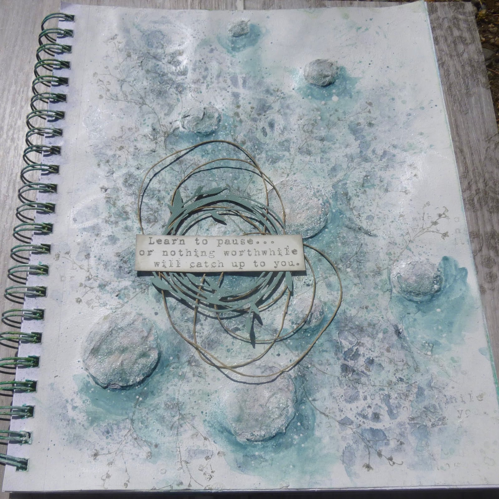
As I've already said, time seems to have been filling up, so I've only just got around to following through on the temptation, and this is my all new journal page, avoiding expensive products, using what was lying around, and doing some recycling along the way.
I'll recap the steps as I take you through the layers, so if anyone else wants to take up the challenge too... !!

Prep your surface - it can be anything you want, from an ATC to a tag, a canvas, a journal page...
I gesso'd over the whole surface - I could have used some cheap acrylic paint, but I have some bargain gesso so I used that. And it's a pretty inexpensive ring-bound pad too - but large format 12 x 9.5 inches.
1. Use some tissue paper and/or tissue tape
I used scraps of tissue that came as wrapping in a parcel, torn up, glued and modged onto the page with a stiff paint brush. I mostly wanted a bit of texture as my underlying layer.
2. Put down some texture through a stencil
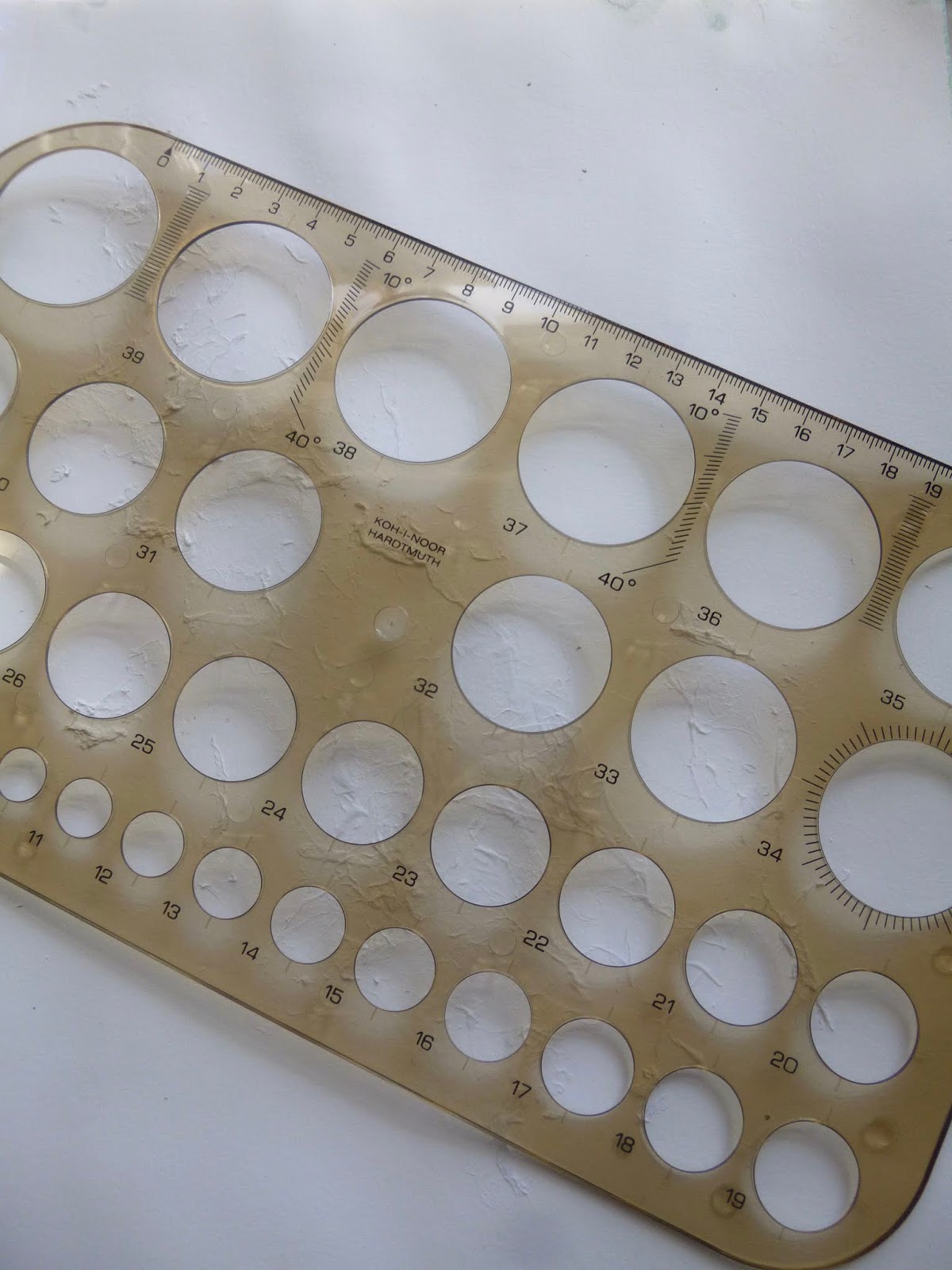
For this, I used a really cheap stencil picked up in a stationery store in the Czech Republic a while back. The "texture paste" is some cheap white paint which had dried out to the point of being solid enough to use this way.

It's a really deep stencil (not being intended for crafting) so I ended up with very 3D bubbles - and they're also pretty rough in places because the paint wasn't terribly cooperative... but I like embracing imperfection.

Since I had nobody keeping an eye out for rule-bending this time (I'm looking at you, Nikki!) I decided to get creative at this point by sprinkling some embossing powders onto my stencilled texture.
There's some Weathered Wood Distress Embossing Glaze which I tried to keep to the bottom right(ish) of the spheres, and some Wow Bright White which I tried to keep in the top left(ish).

But there are also completely bare areas of texture paste, heated to bubbling point.

3. Some stamping with text and/or numbers to fill in the gaps
I used a much-loved Tim Holtz quote stamp - from one of the first sets of his I ever bought - to do some text stamping in and around my lumpy spheres. It's stamped in Watering Can Archival, and I smeared on some gesso with my fingers afterwards to soften it even more.
4. Add more than one colour of paint in any way that you want to
I used my Fresco chalk acrylics for my paint application. First I made a watery wash of Niagara Falls on the mat and splodged that into the centre of the page. Then, spritzing with my water bottle, I tilted and dabbed the page until I liked the flow of the paint. The leftover paint from the mat got spattered on to the page as another layer.

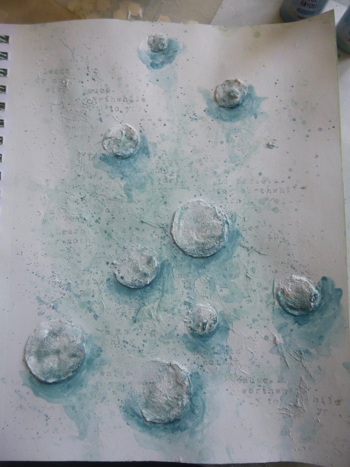

Next, I added some Blue Bayou to the mix and, in combination with the Niagara Falls, brushed on some shadows beneath the spheres, again spritzing to get some drips and soft edges.

Finally, I used a bit of Space Cadet to create deeper darks to my shading. And again, leftover paint made its way onto the page via some more spattering.

5. Create a resist using any product
This is one of my favourite bits of "using what's around". I created my resist using some Vaseline lip balm and a candle stump.
 There's always a candle stump available here (I light a lot of candles), so I scribbled around the page with that.
And I smeared the Vaseline on the area above each "planet" so that it would stay lighter and brighter from the top left.
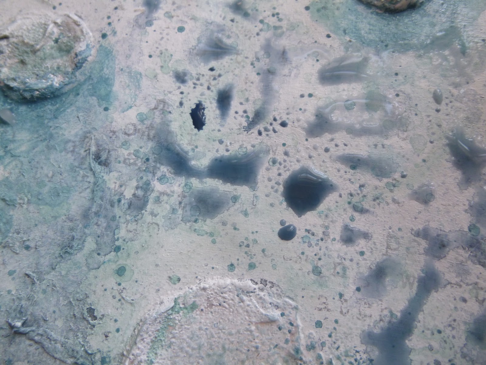
There's not much point showing you a picture of that stage, as it's all pretty much invisible until you do step 6 - so these are already post-6 photos!
You can see where the resist is doing its resisting, with the pigments beading up.

6. Use a colour medium to reveal your resist
Okay, for this one, I did use a rather expensive colour medium - one of my Daniel Smith watercolour paints - to reveal the resist. You could, of course, use any watercolour paint or any ink for a similar effect, but I really wanted the magical mineral shimmer of my Kyanite Genuine so I went for it.

I love how the random scribbles are revealed as the wax and the Vaseline resist the pigment and water.
The swirls and squiggles are like crazy planetary orbits, or plant roots twining around the page.

7. Add some more stamping but not text and numbers
This caused me my longest delay in an otherwise flowing process. I couldn't decide what kind of stamping I wanted. Something textural/abstract? I toyed with some birds in flight for quite a while.

But in the end I couldn't resist re-inking my current obsession - the creeping tendrils of this stamp from Rubber Dance's Weed Love set, stamped in Watering Can.

It's been working over time lately (for the tag book, Collect Beautiful Gelli Prints, in the depths of the Curio Clock shadow box, and an extra special variation for Rusted Hope among several others!), and you can probably see why.

8. Select a focal point (or points) and gather elements
After the delay in choosing my stamps for step 7, I thought I'd stay very simple with my focal point. I could see where on the page I wanted it to go. It would mean losing one of my bubbles behind it, but there are plenty to go around, after all.
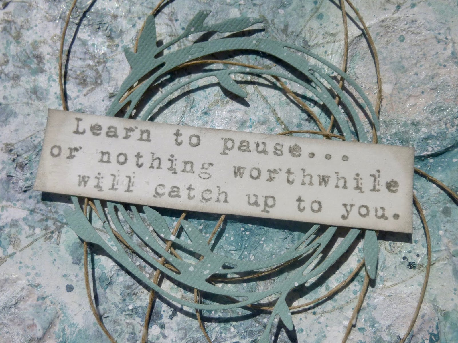
And the choice was clear - that sentiment which provided the random detail stamping in the early layers needed to come back into focus.
The thought seems apt for the times. Evidently my subconscious knew exactly what it was up to right at the start when I chose it.

9. Alter/colour up/prepare and position elements for your focal point/s
At first, I thought that might be it - spare simplicity. But then I decided I'd like a little more framing for the words so I cut this delightful little vine garland from some card to which I'd given a rough coat of the Niagara Falls paint.
And then I wound some fine twine into concentric circles and then allowed them to spread out in a deliciously wild and random way.

10. highlight or refresh the original background before adhering the embellishments
I did do a bit of re-stamping of the background quote (secondary stampings to keep it pale) as the words had got a bit lost under the layers.

And I also dipped my finger in some Snowflake (white) paint and smeared it over the spheres to highlight some of the texture, particularly in the top left(ish), again to keep that illusion of light striking from that top corner.

I glued down as little of the twine as I could, so that it would keep its wildness and free-flowing look, but stay pretty much in the places it had landed. Mostly, it's held in place by the gluing of the sentiment panel.

Finishing Touches
And of course I had to do some spattering of white paint as my finishing touch.
So there you have it... the same set of steps, but a completely new journey and an entirely different page at the end of it all.
I didn't really register until I was taking the photos how much shimmer was going on. The Vaseline has a sheen to it, and so does the candle wax.


But that Bright White embossing powder is also really glossy, as are the translucent grains of the Distress Embossing Glaze once they are melted.

I really like my painty shadows giving additional depth to the already-dimensional bubbles.

And the scribbly patterning of the wax resist is a lovely additional bit of interest in the background.

The looping twine gives us looser, wilder parabolas for the eye to follow, and that lovely die-cut garland...

... is echoed in the twining tendrils of the stamped vines.

And you can still see and feel that tissue paper texture from all the way back in step 1.
This is a gentle page, calming and serene. The colours are really harmonious but I'm sure the atmosphere is also induced by the circle motifs. The circle is a meditative shape to begin with. It really is a page to pause over. It gives me tremendous pleasure - and that's got to be good news in the current chaos, right?
Thanks so much for stopping by today. As I said at the beginning, I'm hoping to be doing some catching up of another kind - visiting your blogs - over the course of this week. I know I must have lots of creative treats and inspiration in store as I've missed so much. So stay safe, stay well, and I'll see you very soon - either here or elsewhere in Craftyblogland.
Success does not consist in never making mistakes but in never making the same one a second time.
George Bernard Shaw
One can't judge Wagner's opera Lohengrin after a first hearing, and I certainly don't intend to hear it a second time.
Gioachino Rossini
With those planetary (?) spheres, I'd like to make this a pretty late entry for Valerie's theme of Geometric Shapes at Art Journal Journey
There's just time to join in again at Have Fun With Stencils over at Try It On Tuesday
The Simon Says Stamp Monday Challenge this week is to make something which is Not A Card
At the Bleeding Art Challenge it's always Anything Mixed Media Goes


