I'm travelling into a new way of working, a new country, a new language, and a new hobby which I'm passionate about. Come with me for some of the journey...

Tuesday, 15 October 2013

Touchy feely spooky creepy


Hello all, and thanks so much for stopping by.  I really will be quick today, since we're at crunch point with the move.  

And you don't need details from me, because this isn't just my Design Team piece for Julia's fabulous Textured Halloween Tag challenge over at Our Creative Corner, though it is here to offer you the usual mid-month nudge of inspiration.

No, it's also my offering for Tim's October tag, so you can get most of the "making-of" details straight from the man himself, as well as checking out his amazing inspiration tag here.

My Halloween colours tend towards the twilight spooky blues rather than the classic purple/black/orange, and I'm always happy at any opportunity to get out one of my favourite stamps, the Tim Holtz skull from the Apothecary set. 


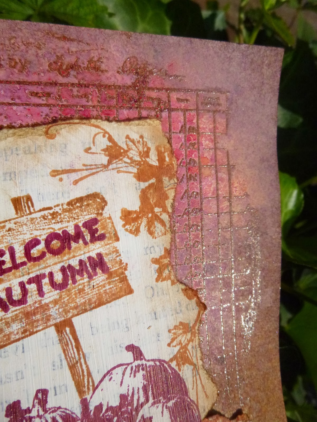
Since Julia's challenge calls for some surface texture on the tag itself, I added some dry embossing to my Distress Paint marbled background.


I inked it with some Black Soot Distress Ink for extra definition.


I had a ball with the Rock Candy Dry Glitter.  I only have that (non-) colour, but by only partially inking my clock and new little bottle with Black Soot, I got lovely colour variation underneath.


And, as Tim says, you can use Distress Inks over the top of the Glitter, so I added some Chipped Sapphire shading to the mix.


I also wanted to have a play with my layering stencils.  

Having signed up for CC102, I haven't yet had time to do any of it, but I did see there was a Distress paint marbling technique, and a stencilling day, so this was one way to join in a little! 


So as well as the die-cut clock, there are some ghostly clocks haunting the background. 

I was quite tickled with the idea of positioning the clock so that the centre is right over the hole at the top of the tag! 


And of course the hands are set for just before midnight: the witching hour approaches...


The fabulous skull is mounted on padded tape, to give him a 3D effect - he's emerging from the frame to come and get you!


\

And I've shaded the hollows of the skull with Sapphire Treasure Gold.


The tiny skull and crossbones has also had a touch of Sapphire Treasure Gold...


... as has the embossed texture.  

I rather like the slightly queasy shade of greeny turquoise it gives it all, as well of course as the shimmer.


And the bat had some Distress Paint before also getting a hint of Treasure Gold.


I added the little label from the Apothecary set too.


The Happy Halloween is from the same set, and is covered with a layer of Rock Candy Crackle Paint and some more Treasure Gold around the edges.


Okay, I just can't keep it quick, can I?  But it's nice to take a brief break from the box-shifting, and I do type quickly!  

Do hop over to Our Creative Corner to see what the rest of the team have been up to, and we hope you'll be able to join in... you still have until 28th October to get touchy, feely, textured and spooky on a tag!

'Tis now the very witching time of night,
When churchyards yawn and hell itself breathes out
Contagion to this world.
From Hamlet, by William Shakespeare

Hold on, man.  We don't go anywhere with "scary," "spooky," "haunted," or "forbidden" in the title.
Shaggy from Scooby-Doo

I'd like to enter this as my October tag in Tim Holtz's 12 Tags of 2013
And I'd also like to enter this (belatedly) into the Something Spooky challenge at Country View Challenges 


Oh, and just in case you missed it before... my rusty barn is over at Artistic Outpost today.

Happy Crafting all, and I should be back on full-scale visiting capability soon!

Sunday, 13 October 2013

The Wisdom of Flowers


Hello everyone, thanks so much for taking the time to stop by.  I seem to be back on the greens and the flowers at the moment...


Some of you may have already seen this over at Artistic Outpost, but it's my first chance to share it with you here at Words and Pictures.


I've a tag for you today.  No big surprise there... Tags have always played a big part in my crafting and, especially just at the moment when real life is so busy, they're a quick way to get some satisfying crafting done.  


There'll be more complex projects under way soon, I hope - but I do love a tag... hope you do too!


This one uses stamps from the recent Artistic Outpost releases, Chalk It Up and Chalkboard Wisdom.


I started by applying texture paste through the Crafter's Workshop Cornflowers stencil to create the flowers.


And then I applied lots of dots of various Fresco paints and used rough brushstrokes to blend them onto the tag.

Once the paint was dry, I sanded back the flowers to reveal the white texture beneath.


I added the corner flourishes from the Chalk It Up plate, stamped first in white using the Prima Chalk Edger, and then overstamped in Peeled Paint Distress Ink.


I really like the ornate and slightly dimensional effect.


The sentiment is another of my original chalkboard experiments - Brilliant White Superfine Wow embossing powder on black card, with some extra chalkiness from the Chalk Edger and from a white pencil.


It's mounted on padded tape to give it a bit of a lift over the flowers.


The topper is crinkle ribbon dyed with Distress Stains - Peeled Paint and Bundled Sage, along with some Picket Fence, which is what gives it that lovely shabby opaque look.


And it's tied together with my black and white paper string combination - to tone in with that chalkboard sentiment.


I then distressed the whole thing with the paper distresser and layered it onto some Prima paper by Finnabair, leftover from her workshop, which I was lucky enough to attend recently. (You can check out what it was leftover from here!)


Thank you so much for stopping by today, and all your amazing feedback throughout this busy week.  I'm almost there with the house-moving, so should be back to full speed on visiting very soon... 


With a few flowers in my garden, half a dozen pictures and some books, I live without envy.
Lope de Vega

When you have only two pennies left in the world, buy a loaf of bread with one, and a lily with the other.
Chinese Proverb

Thursday, 10 October 2013

Create? I am creating!

Hello all!  I'm back with yet another sneak peek... yes, it's one of those busy weeks here at Words and Pictures again.

For those not up to speed, you might want to catch up with my three PaperArtsy projects - A Study in Scarlet, If I Had Wings, and the frankly crazy Dolls Houses...  Or there's this fortnight's piece for Fun With ATCs, Around the World in 80 Stamps (very cute, though I do say so myself)... Or even a (shhh) Christmas Card over at Artistic Outpost if you fancy it!

But here and now, it's time for a return to normal service... blues, greens, corrugated card and glorious meadow grasses for my Artistic Stamper creation today.  I would love it (if you're not already exhausted from the pace round here) if you had time to pop over to the Artistic Stamper Creative Team blog and have a look... It's probably my favourite make of the week if I'm perfectly honest!


Anyway, enough from me.  I hope you're all thriving and having a wonderful week, and I'll see you soon, either here or elsewhere in Craftyblogland.  But first, I'm off for a little lie-down...

Rest is not idleness, and to lie sometimes on the grass on a summer day listening to the murmur of water, or watching the clouds float across the sky, is hardly a waste of time.
Sir John Lubbock

Tuesday, 8 October 2013

Dolls Houses (or Houses made of Dolls)

I warned you it was going to be busy here at Words and Pictures.  If you're looking for this week's Design Team make for Fun With ATCs, you'll find it here - I'd love it if you had time to check it out; I'm rather fond of this one.  And there's a card (shhh - whisper it - a C*******s card) over at Artistic Outpost today too...

But I'm here this evening with PaperArtsy sneak peek number three (you'll find project one here and project two here if you've missed anything).  

I also warned you things were going to get weird this week...  To witness the full strangeness, hop over to PaperArtsy.  Personally, I think real-life stress must have got to me!


Hope you enjoy yourselves... and thank you all again for your amazing support and feedback.  You are fantastic, and I'm so grateful.  See you again soon.

Reality is merely an illusion, albeit a very persistent one.
Albert Einstein

Around the World in 80 Stamps

Hello all... just slipping in an actual post between all the PaperArtsy sneak peeks.  PA project 1 can be seen here, number 2 is here and, just like with buses, there'll be another along in a minute - well, at 7pm this evening to be strictly accurate!


But first, it's time for a new challenge over at Fun With ATCs.  


And it's okay, you don't really have to use 80 stamps; but we would like to see you use At Least Three Stamps on your 2.5 x 3.5 Artists Trading Card.


This seemed the perfect chance to use the teeny tiny Tim Holtz stamps Tiny Things - they're unbelievably adorable vintage images, and give incredibly sharp, detailed stampings.


To make the most of them, I stamped them in Archival ink onto Specialty Stamping Paper.  It really does give a clearer, sharper result...


I've actually used seven stamps in total - just showing off now, of course!!

The very dapper chap (I suppose the post title makes him Phileas Fogg...) is attempting to make a decision as to which form of transportation he should select for the next stage of his Around the World journey.  


And with the fabulous balloon, or the vintage car...


... or the splendid aeroplane, or of course that wonderful 'motorcyclette' to choose from, I'm not surprised he's looking a little indecisive.


Still, at least he has the globe to guide him on the way; I'm sure he'll 'enjoy the journey' (from the Simple Sayings stamp set) once he gets started!

All the panels are mounted on padded tape in varying thicknesses so that you get layers of dimension, and some gentle inking with Vintage Photo DI finishes things off.


I'm trying to keep it short today since there's so much going on.  

As I said, there'll be another PaperArtsy post later this evening, and of course there's also a project to be seen over at Artistic Outpost today (shhhh... it's a C*******s card!), so if you've got time to hop over there, that'd be great too!

Thanks so much for stopping by, and I'll see you out there in Craftyblogland some time soon.

Anything one man can imagine, other men can make real.
From Around the World in Eighty Days, by Jules Verne

Monday, 7 October 2013

Fly Away


Hello again... time for sneak peek number two for my October PaperArtsy projects.  If you missed the journalling pages from yesterday, you can catch up with them here.


This one takes us back to neutrals - I seem to veer wildly from full-on colour to naked neutrals in my crafting!


It would be lovely if you had time to hop over to PaperArtsy to check it out, so I won't keep you hanging around here any longer... happy crafting all!


“The Guide says there is an art to flying", said Ford, "or rather a knack. The knack lies in learning how to throw yourself at the ground and miss.”
From Life, The Universe And Everything by Douglas Adams

Sunday, 6 October 2013

Can you hear the voices?


Hello all!  Hope you've all been having a great weekend...


After a slight lull, we're about to head into another flurry of posts here at Words and Pictures as it's my week again over at PaperArtsy.  

So I've sneak peeks for you tonight, tomorrow and Tuesday... I do hope you'll have time to check out the projects, and even to join in with the challenge this week.

I've been playing in the quirky world of the Ink and the Dog stamp sets this week... so I warn you: things will be turning a little weird before we're through!!

Without more ado, here's sneak peek number one.  If you'd like to see more, hop over to PaperArtsy for a closer look...

See you again (very!) soon.


Some people hear their own inner voices with great clearness. And they live by what they hear. Such people become crazy... or they become legend.
Jim Harrison

The more faithfully you listen to the voices within you, the better you will hear what is sounding outside.
Dag Hammerskjold

Friday, 4 October 2013

Welcome, Autumn!

Hello all... I have to be quick today - piles of boxes await me!  Unusually for me, I've a card for you, and again I was playing with the lovely new Artistic Outpost set, Hayride.


There's really no need for a how-to on this one, as you've seen a "naked" version of this card already, so you can see the steps towards it here as Leftovers.  And if you want to know how I masked the images, you can find that out here.

So that should leave us with a very quick post today...


The images are stamped in Plum Archival - such a fun colour to play with - and Sepia.

They're stamped on a book page which has had a rough coat of heavy gesso.


Once I'd arranged all the layers and glued them down I got going with some spritzing and spraying.  

Not sure I can remember the precise colour combinations any longer, but they were mists and inks from a fantastic Polish shop, 13Arts.


I love how the resist on the canvas (Prima - also leftover from my workshop with Finnabair) comes singing to the foreground once you add colour.


I tell a lie... there is something on this card that isn't on the naked version.  

I started by doing some clear embossing on the kraft card background, using the ledger stamp from the Ephemera Backgrounds.  

I do love a bit of embossing to catch the light...


Okay, so that's as quick as it gets round here, I guess.  

Hope you're all well... I'm still having trouble fitting in much blog visiting - but I will be back!  Have fun in the meantime, and I'll see you soon.

I'm so glad I live in a world where there are Octobers.
From Anne of Green Gables by L.M.Montgomery


Wednesday, 2 October 2013

Come buy, come buy!


Hello everyone! What with all the house-moving shenanigans, it's pretty quiet at my craft table at the moment... though the quiet was interrupted with some squealing when I found my Bluesy tag had been pinned by a certain Mr Tim Holtz!!

In any case, I thought I'd do a catching-up post today, as I continue to gather some of my GD projects together under the one roof.  So please don't feel you have to comment again...

This was my final project as Guest Designer for The Artistic Stamper in February.   As you know, I'm now thrilled to be a regular member of their team!

But here's what I offered up at the end of February, earlier this year...


So, I promised you something simpler for my final piece (in the hope of writing a post shorter than War and Peace for once)... and I did make something simpler, but I ended up making it in two different versions!


I knew I wanted to work with the glorious Victorian advertising bills - they are so much fun: fantastically detailed in their wording, with brilliant cartoons.  They are simply wonderful pieces of print ephemera that rocket me back in time when I look at them.


My first thought was that I wanted to stick them on a wall; a grimy, crumbling wall in a forgotten alleyway, with these three ancient posters still clinging on.  So I had to create a wall background... 


Lots of ways to do that - you could use the Decorative Strip Die by Sizzix, or some texture paste through a stencil.  I used an embossing folder, Tim Holtz's Bricked Texture Fade on a large tag (running it through twice to emboss the whole thing).


Then I set about it with some inks - Vintage Photo, Pumice Stone, Black Soot and Aged Mahogany - until I had a suitably grungy look.  


I used the Paper Distresser on the edges, and then ran the Black Soot DI pad around them to give it a good strong inky edging.

For the posters themselves, I did a bit of TH's wrinkle free distress technique using Old Paper and Antique Linen DIs - not too much ink, as I wanted age spots rather than a complete change of colour. 


I'd already done one version with darker inks, very beautiful, but once I'd stamped the images, they didn't really look like posters.

So with this new, paler version, I stamped the three adverts in Black Archival, and then did lots of distressing - ripping, rolling, using the TH paper distresser, and adding Vintage Photo to some of the tears and creases.  It's one of my favourite things to be able to age a piece of paper like this!


Simple enough then to stick the bills on the wall (hope I don't get prosecuted), all in a row, and add some trimmings.  

And you can read what you like about Victorian society into those trimmings: it's raffia, inky twine and some leather all tied up with a beautiful shiny satin black ribbon.


I was pretty pleased with that, but I still had those spare stamped images still sitting on my desk, stamped on the darker inky paper (two sets in fact, safety in numbers you know).  I started shuffling them around, thinking that they'd look pretty good in a slightly grungier version of the tag.


I grabbed some corrugated card, and added Distress Stains and thick gesso to it randomly and roughly.  

I created a background like this for a recent project and really liked it, so it was fun to resurrect it.  It creates a fantastically grungy, textural mess - no other word for it really.


I gave my three posters the distressing treatment again, and started positioning them on the tag.  They seemed to want to go in the other direction for this one, so I let them.


It was crying out for some metalwork, but I didn't want to go too smart...


... so I used some black alcohol ink to grunge up a key and some pen nibs from my stash, as well as an Idea-ology clock.

I like the grimy look of this - like the soot-ridden London streets of the nineteenth century.


I particularly love how the clock looks, with the black face and the figures sanded back to reveal the gold underneath.


I've always sort of thought that I was born in the wrong century, and I'd love to go back in time and visit, but looking at these images did just make me wonder whether my historical glasses are a little rose-tinted... were they really the "good old days"?

So I added a little slogan at the bottom asking just that question... stamped in black on paper inked to match the advertisements.


Again, I added some varied trimmings: string, raffia and some black paper string to tie them together.  

So there are my two variations on a theme using these fabulous little stamps, and I think I've brought it in under the 10,000 word mark!

Thanks so much for taking the time to stop by, and Happy Crafting!


Ingredients:
Stamps: Goose Grease, Phineas Pinchbeck and Squaretoes Continuous Lunch
Distress Inks: Vintage Photo, Aged Mahogany, Pumice Stone, Black Soot
Distress Stains: Vintage Photo, Walnut Stain, Old Paper, Antique Linen
Ranger Archival: Black
Alcohol Inks: Pitch Black
Gesso
Idea-ology: Time Pieces, Game Spinners
Decorative Strip Die Brick Wall (as an alternative to Bricked Texture Fade)
Tim Holtz Paper Distresser

Remembrance of things past is not necessarily the remembrance of things as they were.
Marcel Proust