

Hello all, and welcome. It's time for the start of a new challenge over at A Vintage Journey and the fabulous Nikki is inviting us to enter The Neutral Zone.
Not much persuasion needed here at Words and Pictures, of course - I'm in the neutral zone as often as not!
But I've been playing with quite a lot of colour while away in NYC - watercolour that you'll get a glimpse of later in the post - so it was lovely to get back to my own craft table and play with all the neutral goodies waiting there for me.
This jumbo tag also fulfils a (nearly) year-old promise. You may remember this Celebration of Friendship, created to celebrate the 60 years of friendship between my mother and her friend, Inge.
The lavender accordion card went to Inge, and I've been on a promise to create something similar for Cestina to keep.

I'm not very good at REmaking a project... once that initial inspiration has been played out, it always feels a little stale to make a direct copy. Happily, Cestina loves this tag, a variation on the friendship theme, with lots of elements in common with that original accordion card.
And you'll see at the end of the post that I've made sure that she has some lavender too!

When I say there were neutral goodies "waiting for me", I really mean it. These two girls and the frame almost made an appearance on my Becoming More tag. You may remember I shared a photo of their brief stay on the half-made tag.
But back in February, I changed direction and went with the butterflies instead, so they were there on the craft table, ready and waiting. I started by grabbing an MDF tag, 8.5 x 4 inches, and layering them onto it with some other unused/leftover bits and bobs which were lying around.

My first thought these days when I hear "neutrals" is probably grey - soft greys, warm greys, beige greys - and of course white, my favourite neutral of all.

For the background, I gave the tag the DecoArt chalky crackle treatment. Artefact, the darkest of these three colours formed the base coat, and then I applied the lighter two (but mostly the white Everlasting) over the top of the Crackle Glaze.

I stamped the lovely Rubber Dance wildflower weeds over the resulting weathered crackle, and I love the look of it at this stage.
It's stamped in Potting Soil Archival (brown being the other neutral which obsesses me), and there's some inking around the sanded edges too.

In the end, I did add a wash of white paint over the whole thing to knock it back, as the background was in danger of upstaging the collaged elements.

When I made the Celebration of Friendship, I had to print out the quotes myself, but now of course I have many of them available as rubber stamps as part of my new PaperArtsy EAB10 collection Friends & Friendship.

This wonderful Kahlil Gibran quote appeared on the accordion. Here it is stamped in Hickory Smoke, and layered up over some of my favourite wire mesh.

The die-cut wildflower didn't make it onto the recent Yellow Wallflowers journalling page spread, because I decided to go with all daisies for that one.
There's some very delicate Hickory Smoke shading done with Distress Stain, inking around the edges and lots of white splatter adding texture.
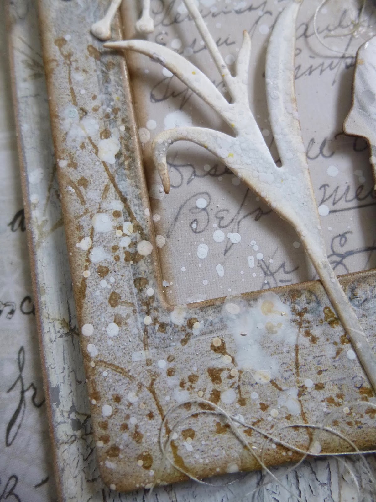
The frame and the panel have had some washes of white paint too, as well as getting in the splatter firing line. And I added some tiny dandelion stamping to the frame, also from the Rubber Dance Weed Love set.

The large panel is "screwed down" with some of the useful flat-backed Idea-ology Hardware Heads. A couple of drops of Mushroom alcohol ink soften the silvery finish to an aged rusty look.

The punched butterfly has some more of the Hickory Smoke Distress Stain shading, and some tiny wire antennae so he knows where he's going.

These two girls narrowly missed out on being one of the pairs on the Celebration of Friendship accordion, so I'm very happy they are now getting to be part of the fun, though in a larger size.

At the top of the tag, there's a file clip, weathered with some white acrylic paint.

And there's plenty of wild tangled thread adding a sense of movement to the whole thing.

I love how the Idea-ology Layers give everything so much dimension with their sturdy thickness, and they make it so easy to create a dynamic composition with lots of lovely vintage style.

Oops, I almost forgot... I was going to show you how Cestina is getting the lavender bit of her commemorative artwork, so that she matches Inge's collection - but we will have to step out of the Neutral Zone temporarily.

She'll get one of these small lavender field paintings (four pictures on a side of A4 paper) to frame. I'll show them to you in more detail some time soon, along with some of the other (obsessive) watercolouring I've been doing.

But back to the neutrals now. Thank you so much for stopping by today. I hope you like this gentle tag as much as I do.
As always, there's lots of glorious inspiration from my fellow Creative Guides over at A Vintage Journey, so do check it all out. And we do hope you'll come and join us in The Neutral Zone this month. Happy neutral crafting everybody!
The fundamental grey, which differentiates the masters, expresses them, is the soul of all colour.
Odilon Redon
If I see everything in grey, and in grey all the colours which I experience and which I would like to reproduce, then why should I use any other colour? I've tried doing so, for it was never my intention to paint only with grey. But in the course of my work I have eliminated one colour after another, and what has remained is grey, grey, grey!
Alberto Giacometti
The Simply Neutrals Tuesday party over at Apple Apricot is going to be taking a break, so I'm delighted that I just managed to squeeze something into this final month before the pause
I'd like to play along at the Bleeding Art Challenge where, this month, Anything Goes
Anything Mixed Media Goes too, as always, at the Creative Artiste Mixed Media Challenge
