I'm travelling into a new way of working, a new country, a new language, and a new hobby which I'm passionate about. Come with me for some of the journey...

Showing posts with label metal paper. Show all posts

Wednesday, 24 October 2012

Work in Progress

Hello... yup, me again.  If you're back for a second visit (having already seen What's On My Workdesk this Wednesday), then you're doubly welcome, but it's great to see you even if it's your first time today, or indeed ever!

I said this morning that I needed to do some catching up with the 12 Tags of Christmas being offered up by the amazing Funkie Junkie a.k.a. Linda Coughlin.  The challenge is sponsored by The Funkie Junkie Boutique.


Linda's offering weekly inspiration between now and (nearly) Christmas, and you can play along in whatever order and whenever suits you, as long as you get all 12 done by 17th December.  Here are all the details - and don't worry that you're behind... so am I!!  Linda's on number 6... this here's my second!

This is an Inspiration Challenge - so one of the great things is that you can spin off from Linda's tag in any direction, as long as you let her know what it is in her work that's kicked you off.

I'm still resisting Christmas crafting, I'm afraid.  Not that I'm trying to be a Scrooge about it, but I just can't get my head round Christmas in October... I don't think I'm ever going to be one of those crafters who makes every single Christmas card.  My nearest and dearest might get lucky, I suppose...

So my tag has taken inspiration from Linda's original in terms of the background and gears, but taken them elsewhere.  And I'll make no bones about it, this was another experiment for me (I was waffling on about experiments this morning) - and a slightly reluctant one at that.


I didn't do the faux riveted metal technique when Tim Holtz had it on his September tag; I didn't do it in the Studio L3's Compendium of Curiosities II week.


It didn't really seem like my thing, but I've seen it look great at lots of my favourite blogs (like here at the fabulous Inkypinkycraft), so I thought it was about time I gave it a whirl.


And you know what, in the end I had a lot of fun with it!


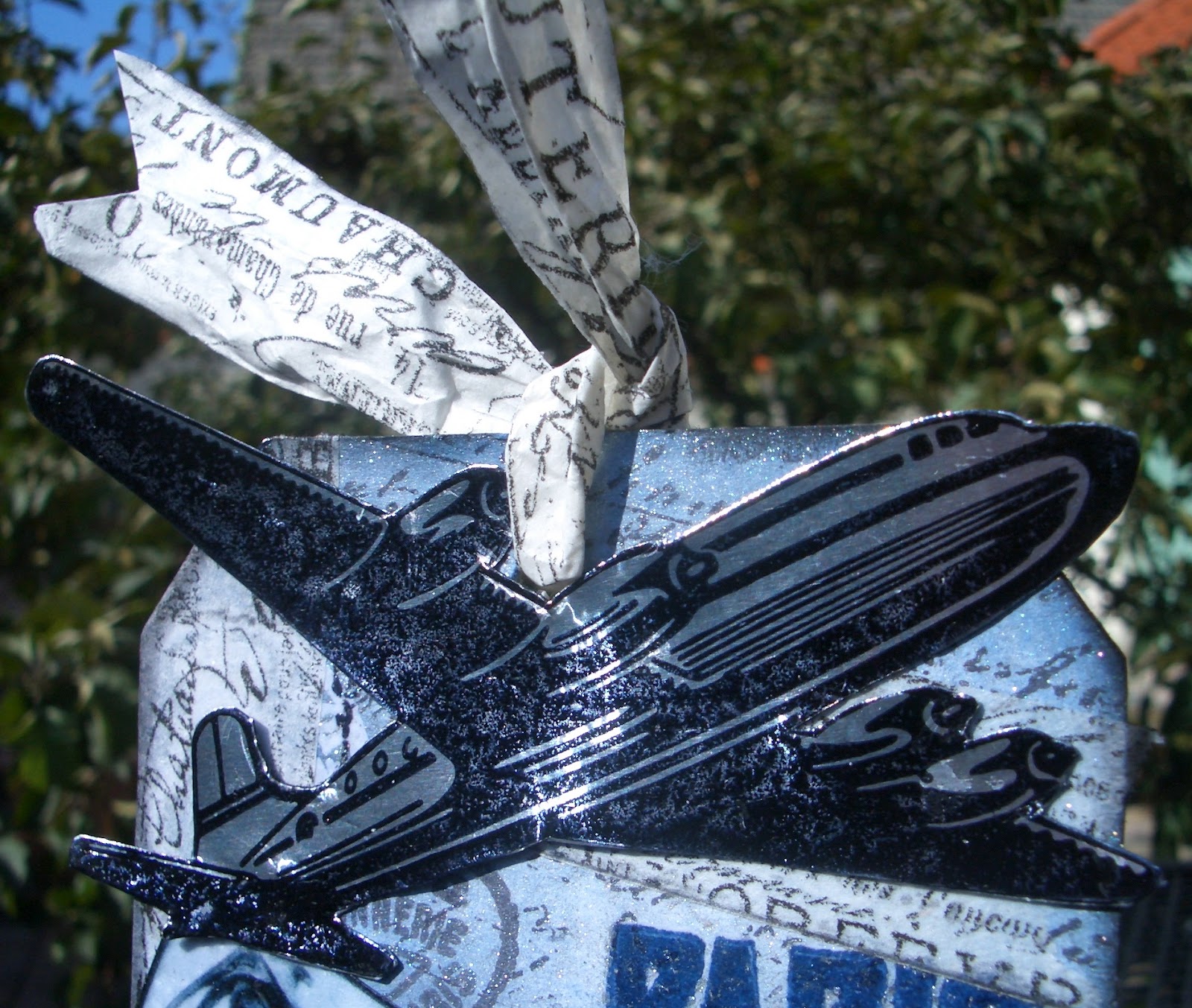
I didn't have the adhesive metal tape, but used some metal paper from PaperArtsy and some glue instead.  And, being me, I went with blue tones on the background, and on my gears.

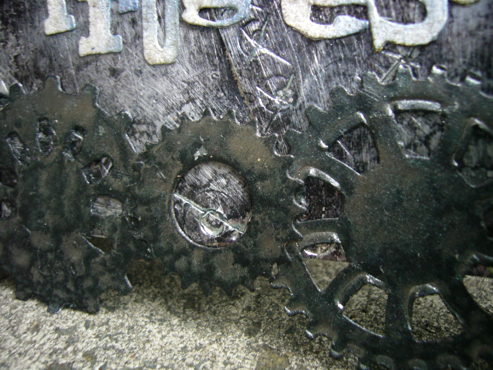
The gears are cut and embossed using Spellbinders' Sprightly Sprockets dies.


The ones at the bottom are cut out of black card, and treated to another TH technique using Perfect Pearls Mist which I've used before, and really loved.

I was going to trim them to the tag edges, so that it would look like an On the Edge die, as Linda's used (though hers were snowflakes), but I decided I liked the circles sticking out.


The gears in the middle are cut out of an old Diet Coke tin (you can still see some red text if you look closely at the edges!), and given lots of lovely alcohol inks to drink.


Okay, and a slight concession to Christmas in the trimmings, I admit it!


The letters are cream cardstock - cut with a TH decorative strip die - with an edging of Chipped Sapphire, and then lots of Perfect Pearls Mist in Pearl and Pewter.  


And the sentiment is pretty clear I think, both in close-up and the wider frame... I'm on tag number 2 out of 12, and I'm on an incredible journey with this crafting lark!  It's all Work In Progress.


Thanks so much for joining me for part of the journey, and I hope to see you again soon, either here or elsewhere in Craftyblogland.

There is no such thing as a failed experiment, only experiments with unexpected outcomes.
Richard Buckminster Fuller

I'm entering this (pretty obviously!) as Tag 2 in the 12 tags of Christmas at the Funkie Junkie

Sunday, 22 July 2012

Les Bleux

Hi all, welcome (back) to Words and Pictures, and an especially big welcome to the new followers.  (I can't believe it - nearly 50!!)

A shorter post today (I think... you never know how it'll pan out!) to invite you on a Trip to Europe on a Tag, as suggested by the Artful Times challenge this week.  Here you go:


I'm already in Europe, so didn't have as far to travel as some... and while I haven't that much interest in taking a trip to Paris now, I would love to do some time-travelling and take a trip to Paris sometime in the early 20th century, say in 1925...

the beginning of an explosion of cultural effervescence in music, art, fashion and celebrity:

when I could have caught the Exposition des Arts Décoratifs (which gave us the term Art Deco);


when air travel was still a luxury affair, in gleaming silver beauties of the sky;


when I could have caught Josephine Baker performing at the Folies Bergère in her early days, and visited the Moulin Rouge at the height of its artistic peak, with Mistinguett creating her great shows; 


when I could have seen the unutterably lovely Art Nouveau entrances to the Paris Métro still quite shiny and new...


It's nice to dream!


So that's the Paris I wanted to take a trip to with this tag.  Romantic, elegant, slightly shabby chic, gleaming and glamorous.

I started by hand-cutting a large tag to the dimensions of the tag in Tim Holtz's Movers and Shapers Tag and Bookplates die.  I don't have that, nor the base tray I'd need to start with the Movers and Shapers dies, but I can still use a pair of scissors!  I cut it out in a medium-weight chipboard, as I wanted it to have some solidity.  

I covered it with plain white cardstock, and started to create my background.  

I'm going to show some pictures of the background before all the main elements were added, as I liked it so much I almost left it that way!


I embossed the PARIS and the Carte Postale using Archival Cobalt with some Chipped Sapphire, and then clear embossing powder.  The rest were stamped in Black Archival.  There's one that I did in a clear emboss with the Versamark Watermark pad, so it would stay white as the base cardstock, but in the end it got mostly covered with TH tissue tape.  


Apart from the Carte Postale (TH) and the writing (Kaisercraft's Script), the majority of the stamps here are from 7 Gypsies Avignon set, which I managed to get very cheaply on ebay (hurrah!).  It's full of lovely French postmarks, and addresses, and authorisation stamps.  (Regular readers will have seen some of them in highly unusual action here.)


After stamping, I did lots of ink blending, starting with Weathered Wood and building up through Stormy Sky to some Chipped Sapphire towards the edges.  I then wanted to add that gleam, so it got a good few spritzes of Perfect Pearls in Blue Patina and in Pearl.  I love that this gives it almost an enamelly surface, and a slightly roughened surface to the touch.


It also had the extremely desirable effect of modulating a lot of the black stamping to a silvery gray... which really tapped in to one of my main ideas for the tag, my silver aeroplane (sorry, I'm going to be British about this... no airplanes round here).


Finally I added some bits of TH Tissue Tape, from the Sketchbook rolls.  They were the last thing on, so kept their roughened texture.


And I backed some on to some white tissue paper too, so that I could make my ribbons for the top of the tag from it.  I so love the tissue tape - it's just divinely gorgeous... all those fonts and handwriting and lovely Frenchifications!  And I love the crispiness of it on the tissue paper.


I was, of course, creating this background already knowing the elements which would take pride of place on it, and it was a process of juggling the elements and the bits of background to make sure my favourite bits continued to get a look in.


As I said, the aeroplane was actually one of the first bits to come to me.  I knew I could use the TH aeroplane from the journey set - à la the ones Indiana Jones is always plummeting out of - but I really wanted it to have that gleaming silver 1930s aura of glamorous air travel (there's a great episode of Poirot that has just what I mean in it).  So I thought I could try stamping it onto PaperArtsy's Metal Paper.  


I did it in Staz-On, as I wasn't sure whether the surface would take it, and for double safety I gave it a little zhuzh with the heat-tool.  No problem - and just the result I was after.  A little bit of fussy cutting and it's "chocks away"!


Of course you can't have Paris without the Eiffel Tower, so that got the metal paper treatment too.  Again this is TH, from the French Marketplace set, but I've cut it away from the framing elements which usually surround it.  (I should own up to a couple of failed attempts with black embossing, and silver embossing on black cardstock - just not sharp enough for my liking, even with the Detail embossing powder.)

And again, if you catch it in the sunlight, the metal paper really earns its keep.


I got the photos from a Google Image search trawl, and I tried them both in Sepia and in B&W, but decided I didn't want to go the 'Vintage Photo' route for once.  I liked this whole Blue/Silver affair, and though you know my passion for Brown and Blue, I decided to restrain myself!

They were shaping up nicely with some Weathered Wood and Stormy Sky shading, and a nice Black Soot edging (so messy, very mucky fingers, but worth it!), but again I wanted a bit more gloss.  

This time I achieved it by covering the whole picture with Embossing Ink, then heating clear embossing powder to get a kind of grainy gloss.  Ooh, look... shiny!


The lovely Deco lettering of this 7 Gypsies PARIS stamp, having been embossed right at the start, also got an extra little glow from the Perfect Pearls Mist stage.  I love trying to get that extra dimensionality on text.


Clearly, somebody had to have been doing all that writing, and addressing the Carte Postale, so I added the pen nib.  I hope that there's a lovely, passionate affaire to be writing home about.  If you're an American in Paris, or indeed anyone else in Paris, I feel there should be!


Merci beaucoup for your visit today.  I hope you've enjoyed my little time-travelling trip to Europe.  It's been so lovely to hear all your feedback.  The crafting community is full of incredibly generous and positive people it seems to me, and I'm very happy to have found this amazing new world of creativity and talent - all available to admire and learn from, at the click of a few buttons!  Thank you for making me feel so welcome.

I do hope to see you here again soon, but for now... au revoir!

I'm entering this in the following:
Artful Times wonderful challenge to take a Trip to Europe on a Tag
I'd like to make this my second and final entry for the Crafty Creations challenge Tags
The Fashionable Stamping Challenges invitation 'Let's Get Messy and Inky'
The Allsorts Challenge this week which is Distressing
and finally the Tando Creative Challenge to offer up some Texture

As an artist, a man has no home in Europe save in Paris
Friedrich Nietzsche

In the movies, Paris is designed as a backdrop for only three things - love, fashion shows, and revolution.
Jeanine Basinger

Friday, 29 June 2012

Man Up


Hi all!  Thanks for dropping in.  A bit of altered art today, my entry for La-de-dah's challenge My Mojo Monthly which, for June, is titled "Man Up!" - Oh, would that I could... but I've not interpreted it that way for the competition, you'll be glad to hear!  

I had such fun with this - lots of firsts for me, crafting-wise: first metal paper, first altered photo frame, first time I've been able to let some of my lovely Tim Holtz cogs escape from my hoard onto an actual project!


How's about a little 'before-and-after' to start us off?


Yes, from a bog-standard, white, plastic, deep photo frame (another bargain pick-up from a Czech pound-shop type place) to this.


The outer and inner walls are covered with papers from BoBunny's brilliant Weekend Market collection.  You can see it in another form on this album, as close followers will remember (it's okay, there's no test at the end).


It looks as though it's a combination of two papers from the collection, one the rulers, and the other the distressed chintz wallpaper, but in fact it's the front and back of the same sheet, called Rulers.


(What is it about old wooden rulers?  They're so beautiful, and rugged - like a good man, then!)


It's the one slight frustration with the BoBunny (and many other scrapbook papers) that they are double-sided... it means you have to CHOOSE which one of the two you want to use or - ah, I see now what they did there - buy extra pads so's you can have both.  Hmm, clever.


Used in smaller amounts, as here, though, you can have your cake and eat it.


I'm particularly pleased with the inner top of the frame, where the word motors appears right next to the motorcar!

The slogan is also stamped on to a piece of the BoBunny paper, using a little alphabet set I got for less than a pound from The Range (love a bargain).


I wanted to add a little slogan, some words to suit the challenge... and this just came out of a little bit of pondering about what it means these days to be a 'real man' - a very vexed question all round, I think.  For my penny's worth, Real Men Do Cry!


The front of the frame is covered with the metal paper which, as I said, I was using for the first time... it is so cool!

I got mine from PaperArtsy (funkiest of scrapping supply sites) It's metal sheeting on the one side, backed onto paper, so it's easily manipulated and stickable-down.  I ran it through the BigShot using the TH Gears Embossing Folder to get the lovely deep impressions.
  
Unfortunately, I discovered that - of all the things not to have with me - I had no black acrylic paint in my supplies, which most of the online tutorials recommend using. 


I had to work with a very dark brown acrylic and some Black Soot Distress Ink to get the metal grunged up; also lots of sanding (with - shh - a nail-file) to add to the texture.

I'm also pretty pleased with my first proper bit of fussy-cutting (what used to be called decoupage, but I love the soundscape of the new phrase, all those nice hissy, spitty consonants, and tender little u u vowels - well, in my accent, anyway) around the gears within the frame.

I hope in these pictures you can also see the dimensional depth I worked for within the frame.  The back 'wall' is a paper from DCWV's Tattered Time Mat Stack (that's Die Cuts With a View, in case you're taking notes at the back) with lovely shiny cogs and gears.  Next layer forward is my slogan, stuck to the back of (next layer forward) the metal paper cogs and gears (extra one up in the top left of the frame too), and then forward to the front of the frame for my stamped, enamelled embellishments.  (And the clock and the car are on double padded tape so that they even come a step forward of the frame too.)

I'm dead chuffed with these embellishments because they're basically so simple to make, but I think they look great.  Indulge me in a few extra photos while I try to get the glossiness over to you!

All three are Tim Holtz stamps, stamped on to plain Kraft cardstock using Staz-On black ink, and burnished slightly with Vintage Photo Distress Ink.  Then I've used the Melt Art UTEE powder over the Versamark Watermark ink, heat-embossed, to get the thick, glossy enamel effect.  I didn't even have to do more than one coat because the UTEE really does do what it says on the tin - it is Ultra Thick Embossing Enamel!

Please also admire the fussy-cutting on the chaps to the left... I'm getting better at it, slowly.  The hands on the clock are TH's Idea-ology Game Spinners attached with a long fastener.

Get that gleam!


Ooh, shiny!


It's okay... calm again now.  As I said, I really had fun with this one!

I like the rugged, aged look on the corners, burnished with a bit of Black Soot Distress Ink.


I like the concentric circles falling backwards into the frame.  


I like that, from the sides, you get a view of one paper on the outer frame and the other paper on the inner frame.  

Basically, I quite like it.  


Hope you do too.


Thanks for taking the time to take a look.  Now go off and have a good cry somewhere - it's ok!


Last words today go to Zsa Zsa Gabor... I'm saying nothing...

I want a man who's kind and understanding.  Is that too much to ask of a millionaire?
ZZG

Macho doesn't prove mucho.
ZZG