I'm travelling into a new way of working, a new country, a new language, and a new hobby which I'm passionate about. Come with me for some of the journey...

Showing posts with label Weekend Market. Show all posts

Sunday, 2 September 2012

60th Birthday Album

Hello all, and a happy Sunday to you...  So glad you've found the time to stop by.

I'd like to share some pictures with you of an album I made for my uncle for his 60th birthday.  You've already seen the card, made on mountboard, to be framed and hung.  There's also a Configuration Box which was a joint gift for my uncle and aunt together (she'll also turn 60 this year), and which I'll share some time soon.

This album I made over the summer, with pocket pages which could be filled with stories, memories, pictures and memorabilia... Last week we, as a family, gathered those bits and pieces, copying, printing, and then I did some distressing to all of it, so that the whole thing could be handed over on Bank Holiday Monday at the party.

So here it is...

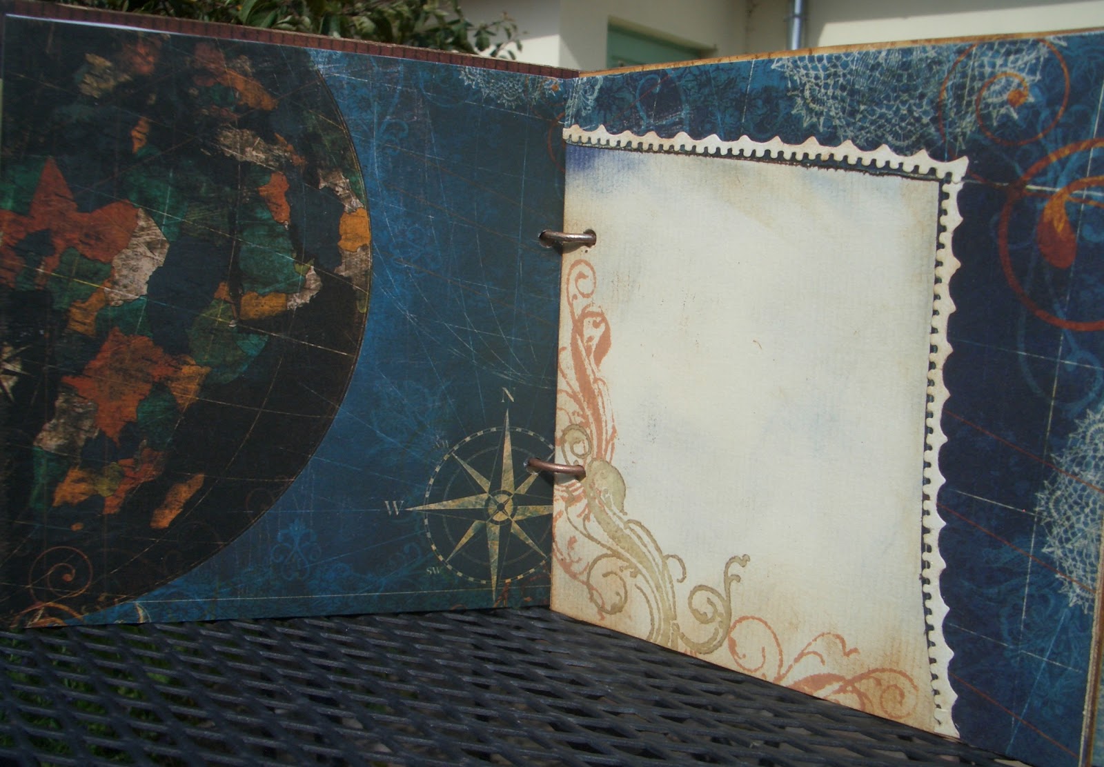
It's handmade completely from scratch, using the BoBunny Weekend Market papers.  They're lovely strong cardstock, so I was able to use just the papers themselves, folded and adhered, to make the pocket pages.  


I folded a half page of card into zigzags to provide the structure onto which to glue the folded pages - I hope that you can see what I mean in this photo on the right. I then also used glue tape along the bottom edge of the folded papers, et voilà - pocket pages!

For the covers, I stuck the paper to some mediumweight chipboard, for added sturdiness.  I've used Weekend Market for a masculine album before - I think it works really well.


I made the spine using a faux-leather technique which I first came across in this video by JAnnB Designs.  I love the texture.


I kept the 'leather' quite loose as I glued it, so that there'd be plenty of leeway for opening the album up.


Let's take a quick spin through the pages.


Each pocket uses a different paper from the collection, and there's additional stamping on some.  For each of them I made a co-ordinating tag, decorated front and back, and either the page or the tag - or sometimes both - has a sentiment stamped, and usually embossed, onto it.  (As well as that, on each tag I then handwrote a quotation we'd specially selected for my uncle on his 60th - but those are not there in these photos.)  I'll leave you in peace to take a look...


Oh, sorry, just one thing... I wanted a nice neat finish to the album, so rather than put ribbons or tabs on the tags themselves, and onto everything else I knew would be going in the pockets - which could have ended up looking a bit messy -  I cut a little triangle opening into the top of each pocket so that you can pull out what's inside easily.


I'm back!  Hope you managed to navigate your way through the album pages. 

Most of you will have recognised that most of the stamps are Tim Holtz, with a sprinkling of Pink Paislee and 7 Gypsies ones thrown in, also my favourite Autumn Leaves silhouettes.


There's a good tag example here at the end: the perched birds, here on the left, are on the reverse of the Journey tag, and - once flipped over - there they are in flight in the picture to the right, with the embossed Journey sentiment.


And in this final photograph you can see the pockets with all their extra stuffings, though I haven't shown you those here, because it's mainly very personal and therefore private.

This album was such fun to make, as the papers are a real pleasure to work with, besides being very gorgeous to look at.  

Thank you for spending some time here today, it's an absolute pleasure to have your company. I hope the rest of your day is filled with joy and peace.  See you again soon, I hope! 

I'm entering this for the following:
Top Tip Tuesday are celebrating their second birthday with a Birthday Gift challenge, and I'm offering a tip: when making pocket pages, make sure you can get hold of what you put inside - either by putting tabs or ribbons on the inserts, or by cutting an 'access dip' in the pocket itself.
Anything But a Card, a brand spanking new challenge blog, are kicking off with an Anything Goes
Another brand spanking new blog, Heck of a Challenge, are also running Anything Goes to get us started
Creavil are asking us to Make It For A Man - done!
Simon Says Stamp are also having an Anything Goes challenge

And for the quotes today, I'll share a couple of the ones I wrote onto the tags for my uncle.  
60? ... who's counting?!  Happy Birthday!

Old wood to burn, old books to read, old wine to drink and old friends to converse with.
Alphonso of Castile

When I was young I was amazed at Plutarch’s statement that the elder Cato began at the age of eighty to learn Greek.  I am amazed no longer.  Old age is ready to undertake tasks that youth shirked because they would take too long.
W. Somerset Maugham

Praise they that will times past, I joy to see
My self now live: this age best pleaseth me.
Robert Herrick

Monday, 30 July 2012

A Proper Gent

Hello all... I've been drooling over the Vintage Gentleman Kit available at Vintage Page Designs for nearly a whole month now.  I'd finally decided to give in and go shopping, only to find that they were on holiday - thwarted again!

But I still wanted to enter the challenge over at their blog this month which is entitled simply 'Gentlemen'.  I've created a number of shabby chic albums (some of which you've seen, and some of which are still to be revealed), but mostly in gentle blues, greens and the occasional mauve/pink.  So what a good opportunity to go for something more manly.  I had done a toilet roll mini-album in browns and blues using the BoBunny Weekend Market collection of papers, but I wanted something on a slightly larger scale (it's a 6x6) - so here it is:

I'm imagining a smoking jacket, pipe, library kind of gentleman here... and definitely of a certain vintage!

For the cover I used a paper from the Papermania Persimmon collection, and distressed it to get a very old wallpaper look - the sort he might have in his study or library.

I sanded it with an emery board (nail files are very useful craft tools), and blended on some Vintage Photo Distress Ink.

The corners are adorned with the corner flourish from the Tim Holtz Journey collection, double stamped in Vintage Photo for extra dimension.
The tiny tabs, cut using the TH die Tiny Tabs and Tags, have Weekend Market papers front and back, sandwiched onto card for some dimension and UTEE'd (Ultra Thick Embossing Enamel) for strength.

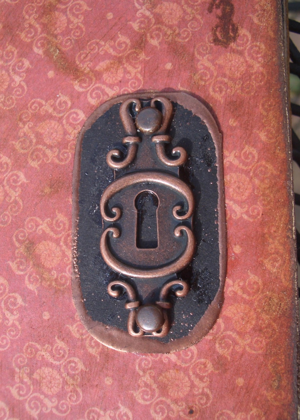
The lock and key are from the BoBunny trinket set which is part of the WM array, and it's all strung on to the book ring using one of TH's ball chains.


I made a black backboard for the lock, and edged it with Copper embossing powder.  I used the same embossing powder to transform my silver book rings into copper ones, so that they'd suit the look of the album.

Throughout the album, I've used the Weekend Market papers combined with the Persimmon set, as well as adding music manuscript and plainer handmade papers of my own.  I'm always worried that I wouldn't want to cover the amazing designer papers with journalling or photographs, but I realise that's pretty much the whole point of an album... so I try to create other spaces for journalling or as photo mats which will allow the papers to still shine through.

Let's take a quick flick through the album...

I like to create each double page spread as a single 'whole' area, so that each time you turn a page you find a new environment.

The flourishes most of the way through the album are from Whimsy Stamps, a set called Lavish Flourishes.


Quite often, I've embossed them with copper embossing powder, to get a lovely burnished sheen.  Love the wooden rulers from the BoBunny papers, so I've created my own version on the reverse of the tags using TH's stamp from the Seamless Experience set.


I can certainly imagine that Sir Jasper (oh, look at that, he has a name...) has one of those glorious globes in his study, and probably an astronomical one too.  This next spread pays homage to that, with a photo pad or journalling space created within the gentle curves of lines of latitude and longitude.


The next spread has a large pull-out tab, one side of Weekend Market, and one of actual sheet music, stamped with flourishes and edged with Vintage Photo.  There are die-cut hearts to match, glazed with Rock Candy Distress Crackle Paint.


I'm sure that, if not a musician himself, Sir Jasper is a keen connoisseur of fine music - chamber music I think, or possibly opera... he might, in this pocket, keep mementos of performances he has attended... a ticket, a programme, the lace handkerchief of the young soprano from the chorus...?


The next one is a little ornate for a man you may think, but a gentleman of Sir Jasper's standing and character will always appreciate beauty in his surroundings.  A fine architectural flourish such as this one, provided by the TH Scrollwork On the Edge die would perhaps be reminiscent of the ironwork of his wrought iron gates.  And rather than lace, let us consider it the mouldings upon the very fine ceiling of his Great Hall.


This page
opens as well, to reveal a pocket in which Sir Jasper might keep records of his latest shooting party.


An elegant gold and brown affair here, a dark rich brown like the leather of Sir Jasper's favourite ottoman, or his favourite wingback chair, with the gold stud work.  (Additional flourishes provided by the Whimsy stamps and some gold acrylic paint.)


The stripes on this spread are a little rakish, like Sir Jasper's younger brother (hmm, let's see... Bertram?) who is, as the phrase has it, 'half flash, half foolish', but very fond of a dashing waistcoat.


There are copper-embossed flourishes, and tags with one of my favourite TH stamps, the pen nibs from the Curious Possibility set.


I shouldn't think Sir Jasper gets many letters written while Bertie is staying - unless they are bills of payment for the debts his brother has incurred.


A retreat to the music room, then, so tastefully wallpapered (BoBunny), there to listen dutifully to the daughters of his near neighbours, the Cottingtons, as they demonstrate their musical prowess... or lack of it.

Still a gentleman will always be attentive and complimentary to the gentler sex.


And then this last one, with much more delicate wallpaper that I love (Papermania), makes a return to the rulers and measures - some of my favourite vintage objects.


I work, in a very old-fashioned way, with a wooden ruler myself - not only that, it has a list of the Kings and Queens of England all the way down the back.


I feel sure that Sir Jasper would approve of my learning the history of the nation as I'm crafting!


Thank you for joining me for this little tour of Sir Jasper's domain - apologies, I think it's the Whimsy stamps that must have induced the whimsical approach... I've been infected by the Lavish Flourishes in my writing too.  Normal service will be resumed as soon as possible.  I hope you'll drop by again soon, just to check my pulse, perhaps?!

I'm entering this (though Sir Jasper would probably disapprove of vulgar competition - oh, hush now) in Vintage Page Designs' July challenge Gentlemen, played, of course, by Marquis of Queensberry Rules... okay, that's enough now - I'm going to bed!

He was the product of an English public school and university.  He was, moreover, a modern product of those seats of athletic exercise.  He had little education and highly developed muscles - that is to say, he was no scholar, but essentially a gentleman.
H. Seton Merriman

A gentleman is one who never hurts anyone's feelings unintentionally.
Oscar Wilde

Friday, 29 June 2012

Man Up


Hi all!  Thanks for dropping in.  A bit of altered art today, my entry for La-de-dah's challenge My Mojo Monthly which, for June, is titled "Man Up!" - Oh, would that I could... but I've not interpreted it that way for the competition, you'll be glad to hear!  

I had such fun with this - lots of firsts for me, crafting-wise: first metal paper, first altered photo frame, first time I've been able to let some of my lovely Tim Holtz cogs escape from my hoard onto an actual project!


How's about a little 'before-and-after' to start us off?


Yes, from a bog-standard, white, plastic, deep photo frame (another bargain pick-up from a Czech pound-shop type place) to this.


The outer and inner walls are covered with papers from BoBunny's brilliant Weekend Market collection.  You can see it in another form on this album, as close followers will remember (it's okay, there's no test at the end).


It looks as though it's a combination of two papers from the collection, one the rulers, and the other the distressed chintz wallpaper, but in fact it's the front and back of the same sheet, called Rulers.


(What is it about old wooden rulers?  They're so beautiful, and rugged - like a good man, then!)


It's the one slight frustration with the BoBunny (and many other scrapbook papers) that they are double-sided... it means you have to CHOOSE which one of the two you want to use or - ah, I see now what they did there - buy extra pads so's you can have both.  Hmm, clever.


Used in smaller amounts, as here, though, you can have your cake and eat it.


I'm particularly pleased with the inner top of the frame, where the word motors appears right next to the motorcar!

The slogan is also stamped on to a piece of the BoBunny paper, using a little alphabet set I got for less than a pound from The Range (love a bargain).


I wanted to add a little slogan, some words to suit the challenge... and this just came out of a little bit of pondering about what it means these days to be a 'real man' - a very vexed question all round, I think.  For my penny's worth, Real Men Do Cry!


The front of the frame is covered with the metal paper which, as I said, I was using for the first time... it is so cool!

I got mine from PaperArtsy (funkiest of scrapping supply sites) It's metal sheeting on the one side, backed onto paper, so it's easily manipulated and stickable-down.  I ran it through the BigShot using the TH Gears Embossing Folder to get the lovely deep impressions.
  
Unfortunately, I discovered that - of all the things not to have with me - I had no black acrylic paint in my supplies, which most of the online tutorials recommend using. 


I had to work with a very dark brown acrylic and some Black Soot Distress Ink to get the metal grunged up; also lots of sanding (with - shh - a nail-file) to add to the texture.

I'm also pretty pleased with my first proper bit of fussy-cutting (what used to be called decoupage, but I love the soundscape of the new phrase, all those nice hissy, spitty consonants, and tender little u u vowels - well, in my accent, anyway) around the gears within the frame.

I hope in these pictures you can also see the dimensional depth I worked for within the frame.  The back 'wall' is a paper from DCWV's Tattered Time Mat Stack (that's Die Cuts With a View, in case you're taking notes at the back) with lovely shiny cogs and gears.  Next layer forward is my slogan, stuck to the back of (next layer forward) the metal paper cogs and gears (extra one up in the top left of the frame too), and then forward to the front of the frame for my stamped, enamelled embellishments.  (And the clock and the car are on double padded tape so that they even come a step forward of the frame too.)

I'm dead chuffed with these embellishments because they're basically so simple to make, but I think they look great.  Indulge me in a few extra photos while I try to get the glossiness over to you!

All three are Tim Holtz stamps, stamped on to plain Kraft cardstock using Staz-On black ink, and burnished slightly with Vintage Photo Distress Ink.  Then I've used the Melt Art UTEE powder over the Versamark Watermark ink, heat-embossed, to get the thick, glossy enamel effect.  I didn't even have to do more than one coat because the UTEE really does do what it says on the tin - it is Ultra Thick Embossing Enamel!

Please also admire the fussy-cutting on the chaps to the left... I'm getting better at it, slowly.  The hands on the clock are TH's Idea-ology Game Spinners attached with a long fastener.

Get that gleam!


Ooh, shiny!


It's okay... calm again now.  As I said, I really had fun with this one!

I like the rugged, aged look on the corners, burnished with a bit of Black Soot Distress Ink.


I like the concentric circles falling backwards into the frame.  


I like that, from the sides, you get a view of one paper on the outer frame and the other paper on the inner frame.  

Basically, I quite like it.  


Hope you do too.


Thanks for taking the time to take a look.  Now go off and have a good cry somewhere - it's ok!


Last words today go to Zsa Zsa Gabor... I'm saying nothing...

I want a man who's kind and understanding.  Is that too much to ask of a millionaire?
ZZG

Macho doesn't prove mucho.
ZZG