I'm travelling into a new way of working, a new country, a new language, and a new hobby which I'm passionate about. Come with me for some of the journey...

Wednesday, 25 July 2012

WOYWW first-timer

Hello all!  I've been meaning to join in for several weeks, and if I don't do it today, my workdesk will be gone... so it's now or never (for this workdesk!).  For those not in the know, the mysterious initials WOYWW stand for What's On Your Workdesk? Wednesday - a chance to be as snoopy as you like, visiting hundreds of busy crafters' work-spaces to see what they're up to... Nosy Parker's heaven!  Head over to Stamping Ground, for Julia Dunnit's generous hosting of the WOYWW links, and you'll be hooked...

So, at the end of this week I'm heading back to the UK, and the crafting space I set up here in the Czech Republic will be dismantled so - as much for my own memories as anything else - I wanted to take the chance to document it.  (Really I should stick to one photo, but I'd like to remember this lovely summer of crafting, so apologies, and feel free to skip some!)

Here's the (thankfully nice and large) garden table we found very cheaply in the supermarket the day after arriving in the Czech Republic.  We'd been several days on the road, staying with friends in Germany en route, so I'd not been able to do any crafting at all, and I was like an addict needing their fix... very, very jumpy!  So finding a table was a priority!


Most of the regular supplies have been living on shelves made out of the wooden crates (free leftovers from the local market at home) I shipped it all here inside.  My luggage consisted of one bag of clothes and several boxes of craft stuff.  Got to get your priorities straight, you know.


There's another table in the corner of the room that my BigShot stands on, and under which is the large, flatter box in which all the papers were transported and have been stored for the duration.


On the desk are some bits and pieces being prepared for a HUGE project which I can't reveal yet - a wedding transformation which is all top secret (and I don't think my sister-in-law-to-be will be able to tell much from this, so I'm running with it).  Alongside all the other stuff I've been doing, there's been this major task also in hand.  After August 12th, I'll be able to share with you what I've been up to.

My stamps mainly live in the small wicker basket with some overflow in other places.  Precious Distress Inks right where I can reach them, and in the black shoebox are embossing powders, re-inkers, Distress Stains, Glossy Accents and little glue pots.  The big gold spray can is my water spritzer, recycled from its previous life into my crafting life.

So, in the next couple of days I'll have to say goodbye forever to my temporary workspace, pack all this back into the crates, load it into the car, and make it through another few days without being able to do any crafting... eek, already nervous at the prospect!  I'm trying to store up enough projects to be able at least to blog occasionally en route.  Total cold turkey would really send me over the edge otherwise... and I'll also be dependent on my visits to all of you to keep me sane!

I'm happy to have finally managed to join in a WOYWW (if rather late in the day), and I hope to make it along more often in future (though perhaps not for the next couple, given the travelling and the wedding preparations).  Thank you for stopping by, and now I'm off to nose round some other craftrooms!

The things most people want to know about are usually none of their business.
George Bernard Shaw

Tuesday, 24 July 2012

Time flies...

Hello and welcome - to visitors and followers old and new!  I have a sense at the moment of time flying away from me... the summer break I carved for myself out of a chaotic and difficult year is drawing rapidly to an end.  I'll be leaving the Czech Republic at the end of this week, and every second now is precious before the return to the turmoil.  I'm trying very hard to stay in the present moment and enjoy it, rather than worry about all the things hurtling towards me.  

So the project I'm sharing with you today is something of a reminder for myself.


There's something so beautiful about clock faces, especially vintage style and Roman numeral ones, and yet when you search for quotations about time, so many of them are about its inexorable ticking away of our lives.  One of my favourite lines from Richard II (possibly my favourite Shakespeare play) is the bitter, melancholy realisation he has towards the end:  I wasted time, and now doth time waste me.

And then, on the other hand, there are the quotes which are about savouring, or living in the moment, and that rather more positive thought is the one I chose to match my lovely vintage clock faces with.

The piece is structured on an 8x8 sheet from Prima's Printery collection - a lovely combination of clocks and script - two of my favourite things, and there are even some keys thrown in for good measure!

I backed it onto some kraft cardstock for more stability, and then painted some gesso onto it in various places.  I kept it to quite a thin coat, so that the images beneath would still show through slightly.

One reason behind the gesso was that I needed to create a space to stamp the sentiment I wanted to use (using a little alphabet set I got for £1 in The Range).  It's stamped in Walnut Stain, though - as I've learned - when you stamp onto gesso it fades to a fabulous weathered look. And I love that you can still see the handwriting from the Printery paper beneath it.


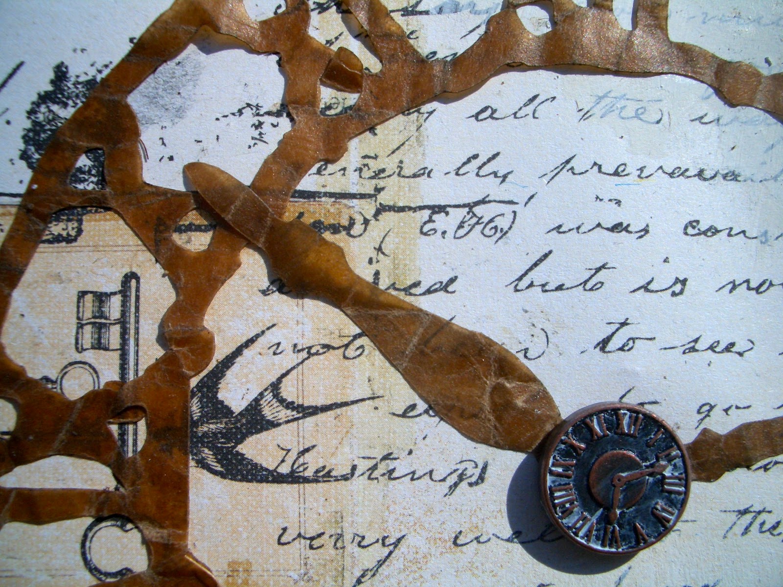
One of the main features of my "canvas" is the large clock face cut in wax paper using Tim Holtz's Weathered Clock die.  The paper is crinkled and distressed with some Black Soot DI to dull down the colour a bit to tone in.


The dark demi-clock face beneath it is cut from the DCWV Tattered Time matstack - it has a slightly glossier finish, though I've distressed round the edge with the TH Paper Distresser (as I've also done with the Kraft backing, the Prima paper and pretty much anything else I could get my hands on!).


At the centre, the hands are held in place (besides the glue!) with a gorgeous brad from BoBunny - it comes in both their Weekend Market and their Et Cetera brad sets (and for all I know, in some others as well).

The brad got a little dab with some gesso too, wiped off, to just leave a little bit of a distress look to the clock face.


In the top right, over another gesso'd area, I blended Walnut Stain using my homemade clock mask (TH mask sheets cut using the same Weathered Clock die) to create a shadow clock.  This area also got a spritz of Heirloom Gold Perfect Pearls Mist to give it a vintage lustre.

The Grungeboard letters are from the Minis set, given a coat of sandy acrylic and distressed with Walnut Stain at the extremities.

I sewed some stitches of beige thread through the Idea-ology buttons but they are then (shh!) glued down.

There's a visual hint of another proverb in this corner if you're willing to 'read' it: a stitch in time...

The clock numerals paper arching over the top corners of the piece is again from the DCWV Tattered Time stack.

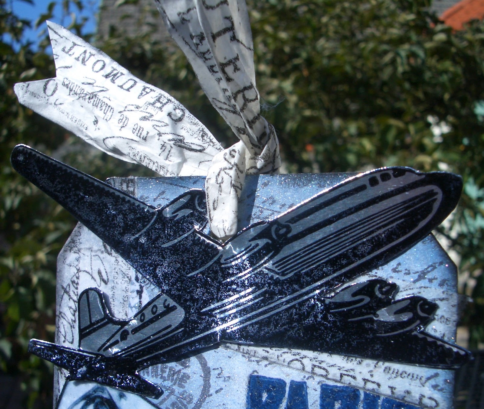
Down in the bottom left, I had some fun placing a trio of clocks, one Idea-ology, one within the paper, and one from, I think, The Bead Shop.  I juggled them for a while looking for the best positioning, but it wasn't until I brought my other framing element into play that I was happy with the result.

I'd thought right from the start that I wanted to use some strands from the disintegrating doormats here in the Czech house.  They are lovely woven mats, but now in a very distressed state themselves - and every once in a while a whole plait comes free, and I grab it for crafting purposes!

I did darken it slightly for this project with some Walnut Stain Distress Stain.


I had thought I wanted to do a full frame on all four sides, but that's now for a future project.


It wasn't right here... it needed to be just down in this corner, and once it was there, it was quite clear where the Bead Shop clock (now also with some gesso distressing) wanted to be.

I love that there's part of the fabric of this house (from which I haven't the slightest desire to depart, but events and work in the UK demand it) built in to this project!


You'll probably have spotted the final TH element - one of the Idea-ology Word Sticks... TIME, obviously.  I painted some white acrylic on and wiped the majority away, leaving the letters highlighted in the centre.

And then this vertical element is placed where the paper at the base of it all has a vertical divide between the script to the right and the images to the left.

Finally I cut some strips of mesh ribbon to provide an extra 'frame', and backed the whole thing with some more Kraft to make sure they stayed put!


So, there you have it... I'm working hard to find the space in every moment, and certainly when I'm crafting, I find that it is possible to enter 'the zone' of being really present and conscious.  Of course, I can spend hours at my craft table, but every one of the minutes feels like time well spent.

Thank you so much for sharing some of your precious time with me here at Words and Pictures today.  Your support and your feedback are a real pleasure, as are all the things I discover whenever I come and pay a return visit somewhere in Craftland!

I'm entering this in the following:
Out of a Hat Creations challenge this week, where the theme is Time
A second entry for the Allsorts challenge, Distressing
I'm joining the Sunday Stamper over at Hels Sheridan's Ink on my Fingers for More than Words
It's All About Vintage who are having an Anything Goes challenge this month

Clocks slay time... time is dead as long as it is being clicked off by little wheels; only when the clock stops does time come to life.
William Faulkner

But what minutes!  Count them by sensation, and not by calendars, and each moment is a day.
Benjamin Disraeli

You must have been warned against letting the golden hours slip by; but some of them are golden only because we let them slip by.
J.M.Barrie


Sunday, 22 July 2012

Les Bleux

Hi all, welcome (back) to Words and Pictures, and an especially big welcome to the new followers.  (I can't believe it - nearly 50!!)

A shorter post today (I think... you never know how it'll pan out!) to invite you on a Trip to Europe on a Tag, as suggested by the Artful Times challenge this week.  Here you go:


I'm already in Europe, so didn't have as far to travel as some... and while I haven't that much interest in taking a trip to Paris now, I would love to do some time-travelling and take a trip to Paris sometime in the early 20th century, say in 1925...

the beginning of an explosion of cultural effervescence in music, art, fashion and celebrity:

when I could have caught the Exposition des Arts Décoratifs (which gave us the term Art Deco);


when air travel was still a luxury affair, in gleaming silver beauties of the sky;


when I could have caught Josephine Baker performing at the Folies Bergère in her early days, and visited the Moulin Rouge at the height of its artistic peak, with Mistinguett creating her great shows; 


when I could have seen the unutterably lovely Art Nouveau entrances to the Paris Métro still quite shiny and new...


It's nice to dream!


So that's the Paris I wanted to take a trip to with this tag.  Romantic, elegant, slightly shabby chic, gleaming and glamorous.

I started by hand-cutting a large tag to the dimensions of the tag in Tim Holtz's Movers and Shapers Tag and Bookplates die.  I don't have that, nor the base tray I'd need to start with the Movers and Shapers dies, but I can still use a pair of scissors!  I cut it out in a medium-weight chipboard, as I wanted it to have some solidity.  

I covered it with plain white cardstock, and started to create my background.  

I'm going to show some pictures of the background before all the main elements were added, as I liked it so much I almost left it that way!


I embossed the PARIS and the Carte Postale using Archival Cobalt with some Chipped Sapphire, and then clear embossing powder.  The rest were stamped in Black Archival.  There's one that I did in a clear emboss with the Versamark Watermark pad, so it would stay white as the base cardstock, but in the end it got mostly covered with TH tissue tape.  


Apart from the Carte Postale (TH) and the writing (Kaisercraft's Script), the majority of the stamps here are from 7 Gypsies Avignon set, which I managed to get very cheaply on ebay (hurrah!).  It's full of lovely French postmarks, and addresses, and authorisation stamps.  (Regular readers will have seen some of them in highly unusual action here.)


After stamping, I did lots of ink blending, starting with Weathered Wood and building up through Stormy Sky to some Chipped Sapphire towards the edges.  I then wanted to add that gleam, so it got a good few spritzes of Perfect Pearls in Blue Patina and in Pearl.  I love that this gives it almost an enamelly surface, and a slightly roughened surface to the touch.


It also had the extremely desirable effect of modulating a lot of the black stamping to a silvery gray... which really tapped in to one of my main ideas for the tag, my silver aeroplane (sorry, I'm going to be British about this... no airplanes round here).


Finally I added some bits of TH Tissue Tape, from the Sketchbook rolls.  They were the last thing on, so kept their roughened texture.


And I backed some on to some white tissue paper too, so that I could make my ribbons for the top of the tag from it.  I so love the tissue tape - it's just divinely gorgeous... all those fonts and handwriting and lovely Frenchifications!  And I love the crispiness of it on the tissue paper.


I was, of course, creating this background already knowing the elements which would take pride of place on it, and it was a process of juggling the elements and the bits of background to make sure my favourite bits continued to get a look in.


As I said, the aeroplane was actually one of the first bits to come to me.  I knew I could use the TH aeroplane from the journey set - à la the ones Indiana Jones is always plummeting out of - but I really wanted it to have that gleaming silver 1930s aura of glamorous air travel (there's a great episode of Poirot that has just what I mean in it).  So I thought I could try stamping it onto PaperArtsy's Metal Paper.  


I did it in Staz-On, as I wasn't sure whether the surface would take it, and for double safety I gave it a little zhuzh with the heat-tool.  No problem - and just the result I was after.  A little bit of fussy cutting and it's "chocks away"!


Of course you can't have Paris without the Eiffel Tower, so that got the metal paper treatment too.  Again this is TH, from the French Marketplace set, but I've cut it away from the framing elements which usually surround it.  (I should own up to a couple of failed attempts with black embossing, and silver embossing on black cardstock - just not sharp enough for my liking, even with the Detail embossing powder.)

And again, if you catch it in the sunlight, the metal paper really earns its keep.


I got the photos from a Google Image search trawl, and I tried them both in Sepia and in B&W, but decided I didn't want to go the 'Vintage Photo' route for once.  I liked this whole Blue/Silver affair, and though you know my passion for Brown and Blue, I decided to restrain myself!

They were shaping up nicely with some Weathered Wood and Stormy Sky shading, and a nice Black Soot edging (so messy, very mucky fingers, but worth it!), but again I wanted a bit more gloss.  

This time I achieved it by covering the whole picture with Embossing Ink, then heating clear embossing powder to get a kind of grainy gloss.  Ooh, look... shiny!


The lovely Deco lettering of this 7 Gypsies PARIS stamp, having been embossed right at the start, also got an extra little glow from the Perfect Pearls Mist stage.  I love trying to get that extra dimensionality on text.


Clearly, somebody had to have been doing all that writing, and addressing the Carte Postale, so I added the pen nib.  I hope that there's a lovely, passionate affaire to be writing home about.  If you're an American in Paris, or indeed anyone else in Paris, I feel there should be!


Merci beaucoup for your visit today.  I hope you've enjoyed my little time-travelling trip to Europe.  It's been so lovely to hear all your feedback.  The crafting community is full of incredibly generous and positive people it seems to me, and I'm very happy to have found this amazing new world of creativity and talent - all available to admire and learn from, at the click of a few buttons!  Thank you for making me feel so welcome.

I do hope to see you here again soon, but for now... au revoir!

I'm entering this in the following:
Artful Times wonderful challenge to take a Trip to Europe on a Tag
I'd like to make this my second and final entry for the Crafty Creations challenge Tags
The Fashionable Stamping Challenges invitation 'Let's Get Messy and Inky'
The Allsorts Challenge this week which is Distressing
and finally the Tando Creative Challenge to offer up some Texture

As an artist, a man has no home in Europe save in Paris
Friedrich Nietzsche

In the movies, Paris is designed as a backdrop for only three things - love, fashion shows, and revolution.
Jeanine Basinger

Friday, 20 July 2012

Semi-controlled Mayhem

Where do these ideas come from?!  Why do I start these things?!  Why do I make life so difficult for myself?!
Here's the latest creation - a mobile - to have been filling my head, craft table and all my time, and it's been quite a ride...  
(Photograph warning - there are a lot!)


The starting point was the Artistic Stamper challenge looking for Circles, which (appropriately for a circular challenge) had been revolving in my head since nearly the beginning of July, and then got an extra little shove when Top Tip Tuesday also laid down a Circles challenge this week.

Somewhere in the small hours one night, the revolving ideas began to take on the shape of a circus Big Top tent (ah... maybe the word 'top' in Top Tip Tuesday snuck in there!).  

And right near the beginning of this new, crazy craft obsession back in March, I was really lucky to get the Graphic 45 Le Cirque stamp sets on ebay for a great price...

I don't have the matching papers yet, so this project gave me a chance to play with lots of fun techniques to create papers for stamping the images on, for the tent, and for the reverse of the images.


I'd been trying to work my way round to some Altered Metal for the Frilly and Funkie challenge, even though I don't have any alcohol inks or patinas in my stash yet (right at the top of the list for when I'm home and have some money again, having seen what everyone's doing with them - really exciting!).  

I was also setting myself a little challenge to use some bright colours out of my comfort zone.  I haven't got the Dylusions sprays which everyone in the universe seems to have, but I do have Distress Inks in Dried Marigold, Tumbled Glass, Wild Honey and a few others which I've barely touched.  Time to get them out.

And, finally, for Simon Says Stamp and Show this week, it's No Rules... so I really decided to let rip.  


I would say the result was semi-controlled mayhem for a while, but I think it worked out in the end!


I'd had three little woven carousels, found in a plant nursery, sitting on top of the wardrobe for a while, and that blinding light in the early hours about the Big Top was simultaneous with the thought - 'I could use one of those for it'. 


I knew the Le Cirque stamps were ready and waiting, but I didn't really have any papers to meet my own challenge of brighter colours, so it was out with the Distress Inks.  

I really had fun creating lots of variations on a theme.  


I did some blending, some spritzing, some flicking, some puddles on the craft mat combining variations of the colours I mentioned above.  

I occasionally added some Peeled Paint to the mat from a Distress Marker (not having the pad in that colour).

(On the left, it's getting ready to be stripes of tent.)


I used the TH retro circles stamp on one of the backgrounds using the wiggle-walk across the colours on the mat to ink up the stamp.  Then with a spritz of water you get a nice watercolour effect on the print.

I really wanted some dots (nice and circular) in the mix, but I don't have a stencil (here's another 'yet'!).  What I do have are some Tim Holtz mask sheets, so with a hole-punch I created my own dots stencil.  


Of course, the hole-punch can't reach very far, so it was a pretty small stencil that I had to keep using as a repeat pattern.

To some parts I added the damask stamp from Recollections Lace Backgrounds set, stamped in Faded Jeans, for some extra texture. Having gone back and looked at the Graphic 45 papers for Le Cirque, I find there's a similar paper there, so again my subconscious was more on the ball than me!  You can see my version on the reverse of the Mayhem pennant above.


As I say, I used some of the papers for stamping the images on, and some were used as the reverse side.  This fabulous laughing clown is the only circus figure to appear twice on the piece - clowns generally come in troupes, don't they... a hilarity of clowns?!  On the reverse side, we have the damask again, with some more stencilled circles added, this time in gold acrylic. 

He was relatively easy to cut out (though circles are not my favourite thing to cut freehand, even following a carefully traced line round some washi tape).  The other figures, once backed onto their respective papers, with some strengthening card sandwiched in between, all had to be fussy cut slowly and patiently.

The acrobatic clown was okay, but I had some hairy moments with a couple of the others... the elephant (near the top of the page) nearly lost his tail.  

The trapeze artist has unfeasibly thin ankles (I think that, like Barbie, anatomically she'd be unable to walk without breaking them if she existed in real life), and the tricky space within her arms, but it was all worth it once I saw her holding on to the twisted gold wire (picture wire from the hardware store), which I wound round her own stamped rope.


All of them needed a UTEE coat for protection of those delicate extremities, but the glossy enamel was part of my plan anyway.  I love it!


The ringmaster hangs right at the centre of things of course, beneath the other element I really wanted to include - a lovely green marble (supermarket freebie, though I had to sand away a silly advertising transfer first)... not just circular, but globular now!  

I created a net of golden picture frame wire to hold it in place, and attached our glorious ringmaster beneath.  With that belly and that cloak, there's plenty of space on the reverse to admire the gold polka dot stencilling!

As well as the figures, there are some stars stamped on orange, backed with the damask papers, and those are mounted into some gold curtain rings, filled in both sides with Glossy Accents from Ranger.  I love this stuff too - pour it over, spread it out, burst any air bubbles with a pin, let it set, and you have a gorgeous glossy dimensional finish to your image.

The other 'balloons' bouncing round the big top are my altered beer bottle tops.  I flattened out the edges as much as I could with a French wrench, and then (whispering invocations to the goddess of the BigShot not to let it break) ran it through with the TH Gears embossing folder.  I really didn't expect it to work (and there is a little bit of scratching on the inside of the folder, be warned!), but I love the result.  I added an extra coat of gold acrylic, as the beer bottle lid was a slightly dull gold, and I didn't want anything dull in my circus!

The part I really wasn't sure whether I would be able to realise from the pictures in my head was the 'tent' itself.  I knew the shape I needed (and if I hadn't been sure, I had the stamp right there to remind me!), and the woven frame was a big help with that.

But I knew trying to get the right shape to the papers, the right number, and trying to get them to stay in place wasn't going to be easy.

I also wanted the 'walls' at different lengths, but I wasn't sure how that would look.  I was delighted when I came up with the brainwave of rolling the strips - like canvas rolled up, but also creating a whole extra set of circles in the edges of the rolled parts (you can see what I mean in some of the photos above - particularly the acrobatic clown).  It also meant I could get each strip to the right length to reveal whatever lay behind or to either side.

I'm really over the moon with the result - although again I've created a project it's pretty difficult to capture in photographs!

The bunting is made from more of the handmade papers (the turquoise numbers paper from K&Co is the only one I didn't create myself), stamped with the Artistic Outpost bunting stamp from their Whimsical Melange set. All the stamping is done is done in Cobalt Archival ink from Ranger.

So, I'll leave you with one final view - from below, where you get lots of those lovely circles, including the main one on which the whole thing hangs... literally!

Long, loooong post today, and many, many pictures, but I really wanted to share this one fully - "give'em the whole three-ring circus", as they (almost) say in the musical!  It wasn't in any way easy, but I stayed in pursuit of the idea my imagination had conjured up and I really hope you've enjoyed the razzle-dazzle of it.
Thank you so much for dropping in today and, if you've lasted this long, a huge thank you for sticking with it!  And if you'd like to leave a comment letting me know what you think, there won't be room on the page for the size of the thanks!!

Do hope to see you here again some time soon, and in the meanwhile have a glorious time, whatever it is you're doing.

I'm entering this in the following:
Simon Says Stamp and Show's challenge this week: No Rules
The Artistic Stamper, where the July challenge is Circles
It's All About Circles over at Top Tip Tuesday too
The Stamp Man is on an Anything Goes with Summer Colours challenge
Frilly and Funkie would like to see some Altered Metal
I think that That Craft Place will allow me one more entry to their Anything Goes challenge
Creative Inspirations would like Altered Art/Anything but a Card... I think this qualifies!
And one more for LEJ Designs and their Anything Goes challenge

Keep the circus going inside you, keep it going, don't take anything too seriously, it'll all work out in the end.
David Niven

Just 'cause you got the monkey off your back, doesn't mean the circus has left town.
George Carlin