I'm travelling into a new way of working, a new country, a new language, and a new hobby which I'm passionate about. Come with me for some of the journey...

Wednesday, 15 May 2019

Brave and True

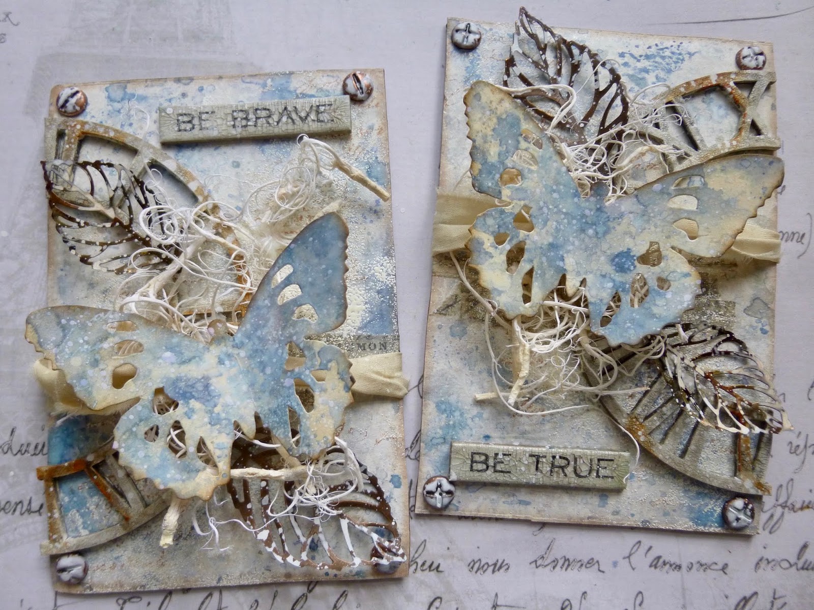
Hello all!  I'm absolutely delighted to be a guest over at the Bleeding Art challenge today, thanks to them liking my Need for Neutrals tag enough to make it their winner last month.  (I really wanted to call this post Bleeding Butterflies in their honour, but my better angel intervened!)  They are starting a new theme today and it's everybody's favourite: Anything Goes.  So here's what I created... a pair of butterfly panels.


I've been struggling a bit to get back into the mixed media swing of things at my craft desk since getting back from New York a month and a half ago, so for this I thought I would just grab some things that make me happy and put them all together!


In fact, the backgrounds of my panels come from a failed project which had landed in the rubbish bin.  I mentioned when I shared my Book It notebooks that it had taken me a couple of goes to get there.


One of the book failures was an attempt with the Wrapped Journal die.  I hated the exterior I ended up with, but I did like the inner covers.  So I fished it back out of the bin and cut out the two wide panels to use for this project.

I added some Design Tape and some stamping...


... but then decided I didn't much like the stamping so I covered most of it up with some sponged gesso and some embossing powder.


I was blowed if I was going to throw the panels away again!  And I do really like the resulting additional texture from the Weathered White powder.


I took a pre-cut greyboard clock face and cut it in half, and then played with some crackle.  It was DecoArt crackle paint, with some Antiquing Cream rubbed in to the resulting cracks...


... and later I rubbed on some Quin Gold Fluid Media Acrylic paint for a rusty look in places.


Some screwhead brads, altered with alcohol ink and watery white paint, add a nice metallic touch to the corners, and they make the panels look a bit more substantial too.


I got this lovely tangled "moss" in a sale ages ago...


... so I thought it was about time it came out to play.


And the silk sari ribbon makes me very happy when I catch sight of it in my stash, so I thought I should start putting that onto a creation or two too. 


I think I've only used it once before now, or perhaps twice.

I love how it looks wrapped around the moss, keeping it in place (along with some glue).


There's some more metal in the form of the skeleton leaves.  I love that you can mould them for a more dimensional look.


And again the alcohol inks and watery white paint bring a great distressed look to the metal.


Perched on top of it all are a pair of the Tim Holtz Tattered Butterfly diecuts (in the smaller size).


They're smooshed in similar colour Oxides and DIs as the original panel backgrounds.


But since the panels were done on gesso'd design paper and the butterflies are on a standard Manila tag, they do have a slightly different look...


... which hopefully makes them pop against all that busy-ness in the background.


I took a couple of the Idea-ology Quote Chips and gave them a coat of DecoArt One-Step Crackle Glaze.


I love the aged look it gives them - adding a slightly different mixed media twist to a generic product can sometimes make all the difference to a project.


I really enjoy the dimensional collaging of these.


There may not be much left to see of the original backgrounds I was moved to remove from the rubbish bin...
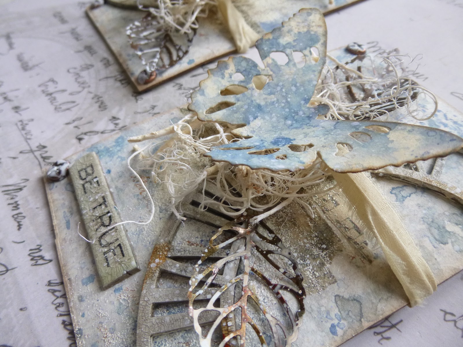


... but they're very pleasing to hold in your hands and twist and turn to catch sight of different angles.


And you can position them so that the clock face is broken apart so that you almost don't register it  (as in the first photo in the post), or you can position them the other way round so that it becomes whole again, and therefore much more present.


I hope you've enjoyed my bleeding butterflies for the Bleeding Art Challenge, and I hope you'll be inspired to play along in their Anything Goes challenge this month.

Happiness is a butterfly, which when pursued, is always just beyond your grasp, but which, if you will sit down quietly, may alight upon you.
Nathaniel Hawthorne


I'd like to join in with the Happy Hour at the Simon Says Stamp Monday Challenge... with the crackled clock measuring the time, this reminded me of how many happy hours it's possible to spend at the craft table, at a time when I really needed reminding!


I'd also like to play along at Frilly and Funkie, where we are allowed to follow our heart's desire in a theme called I love it because...  I love this because it's full of my favourite things, but mostly because it gave me a much-needed nudge back towards the mixed media playfulness I've been missing
And I'm joining in with the Anything Mixed Media Goes theme at the Creative Artiste Challenge Blog too
At the Mix It Up Challenge Blog they are also playing Anything Goes with a Mixed Media twist to use more than two different media - I've got inks, Oxides, paint, crackle, alcohol ink and embossing powder, so I'm in!

Friday, 10 May 2019

Encore - Vintage French Postcards

Hello all!  I have been creating new things, but they have specific publication deadlines, so while I'm heading into the busy period of technical rehearsals, dress and previews, here's a little Encore for you from way back when.  I created these projects with vintage printable images for the Sponsor Spotlight slot at the Our Creative Corner challenge blog back in November 2014.  Nicecrane Designs was one of our sponsors, and I designed both for the company and for the challenge design team.

Sadly neither Nicecrane Designs nor Our Creative Corner are up and running any longer, but that's no reason not to share this post with you.  During my time designing for Nicecrance, I worked with digi images fairly regularly, not something I really do much of in the general way of things.  This was one of those times, and here's what I wrote back then.
__________________________________


Hello everyone, it's Alison (butterfly) here with the second Sponsor Spotlight of the month, and we're turning that light on to Nicecrane Designs.

If you've never explored the huge range of printable images and collections available at Nicecrane Designs, it's high time you did!  If you're not a scrapbooker or card-maker, you may have thought printables weren't really up your street.  I hope to show you today that they can play a role in mixed media crafting too.  Here's just some of what I've been creating...


I was playing with the Vintage French Postcards - enchanting black and white designs with a delicious Parisian feel.

[2019 - I've had to delete the now non-existent image link here, but you can see the designs in the next photo anyway.]

I started very simply.  Once I'd downloaded the individual files, I put them all into a Word document and re-sized them to approximately ATC size, so that all six were on one page - almost exactly as the preview picture above shows them.  Then, rather than printing onto plain paper, I chose an A4 sheet from the Prima Cartographer pad and printed them directly onto that.


A bit of simple cutting and inking and I now have six great little cards/tags to insert into a scrapbooking layout or to include in a layered vintage-style card.  (The four on the right are inked already; the two on the left are still in a nice pristine state.)  Homemade ephemera in an instant!


Next, I picked my favourite of the images, the swallow, and copied and resized it on the second page of my document.  I wanted to try printing onto tissue paper so that I'd be able to use the image more flexibly in mixed media situations.  There are many tutorials for this on the internet, including several on youtube.  You can't put the tissue paper through by itself, so you have to attach it to a "carrier sheet" of stronger paper.  Some use spray glue, some use glue sticks.  I ended up using this method with double-sided tape - partly because I didn't have any temporary spray glue, but mainly because I could see she had the same printer as I have, so that encouraged me to hope I wouldn't kill the printer by doing it!  And it all went smoothly, I'm happy to say...


Once printed and trimmed free of the taped edges, I tore around the images.  If you have a torn edge rather than a sharp cut it's much more likely to "disappear" once you've glued/painted/spritzed around it.  My plan for the larger of the two images was to make a shabby chic style wooden hanging. I started by coating a wooden plaque with DecoArt Chalk Paint, mixing Rustic (basically brown!) and Relic (a dark grey) directly onto the wood.


The next layer was a coat of the American Decor Crackle Medium - specially formulated by DecoArt for their chalk paints - and then a topcoat of Everlasting (a.k.a. white!).  Once it had dried and crackled to my heart's content, I used Vintage Photo Distress Ink to warm-up the edges and give it that shabby age-stained look.


I applied multi-medium to the reverse of my tissue paper image (not to the plaque as the moisture would make the Distress Ink run) and smoothed it down onto the wood.  Once I'd made sure there were no wrinkles, I applied the multi-medium over the top too to seal it.


I love that you can clearly see the crackles through the image, giving the impression that the whole thing has weathered together over the years.


I did a little bit of extra inking over the top of the tissue...


... and added simple rustic twine to hang the plaque up by.


Next, a tag (of course!) which uses one of my patterned paper ephemera pieces as well as the tissue paper technique, this time over a different crackle medium.


For this one I started by applying DecoArt Crackle Paste to a large tag with a palette knife and leaving it to crackle.


Well, I say leaving it...  It got going with the crackling as it dried, but time started to press, and I decided to see if I could help things along with the heat gun in the places where I'd applied the paste more thickly.  Lots of crackle mediums don't like being hurried, and sure enough the crackle was a bit reluctant to play ball under the added heat.  However I did get this fabulous bubble effect instead - just as much fun!


Patience is a virtue, but impatience leads to happy accidents.


I gave the whole tag a wash of white paint, and then applied multi-medium to my medium-sized tissue paper bird in order to stick him over the crackly top half of the tag.


The much subtler texture where the paste was fairly thin gives a lovely porcelain crackle effect to the image.


Once it was all dry, I applied Vintage Photo Distress Ink with a blending tool to highlight all the different textures.


I selected the Parisian chair tag from my homemade ephemera...


... and a photo of Gloria Swanson downloaded from the internet and printed onto glossy photo paper...


... and set to work to do her justice with the embellishments.  I altered some paper roses using sprays made up from Luminarte Primary Elements powders in Hopeful Honeysuckle and Hot Cinnamon, as well as a spritz or two of Tattered Rose Distress Stain Spray.


I broke up the Prima wooden chequerboard embellishment and spritzed it with the same sprays to create a base for the flowers.  


And I used Ginger and Rust alcohol inks to tint the Word Band before smoothing on Antique Linen Distress Paint and wiping it back to leave the paint just in the lettering.


The Idea-ology Plaquette has had a drop or two of the same alcohol inks rubbed in to mute the bright white tone.


The Trellis Framework bits from another project have been sitting around for ages waiting to be used up.  They toned in perfectly with the palette here, and I added some flourish stamping around the edges to draw the eye inward towards that fabulous bubble texture!


And the seam binding at the top was gathered up from the tiny packages included when you order from The Funkie Junkie Boutique (last month's sponsor here).  They were all a very delicate pink, so I spritzed a couple of them with the Hot Cinnamon and Hopeful Honeysuckle, while leaving the others pale and pretty in between.


And I still have five more pieces of ephemera ready to use on future projects, including another version of that lovely swallow...


So there you have it - printables used in pretty much their simplest form, as well as with crackle mediums, paints and inks.  I hope they'll inspire you to check out some printable images (2019 edit - and there are plenty out there, even if Nicecrane is no more!).


_______________________________________

Not only printables but also pink... definitely a hop out of kin for me here!  But plenty of crackle and texture and that vintage vibe, so it still feels like home in some ways.  Thanks so much for stopping by today to enjoy this blast from the past, and keep your eyes peeled for some new creations coming your way very soon.  Have a great weekend, everyone!

True hope is swift, and flies with swallow's wings...
William Shakespeare

Encore Posts
Projects which made their first appearances elsewhere for Design Team duties or Guest Designer opportunities, but which only had a sneak peek here, are being gathered together in the pages of my virtual scrapbook while I'm busy.
As always, the Encore Posts are formatted differently from the regular ones, so that you can easily spot them.  Please don't feel that you have to comment all over again!

Friday, 3 May 2019

Book It!

Hello all and welcome.  It's time for a new challenge at A Vintage Journey, and the lovely Deb wants us to "Book It!".  You could make a handmade book or journal, or create something inspired by your favourite book (but please tell us what book it is).  After flying high with my Having Fun Flying pages, I'm afraid I slightly crashed and burned with this one.  Several projects are now on display in the rubbish bin, and I've ended up with what feels like a ridiculously simple make for you today.

Still, if inspiration is a little thin on the ground here at Words & Pictures, you can be sure my fellow Creative Guides over at A Vintage Journey will be filling in the gaps if you hop over to take a look, and we hope you'll come and share your book projects with us somewhere along the road this month.  But before you hop off, take a look at my simple project and see what you think.


With several failed mixed media efforts biting the dust - I was just in one of those moods where nothing made me happy, and with every failure the mood got darker! - I've definitely cheated slightly.  Rather than hand-making my books from scratch, these are simply little notebooks which I've covered with some experimental Oxide tags which had been sitting around pretty much since the release of the (much longed for here) Stormy Sky Distress Oxide pad last July.


Underneath, these are just small kraft notebooks (3.5 x 5.5 inches).  I use them a lot for taking notes during previews when I'm working in the theatre, so I always have a few sets of them hanging around.


When I'm playing with ink and tags, I usually work in pairs, dipping and mopping, so there was a tag for the front cover and a tag for the back cover for each notebook.  All I had to do was snip the tops off, glue them down, and trim the corners to fit.


The tags were standard #8 manila ones, and they weren't quite wide enough for the whole cover, so I used some sticky-backed linen ribbon to create a "binding" for the spine.


Regulars will know how much I enjoy my wrinkle-free distressing...


... and often there's so much delight in these inky splotches and splatters that I'm reluctant to cover them up.


So, as far as that goes, this project is actually a resounding success.  The fabulous combination of Oxides and Distress Inks and water splatters gets to take centre stage.


I love that misty Oxide effect and the vibrant ink splatters in between.


Just the simplest of embellishments... these will be working notebooks, after all.


I applied the Stormy Sky Oxide pad direct to the Idea-ology Muse Tokens' surfaces, and it created the perfect highlighting of the lettering.


Job done!  And they look good from the back too...  Given they're in my favourite blues and browns, and given that I'm of a minimalist mind when I comes to the look of my personal possessions (not that I succeed with minimalism in terms of amounts of stuff, of course), these do please me rather a lot in the end.


I just feel a bit guilty that they were so easy to make!  But just occasionally a shortcut is allowed, I hope.  Thanks so much for dropping in today, and do hop over to A Vintage Journey to see the literary delights the other Creative Guides have come up with to inspire you.  We hope to see you en route.  Happy bookish crafting all!

A room without books is like a body without a soul.
Marcus Tullius Cicero