
As always, my fellow Creative Guides have created wonders to inspire you, but before you hop over to check them out, let me invite you to come lie with me, under the greenwood tree, and gaze up through the branches at the sky above. It's a long post, I'm afraid, but I want to remember how I did this!

I'll come clean... Under the Greenwood Tree isn't necessarily one of my favourite songs, but it is by my favourite writer, William Shakespeare. It also formed one of my earliest encounters with performing Shakespeare.

At school, I was cast as Amiens, the balladeer/courtier in As You Like It, and this was one of the songs I had to sing to entertain the banished court in the Forest of Arden. It was part of the beginning of a long relationship with Shakespeare, with singing, and with theatre.

I didn't start this page spread with the intention of it being my piece for this month's challenge theme. I was just playing, starting another background in my Dina Wakley Media Journal.
(You can see some of the other backgrounds taking shape in the recent Birthday Blues and Browns and Greens post.)

I glued down torn paper napkin pieces, keeping a nice crinkled look for texture, and thinking that the daisies would continue to hover in the background (didn't really end up that way, but I don't mind).

I gesso'd over them, and then decided I wanted a bit more coverage so I added a slightly heavier coat of DecoArt paint in Buttermilk over the top.

This ended up being thick enough to do a bit of scratched scribbling in with a wooden skewer... more texture - always welcome here at Words and Pictures.
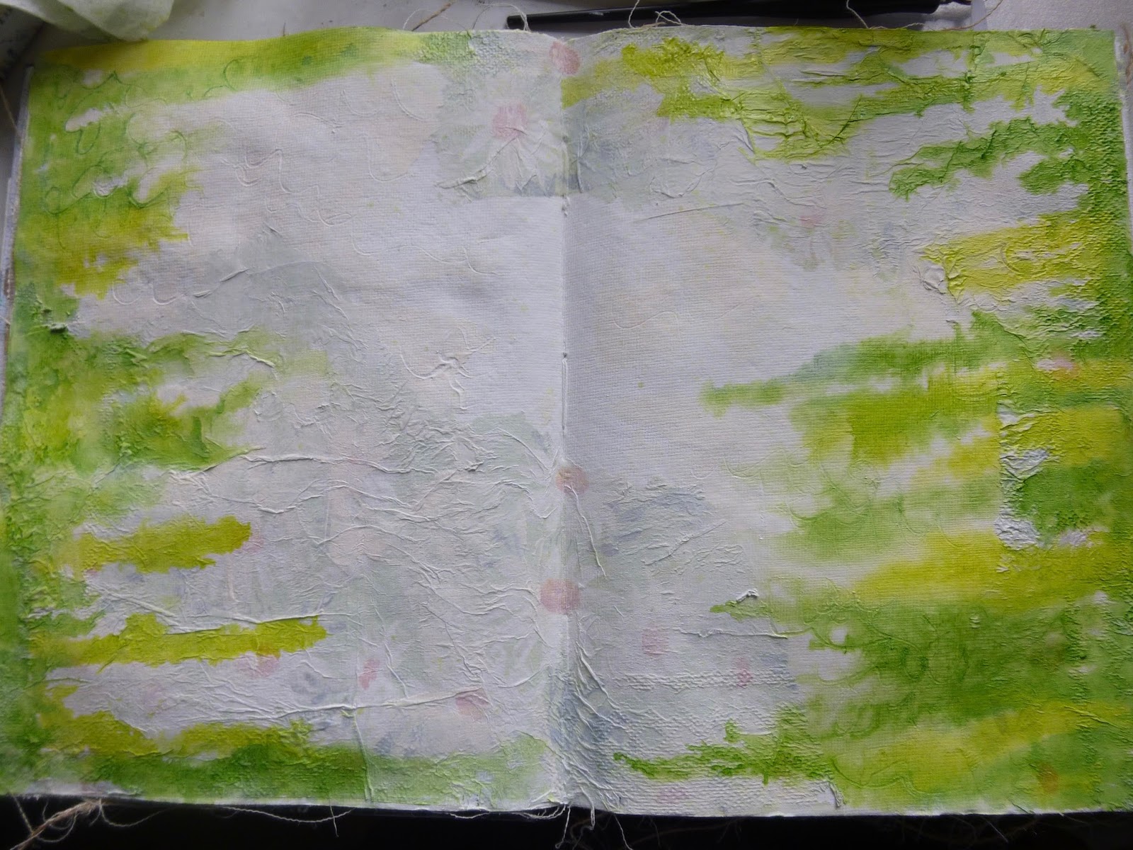
Next up I dribbled some watercolour inks from the edges inwards. I used the Avery Elle Liquid Watercolours I picked up with a money-off voucher while I was in NYC. (They're also in action on the flowery page in the Birthday Blues post.)

I used some of my Daniel Smith watercolours to add darker blue shading around the edges.

And then sprayed Tumbled Glass Distress Spray across the centre section. I spritzed with water droplets to lift some of the colour for more interest.
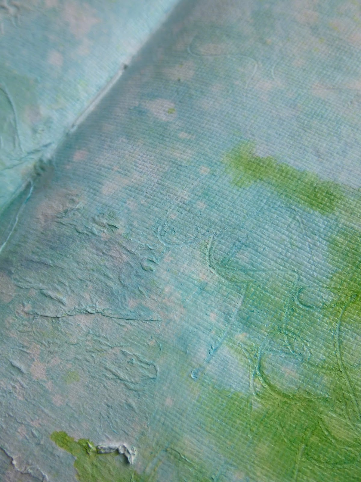
Believe it or not, it wasn't until that gentle blue was there that I realised I was on the way to looking up at the sky through the tree branches!

As soon as I worked that out, I started working to intensify the effect. I added more depth and shading to my branches using some more of the Daniel Smith watercolours.

I used very rough brush strokes, a sort of scumbling action (with one of my cheap Ikea brushes, not one of my expensive watercolour brushes!). I love that you can still see all that texture, though the daisies are vanishing by this point.

Next up, some stamping using a rather lovely Memory Box stamp called Windswept.

I stamped in Leaf Green Archival (but of course) for that fresh, vibrant, spring green colour.

And, in what became one of my favourite steps, I used my Walnut Drawing Ink and dipping pen to add a little more weight to the branches.

It's a subtle shift, but it really made a difference. And it was also really pleasurable to do, following the path of the stamped branches, but creating a little more personality with the point of the dipping pen.
By now I really didn't want to interfere too much with the pages. I had originally had all sorts of plans to layer ephemera and a photo or Paper Doll at the heart of things, along with a sentiment of some kind, but now I just wanted to keep gazing at the sky.

And it may seem a bit slow of me, but it wasn't until now that Under the Greenwood Tree popped into my head, and I suddenly realised I could turn this page spread into my Vintage Journey inspiration piece!

Before I could change my mind, I grabbed my white pen and added the lyrics all the way around the edge of the pages.

And at some point I applied Picket Fence Distress Crayon softly over the textured background, which gave the whole thing a softer, dreamier look.
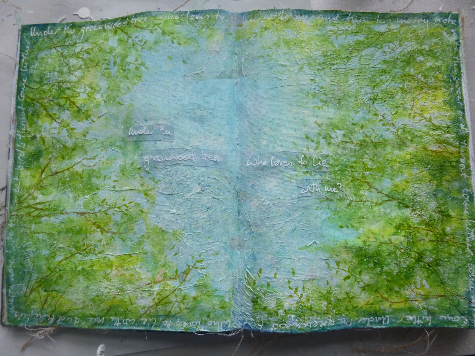
There was quite a lot of hesitation about the next steps because of not wanting to interfere with the look. I played with adding the first line of the song to the centre of the page too, using acetate to see what it would look like.

I liked the acetate, but when I wrote it directly on the page it didn't really show so well against the pale blue sky. Fortunately, I was able to wipe it away and re-spritz with Tumbled Glass, and go back to the drawing board.
Gluing the acetate down might have led to visible glue streaks, and I didn't want to risk that.

So next I tried a version using Dina Wakley's blank washi tape with the words written onto it. I wanted the words to be there but not there - and I got that, but it didn't really work for me either.

Finally, I decided to take my cue from the words of the song, and add some birds high in the sky. I was thinking of the Tim Holtz ones but happily came upon these even tinier silhouettes from a Visible Image stamp set called Free Your Imagination.

I didn't want them to be too present, so I stamped them in Pumice Stone and added some clear embossing powder for that shimmering now-you-see-them, now-you-don't effect.

I felt the urge for a few more words so I sought out some Clippings stickers which seemed to fit where my imagination was going, and added them in the corners of the spread.

I used a dark pencil and the white pen to frame and embed them into the pages. The corners seemed the right place - the words are present, but they don't get in the way of the main gaze, which is skywards, through the branches.

I'm not going to lie... I really like looking at this page spread. It has a sense of space and serenity about it which make it almost as good as actually lying on the ground beneath trees, gazing at the sky.
Given that it's pouring with rain again as I write this, it's probably a better alternative than doing it in real life!
I hope you'll have time to hop over to A Vintage Journey to see the Words and Music inspiration provided by my fellow Creative Guides and, most of all, I hope you'll be inspired to join us on the journey some time this month to share your own favourite song lyrics and musical delights. Thanks so much for stopping by, and I hope you all have a wonderful weekend.
Under the greenwood tree
Who loves to lie with me,
And turn his merry note
Unto the sweet bird's throat,
Come hither, come hither, come hither:
Here shall he see
No enemy
But winter and rough weather.
From As You Like It by William Shakespeare
I'd like to share this with Art Journal Journey where they have the perfect theme this month: Flora and Fauna

I'd also like to play along at Scrapki Wyzwaniowo where the theme for the month is Blue Sky


