As you'll see, after a brief detour into slightly different colours, we're back at my springtime blue/green obsession. I did say there was more of it to come.

These are the colours and motifs which are bringing me peace and pleasure in these unsettling times, so I'm letting the need play out as often as it wants to.
For our session this time we applied some limitations to our creativity. We were each allowed to pick just two elements to "put in the kit" for us all to use.

Brenda said we could have three colours of paint (which got expanded to four, but I ended up sticking with three), and our choice of die-cuts/punched elements.
I chose Frescos in Heavy Cream, Blue Bayou and Spring with Cheesecake as the last-minute extra which got left out in the end.

Nikki allowed us one stencil (generous!) and something we had bought recently. My recent acquisition was some white drawing ink made by Koh-i-Noor which arrived just before the lockdown, and underneath you can catch a glimpse of the stencil I (with considerable agonising) chose to put in my kit.
My contribution was three inks (your choice of colour/form but only three actual inks - eg. one Archival, one Distress Spray, one Oxide pad - though that also got expanded to four in the end) and one stamp set (or three individual stamps).

I selected three pads (figuring they were more versatile than a spray) - Watering Can Archival, Peeled Paint Distress Ink, Pumice Stone Oxide and my last minute extra was my little pot of Daniel Smith Walnut Ink.
You'll already have spotted my chosen stamp set, I should think.

Now, that's quite a generous batch of ingredients to play with. That wasn't the difficulty for me - sometimes I work just with a couple of inks and a stamp or two.
The hard part was having to declare all the choices in advance!
How to decide which of the (too many) stencils I have would be the one to use? How to narrow down my choices of ink pad before I knew what I would be making?

In the end, the choosing took more than a quarter of the time - partly because we were having to make decisions about what to make and which direction we might go in rather than just starting out and then reaching for anything we needed at the point of wanting it.
But then, once the pain of choosing was over, it was actually great fun to see what could be done with the tools at hand. Oh, and Nikki (who was being the strict school teacher on the rules!) said we could each have one joker to play at any point, to add one additional ingredient to what we were making.

We decided to work on smaller substrates than last time, so I chose tags (big surprise!).
I started by giving all three of my tags a coat of the Heavy Cream to give me a nice pale background, and then did some brayering of watery washes of Blue Bayou and Spring.

Finally, I brayered on some of the white drawing ink which turned out to have a lovely shimmering sheen to it compared to the matte chalky finish of the Frescos. I did a bit of dipping and dabbing with the white ink too for extra splotchiness.

There was lots of watery paint left on the craft mat after the brayering so I mopped it up onto three extra tags - waste not, want not. And it turned out they would be coming in useful much sooner than I'd expected!

More tags and more smooshing next. I put a mixture of the Pumice Stone Oxide, the Walnut Ink, the Heavy Cream paint and a dribble of the white drawing in onto the craft mat and spritzed with water...

... so that I could make some "old parchment" on two more tags ready for stamping with my chosen stamp set.

Yes, it's the Field Notes! If you've been following along with recent creations, you probably already guessed that.

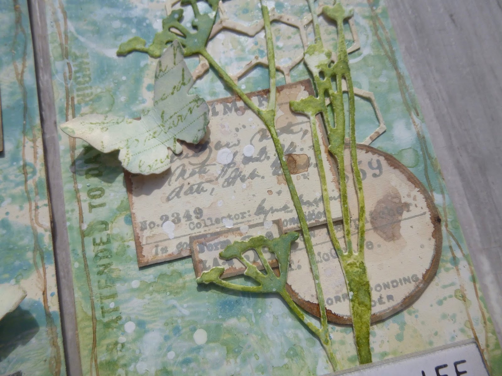
It's hardly been off the craft table since it arrived, and it's a brilliantly versatile set. I was able to create these ephemera labels for layering onto my tags - same three labels for all three tags, just differently arranged each time.

And I used some of the numbers and lettering with my Peeled Paint pad to add some more background detailing...
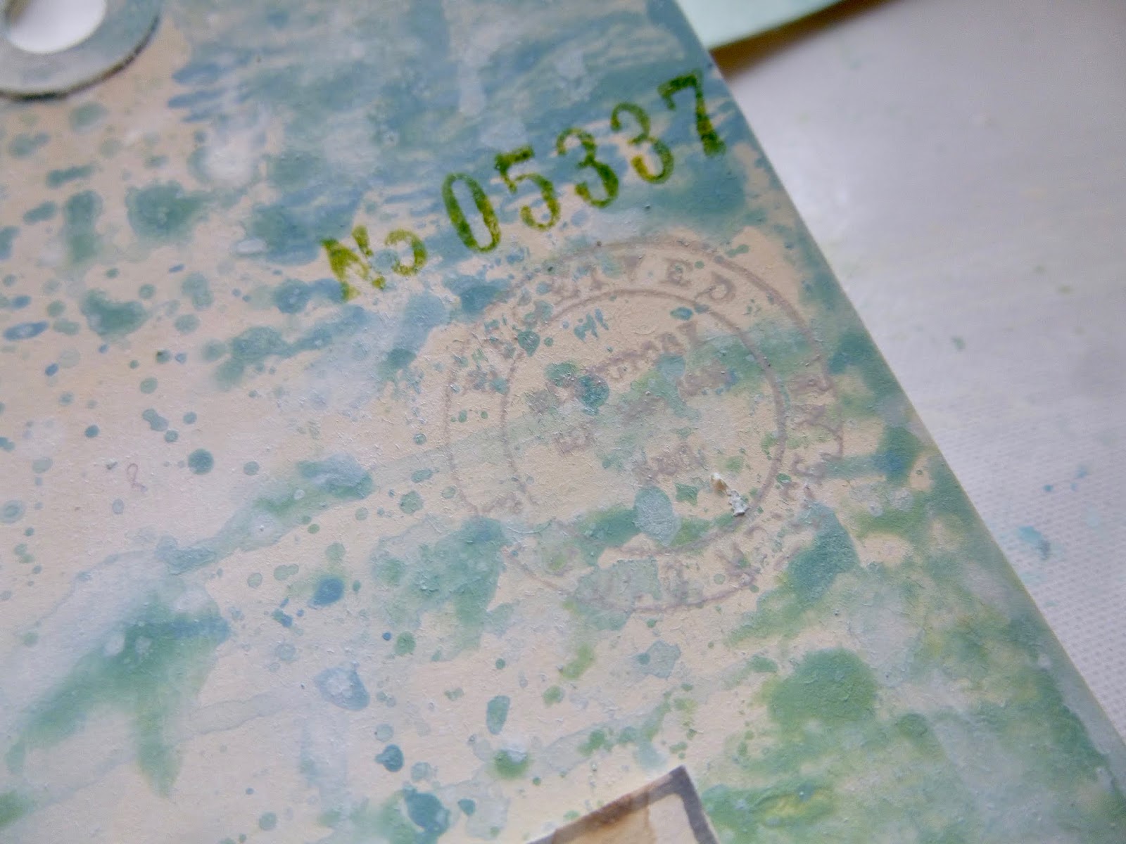
... as well as some now-you-see-them, now-you-don't postmarks stamped in Pumice Stone Oxide. From one angle, they're definitely there...

... and then when the light hits they get that same shimmering half-visibility as the white drawing ink smooshes.

I was enjoying the ride quite a lot by this point... and was ready for some more ingredients. Die-cutting time!

As I said, I make no apology for constantly returning to the things which make me happy at the moment, so when we had to make all those difficult decisions up front, the die-cutting one was actually one of the easiest...
It had to be some of Tim's delicate flower Thinlits. I've been using the Wildflower Stems quite a lot lately, so this time I chose the slightly older Wildflowers sets - they're a little smaller and, if anything, even more delicate and intricate.

And here's where those spare mop-up tags made their way straight into action... I used them to cut my wildflowers, with added Peeled Paint dipped and splotched over the top to give them more definition.

Since we were allowed our choice of die-cuts, I'd also selected one of the Pattern Repeat Thinlits sets, thinking I could cut it and use it as a secondary stencil if need be. (Hah - that would have got round Nikki's strict one-stencil policy!)

As it turned out, I used it in this more conventional way - using up the spare neutral tag pieces by cutting bits of "wire trellis" from it. (The ephemera labels had only used up one and a bit of those tags.)

Mostly, it was now about positioning things, but I did need to use my chosen stencil on the backgrounds, so I shifted my arranged pieces over to some bare tags while I got ready to stencil.
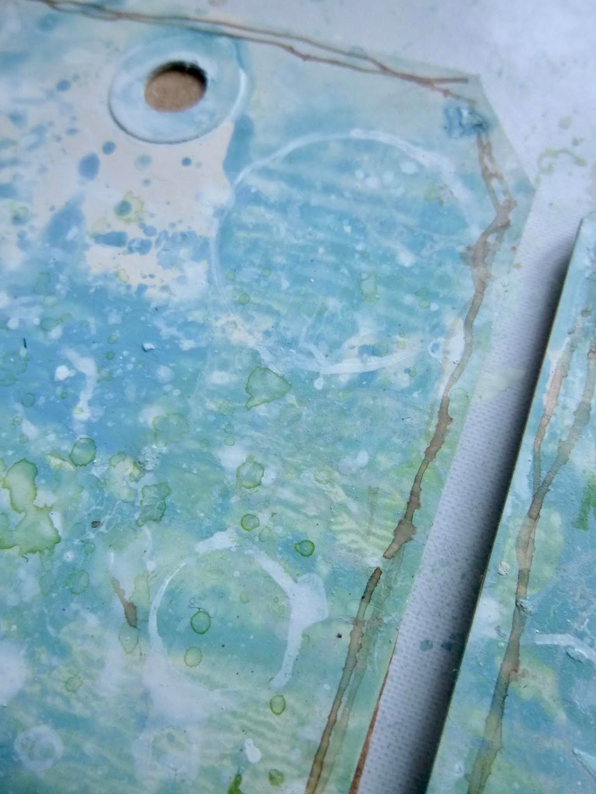
Picking the stencil was one of my hardest decisions. Did I want something nature-based? But then those leafy shapes or flower stems might be too busy or distract from the die-cut flower stems...
Did I want some lettering or numbers? But my Field Notes stamps are pretty letter/number based, so that would be doubling up unnecessarily when I could have some more flexibility...
Did I want geometrical shapes, or maybe brickwork to create a garden wall? But there was no texture paste amongst the ingredients, so I couldn't follow my usual favourite way to use a stencil like that...

In the end, I plumped for Finnabair's Bubbles stencil. I figured that would give me something geometric, contrasting with the letters/numbers of the stamps and with the intricate flower stems of the die-cuts, but it would still be a nice organic shape, maybe for bubbles of light, or actual bubbles!

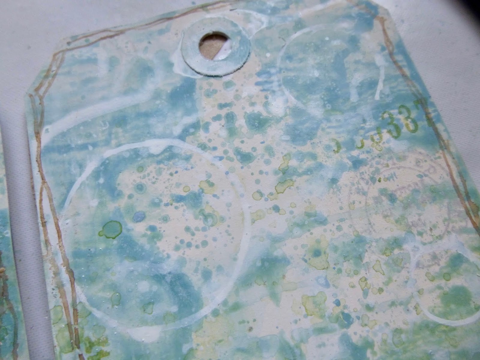
And in the end, that's what they are closest too. I did a thing I seldom if ever do with stencils. Rather than using texture or crackle paste (my absolute favourite stencil method), or even solid ink blending, I used my white drawing ink and my dip pen to draw round the outline of some of the bubbles.

I love the lighter-than-air look of them. It's subtle, but definitely there. And of course doing it this way with the pen and ink I could just have a few bubbles here and there rather than the hundreds of them all close together as the stencil has.
And they're a lovely echo of the postmark stamping as well as the round ephemera label.

Out of limitations, you see, comes creativity. I never use stencils like that normally - but having chosen that stencil, I had to use it, so I had to find a way of using it which wasn't too in your face over my lovely backgrounds... and I found it.

By this point, I was vacillating wildly between the two possible "Joker" cards I wanted to play. I wanted them both urgently.
I really really wanted some twine to wrap around the tags and to create the topping.
And if you look at the title of my blog, you'll know what the other one was... yes, WORDS. I had no words to go with my pictures... aaagh!

But then, brainwave - I made an offer to the others.
Surely we would all three of us need something to add to the top of our tags? (Thankfully, the other two had also chosen to go the tag route.)
So we would all need something to top them off?
So we could just agree on "toppings" as an extra for all of us... and then I could play my Joker as "words" (and assuage my conscience by not using my topping twine to wrap around the tags too - that would be cheating!).
I could have gone with some of my quote stamps, or with some Clippings stickers, but I decided these Idea-ology Quote Chips were just right to give a bit more presence to the words. Each tag has its own little phrase, with a little touch of inking...


... first on the very edges with the Watering Can Archival and then a bit of soft blending of the Pumice Stone Oxide. I did snip off the sides of each of them as they were quite long and looked a bit bulky in full, but trimmed down they do the job nicely.
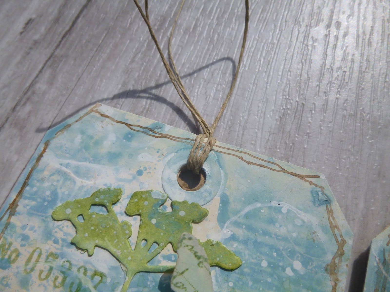
Finishing touches now - the fine rustic twine at the top...

... some dip pen + walnut ink doodled frames around the edges and a bit of spattering with Heavy Cream paint and with white drawing ink.

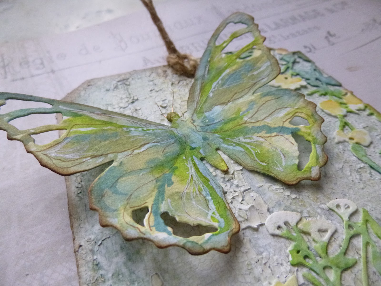
And then a very last-minute additional extra. Amongst my choice of die-cuts/punches, I'd also declared my Tim Holtz butterfly punch at the start.
Most of the way along I didn't think I'd be using it, but suddenly, as we were winding up, already getting ready to show each other what we'd made, I changed my mind.

Those three mop-up tags still had enough leftover after cutting the Wildflowers for me to punch out three butterflies, and the large Field Notes label from the middle of the stamp set provided enough vintage script for me to stamp just that in Peeled Paint to add a bit of detail to them.

And with their folded wings, they add just that extra little touch of dimension which makes me happy. Phew!
So there you have it... another joint crafting session via Skype which has produced a hugely long blogpost, but if you've enjoyed seeing all the details even half as much as I enjoyed making them, then I hope you'll forgive me!

Do hop over to see how creativity flourished for the others under our limitations. As you can see from the sneak peeks, Brenda was also channelling the floral vibe...

... while Nikki, though still playing with Mother Nature, took us into a whole other element with her tag duo, out of the earth and air, and into the water.

I hope you're finding ways to be creative and/or finding moments of contentment and calm amidst the crisis. I'm finding my mojo is a fairly elusive beast... I'll go for days struggling to find the urge to make something, and then suddenly have a burst of creative energy.

And every morning I drink my coffee while sitting on the front step chirruping and whistling to the birds feeding on the seeds and fat balls and other food I've put out for them. I'm hugely aware how lucky I am to have these escape valves, and they are all a very necessary antidote to the news coming in from around the world.
My heart goes out to those struggling with the many and various impacts of this disease, and my heartfelt gratitude to those battling on the frontlines against it as well as those keeping our lives running, even in this changed form, with their essential work.
Love and thanks to all of you for stopping by today. I will be round to do some visiting over the weekend, and I'm looking forward to finding out what you've been up to creatively or otherwise.
Take care, stay safe, stay well xx
For the person who has learned to let go and let be, nothing will ever get in the way again.
Meister Eckhart
I'd like to share this at the Simon Says Stamp Monday Challenge where they are playing E is for... ephemera in this case - my hand-stamped versions, since I wasn't allowed any other kind under the limitations!
At Try It On Tuesday they are inviting us to Have Fun with Stencils - I really did, using the stencil in a way I have seldom or never done (to my recollection)
And I think my butterflies qualify for the Animal Magic theme over at Country View Challenges this month