I'm travelling into a new way of working, a new country, a new language, and a new hobby which I'm passionate about. Come with me for some of the journey...

Saturday, 14 July 2012

Can you make me a...?


I've been deploying my crafting skills, and especially my Tim Holtz Distress Inks, in a slightly different capacity over the last few days and using my craft stash for a whole new set of challenges.


Well, I say "new"... I've been roped in (mainly willingly, I admit) to my mother's dolls house hobby ever since I can remember.  You can read about her Dutch Coffee House and what it's doing here in the Czech Republic right here.  I'm just going to fill you in on a few of the tasks which fell to me in preparing it for its new life.  So this is just sneak peeks!


First up, in transporting it from the UK in the back of the car, a number of the roof tiles had come loose, broken or disappeared entirely.  They're stained wooden tiles, and there weren't any more of them, or any of the stain/paints which had originally been used.  


So I set off with my Grungeboard, some chipboard, Distress Markers, Distress Stains and Inkpads to fashion some roof tiles which wouldn't look out of place amongst the rest.  I challenge you to spot mine!  


I had to blend layers of Pumice Stone, Picket Fence and Bundled Sage to get the right shades.  And then the Distress Markers were perfect to just touch up the odd wooden tile directly on the roof.


It was also a question of colour-matching to long-lost paints when it became apparent that some extra panels were needed in the downstairs room, to balance the look of it when the house was opened up.


Thankfully, I was able to recreate the two shades of blue with just two shades of Tim Holtz Distress Ink.  First I gave the newly-cut panels of chipboard a coat of white acrylic to get a matt base coat on which the inks would ping in their true colours.  Then it was my trusty Weathered Wood for the paler panel, and several layers of Stormy Sky to get the darker centre panels.
A little stripe of gold acrylic, using my finest paintbrush, completed the look.


Rather than matching, the next challenge was all about changing colour.  Most of the furniture in the upstairs room was in a sophisticated dark wood veneer.  But two pieces didn't quite fit in: a small carved two-seater in a rather unpleasant orangey, plastic finish; and the wooden piano stool in a slightly bizarre shade of red.


Out again with the trusty paintbrushes, and a couple of quick coats of acrylic did the job.  You can see the two-seater part-way through its transformation, and the piano stool both before and after.  


What I haven't got a picture of is the foul dark yellow of the cushion of the two-seater before - genius TH - Bundled Sage and Forest Moss gave it the look of old, distressed velvet. 


Another "Can you make me a...?" request which floated up to me was for a pavement to run along in front of the shop.  


Textured cardstock, more acrylic as a base coat, and some freehand pencil lines, deeply grooved into the card gave me the starting point.  

(It's not yet stuck down properly in these pictures!)


Then I got to do fun colour work again: some Antique Linen, some Bundled Sage, some Weathered Wood applied with a Blending Tool, and then I used the Pumice Stone Distress Marker brush end, and the Black Soot fine end to create some depth in the cracks between the 'paving stones'. 


Because of how the house is going to lead its new life (go on, if you're curious you can find out) the outer walls needed some adornment.  


My mother wanted to use the images from this Dutch vintage-style coffee tin, so she scanned them, and then asked me whether I could make the images look like advertising hoardings which had been outside on a wall for some time. 


And so the crafting kicks in again...


First I backed them onto cardstock.

Then I started the distressing with (what else?!) some inking around the edges to give a weather-beaten look to them both.  Weathered Wood played a part, and some Walnut Stain came in to play too.  


I then gave them a coat of the Ranger Inkssentials Glue'n'Seal in Gloss to give a gentle, protective sheen.  It really changes the texture, so that you don't immediately think "ah, paper".


Finally, I tried to make it look as though the posters might be within a hoarding frame.  I edged the card with the Versamark Watermark stamp, and used UTEE as the embossing powder to get a thick enamelled ridge round the border of the images.


I really like the look of the "hoarding" against the beautiful brickwork of the dolls house.  And if you want to know how that's made, you know by now where you need to go!


The last bit of miniatures work (for the present, at any rate) was probably my favourite to do.  The "Can you make me...?" this time was founded on the need for something to go in the beautiful attic space of the house.


It's a coffee shop, so the request was for some sacks of coffee!  There were already a couple of small bags, but the loft was still cavernously empty.


A jute bag was duly relieved of its interior bottle divider - nice interlocking bits of woven sacking material, all ready to be ripped apart at the seams and altered.  I cut and shaped my bits of hessian (burlap for the Americans?) round some triangular bits of card to give them a shape when standing up.  


Then - ah, finally! - it was out with the stamps.  I wasn't sure at first whether the stamping would work as the weave of the fabric was so coarse, but a little bit of testing resolved that fear.  I used the smaller stamps from the 7 Gypsies Avignon set, which has lots of postmarks and authorisation stamps in it.  


I layered a few of them on each sack so that you'd get the impression the coffee had been in and out of a number of ports, and I had one stamp that I was imagining as the logo of the import/export company shipping them, so that one's on all of them.  Here they are stashed in the storage loft... mine are the larger ones behind. 


I'm going to leave you with a couple of old-style "Vintage Photos" because I'm suffering withdrawal: I don't think I've used any Vintage Photo Distress Ink in any of these creations! 


So, I hope you've enjoyed this "Altered Art with a Difference", and perhaps it's given you ideas about how to use some of your stash and supplies in new ways.

A little ingenuity can go a long way... and in the world of miniatures and the world of crafting it's all up for grabs.  As one of the Tim Holtz stamps has it: The world of reality has its limits, but the world of imagination is boundless.

Set your imagination free and see where it takes you and your crafting...

Thanks for dropping by, and have a great time, scrapping or otherwise, until we meet again.


With all the Distress Inks and Markers being used, I'm entering this (or the bits of this that count!) for the Hot Shot Craft challenge which at the moment is 'Distress Inks' - perfect!

Go to Cestina's dolls houses for more on this house and many others.


A cup of coffee - real coffee - home-browned, home ground, home made, that comes to you dark as a hazel-eye, but changes to a golden bronze as you temper it with cream that never cheated, but was real cream from its birth, thick, tenderly yellow, perfectly sweet, neither lumpy nor frothing on the Java: such a cup of coffee is a match for twenty blue devils and will exorcise them all.
Henry Ward Beecher


Thursday, 12 July 2012

Al Fresco

Hello, so glad you decided to drop by today.  I'm in the mood for a party... that's pretty rare for me!  I'm gazing out of the window at yet more gathering storm clouds, and wondering when the summer is going to arrive - or should that be 'if'?  My idea of summer is to be able to laze in the garden with a book, to swim (wish there was a pool in my garden!) when it gets really warm... but best of all, I like to eat al fresco, outdoors on a summer's afternoon or evening, with good friends, good wine, and good conversation.

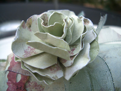
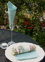
Round our way it was always my job, on festive occasions, to "make the table look nice".  So for Our Creative Corner's challenge to come up with something for a party, and with the 'Summer' challenges around all over the place, I decided to create something for my ideal party on a summer's day:


I believe party crackers are not as common in the US as they are in the UK; and I'm afraid mine doesn't have a cracker in yet - it'll have to wait until I can source some, but there is room to slide it in when I do.

I used a toilet roll (yes, you see, they're not just good for albums!) and papers from Prima's Botanical collection - they're gorgeous in themselves, so that's a good bit of the job done right there.  I cut the overhanging edges into  strips so that I could bend and manipulate them to form the ends of the cracker.

I'm usually a paper-tearer, but this project required my paper-curling skills.  Of course, once I started to get curly, I realised I needed to do something with the reverse of the paper, so I blended on some Bundled Sage Distress Ink (Tim Holtz), and then stamped with my little Alla Prima Floral stamp (it's been getting quite a workout recently) in Aged Mahogany (but as a second printing, not full-on colour).

I cut some of another paper from the Botanical collection using the Tim Holtz Decorative Strip Die Vintage Lace to give me some additional detail for the body of the cracker, and then cut very thin strips of the same page to create the ribbons for the ends.


Again, I had to colour the reverse using Bundled Sage, and because I'd been doing some curling using the scissors, it gave it this great distress crackle look on the back... happy accidents - we love serendipity!


I used some of the paper doily left over from another project to create an extra little pleated flower within the end of the cracker, edging it with the Bundled Sage again to tie it in with the rest.


For the top, I made a flower using the first paper again.  This time, as well as Bundled Sage on the reverse, I used a spritz of my home-made Bundled Sage pearl mist, so that there'd be a bit of a gleaming lustre in the sunlight.


The ribbon was white gauze to start with so I played the mucky finger game I've played before, sliding it across the surface of an ink pad (you'll never guess which one...) until I had the depth of colour I wanted.


So now all I've got to do is make enough for everyone to have one... hmm, maybe I'll eat alone after all!


I'm entering this for the following:
The Party challenge at Our Creative Corner
Summer Days at Sugar Creek Hollow
Summer at Everybody Art
Paper Crafting Journey are also playing a Summer challenge
Totally Paper Crafts have one called Here Comes Summer - I do hope they're right!


I hope your summer weather is good enough to let you have at least the occasional meal out in the sunshine.  And I hope you're having a great day, whether the sun is shining or not.  Thank you so much for spending some of it here with me.  I'd love to know what you think... or what your favourite summer's day includes, so do leave a comment if you have some time to spare.

I always think food tastes so much better out of doors.
Said by Anne in almost every single one of Enid Blyton's Famous Five books!

Seating themselves on the greensward, they eat while the corks fly and there is talk, laughter and merriment, and perfect freedom, for the universe is their drawing room and the sun their lamp.  Besides, they have appetite, Nature's special gift, which lends to such a meal a vivacity unknown indoors, however beautiful the surroundings.
Jean-Anthelme Brillat-Savarin


Wednesday, 11 July 2012

In an English country garden


I really enjoyed creating this card... and telling myself stories as I went!  From the moment I saw the colour challenge inspiration photo on the Daring Cardmakers challenge site, I knew which papers I would be drawing on - the 7 Gypsies Conservatory collection.

And it wasn't only the colours which led me there; the eggs are also a featured element within the papers; they have an Edwardian nature-collector theme, so there are botanical drawings, fauna and flora, and plenty of birds and eggs around all over them.

None of my Distress Inks really tone precisely to these colours, so I ended up playing lots of blending and layering games, to get combinations of colours which would relate to the challenge colours.

Over at Sir Stampalot, they want to know about my 'crafty passion'. Well, anyone who's visited recently could tell them I seem at the moment to be fairly firmly lodged in the world of Shabby Chic, so what with that and the feel of the Conservatory papers, it was pretty clear, pretty quickly, how the style of the card would develop.  So here it is:


The eagle-eyed amongst you will have spotted the green ribbon tab at the bottom - you lift up the front to get a form of what's called, I think, an easel card...


The inside has a more turquoisey feel to the bluey-greens, and some memorabilia.


The story in my head is of the woman in the garden remembering an affair of her youth, and all the mementos she's kept from those halcyon days.


I found both the photos on a Google image search trawl.

There doesn't seem to be a record of the garden lady's identity but Lily Elsie (on the right) was a hugely popular Edwardian actress and singer, renowned for her beauty and charm.


I fell in love with this photo of her, but that of course didn't stop me from taking my inks to both photographs in order to get the newly-printed images from a very 21st century printer to look a little more Edwardian.  

In addition to inking with Tim Holtz Vintage Photo Distress Ink, I did some paper distressing on the edges, as well as giving Lily a good old inked crease too (as though it might have been folded close to someone's heart in a breast pocket; though she demanded the return of her picture in the heat of the break-up!).


All the blue-green papers I created myself, blending Bundled Sage, Tumbled Glass, and occasional touches of Forest Moss and Weathered Wood (Broken China is top of my shopping list when I get home to the UK).

And I've used the little Prima stamp (I think of it as 'the wallpaper stamp' but I think it's actually known as 'Alla Prima Floral 550950') on those papers, including the tag, as well as on the music paper (from an old music book) which forms Lily's background (blending the same colours straight onto the stamp), and as added texture on the front of the card.

As well as the 7 Gypsies, there's a couple of appearances by papers from the Prima Printery collection which I've got in the 8x8 size.  It's a lovely collection of ledgers and text-based papers mainly in neutral creams, some with a hint of green.


I used the Tim Holtz Decorative Strip Die Vintage Lace to make the lace edging for the flap and for the tag inside.  I love this die and, unable to get hold of any actual lace at the moment, I think it provides a really pretty alternative.  I fussy cut (or decoupaged?!) the eggs from the 7 Gypsies Conservatory paper to adorn the tag.  


In my head, this affair grew up around a collector's butterfly net, the naturalist sharing his discoveries with the actress taking a quiet holiday away from the whirl of her West End life.


The internal pocket I made from one of my handmade papers, and used some broad cream chintzy ribbon to decorate it.  The script underneath is the back (yes, the B side!) of one of the Conservatory papers.  You can see why I like them, if this isn't even the primary side!


Amongst the memorabilia there's also one of my mini-postcards (made with the TH postcard and script stamps, and the Prima wallpaper flowers again)...


... and an accommodation invoice (surely they did not share a room, did they?!) cut from one of the 7 Gypsies papers and edged and aged.


And her own final reminder to herself:

When it's meant to be, it's meant to be... they could surely have overcome all the differences between her glamorous life and his studious, academic one.  She shouldn't have been so hasty in bringing the affair to a close.  And now she looks back and knows that what matters is that you Listen to your heart.

Back to reality, and back to the front now, as it were, just for a last couple of details.


The Special Moments text is from one of the Prima Printery papers I mentioned, die-cut with the centre of the TH On the Edge Brackets die.

And of course, with Lily being in a garden, remembering her salad days, I had to add some of the little mulberry paper flowers.  The roses seemed too formal somehow, though, so I used these lovely cream and ivory gypsophila heads - an informal bouquet, picked in the meadows one afternoon as they walked, and carefully preserved with the other mementos of a long lost love.

Oh, come on... I've already confessed to being a hopeless romantic - you're surely not surprised!!


In the hope that perhaps they're being judged by fellow hopeless romantics, I'm entering this in the following challenges:


For the Daring Cardmakers, I've been following their Colour Combination
Sir Stampalot would like to know about 'My Crafty Passion' - for now, at least, very clearly Shabby Chic! - but particularly the layering, Distress Inks, and paper-distressing
The Vintage Artisans have a brand new Challenge Blog, and their first theme is Vintage Shabby Chic
I'm offering another entry to the Crafty Bloggers July Anything Goes challenge
I'm taking a plunge on Crafty Boots, playing their Bingo Challenge - with a vertical win on Blue, Ribbons and Lace (I know you can argue the whole blue - turquoise - green spectrum, but given the fight I had with my mother, you can call it both ways on this card!!)
And I'm adding it as my third and final entry for the lovely Danish site Vintage Urfordring's July challenge Anything Goes (as long as it's vintage)
And there's a Shabby Chic/Vintage challenge at the lovely site Paperminutes (it seems right to be doing all these European challenges as I sit here in the Czech Republic)


I'm so pleased you were able to spend some time here at Words and Pictures today.  I really hope I'm not the only one who creates stories at the same time as creating crafting projects, or you'll all think I'm completely barking!  

In any case, I hope your own story takes a pleasurable turn today, and I hope to have your company again soon.

It is good to be alone in a garden at dawn or dark so that all its shy presences may haunt you and possess you in a reverie of suspended thought.
James Douglas

Love is the flower of life, and blossoms unexpectedly and without law, and must be plucked where it is found, and enjoyed for the brief hour of its duration.
D.H.Lawrence


Tuesday, 10 July 2012

Only you...

Hello, thanks so much for dropping by here at Words and Pictures.  I've a new project to share with you:


And when you open the door...


... you get to see...


              ... what's inside!


Today's card was kicked off by the colour challenge over at the Play Date Cafe, which was to use Gold, Nude and Silver.  I had some trouble at first getting to grips with the colour 'Nude'.  I looked at it on a couple of different computer screens, and it was completely different on each - I guess your 'nude' also slightly depends what colour your skin is!  Anyway, it seems to be a gentle light brown with a hint of blush.


I gathered some papers which seemed to fit the bill: the frame and door panels use a paper from Prima's Nature Garden A4 pad; the door itself (2 different papers, front and back) is from the Prima Almanac collection, 6x6; and the music inside is a sheet out of a real old music book, stamped with the gorgeous little Prima wallpaper stamp (romantically titled 550950!).

So, it's a pretty strongly Prima piece, paper-wise.  The embellishments are almost pure Tim Holtz, however, and they provide the silver and gold elements.

I was also following a recipe from Crafty Creations to use 3 patterned papers, 2 buttons and a partridge in a pear tree... no, sorry, no partridge... it's really 1 ribbon plus 1 sentiment, which was really fun to incorporate.


The doorway became inevitable at the point when I decided I wanted to use one of the TH Idea-ology door-knobs to be one of my main silver focusses (they're too cute!), and everything else seemed to tumble forward from there.


On each door panel, there's a Grungeboard letter from the Mixed Minis set (TH), spelling the word 'only'.  I gave them a coat of acrylic (mixed from a sandy colour and a very pale rose), and then spritzed them with some Heirloom Gold Perfect Pearls Mist. 

I wanted a shabby chic, patchy effect, not total coverage, and I like the antique-y look I ended up with.  Rather than out and out bling, it's got an old-fashioned lustre.

Also, in pursuit of shabby chicness, the papers all got a wash of Picket Fence Distress Stain to get that white-washed look.


The layered paints and mists on the letter are then layered onto the door panel with its layers of paint and paper, layered onto the door itself, with a whole hidden layer behind the door!


Over the top of the doorway, I've attached a lovely wooden carving (part of a whole bagful of various shapes and sizes which have been sitting around the family house for almost the entire 40 years we've been there).  Again, it got a coat or two of acrylic, and then a spritz of the Heirloom Gold to get that subtle gleam.


The other embellishments on the outer frame include one of my regular scroll creations (this time using the leftover scraps from the Almanac paper, with a glimmer of Perfect Pearls Mist, Heirloom Gold), with one of the pen nibs I got on ebay;


the lovely TH buttons, again spritzed with Heirloom Gold (magical stuff!);


and some Idea-ology flowers and leaves from the Foliage set, two of them silver and two gold, and edged with a bit of the Ranger Weathered White embossing powder to add to the shabby chic look.


Inside, the sentiment is completed: Only... you hold the key to my heart.


I wanted to ring the changes with the text, so I picked the three important words and decided to do something different with each of them, trying to pick out the three challenge colours again.  Gold and Silver are also required over at the So Artful challenge this week.


The gold safety pin (TH Idea-ology) holds the three letters of the word 'you', made from stickers from the Tim Holtz Salvage set, backed with the flesh/nude (whatever you want to call it) paper on which the in-between words are printed, and attached with jump rings to match.


The silver key is one of a set of jewellery findings I got ages ago, and has the nude ribbon tied through it.


The heart is in what I hope counts as a 'nude' paper colour (I like the notion of a nude heart - naked, vulnerable - just as it is when in love), die-cut and then enamelled with UTEE for that great, glossy, dimensional look.

So, I'm entering this in the following:

The Play Date Cafe colour challenge, Gold, Nude, Silver
Crafty Creations Recipe challenge
So Artful's challenge All That Glitters
The Craft Barn, where you need to use Frantage, mica flakes (not in the stash yet) or UTEE (so in the stash!) for their Embossing and Mica Challenge
That Craft Place Challenge are having an Anything Goes fortnight
Since I've just found out (with 26 minutes to go!) that you can enter Simon Says Stamp and Show more than once, I'm putting this into their Layered challenge (as I like it much better than the other one I entered!!)

I hoped you enjoyed going through the doorway with me.  Leave me a comment if you did (and if you have time!) ... and do join up to follow if you'd like to see more.

I'm going to leave you with a poem I  particularly like - it so happens that it's by a Czech, but that's not why.  As you'll see, it seems appropriate!


Go and open the door.
   Maybe outside there's
    a tree, or a wood,
    a garden,
    or a magic city.


Go and open the door.
   Maybe a dog's rummaging.
   Maybe you'll see a face,
    or an eye,
    or the picture
    of a picture.


Go and open the door.
   If there's a fog
    it will clear.


Go and open the door.
   Even if there's only
    the darkness ticking,
    even if there's only
    the hollow wind,
    even if
             nothing
                         is there,
go and open the door.

At least
    there'll be
    a draught.

Miroslav Holub   trs. Ian Milner


Monday, 9 July 2012

Simplify, simplify

A tattered autumnal card today, again playing with my Artistic Outpost stamps (see more here):


I wanted to try out the gorgeous stamps from the AO Old Grist Mill stamp set.  I played around with them trying out some different ink colours, and on some different surfaces.


Both the covered bridge and the mill felt best to me at first stamped in black, brown or rusty ink colours.  


It's probably because they're the first 'photo-real' stamps I've used, so at the moment I'm inclined to stick with colours which could be found in a vintage photo.  Maybe I'll get brave and radical one day soon!


I did try one on the wax paper from PaperArtsy for fun.  You have to heat the image after you've stamped it to get it to 'sink into' the surface of the paper, otherwise it will continue to smudge if you touch it.  I love its haunting, ghostly quality.


Pretty soon I started to get itchy fingers, wanting to put something together.  

I went to have a flick through some papers to see what jumped to the eye, and came back with several papers from the BoBunny Timepiece 6x6 pad which seemed perfect.


It all felt as though it was quite homely and rustic, lovely earthy colours, and I started to assemble the layers.  


I've been enjoying bringing some dimensionality to the paper layers recently by rolling and tearing the edges, as well as using the Tim Holtz Paper Distresser (and some ink-blending too, sometimes, of course).


But when I got the stamped image onto the papers, I found I wanted to give it a closer colour relationship to the framing backgrounds.  I got out the Tim Holtz Distress Markers and a water brush, and painted the roof of the bridge using Aged Mahogany, Barn Door and a bit of Vintage Photo.  


The walls were done in Walnut Stain and Vintage Photo.  The trees on the right I did very loosely with some Walnut Stain and a blending tool.  I also flicked some water at it to get 'blotches from the developing process' onto the photo.


The additional elements on the card also come from the AO Old Grist Mill stamp set (hmm... just been away to look up the old phrase which leapt into my mind just then: it's all grist to the mill.  Quite interesting: the grist is the unground corn - or whatever grain - being brought to the mill; it's produce that will bring a profit eventually... and so the proverbial sense of everything adding to the profit of an enterprise arose.  Mills were quite often known as 'grist mills' - that's to say, they would receive any kind of grist, or grain, for grinding.  Well, I thought it was interesting!).  The sentiment is backed on to a piece cut out from some new seedling pots (a much darker, rougher grained set than my others, which I pounced on in the local DIY store) and covered with a coat of TH Crackle Paint in Rock Candy (clear, basically).  


Then there's the lovely old mill advertisement which is stamped in Sepia Archival Ink from Ranger, backed on to some thick cardstock, inked a touch for that antiquated look, and mounted on some padded tape to lift it away from the background.


I was playing with placing the poster it at a higgledy-piggledy angle, in my usual skewiff fashion, but with that sentiment glaring at me - simplify, simplify! - I found myself straightening it all up so that it was all at nice, clean right angles, and that seemed to suit the whole thing much better.  

I'm entering this in Artistic Outpost's July Challenge Anything Goes, as well as in the following:
Top Tip Tuesday who would like to see One for the Men
Simon Says Stamp and Show who are after Layered projects 
Ett Trykk, a lovely Norwegian site who would like to see some Noe for Gutta (Something for the Guys) for July
And Kreative Hender AS (Creative Hands), also in Norway, would like to see Cards for Men as well
There's also an Anything Goes challenge over at Chocolate, Coffee and Cards (a combination I think I like almost as much as blue+brown!)


Thanks so much for dropping by today.  If you like what you've seen, stay a while and look around... or even join up as a follower.  It's always great to hear from you if you'd like to leave a comment too.  For now, have a great day, whatever it brings you...

The hardest thing in life to learn
Is which bridge to cross and which to burn.
David Russell

The sharing of joy, whether physical, emotional, psychic, or intellectual, forms a bridge between the sharers which can be the basis for understanding much of what is not shared between them, and lessens the threat of their difference.
Audre Lord

A politician is a man who will double cross that bridge when he comes to it.
Oscar Levant