
 Hello and welcome (back) to Words and Pictures. Thanks for taking the time to stop by.
I'm sharing an Altered Bottle today - and altered from clear glass to green too - so without further ado... here it is on the right, my Bottle of Butterflies!
This project was kick-started by the photo prompt over at the Shabby Tea Room challenge this week:
 I loved the delicate pinks and strong greens, and also I started to crave pink lemonade really badly!!
The colours reminded me straight away of the Pink Paislee London Market collection. I've got it with me as I've been planning to alter one of the Ikea Moppe chests of drawers with it to go in the spare room here, which is all pink and rosy. Haven't got round to it yet... three days to go - what odds would you like to give me?!
The B of B didn't really get started though until I was washing out one of the glass bottles from the light evaporated milk we like to put in coffee. It doesn't come in bottles in the UK, so none of this would have worked out there!
The bottle is quite small (holds less than a pint, I'd say), and has lovely fluted ridges towards the top. Unfortunately it's clear glass, so my first desire was to see if I could transform it to green.
 I haven't any alcohol inks yet (well... that's to say, I do own some, having just completed an ebay purchase, but they're on the way to my UK address, and will almost certainly be there before I am... no good to me here, though), so I had to figure out a way of getting the colour to stay on the glass surface.
I have some Peeled Paint in a Re-Inker, so the very concentrated form of Distress Ink, and I tried dabbing it onto the bottle with some paper towel. It looked sensational... but it wouldn't stay there. Every touch wiped some away, and left me very green-fingered (and I don't mean in a good gardener type way).
Having seen how it looked, I wasn't prepared to give up though... so I resorted to my old favourite when I can't get colour to stay where I want it - emboss it on!!
 I got plenty of Peeled Paint back on to the glass (no problem with it staying wet to hold the powder), and then tipped clear embossing powder over it - making sure I had the paper there to catch it underneath (been there, done that, spent hours trying to sweep it carefully off the craft mat!).
I then started to heat it, VERY carefully, as I wasn't at all sure that I wouldn't end up shattering the glass (though it's pretty thick).
I started with one hand held in front of my eyes, just in case... and in the end resorted to putting on my sunglasses, as the closest thing to protective goggles that I had (note to self: maybe buy some protective goggles?). In any case, disaster didn't strike, and I was thrilled to end up with a glossy green glass bottle, in the bright tones of Peeled Paint.

Once I'd decided which papers from the collection I wanted to use, they pretty much worked themselves out in terms of which order the stripes wanted to go in. The paper's nice and sturdy, which means it was quite easy to get it to encircle the bottle.
I knew I wanted the word BUTTERFLY, obviously, and followed the nice arching of the word from underneath as I cut that strip. That's over to the left here.

I also wanted the butterfly itself from that same sheet, and his stripe needed to go at the top, as I wanted his top wings to float free of the strip of paper.
The gorgeous pink music manuscript, with composers' names and lovely swirly music cover embellishments, wasn't quite pink enough once it was set against the other stripes, so I put some ink from my Spun Sugar Distress Marker with some from the Tattered Rose ink pad onto my acrylic block and blended them together onto the paper to give it an extra embarrassed blush.
The two pink butterflies are cut from that same music sheet, and - in a reluctant concession to 'girlydom' I added some Rock Candy Distress Stickles, and some sequins to tone in with the overall colour scheme.
 The little silver charms which make up the bodies of the butterflies were one of my best, best bargain buys: they came from The Works, who were selling packs of 6 craft embellishments at 59p a pack, but then at BOGOF (I'm not being rude... that's Buy One Get One Free), and then came an extra reduction to four packs for £1 - that's 24 silver charms for £1.
 Sadly, this was at the beginning of the year, and I idly picked up a few packs thinking they might come in useful for something dollshouse-y for my mother. If I had only known what obsession was about to hit me for six, I'd have bought up the entire stock!!

The flower is made with a couple of the cardstock tattered florals I bought ready-cut from ebay. I gave them a coat of pale pink acrylic, and then stamped them with my much-loved Prima 'wallpaper' stamp, the Alla Prima background - little flowers and leaves.
It's stamped in Ranger Archival Sap Green (appropriate given the plant stems in the photo prompt!), but it's very delicate, and hard to see in the bright sunlight which has suddenly flooded the Czech Republic again today. The whole thing's also got a generous spritz of Perfect Pearls Mist in Pearl.
It's stamped in Ranger Archival Sap Green (appropriate given the plant stems in the photo prompt!), but it's very delicate, and hard to see in the bright sunlight which has suddenly flooded the Czech Republic again today. The whole thing's also got a generous spritz of Perfect Pearls Mist in Pearl.

The bow is made from the white gauze ribbon which I get for free every time I buy a box of the plain cream cards and envelopes I like, again from The Works. They're a great base for cardmaking, and they come tied up all prettily in yards of this white ribbon.
I did my trick of pulling it through, pressing it under my thumb, against the Tattered Rose ink pad, to get that nice blush onto it (and onto my thumb).
I've also used some of the Tim Holtz tissue tape - the butterflies from the Sketchbook set - right at the top of the bottle, pressing them into the ridges of the screwtop, and then giving them a swipe or two with the blending tool pad I use for green - which by now has a combination of Forest Moss, Bundled Sage, Sap Green and a bit of Peeled Paint all embedded into it. I didn't even add any extra, just used up some of the spare ink soaked into the sponge!

You can get a better idea of the colour here. I also wanted a sort of double bow affair... so, having placed a button (pink acrylic to the rescue again) as the centre of the flower, I added a couple of extra lengths of the ribbon, so that there'd be an additional 'layer' to the bow.
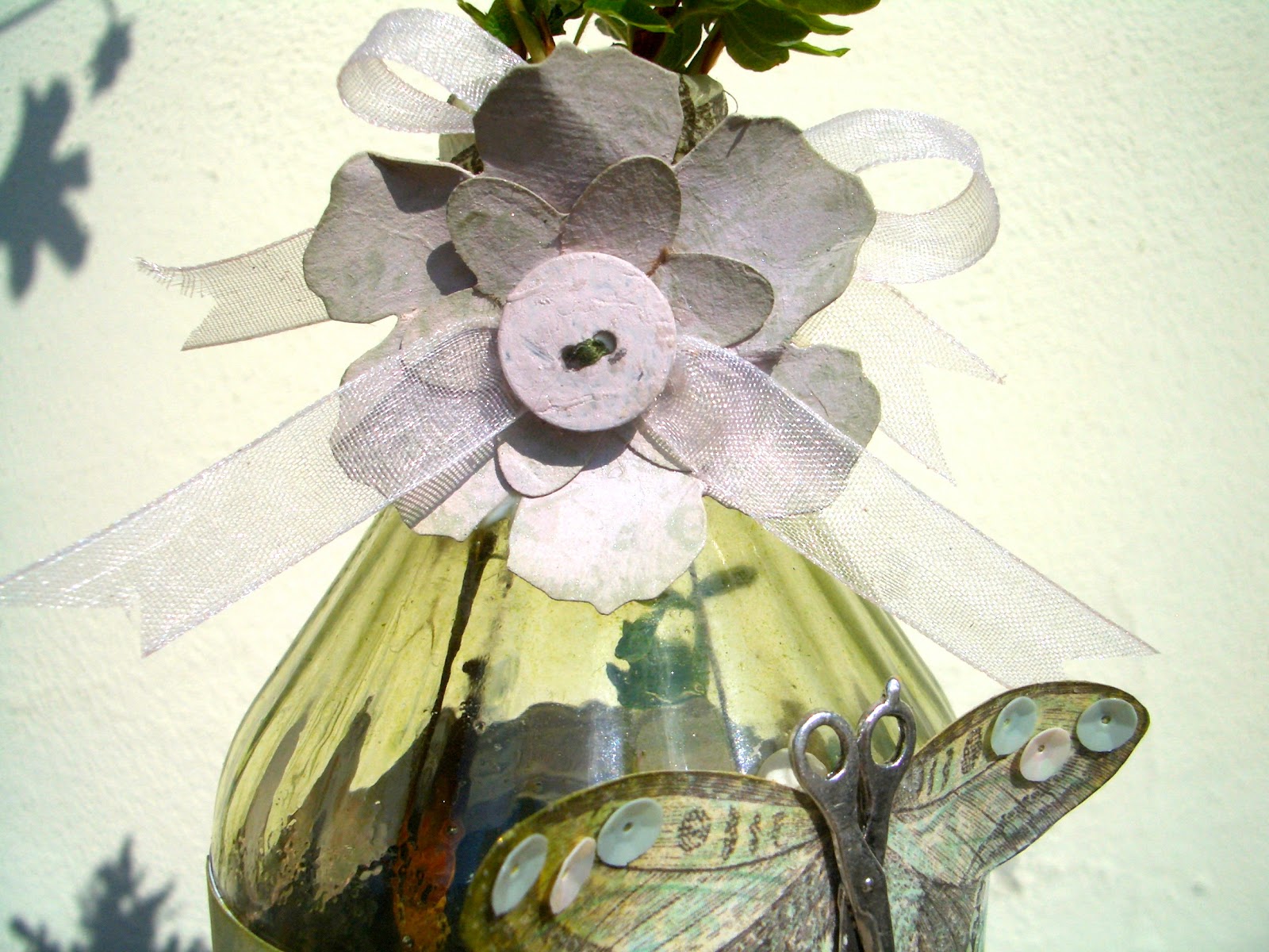 I'm so glad the sun came out for the photos of this one... it really allows that green glass to glow.
Thank you for spending some time here at Words and Pictures today - especially if you've given up some sunshine to be here! I didn't realise that once the sun came out there'd be such a conflict between my desire to soak some of it up, and my desire to continue crafting. Anyone who knows me, and my sun-worshipper tendencies, will understand what a statement that makes about the power of this addiction I've developed!

I'm entering this in the following:
The Shabby Tea Room challenge: Oh - So Pretty In Pink
Simon Says Anything Goes at the Simon Says Stamp challenge blog
Buttons and Bows over at The Craftroom Challenge
At the Anything Goes challenge there's a suggestion - Let's Not Be Square
A Muse Studio who are inviting us to have Triple the Fun, with at least one flower, one ribbon and one button on the project.

 I'm making another entry to Top Tip Tuesday (for whom I'll be making a Guest Designer appearance shortly, thanks to my Big Top... watch this space) and their Circles challenge. They also invite you to add a tip. My first thought was: When using sequins... don't! But I suspect that's not quite what they're after.
 So I think I'm going to go with my glass altering technique, with a strong Health and Safety caution: Make sure you have heat-happy glass - eg. would it withstand boiling water being poured into it?. Apply Distress Re-Inker (for the concentrated colour) to the glass. Add clear embossing powder and heat VERY CAREFULLY - protective clothing may be advisable. No joke.
Butterflies are self-propelled flowers.
R.H. Heinlein
The butterfly counts not months but moments, and has time enough.
Rabindranath Tagore
And to all my followers, old and new, an Irish blessing:
May the wings of the butterfly kiss the sun
And find your shoulder to light on,
To bring you luck, happiness and riches,
Today, tomorrow and beyond.


